Calendars
I’m not a heavy calendar user. I don’t have a lot of events going on at specific times and locations; I tend to have a series of tasks that have to be completed within a certain time frame, so I use my task manager more than my calendar app. However, I’m trying to be more disciplined about adding all kinds of personal and work-related events to multiple calendars, and I found an app that suits my taste better than others.
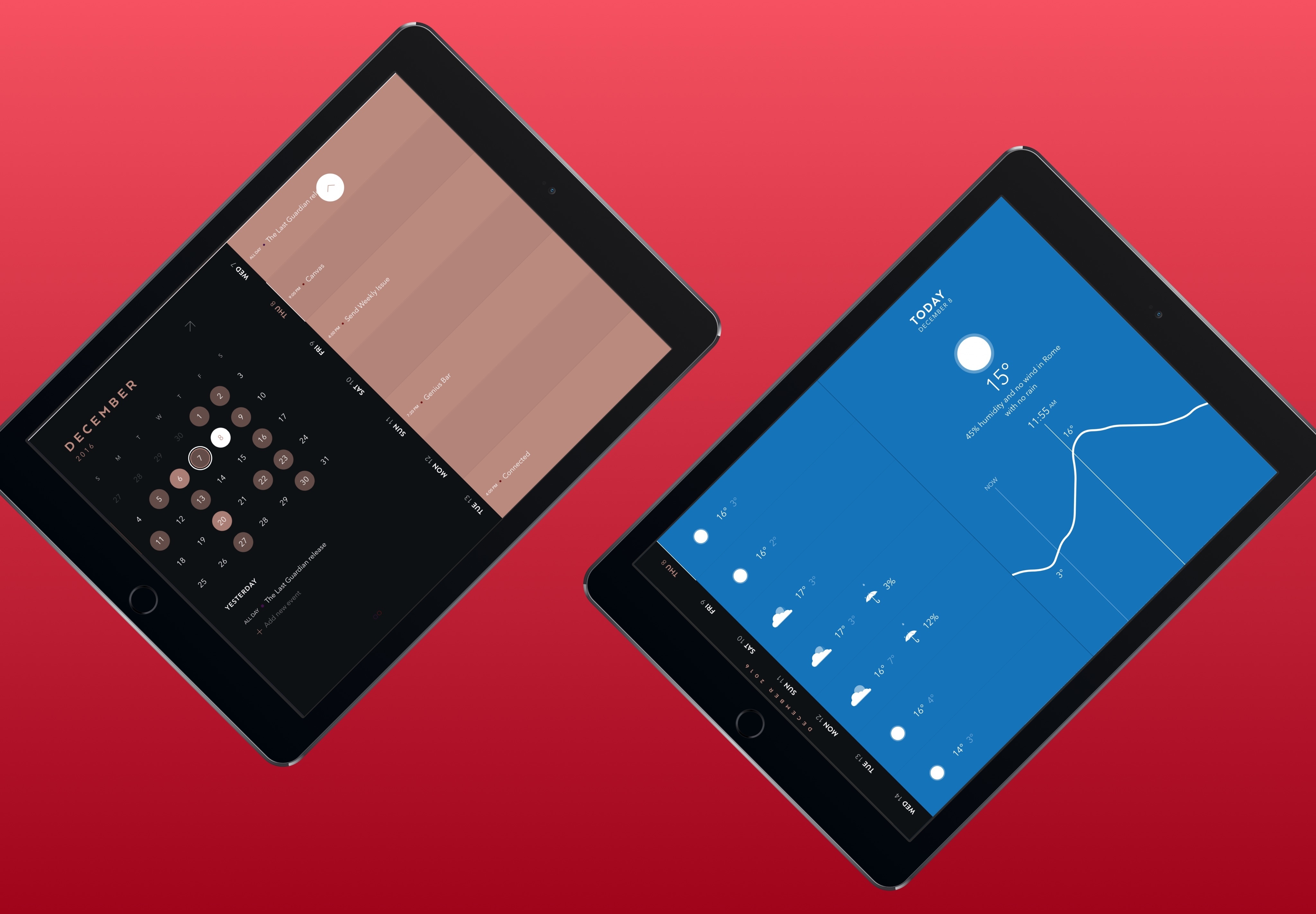
Timepage launched on the iPad earlier this year, and I switched to it as my main calendar app as soon as it came out. We have reviewed Timepage on MacStories multiple times, and I believe it is one of the best app launches of the past year.11 Developed by Bonobo in partnership with Moleskine, Timepage makes calendars beautiful and smart with some of the most clever interactions I’ve seen on iOS in a while. This is true for both the iPhone and iPad versions, but the app truly shines on the iPad Pro’s large display.
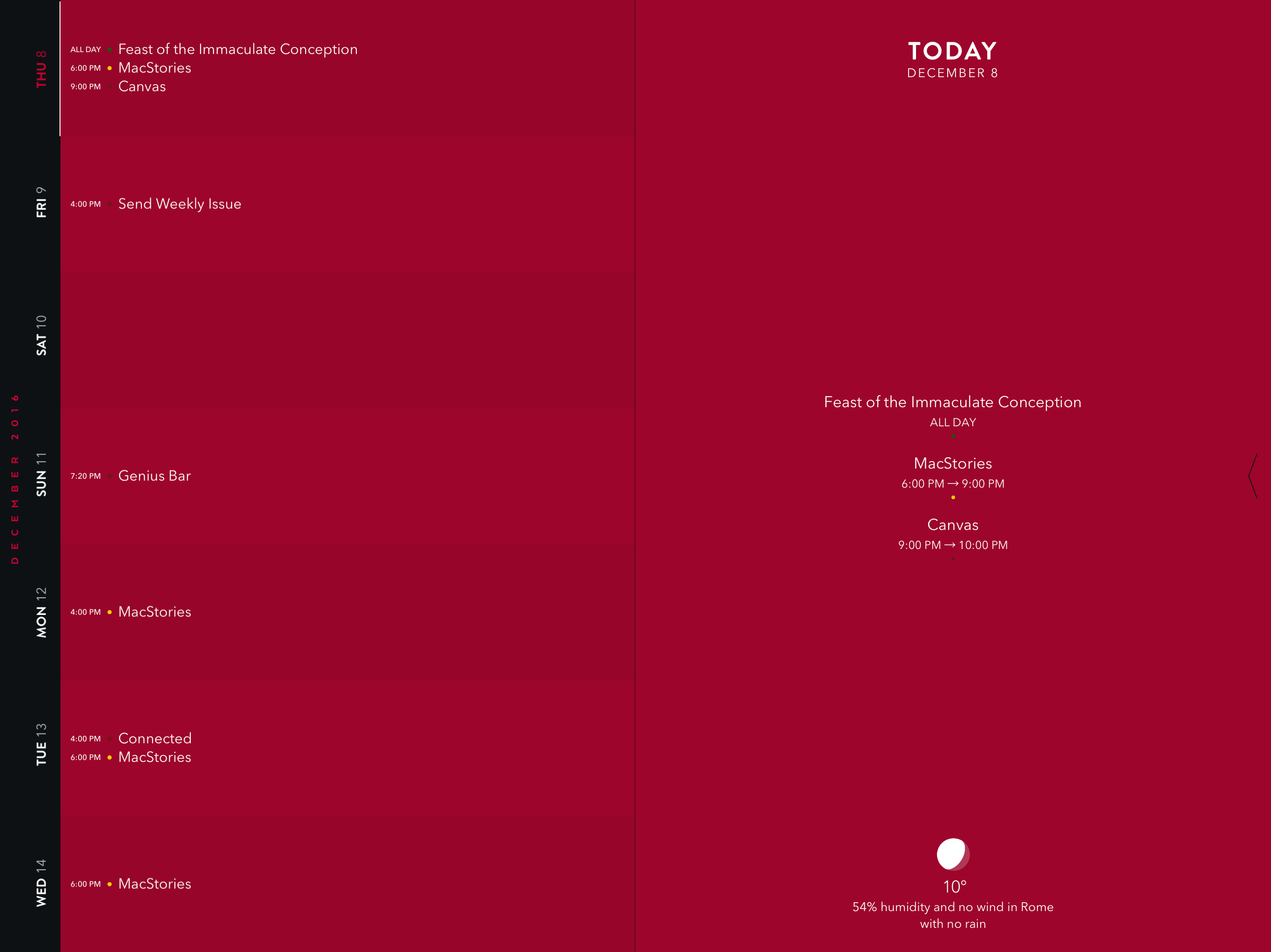
There’s no calendar client as elegant as Timepage. The app comes with multiple themes to choose from, and there’s a unique use of pastel tints, bold typography, and colored accents throughout the interface that make your daily agenda stand out. On the iPad, days are displayed in a vertical strip on the left, with events in the middle and details for individual days and events on the right.
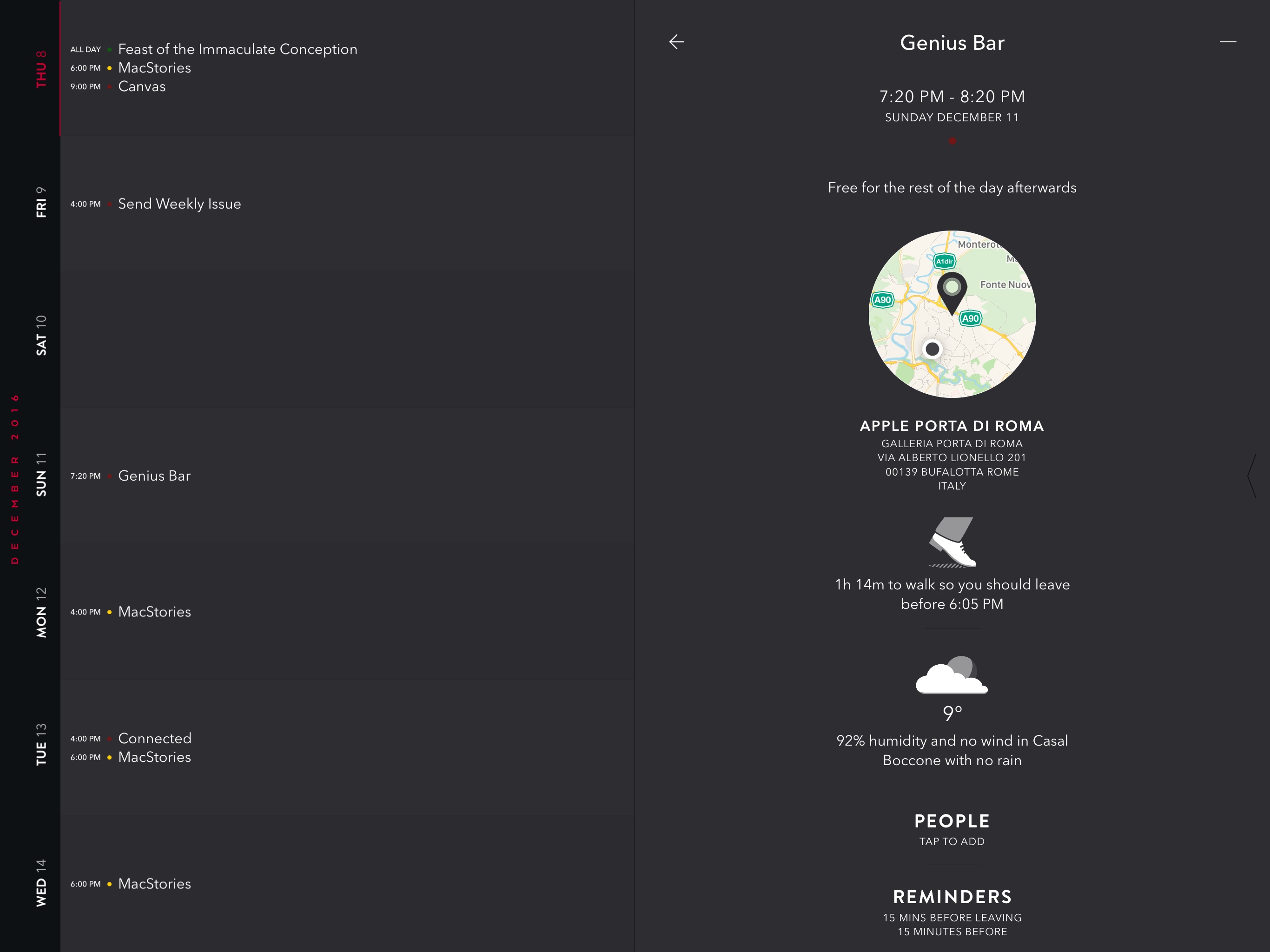
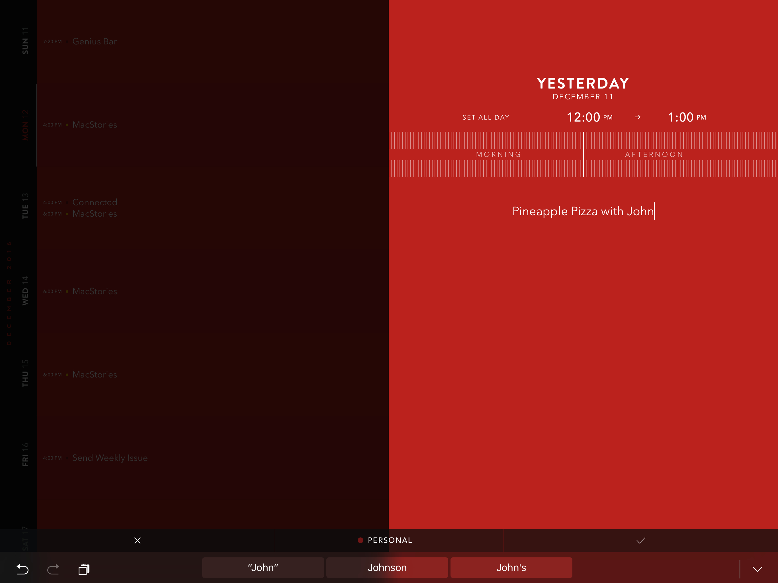
There are tons of delightful touches everywhere, such as integration with weather forecasts, estimated travel times, and a morning briefing that tells you what your day is going to be like. Even adding a new event eschews the paradigms of traditional calendar clients.
Timepage isn’t just about the novelty effect of a unique calendar visualization, though. The app is built on new types of interactions that simplify navigation in intelligent ways. In the month sidebar, for instance, there’s a heatmap that indicates how busy each day is through different levels of shading.
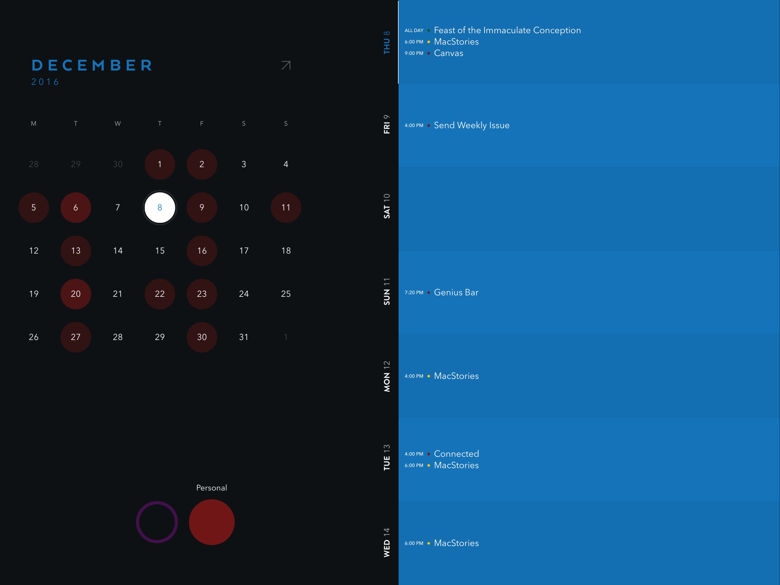
Calendars displayed in the app are available as large bubbles at the bottom; if you tap and hold one, you can drag the finger around to switch calendars and update the heatmap above to only show events for the current selection. It’s a genius solution for the problem of filtering month views by calendar. But I could also mention how swiping horizontally expands the sidebar into a full month view, or how the event creation panel pairs relative times of the day with more precise hours and how you have to scrub through a progress bar to set the time quickly.
Timepage is filled with ideas, design choices, and interaction patterns I’ve never seen in any other iOS calendar client before. It’s a joy to use and look at, it’s fun, and the developers are constantly improving it with new integrations and features. Managing my schedule with Timepage on the iPad makes me want to use my calendar more.
- I'm surprised it didn't win an Apple Design Award at WWDC 2016. ↩