This Week's Sponsor:

BetterTouchTool

Now with a Powerful Launcher for Your Mac


Instagram Launches Snapchat-Style Face Filters and More

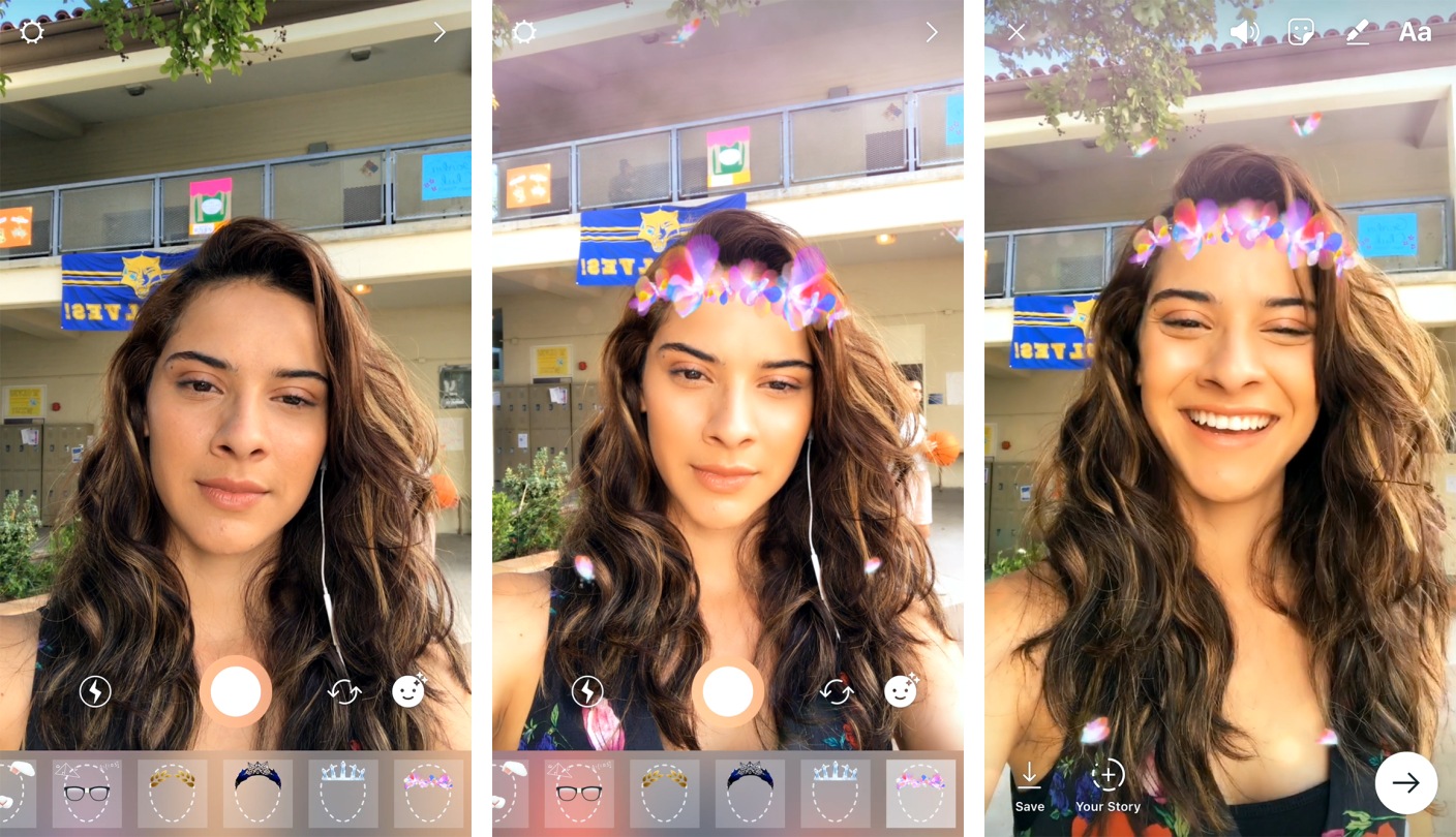
Instagram has announced several new features rolling out today, chief of which is another major borrow from Snapchat:

Today, we’re introducing face filters in the camera, an easy way to turn an ordinary selfie into something fun and entertaining. Whether you’re sitting on the couch at home or you’re out and about, you can use face filters to express yourself and have playful conversations with friends.

From math equations swirling around your head to furry koala ears that move and twitch, you can transform into a variety of characters that make you smile or laugh. To see our initial set of eight face filters, simply open the camera and tap the new face icon in the bottom right corner.

The initial batch of eight filters is smaller than what’s available on Snapchat, and it remains to be seen how often new filters will be added, but I wouldn’t be surprised if we see a lot more growth in this area. Snapchat’s advantage is not only in the number of filters, but also in its recent expansion of filtering technology in the form of World Lenses – and Instagram has made clear its commitment to beating Snapchat at its own game.

Also launching today is a new “Rewind” camera format to play videos in reverse, a hashtag sticker that can be used when crafting Instagram Stories, and a new eraser brush to complement the set of existing drawing tools.


PDF Viewer Adds iCloud Drive Sync, Improved Apple Pencil Support, Document Providers and Search

Last fall, PSPDFKit introduced PDF Viewer, a powerful, free iOS app for viewing and annotating PDFs that matched or exceeded many of the features found in paid PDF apps. Since then, the team behind PDF Viewer has rolled out a steady series updates, adding new features and refining existing ones. The latest update continues that trend with major additions that round out PDF Viewer’s feature set.

Read more


Sal Soghoian Announces CMD-D, a Mac and iOS Automation Conference Coming in August

Sal Soghoian, Paul Kent, and Naomi Pearce are collaborating on a new conference called CMD-D covering automation and scripting on macOS and iOS.

The conference is called CMD-D (pronounced “Command-D”), and it will be held August 9th at the Santa Clara Convention Center. It’ll be a full day of exploring the current state of automation technology on both Apple platforms, sharing ideas and concepts, and showing what’s possible—all with the goal of inspiring and furthering development of your own automation projects.

To assist in this exploration of all things Automation, I’ve invited some of my smartest friends to present sessions focused on their own areas of automation expertise, on macOS and iOS. And, for those new to automation, we’re also planning a Scripting Boot Camp on August 8th.

Speakers include Andy Ihnatko, Jon Pugh, Jason Snell, John Welsh, and Sal Soghoian. Registration is open and can be found here.

Permalink

Philips Hue Line Expands with Ambiance Lamps, Fixtures, and New Bulbs

Philips Hue has long been one of the premier lines of smart lights on the market, and today that line is expanding with several new products. Philips announced through Business Wire a range of Ambiance offerings, including table lamps, fixtures, and bulbs.

The Ambiance lamps, named Wellner and Wellness, along with the Flushmount fixture, are available for pre-order today with mid-June ship dates. Each of the lamps is listed for $99.99, while the ceiling fixture is $199.99. At a glance, these products appear well designed, and a great fit for placement in anyone’s home. The new Ambiance bulbs will be available for pre-order in June, with July ship dates.

As with other Hue devices, each of these upcoming products feature support for an array of smart home platforms, including Apple’s HomeKit, Amazon’s Alexa, and more. So no matter which platform you may be committed to, you shouldn’t have to worry about compatibility issues here.


AppStories, Episode 5: App Subscriptions

On this week’s episode of AppStories, John and I covered how app subscriptions work, the pros and cons for consumers and developers, and examples of apps using creative subscription models. After some research, we discovered more indie apps that have added subscriptions over the past year than we initially imagined.

You can listen to the episode below, or jump directly to the app examples (and download them from the show notes) using this Overcast link.

Sponsored by:

AppStories+ Deeper into the world of apps

AppStories Episode 5 - App Subscriptions

0:00
34:47

AppStories+ Deeper into the world of apps

Permalink

FocusList Review: A Minimalist, Pomodoro To-Do App

Through testing productivity apps like Doo and Time, my to-do preferences have changed; while I was once a fan of feature-rich task managers, I’ve learned to appreciate the simplicity of apps that just focus on helping me get stuff done.

FocusList is a great example of that sort of minimalism in action, an unadorned display of your tasks, their estimated completion time, and, on occasion, a timer. Its content is driven by your list of tasks, but no more – its one goal is to focus you on your work.

Read more


Shazam Launches Redesigned, Simplified iOS App

Shazam for iOS has introduced an update that makes app navigation more simple and streamlined. Gone are the traditional navigation tabs at the bottom of the screen; they have been replaced by a paginated layout where a swipe left or right is used to switch screens.

Launching Shazam lands you on the Home page, which is devoted almost entirely to the Shazam button. Tapping it will cause the app to start listening to what’s playing; one change to the Home page is that you now activate Auto Shazam with a long-press on the Shazam button. Auto Shazam allows the app to continue listening to what’s playing even after the app closes.

The top of the Home page indicates that there are three pages in total to navigate through. To the left of Home is My Shazam, to the right is Discover1, and swiping back and forth is the primary way to get where you want to go. This type of layout resembles that of apps like Snapchat, only Shazam pulls it off in a less confusing manner. Not only do you always see three navigation dots at the top of the screen to indicate your current place within the app, but the Home page also contains icons that show which pages are placed on the left and right – Snapchat could benefit from similar aids, for new users at least.

My Shazam hasn’t changed much from before, but in an effort to consolidate the total number of pages in the app, Discover now includes the contents formerly found in Trending as well. A Chart Update card is included with your daily mix, plus you’ll find a button at the top and bottom of your 10 daily updates that takes you straight to Trending.

I appreciate what Shazam has done to try simplifying its app, both in the number of pages to navigate through, and in adopting the swiping gesture to handle that navigation with ease. Not every app would benefit from such a streamlined interface, but it works well here.


  1. Unfortunately Discover has not yet made it to the iPad, so Trending stands in its place on that device.