Recent days have seen an increasing number of HomeKit accessories released, making it more difficult to keep up with all the products currently on the market. Enter HomeKitty.
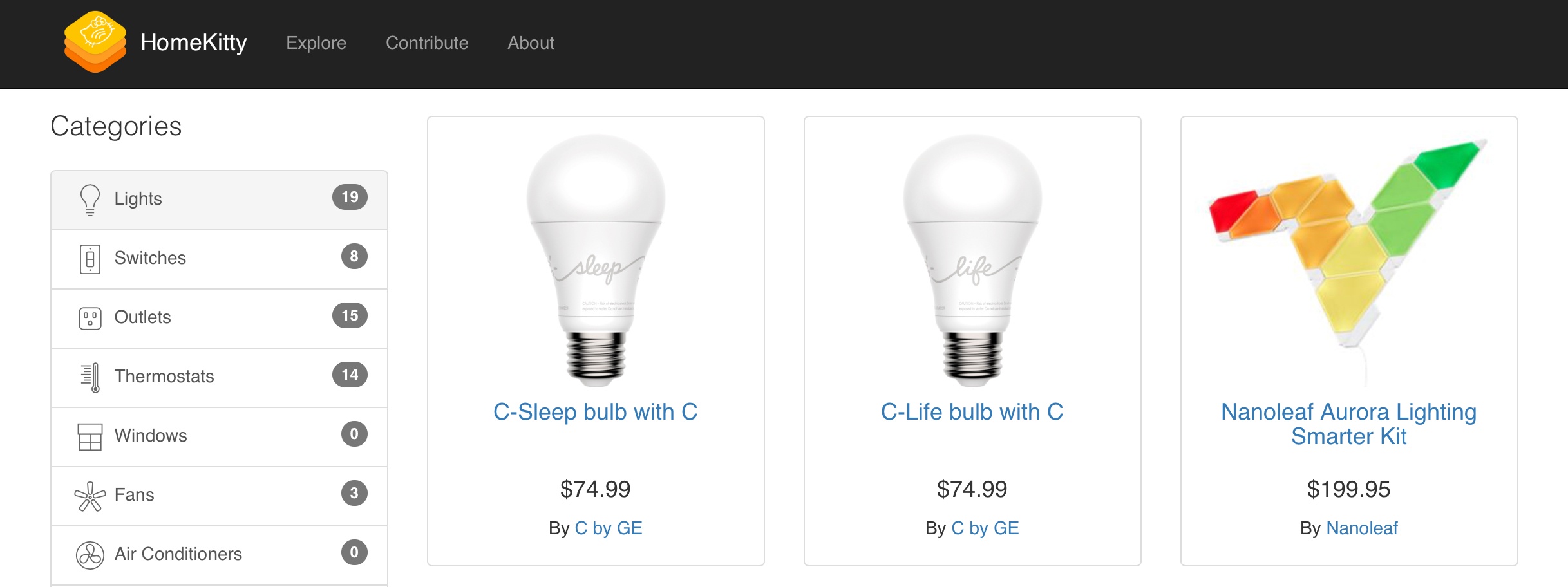
HomeKitty is a new site created single-handedly by developer Patrick Balestra as a hub for all things HomeKit. It was written entirely in Swift, and contains basic information about every currently available HomeKit accessory. Thanks to the site’s categorical listings, you simply select a category of device – such as lights, outlets, or thermostats – to view all available products of that type.
Alongside a product’s image, HomeKitty displays its name, price, maker, and a link to either the product’s official manufacturer site or its listing in the Apple Store – that’s it. Rather than include detailed listings and ratings/reviews for HomeKit products, HomeKitty keeps things clutter-free and serves as a sleek, easy-to-navigate database that can help point prospective shoppers in the right direction.
HomeKitty was designed to serve as a crowdsourced site, so anyone can submit a product for inclusion in its database. Once approved, the product will be displayed alongside existing entries; currently over 80 products are listed. For now, every listing is restricted to products currently available for purchase, but in the future Balestra plans to add announced-but-unreleased products as well.