WriteUp 3.0

https://cdn.macstories.net/002/29904_Camera%20Roll%201.png

https://cdn.macstories.net/002/29904_Camera%20Roll%201.png

In my original comparison of iOS text editors, I included WriteUp, a fast and powerful Dropbox-enabled app that stood out thanks to its support for folders and sub-folders, exporting options, and versions. Prior to settling with Writing Kit for my daily iPad writing efforts, in fact, I had been using WriteUp as my go-to text editor – version 2.0 of the app was solid, but in the end not as powerful as Writing Kit.

Version 3.0 of WriteUp, released today, adds new powerful functionalities to speed up the process of working with multiple Dropbox folders and notes, bringing a new built-in web browser to augment the app’s research capabilities with split view. I have been testing WriteUp 3.0 for the past two weeks, and while I won’t completely switch from Writing Kit just yet, this new iteration of the app has stayed on my iPad because of the very specific features it introduces.

Split View

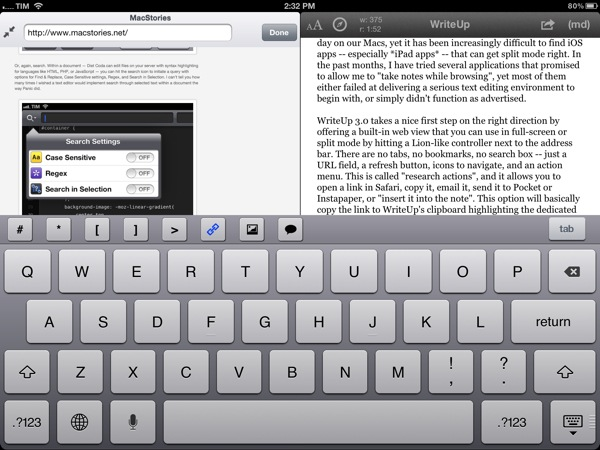
If you write on the web, split view is kind of a big deal. Being able to take notes and write blog posts while referencing a webpage on the other side of the screen is something we do every day on our Macs, yet it has been increasingly difficult to find iOS apps – especially iPad apps – that can get it right. In the past months, I have tried several applications that promised to allow me to “take notes while browsing”, yet most of them either failed at delivering a serious text editing environment to begin with, or simply didn’t function as advertised.

https://cdn.macstories.net/002/29904_Camera%20Roll%201.jpeg

https://cdn.macstories.net/002/29904_Camera%20Roll%201.jpeg

WriteUp 3.0 takes a nice first step on the right direction by offering a built-in web view that you can use in full-screen or split mode by hitting a Lion-like controller next to the address bar. There are no tabs, no bookmarks, no search box – just a URL field, a refresh button, icons to navigate, and an action menu. The latter is called “research actions”, and it allows you to open a link in Safari, copy it, email it, send it to Pocket or Instapaper, or “insert it into the note”. This option will basically copy the link to WriteUp’s clipboard highlighting the dedicated link button in the extra keyboard row, allowing you to open anInsert Link panel with the address already copied. Unfortunately, unlike Writing Kit, WriteUp 3.0 still doesn’t let you select words in text and only wrap those within Markdown links; I hope better Markdown auto-wrapping options will come in a future version of WriteUp. Overall, I also still prefer Writing Kit’s custom keyboard row.

The built-in web browser isn’t perfect: its performances aren’t comparable to Mobile Safari, and because of its size constraints, webpages will often be displayed partially, even when using the iPad in landscape mode. On a couple of times, I also noticed WriteUp would “freeze” a webpage without letting me reload it, and I really think there should be a dedicated Google button to relieve stress from the address bar. In spite of these few bugs and limitations, however, I can’t help but like WriteUp’s split view. It doesn’t let me drag & drop text between panels – I am not even sure that is technically possible – but it works in portrait and landscape mode, it’s dismissible with gestures, and, more importantly, it has already helped me write several news posts for MacStories when I needed to work side by side with webpages to reference quotes and other facts. It can only get better from here (idea: split view for multiple notes).

Pinned Notes, Favorites, and iCloud

The second major addition to WriteUp 3.0 is something I’ve been wanting from a Dropbox text editor for a long time, and which the app gets precisely right. WriteUp can now mark notes as “favorite” and make them available anywhere no matter the folder they are into. Furthermore, a separate “pin” option lets you pin notes at the top of any folder, and both favorite and pinned items are synced across devices running WriteUp with iCloud.

https://cdn.macstories.net/002/29904_Camera%20Roll%203.png

https://cdn.macstories.net/002/29904_Camera%20Roll%203.png

Here’s how I use this feature. As outlined in my Dropbox writing workflow, I try to keep a consistent environment of text files that are always accessible and up to date independently from the tool or device I decide to use.

Lately, I have unified all my notes, drafts, and lists inside a single Apps folder that I can access from Writing Kit, TaskAgent, Drafts, TextDrop, and my Mac. My “longer notes” are located in the root of the /Apps folder, with sub-folders for the aforementioned apps inside it. OS X and TextDrop make it easy to navigate through these as they have access to my entire Dropbox filesystem; most iOS text editors, on the other hand, typically force you within a single folder, and won’t let you move between sub-folders. Not only does WriteUp let me navigate notes and folders, it now also a) enables me to mark my most used TaskAgent list as favorite so I can see it in the main Apps folder and b) pin my Scratchpad.txt file to the top of the folder view so I’ll always know where I can quickly jot down notes and links (and if I happen to be cleaning up my Drafts folder, I can easily cut links, and copy them back to Scratchpad.txt without navigating back to /Apps).

Pinned and favorite notes have been a terrific addition to my workflow, and I found both the implementation and iCloud sync solid and reliable. It’s not for everyone – admittedly, several writers I know like to keep their Dropbox notes and folders in separate locations – but if you’ve been looking for a way to unify your text files and folders in a single view, WriteUp 3.0 should have you covered here.

Wrap Up

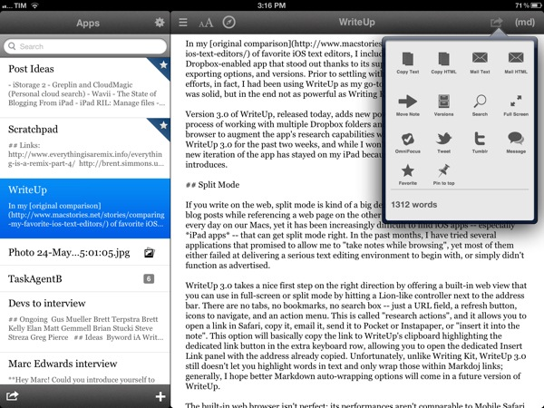
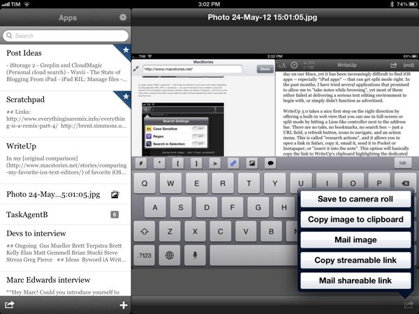
There’s a bunch of other neat additions in WriteUp 3.0. Markdown Extra (tables, footnotes, etc) is now supported, and the app can send notes to OmniFocus, iMessage, and publish to Tumblr. Terminology integration lets you look up or replace words using Agile Tortoise’s fantastic dictionary app; you can move “complete” folders to other locations in your Dropbox; and because Dropbox now lets you share files from any folder, WriteUp 3.0 can upload images, and give you a streamable link you can share or use as source for images in your notes. If you plan on serving images from your Dropbox account, this will come in handy.

https://cdn.macstories.net/002/29904_Camera%20Roll%202.png

https://cdn.macstories.net/002/29904_Camera%20Roll%202.png

In my tests, I experienced a few bugs with WriteUp 3.0. Sometimes, the built-in Markdown preview wouldn’t be displayed, forcing me to tap on another note, then select the previous one again to activate it; the app didn’t crash, but it failed to create a text file with “2.1” in the title (it wrongly recognized .1 as the extension, thus not creating a .txt file), and the bottom navigation bar (where the + button to create new notes is placed) isn’t displayed when using a Bluetooth keyboard. Fortunately, the developer has been extremely responsive, and I was told fixes, stability improvements, and new features are already underway now that 3.0 is available.

WriteUp 3.0 is a great update. In my opinion, Writing Kit still remains the most powerful text editor around, but, as I mentioned above, at the same time I couldn’t get myself to stop using the functionalities introduced in WriteUp 3.0 such as split view and favorite items. For those specific purposes – writing while referencing a webpage and browsing notes across folders – WriteUp 3.0 is superior to Writing Kit.

With strong sharing options, support for Versions (another feature most iOS text editors are lacking), images, custom CSS previews, and all the other features of version 2.0, WriteUp 3.0 has still some rough edges, but shows an incredibly promising, and possibly even more powerful text editing future.

WriteUp 3.0 is $4.99 on the App Store.


Apple Posts New Siri Ads Featuring John Malkovich

Following a series of “celebrity ads” for the iPhone 4S’ voice-based assistant released last month, Apple today posted two new Siri TV commercials featuring actor John Malkovich. The ads, titled “Joke” and “Life” show Malkovich casually talking to Siri with short sentences and a series of single words such as “weather” or “evening”, perhaps in an effort to showcase both Malkovich’s particular attitude and Siri’s capability of handling short commands with seemingly no context (“evening” returns a series of calendar appointments, “linguica” displays local restaurants).

According to a recent study, the previous commercials featuring Zooey Deschanel and Samuel L. Jackson fared well with viewers, who, reportedly, were highly receptive to familiar faces of celebrities illustrating the latest features of the iPhone in a familiar, almost casual setting. MacRumors has put together a number of possible responses Siri can give to Malkovich’s query – tests performed with the question asked by Samuel L. Jackson showed that, in practice, Siri was a little less accurate than its primetime counterpart.

The new Siri ads are available on Apple’s website, YouTube channel, and we have embedded the official versions below.
Read more


Diet Coda From An iPad Blogger’s Perspective

I am no web developer – I write prose, not code – but I just bought Panic’s highly-anticipated, fantastically-named Diet Coda for iPad from the Italian App Store. I want to show my support to the great independent developers of the iOS and OS X community. Furthermore, I want to help disrupting the long-standing meme that the iPad can only be used for “content consumption”, whatever that has come to mean in 2012. I didn’t know I could still find Diet Coda useful for my iPad-based writing and blogging workflow.

I can’t review Diet Coda – as I said, I wouldn’t be able to fully understand its functionalities and judge its (possible) shortcomings when compared to the (also coming today) Coda 2. But I can recognize software crafted with care and attention to detail. Diet Coda immediately stands out as one of those apps where pixels aren’t just there to fill the screen – they’re the epitome of design enhanced for function.

Take the custom text selection method Panic built. It’s not entirely custom – it’s still fundamentally based on “drag handles” and a “zoomed-in view” of the cursor – but Panic reworked it to allow for faster selection by swiping on the left (where numbered lines are) and to visualize a larger, rounded “zoom selector” (they call it the Super Loupe) when you’re moving the cursor between characters. It feels much better than standard iOS text selection – faster, and somewhat more accurate – albeit it really needs to be experienced “in motion”, rather than through the screenshot I have embedded below.

I wouldn’t mind seeing Apple drawing some inspiration from Panic’s Super Loupe and Hooper Selection for the next major version of iOS.

Or, again, search. Within a document – Diet Coda can edit files on your server with syntax highlighting for languages like HTML, PHP, or JavaScript – you can hit the search icon to initiate a query with options for Find & Replace, Case Sensitive settings, Regex, and Search in Selection. I can’t tell you how many times I wished a text editor would implement search through selected text within a document the way Panic did.

It’s about getting the details right, yet making sure the main foundation is also solid to begin with. Diet Coda features a perhaps not so innovative, yet reliable column-based navigation for browsing folders and opening files; at any time, the column view can be “enhanced” with thumbnail tabs (also called “document shelf”) displaying open files, the main Sites page, and Terminal along the top of the screen.

And if you go back to the Sites page – where you add the servers you want to connect to using Diet Coda – and enter “wiggle mode” to edit the sites you’ve configured, Panic added a nice button at the bottom to confirm you want to exit the wiggle animation. You could stop it anyway by touching anywhere on the screen, but this is a nice extra visual cue.

Same for buttons: the purple ones “glow” when tapped, and the Delete action is, again, custom by Panic, yet incredibly nice to use on iOS.

I may not write a full review of Diet Coda, but I was sure happy to find out Panic’s latest effort will find its well-deserved spot in my iPad writing workflow. Diet Coda, finally, allows me to copy the public URL for images uploaded to my FTP server. That’s a small feature, but you’d be surprised to know how many FTP iPad apps end up lacking it amidst dozens of other “power user options”. I wish Diet Coda would let me upload from the Camera Roll – hopefully that’s coming in a future update. However, together with buttons to copy the public URL and file path, Panic added options to copy an image’s HTML <a> and <img> tags to the system clipboard, making it extremely easy to paste the code into Blogsy, my blogging app of choice. The simple, yet often ignored “copy URL” action will play nicely with Writing Kit’s shortcut for inserting images into Markdown, too.

Even without fully utilizing Diet Coda’s set of features, I’m happy to see the app filling a particular void in my workflow – and even better, with style and prowess.

We will have more detailed looks at Coda 2 and Diet Coda later this week on MacStories; personally, I believe Panic’s latest iOS effort will redefine the category of web code editors on the iPad, proving once again that the platform has moved beyond “consumption” – and that’s just up to users to accept it now.

Diet Coda is now available on the Italian App Store and other international stores (same for Coda 2). Diet Coda and Coda 2 will be available here and here, respectively, on the US App Store in a few hours.


CheatSheet Quickly Lists an App’s Keyboard Shortcuts

CheatSheet Quickly Lists an App’s Keyboard Shortcuts

With Coda 2 from @Panic hitting the Mac App Store this evening along with Diet Coda, we’d be hard pressed not to share this simple utility from @MediaAtelier. CheatSheet is a free Mac app that displays an app’s keyboard shortcuts in an opaque pop-up in the vein of a Quick Look preview. Holding down the command key for a couple seconds brings up the entire list of shortcuts for the active application. While holding down the command key, you can click on commands with your mouse cursor to activate that command. If you want to learn all of the useful keyboard shortcuts to get the most out of your new applications, CheatSheet will be an excellent companion — it runs in the background without taking up menubar or dock space on OS X.

You can also check out KeyCue from Ergonis and Dashkards if you prefer additional options like custom global shortcuts, themes, or if you want your keyboard shortcuts to be listed in the Dashboard. For me, CheatSheet provides everything I need in an easy-to-read interface and easy-to-use keyboard shortcut suited for OS X.

Permalink

CleanMyDrive Instantly Frees Your External Drives From Junk

I am a huge fan of MacPaw products. The company’s care for consistent UI design combined with huge functionality is well-known all over the Macintosh community, and I use their apps pretty frequently. In fact, Gemini was the topic of my first MacStories post.

MacPaw remained makers of desktop software only, even after the iPhone came out; this is a move I personally like a lot, as you find less well-designed Mac apps than iOS utilities nowadays, and it feels good to see some guys focusing on the desktop business. MacPaw’s newest product, CleanMyDrive, is a stripped-down, menubar version of their first and most popular app CleanMyMac, and it fulfills the task of silently freeing your external HDD and flash drives from unwanted junk data or duplicates.

After installing the app, CleanMyDrives sits behind a nicely crafted hard disk icon in the menu bar. Click on it, and a dropdown window appears; from there, you can control the app’s features. The biggest advantage of making CleanMyDrive a menubar utility is that it’s invisible until you really need it. Now, every time you connect an external drive to your Mac CleanMyDrive will check its capacity and data — when it recognizes new ones, you’ll be asked whether it should check them as well in the future or not. The amount of used and free space is shown in a horizontal bar using blue and white parts.

If CleanMyDrive finds junk files on one drive (things like DS_Store, Thumbs.db, Spotlight, hidden trashes and so on), it displays their portion in red (plus the exact size in MB on hover), and you can delete them instantly. If you’re lazy and don’t want to manually delete the found junk on your drives all the time, CleanMyDrive can automatically delete junk every time you eject a drive, too.

After testing the app with my USB drives, I can say that it did not delete any of my files and folders, but still freed some space – likely related to “junk” accumulated over time.

Because the app is focused on smaller drives, CleanMyDrive firstly only scans external drives with 64 GB of storage or less. However, you can change that in the preferences to any size limitation you like and even disable it completely to also include large external HDDs. However, CleanMyDrive can’t check your internal drive for junk. One could already have guessed so from the app’s name, but as the internal drive’s storage is nevertheless shown in the app’s window, I tried to scan it as well. At this point, the developers allowed themselves some advertising for their other product: the app brazenly recommended me to scan my internal drive with CleanMyMac.

For cleaning my external drives, I’ll definitely stick with CleanMyDrive; this almost instant decision was mainly made due to the app’s fantastic and — yes, that’s the way I felt about it — cute design. The UI is clutter-free, simple, and it makes intelligent use of sliding effects and hover controls; it’s fun to use. The app’s small preference window plus the rotating cog wheel to open it up — little details, something I like very much — rounded up my impression of it as a cute little companion to ease up your workflow.

CleanMyDrive can be a very useful utility, especially when you’re using (maybe even several) external drives. Plus, its unobtrusiveness and pleasant user experience make for a very useful package which comes for free for a limited time. So don’t hesitate and grab CleanMyDrive on the Mac App Store while it’s hot.


iOS 6 and Files.app

Rene Ritchie thinks Apple should provide direct document access with iOS 6 through a dedicated Files.app:

A unified document repository, modeled after the existing unified image repository, rounded out with more consistent attachment options, could be the best of all worlds. Users wouldn’t have to remember which folder a document was in, nor which app. They wouldn’t have to jump around to edit or share. Users could simply open any app capable of editing or sharing a certain type of app and go to work.

I agree with the notion that the current Open In, app-based document transfer model of iOS is broken. The simplicity brought by iOS freed average users from the complexities of the filesystem; people who like to get their daily work done with iOS devices, however, miss a unified document filing system. Paradoxically, the “simple” iOS, with its “Open In” menu and multiple copies of the same document, requires people to manually manage more.

In February, I envisioned something similar to Rene’s proposed Files.app solution:

So, I had an idea. I think the same iTunes File Sharing feature would work a lot better as a dedicated, native iCloud app for iOS devices (and maybe the Mac too). After all, if Apple is providing an iTunes-based file management utility for Mac users, why couldn’t they build an app that enabled any third-party iOS app to save and import files from iCloud? This app would be built into the system and allow users to simply collect documents, like iTunes File Sharing. Developers could easily add options to their apps to import files from “iCloud File Sharing” and export files to it. Users would have the same feature set of the existing iTunes File Sharing, only with an interface they are already familiar with, because iCloud File Sharing would resemble the existing file management workflow of iWork for iOS or iCloud.com. The only difference is that it would be integrated on a system level, work with any iOS app, and basically be an extension of the “Open In” menu that already allows apps to communicate with each other through supported file types.

After having tried the latest developer releases of Mountain Lion and putting some more thought on the matter, though, I am not so sure about the centralized repository system anymore. Namely, I am not convinced it should be a separate app.

Rene rightfully compares the possible Files.app to the existing Photos.app for iOS. Files could present document folders the same way Photos displays image albums, and it could have the same systemwide hooks to let other apps access documents from the unified repository. However, there is a difference worth noting: Photos.app gets its contents from a primary, hardware-based component of iOS – the camera. A user takes a picture, it goes into Photos. Same for videos and screenshots – the interaction is simple.

What is a file, though? Is it a text document? RTF or .txt? If so, does Files.app come with preview capabilities for those file types? Or is it about PDFs, .zip archives, folders, and .cbr files? And how do you get documents into Files.app?

Even by only slightly mimicking the Finder, Files.app could reset the past five years of “simple” iOS interactions in one big fell swoop. Photos itself, which is extremely straightforward, is criticized for its file management features. Now imagine that applied to the general concept of “files” with folders, views, sorting options, settings, and previews.

Today, I think what I wrote back in September could make for a better solution: inter-app communication.

Why can’t Apple build an invisible layer that lets Elements edit a text document from Evernote and Pages access the same file?

It turns out, a possible implementation of such layer already exists, but iOS won’t let apps communicate with it. Enter iCloud Documents & Data:

The same interface is available on OS X:

And in Mountain Lion, the standard file-saving dialog has been enhanced with the addition of an iCloud option (image via Macworld):

The design is slightly different since the first Mountain Lion Developer Preview that Macworld reviewed, but the concept has stayed the same throughout betas: Apple apps like TextEdit and Preview can “hold” documents into a special iCloud folder (located under Library/Mobile Documents/appname/Documents on OS X); these documents also show up on iOS under Documents & Data; currently, they are not available on iCloud.com, nor is Mountain Lion’s file-saving UI allowing, say, Preview to easily grab a file from TextEdit’s own iCloud “folder”. However, on Mountain Lion, Apple says that you can get your “existing documents” into iCloud by dragging them from the Finder or “other apps”.

If the system Apple has been putting in place is of any indication, I think enhancing the app-based model with better communication would actually outmatch the possible benefits of a separate Files.app. Documents & Data could become a document picker developers can enable in their apps with an API; because apps register file types they support, Apple wouldn’t have to worry about creating a Files.app capable of previewing every single format out there. GoodReader could open a PDF from Pages’ iCloud, and Pages could later access that same PDF with the changes made by GoodReader.

I am arguing that apps should become their own centralized locations that other apps can access and interact with – without creating duplicate files. Apple can’t provide the basic preview/edit functionalities of Photos for every possible format supported by Files.app, but 600,000 App Store apps might have the solution for that. Rather than creating an additional layer of management – disconnected from apps – iOS 6 could turn the interface already in place into a document picker that gives files their proper meaning: the app they belong to. Only with the addition of inter-app access and “universal save” to avoid duplicates.

Making changes to a single file with a variety of apps is something we do every day on our Macs. On OS X, there’s the Finder that acts as a glue between apps and files. By design, the technical constraints of iOS have turned non-destructive editing into a clunky and confusing experience, as we’ve seen with iPhoto. I am arguing that instead of building a “Files.app” or “Finder for iOS”, Apple could leverage the existing iCloud Documents & Data UI, and rework the iOS architecture to allow for changes to the same document from multiple apps.

The centralized Files.app idea is certainly appealing, but Apple has heavily invested in the app metaphor for the past years, and rather than replacing it with a new layer, I wouldn’t mind seeing it get smarter.


Google Launches Complete Redesign of Search iPhone App

Today, Google launched a major redesign of its official Search app for iPhone, which reaches version 2.0 and is now available on the App Store.

Inspired by the iPad update that was released last year, the new Google Search app for iPhone brings a completely redesigned start screen with options to sign in, search, and access Google apps. A shortcut for settings is available at the top alongside an icon to switch between search results and the search field at any time.

Searches can be performed by typing, or through two new shortcuts for voice and Goggles. These functionalities were already in place, but Google says they are now faster and more accessible thanks to the new interface. Similarly, the standard search results have gone through a major overhaul as well: as you scroll, controls are hidden and results are displayed in full-screen; like on the iPad, results open in a separate panel that you can dismiss at any time with a a single swipe. You can share results via email, open a webpage in Safari, and even search for specific text inside a page. Along the bottom, new tabs for Images, Places, News, and more allow you to easily switch between different types of Google results.

Furthermore, Google has redesigned image results to be displayed in full-screen, and a new Apps tab in the main screen allows you to load Google apps “on the web” or “from your iPhone”. As a side note, the app has also received a slightly redesigned icon, and both the iPhone and iPad version of Search can now save images to the Camera Roll.

Google Search 2.0 is now available on the App Store.


Drafts 1.2 Saves Quick Notes To Evernote, Facebook

Drafts 1.2 Saves Quick Notes To Evernote, Facebook

Agile Tortoise released version 1.2 of its “quick note-taking” app Drafts today, adding support for Facebook and Evernote. As an Evernote user, the addition is more than welcome, as I now have the possibility of quickly saving a time-stamped note into my account in seconds. Previously, I used FastEver for this functionality. I don’t post to Facebook much, but the integration sounds handy as well:

Like Drafts’ existing twitter features, this update adds the option to post drafts to Facebook. The first time you post you will have to go through an authorization process, allowing Drafts access to your wall – from then on out it’s a simple tap. Those of you that use the Facebook app know, launching it and waiting for it to load to post an update is cumbersome – now you have a quick alternative.

Other improvements in Drafts 1.2 include a new “new draft after success” setting, support for calendar event creation, and integration with OmniFocus notes and Due. These add to the new icon, fixes, and Dropbox support that came in Drafts 1.1.

Drafts is available at $0.99 on the App Store.

Permalink