This Week's Sponsor:

Inoreader

Build your own newsfeed and cut through the noise


OmniOutliner, Plain Text, and Nebulous Notes
OmniOutliner, Plain Text, and Nebulous Notes

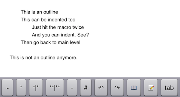
A few months ago, I asked if there was a way to produce plain text-based outlines and import them into OmniOutliner for iPad while preserving indentation. Today, Jeff Hunsberger has posted a nice overview of his setup, which doesn’t include OmniOutliner but relies upon the same “trick” I use – speeding up plain text outlining using Nebulous Notes’ macro functionality.

Just by setting up those few macros, I have create a fully-realized meeting outline tool in markdown using Nebulous Notes. The outline in the same format I’ve been using for years and is searchable, extensible and ubiquitous thanks to Dropbox. The beauty of this is, after the meeting is over, the notes I’ve just taken are ready back at my desk – they can be inserted into an email to the team with a simple copy/paste.

My workflow is only slightly different. Firstly, I usually outline in CarbonFin Outliner on the iPad (Tree on the Mac), but sometimes good ideas strike when I’m already in my text editor, thus requiring me to write them down as quickly as possible. What I end up with is a rough structure of my thoughts that I want to further refine in OmniOutliner. From there, I’ll then export as OPML to CarbonFin Outliner. It sounds convoluted – maybe it is – but this setup works for me. This is how I built the outlines for my Mountain Lion and iOS 6 reviews, and I’m always looking for improvements.
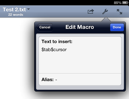
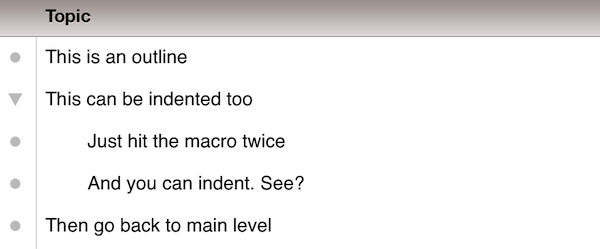
As I discovered, OmniOutliner for iPad wants to receive tab-delimited plain text. So, unlike Jeff’s, my macro doesn’t have hyphens, just a tab that I can hit as many times as I need to indent text into lines and children. Unfortunately, it doesn’t seem like tab-delimited plain text can handle notes, but that’s something I do in OmniOutliner or CarbonFin Outliner anyway.

I would love to see proper documentation for plain text import in OmniOutliner; for instance, while OmniOutliner can export to plain text, if you try to re-import what you exported (I know, I like to reverse-engineer plain text), OmniOutliner will lose indentation. Similarly, I’d like to see import/export options in CarbonFin Outliner, which is still lacking from this standpoint. As for Nebulous Notes, the latest 6.0 version lets you chain macros, which makes the app even better.

Check out Jeff’s plain text workflow for outlines here.
Permalink

Better Dropbox Camera Uploads with CameraSync

Two weeks ago I wrote about my new Dropbox-based workflow for photos. Towards the end of the article, I mentioned how I was handling uploads from my iPhone:

The official Dropbox app recently gained the capability of automatically uploading photos to the Camera Uploads folder: this means every time I go out and take some photos, I can come back home, open the Dropbox app, let it do its magic, then delete the photos from my iPhone. The photos will be uploaded to the Camera Uploads folder, and sorted using the same Hazel workflow described above.

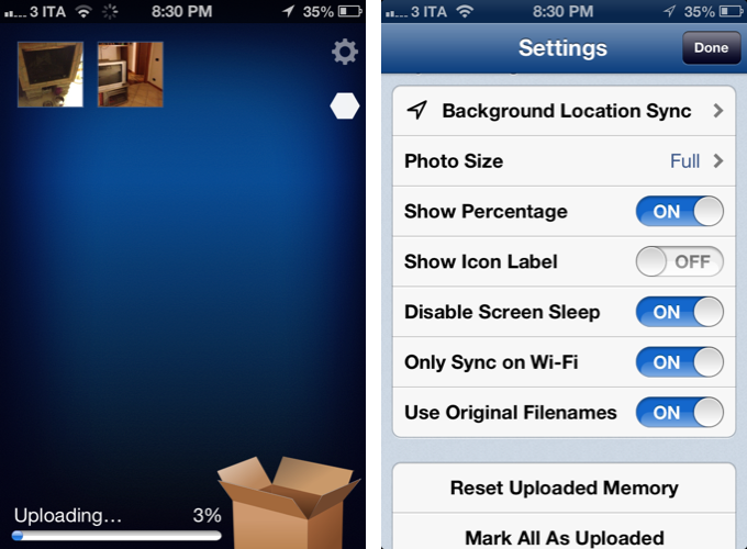
Thanks to a third-party app, I’ve managed to (partially) automate the process of uploading photos from my iPhone (and iPad) as soon as I get home. I’m now using CameraSync to upload photos to Dropbox automatically. Read more


iOS 6 and Developers

iOS 6 and Developers

Over at TidBITS, Matt Neuburg has posted a clear and concise overview of what iOS 6 means for third-party developers. Among the mentioned technical changes, he talks about UICollectionView:

The major new widget that will have the biggest impact on app interfaces is the collection view. A collection view is like a table view on steroids. A table view is the scrolling column of cells commonly seen in any master–detail app where a list must be displayed; Settings, Mail, and Music are familiar examples. A collection view breaks the bonds of the single vertically scrolling column, so you can expect, in short order, to see horizontally scrollable rows of data, multicolumn tables, and grids of information.

While web-based, some of the conventions of the new App Store in iOS 6 (horizontal-scrolling lists, grids) could be replicated with UICollectionView. I’d argue that many of the changes brought to the App Store are actually making some parts of search and discovery worse, but that’s not the point.

What matters is that, with each new version of iOS, developers are given more powerful tools to build new apps and refine existing ones. As I wrote in my piece about iOS 6, Apple understands “the importance of a healthy developer ecosystem that sets iOS apart from the competition”.

To get a good overview of the changes for developers in iOS 6, I recommend reading Matt’s article.

Permalink

Latest Dropbox Beta Brings Redesigned Menu

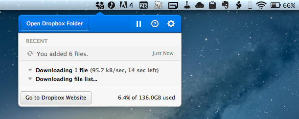
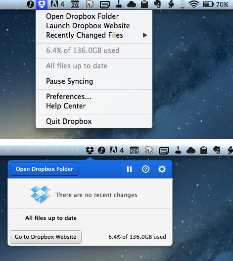
Announced last night on the public forums, the latest beta of Dropbox 1.5 for Mac brings a completely redesigned popup menu, support for Mountain Lion’s Notification Center, a new installer, and better performance.

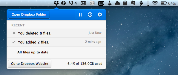
Sporting a new modern look, the redesigned popup menu is reminiscent of “popovers” that have become extremely popular among iOS developers. The new menu takes a more visual approach at displaying changes in your Dropbox, with icons for added or deleted files (that you can click to quickly go to Dropbox), a play/pause button for sync, and a large “Open Dropbox folder” to launch a Finder window at the “root” of your Dropbox.

This new popup combines all the functionality from the older tray menu with a new view of your Dropbox’s event stream, letting you see your (or other people’s) latest changes. In addition, you can use the events to easily view, share, or restore files.

Alongside the new appearance of Dropbox in the menubar, the team also says version 1.5 will bring full Notification Center support and a new, simpler installer for Mac users. The new installer works as advertised: you can simply double-click the icon for Dropbox to “update” itself to a new version. Unfortunately, while enabled in Notification Center, I haven’t been able to test the new notifications on the desktop, as I assume the functionality isn’t quite ready yet in this beta.

Personally, I think what Dropbox is showing in this experimental build is very promising. The popup menu was in need of a serious upgrade, and I’m looking forward to seeing how it will evolve throughout the next betas.

To download the latest Dropbox experimental build (and send feedback to the developers), you can head over the Dropbox forums.


Where Great Animations Make All the Difference

Where Great Animations Make All the Difference

Ben Johnson of Raizlabs writes,

Animations can make a world of difference in the user experience of a mobile app. Most of the time, we don’t even notice these animations in the same way that we rarely notice the environmental sound effects (by foley artists) that are added to most motion pictures. It is important when building mobile apps to remember that animations can be a powerful tool and can often do more for a user’s experience than the interfaces they inhabit. They Inform, Enable, Welcome, and Delight us. Below are a few examples (from iOS) of great animations that fit into these four categories.

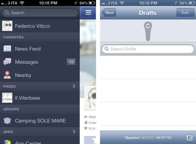
It seems obvious right? The classic instance of where animations can make all the difference could be something as simple as loading a specific splash screen before the content loads so that apps, to the user, appear as if they’re loading quickly (less of a problem nowadays). Today, with gesture driven interfaces being the norm on mobile devices, animations can guide the user through the interface or help them find their way back home. In cases like Mail, animations verify that an action took place (yes — your email was deleted). Ben goes through several examples from lots of popular apps that get it right. It’s also good for pointing out some of the more recent design trends (such as how navigation is revealed in Facebook).

Permalink

Jasmine: Free, Elegant YouTube Client for iPhone and iPad

In my ongoing coverage of YouTube apps for iOS (a rising trend following the removal of the official YouTube app from iOS 6), I have been able to test Jasmine, a new YouTube client developed by Jason Morrissey, creator of Alien Blue.

If you’re looking for a YouTube app that’s elegantly designed, easy to use, and that runs both on the iPhone and iPad, I think Jasmine is your best option for now. And knowing Jason, I believe the app will soon get better with fixes, more features, and improvements to the interface. I’ve been testing Jasmine for the past two weeks, and especially on the iPad, the app has become my go-to client when I want to sit back and watch some videos on YouTube.

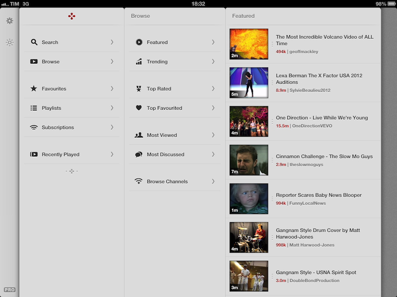
Both on the iPhone and iPad, the app has a light gray color scheme with font and menu navigation choices somewhat reminiscent of Morrissey’s work with Alien Blue; the app is fast at moving between sections, and you can tap on the status bar to switch to a “night mode” that makes the entire UI black. On the iPad, the app makes use of a Tweetie-inspired panel navigation, both in portrait and landscape mode; the performances are good, and panels contribute to facilitating the process of instantly seeing whether a video belongs to a playlist or a search query. Speaking of search, one of Jasmine’s nicest touches is the search field, which rotates and expands inline with a cute animation. I’d like to see search suggestions in a future update, though.

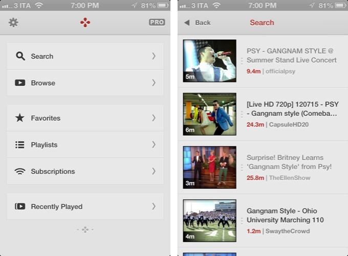
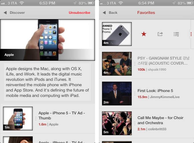
In Jasmine – like any other client these days – you can log into your YouTube account, or use the app to just search and browse YouTube content. The main screen/panel features shortcuts for search, browse, favorites, playlists, subscriptions, and recently played videos. The latter is just a local collection of videos you’ve watched on your device – it won’t sync with History on YouTube.com or another instance of Jasmine on another device (idea: iCloud sync could be used to sync videos across devices). The “Subscriptions” section, on the other hand, does synchronize with channels you’ve subscribed to through YouTube’s website (or another app), and lets you watch videos on a single channel basis, as well as a list of “latest videos” from all subscriptions – a useful feature to catch up on every new upload. Furthermore, if you want to discover more channels, you can search, enter a specific username, or check out YouTube recommendations in-app.

As I used Jasmine, I noticed I kept coming back to the “Browse” area. I don’t typically do this on the (cluttered) YouTube website, but I found myself casually checking out YouTube’s Featured and Trending videos a lot more with Jasmine.

Both channels and videos are presented with their own custom page. Videos have a large thumbnail at the top (which you can tap to play), and more actions below, such as comments (you can leave new ones), a link to the uploader’s page, description, ratings, related videos, mark as favorite, add to playlist, and share. Sharing supports the services iOS natively comes with, and is presented through the new iOS 6 share sheet. There is no option to set a specific streaming quality (like in Tube+), but there’s a setting you can turn on to be asked every time which kind of quality you’d like to load a video with (medium, 720p, etc).

If you don’t want to open a video page to share or mark as favorite, you can swipe on a result to bring up an action bar with buttons to share, add to playlists, and star. The same can be accomplished by tapping & holding a video, and I wish this feature also allowed me to quickly open an uploader’s page, like FoxTube does.

There are some things I wish Jasmine did better. For instance, I can’t find a section to catch up on the videos I “saved for later” on YouTube; and speaking of available sections, I think that, on the iPad, the larger screen could allow for an option to save personal shortcuts (say, to a playlist or search) in the sidebar.

On the surface, Jasmine looks extremely simple. But don’t let the app’s clean design and no-clutter approach fool you: Jasmine packs a lot of YouTube functionalities as well as nicely implemented little touches (the pinch-to-close gesture to dismiss panels on the iPad, the custom pull-to-refresh animation) that make for an intuitive and pleasant YouTube experience on iOS. And like I said above, if you own an iPad and have been looking for a great YouTube client, you should check out Jasmine.

Jasmine is free, with an in-app purchase to unlock parental controls and support the development of the app.


Review: Tyype HD for iPad

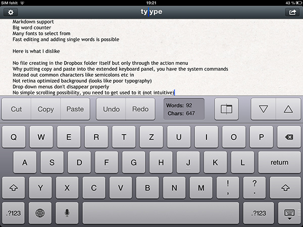
Text editors on iOS are always difficult to review. More or less everyone who writes on a computer or other digital device has a favorite mobile and desktop text editor, and is accustomed to the workflows connected to it. To give an example, I am totally in love with iA Writer. Its easy iCloud sync options, readable typography, and Focus Mode fit my needs. I don’t need Markdown, lots of different fonts, or an extensive amount of settings. I just want to write, and with iA writer I found the perfect, distraction-free environment to do so.

However, when I recently discovered Tyype, a new iOS text editor by Polish app development company Appvetica (who also developed apps like QRSight, an OS X QR code scanner), I got curious. Their clean, minimalist website and product video promise a text editor with easy text navigation, selection, and copying using custom gestures. Its interface seemed easy to understand, and the icon looks gorgeous. So I went ahead, downloaded Tyype HD for the iPad (which I’ll refer to as “Tyype”) and starting writing with it. Unfortunately, I have to say that Tyype does not work as great as it is shown in the demo video on the app’s website. But it’s certainly not a bad app either. Read more


Twelve South Launches “HiRise” Stand and Desk Storage System

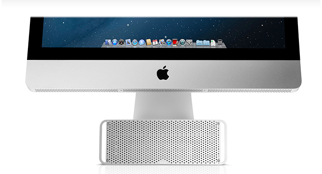
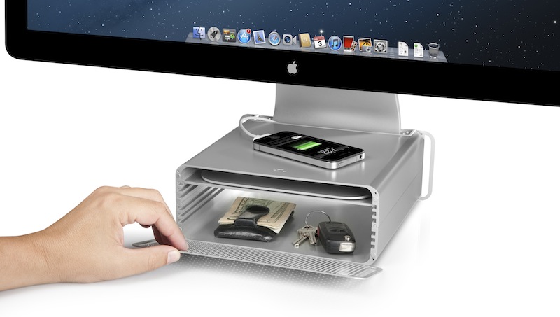
Twelve South, makers of fine accessories for Macs and iOS devices, have announced today the latest entry in their family of add-ons for iMacs and Apple displays: the HiRise. Made of aluminum and stamped steel, the HiRise is a height-adjustable stand that doubles as a storage system for your desk, so you won’t end up cluttering your workspace with keys, your wallet, or USB drives anymore.

The main purpose of the HiRise is to elevate the base of an iMac or Apple display to a more comfortable position for your preferred viewing angle. By using an internal metal “shelf”, you can adjust the height of an iMac depending on your viewing position, and, alternatively, you can use the HiRise to place an iMac and Apple display already on your desk at the same height (a minor detail that has annoyed owners of multiple displays for a long time).

It’s time to do better than a phone book!” said Andrew Green, Creative Director of Twelve South. “We see Mac users prop their beautiful hardware up on reams of copy paper and cringe. Many agree that just a few extra inches of height makes their Mac tremendously more comfortable to use. Enter HiRise for iMac. It raises your Mac to six different positions. It hides connected hard drives and keys inside. But coolest of all, its design integrates with your Mac to look like nothing else you’ve ever seen.

With a perforated, Mac Pro-like metal front plate that attaches magnetically, the HiRise can also work as a hidden, classy storage space for your desk. According to Twelve South, HiRise fits all Apple iMacs, Apple Thunderbolt Displays “and Apple Cinema Displays with metal L-shaped desk stand”.

While the main purpose of this accessory could easily be replicated with some quick DIY skills (case in point: an iPad box), Twelve South’s typical attention to detail should ensure a premium-quality product with a grade of finish and “Apple feel” that should be difficult to find in other solutions. However, the price may be a little steep depending on just how much you’d value such an accessory: the HiRise will set you back $79.99 from Twelve South’s website.

Check out more photos of the HiRise here, and a video below.
Read more