These numbers should serve to show you the power and nearly limitless earning potential of Nintendo franchises, and this is why you should never take anyone seriously when they suggest that Nintendo games should come to iOS or Android devices as a way to boost revenue. Anyone who thinks Nintendo would be better off selling $3 versions of games that now move 10 million units at $40, often selling multiple copies to the same family, is insane.
A Ship In Troubled Waters→
YouTube 2.2→
The official YouTube app for iOS received an update earlier today. You can now choose the quality of videos you want to stream (tap the new icon on the video player); unfortunately, after two months, the app still isn’t built for iOS 7.
Previously, YouTube announced that an update set to be released in November will add a new feature to download videos for offline watching.
Terminology 3 Review
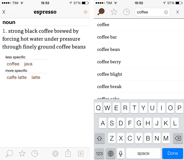
Less popular than Drafts but equally impressive in terms of functionality and inter-app communication, Greg Pierce’s Terminology, a dictionary and thesaurus app for iOS, is relaunching today for iOS 7 with a new Universal app that adds sync, configurable actions, and a redesign that matches iOS’ new general aesthetic. I have been testing Terminology 3 for the past few months, and this new version holds up to expectations by honoring Terminology’s tradition of simplicity and bringing powerful new features.
We first reviewed Terminology in 2010, when it was an iPad-only app that already showed how developer Greg Pierce wanted to focus on words and definitions rather than heavily custom graphics and fancy effects. A few months after the iPad version, Pierce released a standalone iPhone version, called Terminology Ph, that carried all the features of the tablet counterpart onto the smaller screen; a year after version 1.0, Terminology 2.0 was released, refining the user interface and adding new app integrations. Throughout 2011, 2012, and the better part of this year, Pierce maintained Terminology with compatibilty updates but otherwise focused on Drafts, which, as MacStories readers know, has contributed to redefining iOS automation and the idea of a “quick notepad” for iOS.
The new Terminology represents a break from the past, fully embracing iOS 7’s new design philosophy and offering customers an easier purchase experience with a Universal version. As a new app, you will have to buy Terminology again – something that is perfectly acceptable after three years of usage of the same app. Read more
Nike+ Move App For the iPhone 5S to Arrive on November 6th→

Announced alongside the new Fuelband SE was an update to Nike+ Running, and the new Nike+ Move app which Phil Schiller showed off during September’s iPhone 5c + 5s Keynote. The Nike+ Move running app is a sort of “Fuelband lite”, being previously detailed by Engadget as being an introductory experience into the Nike+ ecosystem. From today’s press release:
Nike+ Move App
Launched by Apple at their recent event, the Nike+ Move App is an introductory NikeFuel experience for iPhone 5S users. Nike+ Move measures when, where and how you moved and uses NikeFuel to motivate you. Nike+ Move then lets you compare your movement with that of your friends or other Nike+ Move users around you.
The Nike+ Move app will be free to download on the App Store.
Apple Confirms: Media Event On October 22
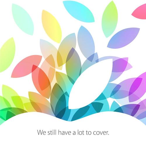
As first reported by All Things Digital, Apple has today sent invitations to selected members of the press for a media event on October 22 at the Yerba Buena Center in San Francisco. The invitation, shared on Twitter by Tim Bradshaw, reads “We still have a lot to cover”.
According to rumors and speculation from recent weeks, Apple will announce updates to the iPad line at the event. In particular, it’s been reported by several rumor sites that Apple will unveil a fifth generation 9.7-inch iPad sporting a case redesign inspired by last year’s iPad mini, and a second generation iPad mini with a higher resolution Retina display. Following the release of the iPhone 5s with Touch ID, A7 processor, and gold color option, Apple has been rumored to be considering these features for the iPad as well, although it’s unclear as to whether Apple could bring them to the iPad or iPad mini. According to 9to5mac’s Mark Gurman, Apple has also been testing a new iPad mini based on the A6 CPU and without a Retina display, which the company could sell as an “entry level” iPad mini.
There are other announcements that Apple is expected to make before the end of the year: the company said earlier this year that it would release the new Mac Pro in the Fall, and announced last month their intention to bring the iPhone 5s to over 100 countries and 270 carriers in 2013. OS X Mavericks, recently released as GM to registered developers, is also expected to get an official release date in the Fall, and it’s possible that Apple will showcase updates to some of its App Store-only apps for iOS 7, such as GarageBand or iWork (the iWork suite was made free last month, but hasn’t been updated for iOS 7).
We’ll be covering Apple’s October 22 announcements with a dedicated hub on MacStories.
A Tour Of The Panic Office→
Everything about the Panic office looks amazing to me. The 8-bit office signage with Samus Aran for “Women”? That’s perfect.
Burberry CEO Angela Ahrendts to Join Apple as Senior Vice President of Retail and Online Stores→
Late last night, Apple announced that Burberry CEO Angela Ahrendts will join Apple in the spring of 2014 in the newly created position of Senior Vice President of Retail and Online Stores. The position of SVP of Retail was vacant since John Browett’s departure from the company last year.
I am thrilled that Angela will be joining our team,” said Cook. “She shares our values and our focus on innovation, and she places the same strong emphasis as we do on the customer experience. She has shown herself to be an extraordinary leader throughout her career and has a proven track record.
As noted by Macworld’s Jason Snell, the hire won’t likely come cheap for Apple:
Last year she was the highest paid CEO on the London Stock Exchange’s FTSE 100, with total pay of roughly $27 million. (That included stock options; her current Burberry salary is reportedly just under $11 million.) But Apple’s retail presence is amazingly lucrative and clearly needs to remain a focus for the company.
Below, a video of Ahrendts discussing her past eight years at Burberry with Chairman Sir John Peace and future CEO Christopher Bailey.
And last, a video of Ahrendts discussing “Human Energy” at her TEDxHollywood talk from April 2013.
Play Games Using The iPhone 5c Case→
Speaking of Australia, how cool is this game by Stuart Hall and Dave McKinney? It is a variation of the classic four-in-a-row game that uses the iPhone 5c’s case as a grid, cleverly taking advantage of the case’s dots to show interface elements and let you tap on the screen.
The game is called Flipcase and it’s free on the App Store. It also uses UIKit Dynamics for some delightful animations and physics effects. Very clever.
How Australian Developers Are Dealing with iOS 7→
Alec Fraser has a good interview with some Australian app developers about iOS 7 and the new APIs. Many of my favorite apps and games have been created in Australia, and I love that these developers are getting more recognition with iOS 7.