This Week's Sponsor:

Copilot Money

The Apple Editor’s Choice Award App for Tracking Your Money. Start Your Free Trial Today


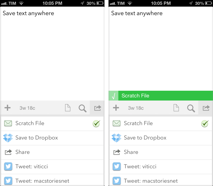
Drafts 2.2 Adds Custom Email Actions

Agile Tortoise’s Drafts for iPhone and iPad is one of my most-used apps for iOS. It sits on the Home screen of both my devices, and I rely on it to send text to a variety of apps and services. With a combination of support for URL schemes and external APIs, Drafts has become a fantastic way to get text saved somewhere else quickly. Plus, we’ve been following Drafts here at MacStories for a while now, and the app underwent quite the evolution recently.

After the major 2.0 update (our review here), I have been looking forward to version 2.2. Released today (app is version 1.2 on the iPad), Drafts now includes new actions for Nebulous Notes (a personal favorite of mine), Netbot, Notefile, and Pastebot. It’s also got a new “Use First Line as Title” setting and advanced options for actions.

More importantly, Drafts 2.2 comes with support for custom email actions, which is the reason I’ve been using Captio for the past two years. It’s with a bit of sadness that I drop Captio, but the app hasn’t even been updated for the iPhone 5 yet, and Drafts does so much more. Custom email actions allow you to send emails to predefined addresses using either your own email accounts, or a background service provided by Agile Tortoise. Read more


iOS 6 GUI PSD for iPhone 5 Now Available

iOS 6 GUI PSD for iPhone 5 Now Available

With every new major version of iOS or new device from Apple, design studio Teehan+Lax releases a free iOS GUI PSD. The PSDs, downloaded millions of times in the past few years, have helped designers and developers mock up their apps and iOS designs using Photoshop, while relying on graphic assets that look just like interface elements and controls of iPhones and iPads.

Today, Teehan+Lax released its new iOS 6 GUI PSD for iPhone 5:

This version, iOS 6 for iPhone 5, is a bit different than previous version. Those of you who have downloaded and used these files have probably noticed they’ve become quite bloated. As fast as our computers are today, they still get pretty sluggish when working in a document that contains tens of millions of pixels with hundreds of shape layers. This time around we focussed on making the file a bit more usable. It’s smaller in file size and has a reduced canvas making it quite a bit more manageable. We did this by removing some of the more obtuse elements.

Weighing at 13 MB, you can download the iOS 6 GUI PSD here.

Permalink

Shortcat: Spotlight For The User Interface

In my daily workflow, I rely on Alfred for Mac to find files, folders, and apps for me. Since July 2012, I have used Alfred 4,326 times for an average of 46.5 times a day. I use Alfred for a variety of tasks which include (but are not limited to) accessing favorite folders, launching Google search, acting on multiple files through the Buffer, and executing AppleScripts. Alfred is one of my favorite pieces of Mac software, ever.

I like launchers. They simplify my workflow while allowing me to save time and be more efficient. This is why I’ll keep an eye on the development of Shortcat, a new Mac app – currently in public beta – that aims at becoming a launcher for interface elements.

The developers describe Shortcat as “Spotlight for the user interface”, and that’s a fairly accurate description. Essentially, Shortcat relies on support for Assistive Devices (an Accessibility feature of OS X) to be able to “see” the labels of buttons and menus and “click” on them. So, for instance, instead of moving your cursor on the trackpad, you’ll be typing “back” to make Shortcat click the Back button in Safari.

Shortcat works better with apps that leverage Accessibility features and have properly labeled buttons and interface elements. In the app’s Help menu there’s already a list of apps that don’t work properly with Shortcat as it’s unable to “read” (and thus let you find) their interface elements. I am no Accessibility expert, but my guess is that these apps don’t support VoiceOver either.

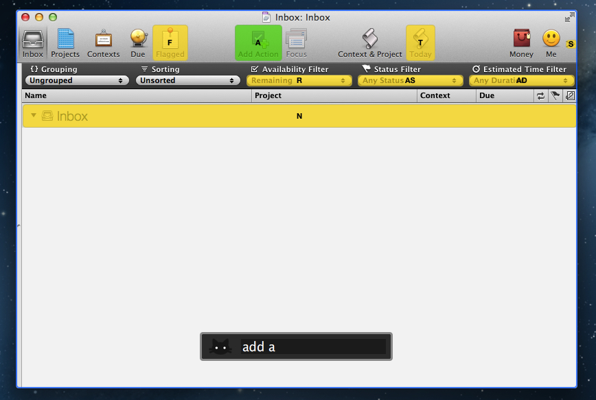
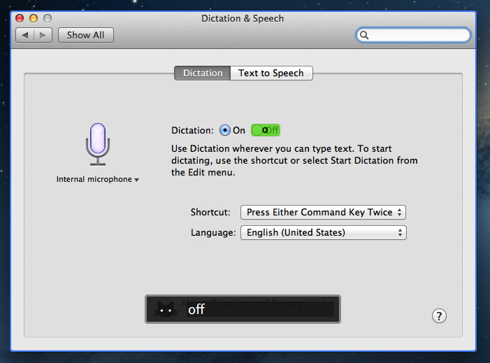
In my tests, Shortcat was a pleasant surprise. If you don’t know about Accessibility, the app will look like a fantastic trick – how can it click for me when I’m just typing? In actual usage, there are some things to be considered. When you invoke the app with a shortcut (it’s customizable from the Terminal in this version) and you start typing, it will highlight areas of an app that match the letters you typed. The best match is highlighted in green, other possible “destinations” for the mouse are yellow. You can click on a button or menu by typing its full name or an abbreviation, such as “Add Action” or “AD” for the toolbar button in OmniFocus.

You can also tell Shortcat to show “hidden” results. By preceding your query with a dot, you’ll be able to reach interface elements that, at first glance, don’t have a label. I tested this with several apps, and, for instance, I was able to type “.1p” to click on the unlabeled 1Password extension in Safari, or “.n” to open the compose box in Tweetbot. Speaking of Safari, you can also use Shortcat to click on website navigation elements such as buttons or text. “Clicking” on hyperlinks with Shortcat will, just like a regular click, open them in a new tab.

Shortcat is an interesting experiment, but it needs more work before being ready for primetime. Its text matching algorithm is good, but still not perfect: sometimes, it associates things like “SYNZ” to “sync”, which isn’t particularly nice to see. I would also like to see a more polished graphical representations of highlights and selected regions of the UI, as right now the highlighting process seems more a “hack” than a consumer product. Also, I’m still not completely sure how, in every day usage, Shortcat could come in handy. Is it a utility to navigate large documents without typing? Or is it an app navigator? In a world of buttons associated with keyboard shortcuts, are virtual clicks really that necessary? Shortcat makes for a cool demo, but it needs to find a stronger message to make people “get” what it’s all about.

You can check out the Shortcat beta for free here.


Goodbye Tweetie

The original Tweetie for Mac – the app that went on to become Tweetie 2 or “Twitter for Mac – stopped working today. Twitter cut access to the API endpoint that allowed for it to work, thus effectively “killing” the app for those who were still using it.

Matthew Panzarino writes:

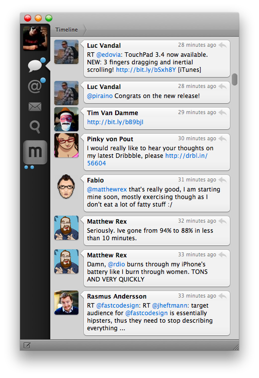
Tweetie for Mac came about on April 20, 2009, and it brought along its own set of UI paradigms that propagated throughout Mac app design culture. The sidebar navigation, for instance, is probably in use on whatever Twitter client you’ve got installed. The ‘nipple’ that indicates the current position on the navigation bar is also a Brichter invention, and now exists in hundreds of apps like Google+, Instapaper and dozens more. It eventually found its way to Tweetie 2 for iPhone as well.

To me, Tweetie was more than an .app bundle available from /Applications in the Finder. It represents a period of my life that I cherish every day.

I joined Twitter in February 2009. As I said, I was jobless at the time. I thought I could try my hand at writing about Apple and Macs, and my girlfriend said “go for it”.

On April 20, 2009, MacStories and Tweetie were born.

Today, we kiss Tweetie goodbye. MacStories and my girlfriend are still around, and my relationship with them is better than ever. I didn’t realize this back when we celebrated the site’s third birthday – that MacStories and Tweetie for Mac launched on the same day.

Tweetie and I had our ups and downs. I loved the app, but I became frustrated with the multiple delays version 2.0 was seeing. I wrote some things about Loren that I’m not proud of. Years later, I apologized to him, but I’m keeping those posts online to remember that sometimes I can be wrong, and ridiculously so. In late 2010, Loren was so gracious to let me beta-test “Tweetie 2.0”, which was launched as Twitter for Mac on the App Store. I used that app until Tweetbot for Mac came out. Loren moved on with his life and left Twitter; I, behind my keyboard, picked a different Twitter client.

I guess, in a way, this site owes much of its success to Tweetie for Mac. I woudn’t have been able to get to know developers, friends, colleagues, and readers if it weren’t for Twitter. If it weren’t for Tweetie, which to me, was Twitter.

I remember using Tweetie all the time. Sometimes I would go days without closing it, keeping it open because I was “looking for news” or trying to get into some new beta of an upcoming iPhone app. Other times I would close Twitter during the night, because, back in the “old days”, Twitter clients – not even Tweetie – had good timeline gap detection.

Tweetie set standards and inspired other developers to create new apps. It won awards, and it marked the starting point of a new era of third-party OS X development.

For me and many others, Tweetie defined Twitter.

Goodbye, Tweetie. Our community is better because of you.


Automatically Send Articles From Reading List to Instapaper

Two days ago, Ben Brooks asked on App.net if anyone had come up with a way to share Safari Reading List items to Instapaper. His question made me realize that it would be a fun project to find out, so in my free time I put together a workflow that runs automatically and in the background on my Mac mini.

Please note, what follows is a raw experiment. I have tested it, and it works, but it’s far from stable. It uses GUI scripting in AppleScript to mark Reading List items as read, and it heavily depends on iCloud, which, unfortunately, is far from reliable when it comes to bookmark syncing. Nothing should happen to your bookmarks (the script simply “reads” them), but backups are recommended, as usual. Read more


Marco Arment’s The Magazine: At The Intersection of Technology and Writing

When people ask me about my job, I usually reply: “I write about technology”.

Just a little over three years ago, I found myself unemployed, so I started MacStories. It wasn’t easy. Not because of WordPress, FTP, or getting black pixels to appear on a white background. I’ve never had a problem with putting words on a screen.

It wasn’t easy because where I live, a small town in Italy, writing about technology sounds a lot like “I spend my days at home looking at a computer while I drink coffee” . Which, to be fair, is a pretty accurate representation of my daily agenda. But how I do it, and why I do it, and understanding the whole idea of seeing technology as more than a bunch of cables – well, that was the not-so-easy part.

It still is. I know it will be for a long time. And yet I keep typing on this keyboard because I think it’s worth it. I do what I can by writing about my experiences.

Because, hopefully, thanks to technology, our kids will have a better future.

Because twenty years from now, people won’t “find out” they have cancer. They will know in advance, thanks to technology.

That’s quite a goal I, and others like me, are priding ourselves upon, you’d argue, when, effectively, what we do is reviewing apps and reflecting on the latest news. In practical terms, that’s what I do. But I see it as more than that.

Writing is about making connections.

In the past three years, I’ve seen how the great technology writers I look up to are able to make connections between topics and streams of thoughts: they look at the big picture.

On the flip side, technology writing, a scene that’s built on its very distinct and yet cohesive communities, has created connections between people. I wouldn’t have met the MacStories team if it weren’t for writing and following the same writers. I wouldn’t have gotten to know friends like Shawn, Stephen, Gabe, David, Matt, Matthew, Justin, Brett, and many more.

In fact, if it weren’t for this little writing thing of ours, I wouldn’t have met any of you.

Great writing creates connections inside and outside of text.

The Magazine

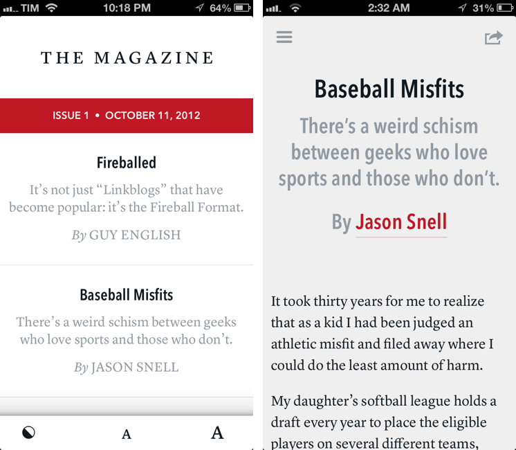
Marco Arment’s The Magazine falls exactly under this aspect of writing. It’s about people who love technology, delivered as a curated collection of articles from great writers. In a way, it’s the opposite of Instapaper: while Marco’s more popular app is what you make of it, The Magazine is Marco’s own vision. So, yes – you’ll have to trust him on this one.

I’ve never met Marco in real life. We’ve exchanged emails a couple of times and perhaps replied to each other on Twitter. The other day we talked about pears on App.net. But see, the great thing about the Internet is that I genuinely like this guy only because of his work and passion for technology.

I think The Magazine is a promising and notable initiative for a variety of reasons. Firstly, for as much as I praise the tech community, there are aspects of it that I’m not particularly fond of. I don’t like rumors and linkbaity headlines. Sometimes I think that it’s too much when a site tries to tell me everything about a topic with 20 articles. In the words of Marco, The Magazine will take a “a measured approach to the big picture” with “meaningful editorial and big-picture articles”. Or, as Guy English writes in “Fireballed” for the first issue, The Magazine is both old and new. It’s old in that it won’t share the same publication schedule of most blogs; it’s new, because it should encourage writers to create more, new “timeless pieces” based on a business model that their “Fireball Format” website wouldn’t probably allow. I suggest you read Guy’s article in the first issue (there is a free 7-day trial).

I’ve heard from several people who received copies of The Magazine in advance that, in hindsight, the idea is obvious. Get articles from great writers and make an app out of it with new content available periodically. To me, The Magazine seemed “obvious” more because of the technology it’s built with.

Earlier this week I wrote a post on how to hide Newsstand from iOS 6. The Magazine is entirely based on Newsstand, and, a year after the launch of iOS 5, it’s the first app that gives it a purpose, at least for me. Read more


Gain Magical Control Over Your Music Player With Flutter

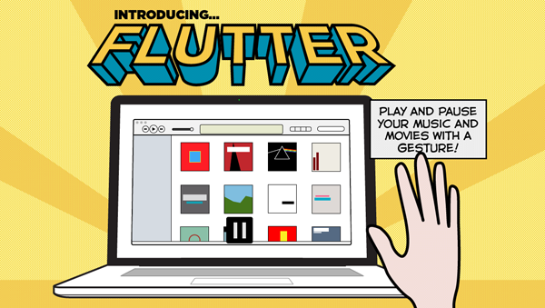
It’s a bit like Minority report. Just raise your hand and your computer responds with an action. Motion-based controls with your hands, now more common with modern gaming consoles (PlayStation Move and XBOX Kinect), still feels a bit futuristic.

On personal computers and modern tablets, peripheral input and touch-based gestures won the race against camera-based gesture recognition. Still, some developers are in love with the idea of controlling devices without any actual hands-on. In small doses, this can be fun and useful. This is the case with Flutter, developed by a large team of developers at BotSquare.

Flutter is a small tool for recognizing motion gestures on OS X, which recognizes you via a webcam (iSight or external) to control your favorite music player. After downloading it, you have work through a tutorial to get to become familiar with the hand gestures. Flutter then sits in the background, with your Mac’s iSight camera on (obviously required for running Flutter) and awaits your actions.

The current version of Flutter (0.1.237 — don’t be afraid, it’s not a beta version, the developers just want to add more features before calling the app 1.0) supports three gestures: a flat open hand, and a fist with your thumb either pointing to the right or the left. Do those gestures in front of your webcam, and Flutter will recognize them and do the action associated with them. To make sure the app recognizes your hand’s action, you have to keep it one to four feet away from the camera.

With the open hand gesture, you can play and pause your music. Using the thumb either pointing to the right or left you go to the next or previous track. The Flutter team is working hard to implement more gestures such as volume control (I suggest a single index finger pointing upwards or downwards respectively for this one).

All three gestures work well in the current version — you just have to get used to the fact that you often need to move your hand a bit to make the camera notice it. Knowing where to position yourself at first so that your hand is inside the viewing area of your camera can be tricky at first. But after a while you also get used to it; when Flutter recognizes you it’s easy to use, looks like magic, and can be a very intuitive way of controlling your music player (the app currently supports iTunes, Spotify, VLC, and QuickTime; no Rdio support unfortunately).

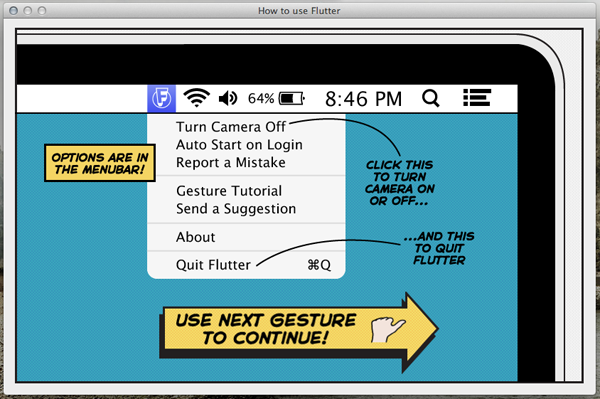
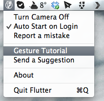
Through the app’s drop-down menu, you can turn the camera on and off (for privacy and energy saving reasons), set Flutter to automatically launch at login, as well as report bugs and re-watch the aforementioned (very interactive and easy to understand) tutorial. The app also sends notifications to the Notification Center when you change apps to let you know that you’re still able to control the newly activated player with Flutter.

Flutter is a small app, although it’s not something I would recommend because not everybody needs it. However, I can imagine that lots of people would want to try it for the novelty of it. It’s a magic little piece of software that can be fun to use.

Flutter is available for free on the Mac App Store.


iTunes and App Store Reminders with Recall

I don’t like some of the changes of the new App Store in iOS 6. That’s not a secret. But there is a single annoyance that goes way back before the iOS 6 days, all the way to when the App Store was relatively new in late 2008 and I got my first iPhone: the lack of a wish list.

I use the Wish List feature of iTunes a lot on my computer. Because I use iTunes mainly for buying apps and checking for updates, I rely on the Wish List to save interesting apps and games to check out later. However, I’ve dropped the occasional song or movie in the Wish List too.

The iTunes Wish List is simple and effective.

Too bad it doesn’t work on iOS devices.

While there have been some rumors on dedicated wish list features coming with an iOS update, in its current state the App Store (and iTunes Store) can’t use your iCloud account to sync items you’ve added to your wish list.

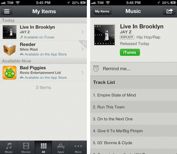
Recall by Overcommitted is not a wish list replacement in the sense that it’ll provide you with a list that syncs across devices. For that, I still use (and recommend) AppShopper, which is just phenomenal when it comes to tracking app updates and price drops with push notifications. Instead, Recall is about “never forgetting iTunes recommendations again”. It provides an alternative interface for the iTunes and App Stores, allowing you to save recommendations and create reminders for them. Read more