After the initial rush following a WWDC keynote, the next few days are typically spent mulling over new features and design changes. This is often a fruitful time for discovering modifications and additions that weren’t covered in the keynote. This year is no different, so I’ve collated a roundup of some of the most significant ones below.
Services Additions
Apple has announced updates to its services, including some that weren’t mentioned in the keynote. Among them were improvements to Apple Podcasts, Apple Wallet, and Apple Fitness+, as well as a new game in Apple News+.
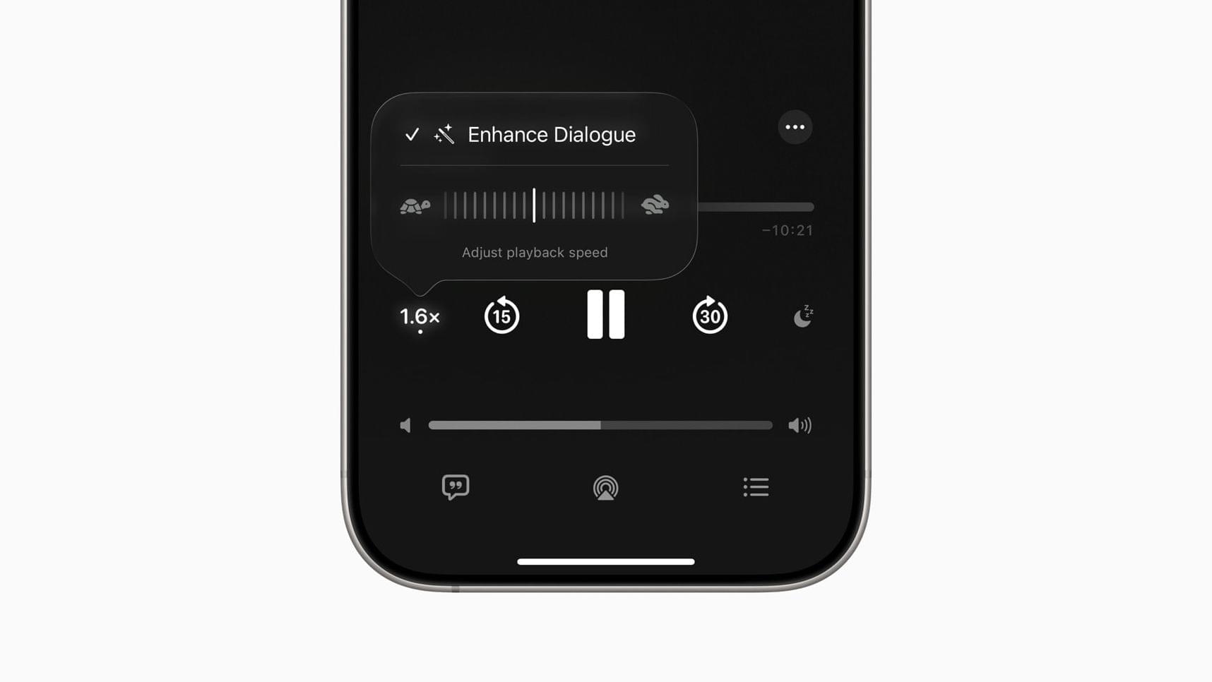
In Apple Podcasts, you can fine-tune the playback speed of your podcasts more specifically and more broadly than was possible before. Enhanced Dialogue has also been added, utilizing real-time audio processing and machine learning to improve speech clarity over background sounds in podcasts.
Apple continues to increase the usefulness of the Wallet app with enhancements to delivery tracking. Now, the app utilizes Apple Intelligence to scan your emails and search for delivery or tracking details related to items you’ve ordered. These details then are automatically displayed and updated within Apple Wallet.
In Fitness+, there are two new Custom Plans in the Plans tab. These are automatically generated based on your preferred workout types, trainers, and music styles. For now, there are two levels of difficulty: Stay Consistent, which offers activities to help you maintain your current fitness level, and Push Further to, well, push you further than your current fitness level.
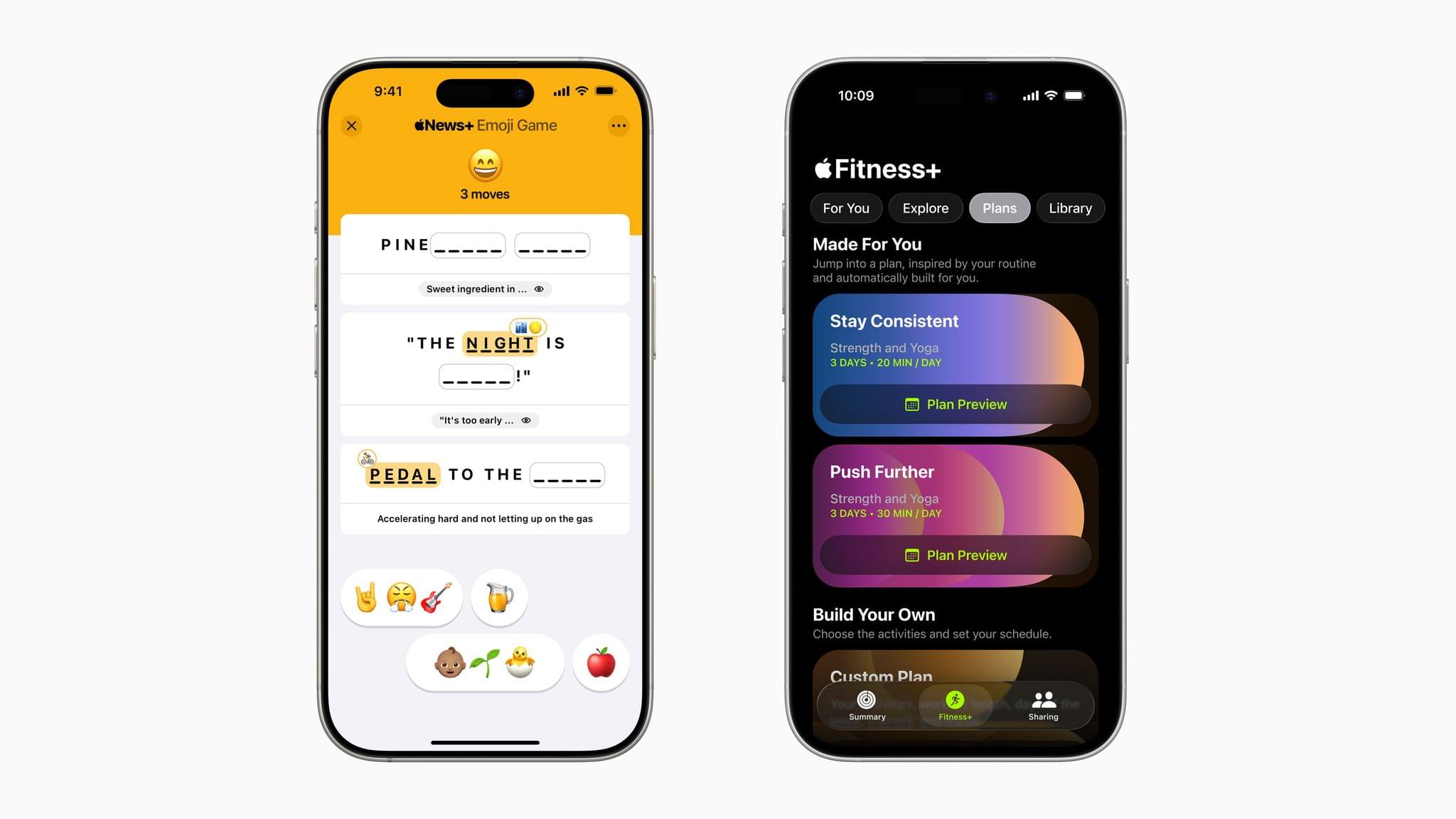
Finally, in Apple News+, there is a new game called Emoji Game. In it, you are asked to complete three phrases using a combination of emoji in as little time and as few moves as possible. You can track your stats, check leaderboards, and compete with friends in Game Center. Initially, this game will be available only in the U.S. and Canada.
Lock Screen Widgets
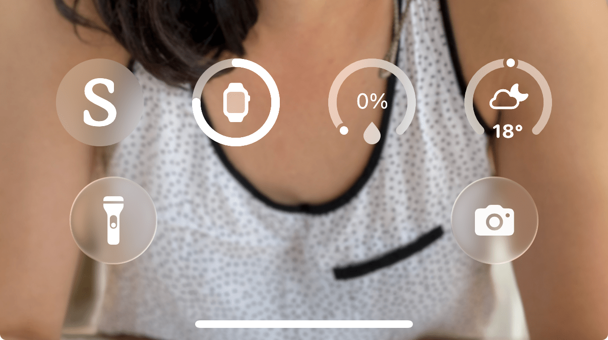
Lock Screen widgets can now be moved to the bottom of the screen, just above the two customizable control buttons. Notifications will then come in above these widgets. This allows you to take advantage of Apple’s heavily demoed dynamic clock font without losing access to your Lock Screen widgets.
Adaptive Power
The long-rumored AI-powered battery management feature seems to have snuck out as a note on a slide. In the Battery section in Settings, you can choose to turn on Adaptive Power, which allows your iPhone to make “small performance adjustments to extend your battery life”. It’s a less splashy announcement, which suggests the effect on battery life might not be as huge as people had hoped, though this could be a precursor to an expanded version of the feature coming with new iPhones in the fall.
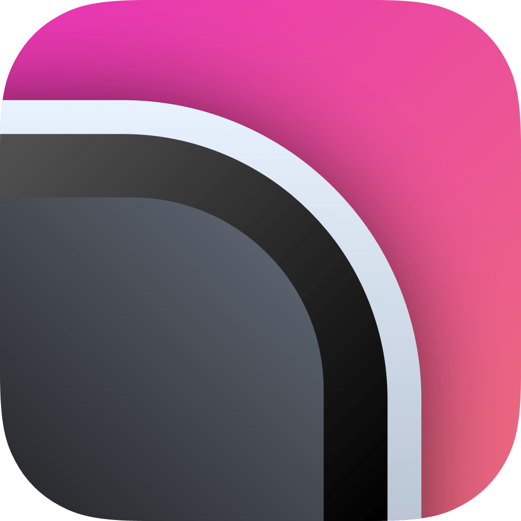
App Icons
.](https://cdn.macstories.net/wwdc25_squircle-1749587414311.jpg)
Source: Yannick Lung on Mastodon.
After all the talk about whether Apple would change the shape of app icons on iOS and iPadOS, it appeared that they didn’t. Or did they? As Yannick Lung pointed out on Mastodon, the corner radius of the classic squircle has changed ever so slightly.
Source: The Icon Factory.
Over on the Mac, it seems that Apple is now forcing all app icons into a squircle shape, even if they are not designed as such. If an app has a custom shape, it will be displayed with a grey background within the squircle, as detailed by The Icon Factory on Mastodon. Developer Simon Støvring may have found a way around this restriction, however.
macOS cursor
.](https://cdn.macstories.net/wwdc25_macos_cursor-1749587414314.png)
Source: Nathan Manceaux-Panot on Mastodon.
iPadOS wasn’t the only platform to get a new cursor design. macOS Tahoe’s cursor features a new, more rounded look, arguably for the first time since the first release of Mac OS X, as pointed out by Nathan Manceaux-Panot on Mastodon.
New Finder Icon
.](https://cdn.macstories.net/wwdc25_about-finder-1749587414115.jpg)
Source: 512 Pixels.
Finally, in the midst of the debate about whether Liquid Glass is good or not, most people missed the redesign of the Finder icon in macOS. Not Stephen Hackett, though. He posted about it on his blog, 512 Pixels, calling for Apple to revert to the previous look and filing a feedback. I’ve got to agree with him; the new icon is weird and unnecessary, spoiling decades of Apple design history.
This is no doubt just the beginning of these discoveries. If you find an interesting tidbit of your own, let me know.
You can follow all of our WWDC coverage through our WWDC 2025 hub or subscribe to the dedicated WWDC 2025 RSS feed.