Posts tagged with "Icons"

WWDC 2026: macOS 27 Icon Refinements

During this year’s WWDC keynote, Apple announced improvements to icons for all of its first-party apps. The company says that by “integrating additional layers of Liquid Glass directly into the icon artwork itself,” icons now “appear sharper and more defined.”

It’s certainly a noticeable improvement, and unsurprisingly, Basic Apple Guy is all over the changes with an excellent side-by-side comparison of all the icon changes in macOS Golden Gate. (Many of these icons carry over to other platforms, of course.)

The clarity and legibility of almost all the icons have improved significantly, with icons like Photos packing a real visual punch. Additionally, viewing the icons at this size, you can see the nice refraction effects of the glass-like elements.

Image: Basic Apple Guy.

Image: Basic Apple Guy.

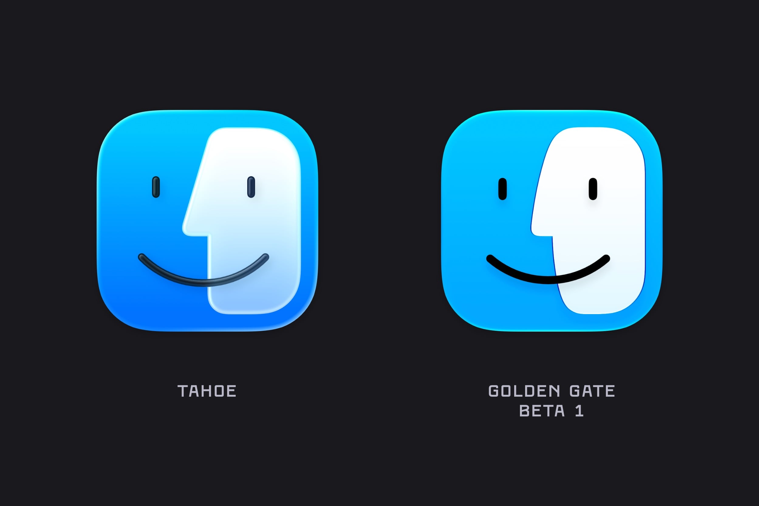
The one that really stood out for me, though, was the new Finder icon, which not only looks cleaner but also has a subtle change to the nose and the curve of the divide, bringing it much closer to the classic Finder icon from the pre-Liquid Glass days.

The Finder icon evolution, pre-macOS 26.

The Finder icon evolution, pre-macOS 26.

What can I say? I’m a stickler for classic design.


You can follow all of our WWDC coverage through our WWDC 2026 hub or subscribe to the dedicated WWDC 2026 RSS feed.

Permalink

macOS Tahoe’s Messy Menus

Nikita Prokopov writing on tonsky.me about macOS Tahoe’s menu icons:

In my opinion, Apple took on an impossible task: to add an icon to every menu item. There are just not enough good metaphors to do something like that.

But even if there were, the premise itself is questionable: if everything has an icon, it doesn’t mean users will find what they are looking for faster.

And even if the premise was solid, I still wish I could say: they did the best they could, given the goal. But that’s not true either: they did a poor job consistently applying the metaphors and designing the icons themselves.

It’s a brutal assessment of the sprinkling of iconography throughout Tahoe’s menu system that had me nodding along in agreement as I read it.

There’s no denying the inconsistencies in icon choices, their lack of legibility, and the overall clutter added to menus. Yet at the same time, I can’t say I’ve been terribly bothered by them either. That’s probably because I use keyboard shortcuts and launchers so much, rarely relying on the Mac’s menu system. At the same time, though, part of me wonders whether those tiny icons are at least partially what drove me to buy a bigger monitor recently. I don’t think so, but maybe?

In any event, if you care about design, Prokopov’s detailed and well-illustrated analysis of Tahoe’s menu icons is well worth your time.

Permalink

Stephen Hackett on Opening Up a ‘Macintosh’ Screensaver Treasure Trove

As detailed on 512 Pixels, Stephen Hackett managed to break into the beautiful ‘Macintosh’ screensaver and uncover the details of how it was constructed.

When looking for macOS Tahoe’s wallpapers, I was reminded of this project. I went digging through the SSD on my MacBook Pro, and my journey through Finder has yielded great fruit.

The screen saver is actually an Extension, residing at /System / Library / ExtensionKit / Extensions / WallpaperMacintoshExtension.appex (spaces added for legibility).

Right-clicking to “Show Package Contents” unveils a treasure trove:

The screensaver itself is not a video one, as evident by the way it randomly displays its designs when activated. Until now, it was somewhat of a mystery how this was dynamically created, so it’s great to peek behind the curtain.

I won’t spoil the details as they are pretty fun, and not really what you would have expected. Stephen has also collected all the image files in HiRes, should you wish to download them.

As someone who absolutely adores these designs to this day (so much so that I have not one but two of them as tattoos - the pixelated cursor and the smiling Mac), this was a delightful little discovery.

Permalink

WWDC 2025: Subsequent Discoveries

Source: Apple.

Source: Apple.

After the initial rush following a WWDC keynote, the next few days are typically spent mulling over new features and design changes. This is often a fruitful time for discovering modifications and additions that weren’t covered in the keynote. This year is no different, so I’ve collated a roundup of some of the most significant ones below.

Read more