[Update: Due to the way parakeet-mlx handles transcript timeline synchronization, which can result in caption timing issues, this workflow has been reverted to use the Apple Speech framework. Otherwise, the workflow remains the same as described below.]
When I started transcribing AppStories and MacStories Unwind three years ago, I had wanted to do so for years, but the tools at the time were either too inaccurate or too expensive. That turned a corner with OpenAI’s Whisper, an open-source speech-to-text model that blew away other readily available options.
Still, the results weren’t good enough to publish those transcripts anywhere. Instead, I kept them as text-searchable archives to make it easier to find and link to old episodes.
Since then, a cottage industry of apps has arisen around Whisper transcription. Some of those tools do a very good job with what is now an aging model, but I have never been satisfied with their accuracy or speed. However, when we began publishing our podcasts as videos, I knew it was finally time to start generating transcripts because as inaccurate as Whisper is, YouTube’s automatically generated transcripts are far worse.
My first stab at video transcription was to use apps like VidCap and MacWhisper. After a transcript was generated, I’d run it through MassReplaceIt, a Mac app that lets you create and apply a huge dictionary of spelling corrections using a bulk find-and-replace operation. As I found errors in AI transcriptions by manually skimming them, I’d add those corrections to my dictionary. As a result, the transcriptions improved over time, but it was a cumbersome process that relied on me spotting errors, and I didn’t have time to do more than scan through each transcript quickly.
That’s why I was so enthusiastic about the speech APIs that Apple introduced last year at WWDC. The accuracy wasn’t any better than Whisper, and in some circumstances it was worse, but it was fast, which I appreciate given the many steps needed to get a YouTube video published.
The process was sped up considerably when Claude Skills were released. A skill can combine a script with instructions to create a hybrid automation with both the deterministic outcome of scripting and the fuzzy analysis of LLMs.
I’d run yap, a command line tool that I used to transcribe videos with Apple’s speech-to-text framework. Next, I’d open the Claude app, attach the resulting transcript, and run a skill that would run the script, replacing known spelling errors. Then, Claude would analyze the text against its knowledge base, looking for other likely misspellings. When it found one, Claude would reply with some textual context, asking if the proposed change should be made. After I responded, Claude would further improve my transcript, and I’d tell Claude which of its suggestions to add to the script’s dictionary, helping improve the results a little each time I used the skill.
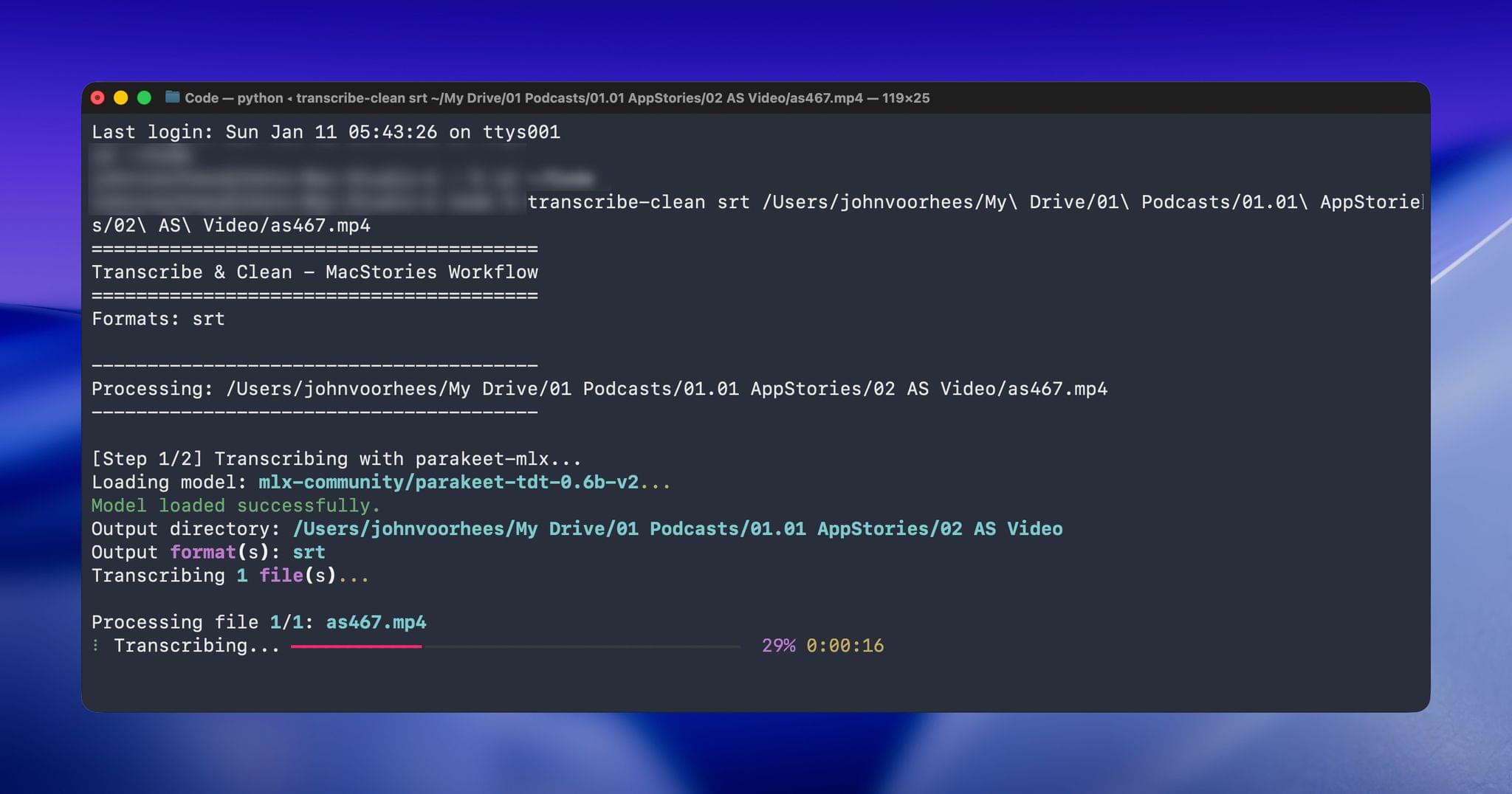
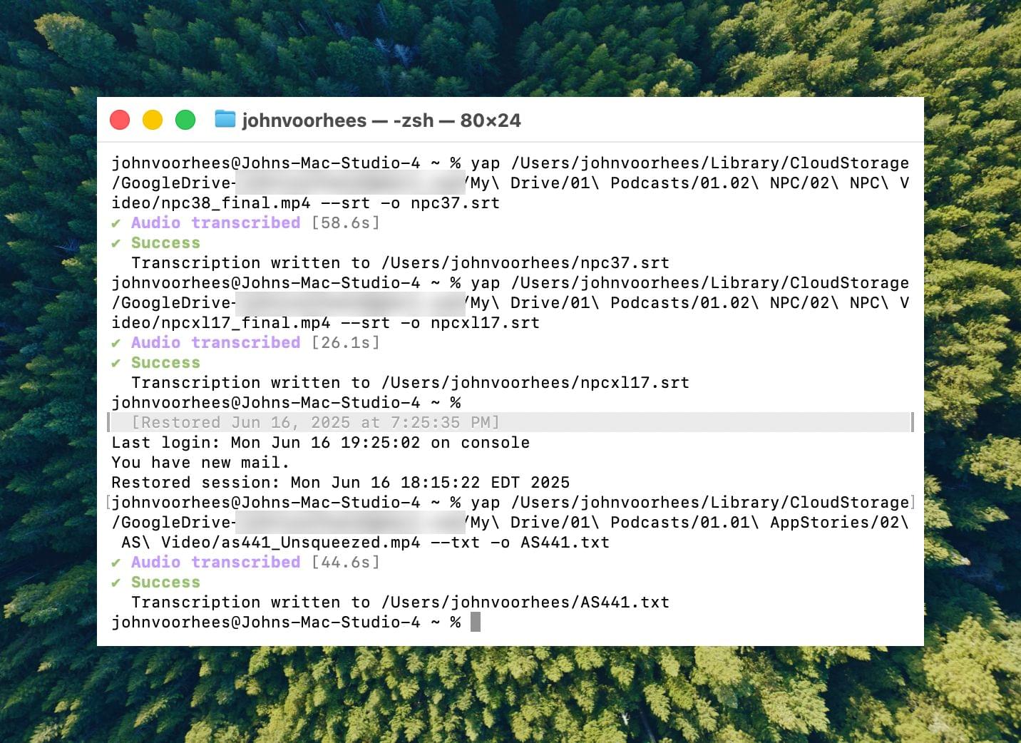
Over the holidays, I refined my skill further and moved it from the Claude app to the Terminal. The first change was to move to parakeet-mlx, an Apple silicon-optimized version of NVIDIA’s Parakeet model that was released last summer. Parakeet isn’t as fast as Apple’s speech APIs, but it’s more accurate, and crucially, its mistakes are closer to the right answers phonetically than the ones made by Apple’s tools. Consequently, Claude is more likely to find mistakes that aren’t in my dictionary of misspellings in its final review.
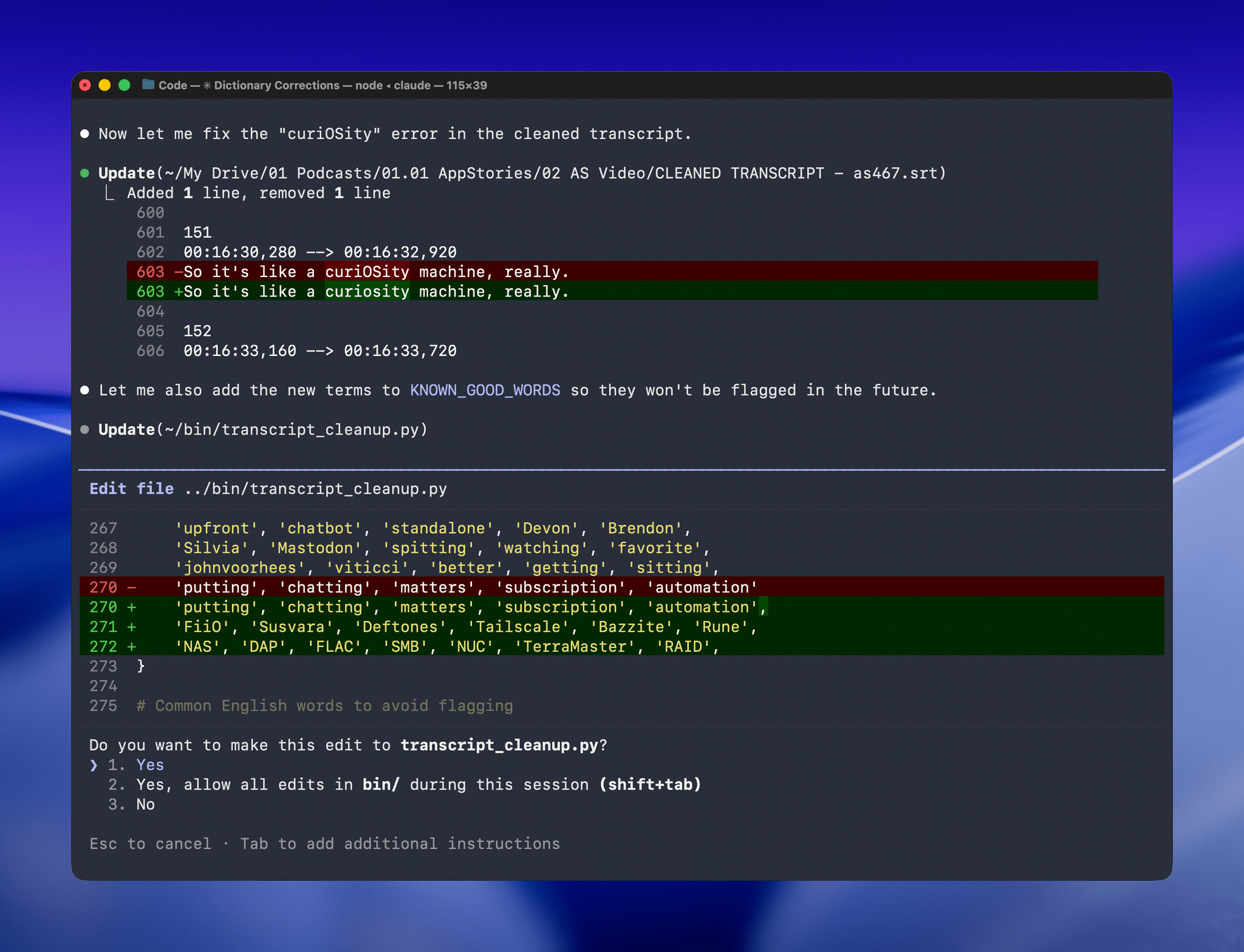
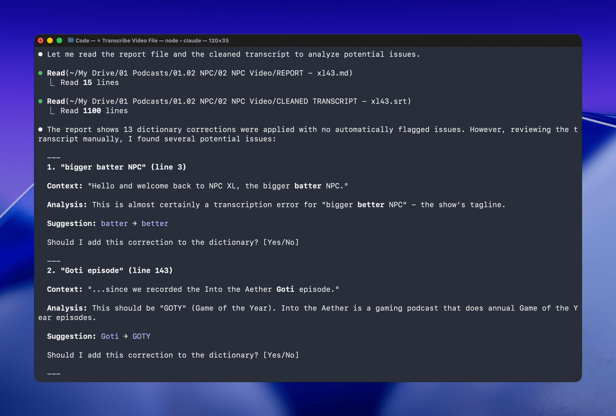
With Claude Opus 4.5’s assistance, I rebuilt the Python script at the heart of my Claude skill to run videos through parakeet-mlx, saving the results as either a .srt or .txt file (or both) in the same location as the original file but prepended with “CLEANED TRANSCRIPT.” Because Claude Code can run scripts and access local files from Terminal, the transition to the final fuzzy pass for errors is seamless. Claude asks permission to access the cleaned transcript file that the script creates and then generates a report with suggested changes.
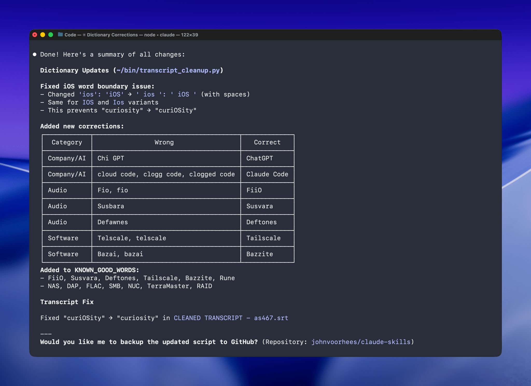
The last step is for me to confirm which suggested changes should be made and which should be added to the dictionary of corrections. The whole process takes just a couple of minutes, and it’s worth the effort. For the last episode of AppStories, the script found and corrected 27 errors, many of which were misspellings of our names, our podcasts, and MacStories. The final pass by Claude managed to catch seven more issues, including everything from a misspelling of the band name Deftones to Susvara, a model of headphones, and Bazzite, an open-source SteamOS project. Those are far from everyday words, but now, their misspellings are not only fixed in the latest episode of AppStories, they’re in the dictionary where those words will always be corrected whether Claude’s analysis catches them or not.
I’ve used this same pattern over and over again. I have Claude build me a reliable, deterministic script that helps me work more efficiently; then, I layer in a bit of generative analysis to improve the script in ways that would be impossible or incredibly complex to code deterministically. Here, that generative “extra” looks for spelling errors. Elsewhere, I use it to do things like rank items in a database based on a natural language prompt. It’s an additional pass that elevates the performance of the workflow beyond what was possible when I was using a find-and-replace app and later a simple dictionary check that I manually added items to. The idea behind my transcription cleanup workflow has been the same since the beginning, but boy, have the tools improved the results since I first used Whisper three years ago.
.](https://cdn.macstories.net/cleanshot-2026-01-28-at-16-02-37-2x-1769634177375.png)