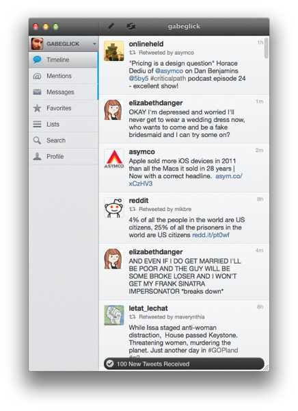
I have been a heavy user of Twitter for Mac since it was first released over a year ago. While certainly not perfect, for me, it is the gold standard of desktop Twitter apps. As such, it is impossible for me to be objective when reviewing a new client, as I will inevitably end up comparing it to Twitter for Mac (hereafter Twitter.app), so I’m telling you here and now that I didn’t even try to do otherwise. As a result, much of this review consists of comparisons between Osfoora and Twitter.app, and the best I can hope for is that other long-time Twitter.app users find it useful. So let’s get into it. Read more
Posts in reviews
Review: Osfoora for Mac
Clear: A Delightful and Clever Todo App
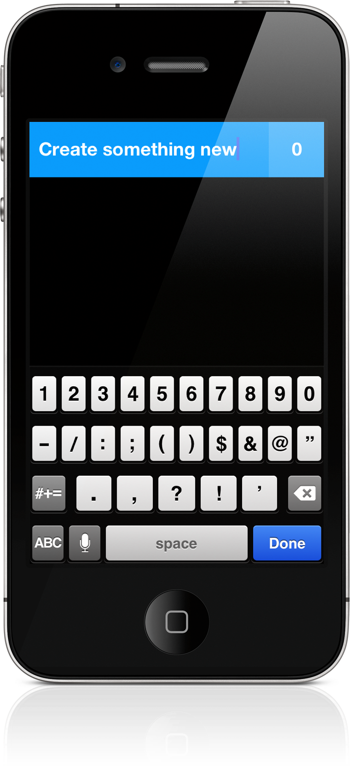
Some apps deliver a certain joy that simply comes from swiping and swooshing through the interface, poking at various elements, and pinching things onscreen. Clear is delightful — it will make you smile. It makes you reconsider the necessity of navigation bars and tool bars and tab bars. We’re used to switching views by tapping at back buttons or icons, but what happens when you take away these common navigational tools? You end up relying on your own honesty and the customer’s intuition. And an honest interface can bring about some terrific ideas.
App Journal, Episode 10: Daedalus Touch, Lovely Charts, Inside the World of Dinosaurs, Skip Tunes
App Journal is a series aimed at showcasing apps we have enjoyed using on our iPhones, iPads, and Macs, but decided not to feature in a standalone, lengthy review here on MacStories. App Journal is a mix of classic reviews, app recommendations, and a diary of our experiences with apps that still deserve a proper mention.
After a two month period of inactivity, the App Journal is back and we’ve got some cool apps to share. From text editing to beautiful diagrams and (gasp) dinosaurs, make sure you don’t miss Episode 10 of App Journal, brought to you directly from the MacStories Team, good coffee, and, why not, Italy’s snow.
If you’ve got apps to recommend, our Tips inbox is just a click away up in the site’s toolbar. Enjoy!
Federico Viticci - Daedalus Touch
When Cody reviewed the first version of The Soulmen’s Daedalus Touch for iPad back in May, I was intrigued by the app’s unique take on portable text editing and document management, but ultimately didn’t pull the trigger on a purchase as I didn’t believe I needed yet another take on Dropbox and text editors. Cody wrote:
Daedalus is interesting. Everything you create in Daedalus becomes a sheet, which exists under a topic sheet that creates a stack. It reminds me of writing a screenplay or developing a report with a cover sheet, but what’s more interesting is how you navigate between these sheets. A majority of the interactions in Daedalus involve pinch-to-zoom actions, which is a bold navigation choice that’s almost pulled off perfectly. You zoom in and out of stacks, and are able to browse between multiple sheets with simple flicks.
After seeing The Soulmen release a couple of updates to bring new functionalities and improve support for things like external hardware keyboards and system clipboard, I thought I could give the app a shot, especially considering it’s on sale at $2.99 on the App Store. In our review, Cody detailed how Daedalus Touch is different from the majority of text editors available on iOS as it allows you to navigate multiple stacks of documents through touch-based interactions based off gestures such as swipes and pinches to navigate in and out of sheets and paper stacks. Having used Daedalus, I think what’s really cool is that – attention to detail and elegant design/typography aside – Daedalus allows you to sync different Dropbox folders independently, meaning you’ll be able to, say, keep your standard notes in a first stack and your book writing project (with additional notes, chapters, and maybe drafts) in another stack. What I’d like to see in a future version of Daedalus Touch is support for more file formats (.md would be a good choice) and automatic sync to avoid the need of hitting “Save” every time.
If you’re looking for a different take on Dropbox-powered text editing, Daedalus Touch is an interesting option at $2.99 for a limited time. Read more
Smartr Contacts
Sometime in the past five years, the Address Book got social. Our contact cards suddenly gained Twitter handles and Facebook links, whilst users more oriented towards business relationships decided to add their LinkedIn pages alongside standard phone numbers and email addresses. More importantly, the Address Book became mobile: adding a new entry to the Contacts app on our iPhones pretty much equals to exchanging business cards now and, unsurprisingly, a new category of apps has arisen from the need of turning old cards into digital reinterpretations of that paper stack full of contacts we’d keep on our desk, but never properly organize.
From this premise, Xobni (that’s Inbox spelled backwards), makers of a popular email plugin for Outlook and Gmail, released Smartr for iPhone a few weeks ago on the App Store. Developed as a mobile companion to Xobni on the desktop, Smartr leverages all the features made possible by a digital interface (search, social integration, slick design, APIs) to provide you with a social address book that’s always up to date and keeps tracks of your communication with friends, family, and work contacts over time. It is very smart indeed.
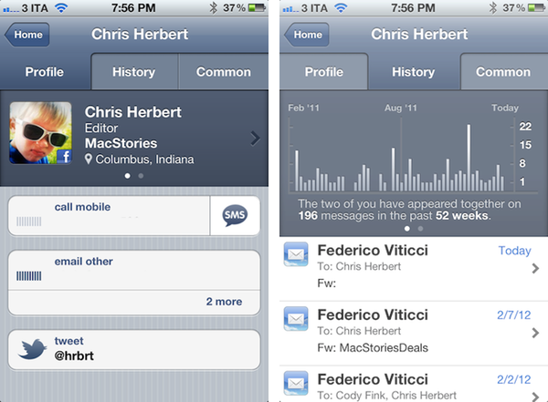
Smartr basically creates rich profiles for all your contacts, aggregating data from Twitter, Facebook, LinkedIn, and email to form a complete overview of someone you might have communicated with in the past. In pulling this data from various social networks, Smartr uses its proprietary matching technology (the “Xobni Cloud”) to analyze and compare your contacts (from your Address Book, an interesting subject following Path’s recent PR fiasco) against conversation history from email (Gmail is fully supported), usernames from Twitter and Facebook, status updates, and so forth. Once a contact is matched, a rich profile view is created featuring name, photo, phone number, and email addresses. Smartr even allows you to swipe across the top section of a profile view to switch between a person’s various social profiles, which upon tap will correctly launch the official Twitter and Facebook apps (if installed).
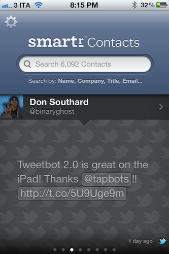
But what to do with these rich, automatic and integrated profiles? Well, Smartr is largely focused on search, unlike, say, a tool like Friends that’s more geared towards interacting with people from your Address Book found on other social networks. Smartr’s prominent interface element is, in fact, a search box that lets you look up contacts by name, company, title, or email. I wish the app supported @username-based look-ups, as I might remember exchanging a message or two with @hrbrt, but I can’t recall his full name from further email communications. Smartr is fast: Searching more than 6,000 contacts on my iPhone takes seconds and the information is always up to date, as Smartr is also web-based in that Xobni’s servers are constantly analyzing and matching your contacts to provide the best results. You can read more about Xobni’s privacy policy here.
Once you’ve found a contact (I managed to retrieve contact information and conversation history from messages dating back to 2008), you can interact with the profile view to compose new emails, call a phone number, or send a new message. The History tab in the top toolbar will give you access to a nicely designed graph showing how many times you’ve appeared in a conversation with a contact, with the actual messages listed below and available for inline viewing if the associated email address is also configured in Smartr (the app will use the standard iOS mail view to enable this). The third tab, Common, shows a list of common contacts between you and the contact you previously looked up.
Smartr is very fast, reliably accurate, and has proven to be a nice addition to my workflow, especially for those times I want to look up an old contact (typically developers) that I want to get in touch with again. I wouldn’t mind paying for Smartr, but the app is free, and available on the App Store. If mail integration is your thing, make sure to check out Xobni’s popular Gmail plugin as well.
Tweetbot for iPad Review
Since its release two years ago, the iPad has always needed a better Twitter client. Tweetbot for iPad is the better Twitter app I have been waiting for, and it sets a new standard that future Twitter clients will have to be compared with.
From a Twitter power user’s perspective, the iPad came at an interesting point in the history of the platform. Twitter clients for iPhone and Mac had reached a kind of maturity and complexity that enabled users like me to demand a certain grade of efficiency from new Twitter apps for the tablet; Twitter itself was beefing up its first-party app portfolio with acquisitions and a fresh strategy based on making the official clients the go-to apps for the average Twitter user. Some notable Twitter clients came out on the iPad throughout 2010, including the excellent Twitterrific, which we have reviewed several times on MacStories.
In 2010, Twitter also released its very own application for the iPad; developed by Loren Brichter, the man behind Tweetie, Twitter for iPad launched to a (still ongoing) controversy as to whether iPad interfaces should adopt more courageous designs in displaying information and sections to the user. Taking the best features of Twitter for iPhone (fluidity, clean design, pull to refresh) and mixing them up with new interaction schemes such as panels and pinch gestures, Twitter for iPad collected rave reviews and considerable disapprovals because of its interesting use of classic Twitter elements (vertical timeline, separate section for Mentions) alongside a new model for driving users’ taps around the app in the form of sliding panels, modal menus, and popovers. You can read more about it in my original review from 2010.
The problem with Twitter for iPad, I believe, is that it failed to appeal power users in the long term, stalling on the same feature set it had at launch without adding substantial improvement over what could have been a fantastic application. I, for one, used the official Twitter iPad app for months, but then I came at a point where I couldn’t stand seeing decent third-party apps staying on top of new Twitter functionalities and “unofficial” services, and Twitter’s own app left behind with Brichter gone and seemingly no interest from Twitter’s mobile team in keeping it up to date – fixing the bugs and annoyances that were reported on day one. Some improvements and new features eventually found their way to the app, and word is that we are waiting for a major 4.0 redesign of the client which, I believe, will put the app on par with the disastrous iPhone version. Tweetbot for iPad thus arrives in a landscape with no clear leader, but with some very good apps that have caught the attention of both power and average users in the past two years.
I wrote about this before. I wish third-party developers would accept Tweetbot as the de-facto app for power users and move on to innovate on other areas of the service. I’m biased: I love Tweetbot, I use it every day on the iPhone, and I couldn’t wait for an iPad version to be released. Today is kind of a dream come true for a Twitter nerd, but the question is – was it worth the wait? Not just good – is Tweetbot the great app the iPad was waiting for? Let’s dive in. Read more
Tweetbot 2.0 Review
How do you improve something that’s already great? You keep working on it, trying to look at your product from as many perspectives as possible. If you believe in it, you can make something great an even greater product. Last year, I reviewed Tweetbot 1.0 for iPhone, the Twitter client many of us had been impatiently waiting for:
Tweetbot is the app I’ve been waiting for: an excellent innovator of the Twitter platform. My new favorite Twitter client.
Tweetbot is everything I’ve ever wanted from a Twitter app: it looks great, it’s fast on WiFi and 3G, it innovates in several aspects that have been regarded as “standards” from both users and developers for too long. Could Tweetbot be any better? Maybe. The developers could work on improving the speed of animations and refresh times as much as possible, or implement support for Readability and other URL shortening services. But as far as the Twitter experience goes, Tweetbot has got everything I’m looking for.
I have tried many Twitter apps in the past years, as you may know, and I’ve never seen a third-party developer as committed to making their client great as Tapbots did with Tweetbot for iPhone. Iteration. Tapbots listened to feedback, and managed to pull the old trick of implementing features without turning your original vision into a piece a software it wasn’t meant to be. With version 2.0 of Tweetbot for iPhone, Tapbots has improved almost every aspect of the original experience, adding features, bug fixes, and refinements that still make Tweetbot the finest Twitter client available on the iPhone. Now faster, smoother, and more intuitive. Read more
Quick Review: Remarks
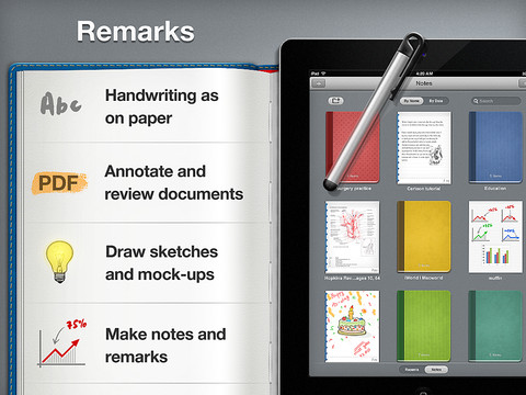
Readdle is today launching their latest iPad productivity app, Remarks. In some ways it is similar to their existing products such as ReaddleDocs or PDF Expert because it features full PDF annotation capabilities, but it is distinctly different because it is the first of their apps to really push the idea of handwriting and note taking as a core function. We’ve reviewed many of Readdle’s products before and by this stage it is clear to us that they make quality productivity software for iOS, so the real question I had when I downloaded this app was what exactly does it let you do and how might it fit into how I work.
What struck me almost instantly was that this app is clearly aimed at being a PDF creation tool, it isn’t like ReaddleDocs or PDF Expert which are more focused as being document management and PDF annotation apps. Remarks may have those same annotation tools but it wants you to create PDF documents, whether it be a handwritten note, drawing or diagram that you want to send to a colleague or perhaps a study note.
In its current form, PDF annotation may be useful but it’s a bit of a pain to get a PDF into Remarks, unlike PDF Expert and ReaddleDocs it doesn’t (yet) have support for cloud services such as Dropbox or SugarSync. Fortunately, this will only be a short-lived annoyance, Readdle plans to have an update ready within two weeks that adds support for cloud services.
Once you do get a PDF into Remarks, you won’t be disappointed - the same powerful annotation functionality that is in Readdle’s other apps is also available in Remarks. So you’ll get the tools to add text, draw shapes and write or draw in freehand on those PDFs, and as usual it is all editable in Preview on the Mac or any other PDF reader such as Adobe Acrobat.
I think for me, this app will come in handy when I need to take down study notes that also require diagrams or illustrations. Things that I can’t do in Evernote, which is very much a text focused note-taking app. In the past I have sketched them down in an exercise book and then for the most important ones I have subsequently drawn them up in Photoshop, OmniGraffle or OmniGraphSketcher, importing those into Evernote. Now I could just use Remarks to make an electronic copy of all my study notes, not just those that are in plain text. I’ll probably still use Photoshop or one of the Omni apps for some of my diagrams that are super important so they are a little neater - but its no longer a requirement.
Before I wrap up, I just wanted to make a quick mention of using a stylus with the iPad. The app does recommend using one and I must admit using a stylus in the context of drawing diagrams and general notes does make a lot of sense - using my finger wasn’t as effective as I had hoped and it soon got tiring. So I foresee myself picking up a stylus in the near future, to make sure I can take full advantage of what Remarks offers.
If you are just looking for an app to annotate PDF documents it might be a better idea to go for PDF Expert or ReaddleDocs. But if you want to do more freeform note-taking, drawing diagrams or creating your own simple PDFs, Remarks is the way to go. Remarks is available in the App Store for $4.99.
Dropzone 2.0 Gets Path-like Radial Menu
Back in November when I took a look at the Mac App Store release of Aptonic’s Dropzone, I was impressed by how the utility transitioned to the Mac App Store whilst keeping most of its functionalities intact. Through a simple drag & drop interface, Dropzone allows you to save time on common and oft-repeated tasks such as sharing images and bits of text, uploading files to your FTP server, or moving files from one location on your Mac to another.
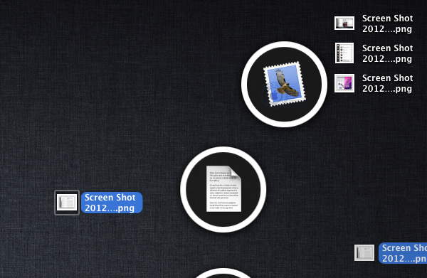
With Dropzone 2.0, released today on the Mac App Store, Aptonic has been inspired by Path’s radial menu (introduced in version 2.0 of the app) and created a new drag & drop interface based on Circles, which as the name suggests are circular icons that sport pretty much the same animation seen in Path 2.0 for iPhone. I don’t know if the new Circles system is more intuitive than the old dock/menubar-based grid of icons (as a Dropzone user myself, I’ll have to see how Circles works in daily usage and if the feature doesn’t get in the way), but it sure looks very nice. Aptonic has also put together an HTML5 demo of Circles, available here.
Dropzone 2.0 comes with other features and improvements as well:
- New improved Amazon S3 support
- New task completion sound
- Added an option to choose whether to intall applications in the user or main application folder
Like I said, I’ll have to keep on using the new Dropzone to see whether the new Circles interface can grow on me. I love the custom sharing menu in Path, but I don’t know yet if the same approach can work for file management and the various shortcuts I have set up in Dropzone. To celebrate the launch of version 2.0, Dropzone will be available at $9.99 until February 5th.
Reader X for iPad Is A Different Take on Google Reader
Those who have been following MacStories in the past months know that I switched from Reeder for iPad to Mr. Reader for my daily RSS feed consumption and management. I have reviewed Mr. Reader on multiple occasions, and as I wrote I was particularly impressed by its attention to a clean interface and integration with services such as Send2Mac, Evernote, and Pinboard. Yesterday Mr. Reader also received a major update that brings themes and several optimizations to the app.
In spite of Mr. Reader gaining a well-deserved spot on my Home screen, I’m always looking for new apps that offer a fresh take on the (much discussed) subject of RSS and Google Reader. Such app is Reader X, released today on the App Store, which brings a minimal yet highly visual approach to RSS that shouldn’t disappoint those who are looking for a new and easy way to quickly scan headlines.
Reader X, in fact, doesn’t let you browse feeds by folder, or manage subscriptions, or scroll unread items vertically as you would expect from a standard RSS client such as Mr. Reader. Well, technically you can sort by folder and scroll vertically, but the implementation of Reader X is entirely different: the app displays feeds as a “mosaic” of news, a list of articles organized in horizontal stripes that represent the websites they belong to. This huge “wallpaper of news” syncs with your existing Google Reader account, and is capable of fetching unread and starred items, folders and all items from a single subscription. Upon firing up the app for the first time, the software will sync with Google Reader and get the latest entries for every subscription in your account; you can tell the app to pre-fetch webpages in the background, and show a badge on the Home screen.
The way news are visualized on screen is functional to what Reader X tries to achieve – that is, trying to offer a more scannable interface for items you’d have to manually scroll with your mouse (or fingers) in a list. Items in the wallpaper are color-coded: unread items are blue, starred entries are yellow, everything else is gray. Newer items have a more saturated color, whilst older entries are gradually fainted as you scroll back in time. Recent headlines are displayed on the left next to a website’s name, and you can also choose to “zoom in” a single subscription (such as MacStories) to browse the most recent articles from that source.
Holding true to its premise of quickly peeking into your RSS items, when you tap on an article headline in Reader X you’re not immediately taken to a full-screen web view. Instead, the app loads webpages in a popover window that, however, still allows you to enter full-screen mode and share a link on Twitter, Pinboard, Instapaper, Tumblr and ReadItLater. You can also share via email, or forward links to Safari.
I like the super-simple and straightforward interface design of Reader X, but I can’t help but wonder how this thing would look like with a bit more polish, especially in the popover and sharing menu design. I’m all for avoiding complex interfaces and over-designed applications, but Reader X feels like it could use some extra pixel love in some areas, so I am looking forward to future updates. I would also like to be able to change the default font of the list, though the one the app currently ships with isn’t too bad.
Reader X won’t replace my main Google Reader client. I do believe, however, that there is room in my workflow for a different take on RSS consumption – a companion app – that allows me to quickly skim through headlines in a visual way that doesn’t get in the way and can make me save precious time when going through RSS feels like a chore. Reader X isn’t perfect, but it sure takes advantage of the iPad’s screen and it’s a promising 1.0 version. You can get the app at $1.99 on the App Store.