Posts in news

Slogger and Day One Memories

Slogger is a fantastic script created by Brett Terpstra. With a bit of manual setup, Slogger can run on your Mac and, on a daily basis, pull entries from various Internet sources – such as Twitter and RSS – and put them into Day One automatically. It is a way to fill Day One with social updates for stuff that you write elsewhere. Brett is awesome, he’s working on new stuff for Slogger, and you should definitely check it out (and consider a donation) if you’re interested in its functionality.

I, however, have turned Slogger off a couple of weeks ago and removed the entries it created. This happened soon after the release of Day One with tags and search, which made me realize “automated logging” is not for me. Slogger was a placebo, not a medicine to let me write more. Somewhat intrigued by its scriptability and automation, I fell short of my own promise:

In twenty years, I’m not sure I’ll be able to remember the songs I like today, or the faces of people that I care about now. I don’t even know if I’ll be around in twenty years. But I do know that I want to do everything I can to make sure I can get there with my own memories. We are what we know. And I want to remember.

It took a while for me to realize I wasn’t fixing the right problem. Instead of making an effort to document memories I care about, I was passively watching another Internet pipe feeding a digital archive of my life with tweets, liked items, starred posts, and everything in between. Brett is awesome, but Slogger is not for me. At least not with the current version of Day One, because there’s no way to meaningfully separate “social entries” from “actually-written-by-me entries”. My wish is for Slogger to eventually mature into a standalone app for “social archiving”, separate from Day One.

I want my thoughts – not my stupid Twitter jokes – to be read by someone who, for some reason, will care about the life I had. There are several aspects of my digital life that I like to improve, but I won’t automate my memories.

Day One is a personal experience, and as such, I want it to be mine.

The Daily Shuts Down

The Daily Shuts Down

The Daily, one of the most discussed Apple-related rumors of late 2010 that turned out to be a poorly designed iPad-only magazine, is shutting down on December 15. AllThingsD reports, in fact, that parent company News Corp. will “cease standalone publication” of the app later this month. Technology and “assets” from The Daily will be folded into News Corp-owned The New York Post, a tabloid. News Corp.’s Murdoch was quoted in the press release:

From its launch, The Daily was a bold experiment in digital publishing and an amazing vehicle for innovation. Unfortunately, our experience was that we could not find a large enough audience quickly enough to convince us the business model was sustainable in the long-term. Therefore we will take the very best of what we have learned at The Daily and apply it to all our properties. Under the editorial leadership of Editor-in-Chief Col Allan and the business and digital leadership of Jesse, I know The New York Post will continue to grow and become stronger on the web, on mobile, and not least, the paper itself. I want to thank all of the journalists, digital and business professionals for the hard work they put into The Daily.

Quite a departure, unfortunately, from Murdoch’s original statements on the future of his venture:

The Daily is not a legacy brand moving from the print to the digital world. We have license to experiment. We believe The Daily will be the model for how stories are told.

Murdoch’s intent may have been noble enough to justify the effort, but The Daily – as an appwas flawed since the first issue. The interface was clunky and confusing; the app required large downloads, and, in just a matter of weeks, its readership substantially decreased, in spite of heavy promotions by News Corp, including a commercial that aired during the XLV Super Bowl.

The Daily was launched in early 2011 as part of Apple’s new subscription feature for App Store apps.

Permalink


Apple Testing Carrier LTE Networks Before Allowing iPhone Access

Apple Testing Carrier LTE Networks Before Allowing iPhone Access

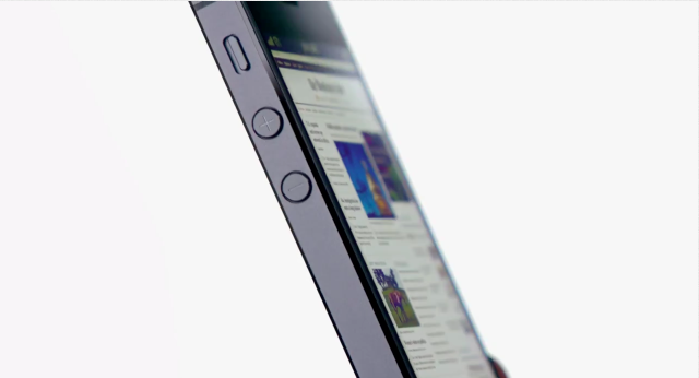
, Apple has been running its own, independent, LTE tests before it allows carriers to offer the iPhone 5 as an LTE device. It’s somewhat of a reversal of how the carrier-handset maker relationship traditionally worked - where the carrier wouldn’t sell a device until the device was tested and met all the quality assurance requirements. Now Apple, infamous for their desire to control all ends of the user experience, is testing the carriers before it allows the iPhone access to their LTE networks.

Telecoms had initially heard of the tests in October but this week heard from an official Swisscom spokesperson that said “Apple only enables 4G access after testing their device on an operator’s live network”.

While extensive network testing of handsets has always been necessary, the focus has historically been on whether or not the handset functions on the network, with operators keen to protect their network assets and customer relationships against poor quality devices.

A handset vendor vetting networks on a technical basis before allowing its device to be used on them is a reversal of this situation, and one that Apple alone has the power to bring about.

Bengt Nordstrom, CEO of consultancy group NorthStream told Telecoms that he was “shocked” of hearing of the policy. Noting that it proved “who is running the industry” and that “Apple have put themselves in the driving seat; it’s really changing the game quite a lot.”

[via @BenedictEvans]

Permalink

Apple Releases iTunes 11 (Update: Remote 3.0 Too)


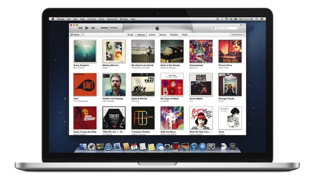
Officially announced at the iPhone 5 media event on September 12, Apple today released iTunes 11, the next major version of the media player/manager for OS X. At the end of October, Apple delayed the original release of the software, saying that it would come out “before the end of November”.

The new iTunes features a new edge-to-edge design that is reminiscent of the Music app for iPad. Album art flows across the display — clicking on an album expands album info as opening a folder does on iOS. iTunes also brings popovers that present a drop down of upcoming songs, and improved search results as you filter through music in your library. One of the big new features is expanded view, which lets users see all the songs of an album in place without opening a different view. The background of an album in expanded view is automatically generated by iTunes based on the item’s artwork.

The new MiniPlayer, unlike previous designs, shows album artwork and gives the option to manage playlists and see upcoming songs as well through the new Up Next feature. From the MiniPlayer, users can now also search for a song in their library by hitting the search button; and to go back to the main screen, all they have to do is click the “expand” icon next to the close button.


The built-in iTunes Store underwent a facelift, too. Inspired by iOS 6, the Store now comes with a cleaner look, carousel-like banners for featured items, and access to a Preview History to check out all media you’ve previewed in chronological order. iCloud integration makes sure purchases are available on every device, and, with iTunes 11, iCloud also syncs position for movies, TV shows, podcasts, iTunes U lessons, and audiobooks users are playing on a device.

iTunes 11 is available for download from Software Update. Our first impressions and screenshots directly below.

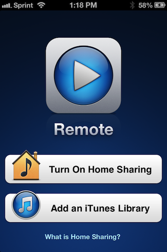
Update: Apple has also released Remote 3.0. The new app supports Up Next, it’s got new view options, and the iPad’s interface highly resembles iTunes for Mac with custom album backgrounds.

Read more


Expedia 2.0

Expedia 2.0

Sometimes innovation comes from unexpected places. Personally, I wouldn’t have thought Expedia would turn out to be one of the most well-designed, innovative, and fun apps I’ve tried on iOS lately. But it is. Released two weeks ago, Expedia 2.0 is a universal app developed by Mobiata, and it is an example of how a hotel-booking application should scale elegantly across different displays without providing a confusing and frustrating experience (a common thread of hotel-booking apps and software).

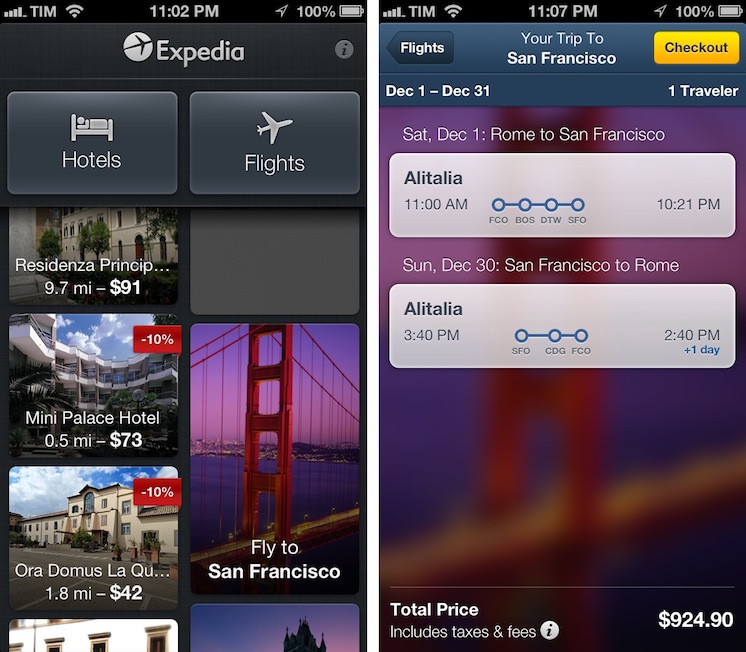
On the iPhone, the app starts with a gorgeous mosaic of deals for hotel rooms and flights. Photos are nice and compatible with the Retina display, and even the loading indicator has been designed with a hotel theme in mind: for flight search, the same indicator changes to another design, but I won’t spoil it here. Once you tap on a hotel, information is laid out elegantly with swipable galleries, green-colored icons for services offered by the hotel (WiFi, parking, etc), price tags, and an embedded Maps view. You can check out reviews, change the number of people requesting a room, and tweak the duration of your stay with a custom date picker that allows you to select multiple days with a single swipe. On the iPad, the same information is conveyed with a “stacked panel” UI that lets you switch at any time between map view and hotel information.

For flight search, the app is possibly even more pleasant to use. With blurred backgrounds and an Apple Store-like menu that progressively collapses as you confirm your choices, Mobiata managed to make the purchasing experience incredibly natural and good-looking in spite of the amount of data they need to present to the user.

The Expedia app is full of nice touches and details. Even if you’re not interested in hotel or flight booking, you should check it out for its design choices and interaction patterns. Free on the App Store.

Permalink

Home Automation With An iPad

Home Automation With An iPad

Here’s another interesting use case for my ongoing coverage of Pythonista. From the Pythonista Community Forums, user nlecaude shares a script and a demo video showing how he managed to control the lights in his house using Pythonista (thanks, Gabe).

The Pythonista app is pretty simple, it’s basically crossfading between different images to show the current state of the lights. I have one layer for each state (3 lights so 2^3) and I have invisible layers that I use as buttons to trigger the lamps and transition on and off. I’m quite fascinated by the possibilities of Pythonista.

If you watch the video below, it basically looks like magic. This guy is tapping on a photo of his room on an iPad to turn the actual lights on and off. In practice, he’s using a Python library to control a Philips Hue system that reacts to touch input from Pythonista.

For those unaware of Philips’ product, Hue is a personal wireless lightning system that can be remotely controlled and programmed to offer different lightning settings and color combinations for every occasion. Philips isn’t offering an SDK for developers yet, but the Python library manages to directly connect to the Hue wireless bridge and send input commands.

As nlecaude writes, this is just a script put together in 10 minutes with an unofficial library. The possibilities for home automation programmed from an iPad are seriously intriguing.

Permalink

Announcing Weekly Sponsorships

Developers willing to promote their company or product on MacStories have always been able to buy ad spots on our site.

Today we’re introducing weekly sponsorships.

The exclusive and week-long sponsorship is the best way to promote your app or service to MacStories’ fine, clever, and influential readership. MacStories’ audience includes creative, professional and tech-savvy readers who care about quality software designed for Macs, iOS devices, and the web, as well as detailed reviews and editorials.

MacStories’ readership consists of:

  • Over 1.3 million monthly page views
  • Over 23,000 daily RSS subscribers
  • 40,000 followers across our Twitter accounts

At the start of the week, we will publish a thank-you post telling our readers that you are the sponsor for the week and also informing then about your company or product(s). During the week of the sponsorship, your company or product will also be linked in the site’s sidebar. Two tweets will be sent – one at the start and one at the end of the week – thanking the sponsor.

To schedule a sponsorship or for additional information, please email us. BackBeat Media is taking care of this for us, and you’re in good hands with John, Jeff or Dave there.


Apple’s New 21.5” iMac Available This Friday, 27” iMac Shipping In December

Apple has just announced that the new 21.5-inch iMac will be available for purchase online and in retail stores from this Friday, November 30th. The larger 27-inch iMac will be available for pre-order on Apple’s online store from Friday but it won’t ship until December.

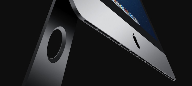
Apple revealed the new look iMac at its iPad mini event back on October 23rd. The new design features a new tapered enclosure that is just 5mm thick at its thinnest point. Whilst on the hardware side, it includes a new Fusion Drive which combines the “performance of flash” and the “capacity of a hard drive” as well as a reengineered display and upgraded performance.

Redesigned from the inside out, the new iMac packs high performance technology into an aluminum and glass enclosure that measures just 5 mm thin at its edge and features a reengineered display that reduces reflection by 75 percent. The new iMac includes 8GB of 1600 MHz memory, a 1TB hard drive, third generation quad-core Intel Core i5 processors that can be upgraded to Core i7, and the latest NVIDIA GeForce graphics processors that deliver up to 60 percent faster performance.

Prices start from US$1,299 for the 21.5” iMac with a 2.7 GHz quad-core Intel Core i5 and NVIDIA GeForce GT 640M. The 27” iMac will start at US$1799 and contain a 2.9 GHz quad-core Intel Core i5 with Turbo Boost speeds up to 3.6 GHz and NVIDIA GeForce GTX 660M. Apple has the full technical specs and prices up on its website.