AppStories Episode 301 - The New iPad and iPad Pro Review: Mixed Signals
0:00
39:48
39:48
This morning, Federico and John get into the details of Federico’s review of the latest iPad Pro and the new 10th generation iPad.
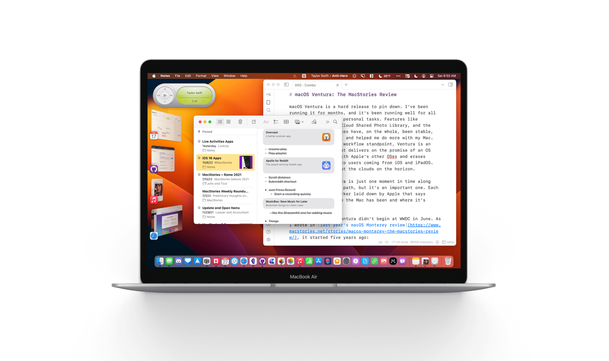
macOS Ventura is a hard release to pin down. I’ve been running it for months, and it’s been running well for all my everyday work and personal tasks. Features like Continuity Camera, iCloud Shared Photo Library, and the many system app updates have, on the whole, been stable, worked as advertised, and helped me do more with my Mac. So, from an everyday workflow standpoint, Ventura is an excellent release that delivers on the promise of an OS that moves in step with Apple’s other OSes and erases artificial barriers to users coming from iOS and iPadOS. And yet, I worry about the clouds on the horizon.
The release of Ventura is just one moment in time along macOS’s evolutionary path, but it’s an important one. Each fall release is a marker laid down by Apple that says something about where the Mac has been and where it’s going.
The story of macOS Ventura didn’t begin at WWDC in June. As I wrote in last year’s macOS Monterey review, it started five years ago:
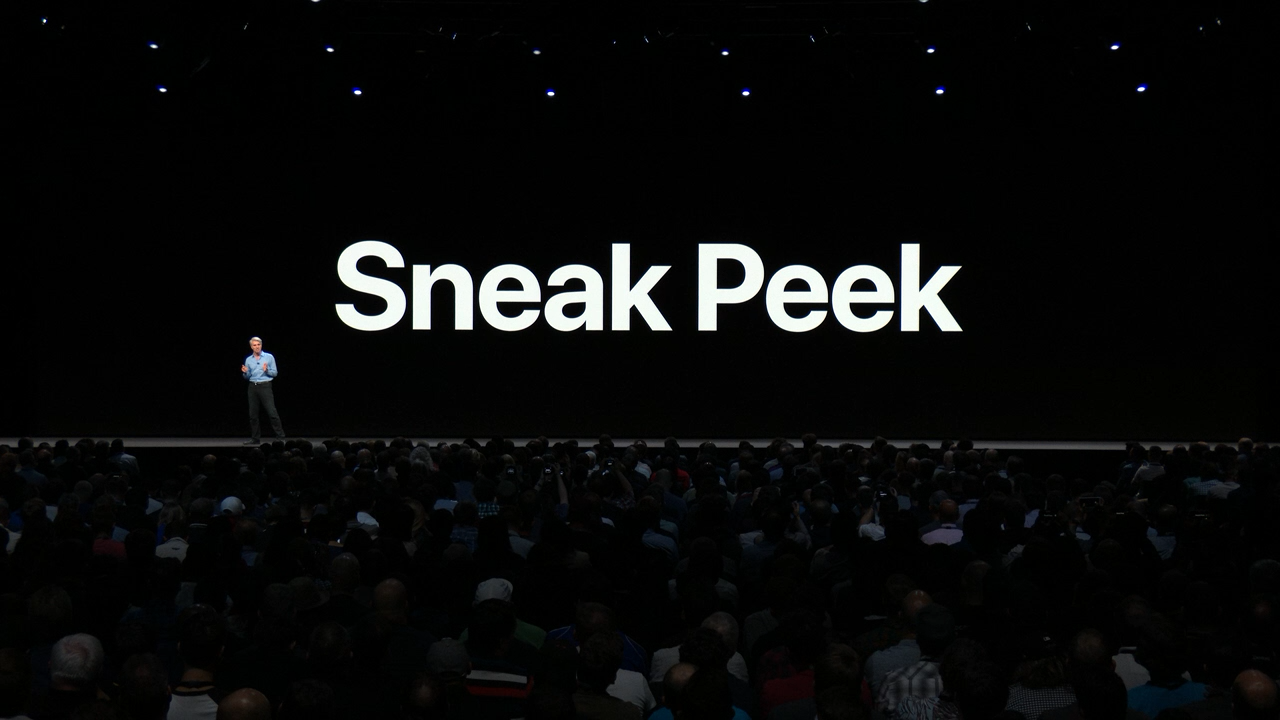
For the past few years, no narrative thread has been more important to the Mac and its operating system than their realignment within Apple’s product lineup. It’s a fundamental transformation of both hardware and software that has taken shape over years, beginning publicly with Craig Federighi’s WWDC Sneak Peek in 2018.
Last year’s release of Monterey went a long way toward validating what came before with Catalina and Big Sur:
Monterey is one of the most tangible, user-facing payoffs of the past three years of transition. More than ever before, Apple is advancing system apps across all of its platforms at the same time. Finally, everything is everywhere.
Ventura is, in many ways, a continuation of Monterey’s storyline. Apple has delivered a second year of parallel development across its system apps, with the notable exception of Shortcuts, which I’ll cover later. That’s a big win for Mac users who, in previous years, waited multiple releases for apps like Maps and Books to catch up with their iOS and iPadOS counterparts.
The familiar interface and feature set across multiple platforms are one of the biggest and most tangible achievements of the past few years.
So, with Monterey’s success of moving system apps forward in unison across all OSes looking more like a trend than a one-off novelty, what are the clouds I’m seeing on the horizon? There are three:
Although each of the items above concerns me, it’s equally important to put them in context. For most users, macOS is in a very good place. My day-to-day work on the Mac isn’t affected by whether the iPadOS version of Stage Manager is buggy. I may feel constrained by the lack of some actions in Shortcuts on my Mac, but at the same time, I’ve got Shortcuts on the Mac, something I’d hoped for for years. And Systems Settings are, after all, just settings that may not be great to look at, but they still work.
However, while the issues with Ventura may not be immediate, they’re still important because they threaten the viability of the Mac in the midst of its hardware renaissance. I want to see the Mac continue to grow and flourish, and I’m convinced more than ever that aligning it and the iPad is one of the ways to accomplish that. Unfortunately, Ventura doesn’t move that ball forward in a meaningful way.
With Apple firing on all cylinders when it comes to hardware, now is no time to let macOS stall. Source: Apple.
By tying the two together, Apple has set the stage for a healthier third-party app ecosystem that benefits both platforms by making it more economical for developers to create apps for both. I’m sent a lot of apps to try, and I can tell you that this is absolutely happening already. The vast majority of the apps I’m sent today aren’t Mac-only or iPad-only – they’re universal apps that work on both and usually the iPhone and Apple Watch too.
However, the work and the story that started with Federighi’s Sneak Peek aren’t finished. For the Mac and iPad to thrive, now is not the time for Apple to take its foot off the gas. Yet, that’s what Ventura feels like after several years of foundational changes to macOS. It’s not a bad update. There’s a lot to like among the system apps and other changes, but I can’t shake the nagging sense that Apple has taken its eye off the long-term vision for macOS with Ventura. That won’t affect your day-to-day use of the OS, but it’s certainly something worth keeping a close eye on as Ventura is updated and WWDC rolls around again next summer.
This morning we got into the details of Federico’s review of the latest iPad Pro and the new 10th generation iPad.


Sponsored by:
We deliver AppStories+ to subscribers with bonus content, ad-free, and at a high bitrate early every week.
To learn more about the benefits included with an AppStories+ subscription, visit our Plans page, or read the AppStories+ FAQ.
Writing for The Verge, Chris Welch covers improvements to Adobe Lightroom’s AI-driven healing tool announced this week. (Link) Arlo, known for its smart home security devices, is entering the personal safety market with an app that will call for help when you remove your finger from a button in the app. The company is...
I enjoy browsing Apple Music’s genre pages now and then when I’m on the hunt for new music. The trouble is that it has gotten harder to do over time. First of all, there’s no genre catalog. Instead, Apple Music has categories, which include what you’d typically think of as genres, along with things like...
Here are the highlights from the Club MacStories Discord this week: Unsurprisingly, the iPad was the talk of the Club Discord this week. For lots of interesting posts that try to make sense of the muddled iPad lineup, be sure to visit the Apple channel. As apps with Live Activities start to show up on...
Ableton Note I’ll forgive you if you don’t remember Music Memos, Apple’s app for recording musical ideas for the iPhone that faded pretty quickly into obscurity after its 2016 release. Music Memos may not have made it long-term, but the idea is a good one. Musical ideas should be as easy to save for...
This week on MacStories Unwind, John is joined by Alex Guyot to talk about the third-generation Apple TV 4K, how they use their Apple TVs and what the new hardware might mean for streaming content in the future.
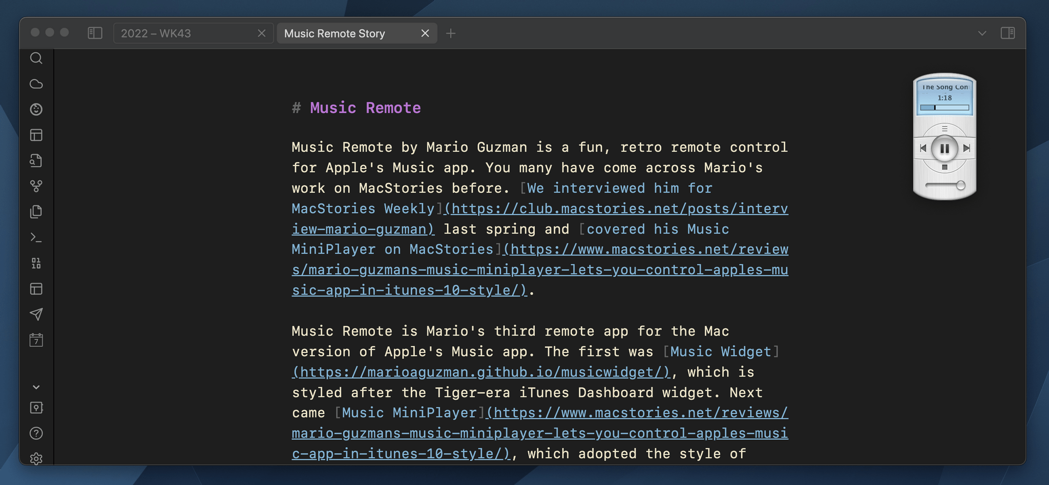
Music Remote by Mario Guzman is a fun, retro remote control for Apple’s Music app. You may have come across Mario’s work on MacStories before. We interviewed him for MacStories Weekly last spring and covered his Music MiniPlayer on MacStories.
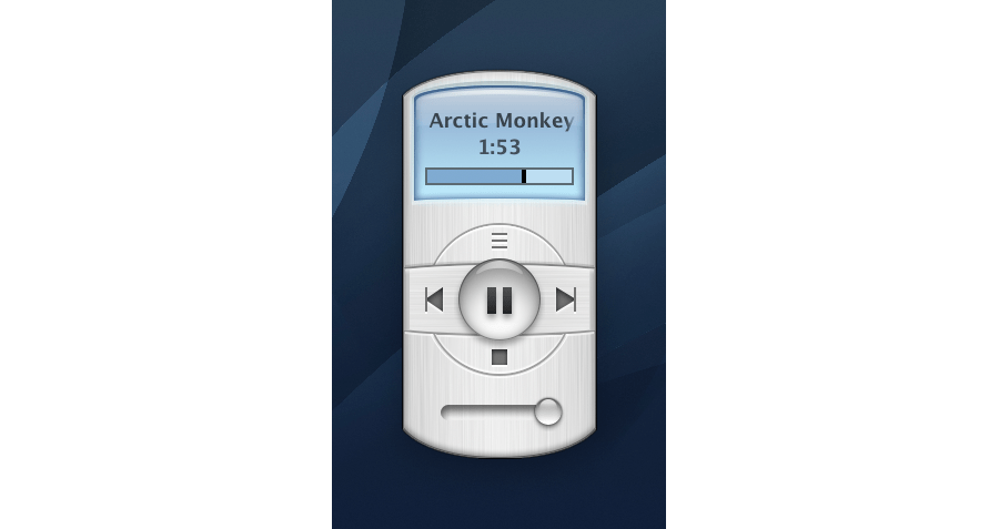
Music Remote is Mario’s third remote app for the Mac version of Apple’s Music app. The first was Music Widget, which is styled after the Tiger-era iTunes Dashboard widget. Next came Music MiniPlayer, which adopted the style of iTunes 10’s mini player. Music Remote reaches further back in time to the Mac OS X Public Beta, recreating the look of Music Player, an app that didn’t last long.
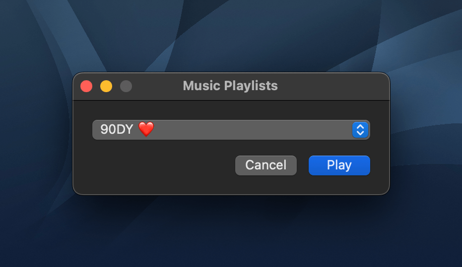
The compact remote requires Apple’s Music app to be running, but once it is, you can minimize Music and use Music Remote instead. The app includes buttons to play/pause and skip forward and back, as well as a couple of unique buttons above and below the play/pause button. Above play/pause is a button that opens a separate window that lets you pick from your playlists. Below is a stop button. It works the same as pause, except that when you resume playback, it will start with the next song in an album or playlist instead of picking up mid-song.
The display above the controls cycles among the song title, artist, and album name. If a text string is too long to fit into Music Remote’s tiny screen, it scrolls horizontally. You can also cycle through the information displayed in Music Remote more quickly by clicking on its screen. The screen shows elapsed song time by default but can be switched to the remaining time in the app’s preferences. At the bottom of the screen is a progress bar. There’s a volume slider at the bottom of the app’s UI, and the app can playback Apple Music radio stations using a slightly different UI, too.
What makes Music Remote such a fun utility, though, is its design. The bubble-like play/pause button and blue LED-inspired screen are from a very different era of Mac design but still look great today. I also appreciate that the app is small. It looks fantastic on my desktop, which is why I immediately turned on the option to float it above my other windows. Because the app is small, though, there’s always a spot for it out of the way. It works perfectly in app sidebars that have a little blank space or the margin of a text editor, for example.
I have all three of Mario’s remote apps installed on my Mac Studio. that may seem like overkill, but I listen to music a lot as I work, so I appreciate having options depending on my mood. However, for the last week, as I put the finishing touches on my macOS Ventura review, Music Remote has been the remote that’s been sitting in the margin of the review as I write, which has been great.
I highly recommend checking out Music Remote, which can be downloaded for free from Mario Guzman’s GitHub page along with his other apps.
](https://cdn.macstories.net/banneras-1629219199428.png)