In August 2017, The Sweet Setup introduced a video course designed to equip users to get the most out of Ulysses, the popular Markdown text editor. Today, that ‘Learn Ulysses’ course is being expanded and revised in a major way. Everything has been completely modernized with entirely new videos that replace the previous set, plus the addition of brand new videos, written tutorials, and setups covering a variety of in-depth topics.
Posts tagged with "text editor"
The Sweet Setup Launches Revised and Expanded ‘Learn Ulysses’ Course
Ulysses 15 Review: Split View on the Mac, Remote Images, Improved iPad Multitasking, and More
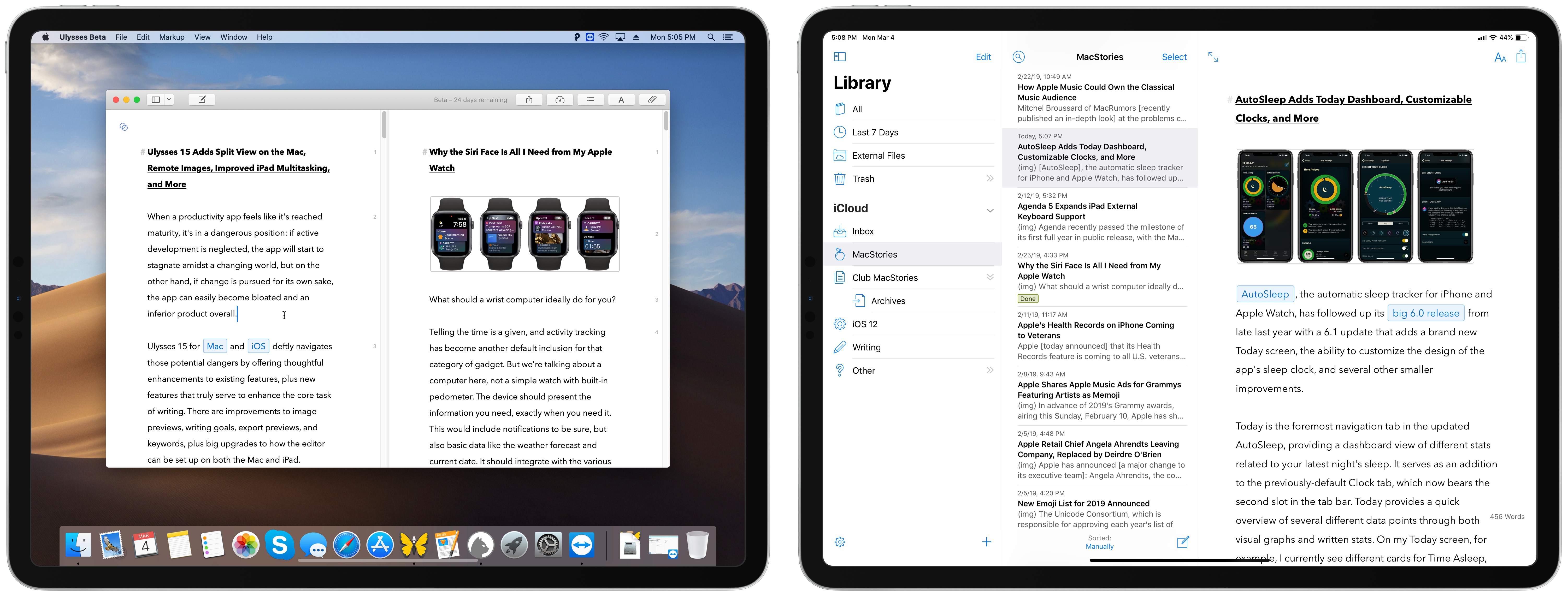
When a productivity app feels like it’s reached maturity, it’s in a dangerous position: if active development is neglected, the app will start to stagnate amidst a changing world, but on the other hand, if change is pursued for its own sake, the app can easily become bloated and an inferior product overall.
Ulysses 15 for Mac and iOS deftly navigates those potential dangers by offering thoughtful enhancements to existing features, plus new features that truly serve to enhance the core task of writing. There are improvements to image previews, writing goals, export previews, and keywords, plus big upgrades to how the editor can be set up on both the Mac and iPad.
The core app remains largely the same, but it’s now more compelling than ever before.
Agenda 5 Expands iPad External Keyboard Support
Agenda recently passed the milestone of its first full year in public release, with the Mac version debuting last January and the iOS app a few months later. The team behind Agenda has been keeping busy ever since, with improvements like Siri shortcuts, dark mode, accent colors, and most recently, images and file attachments. Today’s update to version 5.0 on iOS and the Mac is relatively minor by comparison, but it still offers a few valuable additions. There are new options for your text environment, like the ability to set a custom line spacing and use an extra small text size, plus you can now perform multi-tag and multi-person searches. The improvement that stands out most, however, is Agenda’s newly expanded support for external keyboards on iPad.
Revisiting Evernote: Checking in with the Former Note-Taking King

Evernote is still alive. The popular note-taking app celebrated its tenth birthday last summer, but the last few of those years haven’t been easy, with two CEO transitions and sizable layoffs at several points. Still, the core product keeps pushing forward.
I last reviewed Evernote in early 2017, when version 8 of its iOS app launched as a major redesign. I concluded then that one of the service’s greatest strengths, particularly when compared with competitors like Apple Notes, is that Evernote strives to be more than just a note-taking app. It’s a solid way to take notes, but it also aims to make those notes easily accessible, to create connections between notes, and ultimately serve as a valuable aid to productivity.
Though Evernote has retained a large user base all these years later, and in fact became cash flow positive nearly two years ago, there are a lot of former users who left the service long ago and haven’t looked back. Personally, while I’ve kept an eye on Evernote over the years, I never put its recent updates to the test – until recently, that is, when I set out to revisit the popular note-taker.
As part of checking back in on Evernote, there were three core features I wanted to focus on evaluating: Templates, Context, and Dark Mode. These are some of the major developments Evernote has touted in its last few years of work, and they make for an interesting case study on the company’s future direction.
iA Writer 5.2: Better Typography and External Library Locations
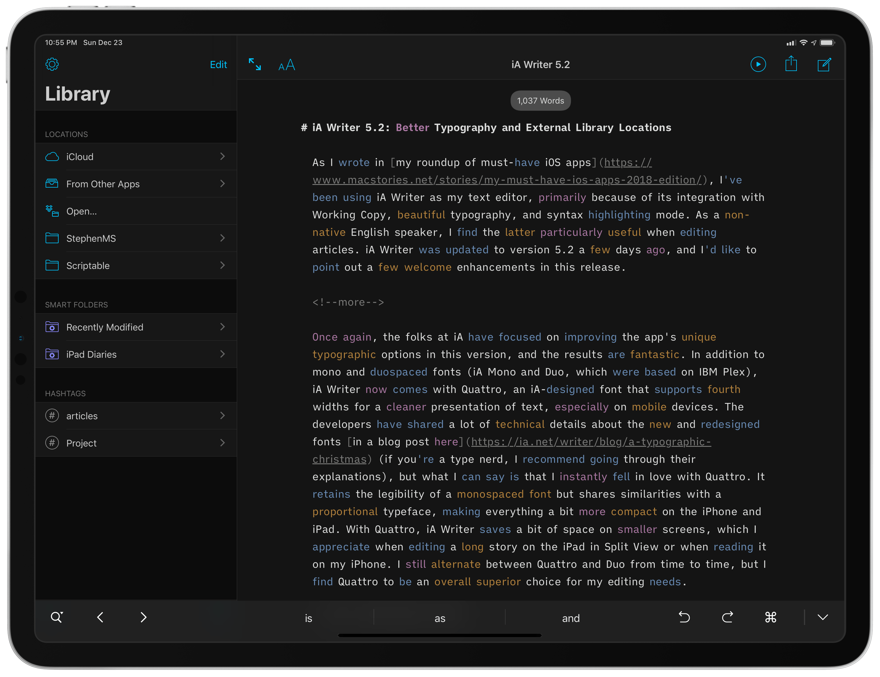
As I wrote in my roundup of must-have iOS apps, I’ve been using iA Writer as my text editor, primarily because of its integration with Working Copy, beautiful typography, and syntax highlighting mode. As a non-native English speaker, I find the latter particularly useful when editing articles. iA Writer was updated to version 5.2 last week, and I’d like to point out a few welcome enhancements in this release.
Drafts 5.5, MultiMarkdown, and CriticMarkup→
Tim Nahumck, writing about the latest Drafts update for iOS:
One thing that is included with MultiMarkdown as an option is Critic Markup. Looking through the guide, there are several helpful elements that can be used for editing my writing utilizing Critic Markup. I can highlight some substitutions, additions, and deletions. I can highlight text to show something I might want to work on later. I can also add a basic comment somewhere that won’t be shown in a preview. And with this action, I can easily add any of them with a tap and a text entry, which inserts it in the proper format. This is helpful for creating and previewing the documents in Drafts, and gives users the flexibility to mark up files and save them back to a cloud service. I can see myself using this a lot for longer posts or large reviews. I’ve even modified my own site preview action to render the MultiMarkdown via scripting, as well as updating both my standard and linked post WordPress publishing actions to do the same.
I’ve always been a fan of CriticMarkup but have never been able to get into it as it wasn’t integrated with the text editors I used on iOS. Considering how Drafts is my favorite option when it comes to writing and editing certain annual long-form stories, and given how I came up with my own syntax in previous years to embed comments in Markdown documents, I’m going to give this a try.
My Markdown Writing and Collaboration Workflow, Powered by Working Copy 3.6, iCloud Drive, and GitHub
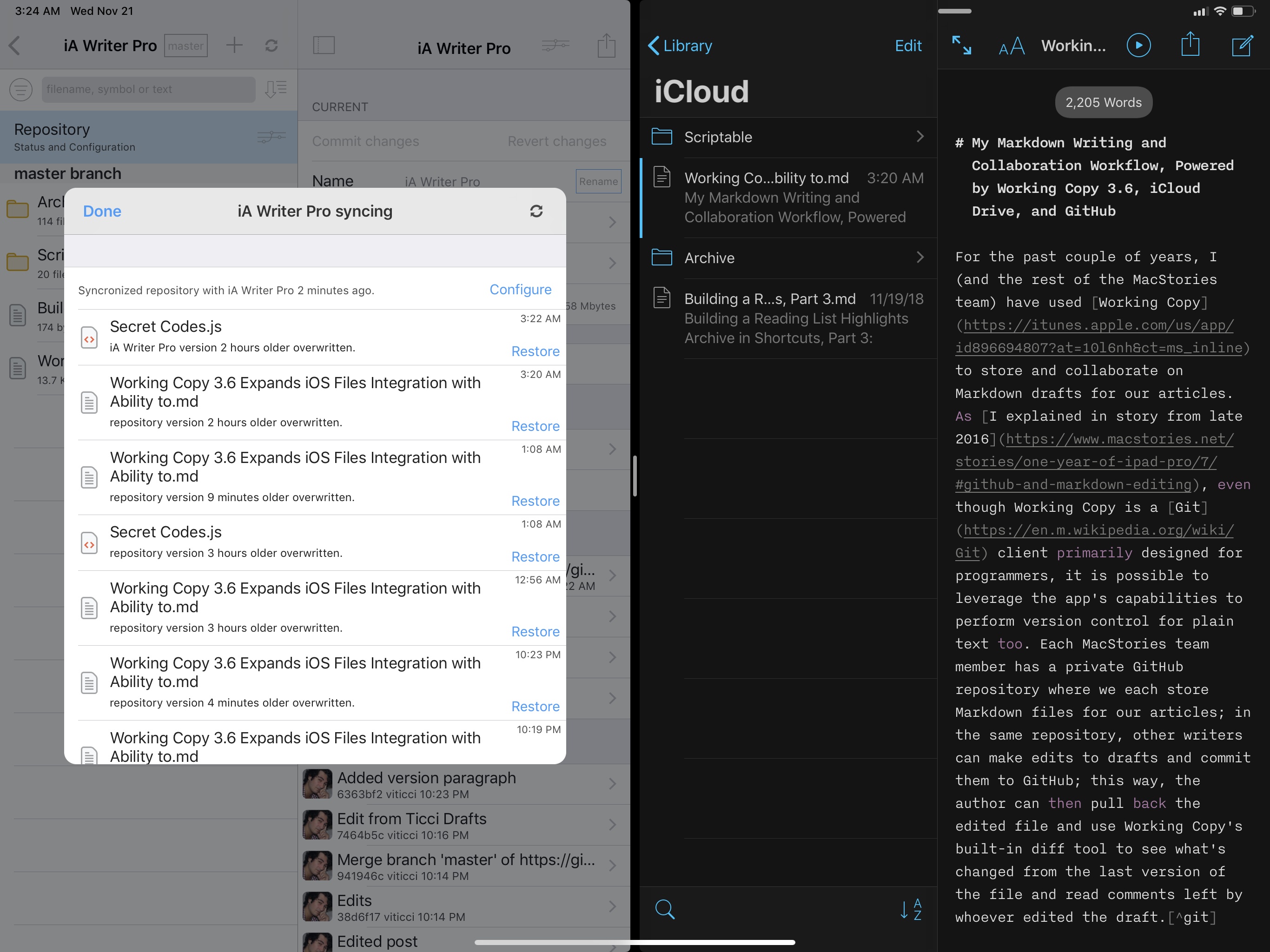
For the past couple of years, I (and the rest of the MacStories team) have used Working Copy to store and collaborate on Markdown drafts for our articles. As I explained in a story from late 2016, even though Working Copy is a Git client primarily designed for programmers, it is possible to leverage the app’s capabilities to perform version control for plain text too. Each MacStories team member has a private GitHub repository where we store Markdown files of our articles; in the same repository, other writers can make edits to drafts and commit them to GitHub; this way, the author can then pull back the edited file and use Working Copy’s built-in diff tool to see what’s changed from the last version of the file and read comments left by whoever edited the draft.1
As I mentioned two years ago, this system takes a while to get used to: GitHub has a bit of overhead in terms of understanding the correct terminology for different aspects of its file management workflow, but Working Copy makes it easier by abstracting much of the complexity involved with committing files, pushing them, and comparing them. This system has never failed us in over two years, and it has saved us dozens of hours we would have otherwise spent exchanging revised versions of our drafts and finding changes in them. With Working Copy, we can use the text editors we each prefer and, as long as we overwrite the original copies of our drafts and keep track of commits, the app will take care of merging everything and displaying differences between versions. From a collaboration standpoint, using Working Copy and GitHub for file storage and version control has been one of the best decisions I made in recent years.
Drafts 5.2→
Tim Nahumck:
When writing my review, I needed a way to navigate between the different sections, and all of the subheadings I had created. I had developed an action to navigate to each of the markdown headers, which I was happy with at the time. It was nice to have that functionality to switch around where I was in my review.
Well, I’m happy to say that I have been Sherlocked.
In the upper right corner of the editor, there is a small triangle icon; when you tap the icon, you are presented with a navigation menu. Not only does this navigate headers in Markdown, but it also navigates projects in TaskPaper, and code blocks in JavaScript. It also include a top and bottom button, as well as a select all button.
Drafts 5.2 came out while I was in San Jose for WWDC, and I’ve been meaning to check out the new features since I started getting back into a normal routine. Tim Nahumck, of course, has a great overview of the changes in this version of Drafts, along with some useful examples you can download.
As Tim points out, the ability to navigate headers of a Markdown document through a dedicated “section popup” is a terrific addition to Drafts. Few text editors designed for people who write in Markdown get this right; one of the reasons I still keep Editorial on my iOS devices is because it lets me navigate longer pieces with a header navigation tool. However, the implementation in Drafts 5 is more powerful, modern, and can be controlled with the keyboard (you can invoke the switcher with ⌘\ and, just like Things, dismiss it with ⌘. without ever leaving the keyboard).
Speaking of Editorial, every update to Drafts 5 is pushing me toward converting all my old Markdown workflows to Drafts actions powered by JavaScript. Automation in Drafts involves a lot more scripting than Editorial’s visual actions, but I feel like Drafts 5 is a safer bet for the future. I’ve been putting this off for a long time; maybe I should spend a few days finalizing the process before I start working on a certain annual review.
iOS 11’s Streamlined, Yet Extensible File Management
I was editing a Markdown text file in Pretext yesterday, when it occurred to me how naturally I was able to create a document and upload it to GitHub without dealing with the limitations and workarounds that used to be commonplace in older versions of iOS. Here’s a brief account of what happened.