This Week's Sponsor:

Copilot Money

The Apple Editor’s Choice Award App for Tracking Your Money. Start Your Free Trial Today


Posts tagged with "iPad"

Evernote Peek Updated with “Virtual Smart Covers”

Back in June Evernote, one of our favorite note-taking and data collection tools here at MacStories, released Evernote Peek, a study aid designed specifically around Apple’s Smart Cover for the iPad 2, allowing students to easily exercise on questions and various topics by simply creating notes in their Evernote account, and quickly “peeking” at the app’s interface by lifting the iPad’s Smart Cover to show a question. Evernote Peek is one of the most original experiments built around the Smart Cover, which thanks to the iPad 2’s hardware can quickly unlock the device’s screen and show a portion of the display as you take the cover off. With a mix of design (the app’s interface has been built with the Smart Cover in mind) and Evernote’s online storage for notes and notebooks, Evernote Peek is a great tool not just for students strengthening their memory for an exam, but for anyone who wants to retain specific information in a new way.

The downside, of course, if that the app made sense only on the iPad 2 with a “real” Smart Cover. With a 2.1 update released today, Evernote is introducing “Virtual Smart Covers” for any iPad model, which will allow iPad 1 users or those that don’t use a Smart Cover on their iPad 2 to enjoy the app’s capabilities via software. In Evernote Peek 2.1 you can choose from a variety of virtual covers, and use the app with a Smart Cover displayed on screen, rather than physically attached to the device.

Peek was inspired by the iPad 2 Smart Cover, but not everyone has a Smart Cover, nor an iPad 2. Knowing this led us to develop a swipeable Virtual Cover that maintains the dynamics of a Smart Cover, but could be used with any iPad. Now, when you launch Peek, you’ll be able to swipe down a tab and select a Virtual Cover of your choice—it’s available in 10 colors.

From there, it’s just like using a real Smart Cover. Choose your study materials, close the cover, peek to see the clue, open the cover more to see the answer. Shut the cover and repeat. All this is done by simply swiping the screen. You may need to enable the Virtual Cover in the application settings.

As the Evernote team says, this is a “nice alternative” for those who don’t have an iPad 2 with a Smart Cover. You can get the update for free on the App Store, and check out the app’s promo video after the break. Read more


Twelve South PlugBug Combines Charging with iPad/iPhone and MacBook

Twelve South, the company behind the Compass, BookBook, BaseJump and many other great products, has released the PlugBug, an iPad/iPhone wall charger that connects onto the MacBook’s Power Adapter, allowing you to charge a MacBook and an iPad/iPhone at the same time from only one power outlet. The PlugBug fits all MacBook Power Adapters too.

Snap the PlugBug onto any MacBook Power Adapter and now have one device that can be a lifesaver when you need to charge both your MacBook and your iPad or iPhone. A great idea when traveling, at work or anywhere you want to charge 2 devices with one plugin. Video after the break. Read more


Kickstarter Project: MobileMount - Mount & Kickstand for iPhone and iPad

There’s a new iPhone mount making some headlines today called the MobileMount. It’s a suction cup mount and kickstand for phones and tablets. JR Sanchez of J & M Company has produced a universal mount/kickstand, called the MobileMount, for most handheld devices with a flat surface such as iPhones and iPads.

The MobileMount is made of two twist-to-lock suction cups and a ball joint making it durable and safe. The twist-to-lock suction method can “hold devices for weeks at a time rather than simply a few hours like other competing mounts.” So why is this “twist-to-lock” method so much better? J & M says that the suction cups squeeze out most of the air when they are in the locked position creating a much stronger vacuum. Videos after the break. Read more


iOS 5: Newsstand Overview

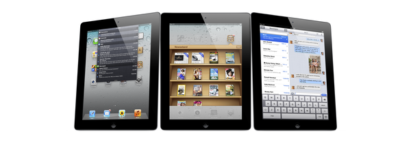
Sitting on every user’s iPad, iPhone or iPod touch when they update to iOS 5 is a new “app” called Newsstand which organises all of your magazine and newspaper subscriptions in one place. Whilst this might sound pretty underwhelming at first, it is actually a fairly significant feature addition that actually contains a lot of ‘behind-the-scenes’ changes to how iOS devices and the App Store deals with magazines and newspapers.

I called it in “app” in quotes because visually it looks no more than an iOS folder with a new skin that turns it into something that looks like iBooks with its cedar bookshelves. In fact all it does is store all your magazines and newspapers so that they can be found in a centralised location, as well as give users a shortcut to the Newsstand section of the App Store.

Jump the break to read our overview of Newsstand and how it’s much more than just a pretty iOS folder.
Read more


Facebook Releases Official iPad App, New Mobile Website

After months of speculation, Facebook released today the first version of its official iPad application, available for free on the App Store. The version available today looks fairly similar to the leaked app posted by TechCrunch earlier this year: there is a navigation sidebar on the left side of the screen to search, open your Facebook profile, check out the News Feed, Messages, Events, Friends and more. An upper toolbar gives you access to friend requests, messages and notifications, whilst Chat has been integrated in a right hand vertical panel. Judging from a first test, it appears what we wrote back in July still holds true for the final Facebook iPad app:

Facebook for iPad uses a concept not too dissimilar from Twitter’s iPad app — rather than displaying all content vertically, the app heavily relies on horizontal navigation to access various Facebook sections, the news feed, chats, liked posts, and so forth. For instance, a sidebar on the left contains tabs below your main profile to open your News Feed, Messages, Events, Places, Friends, and Photos. In the same sidebar, there are links to jump to the groups you’re subscribed to — it almost appears as Facebook wants to put the focus on Groups as much as Google gave Circles, its friend-organization tool, a huge role in Google+. There are two top bars in the middle panel: one has buttons to upload photos from your iPad’s camera and library, the other two are associated with a regular status update and check-ins. In the blue toolbar, the app has a series of additional icons to open the friend requests panel, messages, and notifications — this looks very similar to Facebook on the desktop, and the design is very distant from Facebook’s implementation on the iPhone. There is also a search function in the app, though it’s been placed at the top of the sidebar, rather than the toolbar.

We’ll have a more detailed look at Facebook’s iPad client as we get to play with it in the next few hours. Another prominent feature of today’s Facebook’s releases is app discovery and integration with mobile browsers – basically what used to be called Project Spartan in the weeks leading up to the iPad app’s release. The Facebook app now allows users to tap on links shared on the News Feed by specific apps, like Words with Friends, and if the app is already installed on the device and recognized by Facebook, it’ll launch it. If the app isn’t installed but available on the App Store, Facebook will forward the link to the App Store; if no App Store version is available, Facebook will try to load a new HTML5 version as part of a partnership with several developers to bring Facebook apps to mobile browsers. Previously, many Facebook apps had to be written in Flash to run on Facebook’s website, and this limitation made them incompatible with Apple’s devices and Safari browser, which don’t support Flash. AllThingsD shares more information on this new web initiative from Facebook:

The combined native and Web app experience is only available on iOS for now. On Android and other phones with Web browsers, users will default to the Web experience. Facebook CTO Bret Taylor told AllThingsD today that Facebook is also working on an update to its native Android application.

On the downside, there’s one place Facebook wasn’t able to negotiate a consistent experience for users: payments. This was a major sticking point in ongoing discussions with Apple, as I’d written last week. Facebook Credits can’t be used to pay for virtual goods within in native iOS apps or mobile Web apps running within a Facebook app on iOS. Instead, users will have to buy separate in-app currency through Apple’s own in-app payment system.

Facebook notes that there are some missing features from its iPad client such as the ticker, a recently launched interface to access your friends’ recent activity from a sidebar on Facebook’s website. Facebook says the ticker couldn’t be implemented on the iPad due to time constraints and limited real screen estate. For this first release, Facebook is putting the focus on photos, available in high-res thanks to the iPad’s screen, games and simplified navigation, which allows you to switch between posts, friends updates and messages with a few taps through the iPad’s interface.

The new Facebook mobile interface is also live through Safari on iOS; the mobile website has received several updates detailed in this blog post, and it borrows heavily from UI elements of the iPad app released today, with a toolbar for friend requests, messages and notifications, and “bookmarks” on the left to search, open your profile, pages, News Feed, and so forth.

With the new Requests dialog for mobile, users can invite their friends to your app. Friends can receive requests anywhere that your app is supported. For example, if a user plays a move in a game on Facebook.com, their friend can respond from her iPhone. As with bookmarks, users will tap the notification and land directly on the mobile version of your app, whether it is a native iOS app or a mobile web app.

Navigation on the new mobile website has been dramatically improved with this update – switching between sections doesn’t reload the entire webpage and it makes for a faster, more pleasant mobile browsing experience. An obvious advantage of the native Facebook apps remains camera access and chat, which the mobile web version still can’t provide through Safari and other mobile browsers.

You can find Facebook for iPad here, and check out Facebook’s new mobile web view at m.facebook.com.

Update: I’ve been playing with the Facebook iPad app, and I’m fairly impressed with how the final version turned out to be – clearly, the app that leaked this summer was a development build that wasn’t ready for primetime. The News Feed design is clean and simple, but unfortunately it’s also the only section that lagged a bit in performances on my iPad 2 with iOS 5: the News Feed’s scrolling isn’t terribly smooth, certainly not as fluid as scrolling through a user’s profile, the Messages window or a Facebook page. I assume Facebook will make changes in the next few weeks to make the News Feed as smooth as possible. Another thing I didn’t particularly like is the Settings window, which isn’t iPad optimized and looks strange on the big screen.

But everything else is quite impressive in this first iPad app. You can have chat conversations with multiple contacts as you’d normally do, and keep the conversations going either by using the Chat sidebar or the unified Messages view. When a contact pings you in Chat, Facebook brings him/her at the top of the list so you can easily respond; unlike Facebook.com, chats aren’t displayed as open “tabs” along the bottom – they’re listed at the top of the Chat sidebar and you can go back and forth between them by tapping on them.

It appears Facebook has given much importance to gestures in this iPad release: you can swipe to open the left sidebar (the one that displays Search, Favorites, Apps and Pages) and swipe to navigate back to previous screens. For instance, you can open your profile from the News Feed, check out something on your profile, then swipe back to the News Feed. Animations are quite fast and responsive. Profiles’ design is extremely simple, with tabs on the left to access the Wall, Info screen, Photos and Friends. These last two items are presented with a typical iPad grid interface, and you can pinch to open photos (or swipe to navigate between them in full-screen). You can add a new friend from the Profile view or, if you’re already friends with someone, tap on the action button in the upper right corner to Send a Message, Chat, Poke and Unfriend. While on a friend’s profile, you can obviously like and comment on posts too, and the buttons to perform such actions have been moved into a single + icon next to each post.

The most visible interface elements of the new Facebook app are the sidebar and toolbar. The upper toolbar, just like Facebook’s website, contains buttons to see Friend requests, messages and notifications. While the updated Facebook mobile website had to recreate Apple’s popover menus inside Mobile Safari, Facebook for iPad features native popover menus to check out requests and notifications; Facebook developers went as far as adding popover-based interaction for posting a new status update (with options to tag friends, insert location, attach a photo or video, and control privacy settings). Popovers work nicely in offering a quick glance at what’s new in your Facebook account, and a little red badge will sit next to them for a missed notification or friend request. When you tap on a notification for someone that liked or commented on a post of yours, Facebook won’t take you to a single page for that comment thread – it’ll open a sidebar allowing you to comment back. Messages, too, when accessed from the upper toolbar won’t launch a dedicated page – they’ll enable you to reply from within the popover itself. It’s a nice touch that simplifies navigation by eliminating the need of constantly swiping through pages, and a huge advantage over the mobile website (which, as you can guess, doesn’t let you reply inside popovers like the iPad app – it’ll quickly reload a new page). Another nice addition to the Messages’ popover menu is the action button that lets you open a thread in the full Messages view, archive it, mark it as spam or unread. The main sidebar on the left, too, provides quick access to often-used Facebook sections with a few taps. Your friends, News Feed, Messages and Nearby check-ins will be listed here if you want to check them out. But the new addition in this 4.0 release is the aforementioned app discovery: apps that have been connected with your Facebook account will show up as entries in the Apps section of the sidebar. Tapping on these apps will launch them if already installed on the device, or open the App Store. Which brings me to the also-updated Facebook app for iPhone.

Facebook for iPhone has received a massive overhaul that makes the app look a bit like the iPad version and new mobile website (screenshots below). Unlike the mobile website, however, items in the top toolbar won’t open in popover menus: Facebook for iPhone loads new full-screen windows for them, and I assume it’s because popovers are native to the iPad’s SDK, not the iPhone’s. The fact that Facebook was able to implement popovers on the iPhone’s web UI clearly shows the different kind of control the web gives Facebook. However, small technical differences aside, Facebook 4.0 on the iPhone looks very similar to its web counterpart. The sidebar is the same, basic navigation concepts are the same, and apps are listed in the sidebar. And because on my iPhone I have some third-party apps that are connected to Facebook, I was able to launch them directly from the iPhone app’s new sidebar. I tapped on Instagram and Shazam, and Facebook for iPhone launched them directly. Other apps that weren’t installed forced Facebook to open the App Store link instead.

Overall, I have the feeling Facebook did something very good this time. The technologies used in the mobile website make for a better experience and unify the Facebook user interface across devices; the new iOS app is more polished, faster to navigate, and it’s got the same obvious perks like chat and camera access. The iPad app is especially easy to use thanks to gestures and the bigger screen, which makes everything more readable and “organized”. The iOS app could still use some tweaks (especially in scrolling the News Feed), but I believe version 4.0 is a huge step forward for Facebook, and the mobile interface is a platform we should keep an eye on in the next months.

Find a gallery of screenshots below.

Read more


The (Big) Numbers Apple Touted At Their iPhone Event

At yesterday’s iPhone event, Tim Cook took to the stage and as he has done at previous events, he gave the audience an overview of Apple’s business. He ran through various statistics of how the iPhone, iPad, Mac and other aspects of Apple’s business are doing. The numbers he gave were clearly chosen very carefully to shine the best possible light on Apple and were an important premise to the first Apple keynote in which he presides as CEO. But regardless of how carefully chosen, its clear that Apple is doing exceptionally well, virtually across its entire business.

We’ve reviewed the keynote and laid out all the key statistics he showed off into each of Apple’s product categories, so make sure to jump the break to view them all.

Read more


Adobe Bringing Six New Apps to iPad In 2012

With a series of press releases issued today, Adobe has announced new software initiatives and acquisitions, including PhoneGap and Typekit. In a separate announcement, the company has formally unveiled six new Touch Apps for tablets that will be available for Android devices this November, and on the iPad next year. An iPad announcement about the release date is expected in “early 2012”, but Adobe has already confirmed this new suite of apps will work with Creative Cloud, the company’s new web hub to ” access desktop and tablet applications, find essential creative services” and share works online. Creative Cloud will come with 20 GB of storage and allow users to view, sync and share files created with desktop Creative Suite and mobile Touch Apps.

Inspired by Adobe Creative Suite software, these stunning new apps bring professional-level creativity to millions of tablet users. The apps address multiple areas of the creative process: image editing; ideation; sketching; mood boards; website and mobile app prototyping; and presenting finished work. They are headlined by Adobe Photoshop® Touch, a groundbreaking app that brings the legendary creative and image-editing power of Photoshop to tablet devices for the first time.

Available soon as standalone apps, Adobe Touch Apps are essential components of Adobe Creative Cloud, a major new company initiative also announced today (see separate release). Adobe Creative Cloud will become a worldwide hub for creativity, where millions can access desktop and tablet applications, find essential creative services, and share their best work. Files created via Adobe Touch Apps can be shared, viewed across devices or transferred into Adobe Creative Suite software for further refinement – key features of Adobe’s vision for the Creative Cloud. With stylus capabilities expected to become a key feature on some next generation tablets, Adobe Touch Apps are designed to work with both finger and stylus input.

Adobe Photoshop Touch: Core Photoshop functionalities available in a new app for tablets, with support for gestures, layered images, and Refine Edge technology.

Adobe Collage: Combine inspirational images, drawings, text and Creative Suite files into modern, conceptual mood boards. Files can be shared with Photoshop.

Adobe Debut: Quickly open Creative Suite file formats to preview designs to clients.

Adobe Ideas: Vector-based drawing tool already available on the App Store.

Adobe Kuler: Generate color schemes and browse creations by the Kuler community.

Adobe Proto Create wireframes and prototypes for websites and mobile apps on a tablet.

Links to video demos and previews are available in Adobe’s press release. Adobe says the new Touch Apps have been built on top of Carousel, the upcoming solution for storing and syncing photos across computers and mobile devices.


The Strenuous Relationship Between Apple And Facebook

It’s been known that Apple and Facebook have had a strenuous relationship over the past year and a half or so - with the debacle of iTunes Ping being the key event known to the public over which the companies clashed. Mashable has a nice scoop today that delves deeper into the rift between the two companies and how things seemed to have taken a positive turn in recent months.

According to Mashable’s sources, Apple approached Facebook over fully integrating Facebook into iOS 4 as well as making their own Facebook app — apparently “lacking confidence in Facebook’s ability to build a great application”. Disagreements arose and negotiations broke down, Apple canned most of the Facebook integration, except Ping which they didn’t fully inform Facebook of — this then led to Facebook banning Apple from the APIs soon after it launched.

Three months ago Steve Jobs supposedly visited Facebook to talk with Mark Zuckerberg about a Facebook iPad app. Jobs learnt that Facebook was working with HP to release a native webOS app and according to Mashable’s sources, Jobs was furious about it. Zuckerberg tried to appease Jobs by pulling the app, but Jon Rubenstien of HP’s webOS division refused. Nonetheless the app wasn’t perfect when released and was restricted because Facebook pulled certain APIs, just as it had done with Ping in the previous year.

Was Facebook playing both sides? Absolutely, says a source close to HP. Facebook was made aware of the application and device integrations. The company knew what was coming, changed its tune right before release — and only did so to appease Apple. For its part, HP was furious. It had hoped the Facebook application would help differentiate the TouchPad from other tablets on the market.

Since then it appears Facebook and Apple have mended their relationship. As reported earlier this week from MG Siegler of TechCrunch, Apple and Facebook have been working together on a Facebook iPad app and on an HTML5 web app platform (Project Spartan) and could well be sharing the stage at Tuesday’s iPhone event to launch the products. Just as Siegler mentioned, Mashable notes that this collaboration seems to stem from the fact that they both share a common enemy: Google.

Be sure to jump over to Mashable and read their full article, they mention other interesting snippets of information and do a great job of putting together the juicy jigsaw puzzle that is the Facebook and Apple relationship.

[Via Mashable]


Reuters: Brazil’s $12 Billion iPad Deal Is “In Doubt”

Reuters: Brazil’s $12 Billion iPad Deal Is “In Doubt”

According to Reuters, Brazilian officials are claiming the $12 billion deal between Brazil and Foxconn, maker of the iPad, is “in doubt” because of a lack of an agreement on tax breaks, work conditions, and other “crazy demands” by Foxconn. It appears the talks between the local government and Foxconn have been difficult, mainly due to Brazil’s high taxes and non-skilled workers that don’t meet Foxconn’s expectations. These demands may also include priority treatment at Brazilian customs, Reuters reports.

We’re dealing with a lot of issues, like the (Taiwanese) trying to figure out how to do business in Brazil … and Brazil figuring out how to produce these complicated products,” a second government official told Reuters.

Maybe we will end up starting with something smaller.

The deal between Foxconn and Brazil was announced back in April by Brazilian’s President Dilma Roussef, with production set to begin in July. The date was then pushed back to November, and more recently Brazilian Minister of Science and Technology, Aloízio Mercadante, said that the new factory was “ready” and making iPads that would start shipping in December.

Permalink