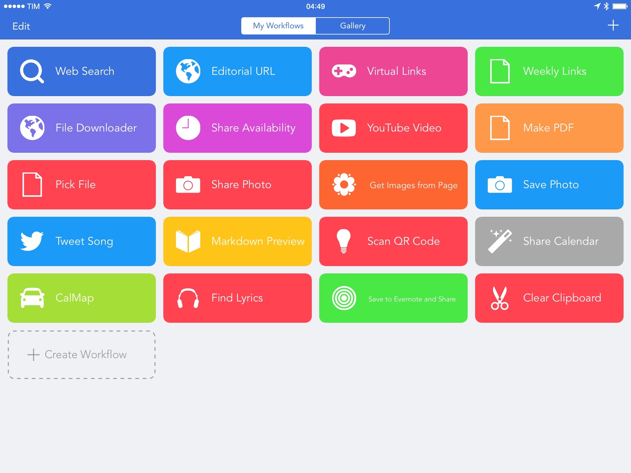
In the years I’ve spent covering iOS automation, I’ve often asked for a mobile version of Automator. Workflow, released today, tries to bring the deep system integration of Apple’s OS X utility to the iPhone and iPad, taking advantage of extensions in iOS 8 to make its automation features ubiquitous and compatible with any app.
Posts tagged with "featured"
Workflow Review: Integrated Automation for iOS 8
Twitter Clients in 2014: An Exploration of Tweetbot, Twitterrific, and Twitter for iOS
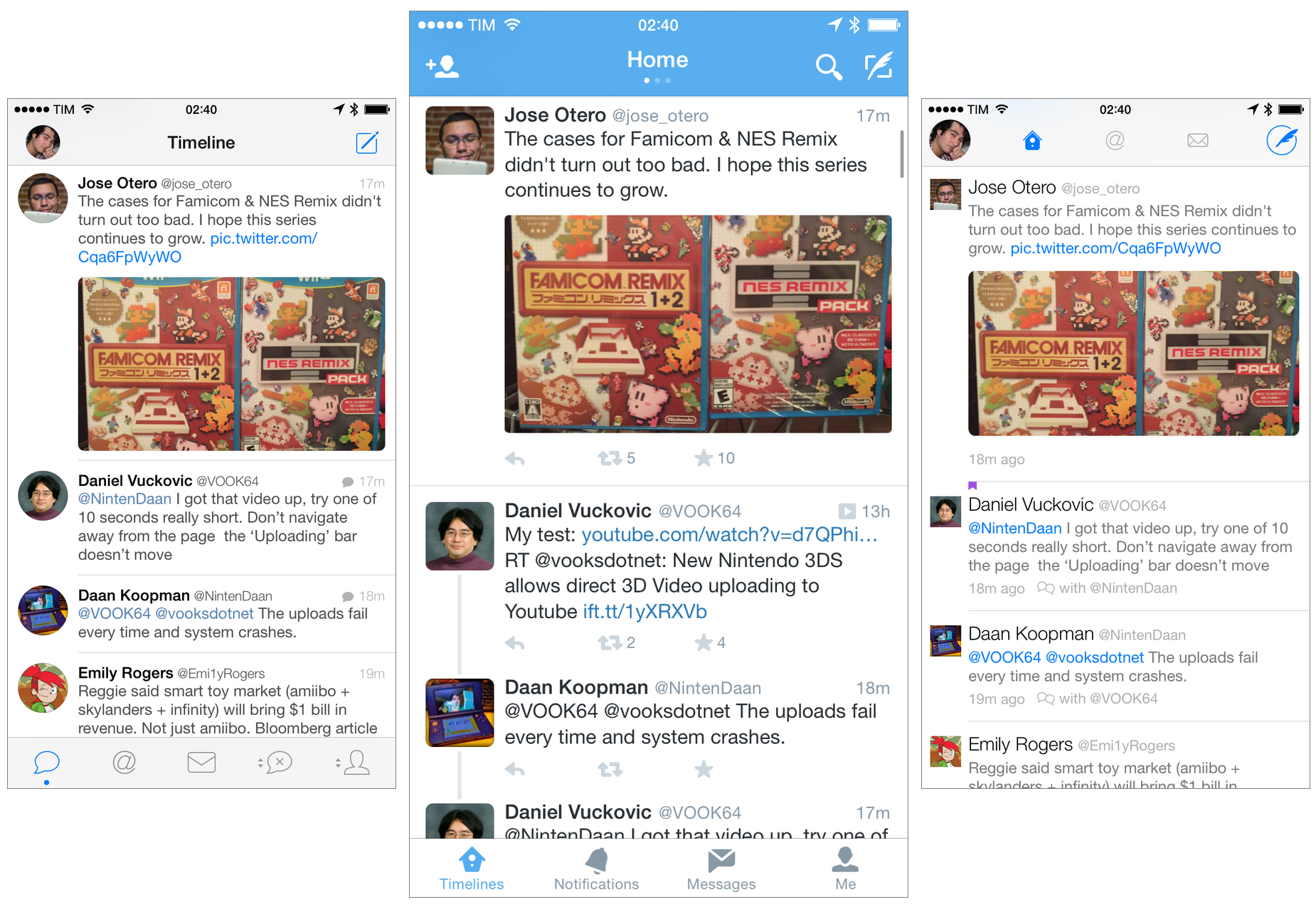
Twitter clients used to be a UI design playground. The growing popularity of Twitter, an open API, and the rapid takeoff of the App Store contributed to the creation of a defining genre of mobile software in 2009 and 2010: the Twitter client for iPhone. In the golden days of third-party Twitter apps, a good new client would come out at least every month, with several developers pitching their own ideas for what was meant to be a mobile-first communication network.
iPhone apps and the Twitter API were a perfect match five years ago. Twitter made sense as a social network in your pocket; Apple’s iPhone OS and newly launched App Store made that a reality. As a user, there was little friction in trying multiple Twitter clients: because Twitter data was always “in the cloud”, changing clients was like choosing a different outfit each day. The core Twitter experience would always be the same; the design and preferences around it would differ from client to client.
That was a time of astonishing innovation in mobile app design. Twitterrific, the first native Twitter client for iPhone, effectively invented key aspects of modern Twitter interaction and terminology; Tweetie, perhaps the most popular Twitter client of its time, pioneered touch interaction paradigms such as pull to refresh. And then there were Weet, Osfoora, Birdfeed, Twittelator, Echofon, Tweetings, TweetList, and dozens of other apps that helped refine and redefine the idea of what Twitter on an iPhone could be.
Good Twitter clients weren’t easy to create, but the challenge they packed was intriguing and flexible. As a Twitter developer, you needed to design an app that would primarily display textual information (this was before Twitter photos), handle hyperlinks, manage interactions between users, account for different network conditions, possibly integrate with third-party sharing services years before iOS 8, and, most of all, be fast, responsive, and easy to use. The constraints of Twitter clients in 2009/2010 freed many from the struggle of coming up with an original app idea.
If you’re using an iOS app[1] today, there’s a good chance some of its features or design ideas first appeared in a Twitter client five years ago.
We know how the story moved forward. In April 2010, Twitter realized that they needed an official iOS presence on the App Store, so they bought Loren Brichter’s Tweetie, relaunched it as Twitter for iPhone, and Brichter released the (unsurprisingly genius) Twitter for iPad.[2] For a while, it looked like Tweetie would live on, but then Twitter started adding questionable features to it, and it became clear that the third-party Twitter client would be persona non grata on the App Store.
Over the years, there have been countless examples of Twitter prioritizing their own app and a closed ecosystem approach over third-party developers and improvements to the API. From the infamous quadrant and token limits to the display guidelines and constant reticence about bringing new features to the API, Twitter has been nebulous in providing an official stance on third-party clients after the Tweetie acquisition, but the subtext of their announcements has always been fairly clear to everyone in the third-party scene. Twitter wanted people to use their official app, not a third-party client.
Before the Twitter acquisition in 2010, I was using a bunch of third-party clients but I had eventually elected Tweetie as my preferred one. After Brichter’s app turned into Twitter for iPhone, I stuck to it for a while, but then I was allured by Tapbots’ promise of a Twitter client for power users. As I wrote in my original review, Tweetbot had everything I was looking for, and that was before Tapbots would bring fantastic new features that made it even more versatile.
I loved Tweetbot in a way that I didn’t love any other app for iOS. I have extremely vivid and personal memories of getting the first beta builds of Tweetbot for iPhone and iPad, and, until Editorial came around, Tweetbot was the app I spent most of my days in. From 2011 until earlier this year, I used Tweetbot every working hour of every day. Tweetbot was Twitter for me.
That’s not to say that I stopped checking in on the state of other Twitter clients for iOS, but I certainly became less curious because I had found the one. I’ve primarily continued to keep an eye on Twitterrific, but I largely ignored the third-party space for two years. Last year, the launch of iOS 7 motivated me to look for new Twitter clients again and I stumbled across new versions of TweetLogix, Echofon, and Tweet7, but my affection for Tweetbot and the fact that the majority of my Internet friends were using Tapbots’ app convinced me that I didn’t have to look for anything else.
I like to think that I’m naturally curious, but, for my Twitter client of choice, I had become complacent and fixated on the belief that the official Twitter app could never offer anything valuable again. Earlier this year, an idea started poking me in the back of my mind: if the rest of the world is using the Twitter app for iOS, shouldn’t I give it another chance?
This realization came from a simple occasion: I was having dinner out with some friends, and I noticed that they were using the Twitter app for iPhone to read news and follow their favorite celebrities. Tweetbot was Twitter for me and I was certain that I could never switch to another app, but they seemed to be just fine with the official app and its lack of streaming, mute filters, quick actions, and all those other great details Tweetbot had. “They’re not power users”, I thought, and that settled it.
Still. For someone who likes to think he’s curious and writes about apps for a living, my unwillingness to at least try the app from the service I use every day was remarkable in its shortsightedness. Twitter had changed since 2011, and it wasn’t meant for power users. The rest of the world was using Twitter through the official apps and I thought that I knew better than anyone else. So, a fun experiment began:
I started using the official Twitter client as my main Twitter app on my iPhone and iPad.
For the past six months, I’ve been reevaluating my entire Twitter experience based on the apps I use to read tweets and interact with people. The idea made a lot more sense once I stepped out of my preconceptions: I wanted to understand what 2014 Twitter was like and if that meant sacrificing my nerd cred and use a Muggle’s Twitter app, so be it. But at the same time, I’ve gone back and forth between Twitter and third-party clients, primarily out of habit, but also because they still offer powerful features and design details that I appreciate.
I didn’t want to focus on the history of Twitter clients, my thoughts on Twitter’s policies, or every single Twitter app currently available for iOS 8. I also couldn’t compare every single feature or design decision for every possible scenario a Twitter client could be used in.
Instead, I attempted to address my curiosity from a utilitarian standpoint. Given the three most popular Twitter apps for iOS (Twitter, Tweetbot, and Twitterrific), I wanted to slowly evaluate their features for my use case. To do this, I assembled a list of features I need a Twitter client to be capable of handling and I started taking notes every time I switched between clients. I’ve been doing this since early June.
I’ve spent weeks comparing features and changing apps to understand the kind of experience they want to promote. But implementation details and design differences aside, I also kept wondering the same question: was the real Twitter different from the third-party clients I used for three years?
What’s 2014 Twitter like on iOS?
Read more
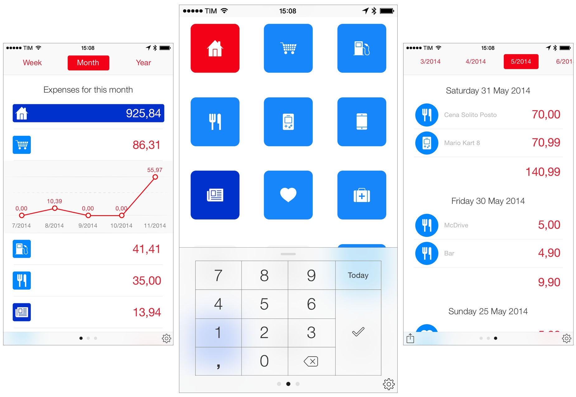
How I Track My Expenses: Next for iPhone and iPad
I was never good at managing my expenses.
It’s not that I didn’t believe in the usefulness of logging how my money was spent – I just used to be lazy and disorganized. But I only blame myself partially: in Italy, cash is still widely used, and, occasionally, smaller stores don’t even give you a receipt, which makes it harder to remember an expense later. To make things worse, I was never able to find great expense tracking software that could work with my Italian bank and credit card – all the cool apps are limited to the US, Canada, Australia, or other European countries that aren’t Italy.
Still, I should have found a way to track my expenses earlier, because growing up it became harder to tell my accountant that “I couldn’t remember” how I spent my money. This is obvious, right? I reached the tipping point last year, when my girlfriend and I moved in together and, like tasks, I completely lost track of a side of my business and financials that was too important to ignore.
Earlier this year, I set out to find a good expense tracker that would work on all my devices (iPhone, iPad, MacBook) but that wouldn’t be a “companion app” on iOS. Too many finance apps are developed for Mac first and ported to iOS as an afterthought with limited functionality, and I’m not okay with that.1
In March, I started using Next, developed by indie studio noidentity and available on the iPhone, iPad, and Mac. I’ve refrained from writing about Next not only because I like to take my time with reviews (which is usually the case), but because I believe that an expense tracker needs to fit in your daily habits and prove itself in scenarios that can’t be tested in traditional ways. How can you tell if your expense tracker works while you’re on vacation? You need to go on vacation. Does it work at IKEA while you’re in a hurry at the checkout line and you want to save your expenses quickly? Well, you need to buy some furniture first (which I did).
So I began using Next and I didn’t write about it. I’ve been using the app religiously for the past eight months: this summer, my friends made fun of my obsession with saving expenses while we were on vacation in Sardinia, but I didn’t budge. If I wanted to truly test Next, I needed to stick to it and test its flexibility over time.
Next is on my Home screen on my iPhone and iPad. I use the app every day, and I log every expense (whether it’s cash or an expense from my bank account) as soon as I can. My perspective of my spending habits has considerably changed since I started using Next, and I’m making more informed decisions thanks to the overview that this app offers and its elegant design combined with astounding ease of use.
Why I Left iCloud Reminders for Todoist
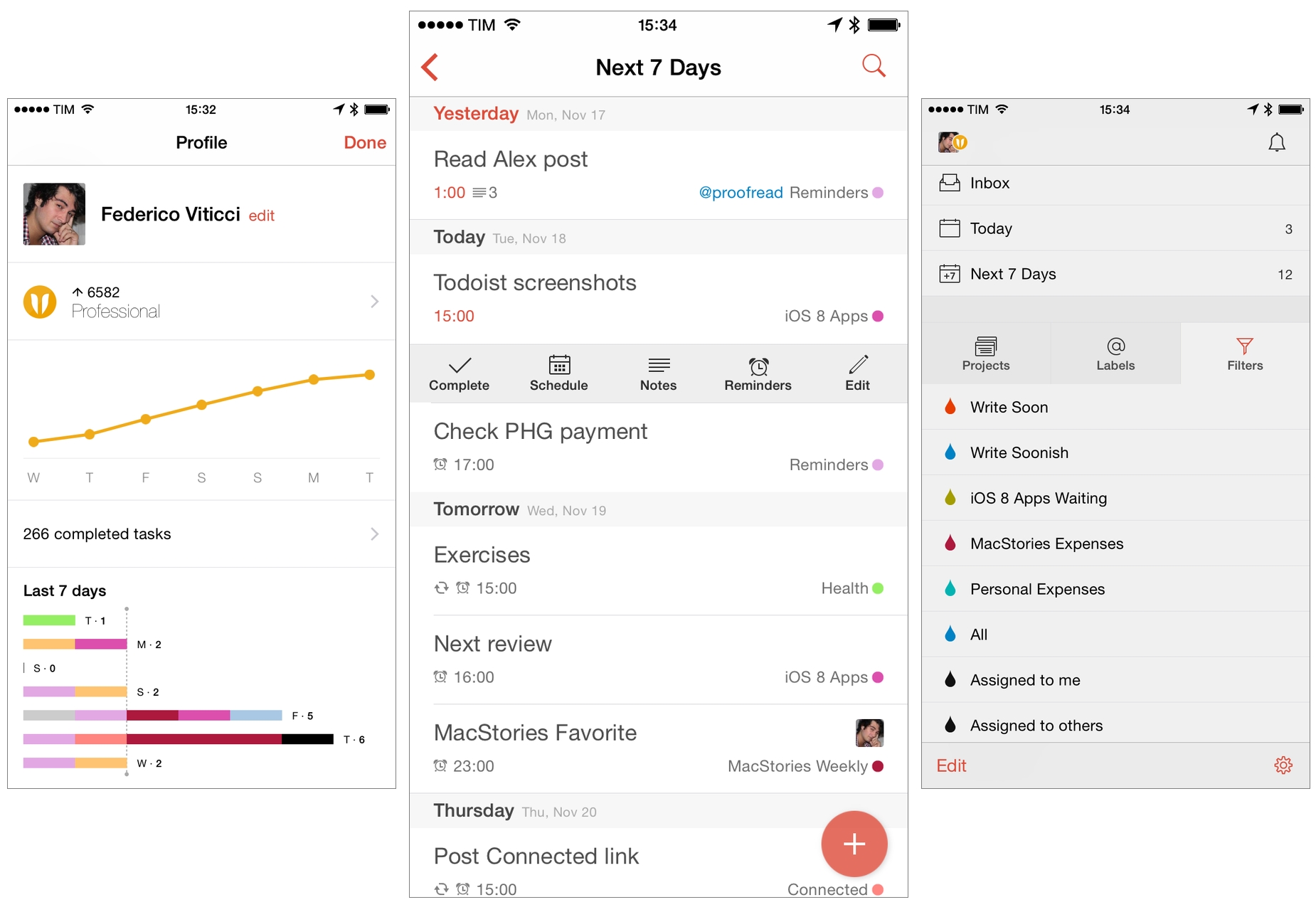
For over two years, I used Apple’s Reminders as my task management app. Contrary to expectations from Internet friends and colleagues who swore by more complex solutions, I was fine with Reminders and I didn’t need anything more.
Space Age Review

Space Age is an adventure game from Big Bucket, the indie dev studio by Matt Comi and Neven Mrgan, who previously brought us the exquisite (and addictive) The Incident in 2010.
Space Age – first teased over two years ago – joins Monument Valley in my list of best iOS games of 2014, and it is the kind of game that I believe anyone with an iOS device should play. Space Age looks great, sounds fantastic, and is filled with witty dialog that powers an intriguing story of space exploration and distant memories.
OS X Yosemite Apps I’ve Been Trying

OS X Yosemite, first announced at WWDC in June and released today by Apple, brings a major redesign of OS X and a variety of new features such as widgets, extensions, Handoff, and Continuity. While I don’t use OS X as much as I did a few years ago, I still rely on the system for tasks that I can’t complete on iOS alone.
Below, you’ll find a roundup of the third-party Yosemite apps I’ve been testing over the past couple of weeks, which should give you a good idea of the design changes and new functionalities Yosemite is bringing to OS X.
iPad Air 2 and iPad mini 3: Our Complete Overview

At a media event held earlier today in Cupertino, Apple unveiled the latest entries to the iPad family: the iPad Air 2 and the iPad mini 3. Building upon last year’s launch of the iPad Air and iPad mini with Retina display, the new iPads brings iterative improvements over the last generation, but it should be noted that, this year, Apple has drawn a clear line between the iPad mini and the full-sized iPad Air.
OS X Yosemite: Tips, Tricks, and Details

At MacStories, we believe in knowing all the little features and details of the software we use every day. We enjoy finding all the tweaks and hidden tricks that Apple ships with OS X and iOS every year, we love to round them up in a comprehensive collection. In this post, you’ll find over 60 tips, tricks, and details of OS X Yosemite that we’ve collected throughout the summer since the first beta release of Apple’s major redesign of OS X.
The release of OS X Yosemite was announced today at Apple’s media event in Cupertino, and the new OS is available now as a free upgrade on the Mac App Store. Yosemite – version 10.10 of OS X – brings a radical redesign, better integration with iOS thanks to Continuity and iCloud, and several changes to apps like Safari, Mail, and even the Finder.
We will have more articles on Yosemite today and throughout the week in our Yosemite hub on MacStories. In the meantime, you can enjoy our collection of tips and tricks to get the most out of OS X Yosemite below.
My Favorite iOS 8 Keyboards So Far

Earlier today, I shared my thoughts on custom keyboards in iOS 8 and how I’ve struggled to use a custom keyboard as my primary input method on the iPhone and iPad.
I wrote:
All these limitations can be easily overcome by setting preferences in each custom keyboard and accepting the fact that iOS will often default to the system keyboard due to privacy concerns. And that is absolutely fine: I appreciate the secure model that Apple built to protect customer data as much possible and I like that Internet access needs to be granted manually to custom keyboards.
But from a user’s perspective, this lack of deep system integration, little trade-offs, and increased friction add up over time when trying to use a general-purpose custom keyboard as your only keyboard. At least in my experience, I’ve found it easier to switch to simpler custom keyboards when I needed them rather than keyboards meant to be used all the time.
In addition to the limitations I mentioned in my article, custom keyboards have taken a while to get used to for two main reasons: performance and novelty.