It’s been an exciting week at WWDC. Despite rumors and leaks going into the keynote on Monday, the presentation was full of surprises and fulfilled many of the wishes of Mac and iOS developers and users.
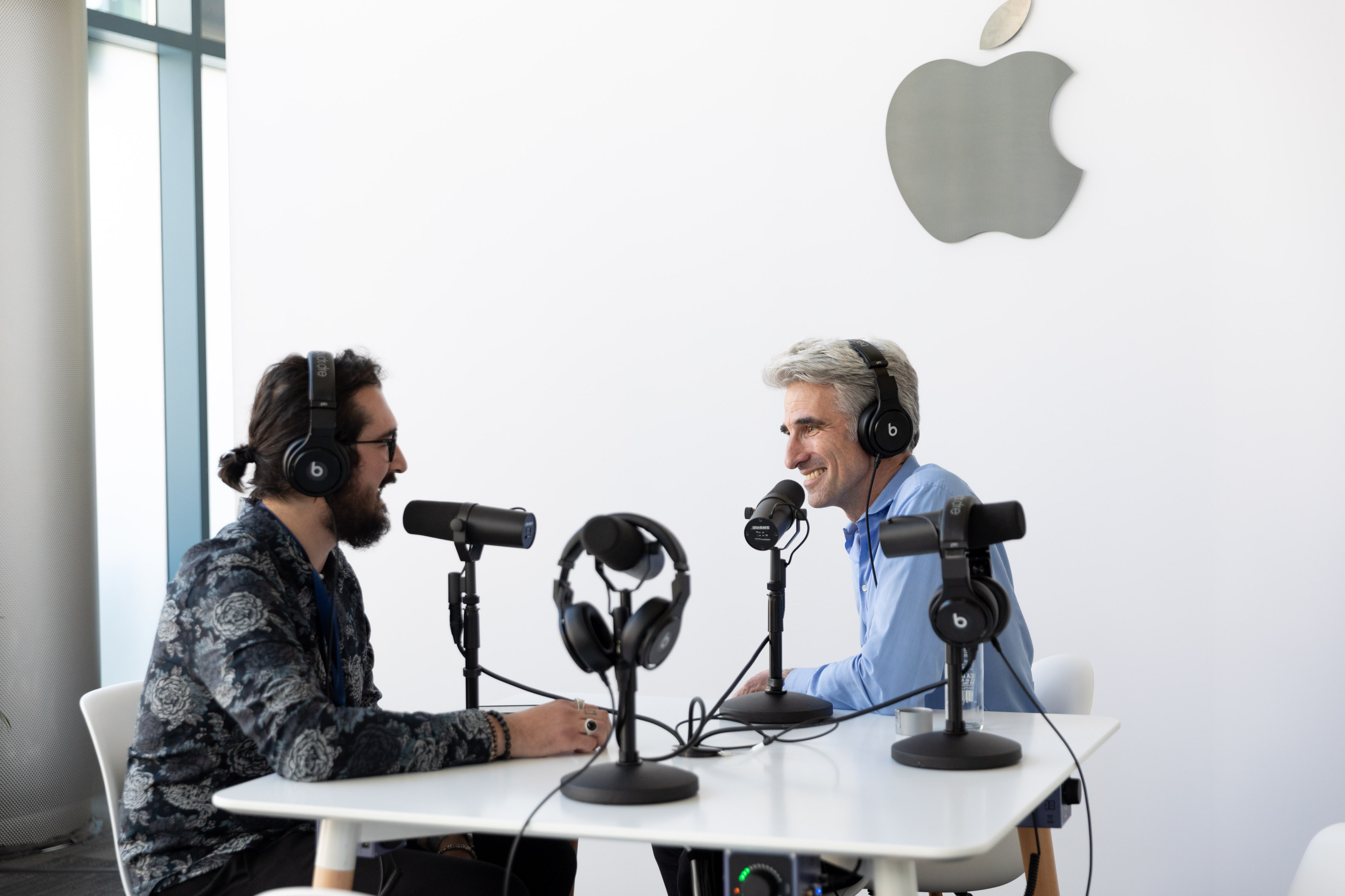
Federico and I arrived in San Jose last weekend and planned to record an episode of AppStories that would begin to sift through the huge stack of announcements made by Apple. Those plans were almost immediately cast aside when a unique opportunity presented itself.
Federico is attending WWDC this week, and Apple graciously offered to schedule a time for him to interview Craig Federighi, the company’s Senior Vice President of Software Engineering. With a WWDC packed with announcements that will affect app development for years to come, we of course agreed immediately.
When you step back from the details of what was announced in the keynote and since, I expect that WWDC 2019 will be remembered as the event when a new vision for apps on all of Apple’s platforms from a tiny Watch face to a Mac Pro driving a 32-inch Pro Display XDR began to come into focus. The tools made available to developers – like Catalyst for bringing iPad apps to the Mac, and SwiftUI, a new declarative way to build app UIs with less code – promise new efficiencies and capabilities to help developers build apps on every Apple platform. Combined with powerful new features coming to the iPad in iPadOS and an extensive Shortcuts update, there’s an opportunity for a future with deeper, pro-level iPad apps and experiences, a more diverse Mac app ecosystem, and tighter integration across Apple’s entire hardware lineup.
Against that backdrop, Federico sat down with Craig Federighi for a special episode of AppStories, one of MacStories’ growing lineup of podcasts, to explore the impact of developer tools like Catalyst and SwiftUI and the new iPadOS on the apps we use today and the apps these technologies will enable in the future.
Thank you to Apple for arranging the interview, Craig Federighi for participating, and as always, thank you for listening to AppStories. We hope you enjoy the show.
Club MacStories: Weekly and monthly newsletters via email and the web that are brimming with apps, tips, automation workflows, longform writing, early access to the MacStories Unwind podcast, periodic giveaways, and more;
Club MacStories+: Everything that Club MacStories offers, plus an active Discord community, advanced search and custom RSS features for exploring the Club’s entire back catalog, bonus columns, and dozens of app discounts;
Club Premier: All of the above and AppStories+, an extended version of our flagship podcast that’s delivered early, ad-free, and in high-bitrate audio.
iOS 13 is the latest major version of Apple’s mobile software platform, unveiled earlier today during the company’s WWDC keynote. Contrasting with last year’s iOS 12, which focused largely on performance improvements and brought fewer new features than usual, iOS 13 promises to continue the theme of strong performance while also adding a wide array of enhancements across the board. From a systemwide dark mode, updates to Shortcuts, a long-awaited redesign for Reminders, enhancements to an unprecedented number of system apps, and much more, there is a lot to take in here.
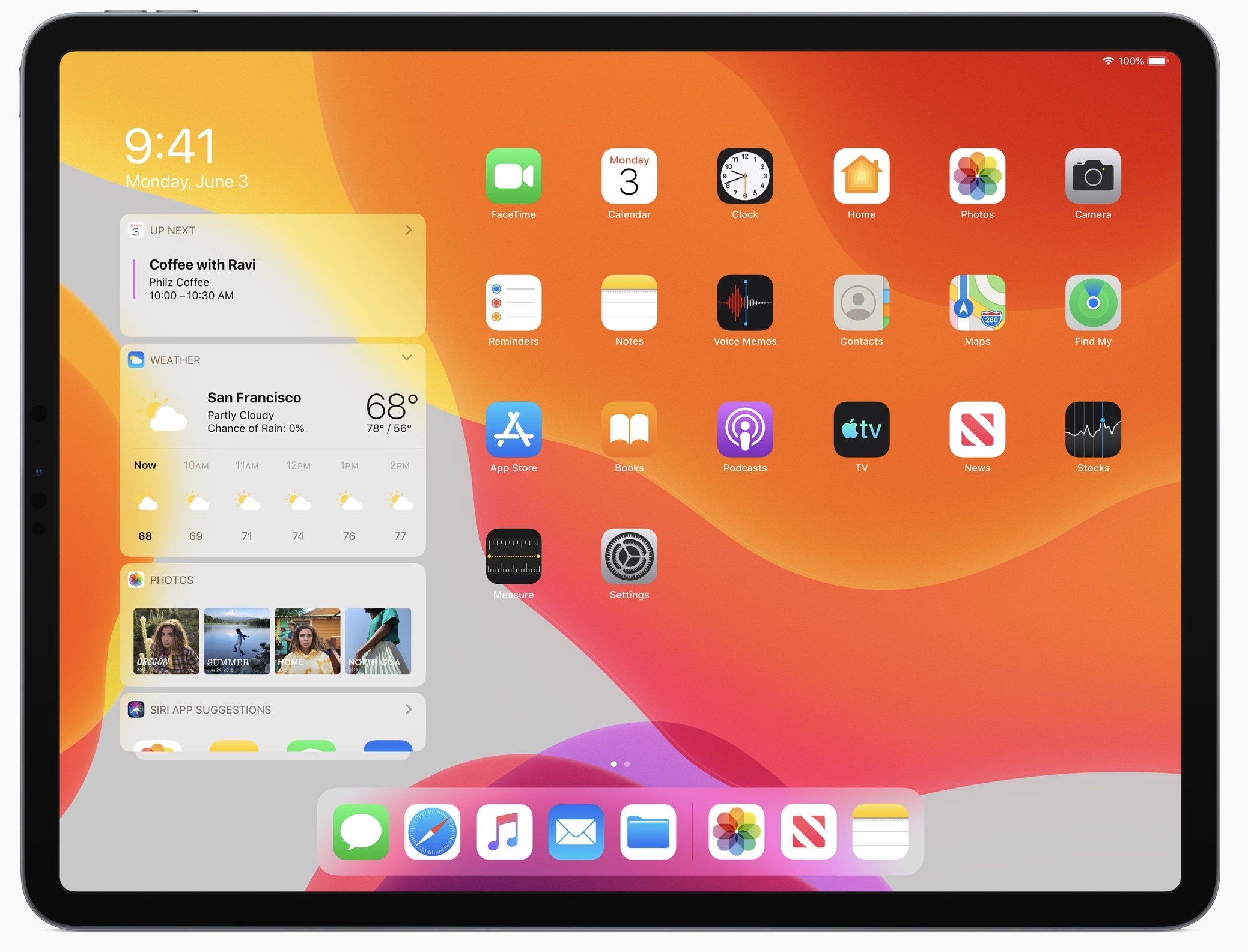
What’s not included in iOS 13 is iPad-specific updates, but that’s because Apple has split off the iPad’s version of iOS into its own dedicated software platform: iPadOS, which you can read our complete overview of here.
As for iOS 13, despite not including the variety of iPad improvements Apple has built, it remains a substantial release meant to take the mobile computing experience to a whole new level. Let’s dive in.
Club MacStories: Weekly and monthly newsletters via email and the web that are brimming with apps, tips, automation workflows, longform writing, early access to the MacStories Unwind podcast, periodic giveaways, and more;
Club MacStories+: Everything that Club MacStories offers, plus an active Discord community, advanced search and custom RSS features for exploring the Club’s entire back catalog, bonus columns, and dozens of app discounts;
Club Premier: All of the above and AppStories+, an extended version of our flagship podcast that’s delivered early, ad-free, and in high-bitrate audio.
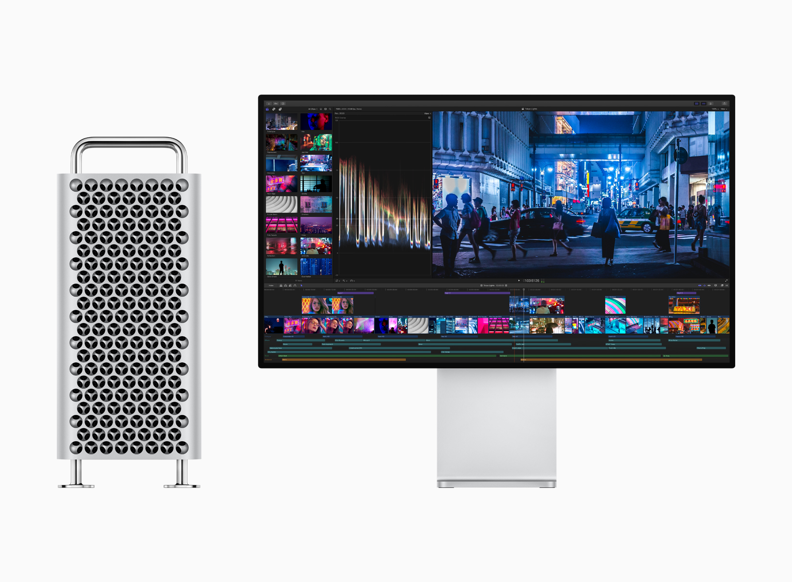
During the keynote presentation at WWDC today, Apple previewed the long-awaited Mac Pro alongside a new 32-inch pro display. Both hardware announcements are aimed at professionals in fields like video compositing, 3D rendering, photography, and audio engineering.
Mac Pro
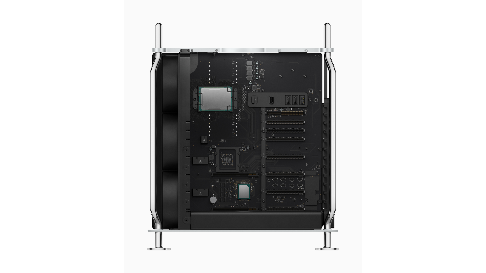
The Mac Pro is designed with performance and customization in mind. The computer’s design echoes the classic ‘cheese grater’ Mac’s shape, vent system, and handles. The frame of the Mac Pro is built from stainless steel, and the casing is aluminum. With a twist of a latch on the top of the computer, users can lift the case off using the two stainless steel handles to access internal components from all sides and install expansion cards.
The case also incorporates a lattice pattern to maximize airflow through the case. According to Apple, the three-dimensional interlocking hemisphere pattern simultaneously assists with airflow by maximizing surface area and makes the case rigid but lightweight. Optional wheels can be added to the case to make it easier to transport in a workspace.
Club MacStories: Weekly and monthly newsletters via email and the web that are brimming with apps, tips, automation workflows, longform writing, early access to the MacStories Unwind podcast, periodic giveaways, and more;
Club MacStories+: Everything that Club MacStories offers, plus an active Discord community, advanced search and custom RSS features for exploring the Club’s entire back catalog, bonus columns, and dozens of app discounts;
Club Premier: All of the above and AppStories+, an extended version of our flagship podcast that’s delivered early, ad-free, and in high-bitrate audio.
Today during the WWDC keynote, where Apple unveiled the next major version of its mobile software platform, iOS 13, the company also had a big surprise to share: iOS is now exclusive to the iPhone and iPod touch and has given birth to a new, dedicated operating system for the iPad, named iPadOS.
iPadOS includes all the existing features of iOS, including the host of updates coming in iOS 13, but adds to it a long list of enhancements that address common pain points among iPad Pro users. From an updated Home screen to multitasking improvements, Files upgrades including USB drive support, a desktop-class Safari, and much more. All of these features aim to make the iPad a more capable full-time computer than ever before.
Club MacStories: Weekly and monthly newsletters via email and the web that are brimming with apps, tips, automation workflows, longform writing, early access to the MacStories Unwind podcast, periodic giveaways, and more;
Club MacStories+: Everything that Club MacStories offers, plus an active Discord community, advanced search and custom RSS features for exploring the Club’s entire back catalog, bonus columns, and dozens of app discounts;
Club Premier: All of the above and AppStories+, an extended version of our flagship podcast that’s delivered early, ad-free, and in high-bitrate audio.
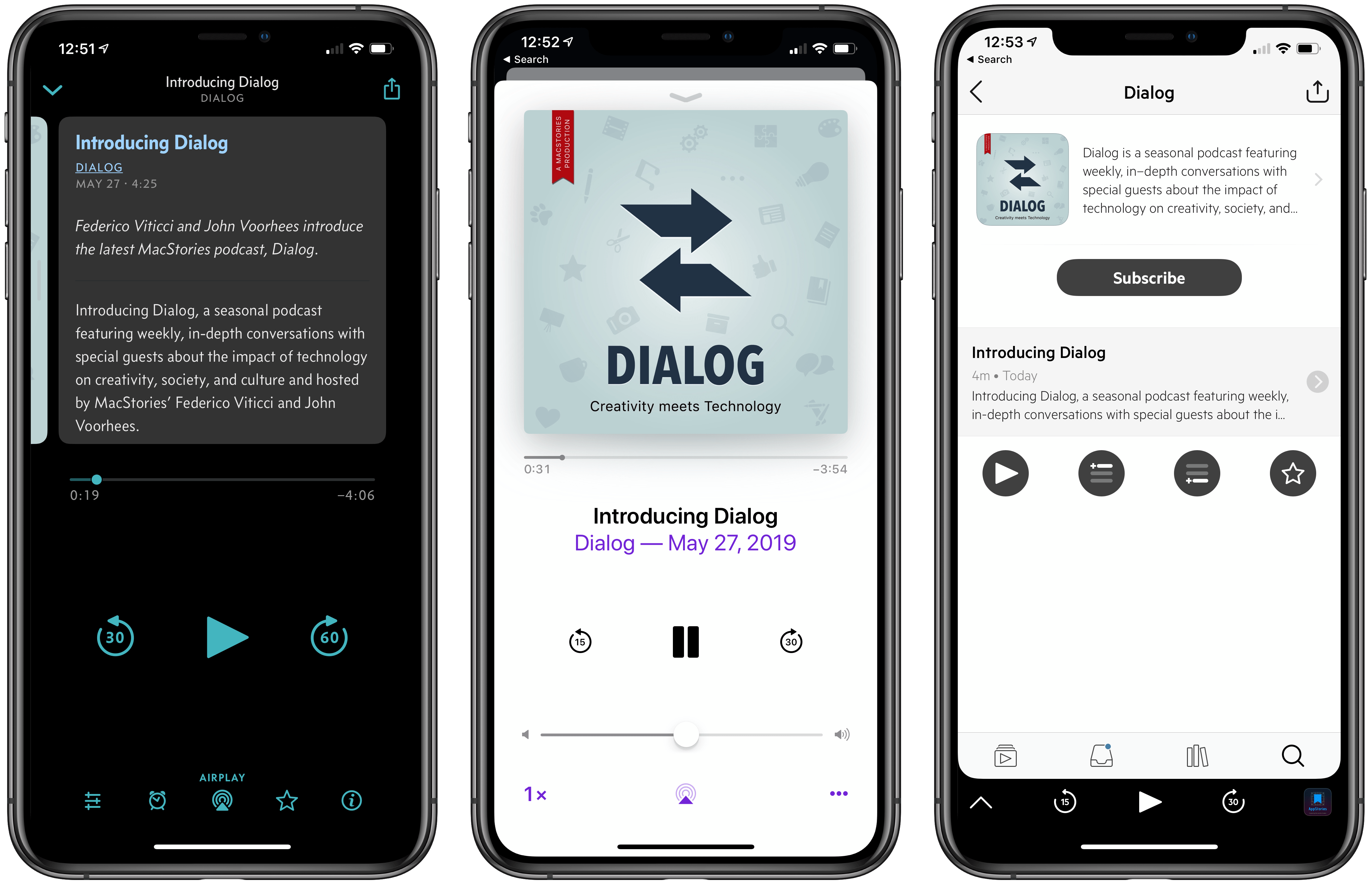
Federico and I are excited to announce a new MacStories podcast called Dialog. The show is a seasonal podcast featuring weekly, in-depth conversations with special guests about the impact of technology on creativity, society, and culture.
Each season will be organized around a central theme and include in-depth discussions with guests with expertise in the season’s topic. To kick things off, season 1 is all about writers and writing. You’ll hear from a combination of familiar and unfamiliar voices, all of whom are accomplished writers with backgrounds in journalism, songwriting, fiction, screenwriting, and more. Since we began recording episodes, it’s been fascinating to hear guests share their unique perspective on writing, the creative process, and the business of writing and discover areas of overlap between very different kinds of writing.
Seasonal Format and Future Guests
Dialog is a sort of spin-off of AppStories, our podcast about the world of apps. The interviews we’ve done on AppStories are some of the most popular episodes we’ve produced. However, over time, we realized that AppStories’ format is too constrained to do justice to many of the interviews we want to do. The self-imposed time limit of that show and its topical focus became a barrier.
That led me to sketch out the contours of what would become Dialog during our annual MacStories winter holiday break. To overcome AppStories’ constraints, I decided we needed to flip that show on its head both structurally and topically.
Structurally, Dialog’s conversations with guests are far more in-depth than we could accomplish in a 30-minute AppStories interview. Dialog’s interviews will run as long as two hours but will be split over two episodes to keep each episode to about one hour long. It’s a format that also provides headroom for Federico and me to participate more fully in each episode; less like a traditional interview and more of a conversation with our guests.
Topically, Dialog’s focus is also broader than any interview we’ve done on AppStories. Of course, you can expect Federico and me to come at each season from a tech angle, but that’s the lens through which each season will be viewed more than it is the subject matter of the seasons themselves.
Although Dialog is different than anything we’ve done before, its roots are also firmly grounded in MacStories’ character. We enjoy the apps and hardware we try every day, but what we love the most is telling the stories of the people who make those things, exploring how they empower creativity, and reflecting on their impact on the world around us. Dialog is a natural extension of our approach to technology.
The first episode of Dialog, which you can listen and subscribe to here, introduces the topics we will cover this season. Federico and I talk about our backgrounds in writing, how we got started, our approach to writing at MacStories, the business of writing online, and a lot more.
Next week, we’ll be joined for a two-part conversation by our first guest, John Gruber of Daring Fireball, who will be followed by singer-songwriter Frank Turner, and other guests throughout the summer. At the end of the season, Federico and I will wrap up what we’ve heard and learned from the writers we’ve talked to before taking a break to plan season 2.
Club MacStories: Weekly and monthly newsletters via email and the web that are brimming with apps, tips, automation workflows, longform writing, early access to the MacStories Unwind podcast, periodic giveaways, and more;
Club MacStories+: Everything that Club MacStories offers, plus an active Discord community, advanced search and custom RSS features for exploring the Club’s entire back catalog, bonus columns, and dozens of app discounts;
Club Premier: All of the above and AppStories+, an extended version of our flagship podcast that’s delivered early, ad-free, and in high-bitrate audio.
Way back in 2016, in the era of iOS 9, I laid out the tentpole features I wanted to see come to iOS and the Mac. Now, three years later, so many things from that wishlist have become a reality that it’s probably a good time to revisit the topics that haven’t yet come to pass, and plan a new wishlist for the years to come. I originally planned this list to have a Developer/User split, but it became clear that the two go hand-in-hand; if you’re doing complex things on iOS today, using the various automation apps, you are but steps away from needing the same things that developers do.
Club MacStories: Weekly and monthly newsletters via email and the web that are brimming with apps, tips, automation workflows, longform writing, early access to the MacStories Unwind podcast, periodic giveaways, and more;
Club MacStories+: Everything that Club MacStories offers, plus an active Discord community, advanced search and custom RSS features for exploring the Club’s entire back catalog, bonus columns, and dozens of app discounts;
Club Premier: All of the above and AppStories+, an extended version of our flagship podcast that’s delivered early, ad-free, and in high-bitrate audio.
For the past seven years, I’ve considered the iPad my main computer. Not my only one, and not the most powerful one I own, but the computer which I use and enjoy using the most.
I’ve told this story on various occasions before, but it’s worth mentioning for context once again. My iPad journey began in 2012 when I was undergoing cancer treatments. In the first half of the year, right after my diagnosis, I was constantly moving between hospitals to talk to different doctors and understand the best strategies for my initial round of treatments. Those chemo treatments, it turned out, often made me too tired to get any work done. I wanted to continue working for MacStories because it was a healthy distraction that kept my brain busy, but my MacBook Air was uncomfortable to carry around and I couldn’t use it in my car as it lacked a cellular connection. By contrast, the iPad was light, it featured built-in 3G, and it allowed me to stay in touch with the MacStories team from anywhere, at any time with the comfort of a large, beautiful Retina display.
The tipping point came when I had to be hospitalized for three consecutive weeks to undergo aggressive chemo treatments; in that period of time, I concluded that the extreme portability and freedom granted by the iPad had become essential for me. I started exploring the idea of using the iPad as my primary computer (see this story for more details); if anything were to ever happen to me again that prevented being at my desk in my home office, I wanted to be prepared. That meant embracing iOS, iPad apps, and a different way of working on a daily basis.
I realized when writing this story that I’ve been running MacStories from my iPad for longer than I ever ran it from a Mac. The website turned 10 last month, and I’ve managed it almost exclusively from an iPad for seven of those years. And yet, I feel like I’m still adapting to the iPad lifestyle myself – I’m still figuring out the best approaches and forcing myself to be creative in working around the limitations of iOS.
On one hand, some may see this as an indictment of Apple’s slow evolution of the iPad platform, with biennial tablet-focused iOS releases that have left long-standing issues still yet to be fixed. And they’re not wrong: I love working from my iPad, but I recognize how some aspects of its software are still severely lagging behind macOS. On the other hand, I won’t lie: I’ve always enjoyed the challenge of “figuring out the iPad” and pushing myself to be creative and productive in a more constrained environment.
In addition to discovering new apps I could cover on MacStories, rethinking how I could work on the iPad provided me with a mental framework that I likely wouldn’t have developed on a traditional desktop computer. If I was in a hospital bed and couldn’t use a Mac, that meant someone else from the MacStories team had to complete a specific, Mac-only task. In a way, the limitations of the iPad taught me the importance of delegation – a lesson I was forced into. As a result, for the first couple of years, the constrained nature of the iPad helped me be more creative and focused on my writing; before the days of Split View and drag and drop, the iPad was the ideal device to concentrate on one task at a time.
Over the following couple of years, I learned how to navigate the iPad’s limitations and started optimizing them to get more work done on the device (I was also cancer-free, which obviously helped). This is when I came across the iOS automation scene with apps such as Pythonista, Editorial, Drafts, and eventually Workflow. Those apps, despite the oft-unreliable nature of their workarounds, enabled me to push iOS and the iPad further than what Apple had perhaps envisioned for the device at the time; in hindsight, building hundreds of automations for Workflow prepared me for the bold, more powerful future of Shortcuts. Automation isn’t supposed to replace core functionality of an operating system; normally, it should be an enhancement on the side, an addition for users who seek the extra speed and flexibility it provides. Yet years ago, those automation apps were the only way to accomplish more serious work on the iPad. I’m glad I learned how to use them because, at the end of the day, they allowed me to get work done – even though it wasn’t the easiest or most obvious path.
When Apple announced the iPad Pro in 2015, it felt like a vindication of the idea that, for lots of iOS users – myself included – it was indeed possible to treat the iPad as a laptop replacement. And even though not much has changed (yet?) since 2017’s iOS 11 in terms of what the iPad Pro’s software can do, the modern iPad app ecosystem is vastly different from the early days of the iPad 3 and iOS 5, and that’s all thanks to the iPad Pro and Apple’s push for pro apps and a financially-viable App Store.
Seven years after I started (slowly) replacing my MacBook Air with an iPad, my life is different, but one principle still holds true: I never want to find myself forced to work on a computer that’s only effective at home, that can’t be held in my hands, or that can’t be customized for different setups. For this reason, the iPad Pro is the best computer for the kind of lifestyle I want.
However, the iPad is not perfect. And so in the spirit of offering one final update before WWDC and the massive release for iPad that iOS 13 will likely be, I thought I’d summarize seven years of daily iPad usage in one article that details how I work from the device and how I’d like the iPad platform to improve in the future.
In this story, I will explore four different major areas of working on the iPad using iOS 12 system features, third-party apps, and accessories. I’ll describe how I optimized each area to my needs, explain the solutions I implemented to work around the iPad’s software limitations, and argue how those workarounds shouldn’t be necessary anymore as the iPad approaches its tenth anniversary.
Consider this my iPad Manifesto, right on the cusp of WWDC. Let’s dive in.
Club MacStories: Weekly and monthly newsletters via email and the web that are brimming with apps, tips, automation workflows, longform writing, early access to the MacStories Unwind podcast, periodic giveaways, and more;
Club MacStories+: Everything that Club MacStories offers, plus an active Discord community, advanced search and custom RSS features for exploring the Club’s entire back catalog, bonus columns, and dozens of app discounts;
Club Premier: All of the above and AppStories+, an extended version of our flagship podcast that’s delivered early, ad-free, and in high-bitrate audio.
I have a long, rocky relationship with time tracking. For years I tracked my time because I had to; clients were billed by the hour. I hated the tedium of it. A big part of that was because I didn’t have access to time tracking apps. Instead, I kept track of my time in a notebook or a plain-text document. When I left that job, I celebrated, figuring that I’d left time tracking in my wake. I was very wrong.
No sooner had I started writing and podcasting full-time than I found myself tracking every minute that I work again. There was a difference this time though. I was doing it for myself to ensure I spent my time wisely; no longer was I just feeding the back-end to an invoicing system.
Time tracking helps me weigh the value of the time I spend on every project, identify inefficiencies in the way I work, and acts as an early warning system to avoid burnout. Tracking for my own benefit has made all the difference in the world, but it didn’t make keeping up with the habit any easier. For that, I needed a better set of tools than a notebook or text file.
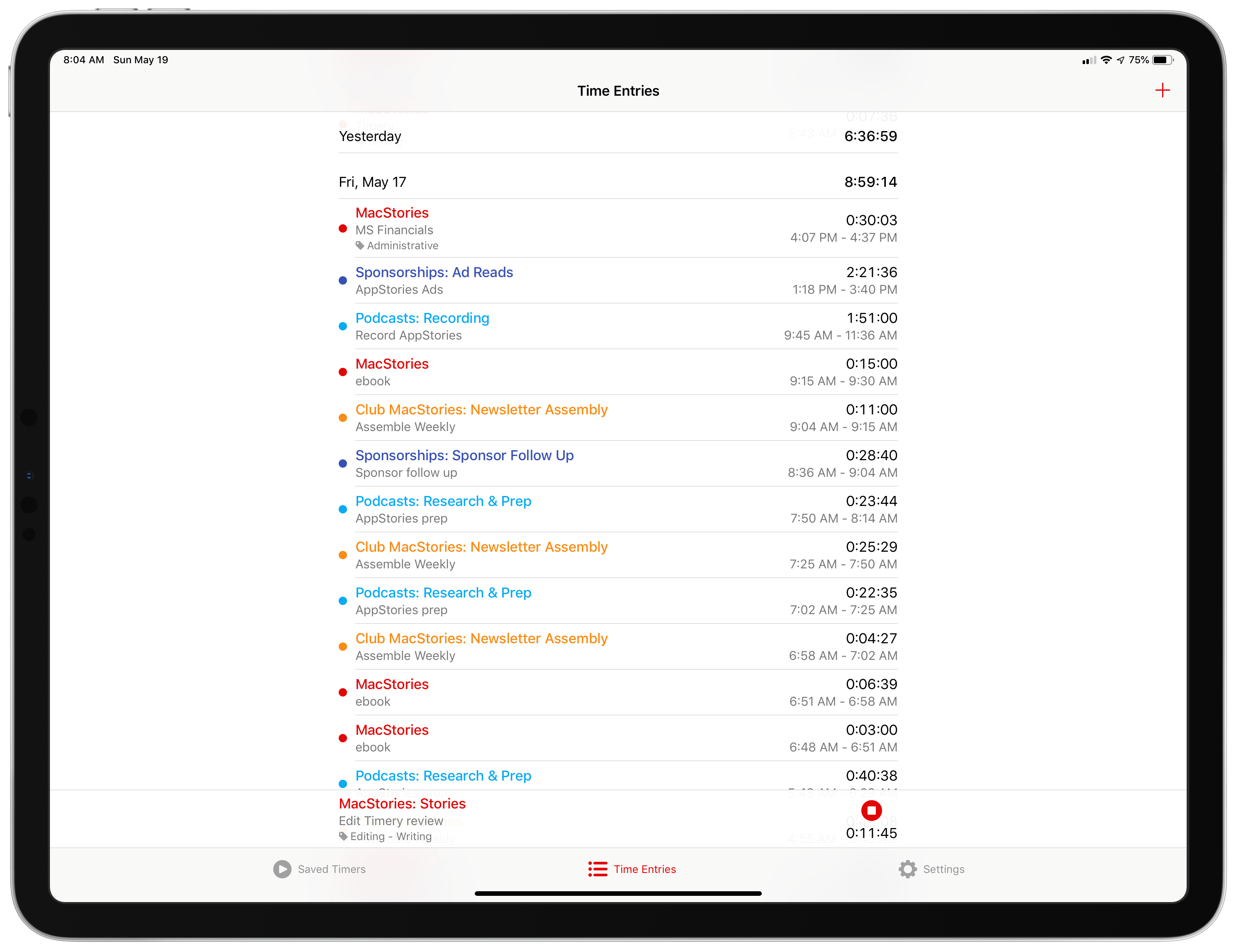
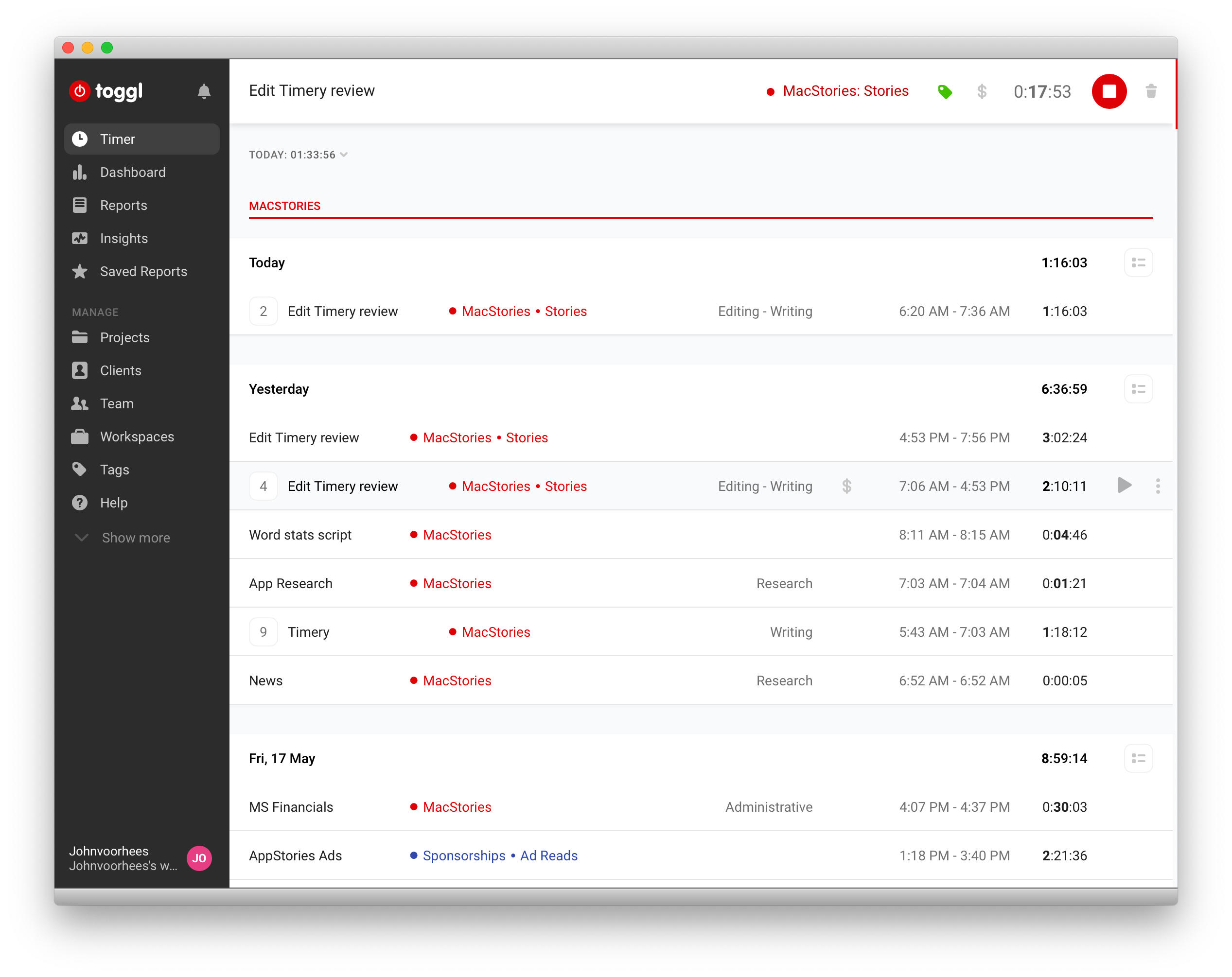
The service I decided on was Toggl, which Federico and a few other friends were already using. It’s perfect for anyone tracking their time for their own purposes because the service has a generous free tier. If you want more extensive reporting, advanced features, or project and team management though, there are paid tiers too.
I’m still using Toggl in a Fluid browser on my Mac, but since last summer, I’ve been using the beta of Joe Hribar’sTimery on iOS and loving it. In fact, Timery is so good that even when I’m at my Mac, I find myself turning to it to start and stop timers instead of the web app. There are additional features I’d like to see Timery implement, which I’ll cover below, but for flexible, frictionless time tracking, you can’t beat Timery. The app has been on my Home screen for months now and gets a workout seven days a week. Here’s why.
Club MacStories: Weekly and monthly newsletters via email and the web that are brimming with apps, tips, automation workflows, longform writing, early access to the MacStories Unwind podcast, periodic giveaways, and more;
Club MacStories+: Everything that Club MacStories offers, plus an active Discord community, advanced search and custom RSS features for exploring the Club’s entire back catalog, bonus columns, and dozens of app discounts;
Club Premier: All of the above and AppStories+, an extended version of our flagship podcast that’s delivered early, ad-free, and in high-bitrate audio.
The iPad has been a key subject at MacStories for years. In fact, it was Federico’s exploration of using the iPad as his primary computer that first led me to become a reader of the site, and subsequently an iPad-first user myself.
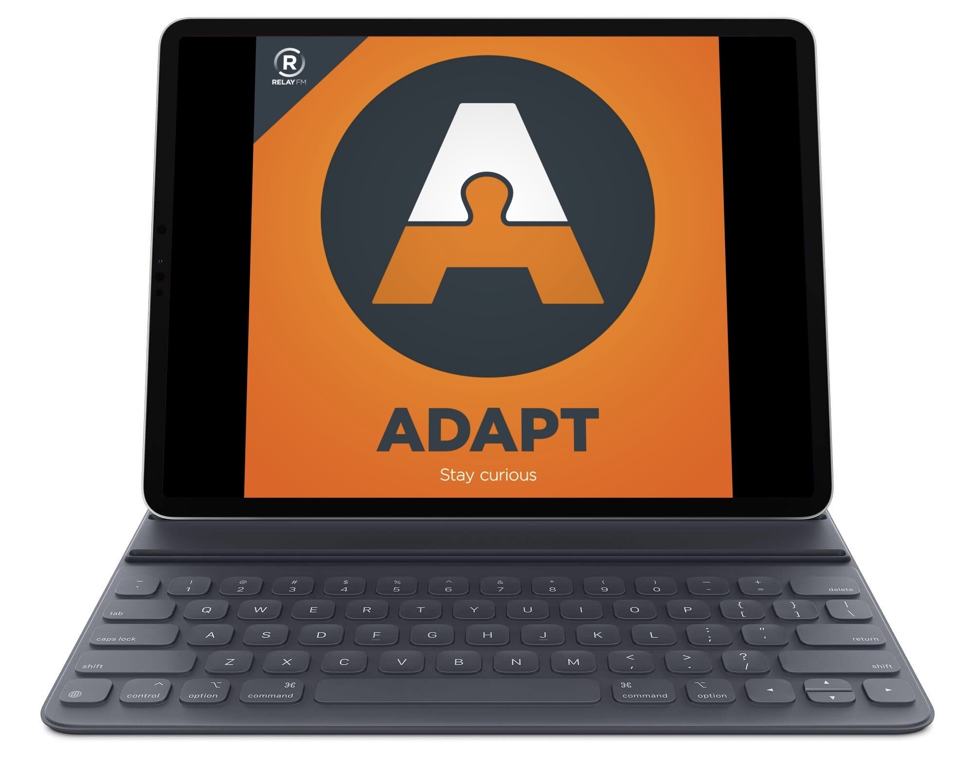
Today, I’m thrilled to introduce a new podcast on Relay FM where Federico and I get to talk about the iPad and challenge ourselves to do new things with our favorite device. The show is called Adapt, and the first episode is available now.
Adapt was born out of a love for the iPad, and a desire to continue pushing our own use of it forward. Federico formerly hosted an iPad-focused podcast with Fraser Speirs called Canvas, but since that show ended Federico and I have been dreaming up its spiritual successor, with a similar focus on the iPad but a unique new format.
Club MacStories: Weekly and monthly newsletters via email and the web that are brimming with apps, tips, automation workflows, longform writing, early access to the MacStories Unwind podcast, periodic giveaways, and more;
Club MacStories+: Everything that Club MacStories offers, plus an active Discord community, advanced search and custom RSS features for exploring the Club’s entire back catalog, bonus columns, and dozens of app discounts;
Club Premier: All of the above and AppStories+, an extended version of our flagship podcast that’s delivered early, ad-free, and in high-bitrate audio.