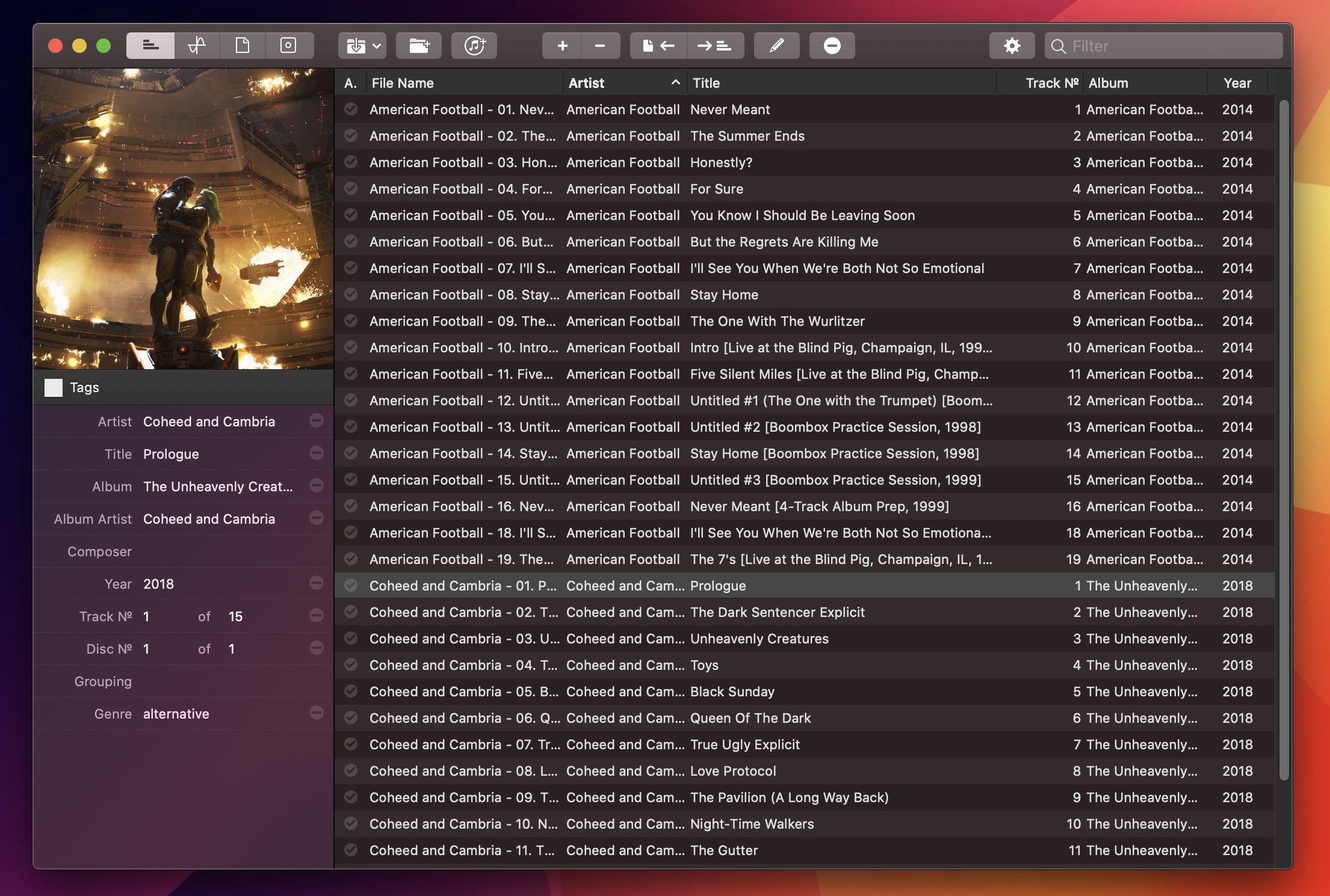
For the past year, I’ve been using a high-res Sony music player to listen to my personal music collection. I detailed the entire story in the December 2019 episode of our Club-exclusive MacStories Unplugged podcast, but in short: I still use Apple Music to stream music every day and discover new artists; however, for those times when I want to more intentionally listen to music without doing anything else, I like to sit down, put on my good Sony headphones, and try to enjoy all the sonic details of my favorite songs that wouldn’t normally be revealed by AirPods or my iPad Pro’s speakers. But this post isn’t about how I’ve been dipping my toes into the wild world of audiophiles and high-resolution music; rather, I want to highlight an excellent Mac app I’ve been using to organize and edit the metadata of the FLAC music library I’ve been assembling over the past year.
Posts tagged with "featured"
Editing FLAC Metadata with Meta for Mac
Access Extra Content and Perks
Founded in 2015, Club MacStories has delivered exclusive content every week for nearly a decade.
What started with weekly and monthly email newsletters has blossomed into a family of memberships designed for every MacStories fan.
Club MacStories: Weekly and monthly newsletters via email and the web that are brimming with apps, tips, automation workflows, longform writing, early access to the MacStories Unwind podcast, periodic giveaways, and more;
Club MacStories+: Everything that Club MacStories offers, plus an active Discord community, advanced search and custom RSS features for exploring the Club’s entire back catalog, bonus columns, and dozens of app discounts;
Club Premier: All of the above and AppStories+, an extended version of our flagship podcast that’s delivered early, ad-free, and in high-bitrate audio.
The New iPad Pro and Magic Keyboard with Trackpad: The MacStories Overview

With a press release published earlier today, Apple officially announced the fourth generation of its iPad Pro line. The new iPad Pro models – available, as with the current generation, in 11-inch and 12.9-inch flavors – feature the all-new A12Z Bionic chip, a new camera system that includes an ultra-wide camera and LiDAR scanner for augmented reality, and integration with a long-awaited accessory, which will become available starting in May: the new Magic Keyboard with trackpad.
Access Extra Content and Perks
Founded in 2015, Club MacStories has delivered exclusive content every week for nearly a decade.
What started with weekly and monthly email newsletters has blossomed into a family of memberships designed for every MacStories fan.
Club MacStories: Weekly and monthly newsletters via email and the web that are brimming with apps, tips, automation workflows, longform writing, early access to the MacStories Unwind podcast, periodic giveaways, and more;
Club MacStories+: Everything that Club MacStories offers, plus an active Discord community, advanced search and custom RSS features for exploring the Club’s entire back catalog, bonus columns, and dozens of app discounts;
Club Premier: All of the above and AppStories+, an extended version of our flagship podcast that’s delivered early, ad-free, and in high-bitrate audio.
Apple Debuts New Seasonal Colors for iPhone and iPad Cases and Apple Watch Bands

Apple has debuted a new lineup of colors today for iPhone and iPad cases, alongside a lot of new Apple Watch bands. A spring launch of new accessory designs is common practice for the company, but this year that was less than certain due to the state of the world amid a pandemic. These releases bring with them a semblance of normalcy, which I find comforting.
Access Extra Content and Perks
Founded in 2015, Club MacStories has delivered exclusive content every week for nearly a decade.
What started with weekly and monthly email newsletters has blossomed into a family of memberships designed for every MacStories fan.
Club MacStories: Weekly and monthly newsletters via email and the web that are brimming with apps, tips, automation workflows, longform writing, early access to the MacStories Unwind podcast, periodic giveaways, and more;
Club MacStories+: Everything that Club MacStories offers, plus an active Discord community, advanced search and custom RSS features for exploring the Club’s entire back catalog, bonus columns, and dozens of app discounts;
Club Premier: All of the above and AppStories+, an extended version of our flagship podcast that’s delivered early, ad-free, and in high-bitrate audio.
Apple Releases Faster MacBook Air with New Keyboard and Increased Storage Starting at $999 and Doubles Storage on Base-Model Mac minis

Apple has released a new, faster MacBook Air with an updated keyboard and more storage at a lower price. The company also released a minor update to the storage of base-model Mac minis.
According to a press release from the company, the new Air features a 1.2GHz quad-core Core i7 that, with Turbo Boost, can achieve speeds up to 3.8GHz. This is the first time the Air has included a quad-core processor. The laptop also features Intel Iris Plus Graphics, which Apple says are 80% faster than previous models.
The Air’s keyboard has been updated too with a scissor switch-based Magic Keyboard that has 1 mm of key travel and an inverted-T layout of the arrow keys.
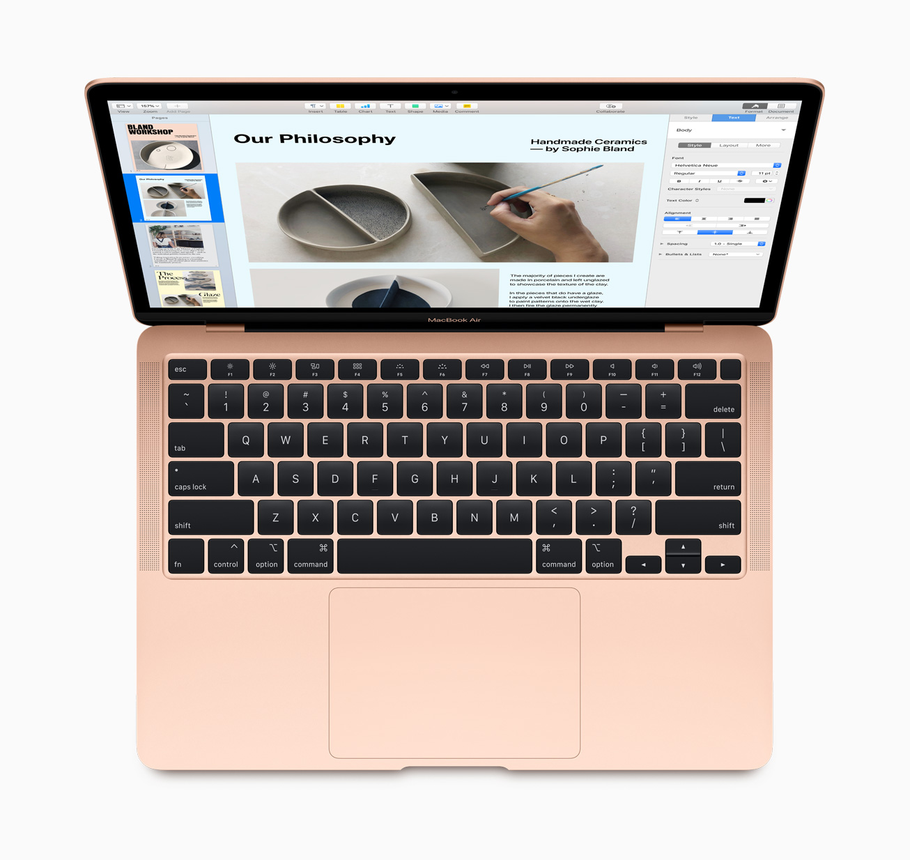
The Air, which is available in gold, silver, and space gray, starts at $999, a $100 drop from prior models. Thankfully, Apple has also increased the base storage of the entry-level model from 128GB to 256GB SSD storage, a capacity that will make it easier for users to store photos and other media locally without resorting to external solutions. The new Air can also be configured with up to 2TB of storage, which is twice as much as could be previously configured, and is equipped with Apple’s T2 Security Chip, which ensures a secure boot process and handles Touch ID information.
Apple’s press release highlights the following features too:
- A three-mic array for more clear voice capture for FaceTime calls with friends and family.
- The industry-best Force Touch trackpad for precise cursor control and multi-touch navigation.
- Thunderbolt 3 ports for data transfer, charging and video output in a single connector.
- Support for up to a 6K external display, a first for the MacBook Air.
- Advanced stereo speakers for immersive, wide stereo sound for activities like watching Apple TV+ content or playing games in Apple Arcade.
The new Airs can be ordered on apple.com starting today.
Finally, the base configurations of the Mac mini received a small update today. The $799 model now comes with 256GB of storage and the $1,099 configuration has a 512GB SSD.
The MacBook Air has been difficult to recommend because of its previous-generation keyboard. With a new keyboard, increased storage, faster CPU and graphics, all at a lower price-point, the MacBook Air looks like the Mac that will meet most people’s needs.
Access Extra Content and Perks
Founded in 2015, Club MacStories has delivered exclusive content every week for nearly a decade.
What started with weekly and monthly email newsletters has blossomed into a family of memberships designed for every MacStories fan.
Club MacStories: Weekly and monthly newsletters via email and the web that are brimming with apps, tips, automation workflows, longform writing, early access to the MacStories Unwind podcast, periodic giveaways, and more;
Club MacStories+: Everything that Club MacStories offers, plus an active Discord community, advanced search and custom RSS features for exploring the Club’s entire back catalog, bonus columns, and dozens of app discounts;
Club Premier: All of the above and AppStories+, an extended version of our flagship podcast that’s delivered early, ad-free, and in high-bitrate audio.
NetNewsWire for iOS and iPadOS Review: The Perfect Complement to the App’s macOS Counterpart
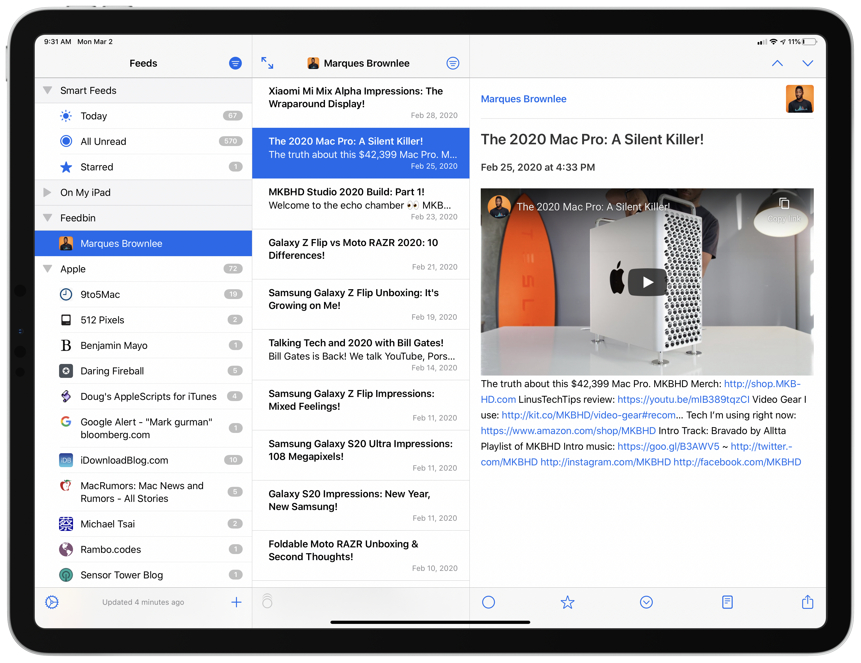
NetNewsWire, which was relaunched on the Mac last August, is now available on iOS and iPadOS. Like its Mac counterpart, the iOS and iPadOS version is built on a foundation of fast syncing and sensible, bug-free design. As with any 1.0 app, there are additional features and refinements I hope to see in future releases. Unlike most 1.0 releases, though, you won’t find lots of rough edges and bugs. NetNewsWire is ready to be your primary RSS client today.
Access Extra Content and Perks
Founded in 2015, Club MacStories has delivered exclusive content every week for nearly a decade.
What started with weekly and monthly email newsletters has blossomed into a family of memberships designed for every MacStories fan.
Club MacStories: Weekly and monthly newsletters via email and the web that are brimming with apps, tips, automation workflows, longform writing, early access to the MacStories Unwind podcast, periodic giveaways, and more;
Club MacStories+: Everything that Club MacStories offers, plus an active Discord community, advanced search and custom RSS features for exploring the Club’s entire back catalog, bonus columns, and dozens of app discounts;
Club Premier: All of the above and AppStories+, an extended version of our flagship podcast that’s delivered early, ad-free, and in high-bitrate audio.
Unread 2 Review: The Elegant RSS Client Leaps into Modernity
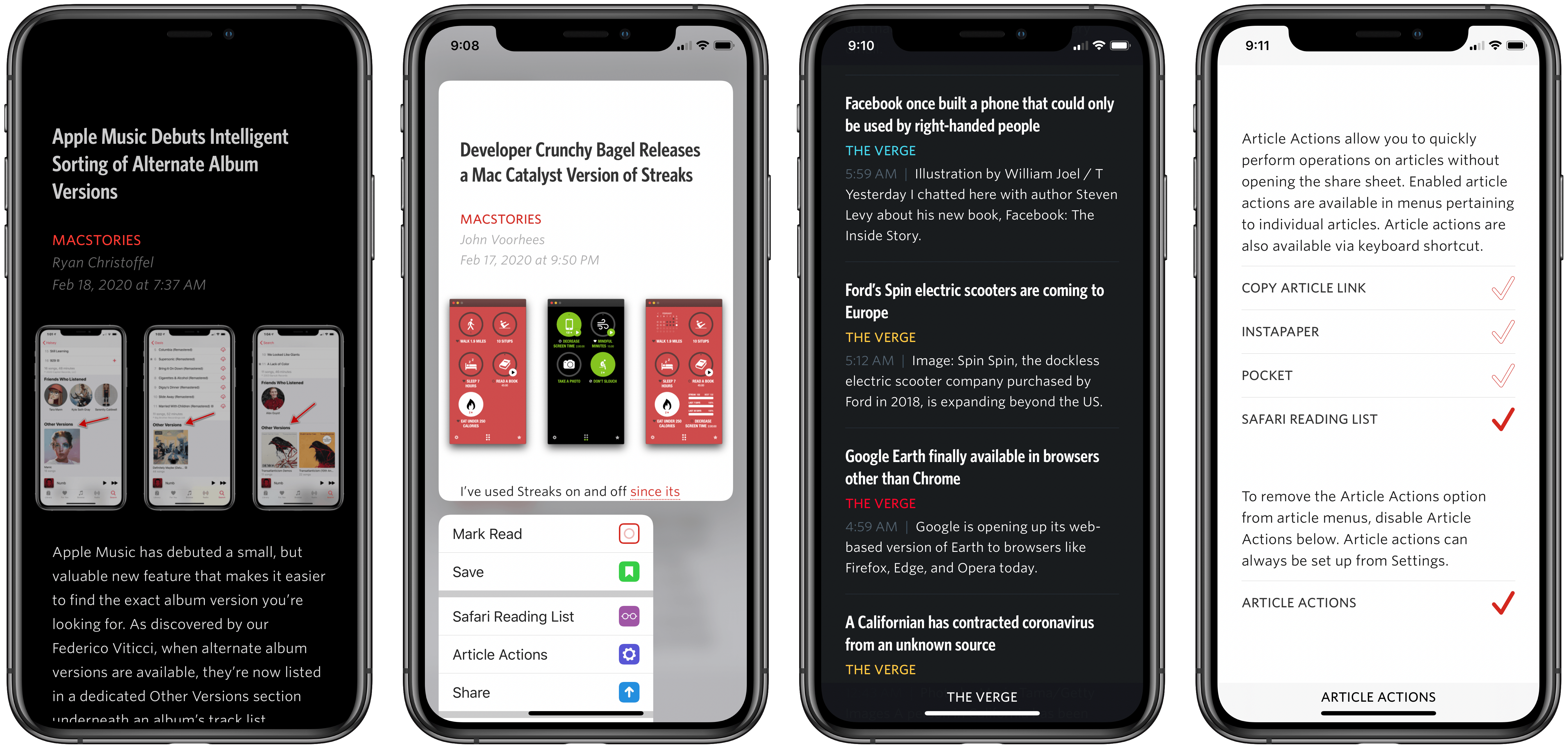
Unread has always been one of my favorite RSS clients due to its clean, elegant, gesture-based design, but as competing apps have continued advancing at a steady pace, Unread’s development stalled leading up to its acquisition in 2017 by Golden Hill Software. Since that time, the app has received new life in the form of regular updates, but nothing on the level of what’s debuting today.
Unread 2, on one hand, brings a lot of change and propels the beloved RSS client into the present. It does this, however, with almost no design changes. Unread 2 looks and feels just like Unread 1, but with more power and a roster of modern features under the hood.
If Unread wasn’t the app for you before, then version 2 almost certainly won’t change your mind. But if you already appreciated the elegant RSS reader, Unread 2 provides a lot more reasons to love it.
There are so many big and small upgrades in Unread 2, for my review I’ve chosen to break its noteworthy improvements into three different categories: RSS, iPad, and OS features.
Access Extra Content and Perks
Founded in 2015, Club MacStories has delivered exclusive content every week for nearly a decade.
What started with weekly and monthly email newsletters has blossomed into a family of memberships designed for every MacStories fan.
Club MacStories: Weekly and monthly newsletters via email and the web that are brimming with apps, tips, automation workflows, longform writing, early access to the MacStories Unwind podcast, periodic giveaways, and more;
Club MacStories+: Everything that Club MacStories offers, plus an active Discord community, advanced search and custom RSS features for exploring the Club’s entire back catalog, bonus columns, and dozens of app discounts;
Club Premier: All of the above and AppStories+, an extended version of our flagship podcast that’s delivered early, ad-free, and in high-bitrate audio.
Tot Review: Collect and Edit Bits of Text

Over the past few weeks, I’ve been on a quest to discover the best iPhone and iPad apps to collect and edit various bits of text I come across every day. The result of this research was a collection in Issue 211 of our Club-exclusive newsletter MacStories Weekly, in which I rounded up the six most interesting plain text apps I’d found browsing the App Store. Members can check out the full collection in the newsletter archive, but, for context, here’s how I led the story:
I often find myself wanting to store random bits of plain text in a document, which I don’t want to save in Apple Notes or iA Writer where my more important notes and documents live. I just want a quick way to stash random, disposable pieces of text – phone numbers, addresses, URLs, etc. – that I will discard shortly after. Inevitably, my research led me to discover a bunch of apps I wasn’t familiar with.
[…]
For the purpose of this roundup, I have excluded apps like iA Writer, 1Writer, Drafts, and other, more complex text editors that go beyond the simple act of just saving text in a scratchpad. While it is possible to use those apps for that kind of task – and I believe plenty of folks use Drafts like that – I was effectively looking for iPhone and iPad alternatives to Apple’s TextEdit for Mac.
I use Apple Notes for general-purpose note-taking, but I’ve started moving some of my videogame-related documents and notes that require heavier formatting to Noto (which Ryan reviewed here). All my writing happens in iA Writer, where I do not want to store any other plain text (Markdown) content that won’t end up either on MacStories or Club MacStories. Lately, however, I’ve found myself searching for a tool that lets me jot down (or otherwise collect from Safari or Mail) random bits of text that are important for the moment, but ephemeral, and as such not a good fit for the richness of editing tools available in Notes or Noto. You may be familiar with this problem: maybe it’s a phone number you need to keep handy for a couple minutes, or a list of three items you need to buy at the supermarket, or a URL to a webpage you need to share with a colleague. To me, using Apple Notes or Drafts for this kind of plain text content expiring soon feels excessive; I just want a scratchpad that frees my brain of the responsibility to hold this text with as little friction as possible.
Enter Tot, the latest release from The Iconfactory. At a high level, Tot is a plain text editor that lets you swipe across seven documents from a single view; each document is represented by a colored dot, and the color is also used for the document’s background to make it visually stand out from the other six. You can switch between plain text and rich text editing modes with the tap of a button; there are word and character counts above the keyboard; when you’re done editing, you can share your text as .txt or .rtf documents with other apps. On a superficial analysis, Tot may not seem that different from the plethora of lightweight Markdown or rich text editors available on the App Store. What sets The Iconfactory’s latest app apart, however, is the combination of embracing constraints and adopting system technologies with a thoughtful, balanced design. Allow me to explain.
Access Extra Content and Perks
Founded in 2015, Club MacStories has delivered exclusive content every week for nearly a decade.
What started with weekly and monthly email newsletters has blossomed into a family of memberships designed for every MacStories fan.
Club MacStories: Weekly and monthly newsletters via email and the web that are brimming with apps, tips, automation workflows, longform writing, early access to the MacStories Unwind podcast, periodic giveaways, and more;
Club MacStories+: Everything that Club MacStories offers, plus an active Discord community, advanced search and custom RSS features for exploring the Club’s entire back catalog, bonus columns, and dozens of app discounts;
Club Premier: All of the above and AppStories+, an extended version of our flagship podcast that’s delivered early, ad-free, and in high-bitrate audio.
Noto Review: Beautifully Modern and Versatile Note-Taking
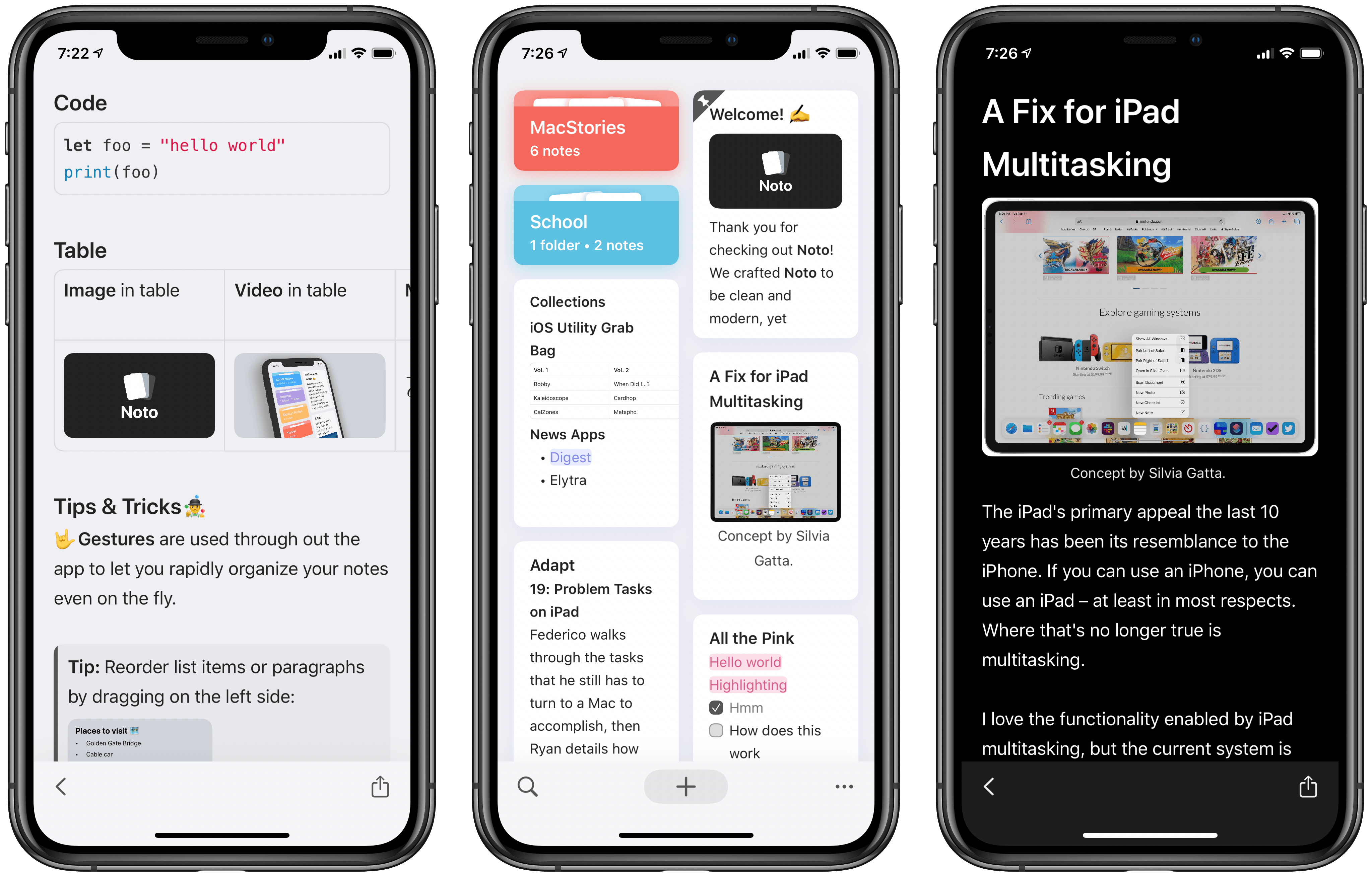
Top-tier note-taking apps don’t come along very often. For years Evernote was king, then Apple Notes gained new life in 2015, and since that time apps like Bear and Agenda have made compelling entries to the notes market. Noto, a recent debut across iPhone, iPad, and Mac, is the first new note-taker in two years that I’ve been thoroughly impressed by.
Noto reminds me a lot of Notion, but in the form of a native app rather than a web wrapper. It offers a clean, elegant design and a diverse array of tools so you can mix and match different content types inside each note. But it also integrates with key system technologies like drag and drop, multiwindow, iCloud sync, and more.
It’s these dual strengths of Noto’s modern integrations and versatile toolset that make the app compelling. A few minor drawbacks aside, it’s one of the most powerful and beautiful note-taking apps available on Apple’s platforms.
Access Extra Content and Perks
Founded in 2015, Club MacStories has delivered exclusive content every week for nearly a decade.
What started with weekly and monthly email newsletters has blossomed into a family of memberships designed for every MacStories fan.
Club MacStories: Weekly and monthly newsletters via email and the web that are brimming with apps, tips, automation workflows, longform writing, early access to the MacStories Unwind podcast, periodic giveaways, and more;
Club MacStories+: Everything that Club MacStories offers, plus an active Discord community, advanced search and custom RSS features for exploring the Club’s entire back catalog, bonus columns, and dozens of app discounts;
Club Premier: All of the above and AppStories+, an extended version of our flagship podcast that’s delivered early, ad-free, and in high-bitrate audio.
Shortcuts Rewind: Linking Tricks Using Markdown and Rich Text
Editor’s Note
Over the past several years, Federico has built hundreds of shortcuts that are sprinkled throughout the stories he’s written. Last spring we debuted the MacStories Shortcuts Archive, a one-stop destination that collects all of those shortcuts organized by topic, so readers can find them easily.
There’s no better way to learn how to build your own shortcuts than by downloading someone else’s, which is what makes the Archive such a valuable resource to readers and one of MacStories’ most popular features. Still, it can be hard to pick up best practices and patterns or other tips and tricks from experimentation and tinkering.
That’s why today we are introducing a new series on MacStories called Shortcuts Rewind to add context to the shortcuts in the Archive. Periodically throughout the year, we will pick a few shortcuts from the Archive that we think would benefit from a further explanation, whether that’s to help new Shortcuts users learn the basics, to illustrate a particular technique that can be used across multiple shortcuts, or to automate a task that you might not have thought was possible.
Tying Shortcuts Rewind together is a new graphical approach to explaining shortcuts. As you’ll see, we’ve created a system that dispenses with distracting UI elements and breaks shortcuts into logical sets of actions. The approach allows us to simultaneously provide step-by-step instructions alongside commentary that we hope will help readers achieve a deeper understanding of Shortcuts and assist them in building their own automations.
Let’s get started.
For this first installment of Rewind, I wanted to start with a trio of relatively simple shortcuts that illustrate the power of Shortcuts’ ability to streamline the transformation of one type of content into another. All three shortcuts can be found in the Text section of the Shortcuts Archive, but there are also links to them below. The foundation of this process is the Content Graph, a core part of Shortcuts dating back to its origins as Workflow. The idea is a simple but powerful one that eliminates complexity for the user, handling much of the data compatibility and conversion chores behind the scenes with little or no effort on the part of the user.
At the heart of the three shortcuts discussed below are transformations between plain text, rich text, and URLs. Thanks to the Content Graph, Shortcuts has the flexibility to create powerful text and link handling functionality.
Access Extra Content and Perks
Founded in 2015, Club MacStories has delivered exclusive content every week for nearly a decade.
What started with weekly and monthly email newsletters has blossomed into a family of memberships designed for every MacStories fan.
Club MacStories: Weekly and monthly newsletters via email and the web that are brimming with apps, tips, automation workflows, longform writing, early access to the MacStories Unwind podcast, periodic giveaways, and more;
Club MacStories+: Everything that Club MacStories offers, plus an active Discord community, advanced search and custom RSS features for exploring the Club’s entire back catalog, bonus columns, and dozens of app discounts;
Club Premier: All of the above and AppStories+, an extended version of our flagship podcast that’s delivered early, ad-free, and in high-bitrate audio.