System Features
Every year, macOS sees updates and refinements to system features, and this year is no different. As usual, there is a variety of new system-level changes in Ventura, including a replacement for System Preferences, which is now called System Settings, updates to Spotlight, new security and privacy enhancements, accessibility, and more.
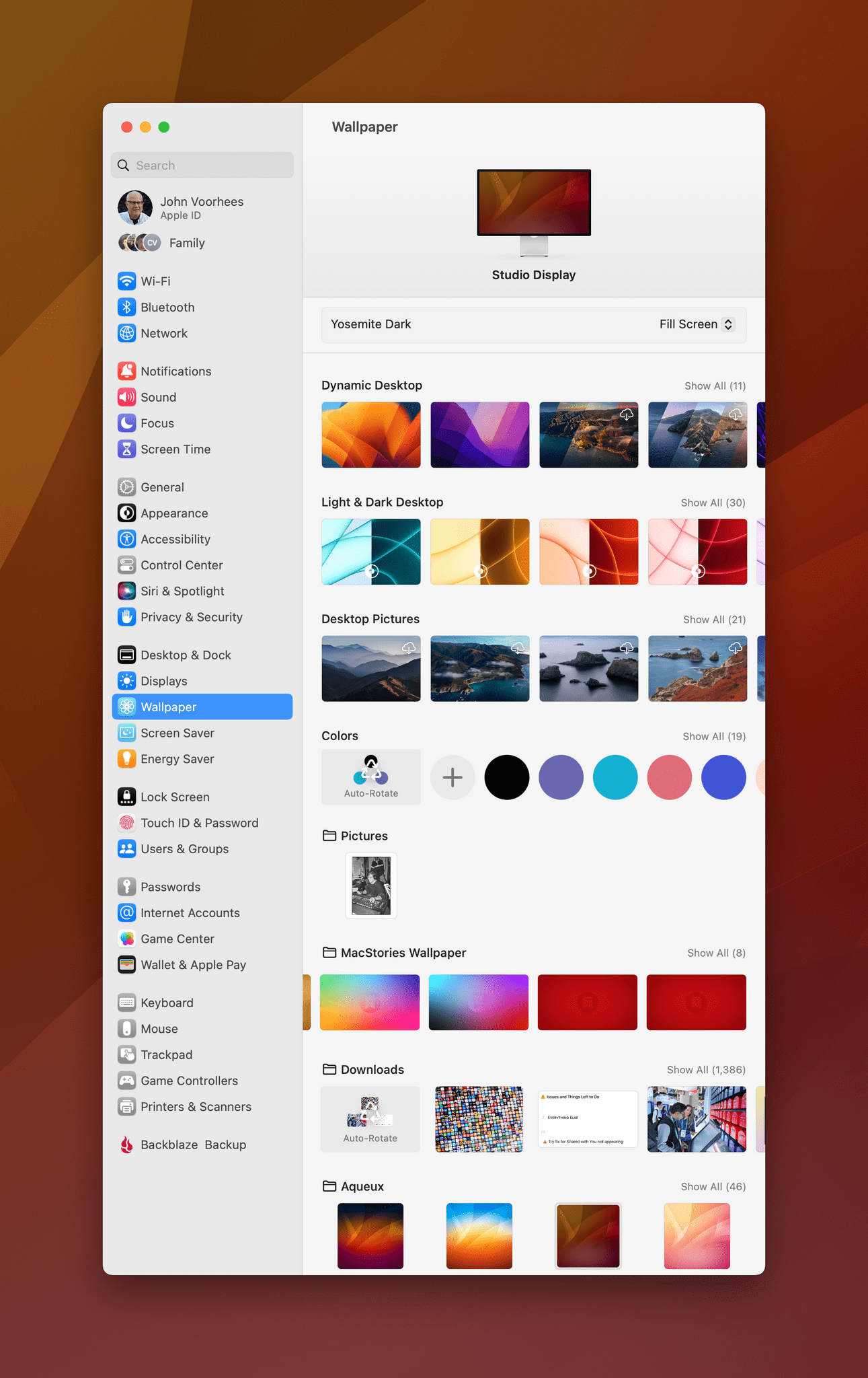
System Settings
System Preferences had to go. The destination for tweaking your Mac’s settings was showing its age and had outgrown its design. What Apple came up with is System Settings, a design that’s reminiscent of the settings app on the iPhone and iPad. And while I agree that System Preferences needed a major overhaul and that approaching the problem of settings across all of Apple’s platforms in a unified way makes sense, System Settings is not the answer. The design is confusing and buggy, and but for excellent built-in search, too hard to use.
There are a lot of layers to the problems with System Settings, and I’m not going to bore you with the minute details. Apple is clearly aware of its shortcomings. Over the course of the betas, many of the early bugs have been addressed, so I expect the list of remaining issues will continue to dwindle with subsequent updates. So, instead of cataloging bugs, let’s look at the structural problems that would remain even if visual glitches and other UI oddities were eliminated entirely.
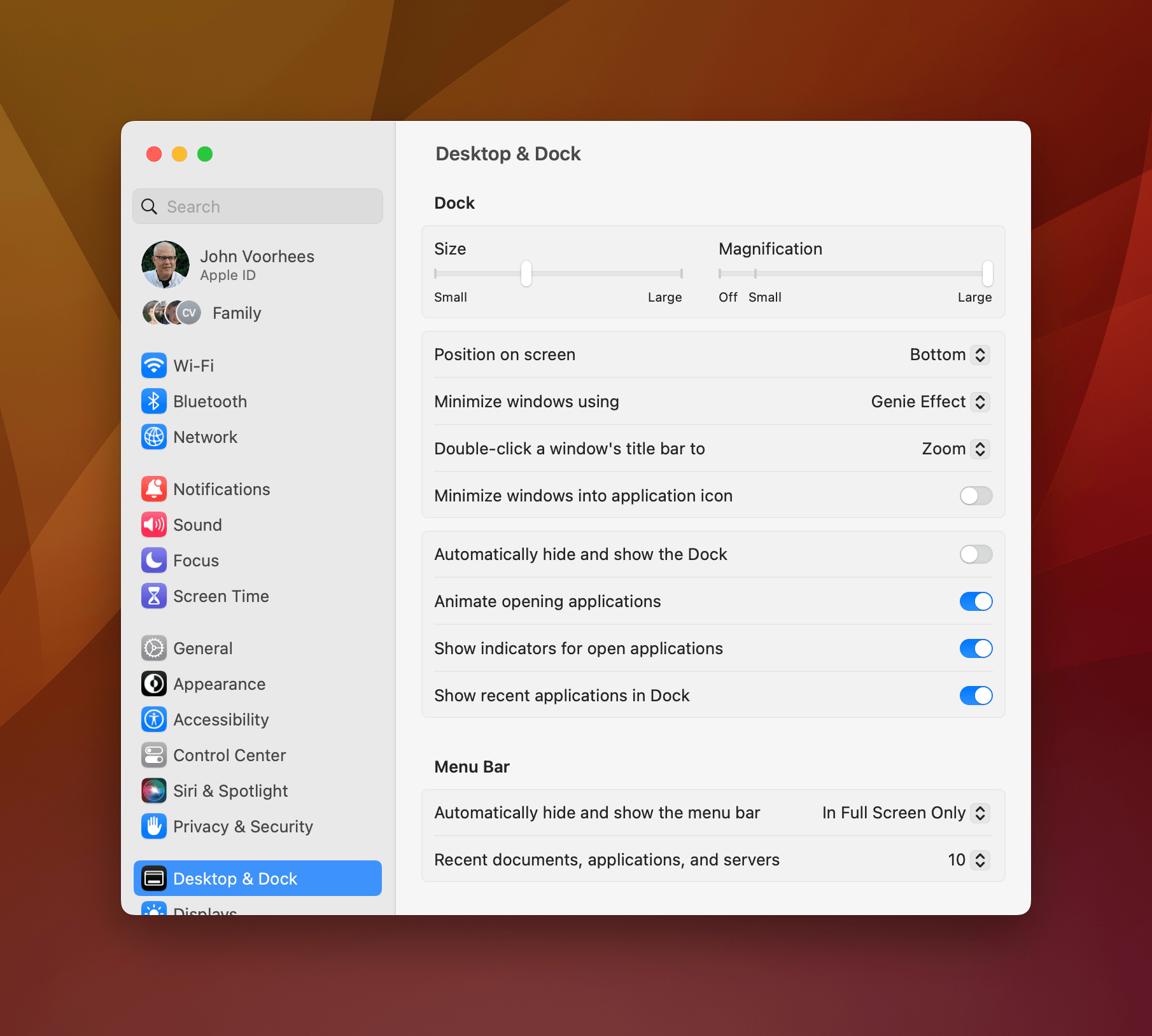
System Settings improved over the summer, but a tall narrow window that can’t be resized horizontally is hard to use.
The first problem with System Settings is that it’s based on the iOS and iPadOS Settings app, seemingly without regard to how the Mac’s settings should be handled differently. For example, one of the limitations of System Preferences is that it was a static window that couldn’t be resized. Without the ability to resize System Preferences, some of its sections required too much clicking to drill down to what you were looking for. System Settings’ solution is a window that can be expanded vertically and scrolls like the Settings app on iOS and iPadOS, but can’t be resized horizontally. The result is a window that feels pasted into the Mac’s UI directly from the iPhone, which is completely out of place on the Mac.
I understand why expanding System Settings horizontally isn’t a great option. The use of left-aligned setting descriptions and right-aligned toggles and other controls would be hard to track visually if the window was stretched out too far horizontally, but that’s a reason not to use a design that’s so closely tied to iOS and iPadOS in the first place, not an excuse to prevent standard window resizing.
The other major issue with System Settings is one it shares with the Settings app on iOS and iPadOS: the organization of the settings themselves. I’ve never thought Settings on iOS or iPadOS were well organized, so grafting that onto the Mac just extends that problem to yet another platform. I get that reorganizing Settings breaks muscle memory for users, which I’m sure Apple would prefer to avoid, but the muscle memory of System Preferences was already going to be broken with this redesign. So why not fix Settings on the iPhone and iPad too?
When I look at Settings on the iPhone and iPad, I see options organized in a way that may have made sense when they were first introduced, but with the introduction of subsequent features, they don’t anymore. That system and its confusing structure have been brought over to the Mac in the name of familiarity without applying a critical eye to why Settings is organized the way it is on iOS and iPadOS in the first place and whether that structure makes sense on the Mac.
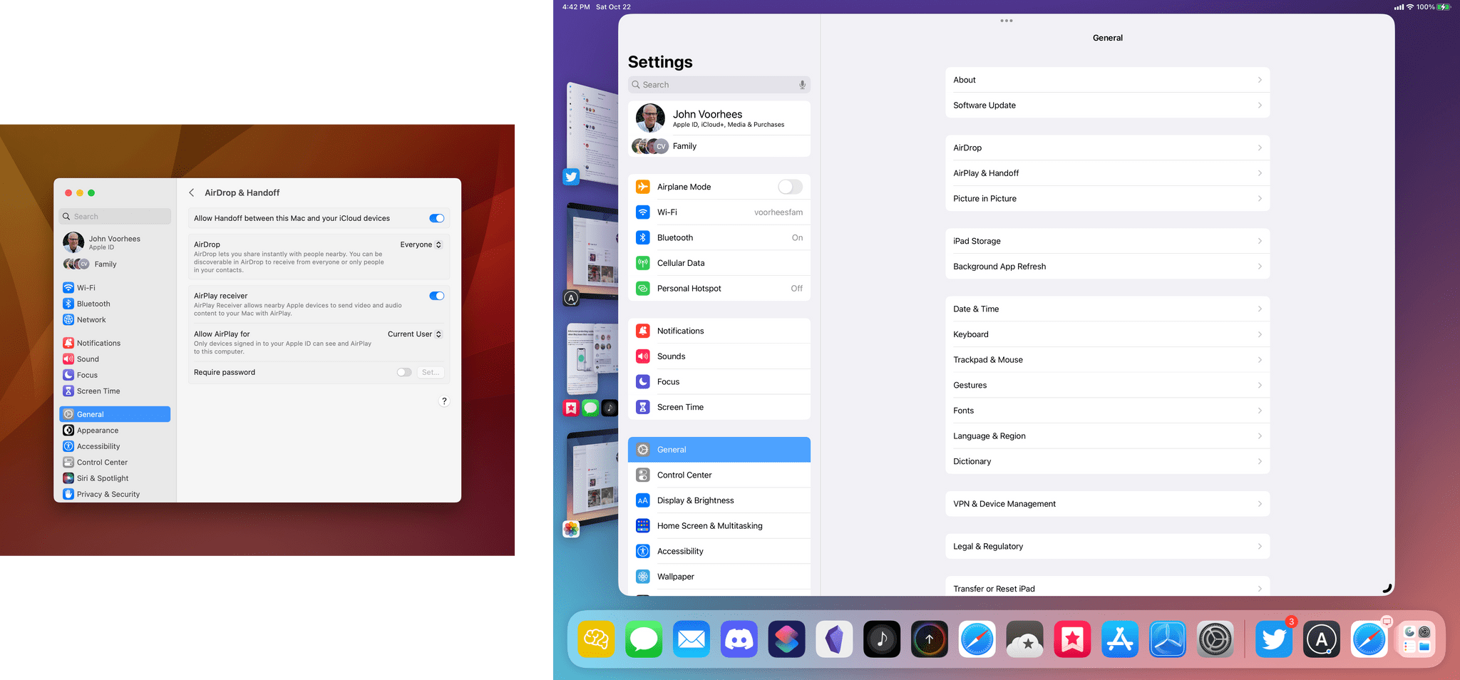
Focusing on just the first few sections of Settings on the iPad and Mac, you can see the resemblance.
If you compare Settings on an iPhone or iPad side-by-side with the Mac’s new System Settings, you can see the family resemblance. Both start with iCloud settings at the top of the sidebar, followed by connectivity settings like WiFi and Bluetooth. Next is a group that includes common settings like General, Control Center, and Accessibility, but after that, the parallels between the systems diverge, and the similarities between the settings fall apart. The result is consistency that’s consistently confusing.
Although it doesn’t excuse bad design, search works well in System Settings and is what I suggest readers turn to instead of hunting through the sidebar for the settings you need. I was already accustomed to relying on search with System Preferences, and I expect many of our readers were too, so unless and until the organization and design of System Settings receives an overhaul, that’s how I plan to use System Settings.
So, as you probably can gather, I’m not a fan of System Settings. I expect better from Apple, but by the same token, search works well, and it’s just System Settings. You’ll find yourself going to System Settings, and you’ll probably be frustrated when you can’t find what you want. However, that’s not much different than the System Preferences experience, which didn’t wreck the overall experience of using a Mac. System Settings is that same old frustration dressed up in a different design, which is disappointing.
With so many unrelated parameters that can be tweaked on all of Apple’s platforms, I recognize that settings apps are a hard design problem and applaud Apple for bringing some consistency across platforms. I don’t have the answer for how to fix the underlying organizational issues with all of its settings apps, but I hope that Apple continues to iterate on settings across all of its devices. It’s not the sexiest app around, but it’s one everybody uses, so it deserves more attention.
Spotlight
Spotlight continues to grow and evolve with each iteration of macOS into something that is far deeper than just an app launcher. I’ll admit that I don’t use Spotlight much. I was using apps like LaunchBar and Alfred before Spotlight was even available. I use Raycast now, and I don’t plan to switch to Spotlight, but I’ve started to hit F4 to activate it more often because it’s added some unique features I want to use alongside Raycast.
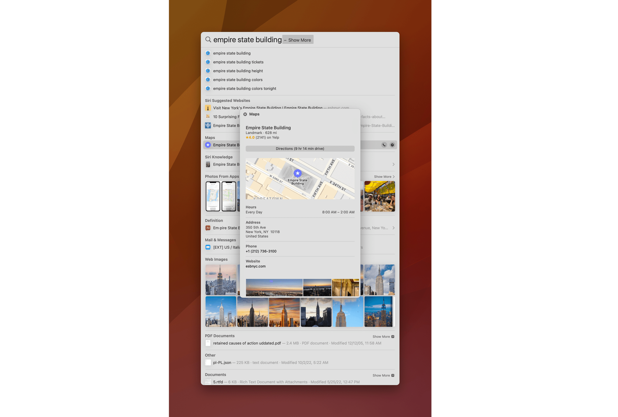
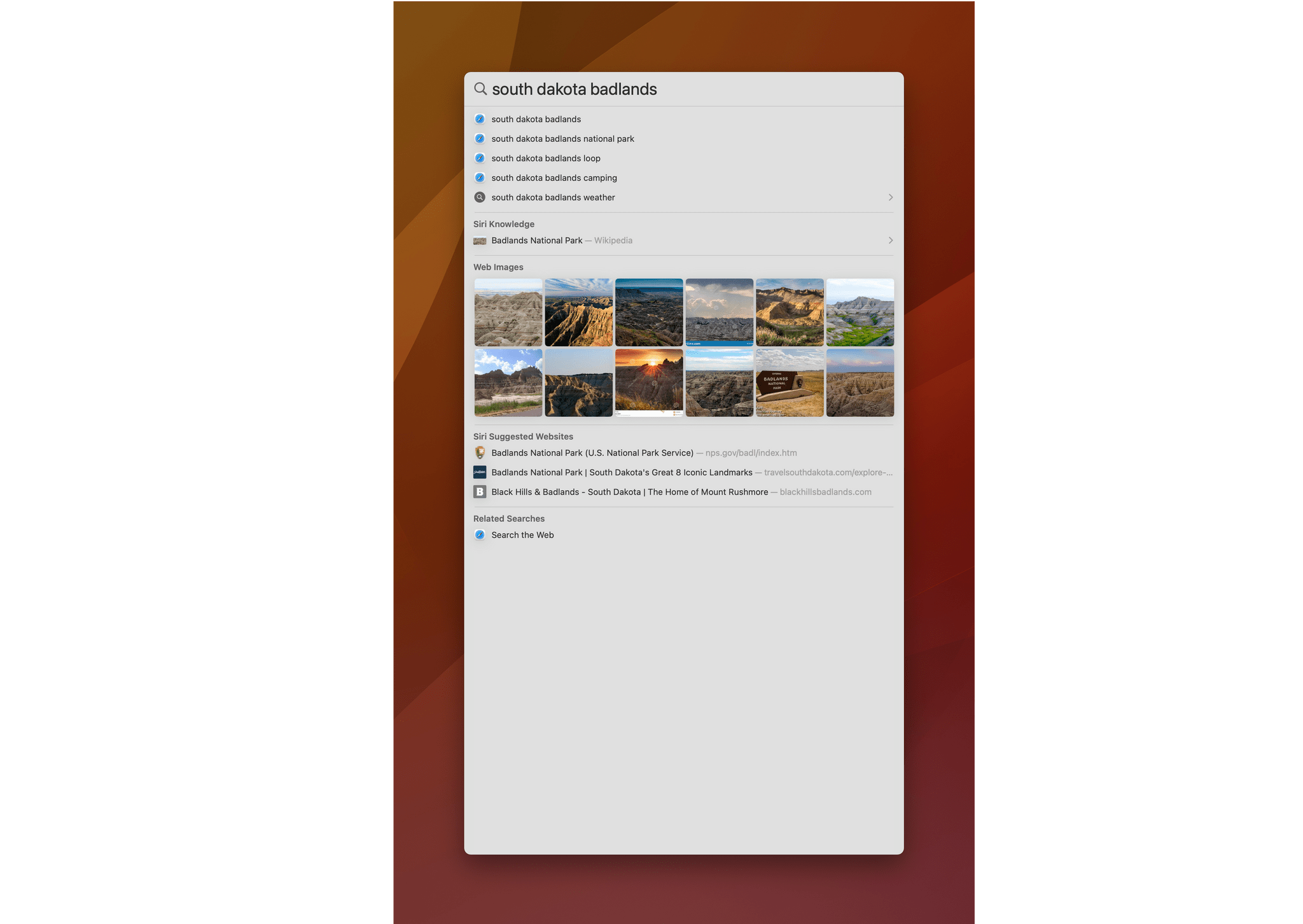
A good example is Spotlight’s image search, which takes advantage of Live Text. It’s perfect for things like receipts you may have snapped a photo of and want to find again. Quick Look is integrated into Spotlight, too, so you can navigate through your Spotlight results previewing images to find exactly what you want. For instance, a quick search for ‘Parcel’ immediately found more than a dozen screenshots in Finder and Photos with the word ‘Parcel’ somewhere in the image. Of course, along with those image results, Spotlight found the app, its website, several email messages about the app’s TestFlight betas, and Mac App Store results, along with other suggested websites and the definition of the word.
The other new feature of Spotlight that is promising but isn’t working to the extent originally announced is Spotlight’s quick actions. Type the name of a shortcut into the Spotlight text field, select it, hit Return, and the shortcut will run. Quick actions can also be used to enable or disable Focus modes and start a timer by searching for ‘Clock.’ However, Apple has also said quick actions can be used to recognize songs with Shazam, which doesn’t work for me.
Based on the interface for invoking Focus modes and timers, quick actions appear to be the Mac equivalent of App Shortcuts on iOS and iPadOS. Both use Shortcuts iconography and UI elements in the case of timers. However, this is the only evidence of App Shortcuts in Ventura. As I discussed in the Shortcuts section, App Shortcuts aren’t available from Shortcuts’ sidebar, and none of the App Shortcuts I’ve tried from third-party developers with universal apps work in Ventura. Quick actions give me some hope that App Shortcuts will make it to the Mac eventually, but for now, they’re not available in Shortcuts, and there’s not a lot that can be accomplished with Spotlight quick actions.
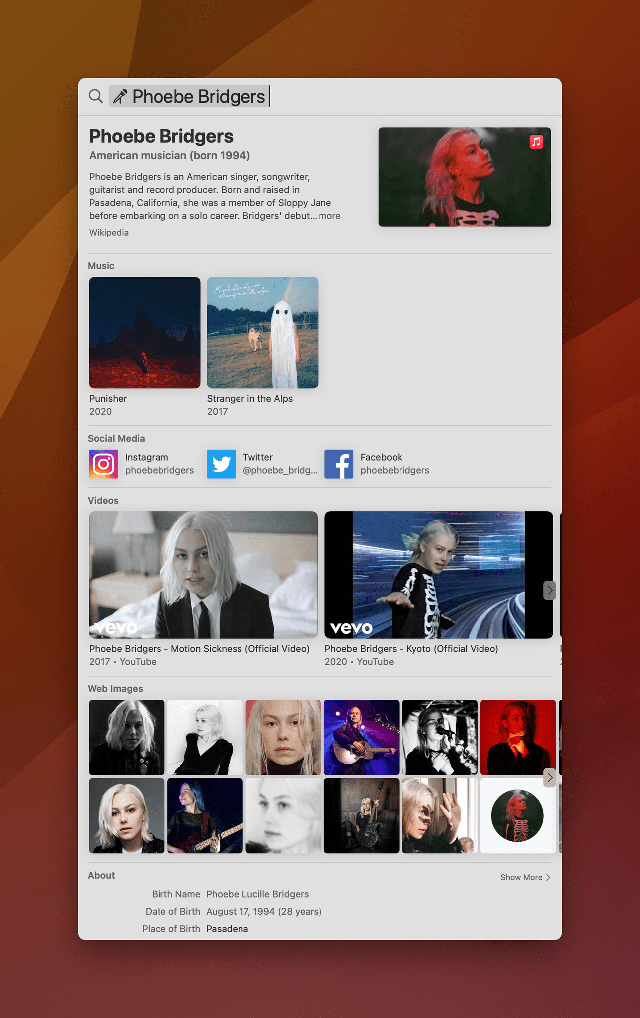
Spotlight has been redesigned this year to more closely resemble the versions found in iOS and iPadOS, a nice touch to make transitioning between platforms easier. Spotlight has also gained rich search results for certain search terms. Apple is leveraging its deep library of metadata for media, plus Maps data, the web, and local data to create rich results for musicians, TV shows, movies, actors, sports teams, businesses, and contacts. The information that each category returns varies, but it’s a rich collection of images, videos, scores for sports teams, discographies for music artists, social accounts, and services where media can be accessed.
For Spotlight users, the changes in Ventura are all excellent evolutions of the tool, but what intrigues me the most is quick actions, the least developed of Spotlight’s new features. The ability to trigger what are effectively App Shortcuts on iOS and iPadOS from the Mac’s keyboard has an enormous amount of potential.
I’d love to see quick actions extended to third-party apps too. Imagine controlling your task manager, calendar app, or text editor via Spotlight keyboard commands. Some actions could be useful system-wide, like displaying today’s calendar appointments, but I’d love to see a scoped version of Spotlight adopted inside individual apps. If you’ve ever used an app like Obsidian, Agenda, or the latest iteration of Spark, you’ll know what I’m talking about. Instead of having to memorize dozens of keyboard shortcuts, a hotkey combination summons a text field similar to Spotlight’s for dynamically searching for available commands. Standardizing that interaction model across apps using a Spotlight API available to third-party developers would make Spotlight much more relevant in today’s productivity app environment.
Everything Else
Focus
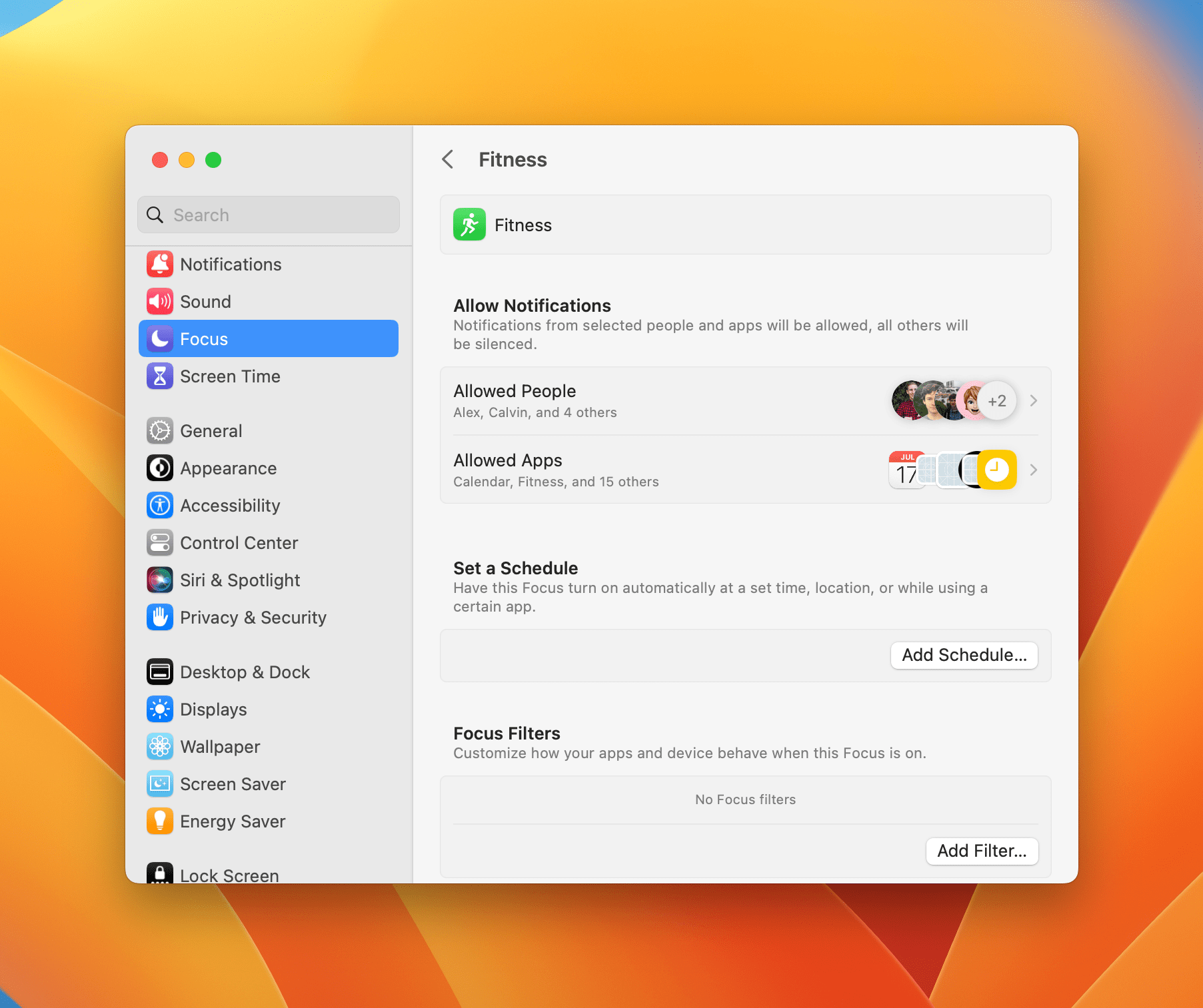
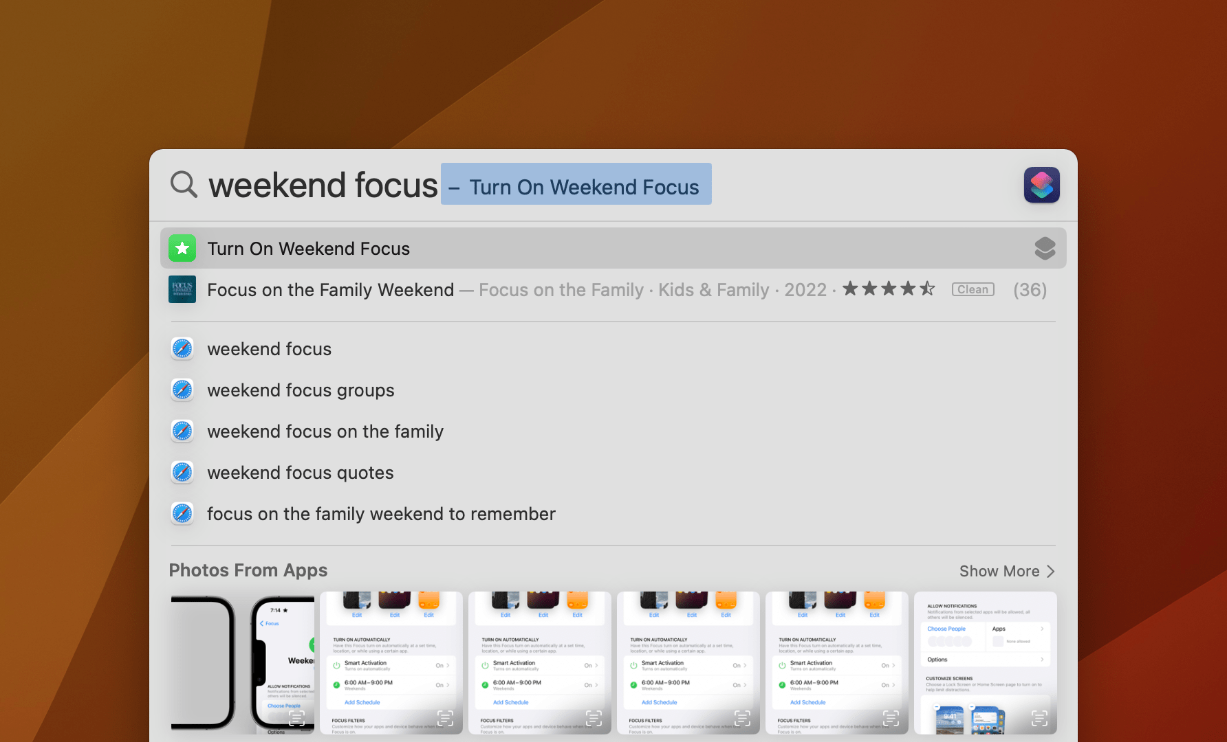
Just like iOS and iPadOS, Focus modes have been refined in Ventura. There are a lot of new options in the Focus section of System Settings. One of the biggest time savers is that you can now use either Allow or Silence lists when deciding which apps and people can break through your Focus modes. Whereas in Monterey, everyone and every app were blocked and had to be added back one by one as exceptions, now you can start from the other perspective allowing everyone and all apps to deliver notifications unless you specifically block them. More than anything else, this one change has made it much easier to set up a wider variety of different Focus modes.
Focus filters are another big addition this year that are available for some of Apple’s system apps as well as third-party apps that adopt Apple’s new Focus filter APIs. Filters are an interesting refinement because instead of filtering out notifications from people or apps, they filter out content from apps. For example, you could set up a Work focus that hides messages from your personal Mail inbox during work hours. You could do something similar with Calendars, hiding those that aren’t relevant to your current context.
One of the few third-party apps that I’ve seen use this during the Ventura beta period was GoodLinks, the app for saving links for later, which lets you filter the links visible in the app based on how they’re tagged.
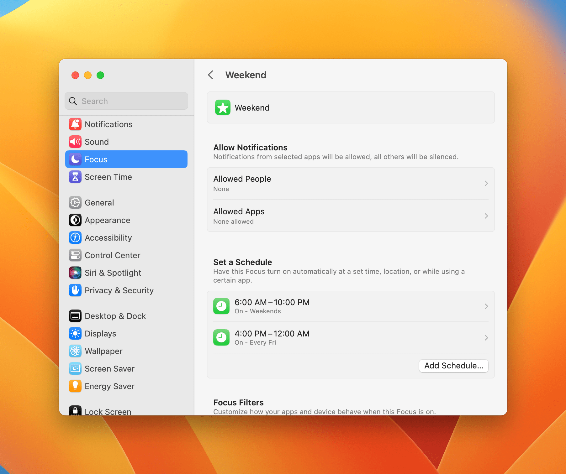
Another nice addition to Focus modes is the ability to schedule them to be turned on and off at multiple times during the day and week.
I’m a big fan of the changes to Focus modes. That said, I’ve found more use for them with my iPhone, where I can also use them to change my Lock Screen and Home Screens. Still, it’s nice to have the option to silence certain apps, people, and app content at certain times of the day, regardless of the device I’m using.
The New Share Menu
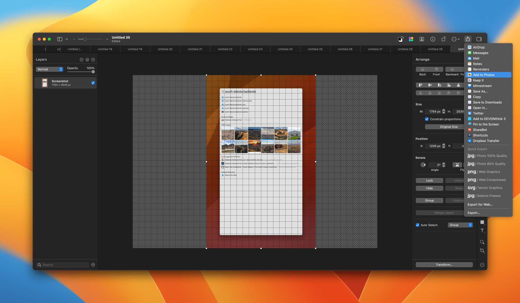
Apple replaced the Share menu, and I don’t like it. It’s a popover element now with smaller text and share suggestions along the top. The design feels out of place in many Mac apps and even worse if you access it from a right-click menu, but the functionality has suffered too. Before, you could assign keyboard shortcuts to Share menu items, which isn’t possible anymore. It’s not a huge deal, but like System Settings, it’s also not an upgrade.
Security
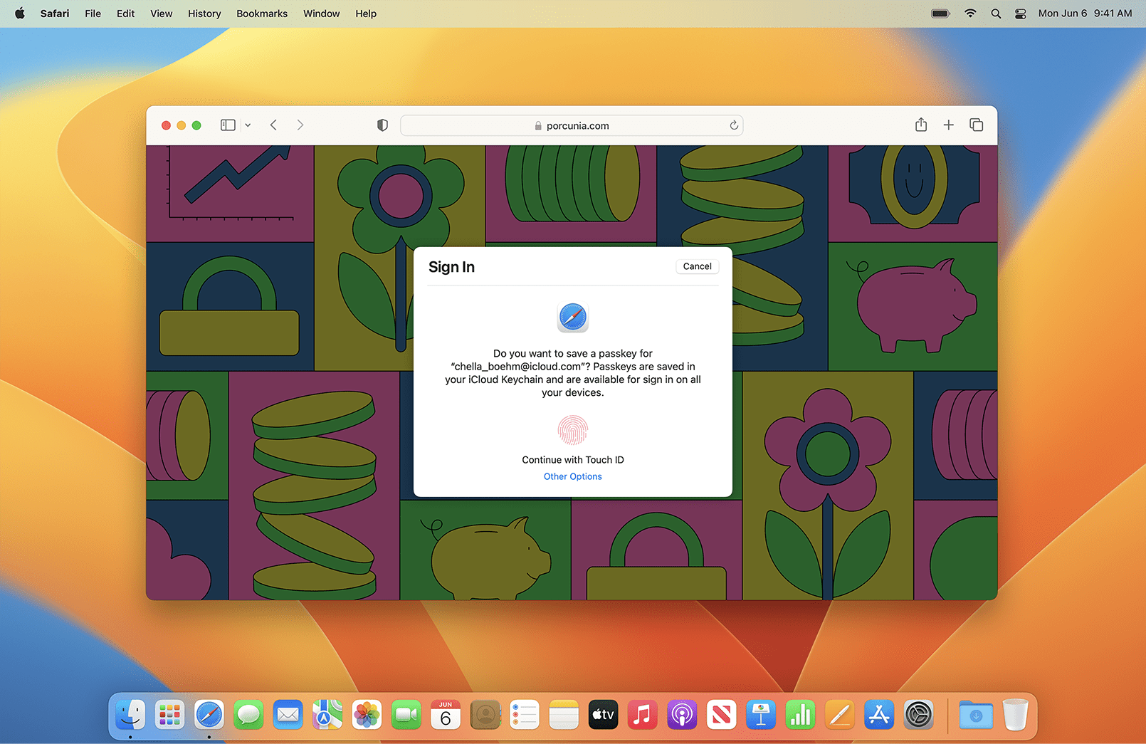
Ventura debuts a new security feature called passkeys, which is designed to do away with passwords using industry standards developed by the FIDO Alliance and the World Wide Web Consortium. Passkeys are based on biometric authentication like Touch ID and Face ID across all of Apple’s platforms and synced via iCloud Keychain. Because passwords aren’t stored on a website or server somewhere, passkeys are a far more secure method of logging into a website or app. Instead, passkeys are stored locally and are unique to each website and app, reducing phishing risks significantly too.
Another nice touch added this year is that the passwords suggested by Safari can be edited. This will come in handy for sites with odd rules about permissible characters in passwords. If a randomly generated password is rejected, instead of picking something less secure off the top of your head, you’ll now be able to go in and tweak the suggested password to match a site’s rules.
On portable Macs, you’ll be asked to authorize interaction with USB-C devices by default, starting with Ventura. Also, Ventura introduces a new Rapid Security Response option that installs security updates without rebooting your Mac.
Dictation
Dictation in macOS just keeps getting better. It’s not a feature I use often, but now that punctuation is inserted automatically as you speak and emoji can be added, too, I’m considering using dictation for notes and outlines as a way of giving my hands a rest now and then.
Gaming
Videogames got a lot of stage time at WWDC this year because Apple introduced Metal 3, the latest version of its graphics framework for game developers. At the conference, Apple showed off No Man’s Sky and Resident Evil Village running on a Mac.
Those games aren’t out yet, and I haven’t tried any others that take advantage of Metal 3, so I don’t have any opinions to share about the extent to which the new framework will improve the experience of gaming on the Mac. However, I hope to have more to share soon because Capcom announced last week that Resident Evil Village is debuting on the Mac App Store on Friday.
Sidecar Reference Mode with an iPad Pro
It’s a very niche feature, which I haven’t had a need to use myself, but the 12.9” iPad Pro can be used as a reference monitor for M1 and M2 Macs when it’s in Sidecar mode, something which photographers and filmmakers should find useful.
Accessibility
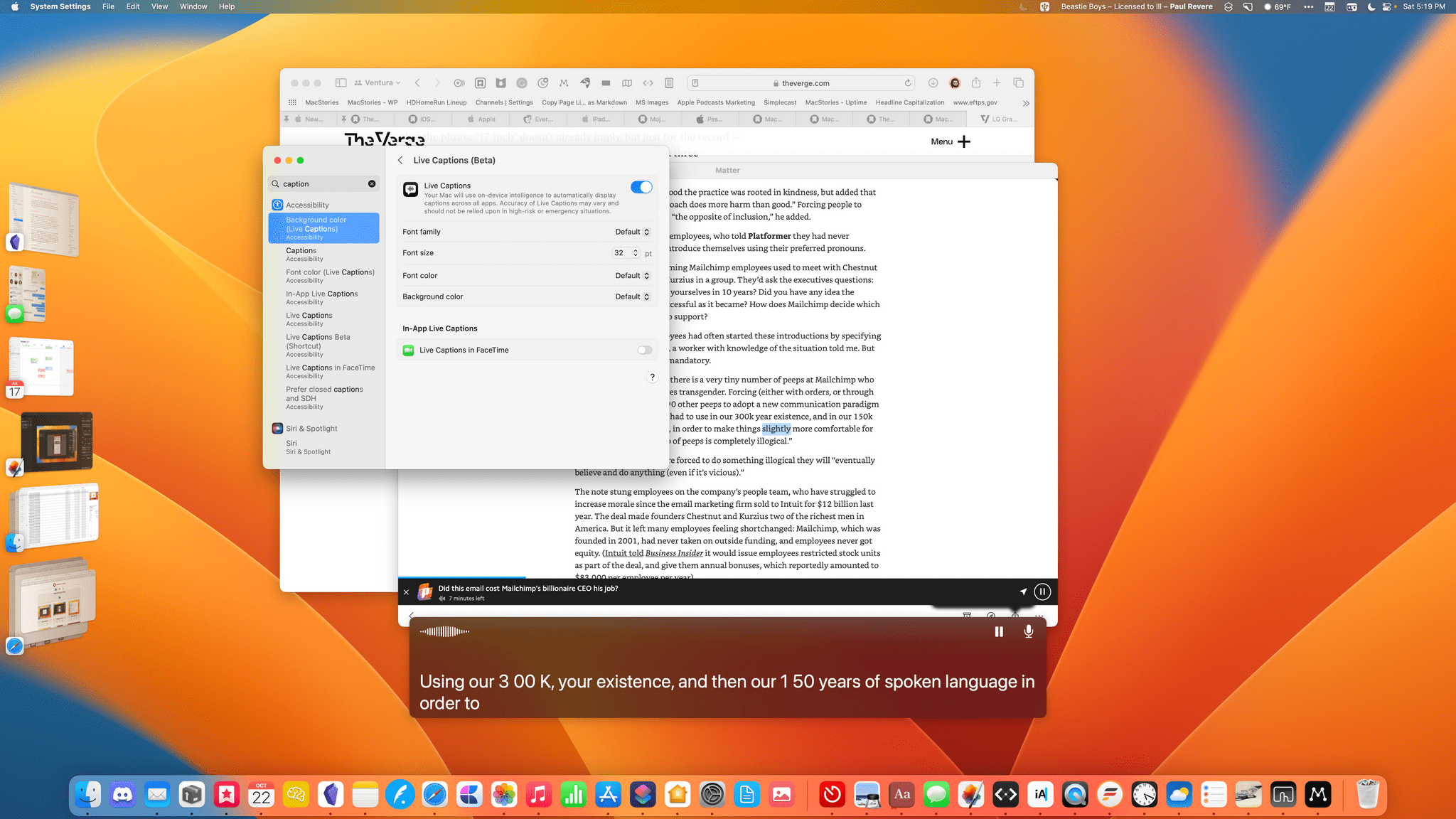
Perhaps the most technically impressive accessibility feature added to the Mac this year is a beta feature that generates real-time captions for FaceTime, complete with speaker attribution, and for other audio and video apps. Users can also type to speak responses during a phone or FaceTime call. Voice Control can be used to hang up calls now, too, and includes a spelling mode to spell out names and words not in its dictionary.
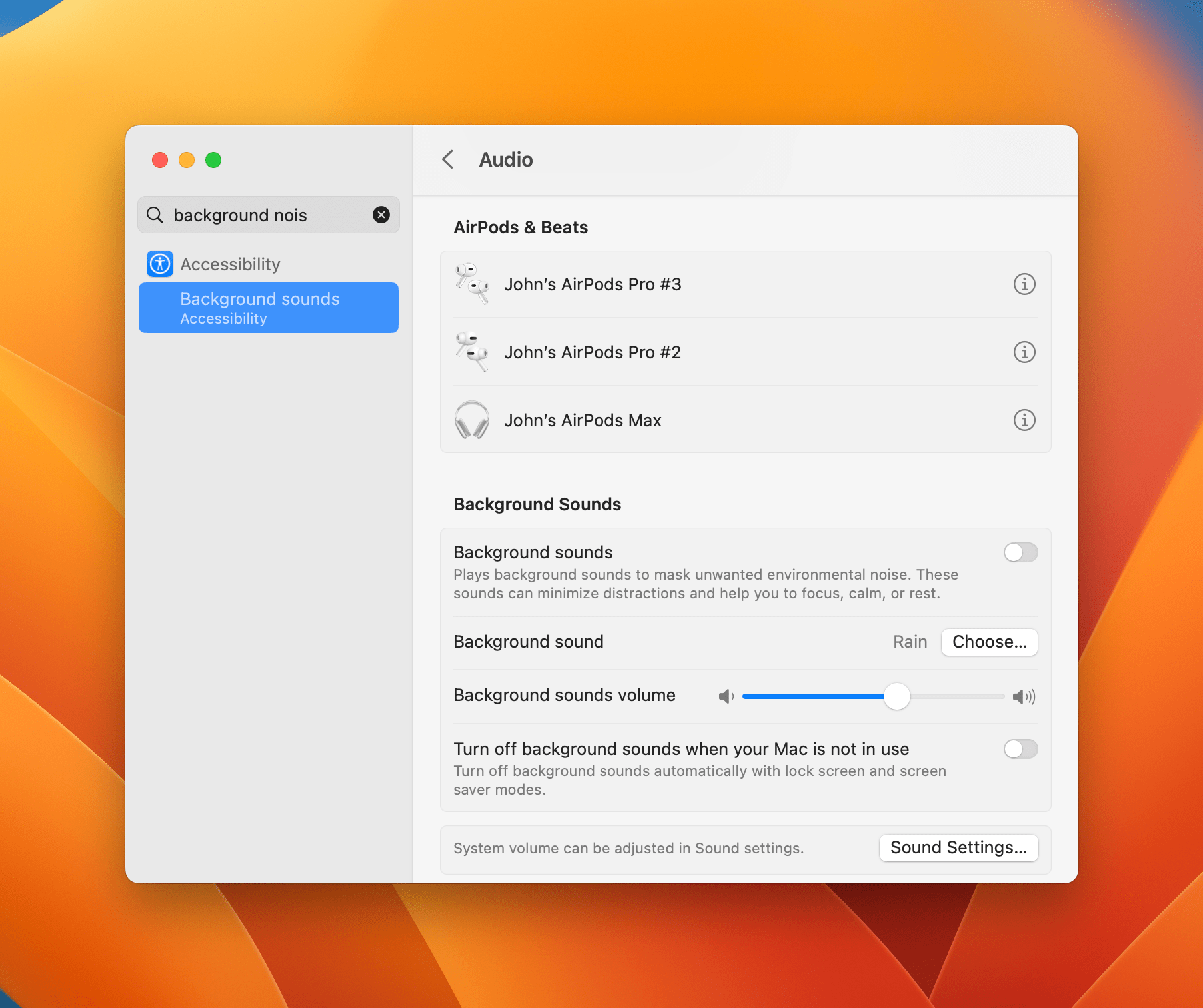
Ventura can play background sounds like rain to help drown out other noise and help focus users. The update can also combine the inputs from multiple game controllers to allow one player to help another with a videogame. VoiceOver can now correct common formatting errors in email messages and documents and includes 20 new languages and additional voices for it and Spoken Content too.
Compatibility
macOS Ventura is compatible with the following Macs:
- 2022 Mac Studio
- 2017 MacBook and later
- 2018 Mac mini and later
- 2019 Mac Pro and later
- 2017 MacBook Pro and later
- 2018 MacBook Air and later
- 2017 iMac Pro and later
- 2017 iMac and later
Also, the following features only work with Macs that have an M1 or M2 SoC:
- Real-time captioning of FaceTime calls
- Dictation’s support for emoji
- Using an iPad Pro in Sidecar reference mode