The Apps
Mac App Store

Mojave marks the introduction of an all-new Mac App Store. Modeled in part after Apple’s successful redesign of the iOS App Store, the new Mac App Store includes some interesting features unique to it.
The first thing that struck me about the new Mac App Store is that it looks a lot like the apps Apple ported from iOS to the Mac even though there is no iOS counterpart to the Mac App Store. As the only other new app introduced this year, perhaps that indicates a shift in the design language of Mac apps that’s intended to make apps ported to the Mac look more at home there.
Like its iOS sibling, the new Mac App Store’s focus is on editorial content. The Store takes a lower-density approach like the iOS App Store, with a slightly different layout that suits its resizable window. The Store is divided into different sections than the iOS App Store too – Discover, Create, Work, Play, Develop, Categories, and Updates – which Apple says better reflect the Mac app world. Also notable, is that macOS system updates, which were housed in the Mac App Store since 2012, have been moved to System Preferences.
The Mac App Store has its work cut out for it. The Store never took off the way its iOS counterpart did. The volume of notable apps released on the Mac App Store is less than it used to be and over time, many important apps left the Store. Nor did the Mac App Store ever get the same attention the iOS App Store did, a problem that only got worse with the introduction of the redesigned iOS App Store, which seemed to monopolize Apple’s attention. Add to that the fact that the Mac App Store has a history of being buggy, and it has a lot of hurdles to overcome to grow even remotely close to the importance of the iOS App Store.
It’s hard to judge how the new Mac App Store will perform before it launches. I like the new design, and an editorial focus should give users a reason to visit, but I wonder how often content on the Mac App Store can be refreshed. The lower app volume will make it difficult to update editorial content daily. I expect we’ll see something less than that; perhaps two or three times per week.
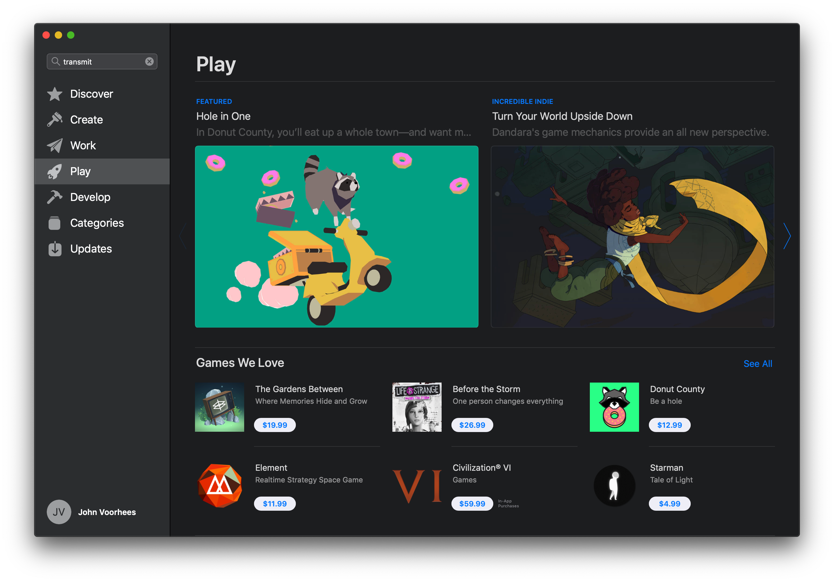
Apple is also working to bring powerful productivity apps back to the Mac App Store and others to it for the first time, including Panic’s Transmit, BBEdit from Bare Bones Software, Adobe’s Lightroom CC, and Microsoft’s Office 365. Those apps should help attract developers who have continued to sell directly to customers, but the option to sell outside the store necessarily means that the Mac App Store won’t ever be the one-stop shop the iOS App Store is.
The Mac App Store also needs to be less buggy too. During most of the beta period, the Mac App Store has generally been fine, but my use of it has also been fairly light. However, recently Apple updated its Store terms of service, to which it insists you agree before updating apps. That’s fine except that when I tried to update an app under an Apple ID other than the one I was logged into, the Mac App Store presented a blank modal window that blocked updating with no explanation of what was going on.
I’ve dealt with bugs related to using multiple Apple IDs for long enough that I was able to diagnose the issue relatively quickly, but that was based on experience, not the blank screen presented by the Mac App Store. I may be an edge case, but the episode does make me wonder whether the same effort that I expect will go into editorial content has gone into the app itself.
Apple has a long way to go to fix the Mac App Store. I hope it’s able to do so. It may not make sense for all developers, but the Mac App Store is a great turn-key solution for new developers who are getting started and a good way to encourage users to explore new apps.
iTunes

The biggest change you’ll see to iTunes is the Friends playlist that Apple began testing as part of the Mojave and iOS betas in August. Apple Music subscribers will find the Friends playlist, which is updated on Mondays, in the For You section of iTunes. The playlist collects what it describes as ‘the best of what your friends are listening to.’ My sense from the playlists I’ve seen since August is that the collection is tuned heavily to the areas where your tastes overlap with your friends, though that’s not entirely the case. Roughly one-third of my recent Friends playlists have been from artists that I don’t recognize.
As with iOS 12’s Music app, you can search Apple Music song lyrics on iTunes. The new feature seems to have been added to Apple Music on iTunes the same day iOS 12 was released.

The remainder of iTunes remains the same, though it looks particularly good in Dark Mode, which makes album art stand out much better than in Light Mode. I’m disappointed we didn’t see a standalone Apple Music app this year, but in light of the status of the migration of iOS apps to the Mac, I suspect it will be a while yet before that is a possibility, if a port of the current iOS app is what Apple has planned.
Safari

Safari received many refinements that were released shortly before Mojave and parallel the changes made to the iOS version. Many of the changes revolve around passwords and security, but there are other notable adjustments too.
One small change that a lot of people are excited about is the addition of favicons to Safari tabs. I didn’t think much of this feature until I tried it. If you have a lot of tabs open, which truncates the name of the sites, favicon are a great way to distinguish them quickly.

Safari makes it easier than ever to choose unique, strong passwords by auto-filling sign-up pages with suggested passwords. You don’t have to accept the password generated, but Safari makes it so easy that hopefully most people will go with the suggestion.
Your passwords are available from the Passwords tab of Safari’s preferences too. Here, you can enable AutoFill for usernames and passwords, browse and manage your passwords, and address any issues discovered by Safari’s new password audit tool. Safari flags reused passwords with a yellow warning label that lets you know on how many other sites you use the same password. Clicking the warning links to the related site so you can visit and change your password.
Safari also addresses cross-site user tracking. Apple has added what it calls Intelligent Tracking Protection to make it more difficult for sites to track you across the web. The company is also anonymizing your system configuration to help prevent sites from identifying you using a technique known as browser fingerprinting.
There are other smaller changes too. If you have pop-ups blocked, Safari now lets you know in the address bar if one has been blocked, which is useful if you’re stuck on a site not realizing that it’s insisting on using a popup for some important functionality. The gray theme of Safari Reader is also higher-contrast than before for a better reading experience.
FaceTime
Group FaceTime calls with support for up to 32 participants was originally announced at WWDC as coming with iOS 12 and macOS 10.14, but has been delayed until later this fall. There are, however, a couple of other tweaks that have been made to the FaceTime UI.
The control at the top of FaceTime, which used to separate video and audio calls, has been replaced by a control divided into all FaceTime calls and missed calls. Now Audio and Video buttons appear at the bottom of the left-hand sidebar after you’ve selected a contact to call, which strikes me as a more intuitive approach.
Siri

One of the most problematic issues with Siri is the fact that it works differently depending on the device you’re using, and the types of queries it can handle varies. Siri on the Mac, which has been one of the most limited implementations of the voice assistant, gained two notable capabilities with Mojave.
The first is the ability to control HomeKit devices, which works just as it does on an iOS device or HomePod. The second capability enables querying your database of passwords. Ask Siri to show your Netflix password, for example, and it opens up the Passwords tab of Safari’s Preferences pane and asks you for your password to unlock the Keychain. Once entered, it displays the results of the search you requested from Siri. It’s good to see Siri gaining capabilities on the Mac, but I’d like to see ‘Hey Siri’ functionality added too, along with better parity with Siri on iOS.
Project Sneak Peek
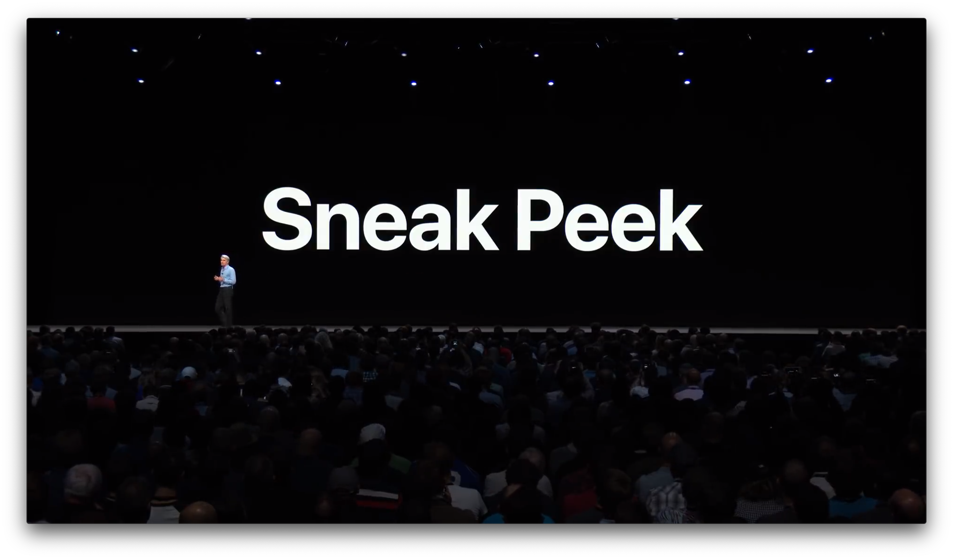
In June at WWDC, Apple confirmed that it was working on a multi-year project to bring iOS apps to the Mac. Apple didn’t give the project or its underlying technologies a name. All Apple called it was a ’Sneak Peek,’ and so will I.
Sneak Peek is a way for Apple to help iOS developers bring their apps to macOS without having to rewrite their apps’ UIs in AppKit entirely. Only the broadest of explanations were given at WWDC, but the approach involves taking certain UIKit frameworks used to build iOS apps, bringing them to macOS’s AppKit, and adapting them to that environment, so they work with things like pointing devices and window resizing.
The developer tools to port iOS apps to macOS were promised by Apple sometime in 2019, but in the meantime, Apple is testing four of its apps in what it describes as ‘Phase I’ of the project. Those apps – News, Stocks, Home, and Voice Memos – were all iOS exclusives until Mojave. All four were good choices for Phase I of Apple’s experiment because each includes relatively few views and controls, and those they include translate well to macOS for the most part. While it’s far too early to judge Apple’s efforts to bring iOS apps to the Mac, it’s worth taking a look at each of the four apps both as new built-in macOS apps and as experiments in adapting iOS apps to the Mac.
Home
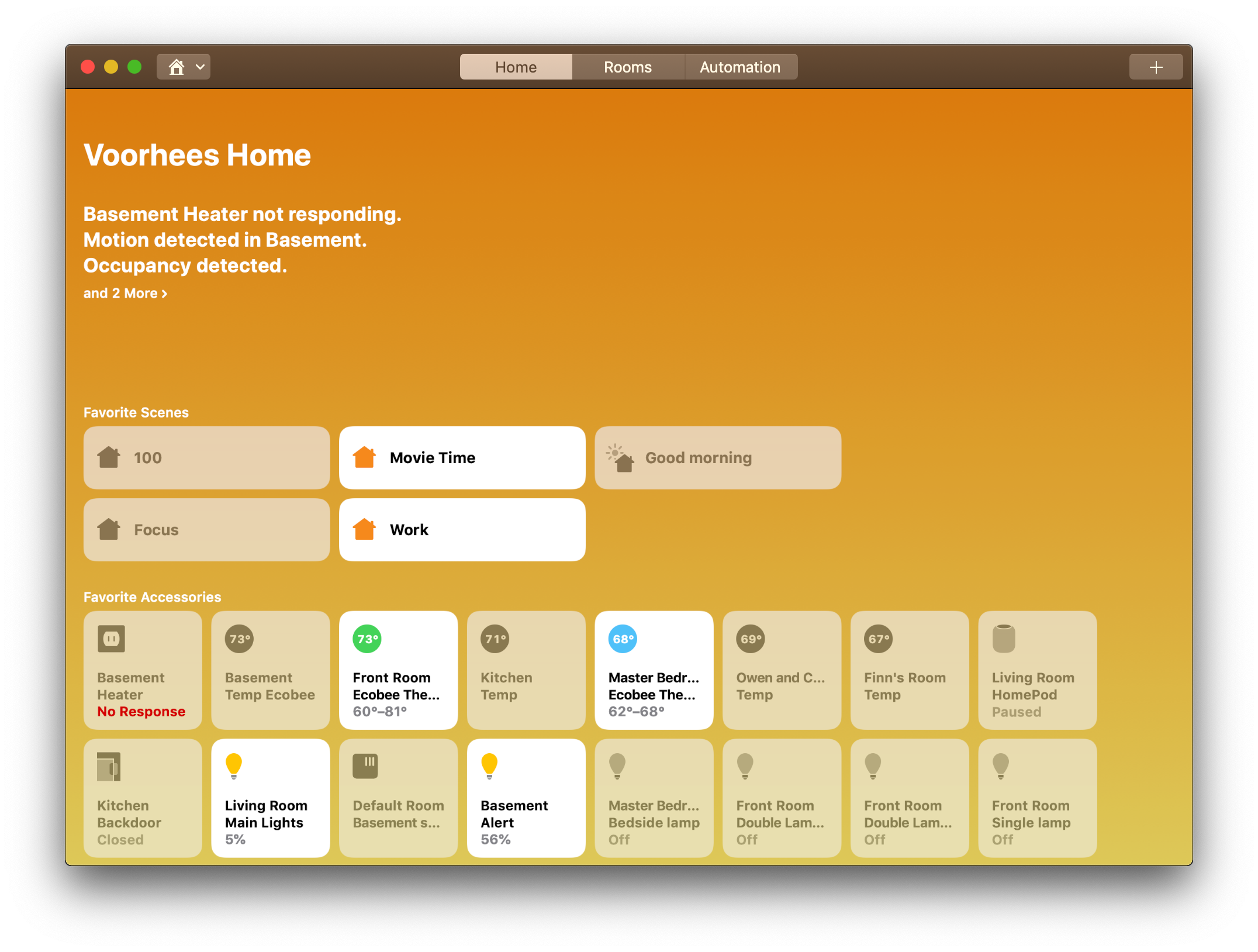
Home on iOS is dominated by square buttons with rounded corners for each HomeKit-enabled device. The same holds true for the macOS version. The first major difference is that the tab bar along the bottom of the iOS app is now a segmented control in the Mac app’s title bar.
The title bar also includes a plus button for adding a scene or automation, which is notable because, on iOS, that button adds a scene or an accessory. The other thing notable about the buttons at the top of Home’s window, which it shares with the other Sneak Peek apps, is that they sit in line with the window controls whereas a typical Mac app would have a clearly-separated toolbar below the title bar. Here, it’s as though the title bar and toolbar were merged.
There is no Edit button in the Mac app’s title bar. On iOS, that button makes the accessory buttons jiggle so they can be reordered. That’s not necessary on the Mac, where the buttons can be reordered by dragging and dropping. It’s worth noting too that any changes made in the Mac app sync almost immediately to its iOS counterpart.
There is also a Home button with an icon of a house on it in the title bar of the Mac app for quickly switching rooms of your home. On iOS, the Home button is for setting up one or more homes, which you can’t do on the Mac. On iOS, the button for switching rooms uses a list icon and is only available from the Rooms tab, and unlike Home on the Mac you can also switch rooms be swiping between them in the Rooms tab.
HomeKit device settings are adjustable on the Mac. Unlike iOS where you long press on an accessory’s button to open its controls and settings, on the Mac you double-click the buttons or right-click and choose ‘Settings.’ It’s an interaction that’s a little awkward given that single-click interactions are the norm for buttons on macOS. However, buttons don’t have settings associated with them on the Mac either. The choice to use a single-click to turn accessories on and off is probably the best one under the circumstances, but it’s also an example where the differences between iOS and Mac apps start to show.

Another awkward area in Home for the Mac is Automation. If you set up a rule based on a date or time, you are shown an iOS-style spinning tumbler. That interaction works well on iOS, but it’s clunky on the Mac and I hope it’s replaced by something more like the Calendar app’s UI for picking dates and times. I’d also like to see Home add Automator actions to create automations beyond the Home app itself.
Despite some areas that need work, I’m glad to have Home on my Mac. While accessory buttons sometimes feel crowded on my iPhone, that’s not the case when I’m running the app on my Mac with a large display. The convenience of using Home on the Mac or iOS makes it an inherently more valuable app too. My most used apps are those that I can use whichever platform I’m on, which is something I hope Apple’s cross-platform efforts will make easier for third-party developers to adopt too.
News
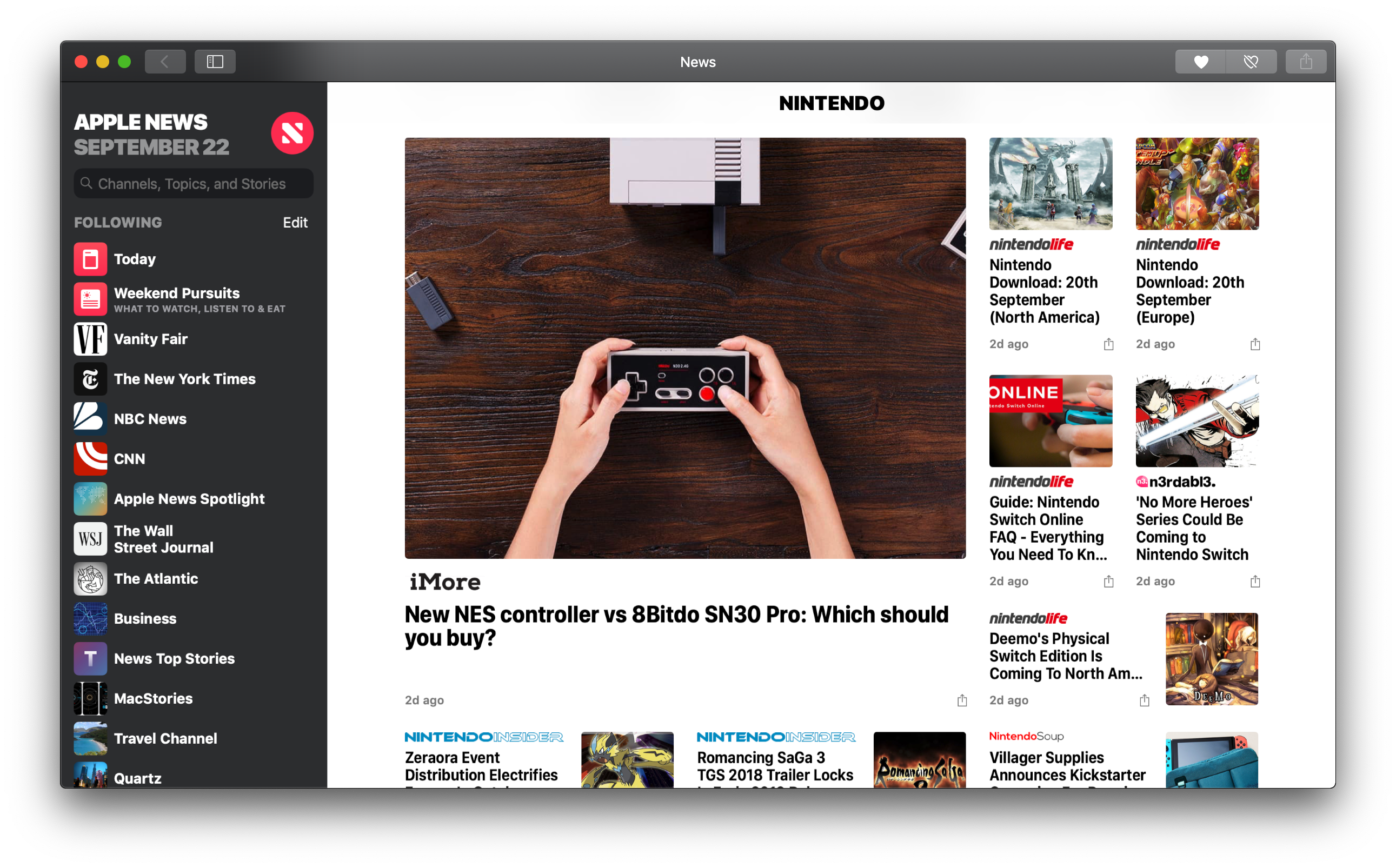
News is an interesting contrast to Home. Instead of moving its iPhone tab bar to the Mac app’s title bar like Home does, News on the Mac resembles the iPad version of the app that moves the Today and news digests to the top two spots in the sidebar followed by an expansion of iOS’s Channels tab, which lets you see all the news sources you follow at once. Unlike the iPad though, the Mac version of news features a collapsible sidebar. You can change the sources you follow by clicking the Edit button, which displays very iOS-like delete buttons and reordering handles for managing the list.
Curiously, the Mac and iPad versions of News omit your local weather which is included on the iPhone version. News also declares its name in the title bar, something you don’t usually see in Mac apps except for things like System Preferences. Unlike Home and Stocks though, News does have a simple Preferences window, which brings it a little closer to what you’d expect from a Mac app.
Stocks
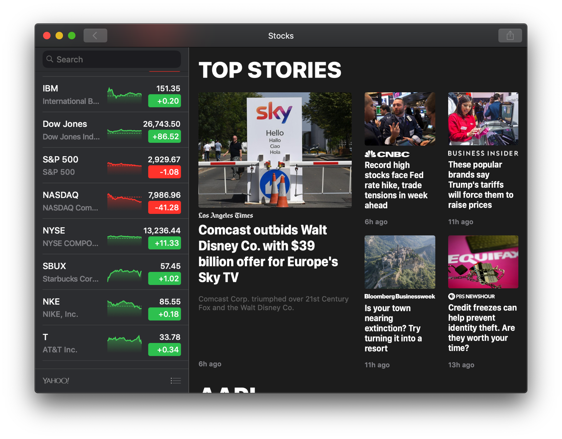
Stocks takes a similar design approach to News by closely resembling the iPad version of the app. The left-hand sidebar lists any stocks you follow, and the right-hand pane features business news stories.
Clicking on a stock opens related charts and news in the right-hand pane, and there’s a link to ‘Business News’ at the top of the left-hand sidebar to return to general business news, which is a little strange because there’s also a back button in the title bar that only works when you’re browsing general news stories.
At the bottom of the left-hand sidebar is a button similar to the iOS app for editing your stock list and adding new ones. It parallels the iOS app’s implementation, but I think a plus button in the title bar would be a better choice on the Mac. Stocks also dispenses with including the current date at the top of the app, which is an odd choice.
Voice Memos
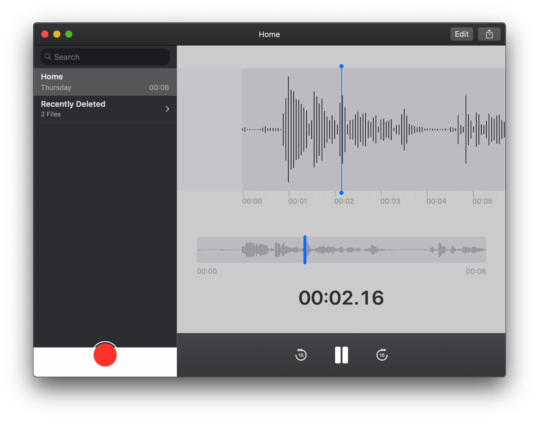
Like News, Voice Memos is almost identical on the Mac and iPad. The only real difference is the absence of a delete button in the UI. Unique to Voice Memos though is that it syncs via iCloud but doesn’t have an entry in the iCloud syncing section of System Preferences. Instead, it’s tucked away behind the Options button for iCloud Drive, which strikes me as not being sufficiently discoverable when the other apps have their own entries in the iCloud syncing section of System Preferences.
Where Does Project Sneak Peek Go Next?
Apple’s efforts to bring iOS apps to the Mac are still in their infancy. Despite rough edges, I’m optimistic about where they are headed. One thing that I’m particularly interested to see added are more complex content creation apps. Other than Voice Memos’ simple UI for recording audio, none of the apps Apple has converted involve activities like writing, photo editing, drawing, or layout and design. By their nature, those sorts of apps are more complex and have more controls that need to be translated to Mac equivalents, but that will be necessary if the iOS apps brought to the Mac are anything more than a reimagining of Dashboard widgets.
32-Bit Support and System Security

With Mojave, Apple continues to advance into a 64-bit future. macOS 10.14 will be the last version of the OS to support 32-bit apps. When the next major release of macOS is released, presumably in the fall of 2019, all apps will need to be 64-bit compatible. For now, the system warns users that an app’s developer needs to update a 32-bit app when it’s opened, but the app will still work. However in the next version of macOS, 32-bit apps will no longer run. I was pleasantly surprised to find very few apps 32-bit apps on my Mac when I checked.
You can check 64-bit compatibility by going to ‘About This Mac’ in the Apple menu of your Mac’s menu bar, then running a System Report. Go to the Applications section of the report and sort by 64-bit compatibility.

Mojave’s security has also been enhanced. The OS prevents developers from using a longer list of system hardware and data without user consent, which includes hardware such as the camera and microphone, along with data such as:
- Messages histories
- Mail databases
- Safari data
- Time Machine backups
- Location and
- System cookies
Apps sold outside the Mac App Store will be more secure too. An app notarization program has been launched for apps that are signed with an Apple developer ID to help prevent malware from spreading. Currently, the program is voluntary, but it will be required in the future. The program will allow Apple to pull the plug on a single rogue app instead of everything related to a developer’s ID if there is a problem with just one app. As Apple’s Mac footprint has grown relative to the rest of the PC industry, it’s reassuring to see the company continue to deploy countermeasures against malicious software.
Conclusion
I went into testing Mojave curious about Dark Mode, but not expecting the update to change the way I work. Although Dark Mode took getting used to, it’s grown on me to the point where I’m not using Light Mode anymore at all. I still occasionally find it harder to distinguish between windows when my Desktop is cluttered than when I’m using Light Mode, but the tradeoffs have been worth it overall. Most importantly, I simply like the look of Dark Mode. Apple’s system apps – especially iTunes, Messages, Notes, and Xcode – look great in Dark Mode.
I also feel like using Dark Mode has been more comfortable for my eyes. Even if that’s just a placebo effect, it’s made it easier to work at my Mac when I’ve been busy, which I appreciate.
As much as I’ve enjoyed Dark Mode though, I’ve found that the real advantages to Mojave have been its collection of Finder, Desktop, and screenshot enhancements. The interesting part of many of these Mojave improvements is that the tasks they enable are possible one way or another in High Sierra. The difference is that Mojave surfaces them better.
For example, the image uploading automation I describe in the Quick Actions section works on High Sierra as a Service or via Alfred. I prefer it as a Quick Action though because I’m usually using my Magic Trackpad to navigate several screenshots at one time as I work. With Quick Actions close at hand in the Preview pane, it’s easier to start an upload, switch to my text editor, and paste in the URL that the Quick Action returns. I’ve never liked the Services menu because there’s no good way to tell one from another; it’s just a long text list. Quick Actions surface the tools I use where I need them.
The same is true of the Markup and other tools available from Quick Look. In the past, Preview always seemed to be open on my Mac. I’d open it to make a quick edit or two and then forget to close it. I also had to edit in Preview, save, go back to the file and upload it, or send it to another app. It may seem like a small thing, but being able to accomplish all those actions within the Finder saves a lot of time when you do them over and over. It also eliminates potential distractions as I switch between apps.
I also appreciate the Desktop organization tools Apple added to Mojave. I tend to accumulate several files on my Desktop as the week progresses and I’m working on a project that involves multiple files in various stages of completion. That mess is usually cleaned up by the following week, but being able to create Stacks by Kind or Date Modified is tidier and a much better way to sift through the files I’ve accumulated during the week.
There’s nothing among Mojave’s new features that has allowed me to accomplish things I couldn’t in High Sierra, but that’s not something you see very often in a mature operating system. Instead, Mojave takes what I do today and removes some of the friction from my existing workflows. How much Mojave improves how you work will depend on what you do, but I’ve been very happy with how its combination of features has made everyday tasks faster and easier to accomplish.
Beyond the productivity gains of Mojave, the thing that intrigues me most is the apps that Apple has ported to the Mac. I remain optimistic about what bringing iOS apps to the Mac might do to revitalize Mac apps in general, but the four examples Apple has shipped with Mojave show that there is still a long way to go.
The issue isn’t the apps’ functionality. They all work more or less the same as their iOS counterparts. The trouble is that none of them feel quite right on the Mac. This is precisely why I’m not a fan of cross-platform apps built using Electron or similar tools.
One of two things needs to change. Either iOS apps on the Mac need to become better integrated and work more like Mac apps, or what it means to be a Mac app needs to evolve. I suspect Apple is working to make those things meet in the middle. There are design and functionality inconsistencies among the ported apps that need to be cleaned up, but you don’t have to look any further than the design of the new Mac App Store to see what I suspect are Apple’s first steps toward evolving Mac apps. The Mac App Store lacks the traditional window chrome of most system apps and shares much more with the ported apps than existing Apple apps.
What remains unanswered though is what all of this means for more complex apps. Perhaps we’re heading toward a more pronounced divide between professional and consumer apps on the Mac – a divide defined not only by software but maybe even hardware, at least for some period as Apple’s in-house chip designs are adapted to handle the needs of professional desktop users. Apps like the four introduced with Mojave and the developer tools that Apple has promised for 2019 will be some of the most interesting things to watch as we head into the new year. Apple has taken the first step into a future, the contours of which are too fuzzy to predict from our current vantage point, but which obviously have been set in motion. One thing is for sure though, we seem to be heading into an interesting phase of macOS’s evolution that will be anything but boring.
