Liquid Glass
Before getting to the new features Tahoe has to offer, I think it’s worth examining the OS’s design changes. Liquid Glass, the marketing term Apple uses to describe a collection of visual changes to its OSes, was revealed with great fanfare at WWDC.
If you were paying attention at all over the summer, you probably came across your fair share of hot takes for and against Liquid Glass. There were a lot of opinions, and most were as reductive in their substance as Apple’s marketing term for the design language is itself. Liquid Glass isn’t like an Instagram filter that’s been applied across the Mac’s UI. Instead, it’s a collection of changes big and small that differ in their look across every Apple platform.
Liquid Glass also employs different elements depending on the context and app. However, it isn’t always clear why one treatment is used in one context and not another. That makes Liquid Glass a little hard to evaluate. But, “Beta Summer” is over, and Tahoe has been released, so let’s dig in and examine it more closely to see what works, what doesn’t, and what the future may hold.
Windows, Sidebars, and Toolbars
I want to start with the Finder because everyone spends a lot of time there, making it an app that Apple’s designers need to get right.
Here’s an example from Sequoia of my Recents folder running against the backdrop of one of Apple’s built-in wallpapers.
You can see that the sidebar and toolbar both take on some of the colors of the wallpaper, but they’re more opaque than not. For example, the video and WAV file icons in the top row don’t show through the Finder’s toolbar.
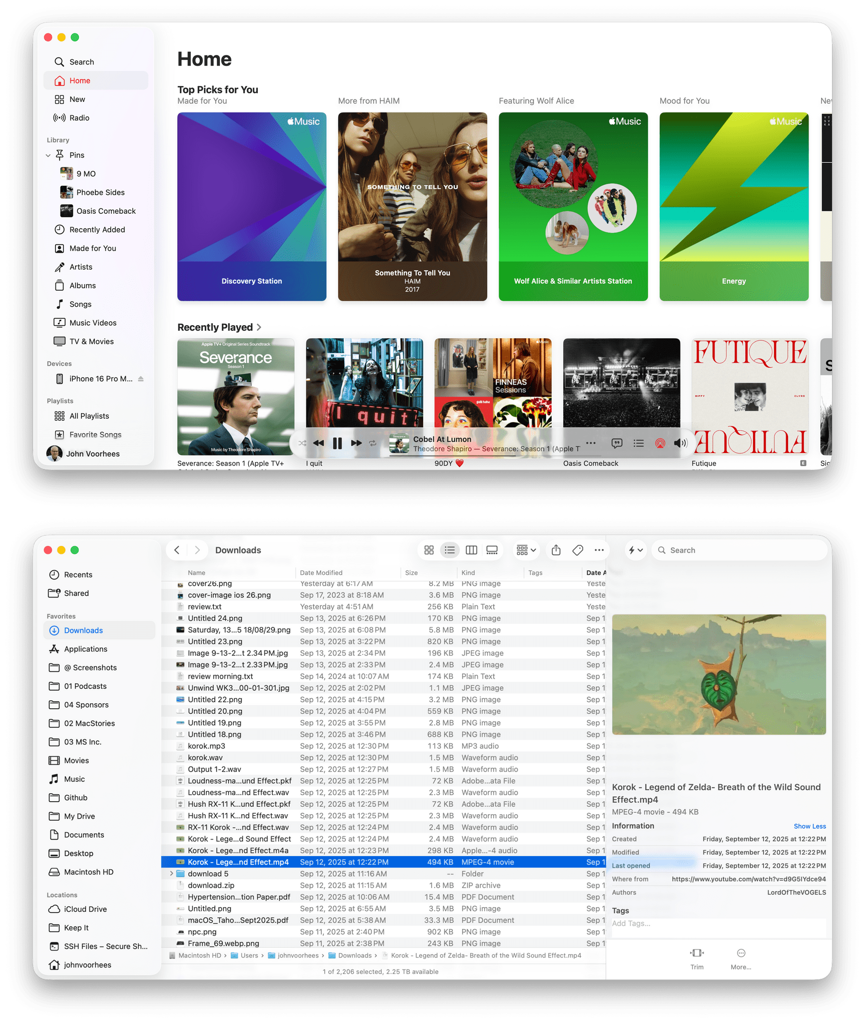
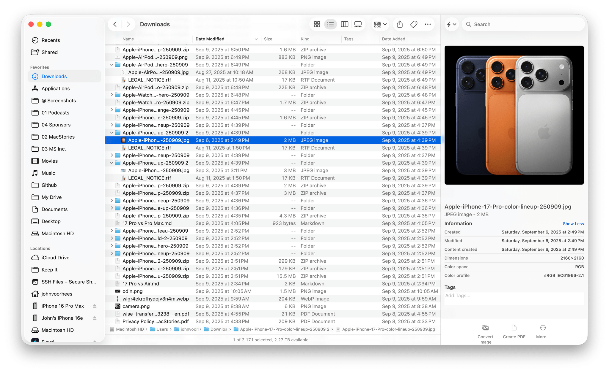
Now, let’s look at a similar screenshot from macOS Tahoe using one of its built-in wallpapers.
Like the last screenshot, this one has no windows behind it. You can see that the wallpaper shines through the sidebar and toolbar more than it does on Sequoia. This is a folder of screenshots, and you can clearly make out each rectangle sitting behind the sidebar and extending into the toolbar. However, they don’t obscure the buttons in the toolbar because those aren’t nearly as translucent as the empty spaces surrounding them.
There are other differences, too. Button groupings are always visible in Tahoe, whereas they only appear on hover in Sequoia. The preview panel also displays more metadata for some file types in Tahoe. Plus, the corners of Tahoe’s windows are rounder than Sequoia’s.
The two Finder windows certainly look different, but I wouldn’t say the Finder is worse because of the changes. Both are perfectly readable to my eye. I also appreciate the depth effect that the distinct layers offer. They form clear boundaries between each element, making items like buttons easier to distinguish from their surrounding labels, chrome, and content.
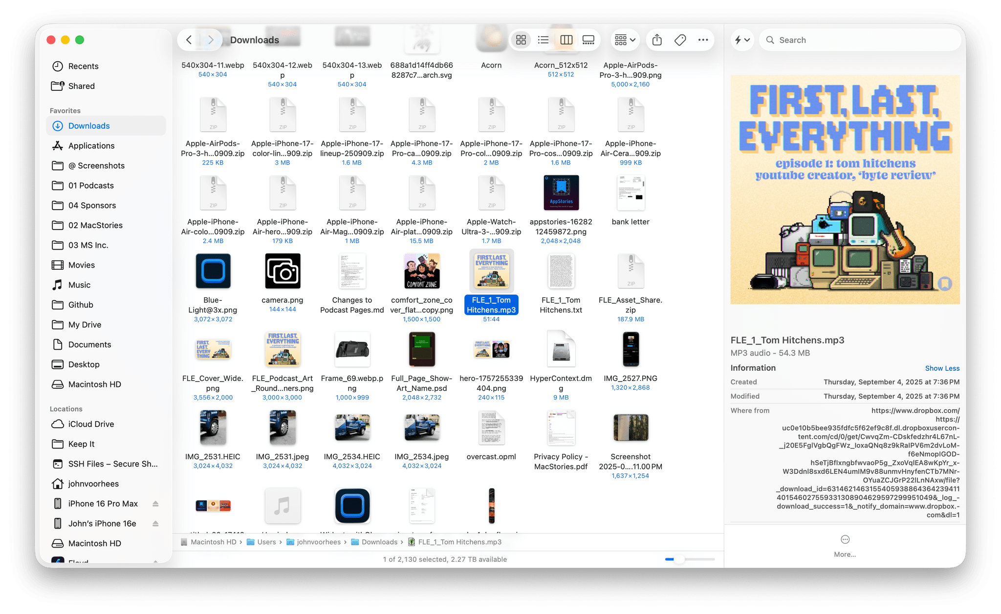
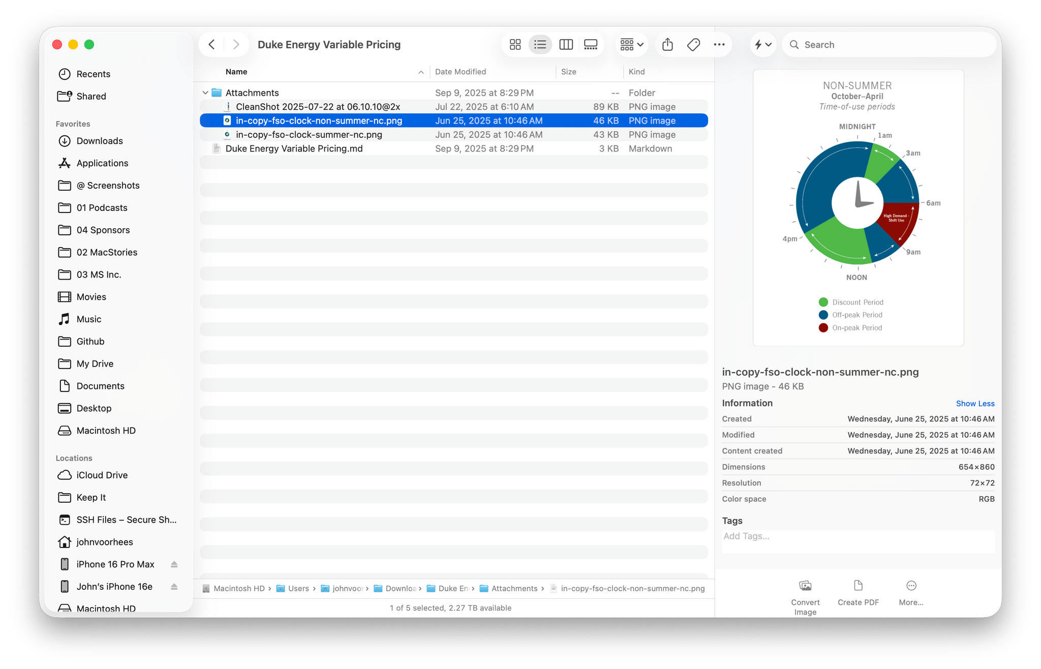
However, Finder comes with an asterisk. I use it with the tab bar visible most of the time, whether I’m using tabs or not. I also almost always use a list view in Finder. What I discovered when I turned off the tab bar and switched to an icon grid view was that the Finder toolbar and buttons became far more transparent. Dark file icons are more noticeable beneath the toolbar, and text becomes more of a distraction. I wouldn’t say the difference makes the Finder unusable, but it does strike me as an inconsistent design approach. I can’t think of any reason why icons and their labels should shine through the toolbar and its buttons more than a list view or any view with tabs enables, but here we are. Hopefully, Apple harmonizes these views in a future update.
I’m not going to walk you through every system app because the patterns are pretty clear, but I do have a couple more examples to share. The first is Safari. Like in the Finder, Tahoe’s toolbar and sidebar are more translucent, and the corners of the window are rounder. With Safari though, the utility of the always-visible button groupings is even more apparent.
Sequoia’s Safari extension buttons were just a collection of random toolbar icons that took on a button shape when you hovered over them. With Tahoe, the extension buttons are grouped, providing a more cohesive look to the toolbar that I like a lot. As with the Finder, the more opaque button backgrounds make them easy to read, and the layering of buttons and the sidebar sets both off from the webpage you’re viewing.
Another design change that distinguishes Safari in Tahoe from Sequoia relates to tabs. Tahoe’s browser tabs have been rounded so they look more like sunken pills in a slot above the browser content than tabs of paper folders. It looks great, separating the tabs from the browser content better than before and doing a good job of distinguishing the active tab from others.
Now, let’s take a look at an app that I think Tahoe makes look worse: Music. One of the stated goals of Liquid Glass is to unify the styles of each of Apple’s OSes. Music shows what happens when that goal isn’t balanced with the unique characteristics of the hardware on which an OS runs.
Here’s Music on Sequoia and Tahoe:
The big difference, besides the common stylistic changes to window elements, is that the playback controls have been moved to the bottom and placed in a pill-shaped rectangle that is much more transparent than the Finder and Safari toolbars that I showed off above. This raises more questions than it answers. Why move the controls to the bottom? That may be the natural place for playback controls on iOS and iPadOS, but not macOS, especially when it means overlaying them against the constantly changing and visually busy backdrop of the Apple Music catalog. Another good example of this problem is Photos, which has very transparent buttons that fight with the background for your attention.
Also, why aren’t the backgrounds of the controls more opaque like they are in the toolbars of the Finder and Sequoia? I like the separation that those toolbars create from the files and web content I’m browsing in those apps; in contrast, Music not only moves the controls where they don’t need to be, but it makes them much harder to read. A good example of an app that overlays controls directly on content and does a much better job is Maps, which has buttons on the right side of the window that conform more closely to the style of the Finder and Safari examples above.
Reminders also handles transparency better than Music. As you scroll your lists, you’ll see a task’s text behind the toolbar and very subtly behind buttons and text fields, but the reduced transparency of those elements makes the text far less disruptive than in Music.
Music raises a larger question. There are other apps with Liquid Glass implementations like Music and Photos, such as FaceTime, Home, and Podcasts, but most system apps follow the Finder/Safari design pattern. Does that make apps like Music outliers, or are they the start of a trend that will spread in future iterations of macOS? Only Apple knows the answer for certain.
What I hope, though, is that Apple’s design team reconsiders Music and the other transparency-heavy apps in Tahoe. I like Liquid Glass’ pronounced transparency on the iPhone and iPad better than on the Mac. Perhaps it’s because I sit farther away from my Mac’s screen than I typically hold the screens of my iPhone and iPad, but if I had a vote at the design meeting, I’d push for moving more in the direction of the Finder and Safari style than Music.
The Dock, App Switcher, and Icons
Two places where I think maximum transparency works better are the Dock and App Switcher. In both cases, the content underneath shines through, and although I expect some people will find it distracting, I don’t. The icons are large enough and opaque, which makes a big difference.
Speaking of icons, Apple has redesigned its system app icons so they all fit neatly in a squircle. The glyphs have been modified, and you’ll notice light reflecting off the edges of the icons, which are generally more abstract than the versions that came before them. Some are better than others, but I don’t feel strongly about them one way or the other.
However, you’ll also notice that some of your third-party apps, and even some Apple apps such as Final Cut Pro and Pixelmator Pro, have had their icons shrunken to fit against the backdrop of a gray squircle. As a means of coercing developers to adopt the new format, I’m sure this tactic will work, but I don’t like it. It’s heavy-handed and makes the user experience worse. I only have a few apps in my Dock that are living in what Jason Snell calls the icon “shame box,” and I expect that number to dwindle rapidly now that Tahoe has been released, but I do wish Apple had chosen a different route for moving icon design to where the company wants it to go.
Another place you’ll find more iconography is in app menus. Apple has included iconography in some menus in past iterations of the OS, such as Messages’ View menu, but there are a lot more icons now. Just look at Preview running on macOS Tahoe:
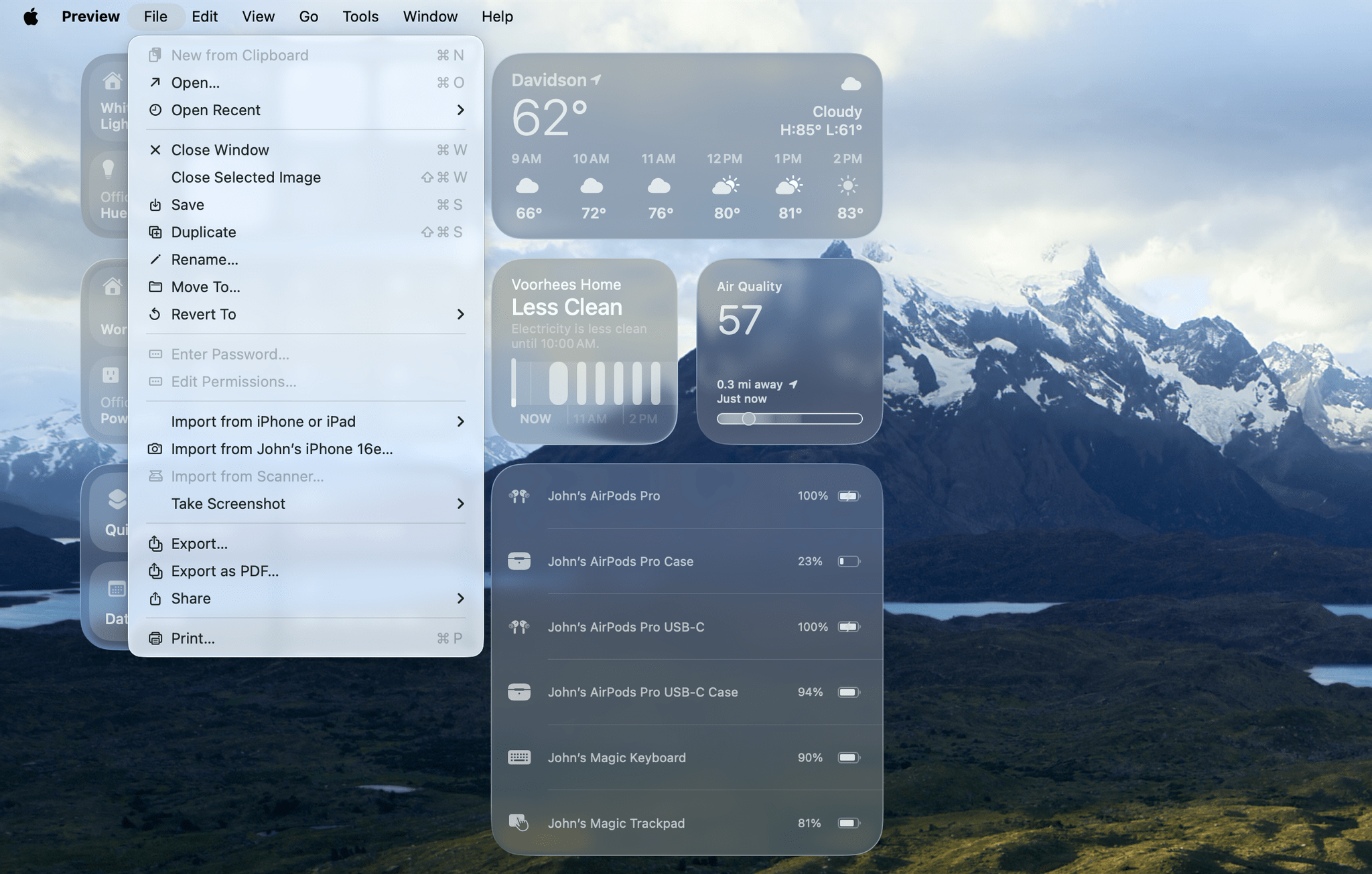
The glyphs can be a little small depending on your display resolution settings, but I like the added visual cues they provide. Thanks to Apple’s years of work on SF Symbols, the glyphs fit in nicely with macOS’ system-wide typeface, too.
Menu Bar and Control Center
By default, the menu bar is now transparent. Early in the beta cycle, Apple added the option to change it back to the semi-transparent style found in Sequoia. If you’re worried about what a busy wallpaper might do to the legibility of your menu bar icons, you may be pleasantly surprised to find the gradient behind the menu bar that dims your wallpaper at the top of the screen is enough to make it legible. If not, you can always switch back to the old style. I’m glad there’s an option to turn on the Sequoia-like look, but I’m more glad that the transparent menu bar stuck, because it looks great.
User Customization and Personalization
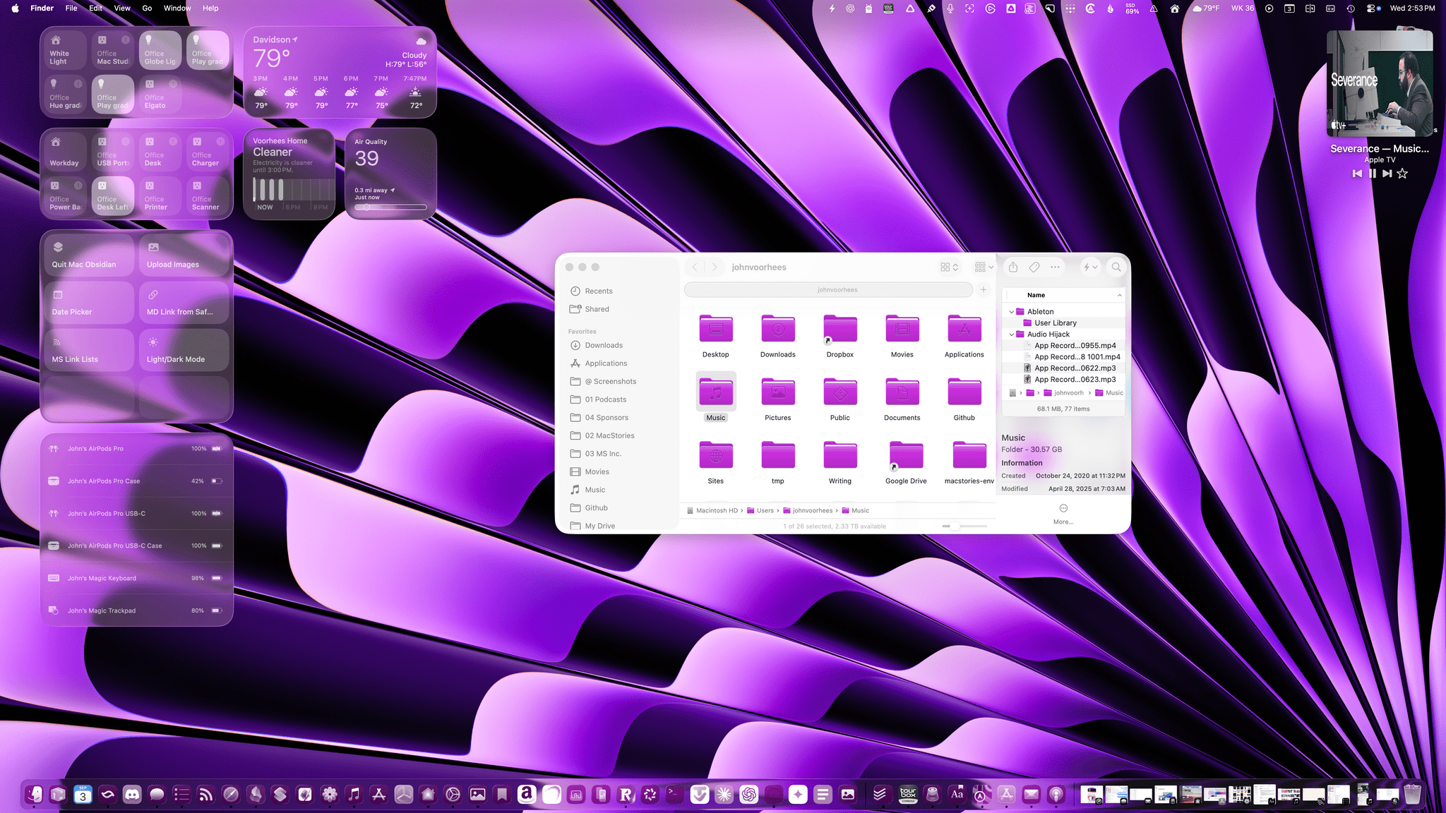
The changes to the look of macOS Tahoe don’t end with Apple’s standard screen elements because, more than ever before, users can adjust their Macs’ UI to their liking. For example, you could go all in on purple like I did above, tinting system controls, folders, and even app icons to match your wallpaper. The possibilities are vast.
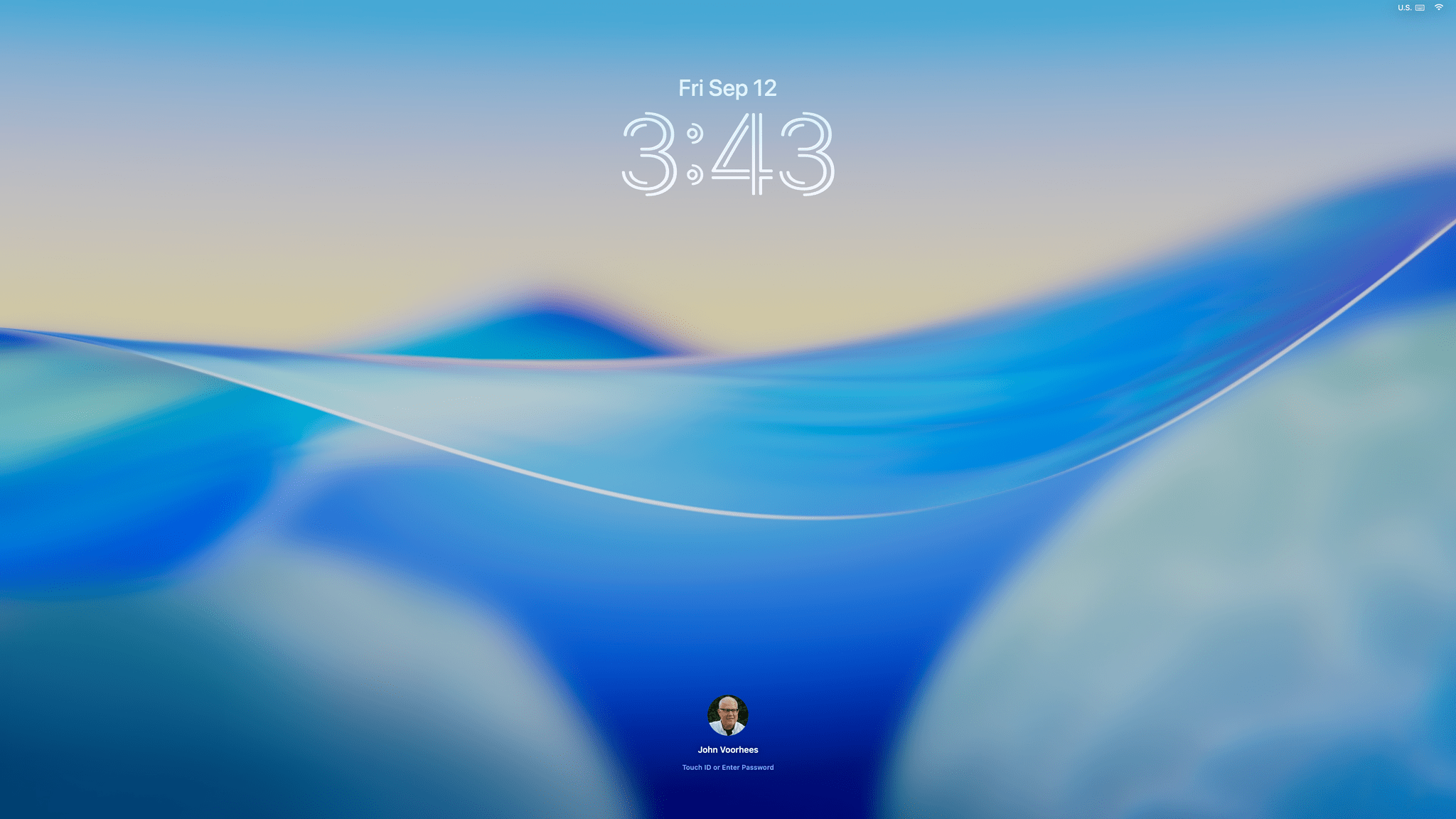
You can even customize your Tahoe Lock Screen with alternative fonts similar to the options on the iPhone and iPad.
Icons can be displayed in their default colors, or with dark, clear, or tinted looks. There are nine theme colors, nine text highlight colors, and eight folder color options, plus a choose-your-own option for highlights and folders if the built-in options aren’t enough. Folder color follows your theme color by default, but they can be overridden, and all the other customization settings can be set independently of one another. You can even change the Lock Screen font and pick from 15 new screensavers that can be used as wallpapers, too.
So go wild if you want. It’s fun to experiment with, even if you like the Mac’s default color scheme. Who knows? Maybe you’ll stumble on the next big macOS aesthetic trend and blow up on TikTok.