Ever since Apple introduced Reminders in 2011, I’ve been looking for a truly great app capable of combining my todos and calendar events in a single, coherent interface. Fantastical for iPad, released today by Flexibits, is that app.
Based on the solid foundation of Fantastical 2 for iPhone, Fantastical for iPad expands the app’s functionality to take advantage of the larger screen while retaining intuitive features and powerful advanced options. I put Fantastical in my dock when I received the first beta in November, and I wouldn’t be able to go back to using Apple’s Calendar and Reminders apps on my iPad.
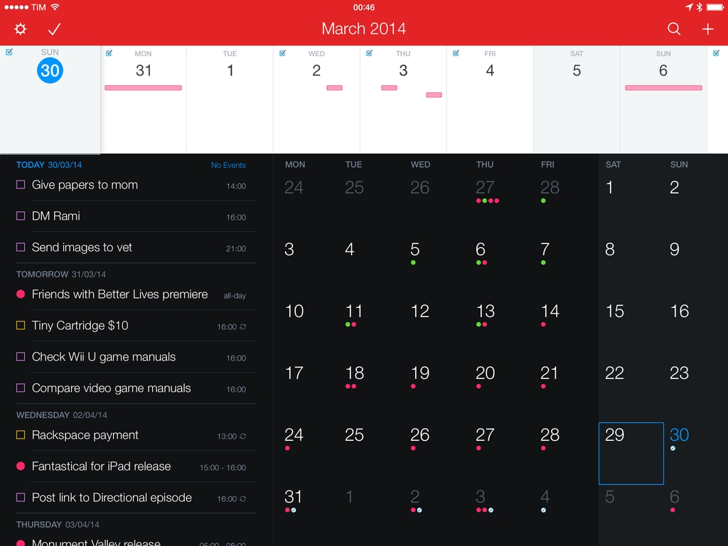
The Fantastical Dashboard
“We don’t want to make an iPad app that just blows up the screen. An iPad is not just a big iPhone”, Michael Simmons, co-founder of Flexibits, tells me over Skype. Since launching Fantastical on the Mac three years ago, Simmons and the other half of Flexibits, Kent Sutherland, brought Fantastical to the iPhone in late 2012, introducing the concept of the DayTicker in lieu of traditional calendar views.
“On the iPhone, Fantastical is a mobile app. It’s a reference tool. It’s the quickest way to add something, find something…it’s modal”, he added regarding the way that Flexibits intended to build Fantastical on the iPhone. Simmons and Sutherland were planning to release Fantastical for iPad last year, but the launch of iOS 7 and its deep reimagination of the iPhone’s interface forced the duo to focus their efforts on updating Fantastical for iPhone, which became Fantastical 2 with Reminders integration, a new week view, and several other additions and tweaks. With Fantastical for Mac having reached a sort of feature stability under Mavericks and Fantastical 2 for iPhone topping the charts of iPhone productivity, Simmons felt it was time to go back to the iPad and apply everything they had learned with Fantastical 2 to a larger canvas.
The result is what Flexibits calls the “Fantastical Dashboard”. Rather than making the iPhone app’s vertical layout bigger for the iPad, Flexibits used the increased screen space to organize Fantastical in four areas: the top toolbar; the DayTicker, now displaying more days; the list; and, on the right side, a traditional month calendar. These four areas are always visible, but they adjust in interesting ways depending on device orientation or user interaction.
The core aspects of Fantastical for iOS – the list of events and reminders and the DayTicker – are mostly unchanged on the iPad, with the exception that they now display more information. The DayTicker still provides a scrollable gallery of upcoming days with inline previews of events and todos through colored blocks, while the list unifies those items, color-codes them based on calendar or list, and allows you to check off todos with one tap without opening an additional view. All the gesture shortcuts from the iPhone version have been ported as well: you can long-tap items in the list to duplicate them or move them, and you can tap & hold a specific day in the DayTicker to quickly create a new todo or event for that specific day.
Fantastical for iPad wants to be instantly familiar for owners of the iPhone app, but it also wants to appeal to new users who may be looking for a replacement to Apple’s built-in apps. From that standpoint, I believe that Fantastical’s large DayTicker with embedded quick previews offers a better deal than Apple’s Day view in the Calendar app, which displays a thin scrollable bar that doesn’t immediately contextualize a day as much as the DayTicker’s individual days do. And for those coming from the iPad’s Reminders app, Fantastical’s list provides a cleaner, handier summary of events that are grouped by day but pulled from all configured Reminders lists.[1] I think it’s important to stress that, while this may not sound new to Fantastical for iPhone users, the iPad has been greatly underserved in terms of Reminders + Calendar clients over the past three years.
A fundamental interaction detail of the DayTicker is that swiping to scroll horizontally through days is reflected in the vertical model of the list. I’ve long praised this data presentation technique as it connects two separate data sets (one is horizontal and focused on previews; the other is vertical and displays details) and provides context through gestures and animations. This hasn’t changed on the iPad – in fact, thanks to the choices that went into the Dashboard’s design, I believe it’s superior to its iPhone counterpart.
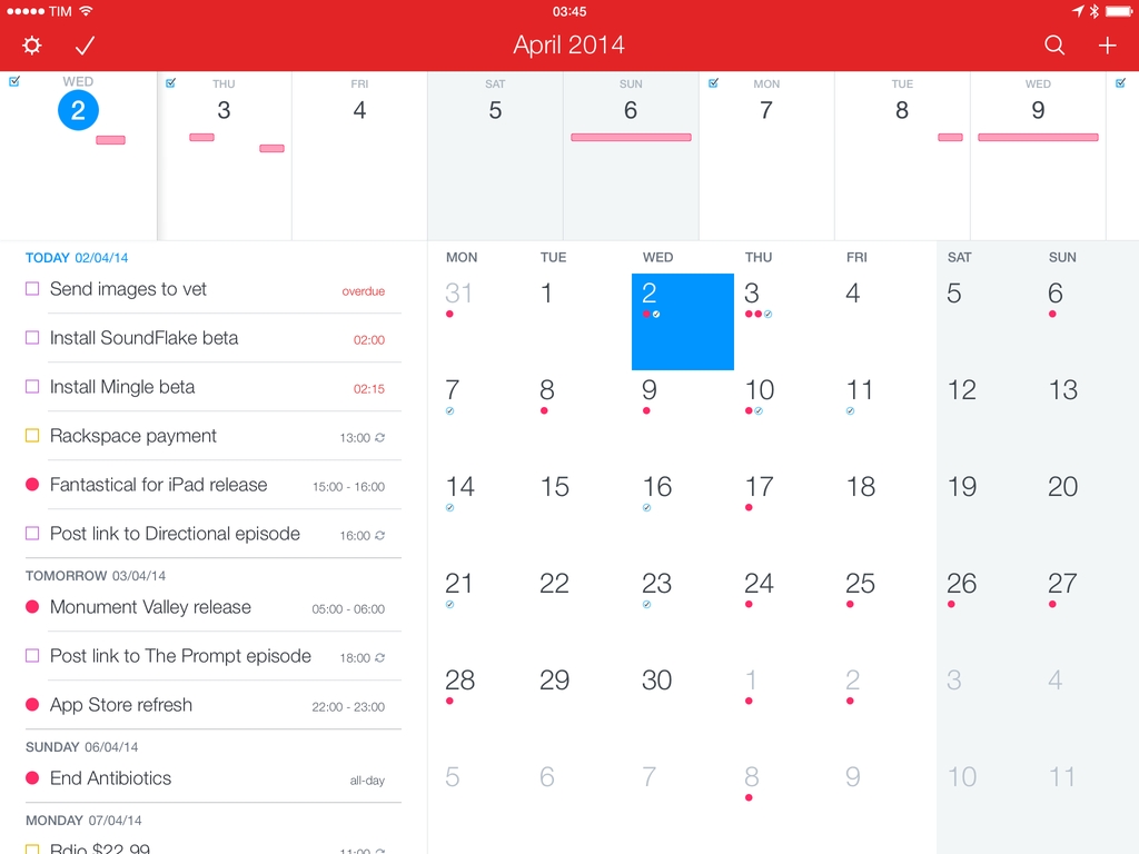
Thanks to a new two-pane design for the main content area, the day that’s currently being viewed (the one on the leftmost edge of the DayTicker, under the virtual loupe) displays events and reminders scheduled for that day at the top of the list, immediately below it. As you swipe vertically in the list to scroll days, the day that reaches the top of the list is also pushed in the DayTicker from right to left, creating a sense of hierarchy and position that’s not as accentuated in Fantastical for iPhone.

But more notably, scrolling in the DayTicker or the list in Fantastical for iPad correlates with the new month view displayed on the right. Like the month view in Fantastical for iPhone, days that have events and reminders show colored icons to provide as a heatmap of your schedule and todos; unlike month views in other calendar clients for iPad, Fantastical doesn’t show event names in the view itself, leaving the role to the list view on the left. “To just copy Apple’s Calendar app didn’t make sense”, Simmons told me, and indeed the result is quite different from the built-in Calendar app or apps like Calendars 5 and Sunrise.
In the calendar, event and reminder dots give you an idea of a day’s busyness just by glancing at them – the more dots you see, the busier you’ll be on that day. The day that is currently in focus in the DayTicker and list gets a blue selection outline (or filled blue for today); as you can imagine, scrolling the DayTicker in Fantastical for iPad advances both the list and calendar at the same time. You can tap a day in the calendar and the DayTicker and list will follow your input, or you can scroll the calendar vertically to jump quickly between months.[2]
When I started testing Fantastical on my iPad, I did initially miss the possibility of having a traditional month visualization like I have on my Mac and in Apple’s Calendar app. Over time, however, I became accustomed to scrolling the list and the DayTicker or, if I wanted to view events for a specific day, just tapping on the month calendar. Once I got how every part of the Fantastical Dashboard was related to each other in the upper left corner of the UI, everything started making sense; now, I don’t miss the traditional calendar view of Apple’s Calendar, and I find the Dashboard superior in every regard.
I’ve never been a big fan of week views in calendar clients, but Fantastical for iPad has one and it’s well done. By pulling down from the DayTicker, you’ll get a “half week view” that displays days as columns with hour blocks.

Keep pulling, and you’ll enter a full-screen week view that shows 12 hours for each day with support for drag & drop to move events around and handles to adjust the duration of each event. Just as tapping the title bar in the Dashboard snaps the DayTicker/list/calendar to the current day, tapping it in week view snaps back to the current day and time.
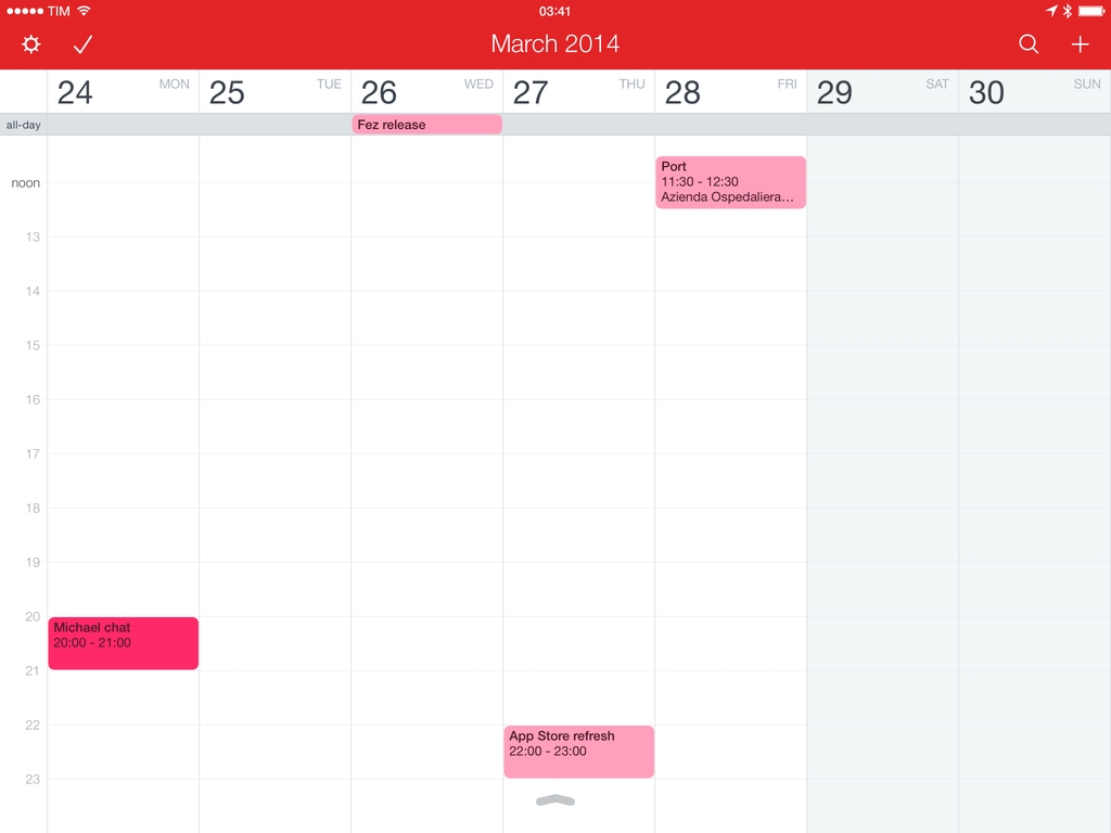
A detail that I really like is how the icon to pull the week view up and down is modelled after the one for Control Center and Notification Center – it’s a nice touch that makes the app consistent with the rest of iOS.
Dismissing the design of Fantastical for iPad as an enlarged version of the iPhone app would be shortsighted. The Dashboard features a compact layout that, in its simplicity, offers four different views that leverage the bigger screen to display more information and allow you to manage your agenda with ease. More importantly, smaller details such as gestures and color bring hierarchical context to each part of the Dashboard – an aspect that many other calendar clients get wrong in trying to only add features on top of Apple’s traditional views.
Panels
Fantastical for iPad doesn’t use popovers to display item details. Instead, Flexibits decided to go with side panels that come in from the right side of the UI – with a twist. First, these panels are just slightly larger than the ones Apple uses in their apps; second, they’re not modal and they don’t completely block the app’s interface when they’re shown. According to Simmons, popovers have some benefits but they “didn’t feel visually coherent” to him; in practice, using panels makes for a confusing choice at first, but, like the Dashboard, they make sense as you keep using them.
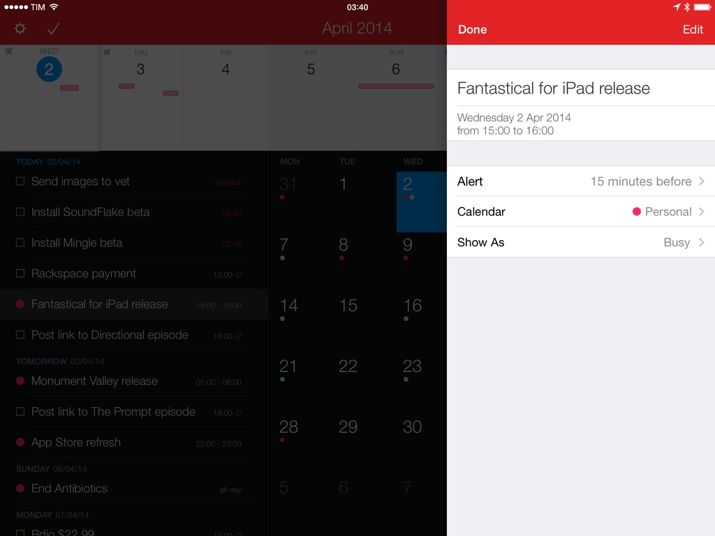
Fantastical’s panels are larger because Flexibits wanted to fit longer event names and space out fields and controls to make the UI more readable. You can compare the app’s panels to the standard width of a side panel in an iOS split view (see, for example, Apple’s Settings and Pushpin), and you’ll see why the increased width does make for easier to read labels and text fields. Furthermore, the custom size enables the list on the left side to be fully visible and scrollable: even if dimmed, items in the list can be selected and you can switch to them while an item is already shown in a panel. In my experience, the benefit has been twofold: panels don’t feel as cramped as popovers do in Calendar; and I can open an item, edit it, then tap another one without closing the panel.
Reminders lists are also displayed in a panel, but on the left side, covering the list. I choose to organize my Reminders by list (Settings > Reminders > Organize By List), but you can show all Reminders without list-grouping if you want to.
Adding Events and Reminders
Fantastical’s most popular feature – support for natural language input – is available in the iPad app with an item creation screen that integrates with the week view. Upon hitting the + button in the top right corner of the app, Fantastical will bring up a special input area above the keyboard with a toggle for reminder/event creation and a button to switch to a panel-based mode. Start typing, and bits of information recognized by the app will fly onto the week view according to recognized input for date and time.
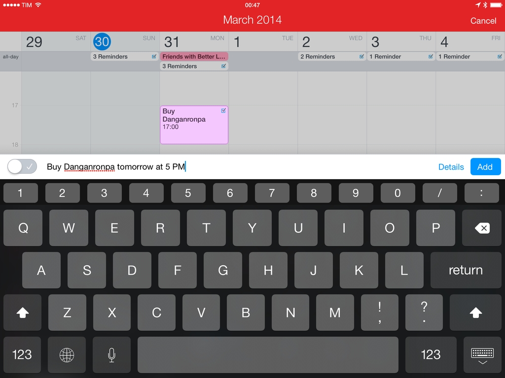
The way that Fantastical shows successfully parsed input is one of the app’s best implemented details – not only does it look good, it also instructs the user about input recognition and the app’s syntax. Type “for two hours” and an event extends vertically to adjust for the new duration; enter “repeat every week”, and a repeat icon appears live on top of an event’s block. They are details, but, again, they’re often what make or break a great app.
On the iPad, the animations are even more impressive because the creation screen isn’t limited to a single day (like on the iPhone) and includes a full week view. When you type, you’ll see event or reminder names move across days and expand as you write down details for location and times; change the day of an event when typing, and the event block will automatically slide across the week view, communicating the change that was recognized in what you typed. If you want a complete editing screen when adding events or reminders, tap the Details button and you’ll get a panel with an embedded timeline that resembles Fantastical for iPhone – it doesn’t have a week view, but it has toggles and controls for every supported field.
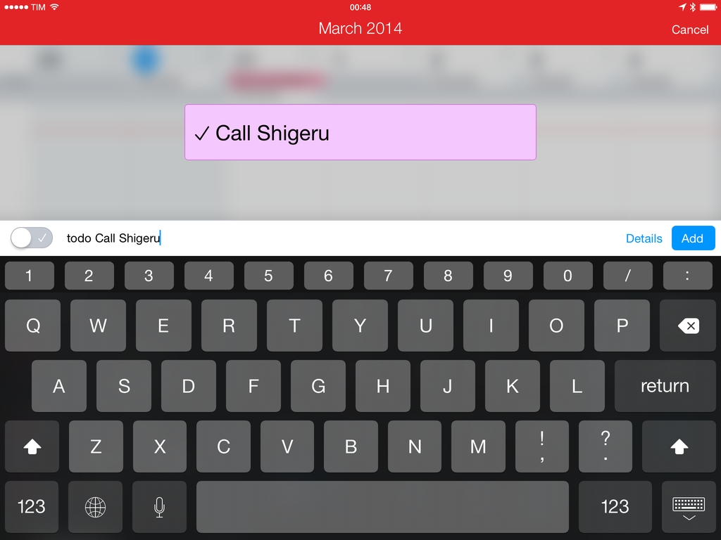
Another detail that I appreciate is how Fantastical switches from a new reminder that hasn’t been assigned a due date to the week view. When you start typing a new reminder (either by using the switch or preceding your sentence with “todo”), what you type will be displayed in a floating box in the middle of the screen that blurs the week view underneath; as you type the date, the box shrinks and flies onto the week view.
On the iPad, Fantastical’s creation view has more context and information about your schedule, which is crucial when adding new events and reminders. The transition from DayTicker to week view is well done, and the use of animations as feedback for natural language input benefits from the larger screen.
For Power Users
Fantastical for iPad keeps all the automation features that Flexibits introduced in Fantastical 1.x for iPhone and refined with the launch of version 2.0. The app supports a wide array of URL schemes that allow external apps to create new events or reminders or to search for existing ones.
With the new iPad app, I was finally able to integrate Fantastical with my favorite text editor and research tool, Editorial. This workflow, made of just seven actions, turns a webpage open in the Editorial browser into a reminder through Fantastical. For me, this is particularly handy when looking for post ideas and saving them for later.
Based on the same idea, you can quickly create a new reminder with a 1-tap Mr. Reader action that can be launched when reading RSS feeds. You can download the action here.
By keeping the same URL scheme of the iPhone app, Fantastical for iPad is compatible with any kind of old action or workflow. I’m using Fantastical with Launch Center Pro through templates, and I can create new reminders from Safari with a quick action menu. Fantastical wants to be fast and intuitive, but the URL schemes are there if you want to build workflows with the app and they’re quite versatile.
Why Fantastical
With Fantastical for iPad, I won’t have to run Fantastical for iPhone in 2x mode ever again. I only have minor complaints about the app[3], and I’ve been using it every day for the past few months – Fantastical is fast, smooth, consistent with the iPhone experience but also uniquely designed for the iPad.
Over the years, I’ve gone back and forth between using Reminders, a GTD app, and plain text for my todo system. Every time I gave Apple’s Reminders another shot, I noticed how few calendar clients that integrated with Reminders were designed to really take advantage of the iPad’s screen – most of them still tend to copy Apple’s Calendar UI with minor modifications for Reminders and a few extras.
Flexibits, on the other hand, has kept everything that made Fantastical great on the iPhone and brought it to the iPad with a Dashboard that makes meaningful use of the larger screen. The components of the Fantastical Dashboard may not be completely new to iPhone users, but they’ve been redesigned and laid out to display more information and provide a feature-packed, yet intuitive experience.
Three years after the release of the original Fantastical for Mac, I’m now entrenched in the Fantastical ecosystem on all my devices. Fantastical works better than Apple’s Calendar and Reminders apps for me, and the new iPad version lives up to its name.
Fantastical for iPad is available on the App Store at $9.99 for a limited time (regular price will be $14.99).
- Apple’s Reminders app for iPad does feel like a blown up version of the iPhone counterpart, and I’m still surprised Apple shipped it with iOS 7. There’s no way to view all Reminders from all lists at once (unless you open Notification Center’s Today view and see those assigned to the current day), there are no filters or sorting options, and items aren’t grouped by day. It’s unclear where you have to tap to add a new reminder, and thin typography makes it hard to immediately distinguish titles from notes. Furthermore, URLs added to the Notes field of a reminder aren’t even tappable. Sometimes I wonder if the team who makes the Reminders app for iOS even uses Reminders – it’s ridiculously underpowered and it hasn’t gotten any better with iOS 7.1, which shipped six months after iOS 7.0. ↩
- Tap & hold a day in the calendar to create a new event for that day. ↩
- I would like to see support for keyboard shortcuts and a way to enter multiple items in a row. ↩