Improve Your Speeches with Ummo

It’s a scene I’ve been a part of too many times: standing up in front of a group of people, I stumble through a speech while asking myself why I hadn’t prepared more. You may know how it feels – discomfort, regret, and even fear.

Ummo, described by the developer as “your personal speech coach,” is here to make the process significantly more comfortable by providing key data on your presentation. Paired with a feature that annoys you every time you use a filler word, the functionality of Ummo is enough to make you wish you had it sooner.

Read more


LiquidText 2.0 Brings Support for Multiple Documents

While I don’t work with a lot of PDFs for what I do at MacStories, I’ve had to annotate documents and collect research material in the past, and I’ve been impressed with LiquidText for iPad.

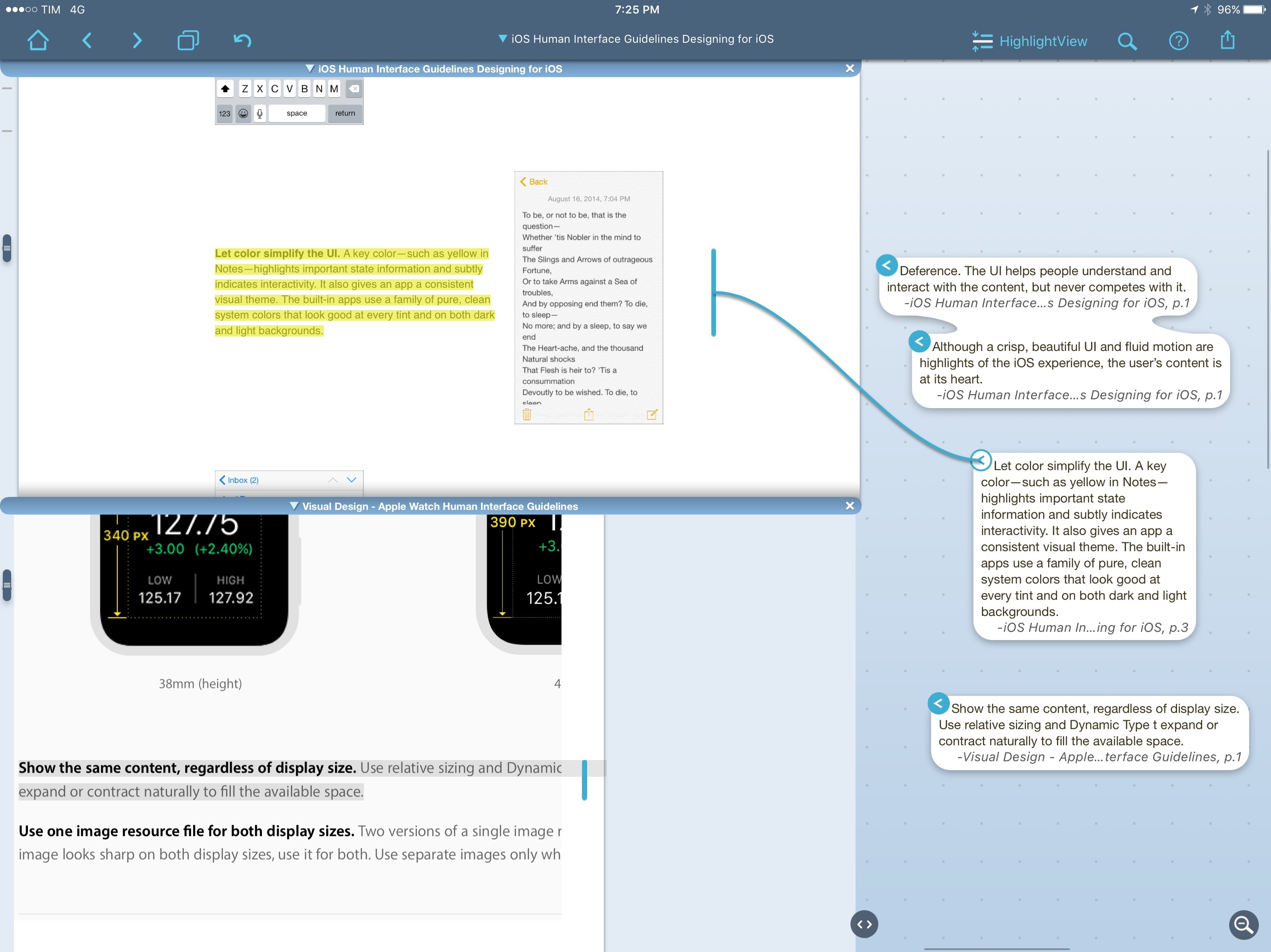
LiquidText is one of the most innovative iPad apps I’ve seen in recent years. The app lets you read and annotate PDF documents, but it looks nothing like a traditional PDF editor. Text can be highlighted and pulled aside with a delightful tap & hold interaction; multiple excerpts can be grouped together in a cluster of bits of text, and you can also add your own notes to the mix. LiquidText is uniquely spatial in the way it lets you organize notes and annotations visually, moving them around, and linking them together. I like, for instance, how you can tap an excerpt in the side panel to see where it links back in the original document. LiquidText is full of interesting, useful features like that.

Today, LiquidText has launched a major 2.0 update that adds the ability to work with multiple documents and easily import webpages in a single LiquidText file. I’ve been playing with the beta, and it’s solid: multiple documents can be opened simultaneously, and you can pull together annotations from different sources in the same space. You can also add notes that reference multiple documents, as well as search for text across all documents at once. I’ve never seen a PDF app for iPad that made annotating and referencing multiple PDF documents this simple and intuitive.

Given the option to import PDF documents and webpages in a single LiquidText file, I think I’m going to give this a shot as I prepare my research for iOS 10 this summer. LiquidText 2.0 can export every excerpt and note as plain text, which I should be able to import in Ulysses to start writing. I haven’t tried importing Apple’s developer documentation webpages in the app yet, but it should be possible. LiquidText’s annotation engine and option to compare files is perfect for that kind of research spread across multiple topics related to each other.

Finally, the upgrade price. LiquidText has always been free (which is crazy if you ask me), but the Multi-Document Pack is a $8.99 In-App Purchase. If you want to support and enjoy one of the most powerful, original iPad apps I’ve tried in years, it’s a no-brainer.


Daylite: A Business Productivity App for Mac and iOS [Sponsor]

This week is sponsored by Marketcircle, the developers of Daylite.

Daylite is a business productivity app for the Mac, iPhone, and iPad. It organizes your contacts, calendars, tasks, notes, emails, projects, and new business opportunities all in one app. What’s special about Daylite is that it links all these things together so get the full picture. Daylite is used by small businesses world-wide in all different industries.

Mark McClung and his team at Starbuck Realty in Denver, Colorado use Daylite to segment customers for marketing campaigns. They also use it to track their sales funnel when selling properties, and to delegate tasks to each other.

Barbora Sablova and her team at Skyform in Slovakia use Daylite in their design studio to organize their clients and projects. Barbora loves that Daylite integrates with Apple Mail so her and her team can link all their client emails to each project. When a client calls, she can quickly see all the emails her team has had with the client, and where they are in the project.

Daylite is a native app so you don’t need an Internet connection to use it. When you do get an Internet connection, it syncs in the cloud across your devices and with your team.

To learn more about Daylite and how it helps businesses to be more productive, visit Marketcircle’s website.


Message Your Journal Using Ipsum

Ipsum, an app released today from developer Sam Ghobril, is a journaling app with a twist. Instead of fiddling with titles, formatting, and tags, you’ll simply type – like you would in iMessage – and Ipsum will log what you write. Other than the text, the only other piece of information in the timeline is the date an entry is written.

Sam said in a Medium post that he built Ipsum as a chat-only journaling system because he wanted users to “feel okay writing down even the smallest of thoughts.”

I’ve spent some time with Ipsum and am pleasantly surprised. It’s ridiculously easy to use, so much so that it made me afraid I was missing something else entirely. But no – all you have to do is type your thoughts, hit send, and they are in Ipsum for as long as you use the app.

If you’re looking for a new journaling experience, Ipsum should definitely be on your radar. You can pick it up in the App Store (iPhone only) for $1.99.

Permalink

Remind Me Makes Quick Work of Reminders Task Entry

Remind Me by Nick Leith is one of those apps borne out of frustration with a stock Apple app – in this case, Reminders. Reminders has some compelling features like iCloud syncing between iOS devices and with Macs, shared reminder lists, and the ability of some third-party apps like OmniFocus and 2Do to import reminders. Yet despite these benefits, Reminders can be tedious and frustrating when you want to enter a reminder with a due date. Remind Me is a handy lightweight iPhone utility dedicated to fast Reminders task entry.

Read more


iPads for India

Fraser Speirs:

I’m starting a new short-term project to raise money to send iPads to the Barefoot College in India.

My friend Srini Swaminathan recently asked me if we had any iPads that we could donate to the project he’s working with in India. We didn’t actually have any right then but we are coming up to the end of our lease at school and I thought there might be an opportunity.

Our lease requires that we either send the iPads back to the leasing company or buy the lease out. To buy out, we would need to pay back the fair market value of the iPads, which is currently about £100 per unit and we have 110.

And:

Barefoot College, which was recently visited by Apple VP Lisa Jackson, is an organisation that trains women in rural India to build solar powered projects to help their villages. These projects include solar water heating, cooking, desalination and even data projectors for use in night schools.

Great initiative. You can donate here.

Permalink

Google Maps & Apple Maps: Cartography Comparison

When I linked to Justin O’Beirne’s analysis of Google Maps in May, I asked:

It’d be interesting to see the same comparisons between Apple and Google, as well as between old Apple Maps and Apple Maps today.

Not only did Justin deliver (for context, he designed and led the development of Apple Maps’ cartography), he’s started an entire series detailing the cartography of Google Maps and Apple Maps.

At its heart, this series of essays is a comparison of the current state of Google’s and Apple’s cartography. But it’s also something more: an exploration into all of the tradeoffs that go into designing and making maps such as these.

These tradeoffs are the joy of modern cartography — the thousands of tiny, seemingly isolated decisions that coalesce into a larger, greater whole.

Our purpose here is not to crown a winner, but to observe the paths taken — and not taken.

(Can you tell he left Apple in 2015?)

I couldn’t stop reading the first post in the series, in which Justin compares the choices Google and Apple have made for displaying cities, roads, and points of interests on their maps. Utterly fascinating and amazingly detailed.

I’ve always preferred Apple’s overall design and balance of their maps (which Justin’s data confirms), but, in my experience, their data (POIs and roads) was either old or inaccurate. My area in Rome seems to have improved in the past year, and maybe I should try Apple Maps again.

I’m looking forward to Justin’s next entries in the series.

Permalink

Apple Updates WWDC App for WWDC 2016 with tvOS, iPad Multitasking Support

Apple updated their official WWDC app earlier today in preparation for the upcoming WWDC 2016.

The app, now at version 5.0, has received a new dark icon and a tvOS version to stream and download videos for WWDC 2016 on the big screen. It’s also possible to watch videos from previous conferences from the Apple TV. Live streaming is now possible on iOS and tvOS, and the iPad version also supports iOS 9 multitasking for Split View and Slide Over.

In addition to a dark interface, the update has brought a preliminary list of sessions that developers will be able to attend during the event. As it’s been the case for the past few years, Apple hasn’t included the real names of the sessions yet as they would reveal the company’s announcements beforehand. This year, Apple has opted for Swift-inspired session placeholders such as ourLips = sealedOnThisOneToo and aWatchedPot != boils. The full schedule of every technical session will be announced after the opening keynote on Monday, June 13.

You can get version 5.0 of the WWDC app from the App Store.


“Where’s the App for That?” – Fixing App Store Discovery

When the iPhone debuted in 2007, it was by no means a forgone conclusion that there would ever be an App Store. Steve Jobs reportedly resisted the idea over concerns that it would ‘mess up’ the iPhone,1 yet about one year later, the App Store debuted with around 500 third-party apps.

The App Store grew like wildfire. By January 2009, there were about 15,000 apps. Though modest by today’s standards, 15,000 was already enough apps that it felt like there was one to fulfill every possible need you might have. Apple celebrated the success of the App Store the next month by launching a TV ad campaign featuring the catchphrase ‘There’s an app for that.’

Fast-forward to today and the scope of the App Store of 2009 feels quaint by comparison. There are now approximately 1.5 million apps in the App Store – a 100-fold increase in just seven years. But while the App Store has been an undeniable success for Apple by almost any measure, that success has come at a cost. With so many apps in the App Store, discovery has become such a serious problem that today’s version of Apple’s 2009 catchphrase may as well be ‘Where’s the app for that?’

The good news is that change is afoot in the App Store. Last December, Phil Schiller took over responsibility for the App Store. In April, Apple launched a site dedicated to helping developers build their businesses, which includes a way for developers to contact the App Store team directly about promoting their apps. In mid-May, app review times dropped dramatically, from around a week to under two days, instantly changing the launch cycle for developers. Then, just in the last week or two, Apple quietly started hiding Apple TV apps from its Featured pages and top charts that customers have already downloaded, making room to display more new apps.

According to rumors Apple has about 100 people working on changes to the App Store. With WWDC just around the corner, I’ve been spending a lot of time thinking about how Apple could improve App Store discovery and gathering ideas from other developers. I’m optimistic that meaningful progress can be made to make developers’ apps more discoverable, but these are hard problems. There is no silver bullet that will improve discovery overnight – it’s a problem that needs to be attacked on multiple fronts simultaneously.

Read more