Metapho is a powerful utility for accessing, editing, and removing metadata from photos and videos. When I reviewed Metapho 2.0, I was impressed with how easy it was to access and edit image metadata. With version 3, Metapho has been extended into new areas without sacrificing the ease of use of prior versions.
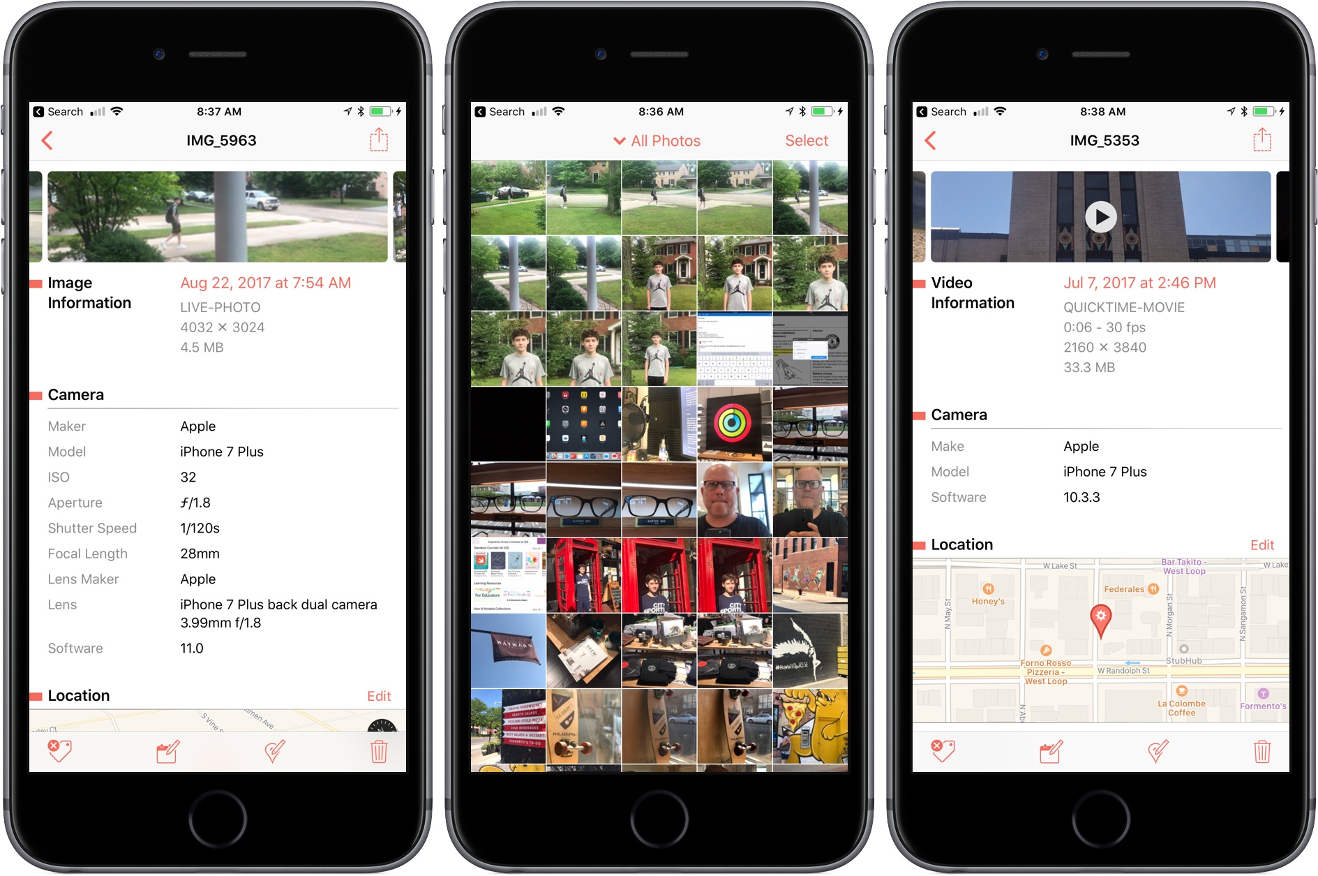
Perhaps the biggest change is that Metapho now supports video. Earlier versions of the app could only handle still photos, so it’s nice to see video added to the mix. The process works the same way as with photos. Access a video using Metapho’s action extension from the Photos app or from within the Metapho app itself. Metapho displays the video’s metadata, which can be edited or stripped.
One of Metapho’s strengths is its design. Whether you start in the app itself or its extension Metapho displays the metadata for images in a clear and concise manner. Today’s update changes the layout by adding cropped versions of the photos or videos you are working on at the top of the page, so you know which image you are working on without it taking up an unnecessary amount of vertical space on your iPhone.
Metapho’s extension also got a refresh with version 3. For the first time, you can select multiple photos to edit. It’s a small change, but one that should speed up the editing process for anyone working with several images or videos.
Metapho is not a utility that I use often, but I keep it tucked away in a folder because when I need it, there’s no better way to edit photo and video metadata. It’s a great example of a thoughtfully designed app, so I’m glad to see its functionality expanded without compromising its utility.
Metapho is available on the App Store.