 MacStories Weekly: Issue 140
Fascinating Close-Up Video of Apple I Being Auctioned Next Month
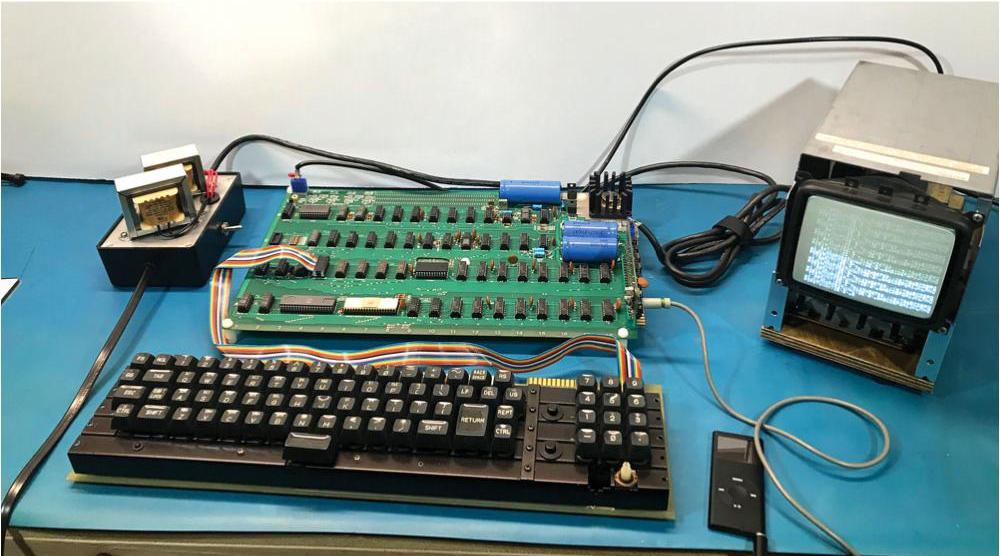
Every so often, an Apple I comes up for auction. The number still in circulation is small. Even rarer are working Apple Is. Next month, auction house RR Auction will sell a working Apple I that’s been rated 8.5/10. The computer, along with peripherals and the original manual, is expected to fetch around $500,000.
Earlier this summer, I had the good fortune of seeing a working Apple I in person during a trip The Henry Ford Museum with Stephen Hackett who donated his collection of iMac G3s to the museum. In person, it’s hard to grasp that the Apple I’s simple circuit board covered with neatly organized, hand-soldered chips played such a critical early step in the history of personal computing.
More interesting to me than the auction though, is a video that the auction house put together to promote the sale, which dramatically pans around the Apple I’s surface revealing the smallest details. It’s a fantastic close-up of a significant piece of computing history that is far closer than you’ll ever be to one in a museum.
You can learn more about the Apple I in this excellent feature by Communications and Information Technology Curator Kristen Gallerneaux on the Henry Ford Museum’s website.
Reigns: Game of Thrones for iOS Announced and Is Available for Pre-Order

Today, Nerial and Devolver Digital announced that they are working with HBO to create a Reigns: Game of Thrones, which is available for pre-order now. Reigns, and Reigns: Her Majesty are among my favorite iOS games. Both Reigns games require players to swipe cards left and right to make decisions about ruling a medieval country and require a careful balancing of multiple interests to survive as monarch.
As I said in my review of Reigns, which I also named one of my favorite games of 2016:
Reigns is perfect for mobile…. Swiping left and right to make decisions about your kingdom is quick and easy wherever you are. The combination of the number of cards, consequences that span generations, and need to balance multiple statistics adds an interesting level of strategy. But above all else, what has endeared Reigns to me most is that the artwork and questions are imbued with a sense of humor that gives Reigns a unique personality unlike any iOS game I have played recently.
Nerial’s follow-up, Reigns: Her Majesty, took the successful formula of Reigns and evolved it to create a deeper more immersive experience than the original.
The same team that created Reigns: Her Majesty is back for the Game of Thrones version, which features characters from HBO’s hit TV series. To get a sneak peek at the game, which will be released in October, Nerial has created a trailer, which is embedded below.
Reigns: Game of Thrones can be pre-ordered now from the App Store for $3.99.
Apple Celebrates US National Parks with Apple Pay Donation Program and Fitness Challenge

Apple is celebrating US National Parks by donating $1 for every purchase made in an Apple Store, on apple.com, and at its retail locations in the US from August 24th through 31st to the National Park Foundation.
Tim Cook, Apple’s CEO said:
“America’s national parks are treasures everyone should experience, and we’re proud to support them again this month by donating a dollar for every purchase made with Apple Pay at one of our stores,” said Apple’s CEO Tim Cook. “These awe-inspiring places are our national inheritance, and Apple is doing our part to pass them on to future generations — just as extraordinary, beautiful and wild as we found them.”
In addition to the its fundraising efforts, Apple has announced a fitness challenge for September 1st. To commemorate the 50th anniversary of Redwood National Park, Apple Watch users who log a 50 minute workout that day will earn a special award in the Activity app and stickers that can be used in the Messages app. The App Store also plans to feature apps for discovering the US national park system.
Facebook’s Onavo Protect VPN App Is Removed from the App Store for Harvesting Data
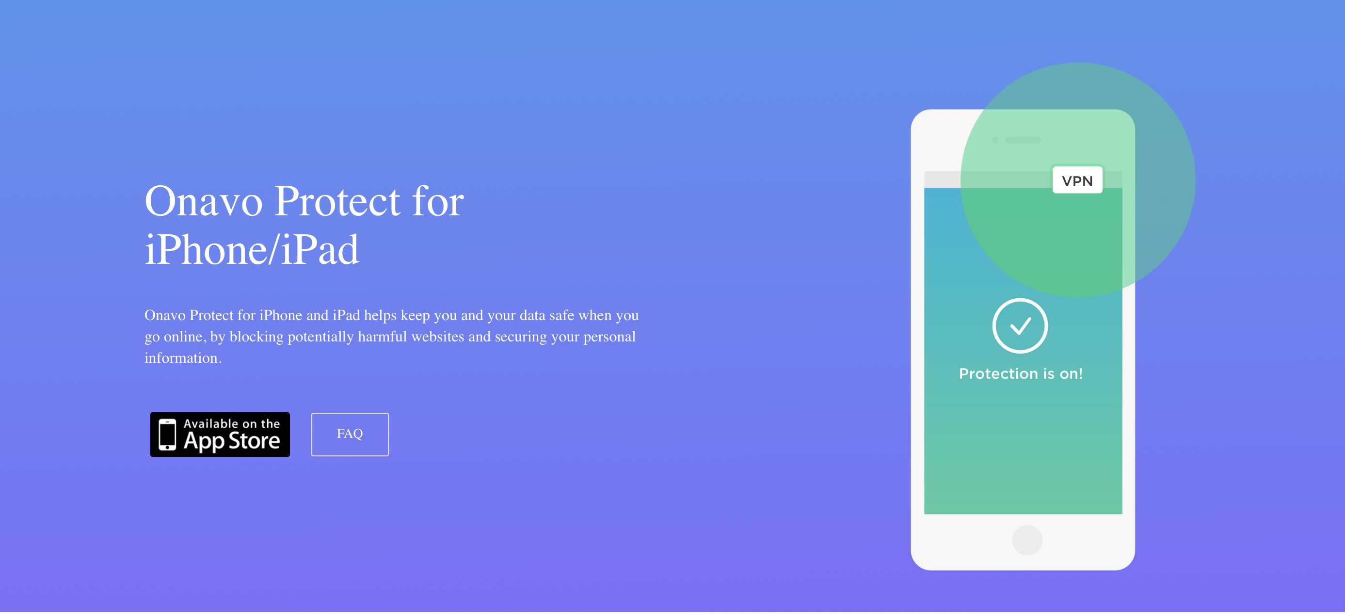
As first reported by The Wall Street Journal, Facebook has removed its Onavo Protect VPN app from the App Store after Apple said the app violated rules against data gathering. The app was acquired by Facebook in 2013 as part of its purchase of an Israeli company.
Onavo collected user data using network traffic to provide market intelligence to Facebook about the popularity and use of apps outside its own apps. TechCrunch reported on Onavo’s data collection practices back in February. In June during WWDC, Apple introduced new App Review Guidelines addressing data harvasting, which struck some as a direct response to Onavo.
In a statement to The Verge, Facebook said:
“We’ve always been clear when people download Onavo about the information that is collected and how it is used,” said a Facebook spokesperson in a statement given to The Verge. “As a developer on Apple’s platform, we follow the rules they’ve put in place.”
It’s good to see Apple enforce App Review guidelines against companies of all sizes, though a little disappointing that it has taken so long.
Preserving macOS History: The 512 Pixels Aqua Screenshot Library→
Having just gone through the exercise of trying to find screenshots and other information about apps from the dawn of the App Store, I have a greater appreciation for how difficult that can be and the need to preserve the historically significant aspects of our digital world. Today, Stephen Hackett revealed a project he’s been working on for nearly a year: a collection of screenshots highlighting macOS from its debut in the Public Beta 17 years ago through today.
Hackett’s Aqua Screenshot Library, which you can find on 512 Pixels, was an enormous undertaking that currently includes 1,502 images that take up 1.6 GB of storage. I particularly like that all of these images were captured from Macs in Hackett’s collection. As Hackett explains:
These images came from the OS, running on actual hardware; I didn’t use virtual machines at any point. I ran up to 10.2 on an original Power Mac G4, while a Mirror Drive Doors G4 took care of 10.3, 10.4 and 10.5. I used a 2010 Mac mini for Snow Leopard and Lion, then a couple different 15-inch Retina MacBook Pros to round out the rest.
When you have a moment, browse the collection. It’s fascinating to see the evolution of macOS from its origins through today.
The History of Aperture
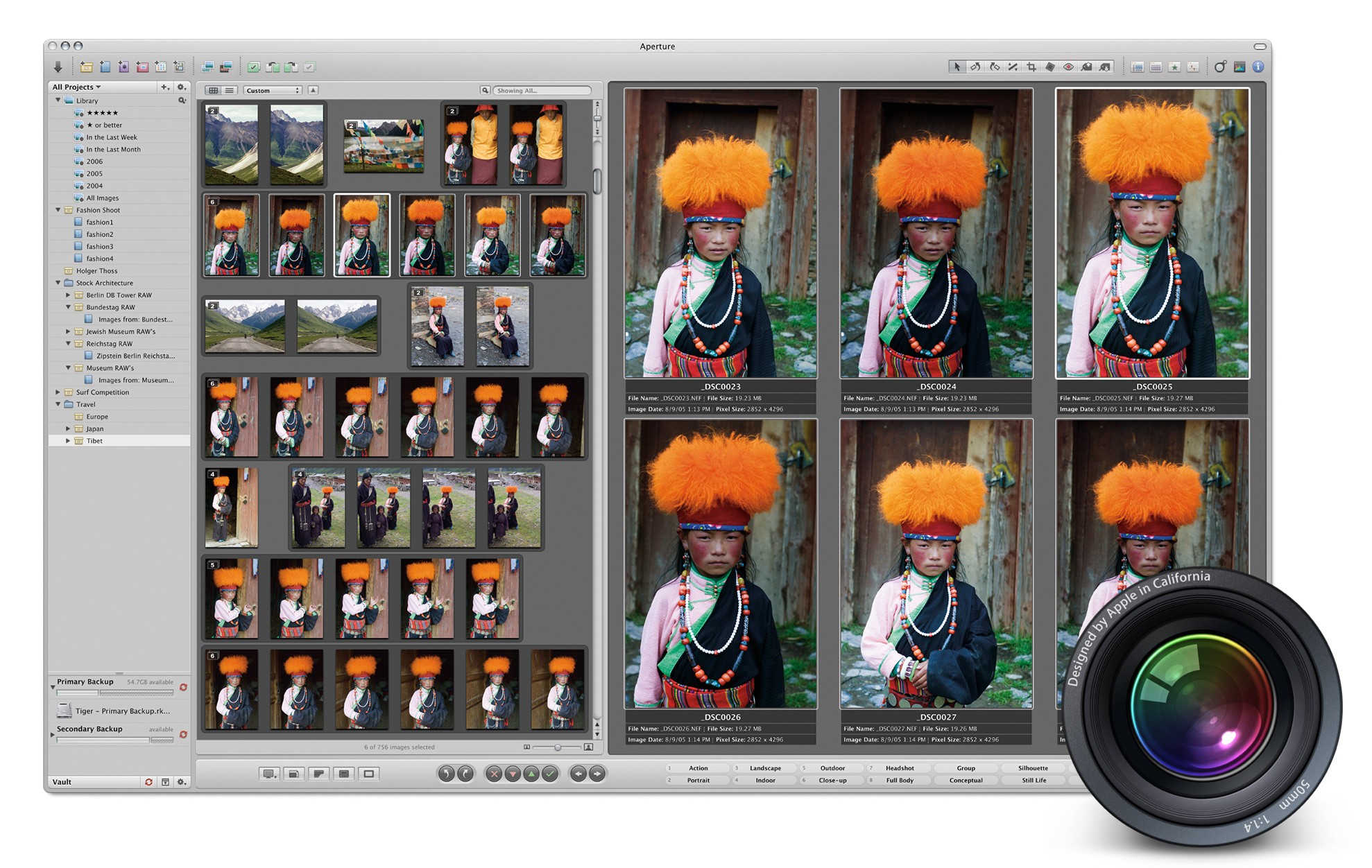
For years, iLife defined the Mac experience, or at the very least, its marketing. An iMac or MacBook wasn’t a mere computer; it was a tool for enjoying your music, managing your photos, creating your own songs, editing your home videos, and more.
iLife was brilliant because it was approachable. Programs like iTunes, iPhoto, iMovie, iDVD, and GarageBand were so simple that anyone could just open them from the Dock and get started creating.1
Of course, not everyone’s needs were met by the iLife applications. iMovie users could upgrade to Final Cut, while Logic was there waiting for GarageBand users. And for those needing more than what iPhoto could provide, Apple offered Aperture.
Dark Sky Update Consolidates Weather Data in a Single Vertical View
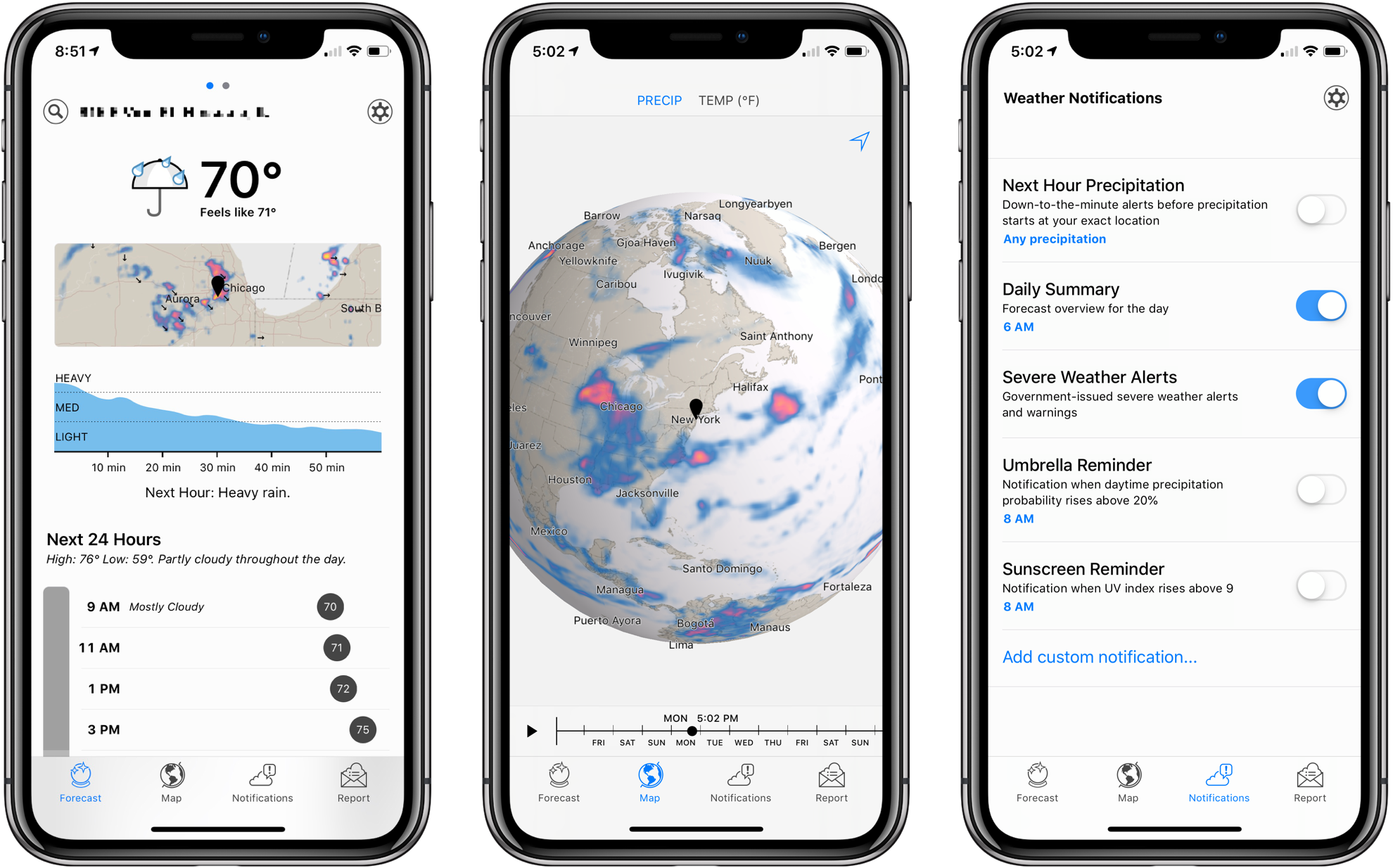
Dark Sky’s signature feature has always been its uncanny ability to predict when it was about to rain. The app has a reputation for working better in the US than other parts of the world, and in my experience, it’s not as good at predicting snowfall, but its ability to keep users from getting caught off guard by a sudden storm has garnered it a lot of fans.
Besides an app, Dark Sky is an API that other weather apps use to deliver their data. That means you can experience many of the benefits of Dark Sky by using other weather apps, which is what I’ve done for some time. Dark Sky was once my weather app of choice, but over time, I moved to other apps that used its API and presented weather data in ways I prefer.
Yesterday, Dark Sky’s app was updated with a redesign that addresses many of the shortcomings of earlier versions. The main Forecast view now features a higher density of information and visual cues that make it easier to understand predicted weather changes at a glance. It’s a marked improvement over previous versions of the app, but the new focus on a vertical timeline comes with drawbacks that won’t be to everyone’s taste.
FiftyThree Apps Paper and Paste Acquired by WeTransfer Along with Its Other Assets
FiftyThree, the maker of the iOS apps Paper and Paste, has been acquired by WeTransfer, a file transfer company based in Los Angeles and Amsterdam. Paper, FiftyThree’s iPad drawing app, was named iPad App of The Year in 2012. Paste, which is FiftyThree’s iOS presentation app, allows users to create slides collaboratively.
In addition to its apps, FiftyThree is well-known for its creation the Pencil, a BlueTooth stylus that debuted before Apple’s identically-named Pencil. Although the Pencil is not mentioned by name in WeTransfer’s press release, the company is acquiring all of FiftyThree’s assets including intellectual property, which presumably covers hardware too.
WeTransfer provides web and app-based tools for transferring files among its users. In addition to offering a free version of its service, WeTransfer includes a premium paid version of its service and sells ads that appear in its web app. WeTransfer’s CEO Gordon Willoughby stated in the company’s press release that it had acquired FiftyThree to expand its ‘family of obvious creative tools, both on mobile and the web.’
FiftyThree has sought to reassure customers saying that:
For the millions using Paper and Paste, we want to assure you that we are dedicated now more than ever to building and growing both tools. This doesn’t change our path, it only accelerates it — the same great team will continue working on both tools. If you’re a paying Paste or Paper customer, nothing is changing around pricing or functionality in the near term, and we’ll keep you well-informed of any upcoming changes that may impact you. We’ve got a few big ideas cooking that we think you’ll be thrilled about.
I imagine the introduction of Apple’s Pencil took its toll on FiftyThree’s attempt to use hardware to build a sustainable business model. Hopefully, joining forces with WeTranfer will allow Paper and Paste, which are both excellent apps, to continue to be developed long into the future.