 MacStories Weekly: Issue 150
Justin O’Beirne Evaluates Apple’s New Maps and How They Stack Up Against Google Maps→

Justin O’Beirne has written about the evolution of Apple Maps and how the app compares to Google Maps several times in the past, which we’ve covered on MacStories. In his most recent analysis, O’Beirne asks whether Apple’s new efforts to update Maps has closed the gap with Google Maps. Backed up by over 100 images comparing the two sets of map data, the answer appears to be a qualified yes. In some respects, Apple has caught up and even passed Google, but in other areas, it remains behind.
Apple also has a long way to go before its Maps update is complete. As O’Beirne notes, the currently-updated map data covers a small fraction of the globe consisting of Northern California and a slice of Nevada. However, those 48 California and 4 Nevada counties contain a lot of new details.
Connected, Episode 216: The Honking Powers the Vehicles→
The MacBook Air and Mac mini are alive, and the iPad Pro has taken a big step forward, but progress seems to come with larger price tags. The guys dive into all the news, after Federico reviews New York City.
This week’s episode of Connected is all about Apple’s Brooklyn event and my first impressions of the new iPad Pro. You can listen here.
Sponsored by:
- Pingdom: Start monitoring your websites and servers today. Use offer code CONNECTED to get 30% off.
- Linode: High performance SSD Linux servers for all of your infrastructure needs. Get a $20 credit with promo code ‘connected2018’
- PayPal: When it comes to growing your business, PayPal is your payments partner for today and tomorrow.
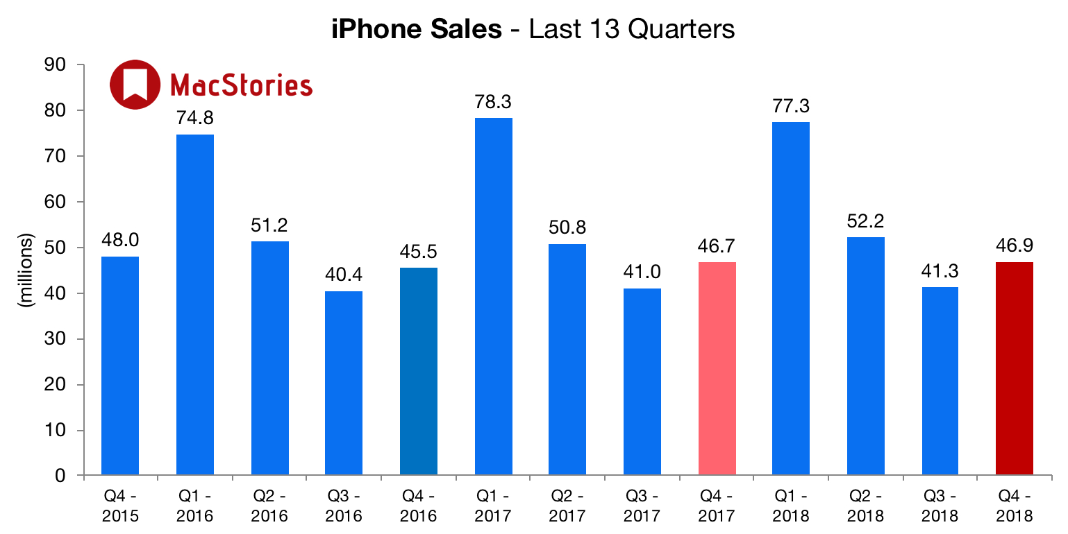
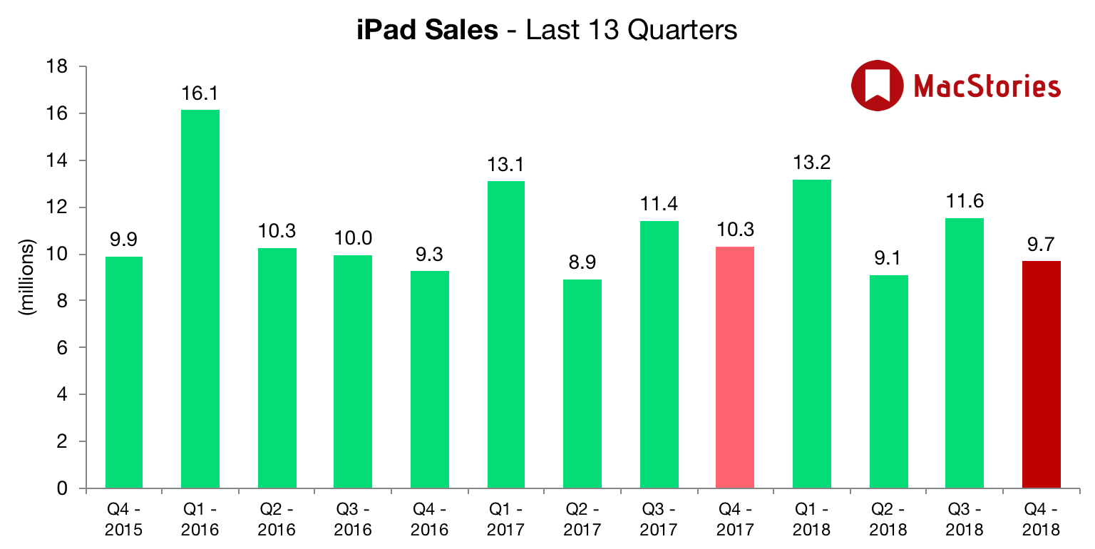
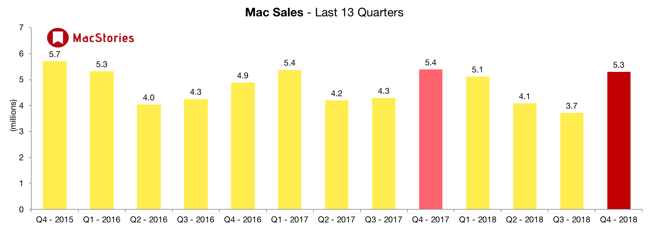
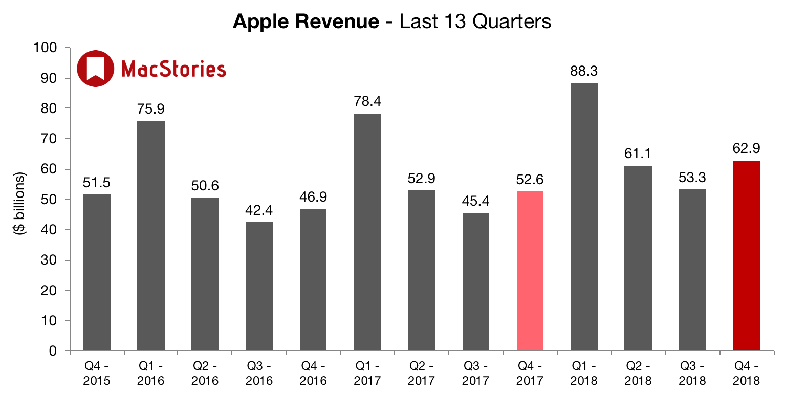
Apple Q4 2018 Results: $62.9 Billion Revenue, 46.9 Million iPhones, 9.7 Million iPads Sold

Apple has just published its financial results for Q4 2018. The company posted revenue of $62.9 billion. Apple sold 9.7 million iPads, 46.9 million iPhones, and 5.3 million Macs during the quarter.
We’re thrilled to report Apple’s best June quarter ever, and our fourth consecutive quarter of double-digit revenue growth,” said Tim Cook, Apple’s CEO. “Our Q3 results were driven by continued strong sales of iPhone, Services and Wearables, and we are very excited about the products and services in our pipeline.
Estimates and Expectations for Q4 2018, and the Year-Ago Quarter (Q4 2017)
Apple’s revenue guidance for Q4 2018 fell between $60 billion and $62 billion, with gross margin estimated to be between 38% and 38.5%.
Going into today’s earnings call, The Motley Fool reports that:
For the fiscal fourth quarter, Apple is expecting revenue of $60 billion to $62 billion, which would represent year-over-year growth of 14% to 18%. The company is also calling for gross margin of 38% to 38.5%, and operating expenses of about $8 billion.
Analysts’ consensus estimates are calling for revenue of $61.48 billion, up 16.9% year over year and near the high end of Apple’s forecast; earnings per share are being pegged at $2.78, rising 34.3% compared to the prior-year quarter.
In the year-ago quarter (Q4 2017), Apple earned $52.58 billion in revenue. During that quarter Apple sold 46.7 million iPhones, 10.3 million iPads, and 5.4 million Macs.
Graphical Visualization
Below, we’ve compiled a graphical visualization of Apple’s Q4 2018 financial results.
After the break, more charts and commentary on Apple’s Q4 earnings on Twitter:
HomeRun: Quickly Trigger HomeKit Scenes on Your Apple Watch
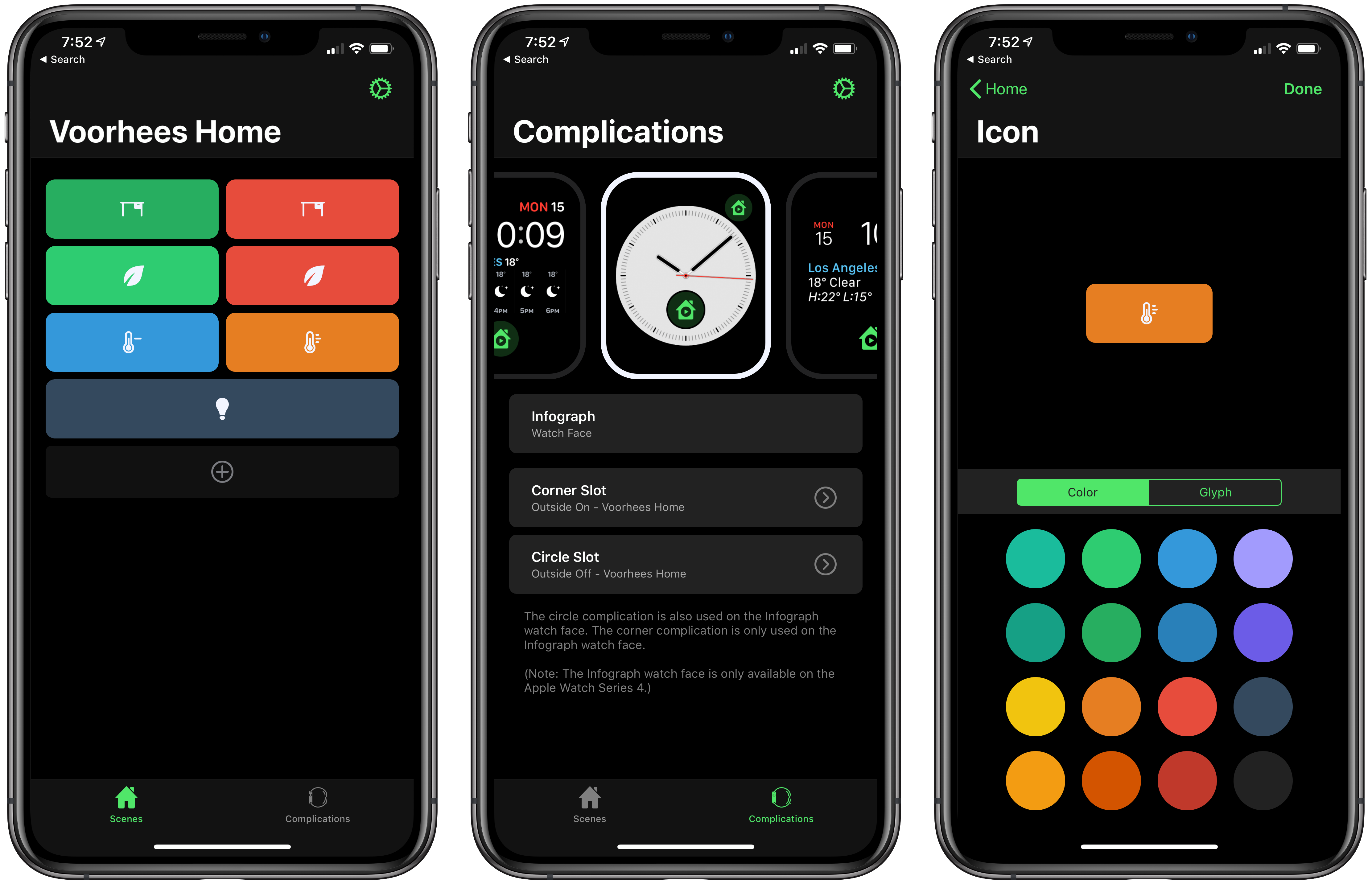
HomeRun is a simple, elegant utility for triggering HomeKit scenes from your Apple Watch. Through a combination of color and iconography, HomeRun developer Aaron Pearce, who is the creator of other excellent HomeKit apps like HomeCam and HomePass, creates an effective solution for accessing HomeKit scenes from your wrist. It’s a user-friendly approach that’s a fantastic alternative for HomeKit device users frustrated by Apple’s Home app.
Apple’s Home app is hard to use on the Apple Watch. First, when you open Home on the Watch, it’s not clear what you’re seeing. Home presents a series of card-like, monochrome scene and accessory buttons that you scroll through one or two at a time. Although the app doesn’t say so, these are the favorite scenes and accessories from the Home tab of the iOS app. That makes the list customizable, which is nice, but the app should do a better job identifying where the user is in relationship to the iOS app.
Second, although you can rearrange your Home favorites to reorder them on the Watch too, you can only see two scenes or one accessory at a time. Depending on how many favorites you have, that limits the Watch app’s utility because a long list of scenes and accessories requires a lot of swiping or scrolling with the Digital Crown.
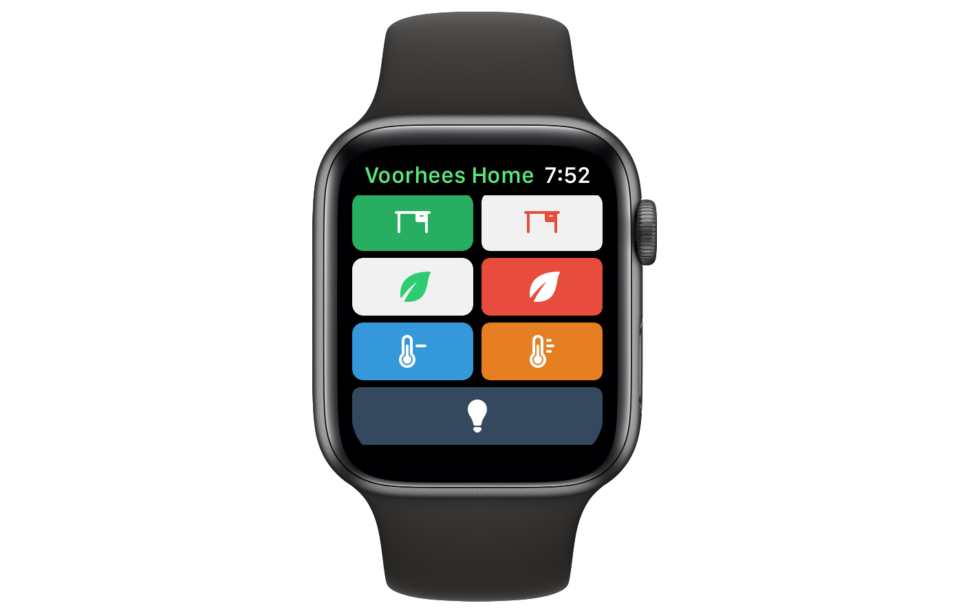
HomeRun avoids this by eliminating text and relying on color and iconography to distinguish between scenes. The app is also limited to triggering scenes, reducing potential clutter further. The approach allows HomeRun to display up to 12 scenes on a single screen of a 44mm Apple Watch compared to the two scene buttons that Home can display. If you set up more than 12 scenes, they are accessible by scrolling.
Monthly Log: October 2018
October 30 Roundup: All the Little Things

Today’s Apple event at the Brooklyn Academy of Music’s Howard Gilman Opera House introduced new MacBook Air, Mac mini, and iPad Pro, but there were also a lot of small details revealed outside the keynote in press releases, on product webpages, and elsewhere. Below is a roundup of some of the most interesting details you may have missed.
The Event
- Apple posted photos highlighting today’s event, including the cavernous and crowded hands-on area.
- Attendees of the Apple event received stickers.
iPad Pros
- Only the 1TB model of the iPad Pro has 6GB of RAM. The other models have 4GB of RAM.
- The 11-inch iPad Pro is the first iPad that doesn’t have a 4:3 aspect ratio.
- Matthew Panzarino reports that the reduction in size and weight of the 12.9-inch iPad Pro make it a compelling choice over the 11-inch model.
- The minimum width of apps displayed in Split View and the width of apps in Slide Over on the iPad Pro has been increased.
- The iPad Pro lets you know if you’re covering the Face ID camera with your finger.
- When you run an app in Split View with an app that hasn’t been updated for the new iPad Pro, they both run in a compatibility mode that shrinks the apps, leaving empty space along the top and bottom edges of the apps.
- Apple is selling a USB-C to 3.5mm adapter because there is no headphone port on the iPad Pro.
- Apple is also selling a USB-C to SD Card reader.
Apple Pencil
- The second-generation Apple Pencil has a matte finish, which Rene Ritchie says provides tactility, and there is a flat edge for the new double-tap gesture.
- Third-party developers can customize the actions associated with the Apple Pencil’s double-tap gesture, but are encouraged to be judicious in doing so.
- The Apple Pencil displays an on-screen message confirming when it is magnetically attached to the iPad Pro.
- The new Apple Pencil only works with the new iPad Pros, and the first generation Apple Pencils do not work with the new iPads.
Macs
- It’s possible to configure a new Mac mini that costs $4200.
- The Mac mini’s RAM is upgradable, but Apple encourages users to do so at an Apple Store or an authorized reseller.
- The MacBook Air has a 7W Core i5-8210Y Amber Lake Y processor.
You can also follow all of our Apple event coverage through our October 30, 2018 hub, or subscribe to the dedicated October 30, 2018 RSS feed.
AppStories, Episode 85 – Personalizing Our iOS Setups→
On this week’s episode of AppStories, we talk about some of the ways we personalize and tweak our iOS setups, including wallpapers, widgets, control center, share sheets, app icons, and more.
Sponsored by:
- Luna Display - The only hardware solution that turns your iPad into a wireless display for your Mac. Use promo code APPSTORIES at checkout for 10% off.
- Mack Weldon - Smart underwear for smart guys. Get 20% off your first order with the code APPS.
AppStories Episode 85 - iOS Personalization and Customization
0:00
35:56
35:56


Pixelmator Photo Is Coming to the iPad Later This Year

I use Pixelmator Pro almost every day on my Mac. A lot of the time, that’s for simple edits to screenshots, but I also use it for more complex layered images and editing photos. I’ve enjoyed the iOS version a lot too, but with the introduction of Pixelmator Pro on the Mac, development of the iOS version slowed. I still use the iOS app, but it’s in need of an update, which is why I was so pleased to see Pixelmator Photo teased at today’s Apple event in New York.
Pixelmator Photo will be out later this year. The app, which was first mentioned when Pixelmator Pro launched almost a year ago, is an iPad-only photo editing app that appears to closely follow the design of the Mac app and include much of its functionality too. In addition to being highlighted during Apple’s keynote today, Pixelmator Photo was on the iPads in the hands-on area after the event where Federico had a chance to try the app for a short time and was impressed.
 is very similar to Pixelmator Pro's on the Mac (left).")
According to the Pixelmator team’s preview webpage, the app:
features a collection of nondestructive, desktop-class photo editing tools, a set of stunning, machine learning-enhanced film emulation presets, a magical Repair tool to remove unwanted objects from your photos, support for editing RAW images, and more.
Pixelmator says the app will include non-destructive color adjustments including Levels, Curves, Hue & Saturation, Selective Color, and Black & White as well as Repair and Cropping tools. The app will also support RAW image editing and the ML Fix feature recently introduced in the Mac app. Machine learning will also be used to simulate analog film with a set of presets and power cropping suggestions.
Apple showed that it’s committed to offering pro-level hardware in the iPad line with the new 11 and 12.9-inch iPad Pros today. Apps are the other half of the equation, and it’s encouraging to see Pixelmator Photos announced along with Adobe’s Photoshop, and other apps that will take advantage of Apple’s new hardware.
You can also follow all of our Apple event coverage through our October 30, 2018 hub, or subscribe to the dedicated October 30, 2018 RSS feed.