Overcast, Marco Arment’s iOS podcast player, received its first update of 2020 today, which enhances the listening experience with improvements focused on playback and audio quality.
Today’s update adds support for AirPlay 2, which means much faster switching between devices like an iPhone or iPad and a HomePod or another AirPlay 2 speaker or device. AirPlay 2 also buffers more audio than Apple’s original AirPlay technology. As a result, Overcast can continue playing a podcast episode even if you are temporarily out of range of the AirPlay 2 receiver.
I’m delighted that Overcast supports AirPlay 2 now. I often listen to podcasts as I’m doing things around my house. When I move to a room with one of my HomePods, the process of switching to the HomePod from my iPhone’s built-in speaker is much faster and smoother now, whether I use Control Center or tap my phone on the top of the HomePod. The delay with the original version of AirPlay wasn’t a deal-breaker, but it was a constant small annoyance that kept me from using AirPlay with Overcast most of the time. With AirPlay 2 baked into the app, I’m using my HomePods to listen to podcasts far more than ever before.
The latest version of Overcast also adds Voice Boost 2. The feature has been rebuilt from the ground up, and the results are subtle but noticeable. The first time I played a podcast using Voice Boost 2 over my iPhone’s speaker in a noisy environment, I immediately sensed the difference. Where in the past, I would have to turn the volume up all the way to hear a podcast over constant, loud background noise like running water, now I can turn the volume down and still listen to what was said and with less distortion.
Over the weeks I’ve been testing the update to Overcast, Voice Boost 2’s volume and clarity improvements have become the ‘new normal,’ making the difference feel less pronounced than they were at first. However, that’s also why the update to the feature is so good. The change is so natural that you don’t notice it except side-by-side with the old version of the feature or another podcast player.
Under the hood, Voice Boost 2 has been entirely re-written and draws on Arment’s experience editing hundreds of podcast episodes. As he describes it in a post on Marco.org:
Voice Boost 2 is a mastering-quality audio-processing pipeline that applies broadcast-standard loudness normalization, light compression and EQ, and a true-peak lookahead limiter to your podcasts, in real time, without sacrificing quality or battery life.
You don’t need to understand what that means to appreciate Voice Boost 2, but Overcast is applying sophisticated, professional-grade audio processing techniques on the fly to generate audio that sounds more natural and is less jarring in contrast to system audio like Siri. Moreover, Overcast accomplishes this while using hardly any CPU resources (1% on an iPhone SE according to Arment), which means you get the benefits of Voice Boost 2 without paying a high price in battery drain. Voice Boost 2 is a remarkable technical accomplishment with practical, real-world benefits that make listening to podcasts more enjoyable.
According to Arment, Smart Speed has been updated to handle background noise better, too. The feature works the same way as it always has, but now it relies on dynamically changing based on Voice Boost’s loudness analysis. I haven’t noticed a difference here, but shows I listen to regularly don’t have a lot of background noise.
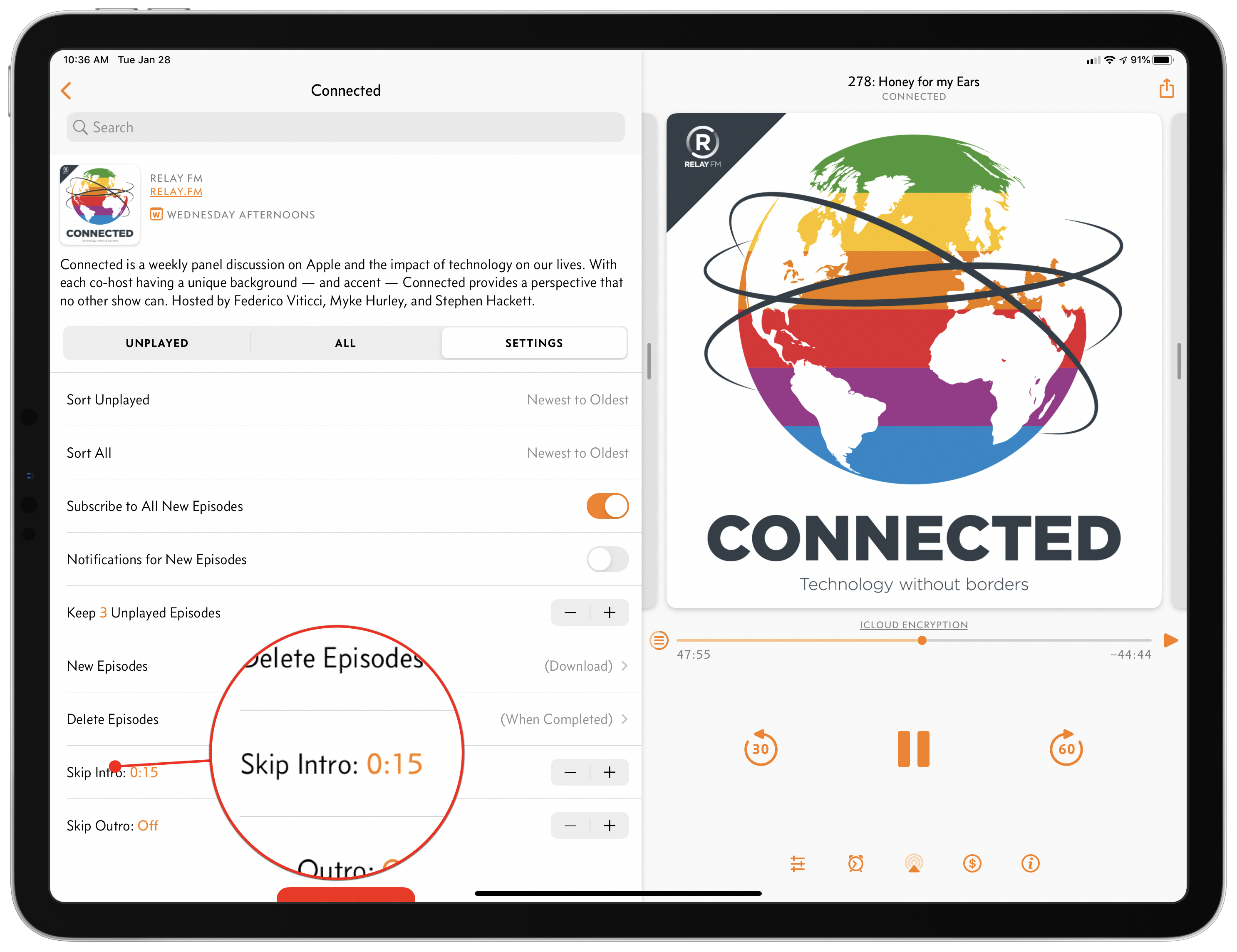
Overcast also includes a couple of other smaller features in this release too. First, you can set a number of seconds to skip at the beginning and end of an episode on a per-podcast basis, which allows you to skip a show’s intro and outro. The period can be set in five-second increments and is a nice addition for shows with long intros and outros that you’ve heard over and over and would prefer to skip, though it’s not a feature I expect to use personally.
Second, clip sharing and starring episodes are now available for private podcast feeds. I haven’t tried this feature because I don’t subscribe to any private feeds, but it’s good to see those features added to private feeds too.
The most significant changes to Overcast in this update are completely invisible to the user but have a considerable impact on how podcasts are enjoyed. With Voice Boost 2 and AirPlay 2 support, Overcast makes your favorite shows sound better, and they are easier to enjoy on more devices, which is a significant improvement for anyone who listens to podcasts in a lot of different environments and contexts.
Overcast 2020.1 is available on the App Store as a free update.