macOS Ventura: The MacStories Review

Future on Hold

On the whole, Ventura has been a pleasure to use all summer and into this fall. I installed the first developer beta in June, put my Mac Studio into Stage Manager mode and never looked back. As I’ve explained, Stage Manager’s stages need to be easier to create, but that doesn’t change how much I like flipping back and forth between a few sets of apps once they’re set up. I’m also a big fan of iCloud Shared Photo Libraries, the new smart features of Notes and Reminders, Mail’s new capabilities, and the new Tab Group features in Safari.

Still, something is amiss with Ventura. It’s not the sort of thing that is going to spoil your day-to-day use of the Mac. I’ve had no trouble with that sort of thing. Instead, it’s a feeling I never shook through eleven beta releases.
macOS has come a long way from 2018’s Mac Catalyst Sneak Peek. Some aspects of the strategy set in motion at that year’s WWDC have already been accomplished, and that’s where Ventura shines. It’s great to finally see Mac system apps updated across all Apple platforms at once, and the influx of excellent third-party apps we’ve seen in the past couple of years is wonderful.

However, what was set in motion in 2018 and even earlier in 2017 with Apple’s acquisition of Workflow hasn’t been finished. One of the remaining barriers between moving between the Mac and iPad is the difference in their interaction models. Stage Manager could be the bridge between the two OSes, but in its current state, I’m afraid most people will try Stage Manager once and then never again.
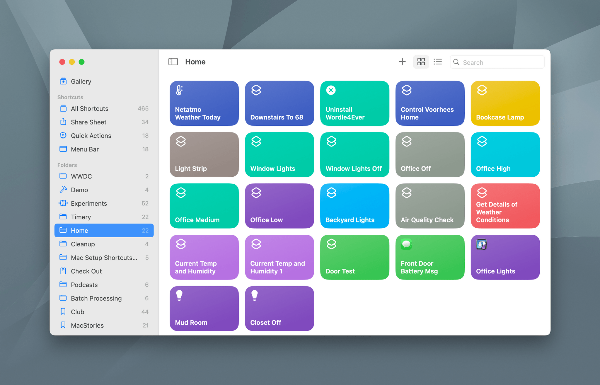
Then, there’s Shortcuts. It doesn’t feel great to be here criticizing Shortcuts two years running. I suppose I’m hard on Shortcuts because it’s so important to the work I do, but I also take at face value Apple’s claim that it’s the future of automation on the Mac. However, Shortcuts won’t be the future of automation unless it can get beyond the functionality of Automator. In one sense, it already has in that third-party developers have adopted Shortcuts more eagerly than they ever did with Automator, keeping Shortcuts and my optimism for the app afloat this past year. Still, deeper system-level action support that takes Shortcuts beyond its roots in past automation schemes is imperative to back up Apple’s bold claims.

Finally, System Settings as inconsequential as it is in some ways, is troubling not because it ruins the macOS experience, but because it’s a rare lapse in Apple’s usual thoughtful design. System Settings doesn’t improve on System Preferences. It’s just a poor substitute for something that was flawed itself. It’s a hard design problem to solve, but just a couple of years ago, Apple was rolling out new macOS and iPadOS designs that brought the two platforms much closer together without compromising the unique identities of either device. System Settings is the exact opposite, which is why it bothers me.
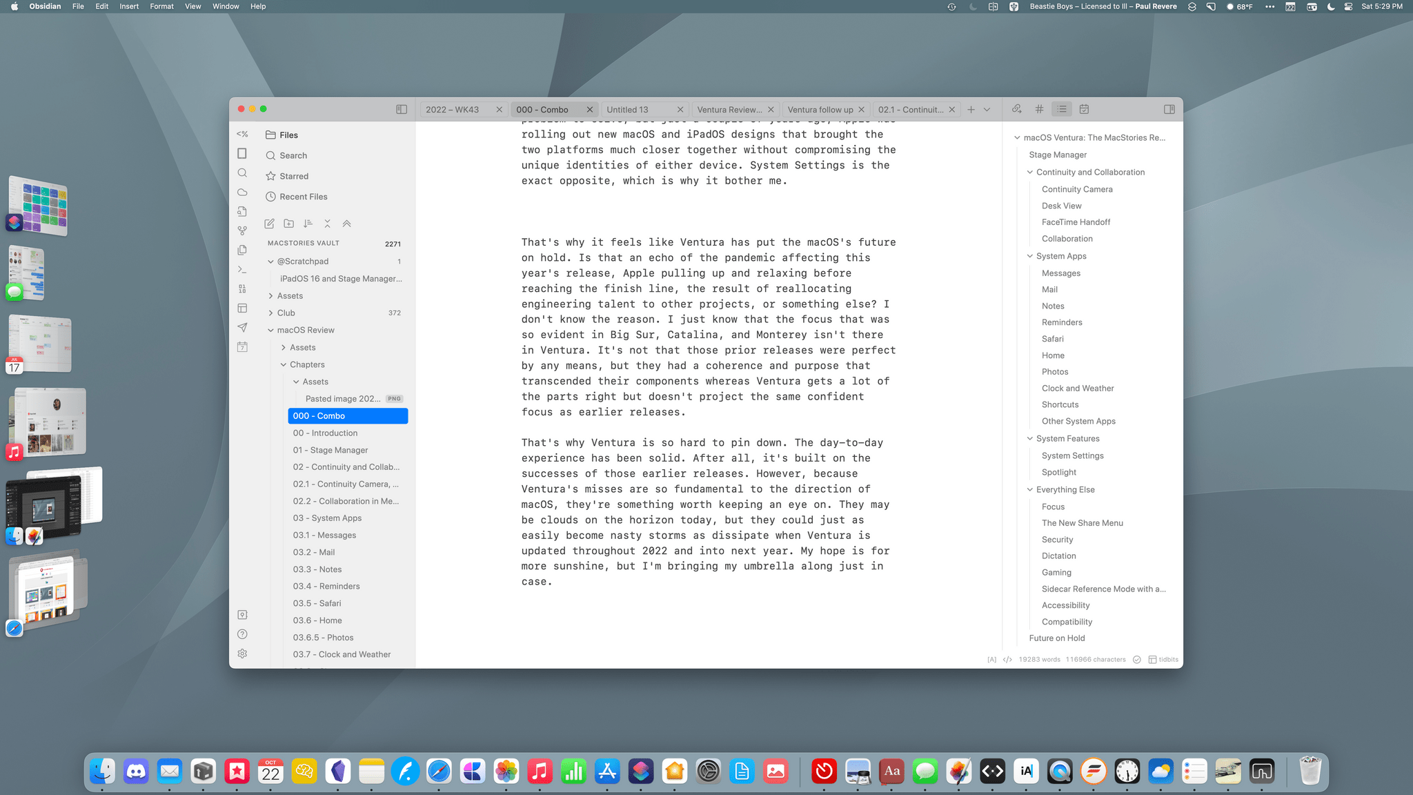
That’s why it feels like Ventura has put macOS’s future on hold. Is that an echo of the pandemic affecting this year’s release, Apple pulling up and relaxing before reaching the finish line, the result of reallocating engineering talent to other projects, or something else? I don’t know the reason. I just know that the focus that was so evident in Big Sur, Catalina, and Monterey isn’t there in Ventura. It’s not that those prior releases were perfect by any means, but they had a coherence and purpose that transcended their components, whereas Ventura gets a lot of the parts right but doesn’t project the same confident focus about macOS’s future as earlier releases.

That’s why Ventura is so hard to pin down. The day-to-day experience has been solid. After all, it’s built on the successes of those earlier releases. However, because Ventura’s misses are so fundamental to the direction of macOS, they’re something worth keeping an eye on. They may only be clouds on the horizon today, but they could just as easily become nasty storms next year unless Apple continues to build and improve on the foundation it started in 2018.
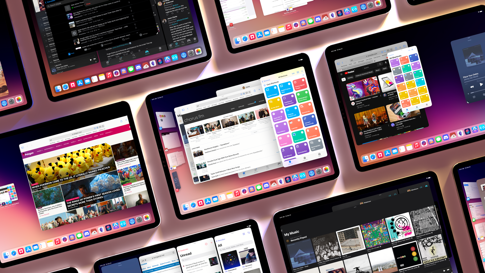


Stage Manager in iPadOS 16: At the Intersection of Bugs, Missing Features, and Flawed Design

Stage Manager in iPadOS 16.1.

Stage Manager in iPadOS 16.1.

This article wasn’t supposed to go like this.

iPadOS 16 is launching to the public today, and it carries a lot of expectations on its shoulders: for the first time since the introduction of the original iPad in 2010, Apple is embracing a Mac-like windowing system that lets you use up to four windows at the same time on the iPad’s screen. You can even resize them and make them overlap. If you’ve been following the evolution of the iPad for a while, you know that’s very unusual.

But the reason this story was meant to be different isn’t to be found in Apple’s design philosophy for iPadOS 16. Typically, MacStories readers would expect a full-blown ‘The MacStories Review’ to go alongside a new version of iPadOS. That’s what I’ve been doing for over seven years at this point, and I don’t like breaking my writing patterns. When something works, I want to keep writing. That’s precisely why I had to stop writing about iPadOS earlier in the summer and until last week.

Stage Manager, the marquee addition to iPadOS that lets you multitask with floating windows, started crashing on my M1 iPad Pro in mid-July and it was only fixed in early October. When I say “crashing”, I mean I couldn’t go for longer than 10 minutes without iPadOS kicking me back to my Lock Screen and resetting my workspaces. And that was only the tip of the iceberg. For nearly two months, I couldn’t type with Apple’s Magic Keyboard or use keyboard shortcuts when Stage Manager was active. Before it was pulled by Apple and delayed to a future release, external display support in Stage Manager was impossible to rely on for production work. The list goes on and on and on.

Normally, I would use the introduction of my iOS and iPadOS reviews to tell you how I’ve been living and working with the new operating system every day for the past three months. I’ve always tried to publish annual OS reviews that are informed by practical, consistent usage of a new operating system which, I hope, has led to highly opinionated, well-researched stories that can stand the test of time. That kind of story hasn’t been possible for me to produce with iPadOS 16 yet.

Effectively, I’ve only been able to sort-of use iPadOS 16 with Stage Manager on my M1 iPad Pro again for the past two weeks. Before that, it’s not that I didn’t want to use iPadOS 16 and Stage Manager because I hate progress; I literally couldn’t unless I was okay with my iPad crashing every 10 minutes. So, at some point over the summer, I made the call to revert to Split View and Slide Over – which are still the iPad’s default multitasking mode in iPadOS 16 – and I’d check back in on Stage Manager on each beta of iPadOS 16. It was only around two weeks ago that, despite some lingering bugs I’ll cover later, I was able to finally leave Stage Manager enabled and go back to where I was when I published my iPadOS 16 first impressions article in July.

Think about my position this way: there’s a hole from early August to early October in my typical “reviewer summer” during which I couldn’t use the biggest addition to iPadOS 16 at all. The fact that Apple delayed, slimmed down, and kept iterating on Stage Manager until the very last minute seems to suggest I wasn’t the only one desperately trying to make it work.

I started using iPadOS 16 and Stage Manager again two weeks ago; what kind of “review” should this be?

Read more


AppStories, Episode 301 – The New iPad and iPad Pro Review: Mixed Signals

This morning we got into the details of Federico’s review of the latest iPad Pro and the new 10th generation iPad.

Sponsored by:

  • Concepts – Infinite, Flexible Sketching.

We deliver AppStories+ to subscribers with bonus content, ad-free, and at a high bitrate early every week.

To learn more about the benefits included with an AppStories+ subscription, visit our Plans page, or read the AppStories+ FAQ.

Permalink

The New iPad and iPad Pro Review: Mixed Signals

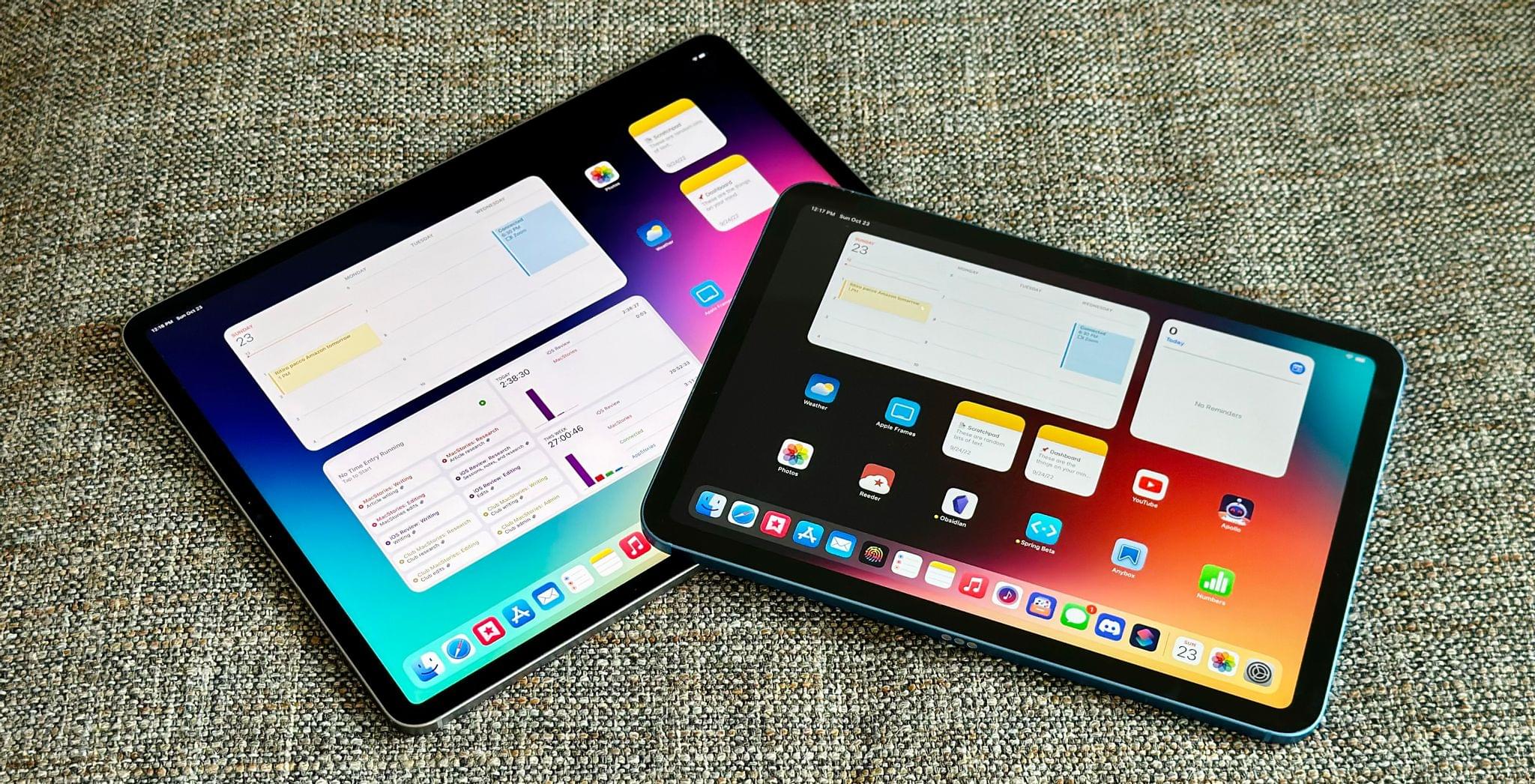
The new iPad Pro and iPad.

The new iPad Pro and iPad.

Last week on Thursday, I received review units of the new 10th generation iPad and 6th generation iPad Pro. I’ve spent the past few days testing and getting work done with both of them – including finishing a big story about Stage Manager I’m going to publish in a few hours on MacStories.

These are relatively easy iPads to review with a fairly straightforward narrative around them. The new iPad Pro is an iterative update that shows us Apple has seemingly hit a plateau in terms of innovation with this particular design – save for one feature that truly surprised me. The new base model iPad is a massive update compared to its predecessor, adding an all-new, iPad Pro-inspired design and a brand new accessory – the Magic Keyboard Folio – that has turned out to be one of my favorite accessories Apple has launched in recent years. I’ve had a ton of fun playing around and working with the new iPad over the weekend; if you’re in the market for an 11” tablet, you shouldn’t sleep on this one.

When considered individually, these new iPads are solid options in their respective categories – each delivering on the different goals Apple set out to accomplish for these product lines in 2022.

It’s when you zoom out and take a broader look at the new state of the iPad lineup that things become…a bit more confusing.

Read more


Kolide: Endpoint Security Shouldn’t Mean Compromising Employee Privacy [Sponsor]

“If you build a dystopian and cynical security program born out of fear, mistrust, and suspicion, then you will inevitably make your fellow employees your enemies.”

That’s a quote from Honest Security, Kolide’s mission statement, and North Star. It was written by Kolide’s CEO, Jason Meller, who spent his career in cybersecurity before founding Kolide. 

He was troubled by the widely-accepted idea among cybersecurity professionals that end users should be treated, first and foremost, as threats. This way of thinking informs the traditional approach to device management, which relies on MDMs that take control of devices and come with surveillance capabilities that most companies don’t need or even really want.

Kolide works by notifying your employees of security issues via Slack, educating them on why they’re important, and giving them step-by-step instructions to resolve them themselves.

Kolide’s open-source agent collects data across 43 categories on Mac, Windows, and Linux devices. It can answer questions like:

  • Do any of my developers have unsecured SSH keys floating around?
  • Does everyone have disk encryption, screen lock, and password managers set up?
  • Are there any Macs in my fleet in need of a new battery?

And while Kolide can provide insights that MDMs can’t, our commitment to transparency really sets us apart. Employees can visit the User Privacy Center for an explanation of precisely what data is being collected, by whom, and for what purpose.

Want to see how it works for yourself? Click here for a free trial, no credit card required, and let us show you what Kolide’s all about.

Our thanks to Kolide for sponsoring MacStories this week.


MacStories Unwind: Exploring the New Apple TV 4K

AppStories+ Deeper into the world of apps
0:00
22:50

AppStories+ Deeper into the world of apps


This week on MacStories Unwind, John is joined by Alex Guyot to talk about the third-generation Apple TV 4K, how they use their Apple TVs and what the new hardware might mean for streaming content in the future.


Music Remote: A Beautiful Retro Utility for Controlling Playback of Apple’s Music App

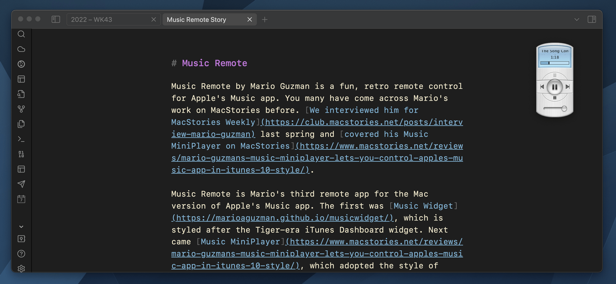
Music Remote by Mario Guzman is a fun, retro remote control for Apple’s Music app. You may have come across Mario’s work on MacStories before. We interviewed him for MacStories Weekly last spring and covered his Music MiniPlayer on MacStories.

Music Remote is Mario’s third remote app for the Mac version of Apple’s Music app. The first was Music Widget, which is styled after the Tiger-era iTunes Dashboard widget. Next came Music MiniPlayer, which adopted the style of iTunes 10’s mini player. Music Remote reaches further back in time to the Mac OS X Public Beta, recreating the look of Music Player, an app that didn’t last long.

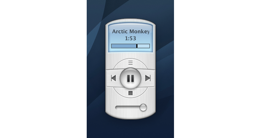
Music Remote up close.

Music Remote up close.

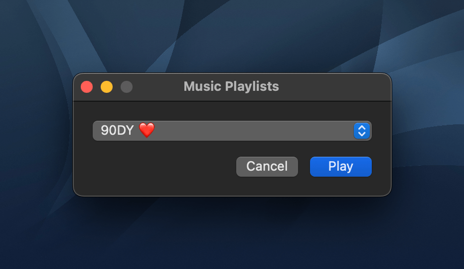
The compact remote requires Apple’s Music app to be running, but once it is, you can minimize Music and use Music Remote instead. The app includes buttons to play/pause and skip forward and back, as well as a couple of unique buttons above and below the play/pause button. Above play/pause is a button that opens a separate window that lets you pick from your playlists. Below is a stop button. It works the same as pause, except that when you resume playback, it will start with the next song in an album or playlist instead of picking up mid-song.

Music Remote's playlist picker.

Music Remote’s playlist picker.

The display above the controls cycles among the song title, artist, and album name. If a text string is too long to fit into Music Remote’s tiny screen, it scrolls horizontally. You can also cycle through the information displayed in Music Remote more quickly by clicking on its screen. The screen shows elapsed song time by default but can be switched to the remaining time in the app’s preferences. At the bottom of the screen is a progress bar. There’s a volume slider at the bottom of the app’s UI, and the app can playback Apple Music radio stations using a slightly different UI, too.

What makes Music Remote such a fun utility, though, is its design. The bubble-like play/pause button and blue LED-inspired screen are from a very different era of Mac design but still look great today. I also appreciate that the app is small. It looks fantastic on my desktop, which is why I immediately turned on the option to float it above my other windows. Because the app is small, though, there’s always a spot for it out of the way. It works perfectly in app sidebars that have a little blank space or the margin of a text editor, for example.

I have all three of Mario’s remote apps installed on my Mac Studio. that may seem like overkill, but I listen to music a lot as I work, so I appreciate having options depending on my mood. However, for the last week, as I put the finishing touches on my macOS Ventura review, Music Remote has been the remote that’s been sitting in the margin of the review as I write, which has been great.

I highly recommend checking out Music Remote, which can be downloaded for free from Mario Guzman’s GitHub page along with his other apps.


AppStories, Episode 300 – App Trends Revisited and Reconsidered

This week on AppStories, we mark episode 300 of the show by revisiting the app trends they covered in episode 100 and discussing the new trends that will shape the apps we use in the next several years.

Sponsored by:

  • Things – The award-winning to-do app.
  • Pillow – Sleeping better, made simple.
  • Kolide – Kolide believes that maintaining endpoint security shouldn’t mean compromising employee privacy. Check out our manifesto: Honest Security.
  • Kosmik – For All Mindkind

On AppStories+, we reveal the app trends we want to see end.

We deliver AppStories+ to subscribers with bonus content, ad-free, and at a high bitrate early every week.

To learn more about the benefits included with an AppStories+ subscription, visit our Plans page, or read the AppStories+ FAQ.

Permalink