
Here are today’s @MacStoriesDeals on hardware, iOS, and Mac apps that are on sale for a limited time, so get them before they end!
Read more
#MacStoriesDeals - Friday
iCloud and Document Sharing→
iCloud and Document Sharing

Over at Macworld, Dan Moren writes about the poor state of iCloud document sharing between apps and users:
For example, if you’d like to take a text file created in TextEdit and stored in iCloud, and then edit it in some other program, there’s no easy way to do so. No other program can see that data, either on the Mac or the iPad. In fact, no iOS program at all can see the files stored in TextEdit, because there’s no equivalent Apple text editor on that platform.
And about collaboration:
Imagine being able to see other documents that friends or co-workers share with you, right in that same iCloud Open dialog box. You open a file and work on it, all of your changes are automatically saved and versioned so that when your collaborators edit it later, they’re sure to be working on the most up-to-date version.
Realistically, I imagine “simple collaboration” with other people (“send John a document”) would be the easiest for Apple to integrate in iCloud. Just like you can “find friends”, Apple could leverage the same infrastructure to “work with friends” – obviously making the necessary adjustments to switch from a location app to tools like Pages or Keynote.
It gets more complicated with stuff like real-time editing, sync, and tracking changes or differences. I believe there is plenty of room in the iCloud Document Library for a “Your Collaborators” tab that would show people working on a project with you or editing a document you are “subscribed” to. Imagine being able to receive “updates” for a document via iCloud email, or to assign to-dos of a document to a Reminders list. Imagine asking Siri “has John updated the presentation yet”? Once you start thinking about pulling all the iCloud strings together, the possibilities are endless.
Question remains as to whether it’s in Apple’s plans to tackle these requests in the short term. Which brings me to the issue with sharing files across iCloud-enabled apps. In my Mountain Lion review, I had a whole section dedicated to this subject. I concluded with:
I’d like an app’s visual Document Library — not just the Mobile Documents folder — to display files from other apps that can be opened and edited. It would enable me to use an elegant interface without giving up on the filesystem-oriented nature of the Mac, which, as much as it may be hidden by default in some areas, is still there and still part of my daily workflow.
On the flip side, I recognize how the majority of users don’t see this option as a must-have. The average user doesn’t fiddle with dozens of text editors, nor do they try 10 different PDF apps to see which one has the best support for annotations (I am guilty of this too). Still, I think there could be some edge cases in which those users would miss “shared iCloud documents” — for example, they could be using TextEdit on the desktop, but another text editor on iOS — so once again, I restate my hope that Apple will someday consider the possibility of making iCloud documents app-independent…as an option if nothing else.
After three months, I keep hoping that Apple is considering the possibility of real iCloud documents, not just app documents. Like Dan and I suggested, they could be the same files with an extra “shared” privilege; or – mine is a more futuristic alternative – iCloud could simply have its own “Documents” area that contains files any app can open and send updates to.
These things take time. As I said, though, I hope Apple isn’t simply dismissing the idea as a “power user request”. After talking to people who have upgraded to 10.8 for the past three months, I’m convinced file portability and inter-app access is something a lot of folks understand, not just nerds.
Read Dan’s full story here.
“App Collections” Promoted To App Store Categories Menu

Since the launch of iOS 6 on September 19th, we’ve been tracking Apple’s efforts to promote a new section of the App Store called “App Collections”. In late June 2012, Apple launched “Game Collections”, which highlighted all the previous game “bundles” Apple had featured on the App Store. For the past couple of years, in fact, Apple has been handpicking apps and games and featuring them in standalone sections often promoted on the front page or elsewhere throughout the Store. For games, such sections included “Big Name Games” and “Benchmark Games”.
However, Apple often launched new sections while forgetting to add new content to existing ones; furthermore, there wasn’t a unified place to browse all the sections launched by Apple through the years. But we’ve noticed a change in the past months: with a revamp of the Editor’s Choice and App of the Week initiatives, Apple also started paying more attention to the curation and discovery aspects of sections. They started by adding new content and launching Game Collections in June; with iOS 6, they created App Collections and featured it in the App Store’s rotating banners; and now, they’re featuring App Collections directly in the Categories menu.
Both on the iPhone and Mac, App Collections are available from the Categories menu of the App Store. On iTunes, they are listed as “iPhone App Collections” and “iPad App Collections”. Interestingly, the iPad’s Categories still hasn’t been updated with the new option.
Apple’s description of App Collections makes it clear they are featuring apps that have been “personally tested”:
With hundreds of thousands of apps on the App Store, how do you find the apps you’ll love using? You’re in the right place – we’ve gathered our favorites here. Every app in these collections is personally tested and recommended by our editors. Whatever you do with your iPhone, iPad, or iPod touch – shopping, watching movies, editing photos, and beyond – you’ll find apps that work smartly and beautifully.
Right now, there are 20 sections inside App Collections:
- Apps Starter Kit
- Hall of Fame
- Apps Made by Apple
- Camera & Photography
- Music Discovery
- Apps for Kids
- Apps for Parents
- Social Networking
- Cooking
- Travel
- Apps for Movie Lovers
- Band in Your Hand
- Get in Shape
- Apps for Shopping
- Get Stuff Done
- Work
- Apps + Accessories
- Apps for Healthcare Professionals
- Your News
- Money Management
This may appear like a minor change, but it is, in fact, a signal of a major shift that could soon happen to the App Store’s discovery dynamics. As the App Store grows bigger in terms of available content, it’ll become harder for users to find the app they’re looking for, just like Apple says. Search doesn’t help when you don’t know what you need yet, and there’s only so much space Apple can give to weekly “New and Noteworthy” apps on the Store’s front page.
An up-to-date, lovingly curated collection of app bundles may become the best way for users to discover new apps. More importantly, app collections will put the focus on what an app does, rather than how it performs in the charts. It is a profound change for developers and users.
In my iOS 6 review, I noted how categories had been given a more prominent spot in the App Store’s top toolbar. As I wrote:
The good news for developers is that, with iOS 6, browsing single categories (not their top charts) may now be more accessible and visible to the end user: whereas in iOS 5 some always ignored the Categories tab in the bottom bar, a button to access every category is now available directly from the front page
Essentially, Apple is now treating App Collections as a category that deserves a user’s attention just like “Games” or “Productivity”. It wouldn’t be a surprise, at this point, to see more options like filters coming soon to App Collections as Apple invests more in it.
Last, App Collections highlights the human aspect of apps that are tested and recommended by Apple editors. We’ve long debated the importance of human curation in the App Store, but I think The Iconfactory’s Craig Hockenberry summed it up best in our App Store overview from May: “A movie recommendation from Roger Ebert means a lot more to me than a computer generated ranking based on reviewer scores. Automated systems can help, but I think it’s the personal touch that’s missing”.
Tweetbot for Mac Review

When the first alpha of Tweetbot for Mac came out in July, I said I would take a look at the app again. Here we are, three months later, with the final version of Tweetbot for Mac available on the App Store.
I concluded my review of the public alpha version with:
Right now, Tweetbot for Mac is, in my opinion, already superior to any other client for OS X — and it still can be improved. More importantly, Tweetbot makes better use of Twitter features than Twitter’s own Mac app, and that says a lot about the importance of third-party clients in this ecosystem.
In calling the alpha version of Tweetbot a “superior” product, I took quite a stance. I had been using the alpha for weeks before the public release, and I had the perspective and context to make a conscious and reasonable decision about my statement. I knew I was going to like Tweetbot and use it on a daily basis. Three months later, that’s still the case.
I’ll get to the point right away. Tweetbot is, in my opinion, the best Twitter client for Mac. From my perspective, no other app gets closer to the amount of polish and functionality that Tapbots poured into their latest creation, making it the most powerful, fast, and elegant Twitter app I’ve seen on OS X to date. In hindsight, it’s also a superior product than Twitter for Mac, which, as you may recall, used to be my go-to client. Three months ago I reviewed an app that I knew was going to be great.
In thinking about how I should approach this new review, I came to the conclusion that you don’t need me to go through the backstory of Twitter clients on the Mac. Here’s what I wrote, again, for context:
Ever since Loren Brichter (creator of the original Tweetie, who sold his app to Twitter and went on to work there) left the company, Twitter for Mac — what I had deemed as the best Twitter client for OS X — fell into an unexplainable state of abandon and lack of updates. You would think it’s in Twitter’s best interest to keep a native client up to date with the latest features of the service; and yet, after a solid first version — which came after years of speculation on Tweetie 2 — Twitter started ignoring the app, failing to bring several of Twitter’s new features (such as inline media and updated search) to the desktop. It only got worse recently: after many updates to Lion, Twitter for Mac has started showing new bugs and glitches that haven’t been fixed by Twitter, alongside the ones that have always been there and were never corrected. And then with the release of the Retina MacBook Pro, Twitter’s lack of support for high-res text and graphics became the proverbial final nail in the coffin of what used to be a great app.
Twitter for Mac still hasn’t received an update since last year. Some say it’s no longer in development.
In my review of Tweetbot Alpha, I briefly touched upon features that were missing from the app:
For instance, there is limited support for keyboard shortcuts, there are some rough edges around the interface, and one of my favorite features of Twitter for Mac — being able to navigate and switch sections with gestures — isn’t yet available. Indeed, Tapbots say that features like better management of multiple windows will be coming in the future, and they confirmed in a blog post that they are planning “ on making everything as beautiful and pixel perfect” as they can. Don’t be surprised if, in this version, some pixels will look misaligned or out of place. Eventually, it will all be fixed.
It is with this standpoint that I want to look at Tweetbot again: you don’t need me to know what Tweetbot is or what it looks like. Between the Mac and iOS, we’ve covered Tweetbot extensively here at MacStories.
What follows is my review of Tweetbot 1.0 based on how I use the final version of the app. The little features and the details I’ve come to rely upon, and the overall functionality that makes Tweetbot the best Twitter client for Mac. Read more
Check the Weather
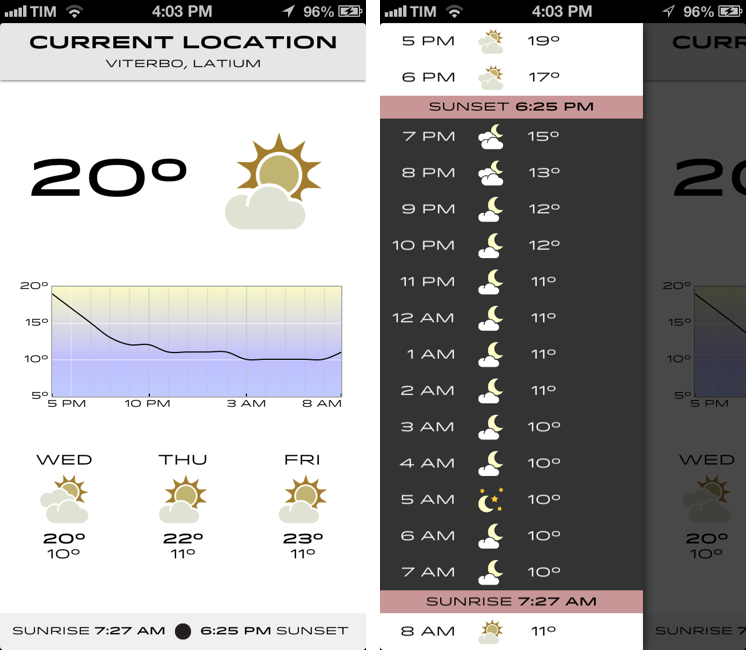
I’m not obsessed with weather apps as much as I am with text editors. Throughout 2012, several developers came out with their own takes on presenting weather data in beautiful interfaces with custom designs; however, when it comes to weather, in spite of my non-obsession, I demand efficiency. Most of the time, many of the “great-looking” weather apps only focus on capturing the user’s attention with pixels, whereas weather software should, in my opinion, pay attention to data quality and information density more than anything else.
For the past week I’ve been using Check the Weather by David Smith, and, interestingly enough, I haven’t gone back to Apple’s Weather app yet. Like I said, I’m not obsessed with weather apps for iOS, but I like to try a new one every once in a while. In the past months I’ve always ended up going back to Apple’s app after a few hours – so there must be something Check the Weather is doing well.
I don’t want advanced data that I don’t understand from a weather app. To grasp the reason why I’m liking Check the Weather, I made a list of the features I need from a weather app:
- What’s the weather like today
- What’s the weather going to be like later today
- What’s the temperature going to be like today
- When is the sun rising (I live in Italy, work on a US timezone, so I see the sunrise every morning)
- What’s the weather going to be like tomorrow
- What’s the weather going to be like this week
With these few “requirements”, I can get a pretty clear overview of weather conditions and temperatures. Check the Weather is remarkably good at this because it presents many data points without cluttering the interface.
Check the Weather is a dashboard for weather conditions. At the top, there’s a bar that indicates your current location and, through a subtle animation, when the app is checking for updated data. Immediately below this bar, you’ll find the current temperature and weather conditions for your location. And then, underneath conditions, one my favorite features of the app: a graph of temperature for the next 12/15 hours. It’s a simple and effective way to visualize temperature changes (like how it dramatically drops between 6 and 8 PM).
Continuing with the main screen, the bottom part is dedicated to showing weather conditions and low/high temperature forecasts for the next three days and sunrise/sunset times. I particularly appreciate the sunrise functionality, as I mentioned above, and I find it somewhat curious that several developers decide not to include it. I also found it accurate for my location (Viterbo, Italy), and I only noticed a few days ago that moon phase is included in this section as well.
One thing that’s immediately distinctive about Check the Weather is its design. Different from any other weather app I’ve tried, Check the Weather makes extensive use of Hoefler & Frere-Jones’ font Idlewild for all its weather forecasts. While I wasn’t sure about this choice at first, within a few days I’ve come to appreciate the unique look of Check the Weather – this app is not yet another Clear clone. Check the Weather is different (a weather app with a very specific font and focused on data rather than prettiness isn’t something you see every day), and I like it. I can see, though, why this is also a very bold (no pun intended) move on Smith’s side: sometimes, people just want pretty pixels heavy on graphics and animations.
Check the Weather is unique in how it approaches the trend of placing additional information in a panel on the side. The app, in fact, uses two panels to display hourly forecasts and extended forecasts for the next 12 days. Hourly forecasts are nicely implemented, as “dark hours” are embedded between sunset and sunrise – as they should be. I don’t typically use extended forecasts (I think predicting 10 days in advance is a bit too much), but I like how they’re presented nevertheless.
As an Italian who reviews weather apps, the typical dreaded moment arrives when it’s time to talk about data. Simply put: if you live in the US you’ll have more features. While Check the Weather tries to be “global” with accurate data by HAMweather, there are several functionalities that are US-only, such as hazardous weather alerts from the National Weather Service, a doppler radar precipitation map, and integration with Dark Sky for minute-by-minute precipitation forecasts. I haven’t been able to test this, but David told me that Dark Sky API data is available in the precipitation view (swipe up from main screen). I believe Check the Weather is the first app to integrate with the recently announced Dark Sky API, and, even though it doesn’t support push notifications yet, it is a huge plus for US customers. As an Italian, all I can say is that weather data and forecasts were accurate and in line with Yahoo weather (the provider Apple uses).
One thing I’ve noticed about Check the Weather: it is localized in 7 languages (including Italian), and it is fully VoiceOver-enabled.

Check the Weather’s support for VoiceOver allows users to listen to forecasts.
Check the Weather is refreshingly different. It doesn’t look like any other weather app I’ve tried, and it leverages its uniqueness to provide weather data in a variety of ways that I find useful and intuitive. What I like most about Check the Weather is that it brings me the information I need without confusing me with custom menus or complicated interface designs. At this point, I only hope David will find a way to add more international weather providers and release an iPad version of the app.
Check the Weather is available at $2.99 on the App Store.
RSS.app→
RSS.app

RSS.app is a very simple Mac app developed by Joost Schuttelaar following the removal of RSS feeds from Mail and Safari in Mountain Lion. RSS.app sits in the menubar, and checks for updates to your feeds every few minutes or hours. It then displays new article alerts using Notification Center.
The app is almost invisible: It is embedded in the status menu and uses Mountain Lion’s Notification Center to alert you of new posts. You can use RSS.app to import your existing list of RSS feeds from Apple Mail — even after you’ve updated to Mountain Lion.
The list of feeds to check can be configured in the app’s preferences, and you can import feeds from Mail even if you’ve already upgraded to Mountain Lion. The app is extremely simple: it’s got no keyboard shortcuts, menus, or distracting interface elements – it’s just a menubar checker for RSS feeds. Clicking on a notification will take you to the article using your default browser, and that’s it.
As Michael Tsai noted, the app has been rejected by Apple because of rule 2.8, which says “Apps that are not very useful or do not provide any lasting entertainment value may be rejected”.
If you think RSS.app can be useful to you, download it here.
Average App Size Increased By 16% Since March→
Average App Size Increased By 16% Since March

MacRumors points to new data by ABI Research, showing that, since March 2012, the average app size has increased by 16%:
The iPad 3’s Retina display and Apple’s more liberal submission policy have caused the file sizes of leading iOS apps to grow substantially, especially in games. The latest data from ABI Research shows that the global average app size across all categories was 23 megabytes in September, 16% more than in March.
On March 1, I wrote:
I see two solutions. Either Apple gets the carriers to agree to larger download sizes, establishing a new “average” that should work for most apps (let’s say 60 MB as Panzarino suggests), or they rebuild the download mechanism completely by allowing devices to “ignore” resources they don’t need. The second solution would be a “cleaner” approach, in that it would address the root of this likely scenario — that is, devices downloading apps containing all kinds of images and resources for Retina and non-Retina displays.
As we know, Apple decided to increase the maximum download size over cellular to 50 MB. This, combined with LTE networking, has allowed developers to be more relaxed in regards to their app sizes, and users to have reasonable download times on 4G (or DC-HSDPA). The solution I proposed earlier this year – a way to identify which assets to download for an app on a specific device – would still require a major rework of iOS.
Due to international pricing, this year I had to get a 16 GB iPhone 5. But I regret my decision. Something we’ve learned in the past two years (since the Retina display was introduced in 2010) is that that app sizes are only going up, and you’re never going to wish you got a device with less capacity. You’ll either be fine, or want more. With the iPhone 5 and Retina + Universal games, I find myself having to keep an eye on my available space, which is something I despise doing.
For the future, I hope 32 GB will become the new 16 GB, and I’m looking forward to 128 GB iPhones and iPads.
SearchLink: Markdown Links Without The Browser

I don’t know how Brett Terpstra finds the time to do everything he does, but I do know I enjoy the results.
Brett’s latest effort is SearchLink, a system Service to generate Markdown links automatically for a variety of web services. In Brett’s words:
SearchLink is a System Service for OS X that handles searching multiple sources and automatically generating Markdown links for text. It allows you to just write, marking things to link as you go. When you’re done, you run it on the document and — if your queries were good — have your links generated automatically without ever opening a browser.
Essentially, SearchLink is a Ruby script that, in the background, generates valid Markdown for inline links inserted in plain text. These can be links pointing to a Google search, a Mac App Store or iTunes search, last.fm, Wikipedia, and more. Instead of having to switch to the browser when you’re writing, you can just write using SearchLink’s simple syntax. Once you’re done, run the Service, and SearchLink will contact web APIs to transform your text into the first/best result for your query, formatted in Markdown. Read more
#MacStoriesDeals - Tuesday

Here are today’s @MacStoriesDeals on hardware, iOS, and Mac apps that are on sale for a limited time, so get them before they end!
Read more