I reviewed MoneyWiz for iPad back in late February and found it to be a really great personal finance app for the iPad. Today I’m back to have a look at the recently launched Mac version of MoneyWiz. In many ways, the Mac app is identical to the iPad app, so this won’t be an in-depth review of the Mac app — rather it’ll be an overview of the MoneyWiz app and then some discussion on specifically the Mac App as well as the ‘Reports’ and the Sync service.
Read more
Posts in reviews
Review: MoneyWiz For Mac
Procreate Is A Full-Featured Mobile Easel And More
The biggest reason for why I always wanted to become a writer is because I’m not good at creating visual art. I like to look at any kind of great art — from the old masters to talented dribbble users — and this love for well-crafted visual arts helped me getting to write here at MacStories. I’m better at talking about cool pixels than creating them. However, three days ago I bought my first iPad, and Procreate by Savage Interactive is considered one of the finest apps when it comes to using all the capabilities of the new Retina display.
After testing it for some time, I have to say that Procreate seems to be a perfect companion for artists when it comes to digital sketching and painting on the road. It’s a full-featured creation app, not forcing the user to cut back in functionality at all. Before I dive in deeper into its feature set, let me shortly recap the app’s main elements and controls.
My New Dropbox List-Making App: TaskAgent 2.2
In the past few months, I have been refining my Dropbox-powered writing workflow, adding new tools and checking out updates to existing ones in order to achieve a reliable, yet seamless environment for quick notes, longer articles, and lists. In particular, I mentioned TaskAgent, an iOS app to manage lists through easily formatted text files inside Dropbox.
In TaskAgent, I keep lists of apps I want to buy or update, and lists of stories I want to work on. These lists can be archived and retrieved later, and they exist as standalone .txt files in my Dropbox. If I want, I can add items to my lists using TextDrop, GoodReader, or TextEdit on my Mac; I guess it’d be nice to have a dedicated TaskAgent Mac app with the possibility of entering items with keyboard shortcuts.
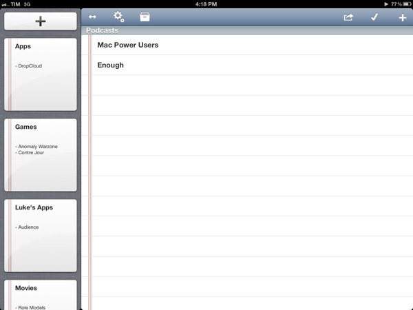
See, on my computer and iOS devices, I keep lists. I have the aforementioned work-oriented lists of apps and posts I’d like to work on. I have lists of apps I want to recommend for our Inspiring UI series, and I have lists of developers I want to interview. But I also keep lists of podcasts I want to check out, movies I want to buy, groceries I need to pick up, and ideas I want to submit to a developer as feedback for his beta app.
In my mind and in my workflow, lists and tasks are separate entities. A list may contain items that will become tasks; my OmniFocus keeps the things I know I have to do – neatly organized and synced to the cloud. Over time, I have found the separation of lists and tasks to be necessary to properly divide my organization skills in two distinct areas: remembering Vs. doing. And I have found TaskAgent 2.2, released today, to be the best app at enhancing this text-based setup on the iPhone and iPad.
From a core functionality standpoint, TaskAgent 2.2 isn’t too dissimilar from the versions we have previously covered here at MacStories. However, alongside a much simpler formatting syntax and a slew of new features, TaskAgent 2.2 impressed me thanks to its completely redesigned interface and Dropbox sync engine.
On the iPad, large “notebook thumbnail previews” adorn a sidebar that can be dismissed with a button in the upper toolbar. On the iPhone, lists are shown through a Facebook-like panel that also contains shortcuts to create a new lists, enter the Settings, or open Archived lists (which aren’t permanently deleted). TaskAgent 2.2 cleverly uses these new list previews to bring up functionalities that would have otherwise been buried in sub-menus within the main interface. A tap & hold on a list will reveal options to quickly delete, rename, duplicate, or archive a list. To avoid the guilty remorse of having too many items in a list, TaskAgent now lets you hide the “0 out of x completed” description, so you’ll focus exclusively on managing your lists without feeling bad about having too many items inside them.
One of TaskAgent’s previously often criticized feature was its New Item dialog. Version 2.2 does away with uninspired blue alert boxes and introduces a new quick way of entering items one after the another: on the iPad, that’s a popover, while on the iPhone the menu has been rendered as another panel on the right. Depending on your settings, new items will be added at the top or bottom of a list, and you can enter multiple ones in a row without having to tap Done every time. The overall workflow is incredibly faster.
TaskAgent 2.2 is unarguably a better version of the app, and, to me, the best solution to manage lists on iOS while retaining the capability of editing them anywhere as long as I can open a .txt file. I can access my lists from my browser with TextDrop or from iOS using GoodReader and ReaddleDocs. I can associate TaskAgent’s folder (which can be moved anywhere inside Dropbox) with a text editor and start editing right away. I can quickly append new items to a specific list file using Alfred, and if I want, I can share a list to Evernote as well, as TaskAgent supports that service, too.
TaskAgent makes lists “open” and available anywhere. Only $1.99 for a limited time.
Bang On Centralizes Mobile Search
Mobile search is and has ever been a very problematic area. After nearly five years of iPhone, developers are still discussing iOS browser search functionality, speed, and the right way of implementing it into the devices workflow. When it comes to services other than Google or Bing, Apple took the easy way by dividing its mobile OS into multiple apps with each one having its own searching capability (Safari for websites, YouTube for videos, etc.). This trend did not stop after the launch of the App Store: third-party apps like Articles and more recent examples like Spotify rely on their own search engine implementation. Bang On by Derek Kepner might be able to change that. Read more
Justnotes is Simplenote’s Desktop Companion and a Little More
I already know what you’re thinking: “Justnotes looks a lot like nvALT.” You wouldn’t be wrong in thinking that Justnotes is visually reminiscient of Notational Velocity and its poweruser fork, nvALT, but it wouldn’t be fair to judge without getting hands on. I’d posit Justnotes as an alternative to TextEdit on OS X — it’s a container for creating, sorting, and archiving text files. Otherwise, Justnotes is simply the desktop counterpart to Simplenote… With a twist.
Due, the Super-Fast Reminder App for iOS, Now Available for the Mac
I remember the first time I heard about Phocus’ Due - John Gruber linked to it. After buying it, Due has always stayed on my iPhone. I’ve tried many similar apps, but Due has always been my go-to application. Due isn’t trying to compete with the larger, more involved GTD apps, so anyone can use it and learn to love it.
One of the most important features of Due has always been the auto snooze feature, as Calendar events and Reminders will show you something once, then vanish back into the OS. Due will continually remind you about something until you get it done, and that’s what I love about this app. I also love that each alert is customizable - need to delay it an hour, a day, or a few minutes? No problem! The timers are also fun and much better than the iOS Clock functions. I use several timers when I’m cooking or grilling, whether it’s flipping burgers or making homemade eggrolls. Due for iOS is a very popular reminder and timer application for iOS, available as a universal application that looks great (and is retina-ready) on both the iPhone and the iPad. We have covered Due several times before, but now it’s available for the Mac!
I was priviledged to help test this app from its inception and it’s been exciting seeing it evolve into the 1.0 release in the Mac App Store. The UI is very similar to the iOS counterpart, so the learning curve is very fast. It has those wonderful pinstripes and the pop-up windows look very nice. The icon is very slick - one of the best I have seen for a reminder application. Due for Mac (along with the iOS version) uses iCloud or Dropbox syncing so that all of your data is available no matter where you are. Set a timer on the Mac app, launch the iOS version so that changes can sync, then go outside. When the timer is up, your iPhone will alert you that it has expired. I prefer iCloud syncing as it is hard wired into the OS; in all my 1.0 testing, sync was fast and flawless.
Like all other versions, Due has natural time parsing which makes it a breeze to enter reminders. Type, “Make dinner reservations with wife at 10am tomorrow” and your reminder is set for 10 AM tomorrow. “Cancel Spotify and renew Rdio subscription in 1 month” and you get a buzz a month later. There are no awkward date pickers, nor rigid date and time format to follow.
As with the iOS versions, assignable alert sounds are available for the Mac. You can use louder and longer alerts for very important reminders, and softer ones for regular reminders.
Power users will love all of Due for Mac’s shortcuts. Don’t worry about using your trackpad - show or hide Due, create reminders, reschedule them, mark them complete, delete them - it’s all a keyboard shortcut away. Due for Mac also supports Growl notifications. If I had to comment about something that I’d like to see it would be a global hotkey to bring up Due no matter what you are doing, and I’d also like to see an optional menu bar icon.
Due is a very fast reminder and timer application. I’d like to think it’s Reminders on steroids. Due is $9.99 and available via the Mac App Store. The iCloud (Dropbox) sync is worth $10 alone and if you already have the universal iOS app, iCloud and Dropbox sync make Due for Mac a must buy. If you’re looking for a great reminder app to add to your arsenal, you can’t go wrong with any of Due’s weaponry. $15 will cover every one of your devices.
Preview iOS Designs Instantly With Skala
A while ago I wrote a quick review about Screenshot Journal, a utility to archive and investigate iPhone and iPad screenshots on the go. It features a zooming capability of up to 400% to inspect single pixels in order to easily find design flaws, but to transfer those screenshots back and forth, I personally use Pastebot. As I recently found out, developer Bjango offers a kind of a mixture of these two worlds: Skala.
Skala is a tool for designers to easily check iPhone or iPad UI designs (or other creations like wallpapers, etc.) they made on their computers on the screen of iOS devices. Skala comes in two apps: Skala Preview on the Mac — which ironically features a 3D version of the feared OS X beachball as its icon — and Skala View on iOS. The latter obviously works on both the iPad and iPhone, but because the design is the same in both cases, I’m going to focus only on the iPhone version here. Read more
EdgeCase Stops Your Cursor Where Your Monitors Meet
I don’t use more than an external display or my MacBook’s internal display since managing a multi-monitor setup isn’t practical with Lion, but in the rare occasions that I do, my cursor always finds a way of wandering off the display I’m working on. EdgeCase boxes your pointer in the current display by putting up a virtual barrier that prevents your cursor from crossing onto the other display unless you hold down a specific key or wait a half-second.
As a simple menubar utility, EdgeCase lets you disable and enable the utility and click one of a few options to get it up and running. By default, EdgeCase will require you to bounce your cursor when it reaches the meeting edge before it transverses displays, but you can turn it off if you desire. Holding down the ctrl key or command keys will grant you access to third party displays: command-dragging app windows will let you carry your application between displays.
I’ve been using EdgeCase to process email and write on one display while watching videos on the other: it’s pretty useful for keeping work and entertainment displays separate. EdgeCase is $4.99 from the Mac App Store.
Compare Timezones On The Go With Timelanes
When I ask myself what timezone a friend (or more recently, colleague) lives in, I fire up the Clocks app on my iPhone or Every Time Zone when I’m on my Mac. In many cases, this needs quite some time and disrupts my workflow; I need to go back to my mail or calendar or any other situation which required this knowledge (meetings, mails or projects) and apply the time differences to them. Yesterday, I stumbled upon Timelanes by B-ReelProducts, immediately bought it, and from time to time while trying it out, I remembered some awkward situations in which I could have needed exactly this app to enhance my workflow.
Timelanes basically is Every Time Zone on the go — with some handy extras and a different, but in no way worse UI. When launching it for the first time, the app automatically locates your current timezone and displays it styled as a horizontal lane. This way, it centralizes your chosen hour of the day, plus indicating the exact current time with a small clock indicator. At the same time, you can easily switch between the days or come back to the current time using the arrows and the clock button at the center of the navigation bar at the bottom of the screen, or you can scroll horizontally until you reach the exact point in time you need (Timelanes works both in portrait and landscape mode).
From here, comparing timezones and times is just two taps away. Using the plus button, you can search for any city in the world — not just those standard “indicating” cities like NYC or Mumbai — and add them to your lanes. Those behind your current timezone are displayed above, those ahead are arranged below it. Tap the weekday information and it will change to the actual date, so you can see when the new day begins in every timezone; swipe one, and you can delete them again. Here lays a small and more or less the only design flaw of the app: the edges of the delete button are scruffy and look pretty ugly in my opinion. Read more


