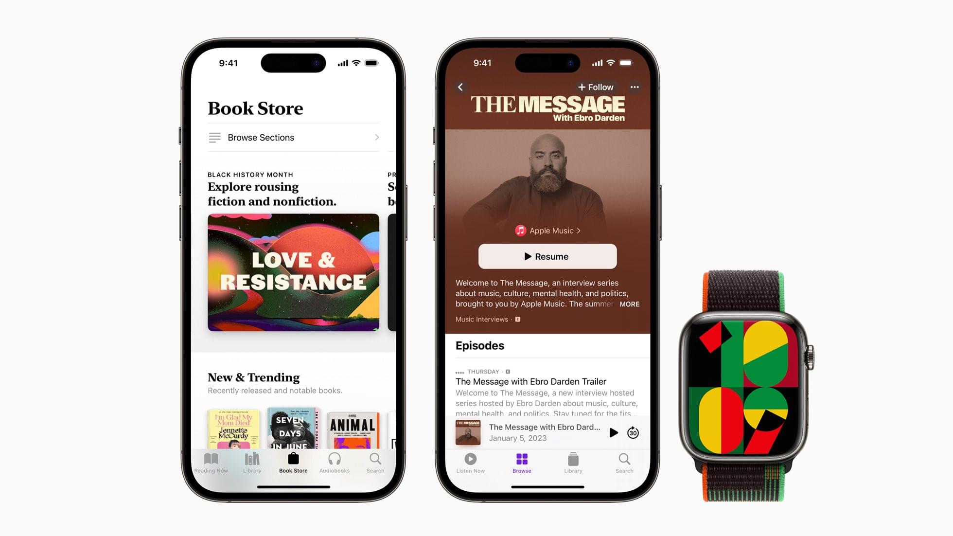
To celebrate Black History Month, Apple has released a new Black Unity Collection. The collection includes an iPhone wallpaper, an Apple Watch face, and a Sports Loop band.
According to Apple, the special-edition Apple Watch Black Unity Sport Loop “features the word “Unity” woven abstractly into the band using red, green, and black yarns that pay homage to the Pan-African flag, while a unique layering of yarns lends a sense of three-dimensionality to the letters.” Both the iPhone wallpaper and watch face combine geometric shapes in green, black, red, and yellow. On the watch face, the numbers on the face change as the minutes pass, using parts of other numbers.
Apple is also marking Black History Month across many of its services, including the App Store, Apple Music, the TV app, Fitness+, News, Podcasts, Books, and Maps. Among the offerings will be Apple Maps Guides by the Smithsonian, curated TV and film collections by Dr. Jelani Cobb, apps and games, special playlists on Apple Music, and podcast spotlights.
is supporting Art Gallery of New South Wales (Sydney), Ghetto Film School (New York, Los Angeles, London), Music Forward (Los Angeles), Shout Mouse Press (Washington, D.C.), and The National Museum of African American Music (Nashville, Tennessee). Apple’s support for these organizations is a continuation of REJI grants over the past two years that helped organizations committed to providing economic, educational, and creative opportunities in communities of color.
The Apple Watch Black Unity Sport Loop is available to order online today and will be in stores on January 24th for $49. The Unity 2023 watch face and iPhone will be available next week, presumably alongside OS updates.
Club MacStories: Weekly and monthly newsletters via email and the web that are brimming with apps, tips, automation workflows, longform writing, early access to the MacStories Unwind podcast, periodic giveaways, and more;
Club MacStories+: Everything that Club MacStories offers, plus an active Discord community, advanced search and custom RSS features for exploring the Club’s entire back catalog, bonus columns, and dozens of app discounts;
Club Premier: All of the above and AppStories+, an extended version of our flagship podcast that’s delivered early, ad-free, and in high-bitrate audio.
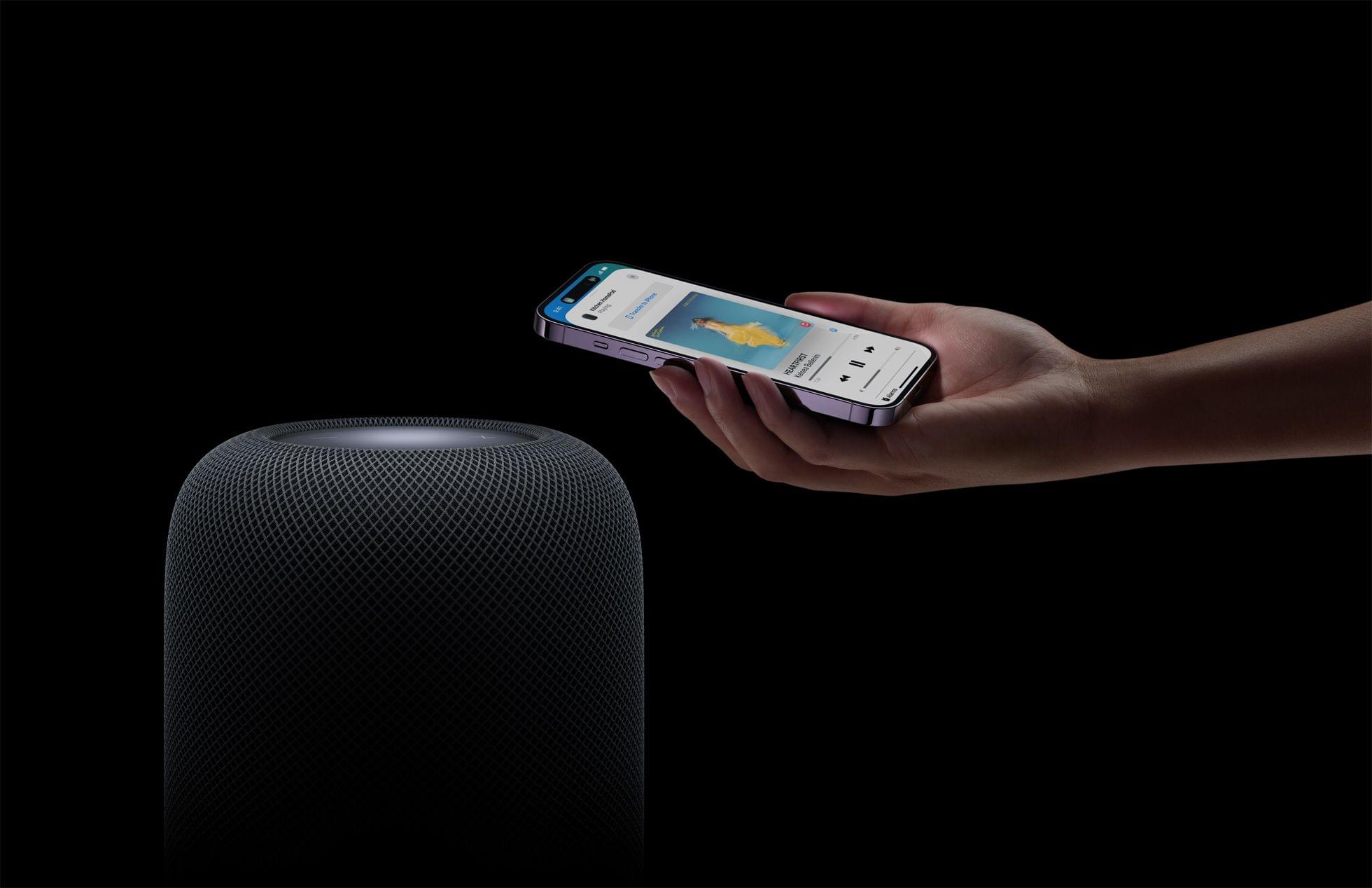
Over the weekend, Mark Gurman said that Apple would be releasing a new HomePod soon. As it turns out, he was correct because today, Apple released a new second-generation HomePod. According to Apple’s press release,
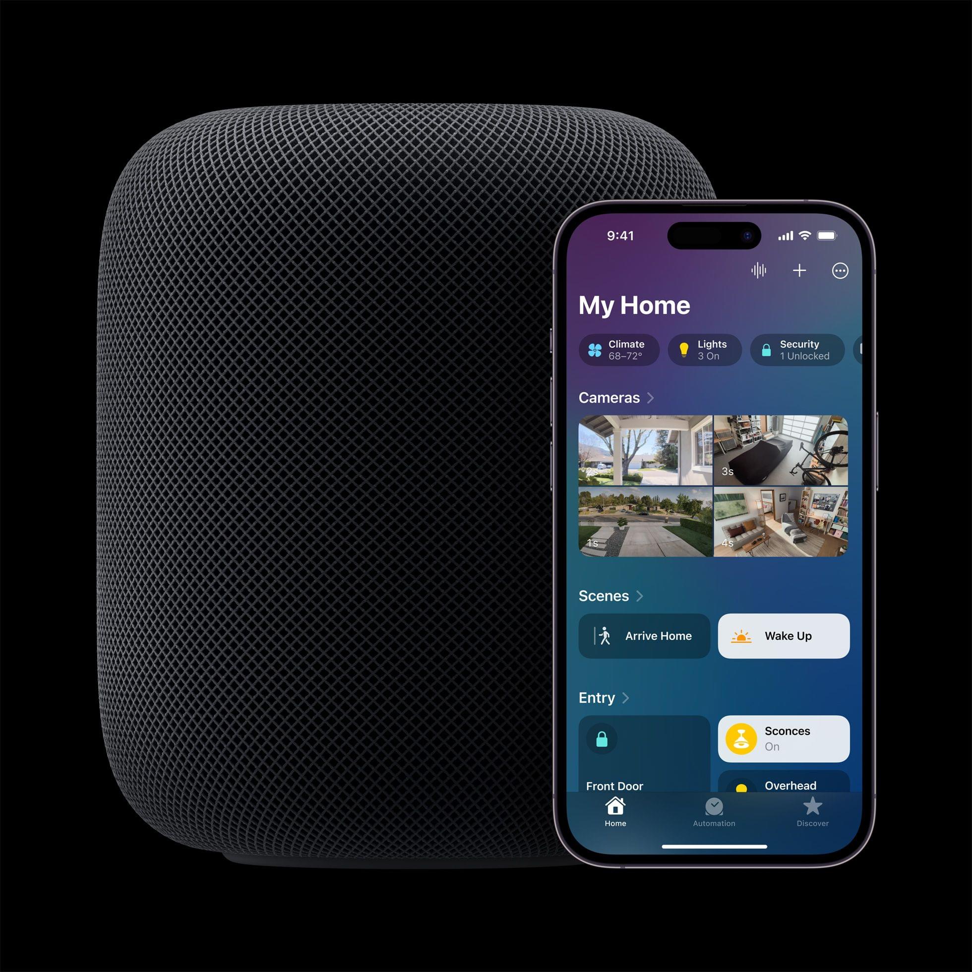
With convenient new ways to manage everyday tasks and control the smart home, users can now create smart home automations using Siri, get notified when a smoke or carbon monoxide alarm is detected in their home, and check temperature and humidity in a room — all hands-free.
The HomePod is powered by an S7 chip and appears to feature a sound system similar to the first-gen model.
Source: Apple.
The new HomePod also adds a temperature and humidity sensor, which can be used as a trigger for home automations, and supports the Matter home automation standard.
The second-generation HomePod is available to order today, with deliveries beginning Friday, February 3rd for $299, which is $50 less than the original HomePod’s price.
Update: Thanks to the Wayback Machine, I’ve gone back and checked the second-generation HomePod’s tech specs against the original model, and there are some interesting differences. The new model weighs less at 5.16 pounds (2.3 kg) versus 5.5 pounds (2.5 kg). The new model is a little shorter, too, at 6.6 inches (168 mm) compared to the original’s 6.8 inches (172 mm), but the same width.
The new HomePod has two fewer tweeters at five compared to the original’s seven. No mention is made of direct and ambient audio beamforming in the tech specs for the new HomePod, although it does support Spatial Audio and Dolby Atmos, which is a nice addition. The latest HomePod has four far-field microphones compared to the original’s six too.
In addition to the temperature and humidity sensor, the new HomePod also features an accelerometer and will support Sound Recognition later this spring with a software update. It’s not clear whether that software update will work with the original HomePod or not.
The new HomePod is also getting a WiFi upgrade with 802.11n support. The new model also includes a Thread radio and Ultra Wideband chip, which the original did not.
Last but not least, the new HomePod’s tech specs appear to suggest that the power cable may be detachable, unlike the original model, because it’s listed as an item ‘in the box,’ whereas that wasn’t the case when the HomePod debuted.
Club MacStories: Weekly and monthly newsletters via email and the web that are brimming with apps, tips, automation workflows, longform writing, early access to the MacStories Unwind podcast, periodic giveaways, and more;
Club MacStories+: Everything that Club MacStories offers, plus an active Discord community, advanced search and custom RSS features for exploring the Club’s entire back catalog, bonus columns, and dozens of app discounts;
Club Premier: All of the above and AppStories+, an extended version of our flagship podcast that’s delivered early, ad-free, and in high-bitrate audio.
Today, Apple announced new MacBook Pro 14” and 16” models and a new Mac mini via press releases and a video on its YouTube channel. The new laptops are available in M2 Pro and Max chip configurations and feature faster memory bandwidth, WiFi 6E, and the same design as the models they replace. The Mac mini has also been updated to add the M2 and M2 Pro options, as well as other features.
Source: Apple.
In its press release, Apple had this to say about the new M2 Pro and M2 Max SoCs:
M2 Pro scales up the architecture of M2 to deliver an up to 12-core CPU and up to 19-core GPU, together with up to 32GB of fast unified memory. M2 Max builds on the capabilities of M2 Pro, including an up to 38-core GPU, double the unified memory bandwidth, and up to 96GB of unified memory. Its industry-leading performance per watt makes it the world’s most powerful and power-efficient chip for a pro laptop.
The 13” MacBook Pro and MacBook Air were upgraded to the base model M2 last year, but the laptops announced today are the first to include the Pro and Max versions of that SoC. Regarding the MacBook Pro, Apple says:
With M2 Pro and M2 Max — the world’s most powerful and efficient chip for a pro laptop — MacBook Pro tackles demanding tasks, like effects rendering, which is up to 6x faster than the fastest Intel-based MacBook Pro, and color grading, which is up to 2x faster. Building on the unprecedented power efficiency of Apple silicon, battery life on MacBook Pro is now up to 22 hours — the longest battery life ever in a Mac. For enhanced connectivity, the new MacBook Pro supports Wi-Fi 6E, which is up to twice as fast as the previous generation, as well as advanced HDMI, which supports 8K displays for the first time. With up to 96GB of unified memory in the M2 Max model, creators can work on scenes so large that PC laptops can’t even run them.
Source: Apple.
The MacBook Pro with M2 Pro comes in 10 and 12-core CPU configurations that Apple says deliver up to 20% faster performance than the M1 Pro, about what you’d expect from an SoC with 20% more cores. The laptops can be configured with up to 32GB of unified memory that has 200GB/s of bandwidth, which is double the standard M2. The GPU has 19 cores and delivers 30% faster performance, according to Apple. The laptop also features Apple’s media engine that handles encoding and decoding video.
The M2 Max version of the MacBook Pro can be configured with up to 38 GPU cores for what Apple says is 30% better performance than the M1 Max, while the CPU has 12 cores. The MacBook Pro with M2 Max also supports up to 96GB of unified memory with 400GB/s of bandwidth.
With incredible capabilities and a wide array of connectivity in its compact design, Mac mini is used in so many places, in so many different ways. Today, we’re excited to take it even further with M2 and M2 Pro. Bringing even more performance and a lower starting price, Mac mini with M2 is a tremendous value. And for users who need powerful pro performance, Mac mini with M2 Pro is unlike any other desktop in its class.
The Mac mini, which was among the first Macs to be updated to the M1, is gaining an M2 SoC, with an option to configure the desktop Mac with an M2 Pro. The M2 mini has two Thunderbolt 4 ports, and the Pro version comes with a total of four. The M2 model can power two displays, and the Pro model three.
The updates bring WiFi 6E to all of the Macs announced today for the first time too. The only other devices Apple makes that support the faster wireless networking standard are the 11” and 12.9” iPad Pros.
These look like solid updates across the board, but I’m especially interested in the Mac mini, which seems to be the best value among the Macs announced today.
Both Macs can be preordered today, with deliveries starting January 24th.
Club MacStories: Weekly and monthly newsletters via email and the web that are brimming with apps, tips, automation workflows, longform writing, early access to the MacStories Unwind podcast, periodic giveaways, and more;
Club MacStories+: Everything that Club MacStories offers, plus an active Discord community, advanced search and custom RSS features for exploring the Club’s entire back catalog, bonus columns, and dozens of app discounts;
Club Premier: All of the above and AppStories+, an extended version of our flagship podcast that’s delivered early, ad-free, and in high-bitrate audio.
Because Club MacStories now encompasses more than just newsletters, we’ve created a guide to the past week’s happenings along with a look at what’s coming up next:
Last week, we kicked of 2023’s AV Club series with Avatar: The Way of Water. For the latest Town Hall Federico and I were joined by Jonathan Reed, who helped us organize the event, to talk about James Cameron’s latest epic and its predecessor in the film series.
Club MacStories Town Halls are part of the special live audio events we hold in the Club MacStories+ Discord community. The show is a recorded and lightly edited version of the Town Halls that we produce, so Club MacStories+ and Club Premier members who can’t attend the event live can listen later.
Club MacStories: Weekly and monthly newsletters via email and the web that are brimming with apps, tips, automation workflows, longform writing, early access to the MacStories Unwind podcast, periodic giveaways, and more;
Club MacStories+: Everything that Club MacStories offers, plus an active Discord community, advanced search and custom RSS features for exploring the Club’s entire back catalog, bonus columns, and dozens of app discounts;
Club Premier: All of the above and AppStories+, an extended version of our flagship podcast that’s delivered early, ad-free, and in high-bitrate audio.
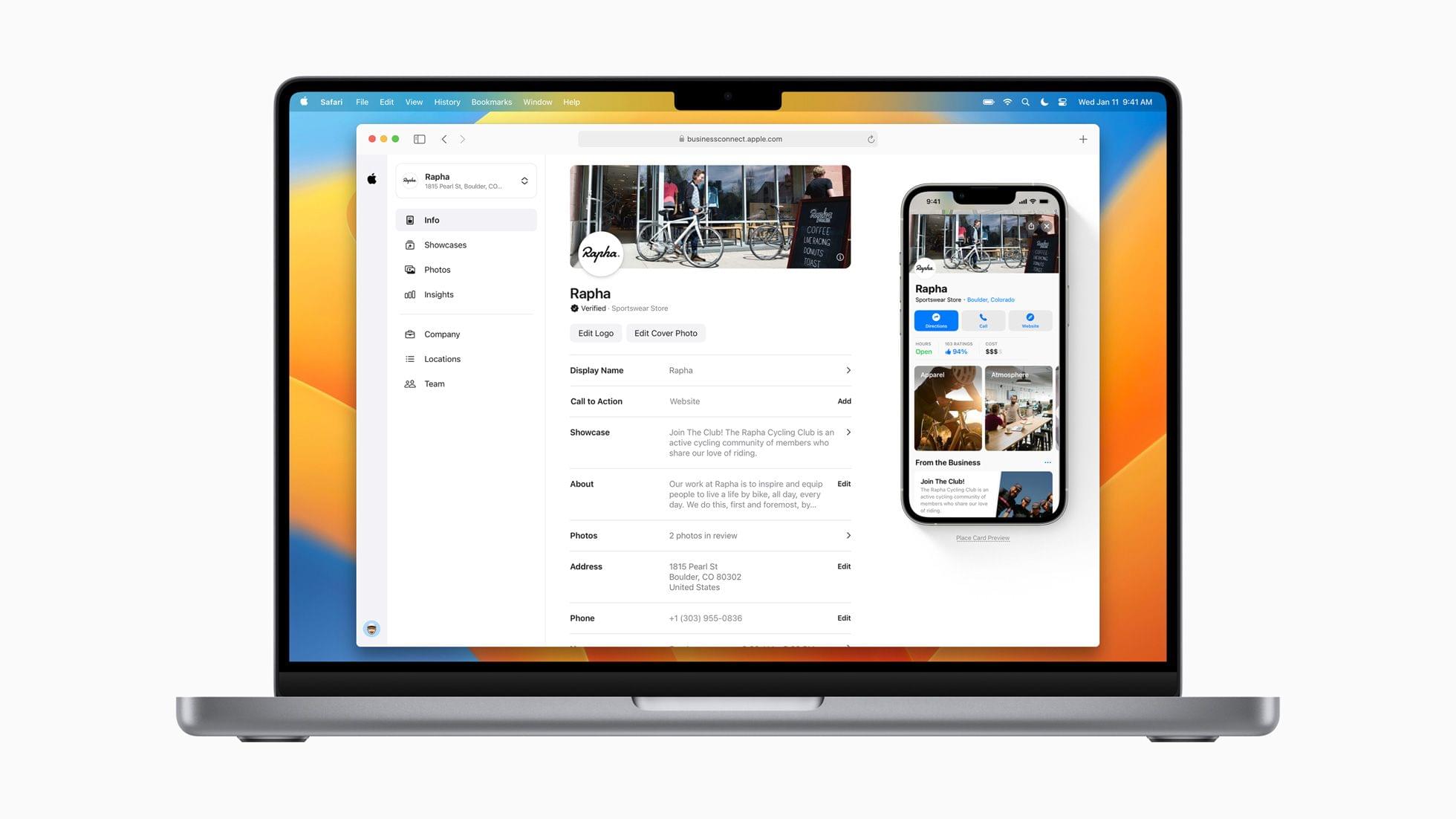
Today, Apple introduced a new online tool called Apple Business Connect that allows businesses to customize the information listed in Apple Maps Maps, Messages, Wallet, Siri, and other apps.
We created Business Connect to provide Apple users around the world with the most accurate information for places to eat, shop, travel, and more. Apple Business Connect gives every business owner the tools they need to connect with customers more directly, and take more control over the way billions of people see and engage with their products and services every day.
There are a couple of components to Apple Business Connect:
A free online tool where businesses can claim their place cards, which include the details about their businesses in apps like Maps, and customize how it appears
An API for businesses with 25 or more locations that integrates with third parties that provide location listing services
In addition to providing a self-service path for business owners, Apple has expanded the features of place cards to include Showcases that provide a way for businesses to highlight promotions, seasonal menu items, discounts, and more. Showcases are available today in the US. Apple says Showcases will roll out globally in the coming months.
To register, business owners can visit the Apple Business Connect website, which requires a desktop or laptop computer and an Apple ID. Once logged in and verified by Apple, businesses can personalize their place cards.
Currently, the data in place cards is predominantly supplied by Yelp, although TripAdvisor, Wikipedia, and other sources like users’ photos are also used. Apple Business Connect puts business owners in control, which I expect will result in more accurate and timely updates to place cards, although hopefully, Apple has put some quality-control oversight in place too. The new program also has the added benefit to Apple of cutting the cost of sourcing data from Yelp and others. Having moved recently from Chicago, where place cards were reliably up-to-date, to North Carolina, where the quality of the cards is less reliable, I’m looking forward to seeing how quickly business owners sign up to claim their locations and whether they keep the cards up-to-date.
Club MacStories: Weekly and monthly newsletters via email and the web that are brimming with apps, tips, automation workflows, longform writing, early access to the MacStories Unwind podcast, periodic giveaways, and more;
Club MacStories+: Everything that Club MacStories offers, plus an active Discord community, advanced search and custom RSS features for exploring the Club’s entire back catalog, bonus columns, and dozens of app discounts;
Club Premier: All of the above and AppStories+, an extended version of our flagship podcast that’s delivered early, ad-free, and in high-bitrate audio.
I was a metaverse skeptic until CES covered my eyes and mouth to the possibilities. Source: Shiftall.
Today, I bring you Weird CES, a collection of wacky and wonderful announcements from the past week. But first, I have a few odds and ends that were announced in between my previous twostories and are worth mentioning.
Odds and Ends
The Razer Blade 18. Source: Razer.
There was a lot of laptop news at CES this year, much of which made my eyes glaze over in its sameness. However, there are some notable exceptions:
LG announced the Gram Style, a 10.99 mm thin, 2.7-pound laptop with a 16” anti-glare OLED display and a trackpad that disappears and uses LED backlighting to reappear when touched
Razer announced its Blade 16 and 18 gaming laptops, which are big, heavy, packed with the latest high-end tech, and are covered in detail on The Verge
During the global pandemic, CES was held online, and there were far fewer strange and wonderful gadgets announced. I’m pleased to report that Weird CES is back in full force. Here are my favorite oddities of 2023:
Source: Blok.
You probably didn’t realize that what your kitchen cutting board is missing is a removable, rechargeable screen, so you can watch cooking videos while you cut stuff. The Blok is exactly that, complete with a docking station for watching cooking videos when you’re not chopping and an app for the not-so-low price of $699, plus a $390/year subscription for video cooking classes. I think I’ll stick with my old-school wood-only cutting board with an iPad propped up nearby.
Club MacStories: Weekly and monthly newsletters via email and the web that are brimming with apps, tips, automation workflows, longform writing, early access to the MacStories Unwind podcast, periodic giveaways, and more;
Club MacStories+: Everything that Club MacStories offers, plus an active Discord community, advanced search and custom RSS features for exploring the Club’s entire back catalog, bonus columns, and dozens of app discounts;
Club Premier: All of the above and AppStories+, an extended version of our flagship podcast that’s delivered early, ad-free, and in high-bitrate audio.
I’ve been through dozens of additional press releases and stories from CES and have collected all of the smart home, electric vehicle, and gaming news that has caught my eye since yesterday’s story on displays and TVs.
Smart Home
Source: Nanoleaf.
Nanoleaf, which introduced some of the first Thread-compatible lightbulbs I’ve tried, made several announcements at CES this week. Nanoleaf is jumping into synchronized TV backlighting with the Nanoleaf 4D, a camera-based setup that synchronizes the colors displayed on your TV with light strips attached to its back. Unlike Philips Hue, which offers a similar system powered by its separate Play HDMI Sync Box, the Nanoleaf’s camera sits on top of your TV, where it picks up the colors of whatever is playing. Nanoleaf 4D is expected to ship in Q2 2023 and start at $99.99, according to The Verge.
Club MacStories: Weekly and monthly newsletters via email and the web that are brimming with apps, tips, automation workflows, longform writing, early access to the MacStories Unwind podcast, periodic giveaways, and more;
Club MacStories+: Everything that Club MacStories offers, plus an active Discord community, advanced search and custom RSS features for exploring the Club’s entire back catalog, bonus columns, and dozens of app discounts;
Club Premier: All of the above and AppStories+, an extended version of our flagship podcast that’s delivered early, ad-free, and in high-bitrate audio.
I love the spectacle of CES. It’s a relentless firehose of ‘new’ that’s full of over-the-top ideas, vaporware, creepy robots, bizarre gadgets, and, best of all, legit previews of tech that’s just around the corner.
CES 2023 hasn’t disappointed, even though it doesn’t officially start until tomorrow. The show has a little bit of everything this year. As in recent years, though, there are a couple of categories that stand out already. The first category, which I’ll cover today, is displays, both computer monitors and TVs, which have become a pillar of CES. So much so that the confetti and champagne bottles of New Year’s Eve were barely cleaned up before the press releases began arriving. CES may not start until January 5th, but the days leading up to it have become a sort of pre-game show for the main event.
The other big story beginning to emerge from CES 2023 is devices compatible with the Matter smart-home standard. Matter 1.0 debuted last fall with a lot of promise but a small collection of new devices and updates to existing gadgets. Whether manufacturers can deliver more devices this year remains to be seen, but judging from what’s been introduced at CES so far, 2023 is shaping up to be an exciting year for the smart home.
Of course, there are many other interesting stories coming out of CES too. There’s a lot of ground to cover, so I’ll be splitting our coverage up, starting with desktop displays and TVs. We’ll have more on smart home devices, other gadgets, and what I affectionately call ‘weird CES’ soon.
Club MacStories: Weekly and monthly newsletters via email and the web that are brimming with apps, tips, automation workflows, longform writing, early access to the MacStories Unwind podcast, periodic giveaways, and more;
Club MacStories+: Everything that Club MacStories offers, plus an active Discord community, advanced search and custom RSS features for exploring the Club’s entire back catalog, bonus columns, and dozens of app discounts;
Club Premier: All of the above and AppStories+, an extended version of our flagship podcast that’s delivered early, ad-free, and in high-bitrate audio.