Posts in reviews

iStat 2 Review

I like Bjango. They make the kind of simple, polished, and useful software that defines OS X as a platform with equal attention to beautiful pixels and powerful features. I was already a big fan of Consume and Skala. Bjango’s latest release, iStat 2, falls exactly under this category of apps: great-looking and efficient at the same time.

Mac Servers

I own a 13-inch MacBook Air and a 21.5-inch iMac. My MBA is the “work machine”, whereas the iMac has always been the media center of the house, as it’s connected to a couple of external drives with my iTunes library on it. For the past few months, however, I’ve been increasingly switching every part of my “entertainment workflow” from local to cloud-based. It started with Rdio a year ago (now, I have a Family account and I’m not switching any time soon). For iTunes, it means I’ve slowly uploaded my library to a Mac mini hosted on Macminicolo. As documented elsewhere, I’m very happy with Macminicolo, their reliability, and the overall message of a Mac mini server always available in the cloud.

But I’m not a “server guy”. I don’t understand the teminology behind server management, and my limited skills go as far as restarting WebDAV and Apache. I use my Mac mini primarily for media streaming through Plex and as a server for Mail, OmniFocus, Dropbox, and other services or apps that allow me to automate my workflow in the cloud. All my Dropbox-based scripts for plain text and OmniFocus are created with the Mac mini in mind, because it’s always-on and lets me receive results in real time. Hazel is another invaluable utility when it comes to automating a remote Mac.

I do put my Mac mini through some more processor-intensive tasks every once in a while. Usually, it’s movie conversion through Handbrake or movie streaming through Plex Media Server. I recoginize this doesn’t compare to using a mini as an Xcode build server, but it’s still something that I want to keep an eye on. Read more


Paper for iPad Adds a Color Mixer, Custom Palettes, and Support for Pressure Input with Pogo Connect

Paper

Paper

I think the incredible thing about an app like Paper is that it allows someone like me to feel like an artist, even though I’m clearly not. It’s an app that brings out childlike joy and creativity in people who’d otherwise say they have no ability to draw or paint well. Paper is probably one of the most interesting apps on the iPad to look at for this reason; it manages to capture the essence of what makes doodling something on paper so fun, without making you feel inadequate thanks to its decidedly simple presentation and a carefully chosen color palette (originally: black, gray, white, orange, yellow, blue, green, and violet). Paper launched with just nine colors and five basic tools.

Paper’s next major update addressed a popular feature request; Version 1.1 introduced several new organizational features such as rearranging pages between journals and duplicating pages. Ink itself became more fluid, more closely matching finger and stylus input thanks to improvements to FiftyThree’s Expressive Ink Engine.

Today’s update further addresses another common feature request. While people have submitted some really amazing things to Made With Paper, I’d expect to see even more spectacular drawings thanks to the addition of the Mixer, Palettes, and support for the Pogo Connect. Not only have FiftyThree added more colors, they’ve added all of the colors.

Read more


Review: Kuvva for iPhone

I recently posted a longer review about a cool app called Kuvva for Mac OS X. The app automatically displays series of cool, professionally designed desktop wallpapers for you. By setting up an account on kuvva.com you can select your personal favorites from the constantly growing database of tremendous desktop art. These are then displayed as your personal series of desktop wallpapers in a set timespan on your desktop in order to make your working day at the computer a bit more beautiful. Kuvva also works with your Twitter profile background wallpaper.

Last week, Present Plus, the developers of kuvva finally published an iPhone version of their very popular app. I was lucky to be one of the app’s beta testers, and as I now hold the final version of the app below my fingers I again have to admit that this is a truly great app.

Kuvva for iPhone (watch a cool demo video made by my friend Joost Van Der Ree over at Vimeo) adopts the same basic features from the web service for wallpaper discovery like the Mac client does. You can view all wallpapers published on kuvva.com (of course in an iPhone-optimized scale and resolution) in the main screen sorted by release date, artist, and popularity.

Tapping on one of the wallpaper previews in the main view brings up the single-wallpaper inspection interface. In this view you can smoothly bring up a small interaction menu by tapping on the small arrow laid over the (now scaled up) wallpaper covering the full screen. If you have a Kuvva account, you can mark the wallpaper you’re currently looking at as a favorite (and thus add it to the list of wallpapers which are also also displayed on your Mac desktop). Additionally you can tweet about it, preview it (which is done via a cool transition effect bringing up the lock screen interface to show you how the wallpaper looks in the iOS- context), and download it right from the app into your device’s camera roll.

Via a paneled side menu you can access all the mentioned sorting categories as well as all of you favorites. If you find a wallpaper you like a lot, you can tap on the button in the top right corner in the preview window to get more information about the artist who made the respective wallpaper, which not only includes all of the artist’s wallpapers on kuvva and a photo of him or her, but also a link to his/her twitter account and website for immediately getting more information if desired.

The app works well, more or less without any performance flaws on my (now considered very old) iPod touch 3rd Gen on iOS 4.1. All subtle UI gimmicks like transitions or moving effects (e.g. the aforementioned navigation menu in the wallpaper view) work just as they should and make Kuvva fun to use.

If you’re already a user of Kuvva (like I am), consider this to be a must-have (it also includes wallpaper optimized for the new iPhone 5). The app extends your wallpaper “workflow” perfectly as you now can like and view wallpapers on the road for usage on your Mac. And of course this is a great, handy resource for new wallpapers on your iPhone if you’re a fan of eye-catching, vividly designed backgrounds. If you are a lover of minimalist wallpapers or photography on your lockscreen though, Kuvva probably won’t suit your tastes. But for everyone else, it is a perfect, easy to use resource for getting new wallpapers for your iPhone without any hassle. I can’t wait to see if the app will be available for iPad as well in the nearer future; it definitely should be a great app as well.

Kuvva for iPhone is available for purchase on the App Store for $1.99.


Improve iOS Screenshots with Status Magic

Status Magic is not a “mainstream” app: you’ll only need it if you care about quality and precision in your iOS screenshots.

I write about a lot of apps on a daily basis. For these apps, I take screenshots, which, when it comes to iPhone apps, are automatically resized and combined with a Keyboard Maestro macro. But, sometimes, the screenshots I take aren’t perfect, in that the status bar is cluttered with icons or, even worse, showing a red battery indicator. Personally, I think showing a red battery in screenshots is a sign of poor attention to detail and quality. This is where Status Magic comes in.

Status Magic lets you replace the status bar in a screenshot with a clean one in just two clicks. It can apply clean status bars to multiple screenshots at once, and it works with the latest Apple devices such as the iPhone 5 and Retina iPad. Read more


Languages Review

Can an offline translator for iPhone be beautiful?

Translations are boring. Even Google, which has put some effort into caring more about its appearance in the past year, has seemingly forgotten that Google Translate is used by millions every day. Not only is Google Translate outdated from a design perspective, it also doesn’t take advantage of the trends and interactions that have recently defined great mobile experiences.

In a collaboration with Sonico, award-winning development studio Tapity wants to reinvent mobile translators for iPhone starting with two core concepts: multi-touch and offline access. Read more


Pocket Releases Mac App

Pocket, the “save for later” service that relaunched as a major revamp of Read It Later back in April, is launching today its first official desktop application for OS X. Pocket for OS X is available today for free on the Mac App Store.

I’ve been able to test Pocket for Mac during the past week. Michael Schneider, creator of Read Later (nèe Read Now), joined the Pocket team to create the new Mac app; you may remember Read Later as a client for Instapaper/Pocket/Readability articles that we’ve been following here at MacStories since the first version. According to Pocket, the former Read Later app will continue to work for existing users, but it will no longer be supported.

Pocket for Mac is a new app, but it borrows heavily in terms of underlying concept and flow from Read Later. On the left, there’s a sidebar listing articles and videos with thumbnails for visual previews; the actual article (or video) is displayed on the right in a clean, Pocket-formatted view that uses the same parser of the mobile app. I personally find Instapaper’s parser to be slightly more precise than Pocket’s when it comes to long articles, but I also find Pocket way better at parsing content than Readability, especially for embedded videos and images. Read more


Loren Brichter’s Comeback: Letterpress

Loren Brichter’s comeback app isn’t a Twitter client, something that works with Tent.io, or a revolutionary implementation of multitouch on the iPad.

It’s a word game. It’s called Letterpress, and it’s available for free on the App Store. I’ve been able to beta test it for a while, and it’s quickly become one of my favorite games on iOS. One I instantly reach out to whenever I have 5 minutes to kill.

Letterpress is similar to SpellTower, but it’s focused on multiplayer and has deeply different rules when it comes to assembling words. Read more


Tweetbot for Mac Review

When the first alpha of Tweetbot for Mac came out in July, I said I would take a look at the app again. Here we are, three months later, with the final version of Tweetbot for Mac available on the App Store.

I concluded my review of the public alpha version with:

Right now, Tweetbot for Mac is, in my opinion, already superior to any other client for OS X — and it still can be improved. More importantly, Tweetbot makes better use of Twitter features than Twitter’s own Mac app, and that says a lot about the importance of third-party clients in this ecosystem.

In calling the alpha version of Tweetbot a “superior” product, I took quite a stance. I had been using the alpha for weeks before the public release, and I had the perspective and context to make a conscious and reasonable decision about my statement. I knew I was going to like Tweetbot and use it on a daily basis. Three months later, that’s still the case.

I’ll get to the point right away. Tweetbot is, in my opinion, the best Twitter client for Mac. From my perspective, no other app gets closer to the amount of polish and functionality that Tapbots poured into their latest creation, making it the most powerful, fast, and elegant Twitter app I’ve seen on OS X to date. In hindsight, it’s also a superior product than Twitter for Mac, which, as you may recall, used to be my go-to client. Three months ago I reviewed an app that I knew was going to be great.

In thinking about how I should approach this new review, I came to the conclusion that you don’t need me to go through the backstory of Twitter clients on the Mac. Here’s what I wrote, again, for context:

Ever since Loren Brichter (creator of the original Tweetie, who sold his app to Twitter and went on to work there) left the company, Twitter for Mac — what I had deemed as the best Twitter client for OS X — fell into an unexplainable state of abandon and lack of updates. You would think it’s in Twitter’s best interest to keep a native client up to date with the latest features of the service; and yet, after a solid first version — which came after years of speculation on Tweetie 2 — Twitter started ignoring the app, failing to bring several of Twitter’s new features (such as inline media and updated search) to the desktop. It only got worse recently: after many updates to Lion, Twitter for Mac has started showing new bugs and glitches that haven’t been fixed by Twitter, alongside the ones that have always been there and were never corrected. And then with the release of the Retina MacBook Pro, Twitter’s lack of support for high-res text and graphics became the proverbial final nail in the coffin of what used to be a great app.

Twitter for Mac still hasn’t received an update since last year. Some say it’s no longer in development.

In my review of Tweetbot Alpha, I briefly touched upon features that were missing from the app:

For instance, there is limited support for keyboard shortcuts, there are some rough edges around the interface, and one of my favorite features of Twitter for Mac — being able to navigate and switch sections with gestures — isn’t yet available. Indeed, Tapbots say that features like better management of multiple windows will be coming in the future, and they confirmed in a blog post that they are planning “ on making everything as beautiful and pixel perfect” as they can. Don’t be surprised if, in this version, some pixels will look misaligned or out of place. Eventually, it will all be fixed.

It is with this standpoint that I want to look at Tweetbot again: you don’t need me to know what Tweetbot is or what it looks like. Between the Mac and iOS, we’ve covered Tweetbot extensively here at MacStories.

What follows is my review of Tweetbot 1.0 based on how I use the final version of the app. The little features and the details I’ve come to rely upon, and the overall functionality that makes Tweetbot the best Twitter client for Mac. Read more


Check the Weather

I’m not obsessed with weather apps as much as I am with text editors. Throughout 2012, several developers came out with their own takes on presenting weather data in beautiful interfaces with custom designs; however, when it comes to weather, in spite of my non-obsession, I demand efficiency. Most of the time, many of the “great-looking” weather apps only focus on capturing the user’s attention with pixels, whereas weather software should, in my opinion, pay attention to data quality and information density more than anything else.

For the past week I’ve been using Check the Weather by David Smith, and, interestingly enough, I haven’t gone back to Apple’s Weather app yet. Like I said, I’m not obsessed with weather apps for iOS, but I like to try a new one every once in a while. In the past months I’ve always ended up going back to Apple’s app after a few hours – so there must be something Check the Weather is doing well.

I don’t want advanced data that I don’t understand from a weather app. To grasp the reason why I’m liking Check the Weather, I made a list of the features I need from a weather app:

  • What’s the weather like today
  • What’s the weather going to be like later today
  • What’s the temperature going to be like today
  • When is the sun rising (I live in Italy, work on a US timezone, so I see the sunrise every morning)
  • What’s the weather going to be like tomorrow
  • What’s the weather going to be like this week

With these few “requirements”, I can get a pretty clear overview of weather conditions and temperatures. Check the Weather is remarkably good at this because it presents many data points without cluttering the interface.

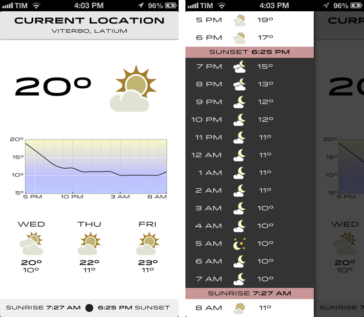
Check the Weather is a dashboard for weather conditions. At the top, there’s a bar that indicates your current location and, through a subtle animation, when the app is checking for updated data. Immediately below this bar, you’ll find the current temperature and weather conditions for your location. And then, underneath conditions, one my favorite features of the app: a graph of temperature for the next 12/15 hours. It’s a simple and effective way to visualize temperature changes (like how it dramatically drops between 6 and 8 PM).

Continuing with the main screen, the bottom part is dedicated to showing weather conditions and low/high temperature forecasts for the next three days and sunrise/sunset times. I particularly appreciate the sunrise functionality, as I mentioned above, and I find it somewhat curious that several developers decide not to include it. I also found it accurate for my location (Viterbo, Italy), and I only noticed a few days ago that moon phase is included in this section as well.

One thing that’s immediately distinctive about Check the Weather is its design. Different from any other weather app I’ve tried, Check the Weather makes extensive use of Hoefler & Frere-Jones’ font Idlewild for all its weather forecasts. While I wasn’t sure about this choice at first, within a few days I’ve come to appreciate the unique look of Check the Weather – this app is not yet another Clear clone. Check the Weather is different (a weather app with a very specific font and focused on data rather than prettiness isn’t something you see every day), and I like it. I can see, though, why this is also a very bold (no pun intended) move on Smith’s side: sometimes, people just want pretty pixels heavy on graphics and animations.

Check the Weather is unique in how it approaches the trend of placing additional information in a panel on the side. The app, in fact, uses two panels to display hourly forecasts and extended forecasts for the next 12 days. Hourly forecasts are nicely implemented, as “dark hours” are embedded between sunset and sunrise – as they should be. I don’t typically use extended forecasts (I think predicting 10 days in advance is a bit too much), but I like how they’re presented nevertheless.

As an Italian who reviews weather apps, the typical dreaded moment arrives when it’s time to talk about data. Simply put: if you live in the US you’ll have more features. While Check the Weather tries to be “global” with accurate data by HAMweather, there are several functionalities that are US-only, such as hazardous weather alerts from the National Weather Service, a doppler radar precipitation map, and integration with Dark Sky for minute-by-minute precipitation forecasts. I haven’t been able to test this, but David told me that Dark Sky API data is available in the precipitation view (swipe up from main screen). I believe Check the Weather is the first app to integrate with the recently announced Dark Sky API, and, even though it doesn’t support push notifications yet, it is a huge plus for US customers. As an Italian, all I can say is that weather data and forecasts were accurate and in line with Yahoo weather (the provider Apple uses).

One thing I’ve noticed about Check the Weather: it is localized in 7 languages (including Italian), and it is fully VoiceOver-enabled.

Check the Weather accessibility

Check the Weather accessibility

Check the Weather’s support for VoiceOver allows users to listen to forecasts.

Check the Weather is refreshingly different. It doesn’t look like any other weather app I’ve tried, and it leverages its uniqueness to provide weather data in a variety of ways that I find useful and intuitive. What I like most about Check the Weather is that it brings me the information I need without confusing me with custom menus or complicated interface designs. At this point, I only hope David will find a way to add more international weather providers and release an iPad version of the app.

Check the Weather is available at $2.99 on the App Store.