Federico Viticci

10759 posts on MacStories since April 2009

Federico is the founder and Editor-in-Chief of MacStories, where he writes about Apple with a focus on apps, developers, iPad, and iOS productivity. He founded MacStories in April 2009 and has been writing about Apple since. Federico is also the co-host of AppStories, a weekly podcast exploring the world of apps, Unwind, a fun exploration of media and more, and NPC: Next Portable Console, a show about portable gaming and the handheld revolution.

Apple Launches Three-Week Mac App Store Productivity Sale

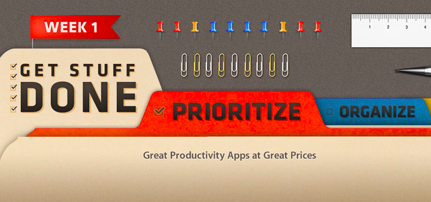
As first noted by MacRumors, in its weekly refresh of the App Store homepage Apple today launched a three-week “productivity sale” on the Mac App Store. The sale includes discounted apps from the “Get Stuff Done” section: Clear, Things, 2Do, Due, Todo, TaskPaper, The Hit List, and BreakTime. The custom Mac App Store page says “Week 1” and includes apps of the “Prioritize” kind; it’s safe to assume Week 2 will feature “Organize” apps, ending with “Utilize” apps in Week 3.

Interestingly, the old link for the Get Stuff Done section no longer displays apps that had been assigned to that section, suggesting that Apple may be picking only some apps previously collected in “Get Stuff Done”.

Both on iOS and OS X, Apple has been curating a series of custom sections for the past two years. As we’ve noticed before, after a redesign of the App Store in mid-2012 with the first iOS 6 betas, Apple started increasing its curation efforts – an area that several developers indicated as Apple’s best option for showcasing apps from the App Store. However, in spite of sections being a shared effort across the iOS and OS X App Stores, some changes remained exclusive to iOS: recent examples include App and Game collections, or redesigned categories.

The timing for this sale is interesting. The App Store turned 2 in early January, and in my look at two years of Mac App Store, I noted how many developers had progressively grown tired of Apple’s unclear Sandboxing policies and restrictions.

Sandboxing has undoubtedly left a scar that won’t go away any time soon. While the world hasn’t ended, Sandboxing – and Apple’s vague stance on some technical aspects, not the best policy when combined with multiple delays – has led to a dichotomy: in spite of Apple’s best efforts, developers are still dealing with two ways to sell their apps – the Mac App Store, and their own websites.

In the same article, I noted how – after a whole year – the Mac App Store charts were still dominated by the same number of Apple apps, and how – according to AppShopper data – growth had considerably slowed down. I offered a variety of reasons to try to motivate how developers felt in regards to the Mac App Store, and what users should expect going forward.

A sale is interesting for two reasons: it highlights great software and it helps third-party developers. Apple can only benefit from letting users know that great apps for a simple, immediate concept such as “Get Stuff Done” are available on the Mac App Store. The obvious consequence is that promotions typically help sales: developers can still make a fair amount of money even at 50% off; users are happy because they can buy at a discounted price from Apple’s own store; and – at least theoretically – the featured apps should go up in the Top Paid charts.

At the moment of writing this article the Get Stuff Done apps are still not listed in the Top 10, but they’re rising quickly (plus, the Mac App Store homepage was refreshed only a few hours ago). The Mac App Store benefits from charts that aren’t dominated by 8 Apple apps out of 10.

Effectively, Apple is now doing app promotions. There have been similar initiatives in the past – Two Dollar Tuesday comes to mind – and even “bundles” grouping multiple apps together, but they weren’t Apple-sanctioned promotions. (Update: there were some apps on sale for Apple’s Back to School promotion in the summer of 2012. However, we can’t dig up any screenshots or links. Apple is also doing a similar “Back to Uni” initiative in Australia now, but there are no apps on sale.)

It’s easy to imagine how, in the future, if this will also be extended to the iOS App Store, developers will look forward to being included in Apple’s official promotions. Developers will get the exposure of the front page, the benefits of built-in social sharing on the App Store, and, possibly, a tweet from the @AppStore account – which has been posting links to apps on a daily basis. Apple is mixing the editorial aspect of the App Store (only apps “chosen by Apple” – therefore synonym of “quality” – end up in a section) with the universal appeal of discounts to generate word of mouth, sales, more variegate charts, and, ultimately, a nice 30% cut for the company.

Right now, this is just the first week of a first promotion Apple is only doing on the Mac App Store. It might as well be an isolated experiment that Apple won’t repeat again. Perhaps they will simply return to launching some promotions for Back to School in the summer. But considering the popularity of their Free App of the Week initiative, I wouldn’t be surprised to see more frequent Apple-approved promotions in the future. Apple needs a healthy, thriving third-party ecosystem, and third-party developers need Apple’s promotional and marketing machine. Old-fashioned sales might just be what (some) developers needed.


The Verge: Redesigning Google

The Verge: Redesigning Google

Excellent story by Dieter Bohn and Ellis Hamburger at The Verge on Google’s efforts to find a new design consistency across its apps, services, and platforms. Make sure to watch the video (as usual with The Verge, their video material is top-notch).

The central design metaphor that Duarte and the team eventually landed on was one he’d used before in webOS: cards. The cards in Google Now also show up in Google search, when it displays “Knowledge Graph” results on the web. In both cases, cards seem to represent the information Google gives you directly instead of through a list of blue links. Cards are like a digital equivalent to the traditional architectural concept of marrying form and function — so that the way a thing looks is inseparable from what the thing is. “These are objects,” Duarte says, “They feel, not necessarily real, but they feel virtual. They’re not trying to be fake things, not … fake leather, fake wood, fake brushed aluminum.”

Right now, I can count three Google apps on my Home screen: Chrome, Gmail, and Google Maps. I’ve always been a fan of Google’s Search app – the one that was actually well designed and intuitive before Google started redesigning its other apps – but I keep that on my second screen.

I like the design choices Google made in the past months, but I primarily use Google’s new apps for another reason: they work better than Apple’s apps for me. It takes seconds for Google Chrome to sync a bookmark or an open tab; I wish I could say the same for Safari and iCloud. Google Maps works better than Apple Maps in my area. The Gmail app isn’t perfect, but it makes going through Gmail faster than dealing with Apple’s Mail app.

It used to be that if you liked Google’s apps more than Apple’s ones and if you relied heavily on Google services, then you should have considered switching to Android. But I don’t want to switch to Android: I use some Google web services, but I like Apple devices and iOS for everything else. The iOS third-party ecosystem is thriving and a source of continuous inspiration and workflow improvements. iOS is my platform of choice, but Google is behind many of the services that I prefer.

For this reason, I’m glad Google found its design voice on iOS.

Permalink

TaskAgent for Mac

TaskAgent for Mac

I like Francisco Cantu’s TaskAgent. It’s a simple iOS app that lets you manage to-dos as text files in Dropbox. I previously covered the app when Francisco released version 2.0 last year, and I also described how I was integrating it with my Dropbox writing workflow.

Francisco has released a first Mac version of TaskAgent today. The Mac app comes with the same settings of the iOS clients: you can link it to Dropbox, create multiple lists (which are actually multiple text files), move done tasks to the bottom of a list and new ones to the top. On the Mac, there’s also an OmniFocus-like “quick entry” to bring up a panel with a keyboard shortcut; from the panel, you can quickly add a task to a specific list.

There are some improvements that I’d like to see in a future version of the app. The interface is a bit rough and the app could use more polished toolbar icons; the quick entry panel should be automatically dismissed after you hit Enter; I’d also like to be able to drag & drop tasks between lists and have hyperlinks recognized as clickable. I am confident Francisco is already considering these fixes.

For existing TaskAgent users, TaskAgent for Mac is a worthy companion. The app is available at $3.99 on the App Store.

Permalink

App Icons

App Icons

Louie Mantia (former designer at Apple and Square, among others) has a thoughtful take on designing app icons:

Consider walking down a candy aisle at a drugstore. If you have a craving for Reese’s Peanut Butter Cups, you know how to find it. Of course, it’s the bright orange wrapper with a bubbly yellow word on it. Instant. Most candy bars have very distinct brands which can be instantly recognizable at a glance of the entire aisle. This should be precisely how you approach your app icon design.

An ideal app icon reminds users of an app through shape, color, and texture. Take the Phone icon, for instance. It has evolved a tiny bit since Steve introduced it in 2007, but has remained mostly the same. Today, it is a bright green, with diagonal stripes, and a white phone symbol. These three elements together (read: by our powers combined) form an instantly recognizable mark for users. When a user needs to use the phone, it’s a no-brainer.

I may have argued in the past that the iOS Home screen needs improvements, but I would never argue against a well designed icon. I use Alfred on my Mac to launch apps, but I also rely on the dock to quickly reach out to an app and make it visible. On iOS, I rely less on Spotlight (though I use it regularly) and I value the “recognizability” of icons in the Home screen.

Read Louie’s post about app icons here. His suggestions for new Zappos, Amazon, and Apple icons look great.

Permalink

iOS Automation and Workflows with Drafts

The latest update to Drafts – a “quick note capturing” app that I’ve covered several times on MacStories – adds a series of features aimed at increasing the possibilities of workflows automation on iOS devices. Obviously, this is something I’m interested in.

It seems like enabling users to save time while using apps has been a common thread in the past few months. The success of Launch Center Pro probably “raised awareness” in regards to the whole concept of URL schemes, but it’s been the increased adoption of x-callback-url and interest in automated workflows that proves better inter-app communication is something that (at least) third-party developers are thinking about. Google included a powerful URL scheme in Google Maps and Google Chrome; more recently, Mr. Reader showed how to enable a “services menu” by requiring users to mix URL schemes from other apps with parameters for an article’s title or selected text. These aren’t ideal solutions, but it’s all we have for now.

Greg Pierce, creator of the x-callback-url specification, has improved Drafts in ways that not only make the app more useful to get text onto other services, but also broaden the possibilities for automation through the use of URL schemes.

There are three main new features in the new Drafts: Dropbox actions, URL actions, and an improved URL scheme with support for callbacks and action triggers. I am going to explain how they work and include various actions and bookmarklets to demonstrate different use cases. Read more


Automattic Acquires Simplenote Creator Simperium

Automattic Acquires Simplenote Creator Simperium

As reported by AllThingsD, Automattic, the company behind WordPress.com and other products, has acquired Simperium, creators of popular note-taking app Simplenote.

This isn’t one of those talent acquisitions where the products aren’t part of the equation; Automattic expects to continue and extend work on both Simperium and Simplenote. “Simperium seems like a genuiune utility for our own apps and for other people as a service,” said Automattic founder Matt Mullenweg yesterday. “And Simplenote as a product I love and it’s just darn handy.”

According to Simperium, they will keep expanding their platform as a “tool for building apps”. They have already open-sourced the iOS and JavaScript components of their code, but it doesn’t look like the existing Simplenote apps will be going away any time soon. In a different blog post, the Simplenote developers explain how Automattic will help them “supercharge” Simplenote and bring it to more platforms:

You know how sometimes, the services you love just disappear when they’re bought by someone else? Or they wither and die a slow and painful death? Not the case here. We made sure of that.

Simplenote is one of the most popular third-party note-taking apps for iOS, with native clients for the iPhone and iPad that sync to a variety of desktop and web clients. On the other hand, Automattic has been criticized on several occasions for features lacking in its WordPress client for iOS, and it appears the Simperium acquisition will enable them to bring more intelligent and reliable sync to the app, though it’s unclear how and when.

You can read the details of the acquisition and transition to Automattic in the blog posts linked above. If you’re looking for Simplenote alternatives, Shawn Blanc recently shared his thoughts on the best note-taking apps for iOS and OS X. You can find our past coverage of Simplenote (including reviews of the apps) here.

Permalink

Apple Q1 2013 Results: $54.5 Billion Revenue, 47.8 Million iPhones, 22.9 Million iPads, 4.1 Million Macs Sold

Apple has just posted their Q1 2013 financial results for the quarter that ended in December 2012. The company posted revenue of $54.5 billion ($13.81 per diluted share), with 22.9 million iPads, 47.8 million iPhones and million 4.1 Macs sold. Apple sold 12.7 million iPods. The company reported quarterly net profit of $13.1 billion.

We’re thrilled with record revenue of over $54 billion and sales of over 75 million iOS devices in a single quarter,” said Tim Cook, Apple’s CEO. “We’re very confident in our product pipeline as we continue to focus on innovation and making the best products in the world.”

“We’re pleased to have generated over $23 billion in cash flow from operations during the quarter,” said Peter Oppenheimer, Apple’s CFO. “We established new all-time quarterly records for iPhone and iPad sales, significantly broadened our ecosystem, and generated Apple’s highest quarterly revenue ever.

Compared to last year’s Q1 – which had an extra week – Apple made $8.2 billion more revenue, but the same profit. Read more


Watermarker 1.1 with Batch Processing

Watermarker 1.1 with Batch Processing

When my dear friend and MacStories writer Don Southard released the first version of Watermarker, I didn’t know whether posting about it here on MacStories would be appropriate. However, after I’ve come to use the app and know how much Don is committed to making it great, I now think not mentioning it would be a disservice to my readers.

Watermarker provides a simple and automated way to add watermarks to images. You can choose between various options including text, your own logo, or even a customizable strikethrough. The app has a clean interface with the “canvas” (the area where you can drop an image) displayed on the left, and watermarking settings on the right. I like how you can save presets (so I can have one for my “large” MacStories watermark, another one for the smaller version), and the fact that an image’s size is reported right below its preview. Don’t take my word for it – I’m not the only one who thinks Watermark is a fine app.

Today’s update is particularly interesting for my workflow because it adds batch processing. You can drop multiple images at once into the canvas or dock icon (you can also drop an entire folder), and Watermarker will display a red badge in the canvas on top of your “stack” of photos (I wish I could click on the photos in the stack to select them). Once imported, you can set your watermark, and the app will apply it to all images at once; I like how Don also created a slider to set opacity for an image. To export, you can simply drag the images out of the canvas or save them. In both cases, a copy will be created.

I don’t like watermarking images, but Watermarker makes it extremely easy and fast. If I had to nitpick, I’d say that it’d be nice to navigate images in the canvas using the arrow keys (so you could still get a preview of the images you’re watermarking) and have AppleScript support for deeper automation workflows. Even without AppleScript, however, version 1.1 is a great improvement over Watermarker 1.0, which required you to import images one-by-one.

Go check out Watermarker here. The app is available at $7.99 on the Mac App Store.

Permalink

Due Clipper For Google Chrome

When there are no actual news or notable app releases, I prefer investing my time in creating something for other people.

Continuing my ongoing series of tips on iOS URL schemes, here’s an adaptation of my existing Due bookmarklet to work better with Google Chrome for iOS (which, as I’ve pointed out several times, has a very nice URL scheme). The following code (to install it, simply copy it and paste the entire string into a bookmark) grabs a webpage’s title and URL and sends them to Due (also powered by a great URL scheme). Read more