Federico Viticci

10759 posts on MacStories since April 2009

Federico is the founder and Editor-in-Chief of MacStories, where he writes about Apple with a focus on apps, developers, iPad, and iOS productivity. He founded MacStories in April 2009 and has been writing about Apple since. Federico is also the co-host of AppStories, a weekly podcast exploring the world of apps, Unwind, a fun exploration of media and more, and NPC: Next Portable Console, a show about portable gaming and the handheld revolution.

Integrating OmniFocus and Reminders On OS X

Integrating OmniFocus and Reminders On OS X

Daniel Jalkut and Sean Korzdorfer have been working on two aspects of the same problem: bridging the gap between OmniFocus and Reminders on OS X.

Sean put together a series of AppleScripts to send tasks from OmniFocus to Apple’s Reminders app for Mac. Daniel created (and open-sourced) an app to check Reminders for newly added items, transfer them to OmniFocus while keeping due dates, and deleting them from their original location in Reminders.

I love OmniFocus for both Mac and iOS, but it turns out that because I lean so heavily on using Siri to add items, I tend not to open OmniFocus while I’m on the go. When I come home and get to work on my Mac, I notice that OmniFocus doesn’t contain any of my recently added items, so I have to go through the cumbersome steps of opening my iPhone and launching OmniFocus just to get this theoretically time-saving trick to work right.

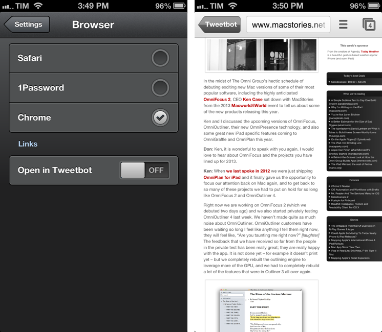
I have tried to get into using OmniFocus’ iCloud capture feature on iOS, but because I don’t use Siri on a daily basis, that didn’t turn into a habit. I know many rely on OmniFocus-Reminders integration, and I think these are nice solutions for the desktop.

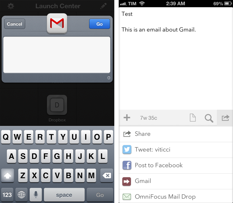
I, however, have become a big fan of The Omni Group’s Mail Drop service. Using Drafts, I can write down a task, send it to Mail Drop, and have it in my OmniFocus inbox after a few minutes; if I want to save a link to a webpage, I can use a bookmarklet that sends a website to Drafts and then to Mail Drop. Rather than further integrating OmniFocus and Reminders, I’d like to open OmniFocus on iOS and find it already synced with all other copies of the app and Mail Drop. Right now developers have to resort to location-tricks to update information in the background, and I wish Apple will allow more background options in the future.

Permalink

TED 2.0

TED 2.0

The official TED app for iPhone and iPad has been updated to version 2.0. I’ve been watching a few videos with it and it’s been a solid update so far.

The app is generally faster on 3G and videos load faster than the previous version. Living in a town where 3G is actually faster than my home DSL connection, I can confirm video buffering starts quickly. I’m a fan of TED’s video player controls that sport the same metallic elements of Apple’s Music app.

The big new feature in this update is the addition of subtitles and translations. Subtitles are available in over 90 languages and they can be enabled from the video player and they persist over AirPlay (useful if you’re going to stream TED to an Apple TV or Mac running Reflector). Languages are available in a dedicated section in the All Talks tab; localized talks come with descriptions, title, and subtitles in your native language.

TED 2.0 is available on the App Store.

Permalink

Sponsor: Today Weather

My thanks to Savvy Apps for sponsoring MacStories this week with Today Weather.

Today Weather is a clean, elegant, and intuitive weather app for the iPhone. From the creators of Agenda, Today Weather sports the same amount of care and attention to simple and fast touch interactions: you can tap on a location to enter its detail view, swipe left to get a hourly forecast of the next few days, and swipe right to see a beautiful graph for each day’s average temperature and conditions. If you live in the US, you’ll also get a radar view with storms, showing rain and snow. The Forecast view is based on NOAA gradients and the data presented is fast and accurate.

I personally keep Today Weather on my Home screen and I’ve been using it every day since its release. My two favorite features are the Today view – which gives me a quick overview of the current day – and the Forecast, as it lets me visually understand what my week will be like in terms of temperature and weather conditions. I’m a big fan of Today Weather’s design and animations, and I’m looking forward to an iPad version of the app, coming soon.

Find out more about Today Weather here.


Tweetbot Adds Support For Chrome and 1Password Browsers, Vine and Flick Inline Previews

Tweetbot 2.7, released today for the iPhone and iPad, comes with a new Browser setting to specify an external app for opening links. I have been testing the feature and I’m a big fan of this update.

In the Settings, you can now choose to open links directly in Safari, Google Chrome, or 1Password. There are two ways to do this: you can choose to keep opening links in Tweetbot’s own web view and then forward them to your browser of choice; or you can skip Tweetbot’s web view altogether and go directly to a different browser upon tapping a link.

Opening links in Safari and 1Password doesn’t have anything special to it aside from the fact that you’ll be taken out of Tweetbot and into another browser. The 1Password integration is particularly useful as it is, essentially, the same idea behind my bookmarklet, only available inside Tweetbot: if you see a link for a website that you also want to log into, you can use 1Password’s built-in browser to access it.

Using Chrome alongside Tweetbot is my new favorite option, as it leverages Chrome’s support for x-callback-url to enable a completely automated workflow to open Chrome and go back to Tweetbot. If you open a link in Google Chrome, a new tab will open showing a back button labeled “Tweetbot”; once you’re done reading, you can hit that button to automatically close the tab and be taken back to your position in the Tweetbot timeline. Chrome is smart in hiding the back button if you navigate to other pages from the Tweetbot-created tab; the browser also remembers the “special” tab if you switch to other tabs and then go back to the one created by Tweetbot. There’s a minor bug in this version that will redirect to the Tweetbot’s Timeline when you open a link from Mentions, but Tapbots is aware of it. For me, this is a very welcome addition to Tweetbot as it allows my two most-used iOS apps to better communicate with each other without requiring me to manually move between apps. I can get all the benefits of using an external browser (Facebook sharing, using bookmarklets) while still being able to go back to Tweetbot seamlessly.

For Flickr and Vine users, Tweetbot 2.7 also adds inline previews. Vine’s short videos are shown with a standard iOS video player that has a play/pause button.

Tweetbot 2.7 is a minor, yet useful update for Chrome and 1Password users who have been wishing the app could open links in other browsers. You can find the update on the App Store (iPhone, iPad).


Pinbook 1.3

Pinbook is my favorite app to create and manage Pinboard bookmarks on iOS. Developer Collin Donnell released version 1.3 of the app today, which includes support for Google Chrome, x-callback-url, more editing options, and browsing tags.

Tag browsing is probably the biggest new feature in this update. You can tap on a new button in the bottom toolbar to bring up a Filter menu containing a search bar, shortcuts for Private/Public/Unread/Untagged bookmarks, and an alphabetical list of all your Pinboard tags. Each tag shows the number of existing bookmarks assigned to it in your account and can be tapped to view them in the main screen. To go back to viewing all bookmarks without browsing by tag, you can enter the screen again and select Clear Filter. You can also tap & hold a tag to share its Pinboard URL.

I like how you can select multiple tags, but I wish the app was capable of showing me results that matched all criteria, rather than any of them; for instance, I often browse a page that contains bookmarks tagged with “python” and “pythonista”, while Pinbook will show it as “python” or “pythonista”. It’s a minor difference that I’m sure Collin will consider.

Bookmarks can now be edited from the Bookmarks screen. Hitting Edit will open an editing interface to modify single bookmarks or multiple ones at once if you want to delete them or make them as read. You can now also tap & hold a bookmark to quickly show an Edit/Mark as Read/Share menu.

My favorite new feature of version 1.3 is the addition of x-callback-url and support for opening links in Chrome. Thanks to x-callback-url, a link opened in Chrome will show a “Pinbook” button to go back to the app (shown above); with x-callback-url built-in, you can also construct URLs that will take you back to other apps after a bookmark has been added. Therefore, I update my Safari and Chrome bookmarklets to take advantage of the new functionality.

Safari

javascript:window.location='pinbook://x-callback-url/add?url='+encodeURIComponent(location.href)+'&title='+encodeURIComponent(document.title)+'&x-source=Safari&x-success='+encodeURIComponent(location.href)+'&x-cancel='+encodeURIComponent(location.href)

Chrome

javascript:window.location='pinbook://x-callback-url/add?url='+encodeURIComponent(location.href)+'&title='+encodeURIComponent(document.title)+'&x-source=Chrome&x-success=googlechrome://&x-cancel=googlechrome://'

You can imagine the sort of workflows that are made possible by x-callback-url. Just to name two: you could create a Mr. Reader service that sends selected text from an article to Pinbook as description (alongside title and URL) and then goes back to Mr. Reader; or, you could create a Launch Center Pro action that sends a URL in the clipboard to Pinbook and then launches the Pinboard website in Safari or Google Chrome.

Pinbook continues to be one of my most used iOS apps. Version 1.3 is available on the App Store.


Gmail for iOS URL Scheme

Gmail for iOS URL Scheme

Tom Scogland figured out the complete URL scheme for Gmail 2.0, Google’s official Gmail app for the iPhone and iPad. As documented on his blog, the Gmail app allows you to compose an entire message using the following template:

googlegmail:///co?subject=<subject text>&body=<body text>

As I’ve also found out, you can add a to= parameter to pass a URL-encoded email address to which an email will be sent to. Unfortunately, my tests also confirmed that a similar from= parameter isn’t supported, and that this undocumented URL scheme doesn’t support x-callback-url, unlike Chrome. So, it’s not possible to return to a “calling” app after an email has been sent or the compose screen dismissed. I’ve also noticed how this URL scheme isn’t particularly reliable at bringing up the compose screen if the app wasn’t paused in the background (such as in a cold start); this is probably the reason Google isn’t publicizing this URL scheme – it’s not ready yet.

I’ve still made some stuff for it, though. Here’s a JavaScript bookmarklet that will open Gmail using a webpage’s title as Subject and URL as body:

javascript:window.location='googlegmail:///co?subject='+encodeURIComponent(document.title)+'&body='+encodeURIComponent(location.href);

Here’s an action for Launch Center Pro:

googlegmail:///co?subject=[prompt]&body=[prompt]

And an action for Drafts:

googlegmail:///co?subject=[[title]]&body=[[body]]

Keep in mind that the URL scheme may fail if Gmail wasn’t paused in the background (it’ll show a splash screen when loading again). I’m looking forward to improvements to the URL scheme, as Google has been doing a great job with these lately.

Permalink

Convertible for iPhone

Convertible for iPhone

Convertible is one of the most peculiar and fun iPhone apps I’ve downloaded recently. On the surface, it’s a unit converter that uses “nested levels” to show conversions: levels start from the top with type (Length, Time, Currency, etc), then move to category (Metric, US & Imperial, Atomic, etc), and end with the actual unit you want to convert (Celsius, meters, Dollars, etc). The interaction is interesting: you can tap a level to bring up a list (therefore “expanding” the entire level), but you can also scroll horizontally to avoid taps. The animations are smooth and responsive. There are color schemes to choose from in the Settings, as well as an option to show or hide the iOS status bar.

The process of entering numbers for conversion is done by tapping on the larger level showing the unit you chose below a numeric value. The same level also comes with a “star” button to add a unit to your Favorites and a “note” you can expand to know more about a unit. The numeric pad to enter values is custom and in line with the aesthetic of the app. I like how showing the numeric pad “zooms” into the unit levels and how you can hit a button in the bottom toolbar to quickly swap the units you’ve chosen.

My favorite feature of Convertible is the addition of custom categories besides the standard Metric and Imperial ones. For each type, you’ll find things like Human, Everyday Objects, Natural World, or Food & Drink; the selection of “units” is variegate enough and not necessarily skewed towards the US. For instance, I can compare 1 Tom Cruise to the length of an iPhone 4S and find out that he equals 14 devices; or, I can choose 1 Usain Bolt and see how he’s capable of running 12.2 meters per second (my personal average is 10.2).

I had a lot of fun exploring Convertible’s interface and its custom categories. The app is available at $1.99 on the App Store.

Permalink

The Larger iPhone

The Larger iPhone

Marco Arment has posted some mockups of what a larger, 4.94-inch iPhone may look like:

The theory is easy to understand: perform John Gruber’s Mini-predicting math backwards. The iPad Mini uses iPhone 3GS-density screens at iPad resolution. What if an iPhone Plus used Retina iPad screens with iPhone 5 resolution, keeping the rest of the design sized like an iPhone 5?

Later in the post:

An iPhone Plus almost as big as a Galaxy Note isn’t ideal for many people, but it doesn’t need to be quite that large to accommodate a 4.94” screen. It’s clear that other manufacturers have found designs and techniques to make larger-screened phones require smaller bezels. Apple could achieve similar results and shrink the “forehead” and “chin” even further, limited primarily by the size of the Home button and the desire to keep the forehead and chin equal height.

Max Rudberg proposed the same concept in early January:

This way, Apple would enter the “phablet” market2. There is obviously such a market, likely people who figure they can get something in between a phone and a tablet instead of having two separate devices. If they can enter a new market segment this easily, why shouldn’t they?

MacStories readers know that one-handed operation of an iPhone is a big deal for me. I don’t think I would be able to use a larger-than-iPhone-5 device comfortably with one hand; judging from my past (and brief) experiences with the Samsung Galaxy Note and S III, I would say an iPhone such as the one Photoshopped by Marco is not for me.

However, the point I’ve made in the past on Twitter still holds true: there’s a market of consumers who like smartphones with bigger screens. Now, Apple and Samsung are two profoundly different companies also in the way they spend advertising dollars. From what I see here in Italy, I can say Samsung’s marketing push for the Galaxy line-up has been huge, and it’s clear how the company’s handset business is growing. These days, when I’m not seeing an iPhone, I’m seeing a Galaxy device.

The question is whether those Samsung devices could have been iPhones sold by Apple. Is Samsung selling Galaxies because the carriers have an interest in pushing those more to consumers? Are people buying Galaxies because they “hate” Apple? Is Samsung doing well thanks to advertising? Or could it be that some people actually like the idea of a bigger smartphone that’s not a tablet or a computer?

I don’t know the answer, but I’m fairly certain these are questions folks at Apple are asking themselves too. So I’m going to relay the same example again: several friends of mine told me how they ended up choosing a Galaxy Note (which to me looks ridiculously huge) because it allowed them to comfortably “watch movies” and “read” in a screen bigger than an iPhone, bought on contract and therefore “virtually” cheaper than a MacBook. The reason they were not using a computer to do those tasks? They just didn’t want to anymore.

Like I said, I don’t know if the rumors are true, I don’t know if there’s an Apple market for iPhones in between an iPhone 5 and iPad mini, and I don’t think I’d buy one. But if I were to buy that theory, I’d say Marco’s ideas make sense.

Permalink

Evernote Relaunches Penultimate: Free, Evernote Sync, Search

In May 2012, Evernote acquired Penultimate, one of the most popular handwriting apps for the iPad. Today, Evernote is relaunching Penultimate as a free app with built-in Evernote sync and search for handwritten notes.

I have been beta testing the new Penultimate, and, overall, I like the update. I have to admit that my usage of the application is limited to importing images into the app’s notebooks and drawing a few callouts and simple illustrations on them. I usually prefer Evernote’s other app, Skitch, for quick image annotations, but I don’t mind using Penultimate every once in a while when I need something more complex than a straight line or callout. Still, keep in mind that I don’t store hundreds of notes in Penultimate. Read more