Ryan Christoffel

981 posts on MacStories since November 2016

Ryan is an editor for MacStories and co-hosts the [Adapt](https://www.relay.fm/adapt) podcast on Relay FM. He most commonly works and plays on his iPad Pro and bears no regrets about moving on from the Mac. He and his wife live in New York City.

Apple Releases Smart Battery Case for iPhone 11 and 11 Pro with Dedicated Camera Button

Today Apple has launched new versions of its Smart Battery Case for the latest iPhone models, the iPhone 11, 11 Pro, and 11 Pro Max, which are available to order now from the company’s website with November 25 delivery, which is the same date the case will be available in local stores.

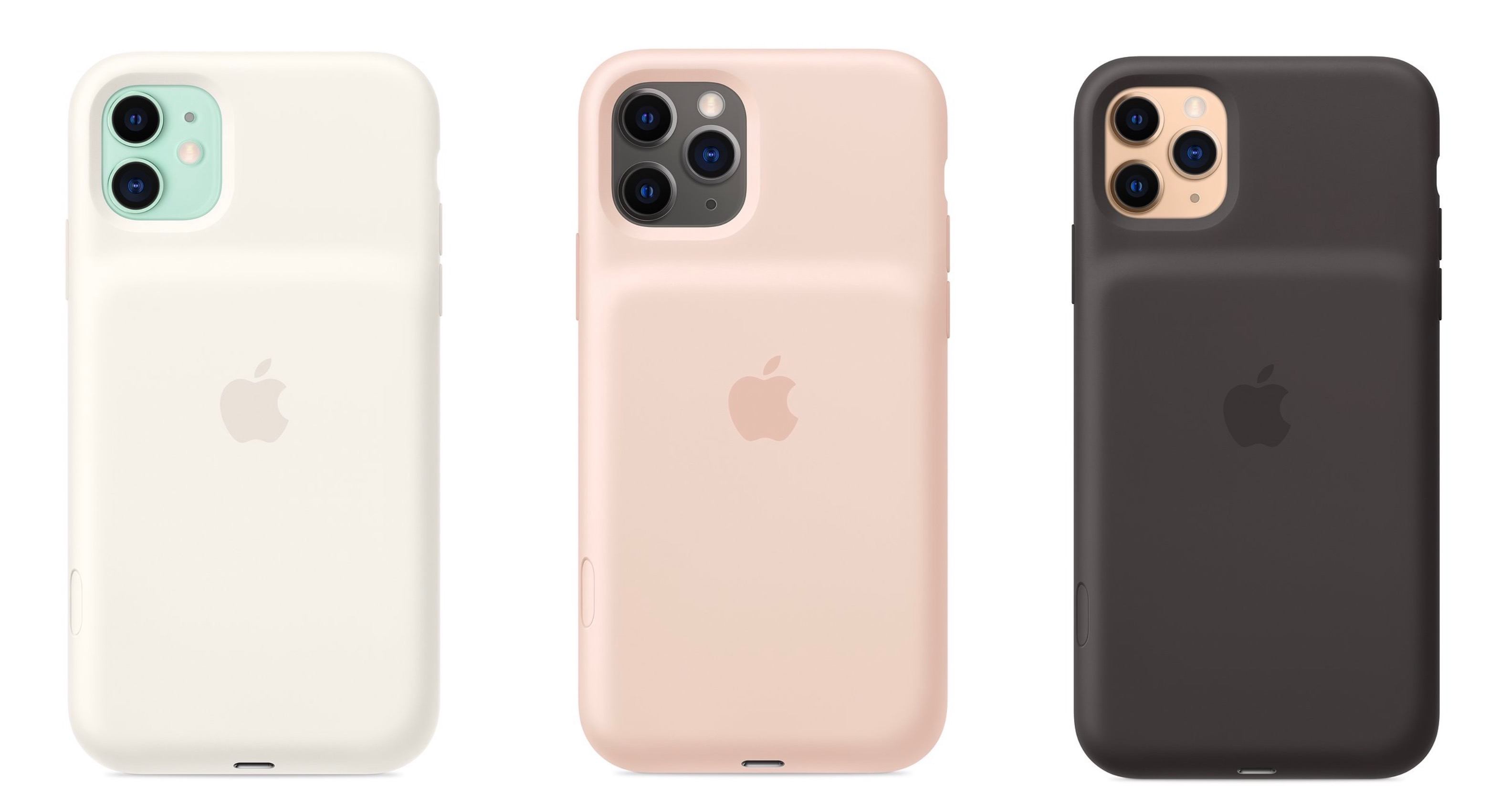
Like previous editions of the Smart Battery Case, the case’s exterior is made of silicone. There are three color options for the 11 Pro and 11 Pro Max case: Pink Sand, White, and Black. The standard 11 case, however, is only available in Soft White and Black. All different versions of the Smart Battery Case are available at the same price: $129.

Links:

Each version of the Smart Battery Case offers a quoted 50% longer battery life, making the already-excellent battery life of this year’s iPhones even better. They also all come with a new feature not available with any other previous case: a dedicated button for launching the camera, which sits on the lower-right side of the case.

From the product listing:

The case features a dedicated camera button that launches the Camera app whether the iPhone is locked or unlocked. A quick press of the button takes a photo and a longer press captures QuickTake video. It works for selfies, too.

This is a very intriguing development, and one that’s particularly fitting for the iPhone 11 lineup due to its heavy emphasis on cameras. Now with the Smart Battery Case, you can shoot photos and videos for much longer than before without killing your battery, while also gaining more convenient access to the Camera app than is possible without the case.


Spark Updated with Multiwindow and Dark Mode Support and a Design Refresh

Two Spark windows open in Split View.

Two Spark windows open in Split View.

Spark, the email client from Readdle, received a strong update today that adds support for the latest iOS and iPadOS features, dark mode and multiwindow, while also introducing a design refresh that refines, rather than reimagines what was already there.

Multiwindow on iPad is excellent to have in an email app. I’ve been using Apple Mail in multiple windows since iPadOS first launched, and it’s especially handy for composing a message while still viewing other messages in your inbox, or that you’ve saved for later. Spark is no exception here: the flexibility to browse the app while writing a message, or even compose multiple messages at once, is fantastic. Where apps like the official Gmail client don’t even support Split View yet(!!), I’m happy to see Spark follow Apple Mail’s example in making multiwindow a core functionality.

Unlike many other apps that have added support for iOS 13’s dark mode this fall, today’s update for Spark is especially noteworthy because the app didn’t formerly offer a dark mode option at all. Now, Spark supports both light and dark modes and follows the system setting by default, though you can choose to perpetually keep the app in a single mode. I was happy to find that you can choose from both grey and true black themes, both of which look especially nice with the app’s blue accent colors; the only drawback is that just the grey theme can currently follow iOS’ system setting, so if you want to use true black, the app will stay in that mode until you manually change it.

Customizing Spark's toolbar.

Customizing Spark’s toolbar.

Dark mode comes alongside a design refresh for Spark. While the app will still look entirely familiar to existing users, I think the tweaks to font details, spacing, and layout result in a better experience overall. The biggest standout of the redesign is that Spark can now display avatars next to messages, similar to what the official Gmail client offers, which I really value. Also, there’s a new option to customize the toolbar actions when viewing a message. Spark has always been great at providing customization tools, so it’s nice to see yet another added to the app.

Spark is one of the best email options on the App Store, and I especially recommend it for teams. Federico, John, and I use its team features to share and comment on emails together, which is an extremely valuable aid to collaboration. If you’ve tried Spark before and it’s not for you, there may not be enough different in today’s update to tempt you, but if you use an iPad at all, don’t underestimate how nice it can be to employ multiple windows while working through email.


My Modern iPad Home Screen: Apps, Widgets, Files, Folders, and Shortcuts

My iPadOS Home screen.

My iPadOS Home screen.

For several years after its launch, one of the best and worst things about the iPad was that it was basically just a blown-up iPhone. This meant the device was extremely easy to use and intuitive, but it also meant lots of “computer-like” tasks were difficult to perform on an iPad. When the iPad Pro debuted in late 2015, that began to change. Features like Split View, Slide Over, Picture in Picture, and drag and drop made the iPad a more capable computer than ever. However, despite those advancements, it took until this fall before one of the iPad’s core iPhone inspirations was altered: the Home screen.

Before iPadOS, the iPad’s Home screen was just a larger version of an iPhone Home screen, with no unique advantages to it. That finally changed mere months ago, when iPadOS 13 brought two primary improvements to the Home screen: it could hold 30 icons rather than 20, and it could include pinned widgets.

These two changes alone weren’t radical departures from the Home screen’s iPhone origins, but combined with other discoveries, they unlocked significant new possibilities.

On a recent episode of Adapt, I challenged Federico to try re-creating a Mac-like desktop environment on the iPad’s Home screen, complete with file and folder launchers. What he came up with is exactly what I’d hoped for. This newfound ability, alongside iPadOS 13’s enhancements to how shortcuts work when added to the Home screen, and the debut of MacStories Shortcuts Icons, meant it was time for me to seriously consider a new approach to my Home screen.

What I’ve come up with includes apps, app folders, files, file folders, shortcuts, and of course, widgets. It’s a diverse setup, and it all lives on a single page of icons. Let me explain.

Read more


Imagining a TV App Overhaul

With the debut of Apple TV+, Apple accomplished at least one of its goals for the service: people finally opened and explored the pre-installed TV app, in many cases for the very first time. I’ve used the TV app consistently ever since it first launched on iOS and tvOS in late 2016, which means...


Apple Debuts New Research App, Launches Health Studies for Women’s Health, Hearing, and Heart and Movement

Today Apple announced the next phase of its efforts in medical research studies. Following the Heart Study which debuted in late 2017 and shared its first results earlier this year, Apple now has three new studies it’s launching at once, which users can sign up for through a brand new Apple Research app.

“Today marks an important moment as we embark on research initiatives that may offer incredible learnings in areas long sought after by the medical community,” said Jeff Williams, Apple’s chief operating officer. “Participants on the Research app have the opportunity to make a tremendous impact that could lead to new discoveries and help millions lead healthier lives.”

Users can enroll in one or more of the new studies: the Women’s Health Study, Heart and Movement Study, and Hearing Study. Each of these uses an iPhone and Apple Watch to collect certain data for the purpose of aiding medical advancements.

Anything health-related can come with plenty of privacy concerns, so the Research app’s on-boarding flow includes a very clear privacy commitment, stated in four points:

  1. Your data will not be sold.
  2. You decide which studies you join, and you can leave the study at any time.
  3. You control which types of data you share, and you can stop sharing your data at anytime.
  4. Studies must tell you how your data supports their research.

Tim Cook on multiple occasions has sought to emphasize how important the issue of health is to Apple. Far from a mere hobby, he’s said he believes health will end up being Apple’s most significant area of contribution to mankind. Studies like these are one way to help push the needle on that goal.


HomeRun Adds Thousands of Icons for Customizing Your Watch HomeKit Triggers

Browsing custom icons in HomeRun's iPhone companion.

Browsing custom icons in HomeRun’s iPhone companion.

Customization options have never hurt an app, and in many cases they make apps far more functional and endearing. Today HomeRun, the Apple Watch app for running HomeKit scenes, has expanded its customization options immensely by adding over 4,400 new icons that can be used for configuring the app’s grid of HomeKit scenes, and also for adorning your watch face via HomeRun’s complications.

HomeRun debuted last November as the best option for running HomeKit scenes from your Apple Watch. Unlike Apple’s own Home app, which only displays two scene triggers on-screen at once, with HomeRun you can fit up to 12 on-screen with a 44mm Watch, plus create complications for those scenes that run on a user-set schedule, so the right scene complication is always present at the right time.

HomeRun's scene grid (left) and custom complication (right).

HomeRun’s scene grid (left) and custom complication (right).

Previous releases enabled customizing HomeRun’s scene grid, which makes up the app’s main UI, by choosing from different colors and glyphs for each of your HomeKit scenes. The number of options was fine before, but now it’s much more than fine. Developer Aaron Pearce has added thousands of new icons by including the full set of Apple’s SF Symbols, the full set of Simpaticons, plus emoji options. The over 4,400 icons can be browsed inside HomeRun’s companion iPhone app, where a search option has thankfully been included.

I love that these new options work not only inside HomeRun’s grid, but also for configured complications. The sole exception is emoji, since they don’t fit watchOS’ design standards for complications. That slight drawback aside, this is a fantastic release for HomeRun that ensures I have no reason to ever look elsewhere for HomeKit scene control on the Apple Watch.

HomeRun 1.3 is available now on the App Store.


Disney+ Available Now, Integrated with Apple’s TV App But Not as a Channel

Today Disney has launched what’s almost certain to become one of the most successful streaming services over time: Disney+. Apple users can enjoy the new streaming service through the Disney+ app for iPhone, iPad, and Apple TV. You can subscribe directly inside the app to start a 7-day free trial, after which it costs $6.99/month or $69.99/year. Disney is also offering a bundled option, where Disney+, Hulu (with ads), and ESPN+ are available for a single $12.99 monthly fee; to sign up for that bundle, you need to visit disneyplus.com.

Disney+ features an enormous back catalog of Disney favorites, from classic animated films to the worlds of Star Wars, Marvel, Pixar, and National Geographic. Not only that, but Disney has prepared a healthy slate of originals to accompany the launch, the clear standout of which is the Star Wars-based The Mandalorian. Combining originals and catalog fare, Disney+ is unquestionably the strongest content debut ever for a streaming service.

The app experience of Disney+ seems at least as good as other streaming services, and in some cases even better. As seen in the image above, Disney+ on the Apple TV offers an easy way to log in if you’ve already set up your account on an iPhone or iPad. Unlike most other streaming apps, which require entering a code on your TV, the Disney+ app can automatically log you in on your Apple TV when you have the mobile app open on the same Wi-Fi network.

Disney+ content inside Apple's TV app.

Disney+ content inside Apple’s TV app.

You can also connect the Disney+ app to Apple’s own TV app, enabling you to track everything you’re watching from Disney inside the TV app’s Up Next queue. You’ll see Disney+ shows and movies advertised inside TV’s Watch Now tab, where they can be added to your queue. This way, content from Disney+, Apple TV+, HBO, and other sources can all reside in one universal hub.

Unfortunately, Disney+ isn’t available as a channel inside the TV app, it only offers an app integration. What this means is that you’ll have to download the Disney+ app on all your devices to play the service’s content, whereas with channels content you can watch without needing a separate app. Also, whenever you initiate playback in TV you’ll be bumped out to the Disney+ app, making for a clunkier playback experience than you would have if the service was available as a channel.

The streaming wars are only just now starting to heat up, and the launch of Disney+ is a significant moment in those wars. While for some, the new service represents yet another video subscription they’re asked to pay for, it truly is remarkable that the dream of unbundling content from expensive cable or satellite packages is finally coming true.


Kindle

I have to say, I never expected that I’d choose the Kindle app as a newsletter Favorite. In fact, up until a year or two ago, I would have vehemently opposed even Federico or John trying to designate it as such because I had so many problems with the app. Things have changed though....


Twitter Launching Topics Feature Soon

Source: The Verge

Source: The Verge

Casey Newton reports for The Verge on a new Twitter feature coming soon:

Recently, a friend told me he wanted to spend more time using Twitter, but he didn’t quite know how. His primary interest is comedy, he told me, and he hoped to find a way to see comedians’ best jokes on Twitter as they were posted. But when he followed comedians, he mostly saw a lot of self-promotion — tour dates, late-night appearances, and that sort of thing. No matter your personal interests, there are countless good and relevant tweets on Twitter. But where are they?

Topics, a new feature from Twitter that is starting to roll out this week, represents a significant effort to answer that question. You will be able to follow more than 300 “topics” across sports, entertainment, and gaming, just as you are currently able to follow individual accounts. In return, you’ll see tweets from accounts that you don’t follow that have credibility on these subjects.

Topics represent a major new addition to the Twitter timeline, easily one of the most significant changes the service has ever introduced. Though topics have the potential to improve a person’s timeline, they could also have the opposite effect if not done well. Based on this report, it sounds like Twitter’s team has all the right checks in place to ensure tweets from topics are things you’ll actually care about. Here’s Newton on how the process works:

First, Twitter scans incoming tweets for keywords like “WWE,” “pro wrestling,” and so on. (It can’t search for those terms in images and videos, at least not yet.) Second, Twitter searches to see if the tweet is from someone who normally tweets about that topic as a measure of credibility. Finally, Twitter looks at engagement: how many other people who care about this topic liked, retweeted, or replied to a tweet? The more people are interacting with the tweet, the more likely it is to make the cut.

I’m eager to try following a few topics to see whether they have a positive or negative impact on my timeline. I think the feature will be a clear win for users who are new to Twitter, and don’t already have a well-curated collection of follows; for those who have used the service for years, though, it may not be as appealing. And there’s no word on whether topics you follow will appear in your timeline in third-party clients like Tweetbot and Twitterrific.

We won’t have to wait long to find out: topics are starting to roll out this week with a full global launch next Wednesday, November 13th.

Permalink