In an unsurprising move considering Apple’s upcoming iOS 6 update, Google released an official YouTube app for iPhone last night. Announced on the YouTube blog, the app is available for free on the App Store, and it runs natively on the iPhone; according to The New York Times, an iPad version is also in the works.
I have taken the YouTube app for a spin, and I was quite impressed with what Google accomplished in this first version. While not excellent in terms of performances, the key to this first release of YouTube for iOS is access.
One of the most controversial aspects of the former, pre-installed YouTube client for iOS was that, as Google started monetizing the YouTube platform with “official” videos from channels like VEVO, the pre-installed iOS client couldn’t display such videos due to a lack of agreement between Apple and Google in regards to ads shown to the users. On the standard desktop YouTube website, users could watch, say, music videos from official channels because the company embedded banners or pre-roll ads to monetize; on iOS devices, official videos were omitted from search results, and links to these videos would return the infamous “this video is not available on mobile” error message. As Google goes free from Apple’s restrictions with standalone apps, this is about to change.
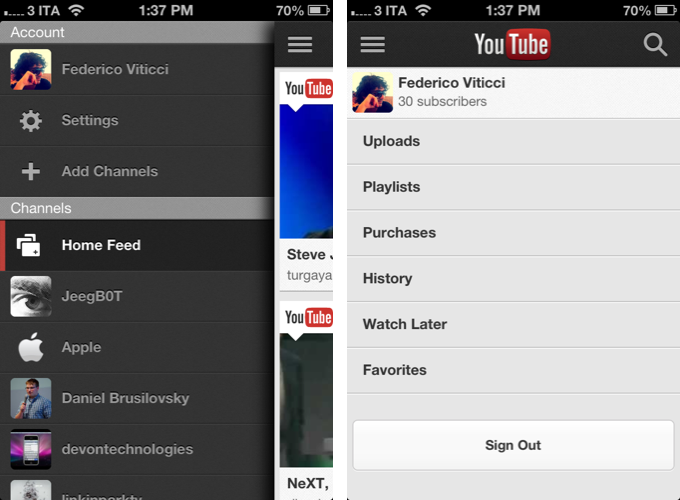
YouTube for iOS features a Facebook-inspired side panel to access channels you’re subscribed to, categories from YouTube (music, sports, popular, etc), the app’s settings, and your account. You can use the app without being logged in as a simple utility to sit back and watch videos, or you can enter your Google account credentials to gain the possibility to leave comments, save videos to playlists or “watch later”, subscribe to channels, and just about anything else that might be related to your YouTube account.
I have tested the app with my personal account. In the side panel, tapping on the profile tab opens a dedicated view with shortcuts to your uploads, playlists, purchases, history, watch later items, and favorites. The watch later section is particularly interesting in my opinion, as it facilitates a kind of experience focused on using mobile devices as a way to “catch up” on videos saved for a later time – much like Instapaper and Pocket do for web articles. For this reason, I believe it’d be neat to see Watch Later gain its own section in the sidebar for easier access; in fact, I would also like an option to selectively pick account sections to display in the sidebar. One last note on accounts: I really like the option to access the entire history of videos you’ve watched, but I have experienced some bugs while trying to load the list or refreshing it (YouTube uses pull to refresh). Hopefully YouTube will fix display issues related to some web view-based parts of the app soon.
In terms of interface design, the YouTube app is reminiscent of the mobile website, which Google redesigned several times in the past few years. The app’s main color scheme is based on a combination of white, red, and black for video thumbnails and menus; while several elements are “native” when compared to the HTML5 website, the overall structure and organization of content isn’t too dissimilar from what Google built for the browser. There are, however, some differences between the two.
Let’s take channel pages as an example. In the browser, channels show a description of the user, with interesting stats such as subscriber and video counts, and total video views. In the native app, there’s no way to check out total video views and a user’s description, but the overall navigation is the same with tabs to switch between the feed (recent activity of a user), videos, and playlists.
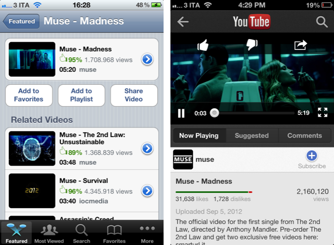
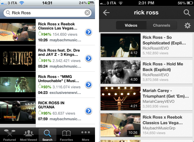
On the left, Apple’s old YouTube app.
For instance, these options aren’t available in Apple’s old YouTube app: there’s no easy way to check an uploader’s page, unless we consider tapping on a video, close it, switch to More Info, and check out a simple list of “more videos”” an easy way to see an uploader/channel page. In my opinion, there’s no question the YouTube app wins over Apple’s old take on the service in terms of features and navigation.[1]
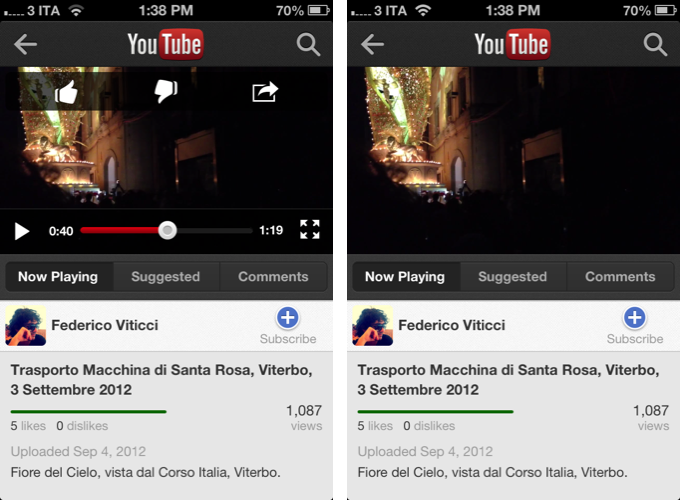
Google’s native app behaves similarly to the mobile YouTube website in single video pages as well. In the browser, there’s an integrated video/description section and two bottom tabs to open suggested videos and comments; sharing options and like/dislike are available as an overlay menu you can hide with an arrow button. In the app, the description of the video has been moved to a third Now Playing tab, but everything else is pretty much the same. Like and sharing are available in a translucent bar across the top of the video player; sharing options include Google+, Twitter, Facebook, Email, Message, and Clipboard. Sharing in Apple’s old YouTube app was limited to “mail link”, Twitter, and “add to favorites”. The new YouTube app is superior in this regard as well, and, personally, of all its options I like the simple “clipboard” one the most, as it lets me get a video’s URL that I can then share anywhere I want.
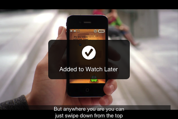
On a design note, I am a fan of the app’s semi-transparent overlay menus that confirm a successful action such as liking a video or sharing it.
But how’s watching the actual videos in this new app like, exactly? Unlike the YouTube mobile website, there’s no visible button to change between “high quality” and standard quality. Instead, YouTube will adjust the quality of the video depending on your Internet connection. On my WiFi network, I was served high-quality videos that were sharp and crisp; on poor 3G (1–2 bars), I got low-quality, pixelated images – as I expected. By default, the app works in portrait mode, and videos can be played inline without switching to full-screen mode (unlike the YouTube website). However, if you do want to switch to full-screen, you can either tap the expand button in the video player, or simply rotate your iPhone to landscape mode. Even when a video is playing, the player will switch from inline portrait to full-screen landscape in an instant; if closed captions are available for a video, you’ll be able to activate those in full-screen mode.
There are two things I don’t like about the app’s video player. Firstly, the full-screen button will sometime open the video in the wrong orientation even if you’re already holding the iPhone in landscape mode. Second, the playback scrubber could use a larger grip area: it’s hard to “grab” the button in portrait mode, and it would be neat to see a popup indicating the point of a video you’re jumping to when using the scrubber. Aside from these limitations, I think the portrait-landscape switching mechanism is very intuitive, and I also like the “replay” button that replaces the standard “play” one when a video is over. It’s a nice touch.
At least for me, the biggest advantage of this new app over Apple’s one is the possibility to watch music videos from “VEVO” channels and other “official” sources Google has partnered with. I’m pretty sure I’m not the only one “who watches music” on YouTube, so I think a decent app with support for official channels is kind of a big deal. I can’t tell you how many times I heard my friends saying “Yes, but you have to watch this video on the real YouTube with the computer”. Recently, my friends and I switched to FoxTube because it somehow let us watch the aforementioned official videos; for years, I have been hearing people complaining about the fact that “the YouTube app for iPhone” didn’t have “as many videos as the website”.
Here’s a reality check: for the average user, that was all Google’s fault. The non-tech savvy iPhone users don’t know about the deals that go on behind the scenes behind Apple and Google; what they know is that Google makes YouTube, and YouTube for iPhone didn’t have the videos they wanted. So, aside from losing control on updates to the app (included in Apple’s iOS release cycle, and basically non-existent for the past 5 years) and on monetizing content, the YouTube app was also hurting Google’s reputation (there’s an argument to be made about Google hurting itself with years of bad iOS apps, but I want to focus on YouTube now). YouTube is one of Google’s most popular consumer products, and they needed to “make it right” for iPhone users.
With a new app, Google is accomplishing three different goals: gaining control, monetizing mobile video views, and offering a better experience to the user. I could argue that happier mobile users are users more likely to share YouTube links on Google+ and perhaps become more entrenched in Google’s ecosystem, but, again, let’s not talk politics now.
Much of the fresh controversy I’m seeing in regards to the YouTube app today is related to ads. To enable support for “official videos”, Google had to turn on ads for in-app video views, which is now free to do because it’s their own app, not Apple’s homegrown one.
Most people don’t like online ads. Some are annoyed by them to the point that they refuse do use anything that is ad-supported; others have become accustomed to them, and as long as the main experience of a service/app can coexist with advertisement peacefully, they don’t care. This is a gray area, but I believe that the millions of people who use YouTube every day are now used to seeing short 5–10 second ads before certain videos. They don’t like them, they are annoyed by them to an extent, but that doesn’t prevent them from waiting and watching the video they need – which happens to be “official”, in HD, free, and streaming from the Internet. I believe most people see this as an acceptable trade-off.
I think much of the controversy we’re seeing today is happening because tech-savvy iPhone owners aren’t used to the idea of a YouTube app with ads. After all, the app made by Apple was simple, responsive, and ad-free. But in the end, it’s not the geeks Google is going after with its YouTube app. It’s the millions of people that were annoyed by the former app, because it didn’t give them the videos they wanted. This new app, from what I’ve seen so far, will give them those videos, but in return, it’ll want users to live with the fact that ads will be shown. As long as the ad system will be similar to the desktop one (short pre-roll messages, ads on channel pages), I don’t think that will turn out to be an issue in the long term. People already know how this works.
There’s also another argument to be made – that people will resort to using the mobile YouTube website for ad-free content. Aside from the fact that the website is ad-free for now, let’s assume for a second that people, deeply annoyed by the app’s ads, will switch en masse to using the website. How long will the lack of content keep them satisfied before they move again to the native app? Also worth noting: iOS 6’s upcoming “smart app banners” feature could potentially help Google’s own game here. The company could easily activate a banner message that informs users of the existence of a native client on the App Store, which supports all the videos they want.
On the other hand, it’ll be interesting to see how users will cope with the removal of automatic opening of YouTube URLs in the native app. Will Google enable a “jump to app” button in the mobile website to drive traffic towards the client?
Wrap-Up
Sure, the YouTube app “has ads”. In the end, though, I think that’s a compromise most people will accept to watch their favorite official videos for free.
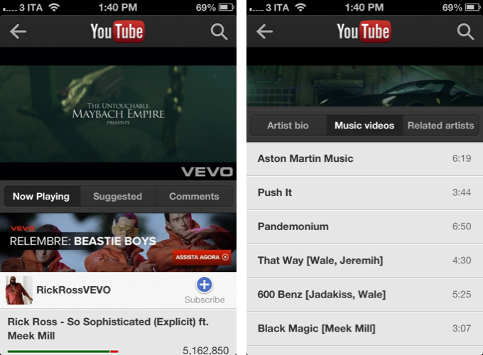
In actual usage, I have yet to see a pre-roll ad, but I’ve seen banner images on VEVO channels and other official sources available inside the app. Speaking of VEVO, the channels I have checked out today featured an additional set of tabs to view an artist’s bio, list of music videos, and related artists. What’s interesting is that by tapping on related artists the app will show more choices inline without opening another view, allowing you to “stack” navigation elements without having to stop watching a video. This is more flexible than Apple’s own clunky video navigation, but I wish there was a way to quickly go back to the “root” of multiple open views. This is also true if you nest too many pages within each other – you’ll have to keep on tapping on the sidebar button to go back to the start. A long press on the Back button would provide an elegant solution to this problem.
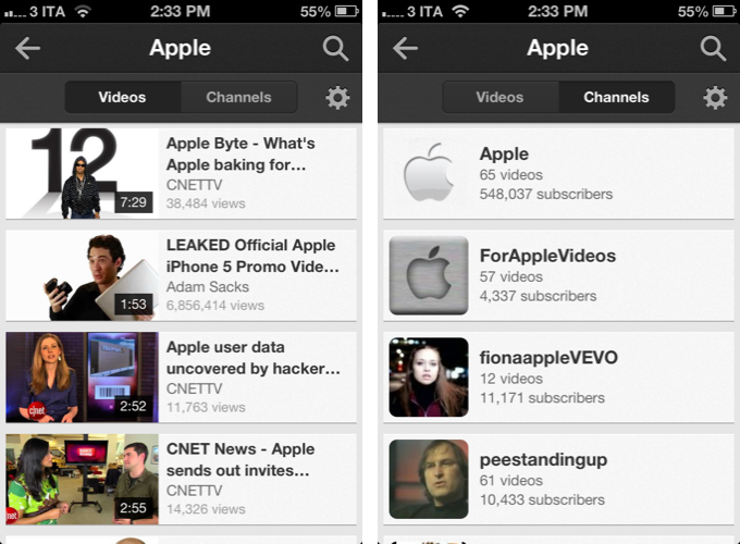
The YouTube app comes with good options to refine your search results. Whereas Apple’s YouTube app for iPhone had a simple search -> results flow, Google’s version lets you choose to sort by relevance, upload date, view count, and rating. You can set the upload date to anytime, today, this week, or this month. You can set the duration of videos to short (around 4 minutes) or long (20 minutes). You can start a search query with voice search (the same seen in the Google Search app), and search faster with autocompletion. More importantly, once you’ve searched for something you can switch with a swipe between “videos” and “channels” results, further simplifying the process of getting to an uploader’s page. [2]
Like I said above, the new YouTube app isn’t perfect. It is not available on every international App Store yet, pull to refresh will fail if your Internet connection isn’t optimal, and playlists and favorites should be more accessible. The reliance on a custom video player means this first version won’t support AirPlay, which is a terrible omission on Google’s end. Competition with Apple or not, Google must prove that it can make great native iOS apps that don’t exclude functionalities users have come to expect from the platform.[3]
There is room for growth and refinements.
Perhaps some people will argue that Apple’s own app was more iOS-like or that it had a better icon. What matters today for the end users, I believe, is that Google’s app offers an overall better YouTube experience for everyone.
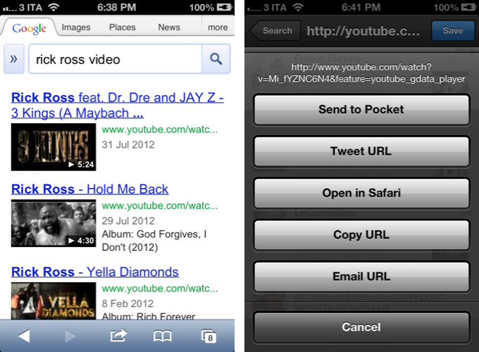
Update: As I speculated above, it looks like Google is already redirecting views to the YouTube app. Tapping on a YouTube link from a Google search in Mobile Safari will go straight to the YouTube app, even if it’s not paused in background. Similarly, selecting “Open in Safari” from a youtube.com video link in Tweetbot will open the YouTube app instead of Safari. The same happens with YouTube links received in a Mail message, and, like the aforementioned apps, it is a “straight redirect” that goes directly to the YouTube app without opening Safari.
If the YouTube app isn’t installed, links will open in the regular mobile website, with no prompts to install the new client (yet). Obviously, this has been tested on the latest beta of iOS 6, where Apple’s YouTube app is not available by default anymore (on older versions of iOS, YouTube links used to open Apple’s YouTube app).
Update #2: According to developers we spoke with, it’s very likely that Apple is giving some special treatment to Google here, by enabling the OS to transform URLs into YouTube.app-specific URLs. In short, if the OS finds the YouTube app installed, it transforms YouTube URLs into youtube:VIDEO_ID links that are specific to Google’s app.
In fact, you can try this by yourself: open Safari, find the ID of a YouTube video (something like “Jz2K2Rjd7rQ”), paste it after youtube: then click Go. The YouTube app will open.
Developers who took a look at YouTube’s code in the new app confirmed that the URL scheme alone wouldn’t enable the instant redirection of links we mentioned above – a “transformation” of regular URLs to app-specific ones is needed, and this is handled by iOS.
Normally, developers of third-party apps aren’t allowed to set basic http:// links to launch their apps automatically. However, this is not the first time Apple has been bending the rules to offer a better experience – they did basically the same for Maps (also a Google service) and maps.google.com URLs. It’ll be interesting to see whether this feature will remain, and if the possible standalone Maps app from Google will support it as well.
- Because the new YouTube app is only available on the iPhone for now, I won’t take into account Apple’s YouTube app for the iPad. This is an iPhone-iPhone comparison. ↩
- The same horizontal swipe can be used in a video page to move between Now Playing, Suggested, and Comments. Swipes are also used on the left side of the screen to invoke the panel navigation. ↩
- Same goes for volume adjustment. The volume slider should be available in the video player. ↩


