Two days ago Google launched Google+, the company’s latest effort to get into the social networking space and build a platform to share content and connect people. For those who missed the coverage (you can find some detailed reports here and here), here’s the gist of Plus: it’s a social network connected to your Google account that looks a lot like Facebook but it’s got a cleaner design and a set of different “apps” tied together by the Plus brand. What does it mean for consumers? It means that whilst Circles, Huddle, Hangouts and Sparks could be seen as separate services and concepts, they’re in fact sections of the entire Google+ website. Yesterday, Google started allowing people to send invites to other users, which resulted in a massive explosion of invite requests on Twitter and thousands of new sign-ups. After a few hours, Google was forced to close invites due to “insane demand” and promise more coming in the next few weeks as the service scales to accomodate new users and more content.
Google+ has a strong mobile counterpart, too. As the service aims at empowering Google users to share and connect at any time from anywhere, Google built native apps for Android and iOS devices to let users enjoy the Google+ experience on the go, and upload media such as photos and videos shot with their phones. Furthermore, the mobile apps get access to Huddle, a group messaging feature built into Google+ that some are already eyeing as Google’s response to iMessage, only it works on both iOS and Android. However, the official iPhone app is not available yet, and Google says it’s “coming soon”. In the meantime though, users can try a mobile optimized web app, which relies on Google’s recent mobile UI changes to lay out a unified interface to access Google+ and switch between various Google services.
Last night, I signed up for Google+ and played around with the website. Today, I decided to take a look at the mobile web app which, surprisingly enough, might just be the nicest thing Google has ever done on iOS’ Mobile Safari.
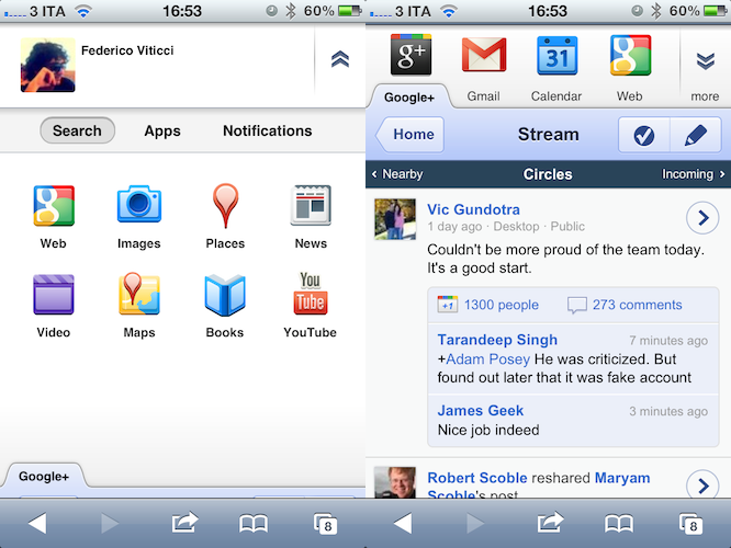
The Google+ web app uses Google’s new design to display a series of tabs along the top to switch between Plus, Gmail, Calendar, Web search, and more. Once signed in with your Google account and added to the Home screen for convenience (by the way, Google+ features a Retina-ready icon alongside Calendar and the new Maps, whilst all other Google web apps are stuck with fuzzy non-Retina graphics), Google+ will launch in the Stream of your Circles by default, visualizing a rather standard list of updates, +1s and comments that resembles Facebook’s usual way of displaying posts, likes, and comments. Nothing revolutionary here. Each post can be viewed in detail in a single view, links to external websites are tappable (and will open in a new page) as well as profiles, comments, and +1s. Scrolling is very laggy, but I assume Apple’s recent improvements to iOS 5 will contribute to making things a lot smoother. Once you reach the bottom of the “timeline”, you can load older posts, or sign out.
There are three toolbars at the top: the first one lets you pick a Google app or service to use; the second one, a standard navigation bar, contains a button to load the Home page, check in at a location, or write a new post. Last, a third bar lets you load “incoming” posts (stuff shared with you from people you haven’t added to any circle) and nearby updates (requires geolocation access, and sadly no one knows about Google+ in Viterbo except, well, me). If you consider that Google has implemented the famous “pull to refresh” gesture in the new set of web apps, you can make Plus’ bars four.
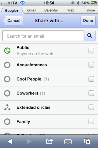
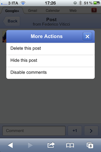
The “check in” and compose screens are really simple. Check-ins display suggested locations near you, but you can manually enter a new one if you want to. The compose screen can fetch your location, and has a text entry field to “share your thoughts”. Both sections let you pick which circles to share an item with, and location can be removed at any time. You can delete, hide and disable comments on your posts as well.
Notifications is another big aspect of Google+. On the web app, you don’t get the fancy animations and interactivity of the desktop website, still there’s an unread badge on the top right corner informing you of what’s new in your account, like comments and new people. As you tap on the badge, you can see Google’s new icon-based navigation view, and a tab called “Notifications” alongside “Search” and “Apps” that lists the most recent updates you might want to know about. The cool thing is, as you interact with the top bar, you don’t lose the state of what you were doing below – you can always scroll down, go back to Google+ and hide the icons at the top. Again, I’m sure Apple’s changes to iOS 5 code for web apps will help improving this kind of design (with several fixed toolbars), and I suppose Google hasn’t had time to target users on iOS 5 beta yet.
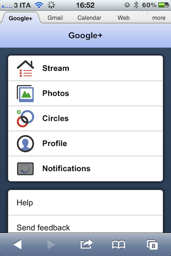
The Home page is quite possibly my favorite design choice of Google+. Not only the thing is elegant and easy to use (four tabs, plus a Notification shortcut), every time you click on a tab the linked section loads with a neat pop-up animation that looks great in Safari. Same for when you go back from the Stream or Profile to your Home.
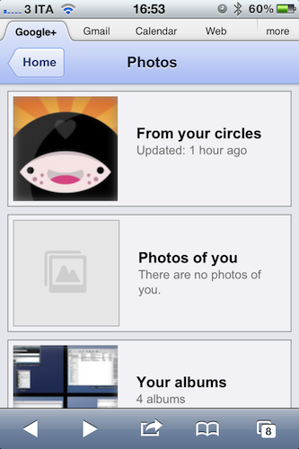
Last, there are Photos and Circles. The implementation of photos is rather limited for now, and I haven’t been able to upload photos from my iPhone yet. However, I can see that, once my photos will be in there, Google+ has a group for photos “from your circles”, one for “photos of you” and a section for your albums, which include photos grabbed from posts, profile pics, and files buzzed from Picnik. I look forward to the native app and Instant Upload features to see how Google+ will ultimately handle processing of my photos; for now, there’s no doubt the desktop photo viewer looks way better than the mobile web one.
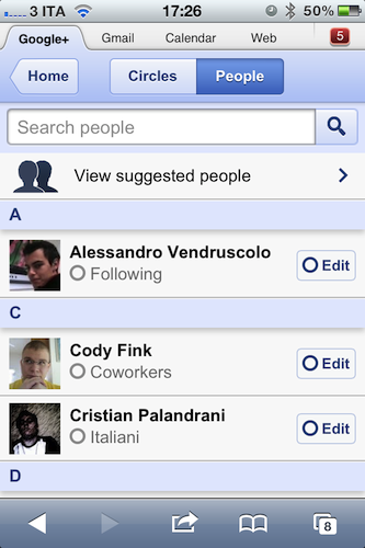
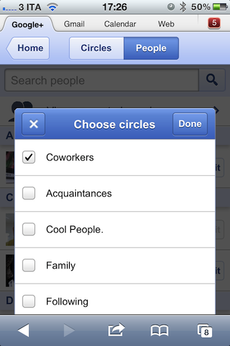
Too, Google clearly had to cut out the awesome Circles UI seen on the desktop to make room for some basic interaction on the iPhone’s smaller screen. You can see see all your circles, create new ones and move people around, but there’s no sign of drag & drop or dead-simple multi user selection. In this section, the “People” tab presents more features than the Circles one: you can view suggested people (not sure what algorithm Google is using here to determine suggested users), search for people and modify existing users’ circles. It works fairly well, but it’s clearly a compromise when compared with the beautiful desktop UI and animations. At this point, I wonder if the iPad’s larger screen could convince Google to come up with a more powerful web or native apps that resemble the desktop version in Circles management. Google hasn’t announced plans for a native iPad app yet.
Overall, I’m excited to see where Google+ is going (will the novelty wear off come next week?), but most of all I want to see how Google will manage to integrate and unify the experience across iOS and Android devices.


