I had some pretty good words about the first beta of Reeder for Mac that came out last December, but since then it seemed like Silvio Rizzi – the main developer of Reeder – disappeared from our radars releasing minor updates to the iPhone and iPad versions (focused on Readability integration) and extending the expiration date of Reeder for Mac (public beta) by one month at a time. After a few updates following the feedback Rizzi got after the (insanely popular) launch of the beta, the app was left available for download with a few fixes coming out every once in a while. Six months later, it looks like we’re back to the start: a new beta of Reeder for Mac with lots of new features is available (and like the last time, I’ve been testing it for a while), but the app is still nowhere to be seen in the Mac App Store. This time, however, with Reeder for Mac Public Beta 14, we might have an almost-complete and full-featured RSS reader for our desktops that not only looks better than ever, but it’s also packed with features, new gestures, and interface schemes.
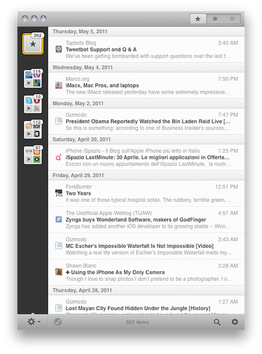
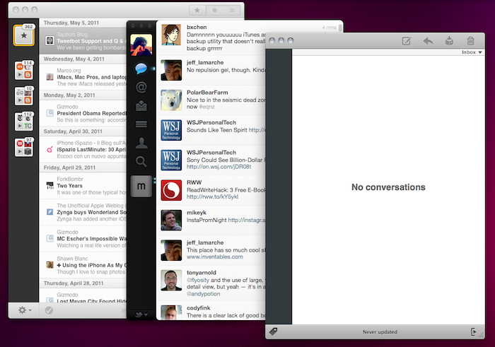
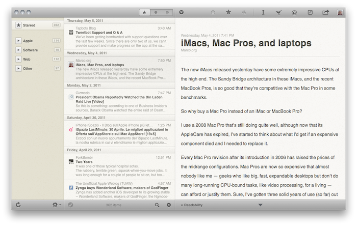
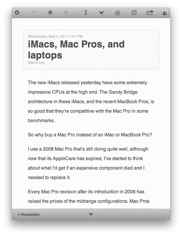
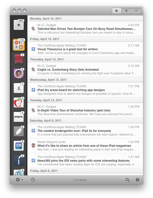
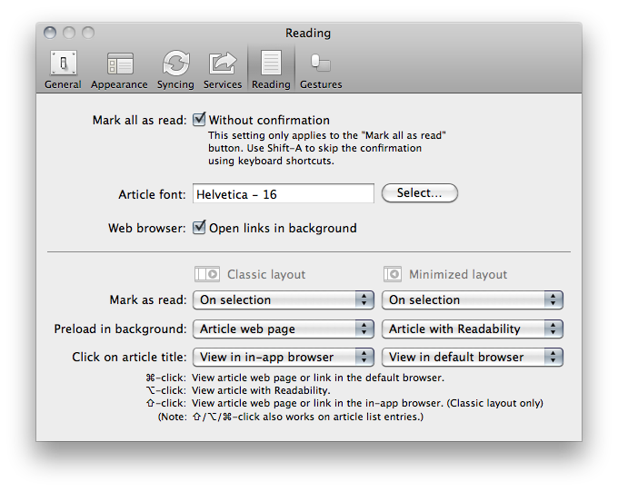
The new beta is available for download here. Without re-reviewing the app all over again (in spite of the additions it still retains 80% of the features seen in the first beta, reviewed here), I’d like to focus on the key areas that Rizzi improved, redesigned and, overall, simply evolved into something new. First off, the app comes with a new optional “minimized layout” that, following a trend started by the original Tweetie for Mac and later re-ignited by other apps like the popular Sparrow email client, places your Google Reader’s source favicons in a narrow sidebar on the left, with unread items in the main panel. The minimized layout, unlike the standard one, doesn’t come with a right panel to read articles: everything happens in a single window, much like Twitter for Mac doesn’t display additional sidebars and popovers when you’re interacting with your timeline. In the new Reeder beta, clicking on a title will open the article (with a neat animation) in the same panel; tap the close button, and the article will bounce back to reveal the main list of feeds again. In this new single-window approach, all the interactions with Google Reader or external services either happen though gestures or keyboard shortcuts – support for both of them has been improved in the new version.
Reeder for Mac retains an iOS-like feel that’s even more visible in today’s beta. The app was accused of being the first iOS app coming to the Mac without considering the nature of the desktop platform; however, as Apple is proving with the Lion developer builds and the latest updates to its flagship applications, it really looks like the future of the Mac will be heavily inspired by iOS. Back to the Mac, as Steve Jobs said, and Rizzi knows this. Reeder for Mac feels like a desktop iOS app more than ever, with support for swipes and pinches to navigate and open / close articles, monochrome icons in the top toolbar to share an article or open it in the browser, and a general feel attached to it that makes Reeder perfect for OS X Lion already, in spite of the OS not being available yet. Whilst the classic reading mode reminds us this is a desktop application meant for RSS power users with lots of features and deep Google Reader integration, the minimized mode and enhanced gesture-based navigation proves, once again, that Reeder is an app with an iOS background that’s coming to a new Mac ecosystem, the one that will start populating our MacBooks and iMacs this summer.
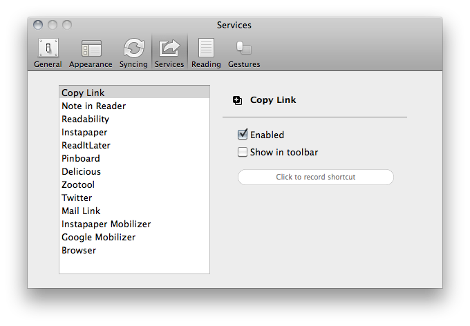
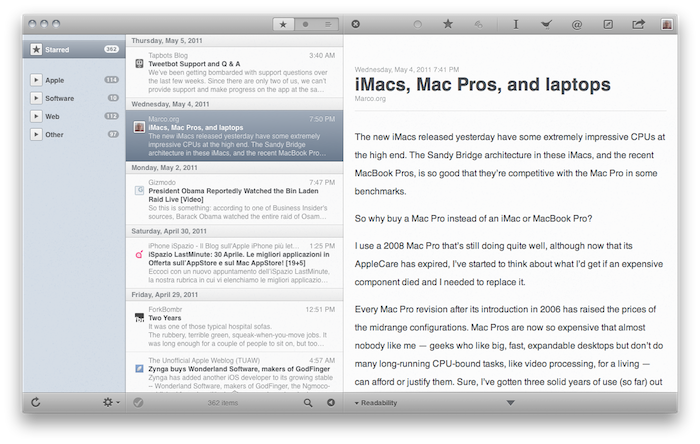
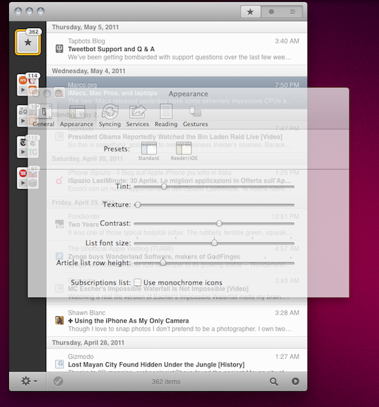
The app is far from finished, though. Whilst Rizzi tells me he’s still planning on making the app available through the Mac App Store, there are some aspects of the app that are not yet completed, such as full subscription management and downloads. However, this new beta confirms that the developer has been busy addressing the issues reported in the first versions: search finally works, and he even implemented a new “appearance” settings panel that will allow you to change Reeder’s color scheme from the much criticized sepia background to something more Mac-like. I love this preference panel: I’m a “standard” user as you can tell from the screenshots in this post, and I appreciate the little touches like the Preferences window fading to let you see the modifications you’re making to the app. Furthermore, the “article list row height” slider enables me to make the app even more minimal with narrower headlines. I quickly skim through hundreds of headlines in my daily news workflow, and I don’t really need to see a three-line preview before deciding to open an entire article. That’s why minimized mode works for me (by the way, you can switch between the two modes at any time by hitting a button in the bottom toolbar).
One thing I’ve always wanted from Reeder for Mac but Rizzi never implemented is the ability to click on a website’s favicon in the upper toolbar to reveal options like “unsubscribe from this source” or “refresh this source only.” Perhaps they’ll come in the final release – which should happen relatively soon at this point, considering the entire app has been rewritten since the original beta and most of the functionalities are working.
Overall, this new beta of Reeder is a terrific improvement over the past version, which was aimed at porting the Reeder experience to OS X, but perhaps lacked the right amount of features that could make it absolutely stand out. With minimized mode, more gestures and an iOS-like approach to news reading, Reeder for Mac leads the way for great things to come. Download the beta here, and check out more screenshots below.


