Posts tagged with "browser"

Hands-On with ChatGPT Work’s New Cloud Browser Feature

Yesterday, OpenAI introduced a new ChatGPT Work feature designed to let it navigate websites that require a login without revealing your credentials to the model.

Like a lot of people, I spend far too much time clicking around websites that require a login, looking at analytics and other data, checking whether new sponsors have been booked for our podcasts, and more. It’s a tedious but necessary part of my week that slows me down and takes me away from writing and other creative work. ChatGPT’s new Work feature is designed to handle that sort of work for you.

The feature works by signing into websites using a virtual, cloud-based computer. That separates the browsing session from any browsing session on your local computer, walling the agent’s computer use off from your open tabs, cookies, browsing history, passwords, and other data. Because the login and browsing happen in the cloud, that also means work can continue whether you close the ChatGPT app or power down your computer.

According to OpenAI, an additional review model checks the sign-in request and credential destination for signs of phishing or deception. ChatGPT Work then pauses while the user signs in. Credentials entered through its secure sign-in form go directly to the cloud browser and are not visible to the model. After the user authenticates, ChatGPT resumes its work.

OpenAI also explains that its cloud-based browser doesn’t store your username and password. Instead, it saves cookies that allow you to return to a previously authenticated session. If you don’t want to remain logged in, ChatGPT’s cloud browser settings allow you to clear browser data for individual websites or all sites.

Similar to other features in ChatGPT and Codex, users have choices when it comes to which sites ChatGPT Work can access. “Always ask” is the default, requiring the agent to check with the user before using a website, but the permission level can also be set to “Auto approve” after ChatGPT checks a site for relevancy and risk or “Always allow,” which OpenAI discourages. Individual websites can also be allowed or blocked. These settings control website access, but consequential actions require separate confirmation.
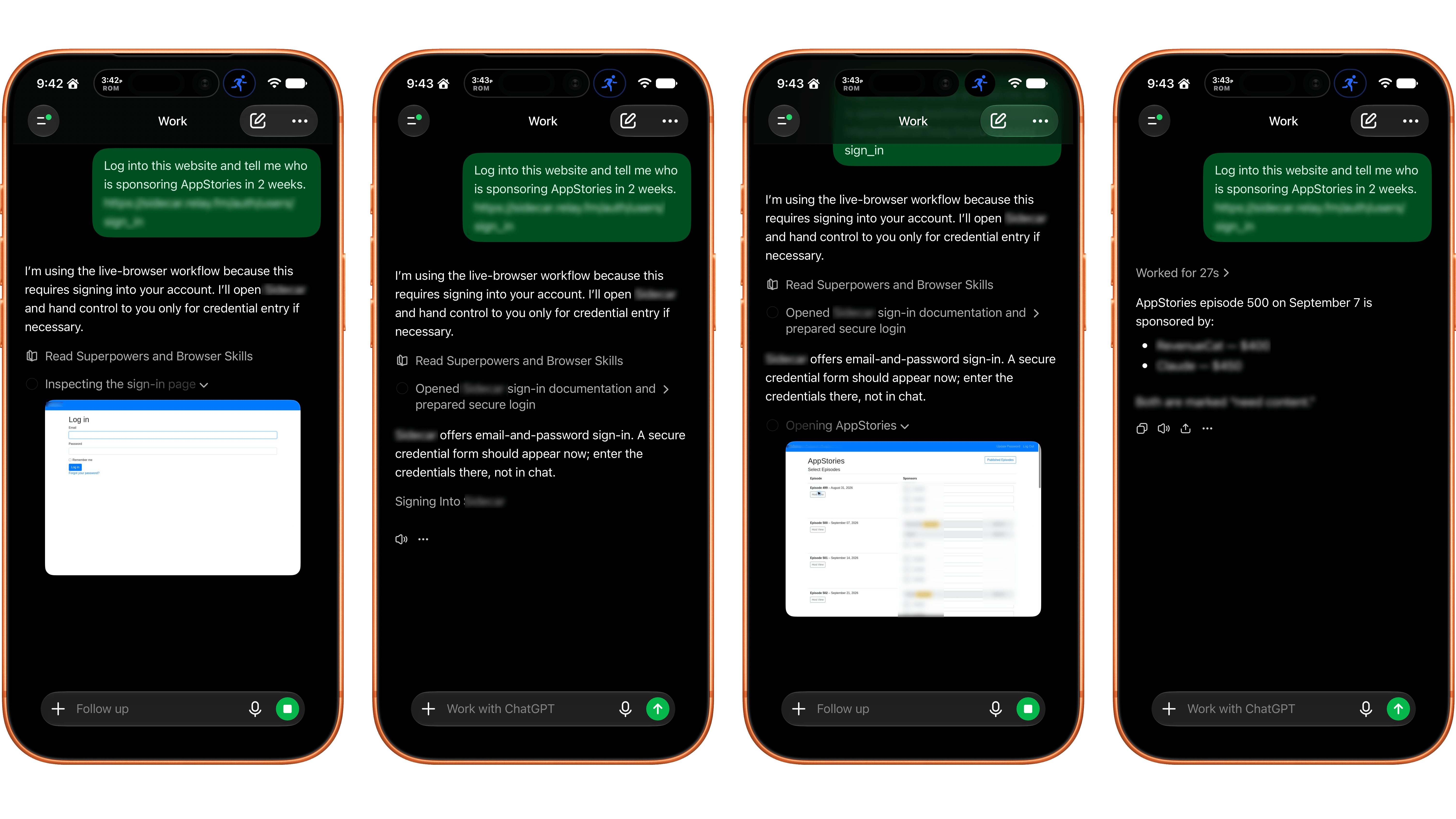
ChatGPT Work's browser control works best on a mobile device and with simple login systems.

ChatGPT Work’s browser control works best on a mobile device and with simple login systems.

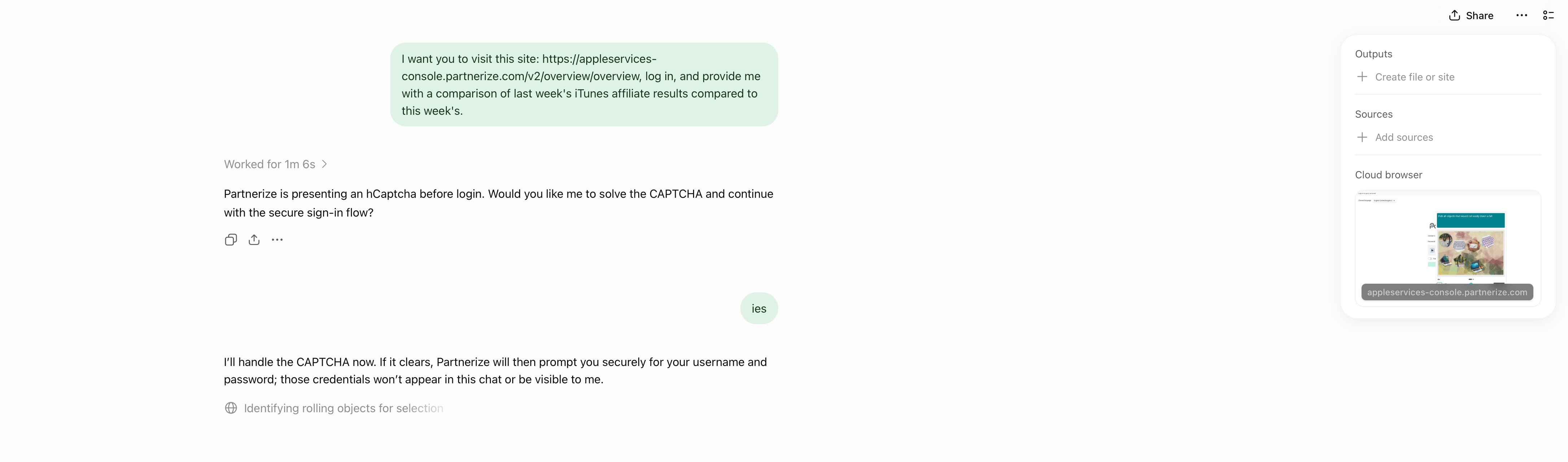
I gave ChatGPT’s browser use a try and the results were mixed. I wasn’t able to get the feature to work at all using ChatGPT Work in Safari on my Mac. Some websites had security measures in place that prevented me from logging in. Other times, the cloud browser asked me to take over manually, but I was unable to do so because the UI was frozen or login panels didn’t appear.
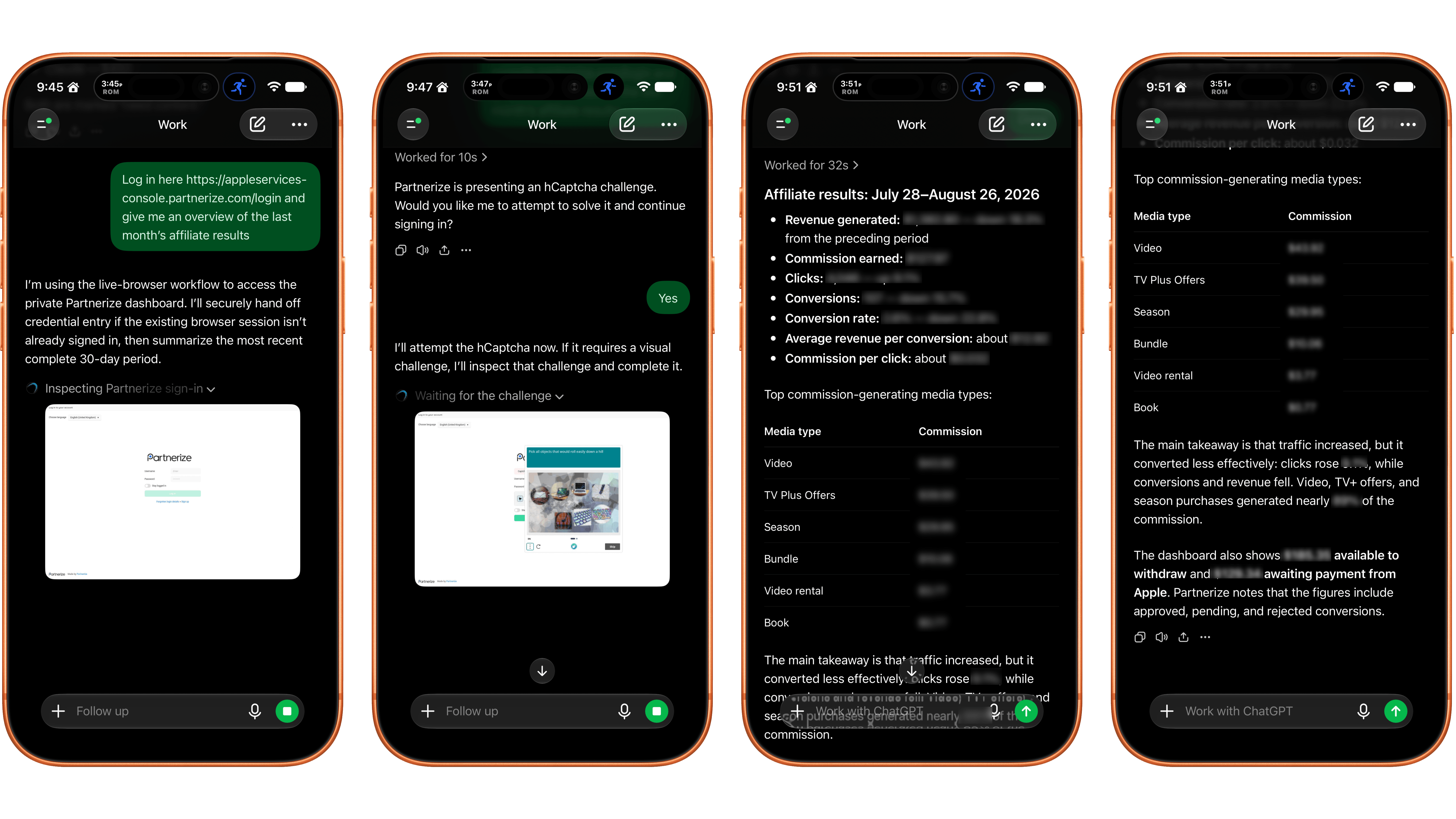
Logging into a site with a CAPTCHA required manual intervention.

Logging into a site with a CAPTCHA required manual intervention.

I had better luck using my iPhone. On one site with a simple username and password system, a login sheet appeared. I entered my credentials, was logged in, and the agent navigated the site to answer my queries. On Apple’s affiliate link dashboard website, I had to take over the browser interaction manually to satisfy a CAPTCHA, which worked after several challenges. Once logged in, the agent pulled and analyzed the data I requested. Also, after I’d signed in to both of those sites on my iPhone, I remained logged in to ChatGPT’s cloud browser, which meant I could also use them from my Mac.

In its current form, the idea of having ChatGPT Work browse signed-in websites on your behalf is better than its implementation. If you can get logged in, having an agent collect and analyze things like analytics data is fantastic. However, getting past the initial login screen is still too frustrating. That said, I’ll be keeping a close eye on the feature, which is available on eligible plans depending on rollout and workspace settings, for future use collecting and analyzing data that would otherwise require a lot of clicking around.
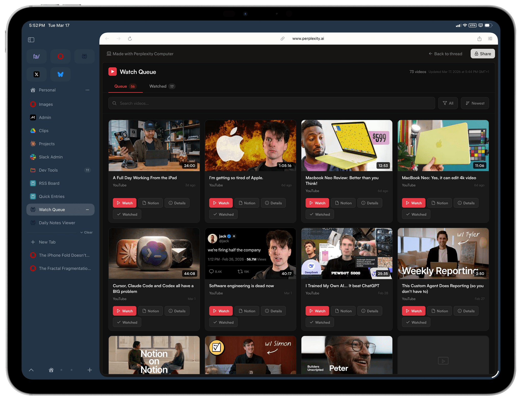
Well, I Guess I Like Safari’s Compact Tab Bar in iPadOS 26.4 (Also: Using Vertical Tabs in Safari for iPad)

We're so back.

We’re so back.

Yours truly, back in September 2021:

In case I haven’t been clear enough above, I’ll be blunt: I don’t understand why the compact tab bar exists on iPad, and I think this design shouldn’t have shipped to customers.

My understanding is that Apple thought the benefit of removing a separate address bar, therefore saving a few vertical pixels on the page, would have made all the compromises we’ve seen so far worth the trade-offs in usability. I think that’s a wrong and mismanaged decision driven by an unmotivated pursuit of an iPhone-like design that has no place on iPad. If slightly increasing vertical space on webpages is Apple’s only argument here in favor of the compact tab bar, you tell me if it’s worth the trouble by judging from the screenshots below.

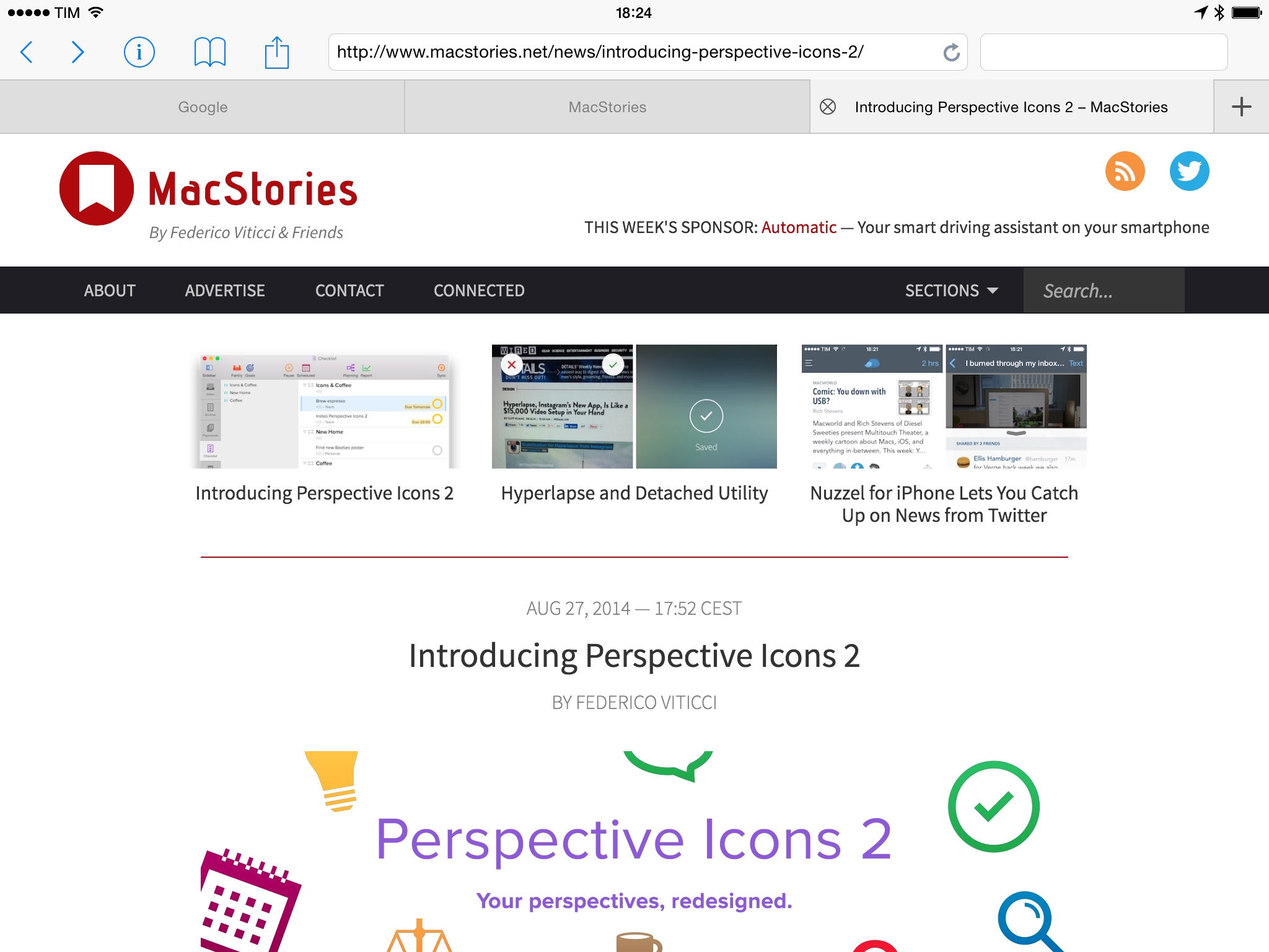
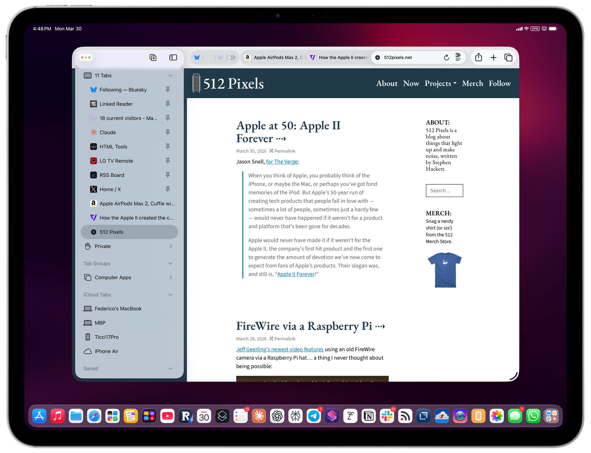
If, like me, you missed this in the release notes for the recently released iPadOS 26.4, the compact tab bar has returned to Safari for iPad after mysteriously disappearing in iPadOS 26.0. And I’m here to tell you that not only do I not despise it like I did five years ago, but I actually like this mode and have been working with Safari on my 13” iPad Pro like this for the past two weeks.

Read more


The iPad’s “Sweet” Solution

In working with my iPad Pro over the past few months, I’ve realized something that might have seemed absurd just a few years ago: some of the best apps I’m using – the ones with truly desktop-class layouts and experiences – aren’t native iPad apps.

They’re web apps.

Before I continue and share some examples, let me clarify that this is not a story about the superiority of one way of building software over another. I’ll leave that argument to developers and technically inclined folks who know much more about programming and software stacks than I do.

Rather, the point I’m trying to make is that, due to a combination of cost-saving measures by tech companies, Apple’s App Store policies over the years, and the steady rise of a generation of young coders who are increasingly turning to the web to share their projects, some of the best, most efficient workflows I can access on iPadOS are available via web apps in a browser or a PWA.

Read more


iChromy Wants To Bring The Chrome Experience To The iPad

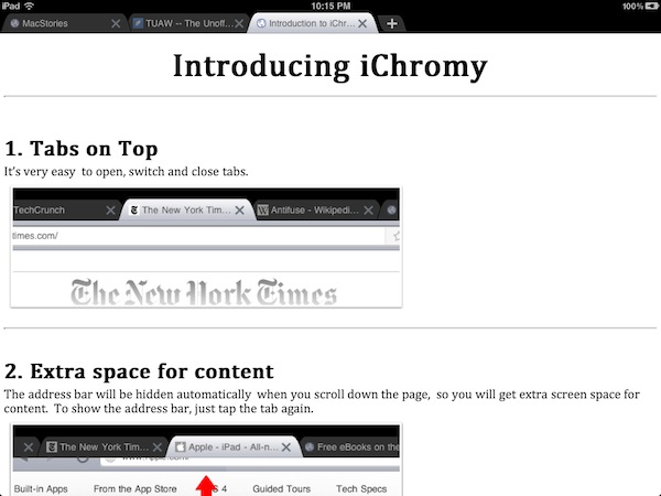
Released earlier today for free on the App Store and developed by the same folks behind web-based bookmarking service Diigo, iChromy is a new third-party iPad browser that aims at bringing the Google Chrome experience on the tablet, obviously without using Chrome’s underlying Chromium open-source project, which can’t be implemented by developers due to Apple’s restrictions. From the name of the app to the iTunes description, the developers of iChromy don’t hide their intentions of developing a heavily Chrome-inspired browser for the iPad; while it still might not look as beautiful as this mockup, I took the app for a quick spin to see whether Chrome (which I love and use on my Mac desktop) could have a proper, unofficial, lightweight counterpart on the iPad.

iChromy is free and the developers will likely introduce a Pro version with more features and deeper Diigo integration in the future, but right now what we have is a simple iPad browser that lacks several must-have functionalities (most of them also available in Safari and not necessarily in powerful alternatives like iCab Mobile) but it’s got tabs on top, a Lion-like Reading List (with the same eyeglasses icon) and decent memory management. More importantly, iChromy has an Omnibox that allows you to search and type addresses in the same bar, like Chrome. So while tabs on top and the Omnibox make for a nice Chrome-like experience that reminded me why it’s still possible to innovate in web browsers on any device, iChromy falls short in the details: you can’t re-arrange tabs, you can’t tap on the status bar to scroll a webpage to the top, you can’t pin tabs. The Omnibox is really, really nice, but the app’s keyboard doesn’t have a .com button and there’s no way to get search suggestions or modify the default search engine. Bookmarks and history are displayed in the Omnibox, but the lack of the .com button on the iPad’s soft keyboard is annoying. Similarly, you can create bookmarks by hitting the “star” button in the Omnibox, but you can’t organize these bookmarks in folders, sync them back to the cloud or import / export them. The Reading List, however, works fairly well in the way it makes entire webpages available offline. Too bad it doesn’t sync anywhere else either, which comes as a surprise considering Diigo’s cloud-oriented nature.

In spite of its missing features, I can’t say iChromy isn’t “nice” in how it mimics Chrome for Mac. The browser is very lightweight, it never crashed on me with multiple pages open in the background and, personally, I think it’s always great to see a browser with tabs on top (I was a huge fan of Safari 4 beta, until Apple killed that magnificent tab implementation). Overall, I see Chromy as an interesting experiment that a) needs some obvious adjustments like the .com button, top scrolling and search suggestions and b) with an upcoming Pro version could have a chance to become a Chrome-inspired, powerful competitor to my personal favorite iCab. We’ll see. In the meantime, go download the app here.


Opera Mini for iPad Now Available

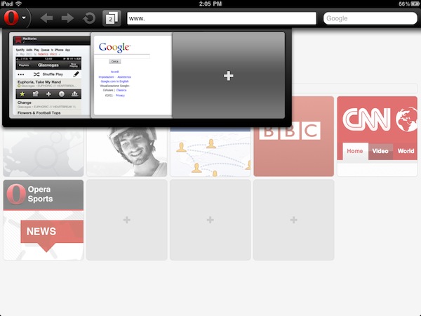
A few months after the first teaser shots and previews that confirmed Opera was working on an iPad version of its alternative browser featuring visual tabs and updated sharing options for the larger screen, the Norwegian company has finally released an update to its Opera Mini web browser this morning, bringing new features and an updated interface to the iPhone 4’s Retina Display, but most of all a native version to the iPad. You can find Opera for iPad now in the App Store.

We’ll have a full review of Opera for iPad later this week on MacStories, but in the meantime we’ve taken the app for a quick spin and we’re positively impressed with it. Visual tabs play an important role on the iPad, as they allow you to keep multiple pages open at once and actually see their previews concurrently on screen to quickly switch between them. Animations of the tab drawer at the top seem very smooth, though I’ve noticed that Opera Mini for iPad sometimes opens web pages in their iPhone mobile web view, rather than the desktop one as Safari for iPad does by default. This might be related to the server-side compression Opera does to speed up browsing, but we’ll make sure to further look into the Settings to resolve this issue. As for other features, a big Opera logo in the upper left corner allows you to access a popup menu with Bookmarks, History, Settings, and Sharing options, which include Facebook, Twitter and My Opera. Pages can be opened in background tabs, and overall the interface has been polished to look great on the iPhone 4 with minor tweaks here and there as well.

From the changelog:

  • Updated design with a fresh new look and feel
  • Super smooth pinch-to-zoom and panning
  • Support for iPhone 4 retina display, iPad, and iPad 2 devices
  • Direct share on Facebook, Twitter, and My Opera
  • Open new page in background tab
  • Improved international font support for Arabic, Chinese, Vietnamese, and other non-latin languages

Opera Mini for iPad can be downloaded here for free. Check out more screenshots and the promo video below. Read more


Survey Shows iPad Still Primarily Used for Web Browsing, Email, Video

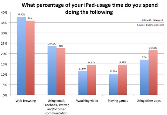
In an unsurprising turn of events following the launch of a survey among readers who own an iPad, BusinessInsider posts a chart detailing how people use an iPad. And unsurprisingly, the usual suspects are on top: the chart shows people use iPads to browse the web (36% in May 2011, 37.7% in November 2010), whilst 23% rely on the tablet for their email needs and communication skills happening on Twitter, Facebook, or other social networks that presumably have a native iPad app, otherwise that would count in the “web browsing” section, I guess. The iPad is also strongly used to watch videos (14.52% up from 11.50% in November 2010), play games and “use other apps.”

The end results of this survey don’t come as a surprise to anyone, but they confirm a widely popular theory – that Safari is the most powerful app Apple could have ever bundled with the iPad and iOS by default. Not only does Safari replicate most of the functionalities seen on the desktop, with the recent iOS 4.3 update it also got some nifty new Javascript engine that makes opening webpages blazing fast. That’s why every little feature that didn’t find its way into Safari and is requested a decent amount of users can become the reason to develop an alternative browser for iPad. The browser on the tablet is the best way to access the internet – it is for me, and clearly it is for other people, too.

What about those other apps? Watching videos with Plex or other media managers is a great experience, especially when combined with AirPlay and an Apple TV in your living room. Playing games? Between Angry Birds and Sword & Sworcery there’s plenty of choice to go by. Other apps? They must refer to things like OmniFocus, Simplenote, LogMeIn, Instapaper and Screens. It’s all about the apps, but Safari is still king when it comes to spending time with an iPad, browsing the web.


Flickr Improves Slideshows for iPad

With a note on the official company blog posted earlier today, photo sharing Flickr has announced improved compatibility of slideshows for the iPad’s Mobile Safari browser. By taking advantage of the device’s touch interface, you can now tap on a photo to view at a larger size in the lightbox, and browse through photos with a single swipe. The lightbox displays photos on a clean, dark background and you also have options to mark an item as favorite or quickly go back to the standard photostream.

Flickr also offers a native app for the iPhone, available for free in the App Store, which was recently updated with Retina Display support and sharing to Twitter through the flic.kr shortener. [via Daring Fireball]