Today, Apple unveiled the iPhone 16e, which replaces the iPhone SE. The new iPhone tracks with the rumors that have been circulating for months, but for those who don’t follow rumors closely, it’s worth running down the specs of Apple’s most affordable iPhone, because the changes are significant.
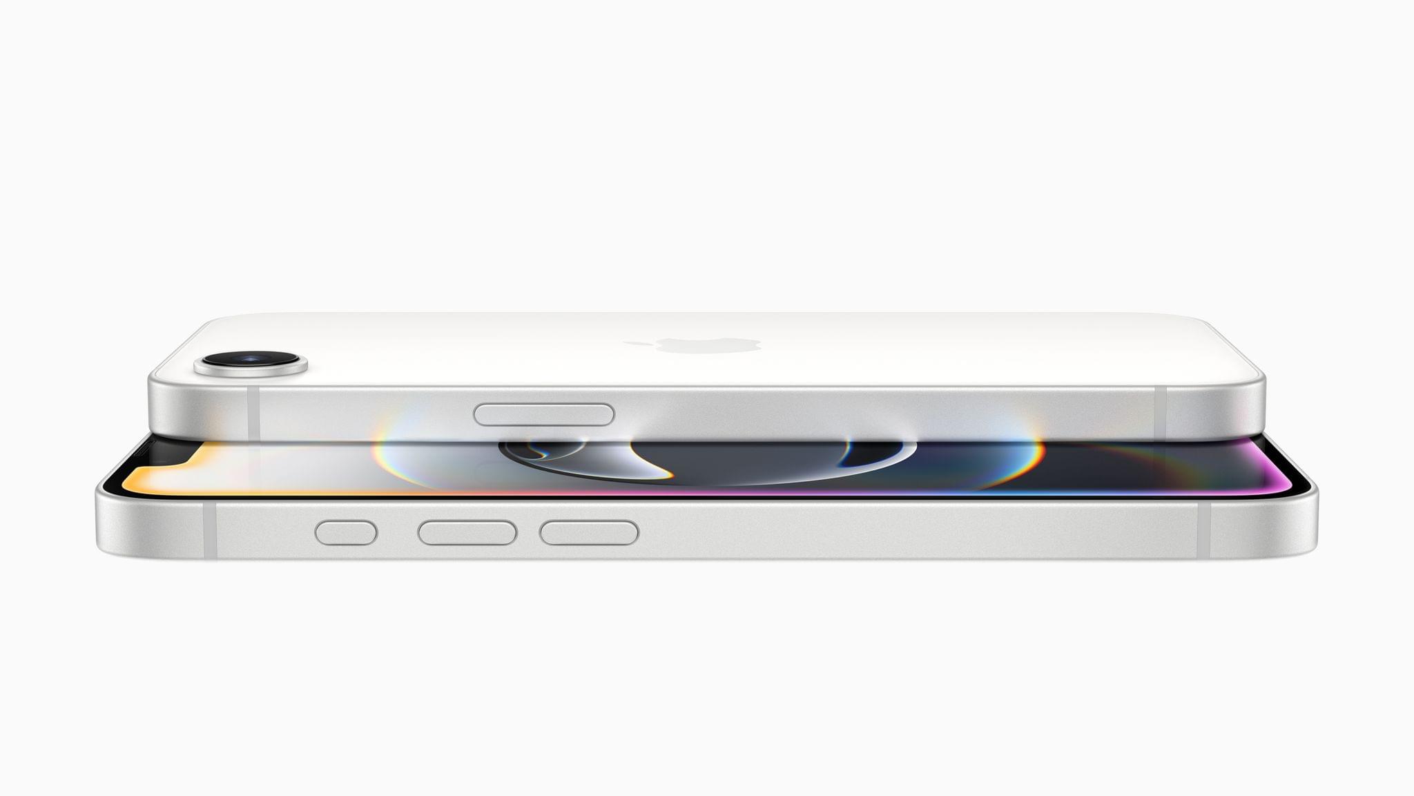
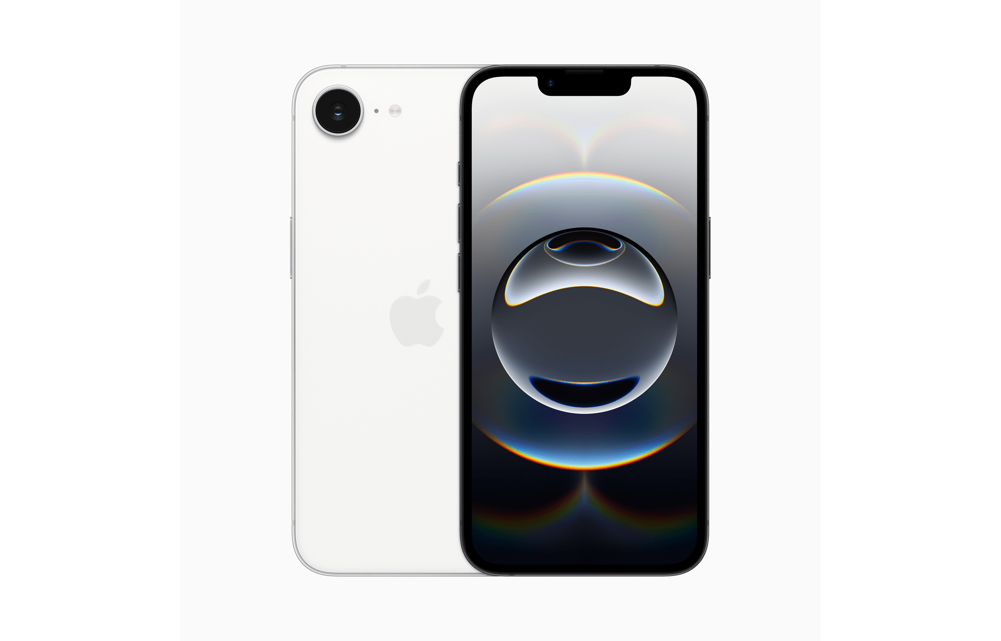
Let’s start with the design. With this update, the phone moves from an iPhone 8-era look to a style that fits in better with today’s iPhones. Similar to the iPhone 14, which debuted a couple of years ago, the new 16e includes a notch at the top of the screen that houses the front-facing camera and other sensors. The screen has been expanded to 6.1” and switched to Super Retina XDR OLED as well.
The new 16e ditches the Home button for Face ID, which goes a long way toward refreshing its look. The new budget phone doesn’t include the Camera Control like the iPhone 16, but it does feature the Action button, which debuted on the iPhone 15 Pro.
Notwithstanding the lack of Camera Control, the new iPhone 16e ushers in a significant upgrade to its camera. The single rear-facing camera now features a 48MP sensor, first introduced in the iPhone 14 Pro. That’s a big step up from the iPhone SE, which only had a 12MP sensor. That camera upgrade will pair nicely for photographers with the 16e’s new USB-C port, which is compatible with a wider range of accessories than Lightning, such as external storage.
The new iPhone 16e is powered by an A18 processor, making it capable of running Apple Intelligence. I’m not sure that’s a huge selling point yet, but the increased processor power and memory headroom should also make the 16e far more capable at tasks like transcoding and editing video, too.
A less welcome change is the 16e’s price, which is significantly more than the discontinued iPhone SE. The SE started at $429, but upgrading to this model will cost you at least $599 with 128GB of storage (twice what the SE offered). The price isn’t surprising considering the many updates included in this generation, but it will make it harder for some consumers to justify the purchase.
Another strange omission is the lack of MagSafe. That not only limits how the device can be charged, but it also rules out a wide variety of third-party accessories.
That said, I’m intrigued by the iPhone 16e and may buy one – not because I need a new phone, but because I want a new camera for shooting multicam video with Final Cut Pro for iPad. It’s such an incredibly efficient workflow for shooting videos for the MacStories YouTube channel that I’ve resorted to using my iPad mini’s 12MP camera alongside my iPhone 16 Pro Max. That has worked reasonably well, but the iPad mini’s camera can’t match my iPhone’s. With the 16e, I’d have a lightweight, highly portable option that’s perfect for my needs. Still, the price and lack of MagSafe are issues that make me hesitate.
The new iPhone 16e will be available for preorder starting February 21, with deliveries and in-store availability beginning Friday, February 28.