If you’re in the market for an iPad Pro, choosing the ideal model size is not easy. It used to be simpler, back when the big option was made bigger by its bezels, and the small option had a significantly smaller display. I’ve used a 12.9-inch iPad Pro as my primary computer for five years, and have been very happy with it, but as the smaller iPad Pro’s display has grown, I’ve become more intrigued by it.
2017’s 10.5-inch iPad Pro was the first smaller model that tempted me. 2016’s 9.7-inch simply wasn’t enough; as an iPad user since 2010, I knew what a 9.7-inch display was like, and it wasn’t suited for my needs as a primary computer. But the screen bump in 2017 was intriguing, so I gave it a test run for a couple weeks. My takeaways: it was a fine device, but Split View was a bit too cramped, and since I mainly used my iPad at home rather than lugging it around regularly, sticking with the larger model made more sense for my needs.
Recently, however, I embarked on another test of the smaller iPad Pro. On the latest episode of Adapt, the iPad-focused podcast I do with Federico, I challenged us both to try doing our work on the 11-inch iPad Pro rather than our usual 12.9-inch setups. In my mind, it was the perfect time to try the smaller size again because a lot has changed since my 2017 experiment.
First, the smaller iPad Pro’s display has gotten larger yet again. The gap between 11 and 12.9 inches is relatively narrow. Also, while the current pandemic has forced me to work from home more than ever, prior to this global crisis I was taking my iPad on the go more regularly. In 2017 I lived in the suburbs of Dallas, whereas now I call Manhattan home, so it’s much easier to just walk out my front door and visit a local coffee shop, park, or some other public space to get work done.
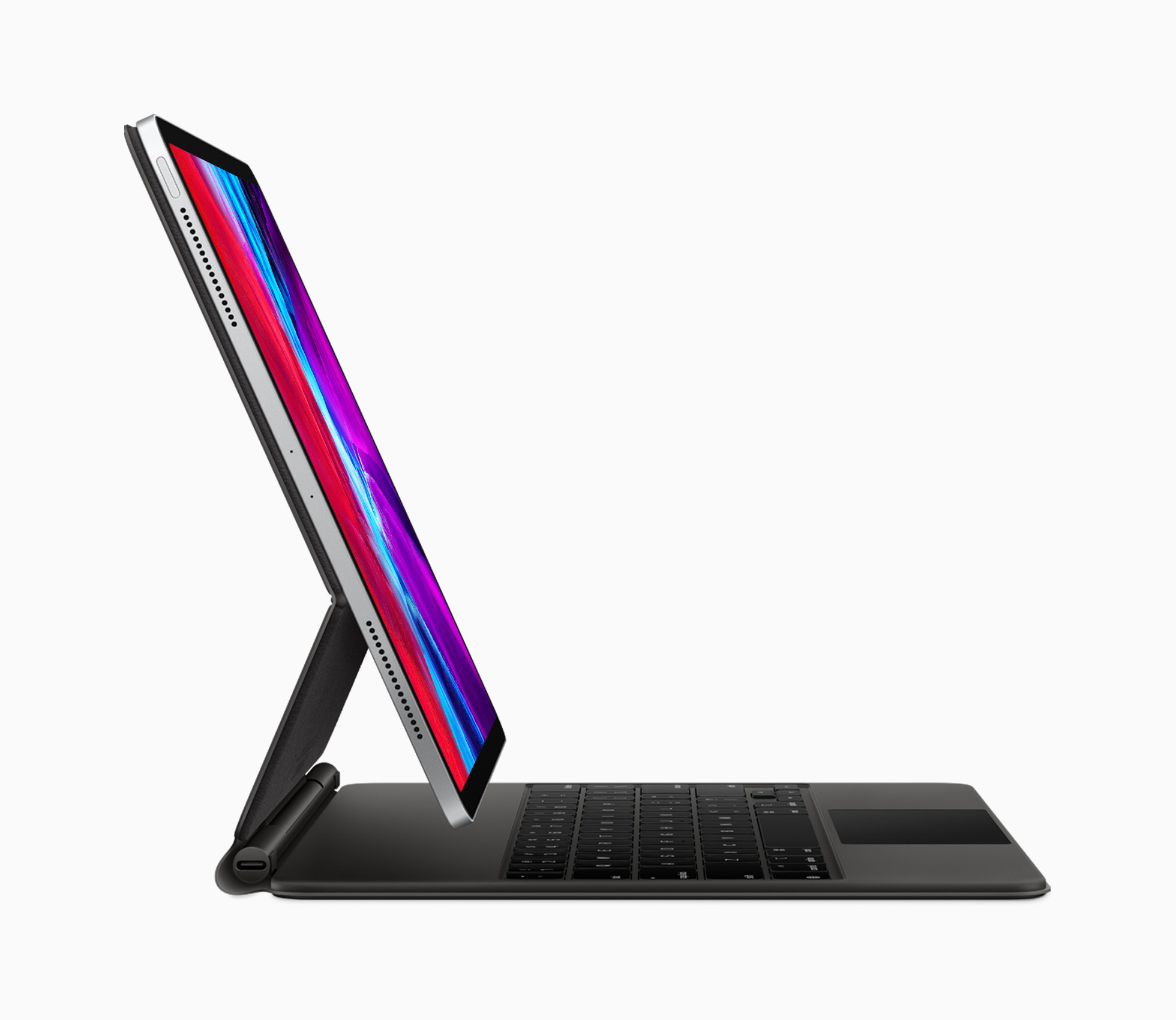
Finally, the concept of the iPad as a modular computer has been another motivator to try the 11-inch model. I normally use my 12.9-inch iPad Pro exclusively in “laptop mode” with a hardware keyboard attached. But lately I’ve been wondering if that approach is too limited, causing me to miss out on the full potential of the device’s versatility. Using my iPad Pro not just as a laptop, but also as a tablet or in a desktop configuration sounds intriguing, and for several reasons I’ll detail later, I think the 11-inch model is better suited to these alternate setups.
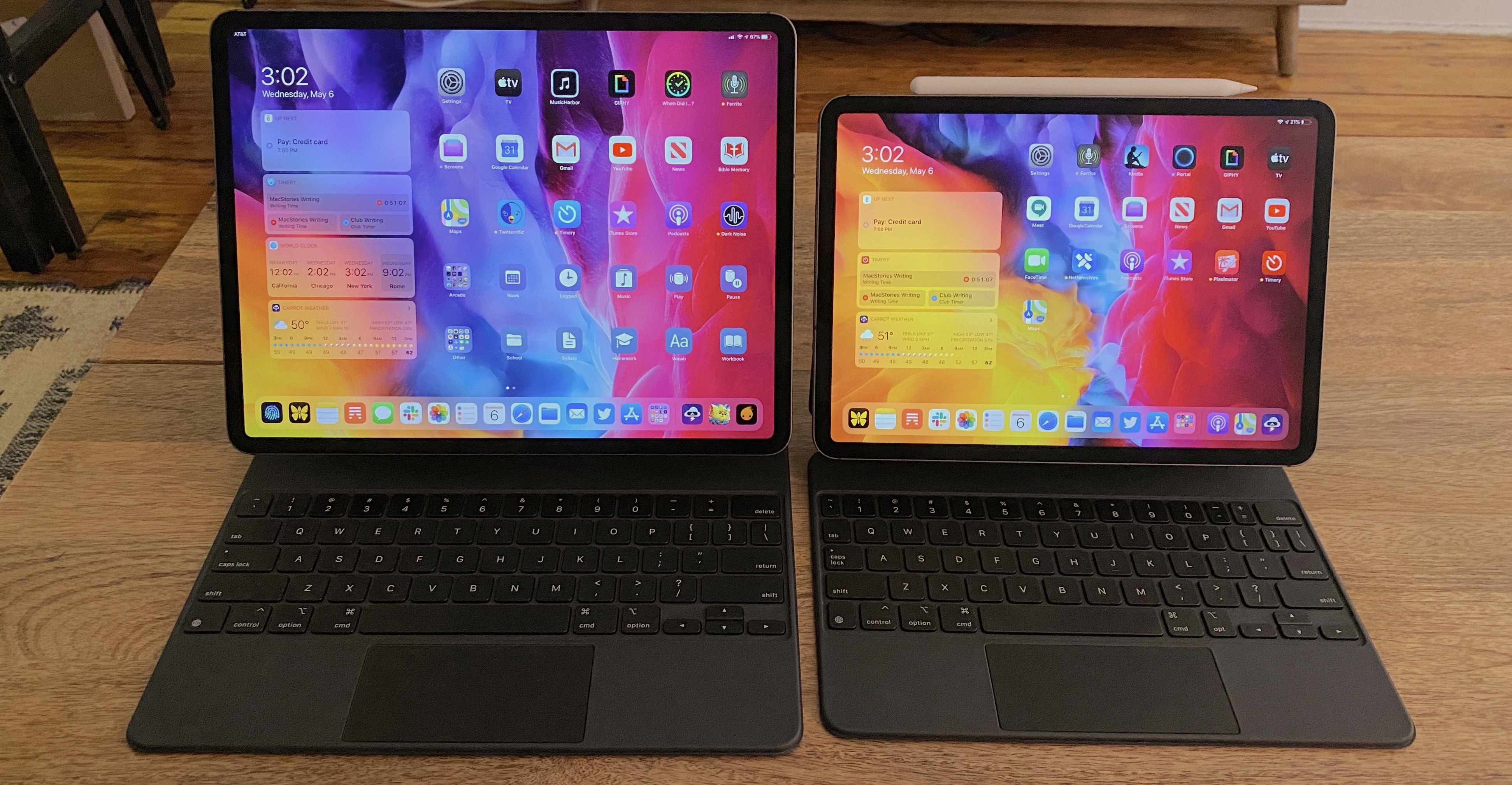
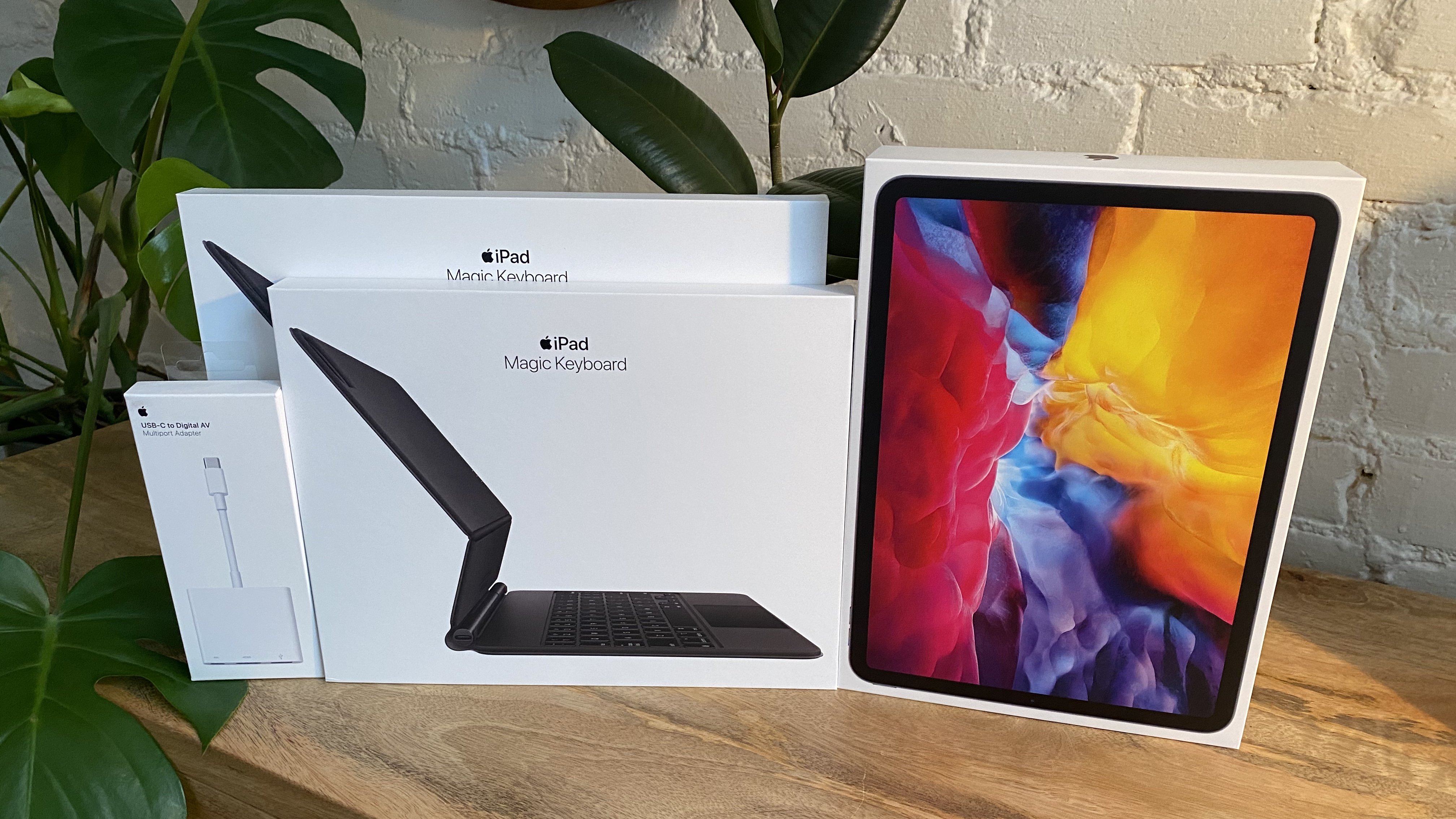
So a few weeks ago I ordered an 11-inch iPad Pro alongside the Magic Keyboards for both the 11- and 12.9-inch models; I also bought a USB-C Digital AV Multiport Adapter so I could connect my iPads to an external display. All of these purchases made possible a comprehensive comparison of the two iPad Pro sizes, spanning tablet, laptop, and desktop configurations, for the purpose of determining which iPad was best for me. As I mentioned, I was already pretty happy with my 12.9-inch model, so my focus was especially on trying the 11-inch and evaluating its unique strengths.
Here is what I learned from my experiment, and my decision on the iPad I’ll be using moving forward.
Read more