Earlier this week, the founders of Dark Sky made their post-Apple debut with a new weather app for the iPhone and Apple Watch: Acme Weather. It’s a terrific 1.0 with all the details you’d expect, plus a few interesting features that set it apart from other apps in its category.
Posts tagged with "app"
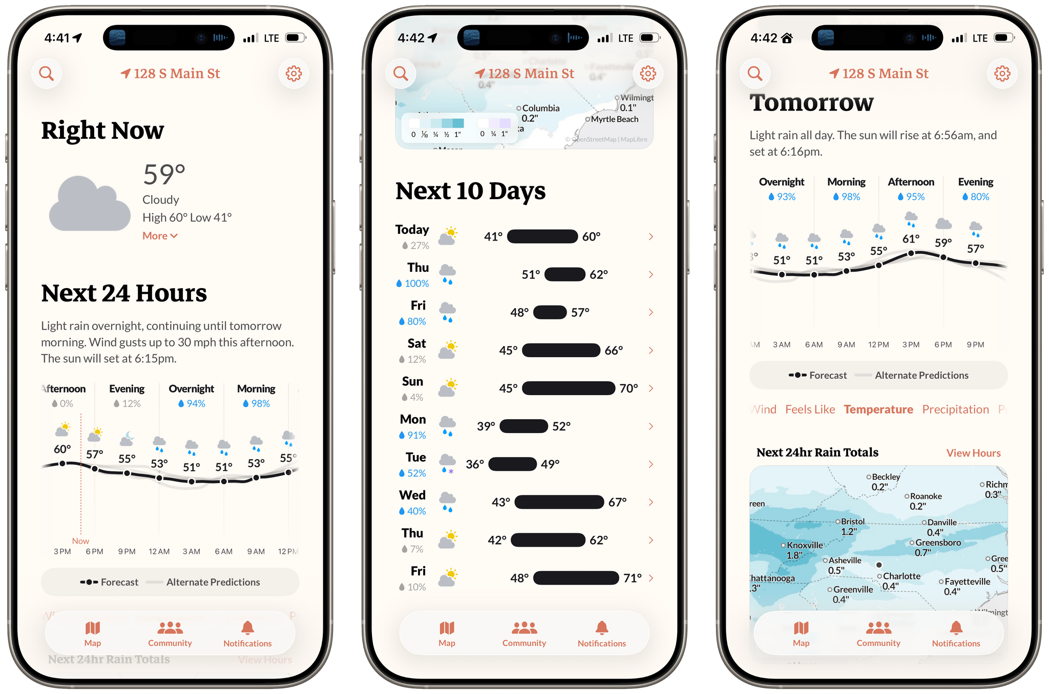
Acme Weather: A Fresh Take on Forecast Uncertainty
Dot: The Menu Bar Calendar That’s Become My Main Calendar
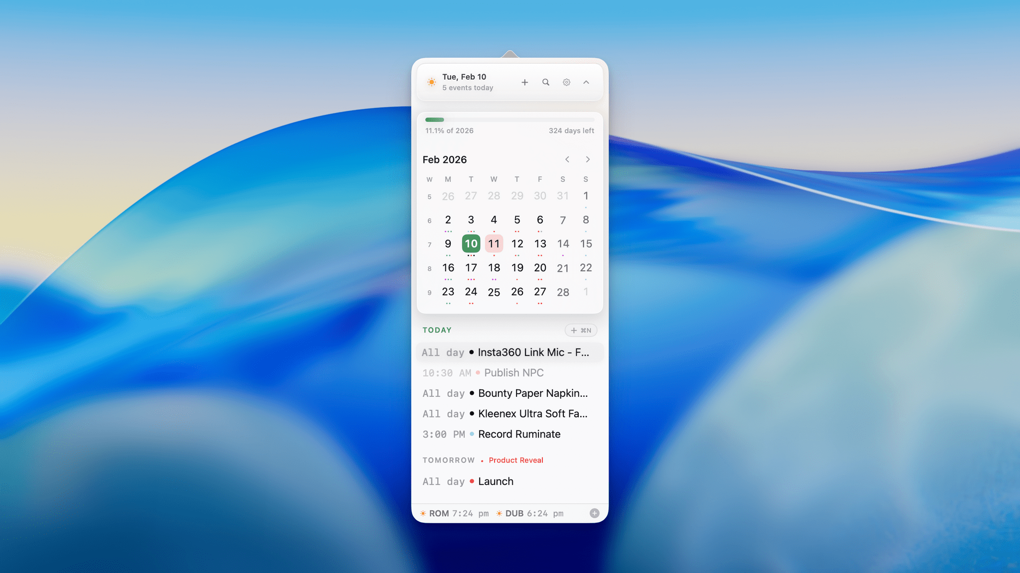
Over time, I’ve gravitated towards a two-calendar system on my Mac because I’ve never found an app where both the desktop app and the menu bar version meet all my needs. That’s probably because my calendar use is a little backwards. I don’t have a lot of meetings each week; instead, my calendar is a mix of reminders, package deliveries, and a handful of work and family events. With just two or three entries each day, I’ve found myself managing events more and more often from a simple menu bar app, reserving my full calendar app for more involved event entry and planning.
On the desktop side, I’ve used Apple Calendar the most, but I’ve also used Fantastical and BusyCal for extended periods, ultimately landing on Notion Calendar. It isn’t perfect, but its Notion integration can be handy at times. On the menu bar side of the equation, I used Dato for many years. It’s an excellent app, but even it is a little more than I need, which is why I was excited to recently discover Dot.
How I Revived My Decade-Old App with Claude Code
Every holiday season, Federico and I spend our downtime on nerd projects. This year, both of us spent a lot of that time building tools for ourselves with Claude Code in what developed into a bit of a competition as we each tried to one-up the other’s creations. We’ll have more on what we’ve been up to on AppStories, MacStories, and for Club members soon, but today, I wanted to share an experiment I ran last night that I think captures a very personal and potentially far-reaching slice of what tools like Claude Code can enable.
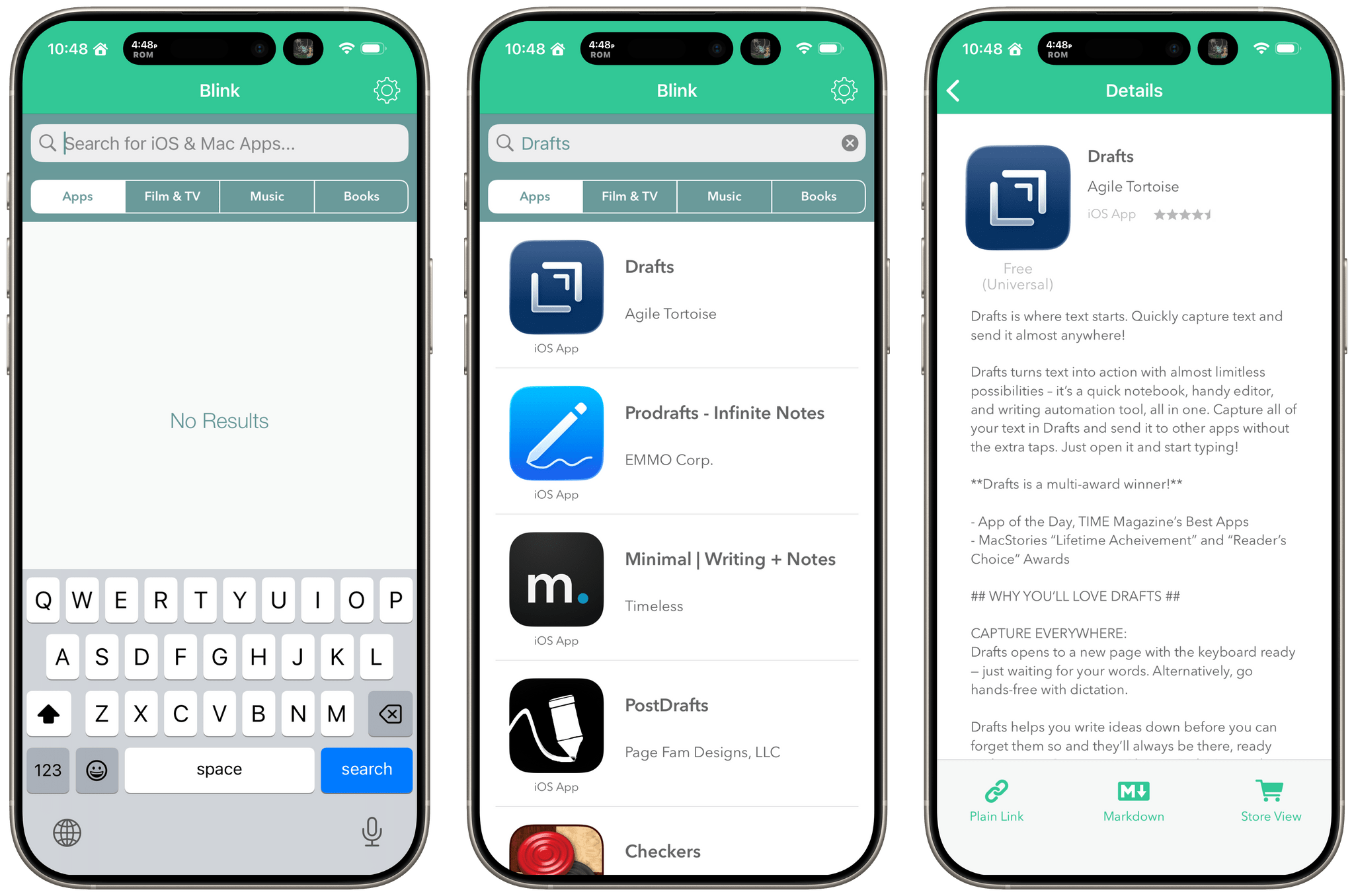
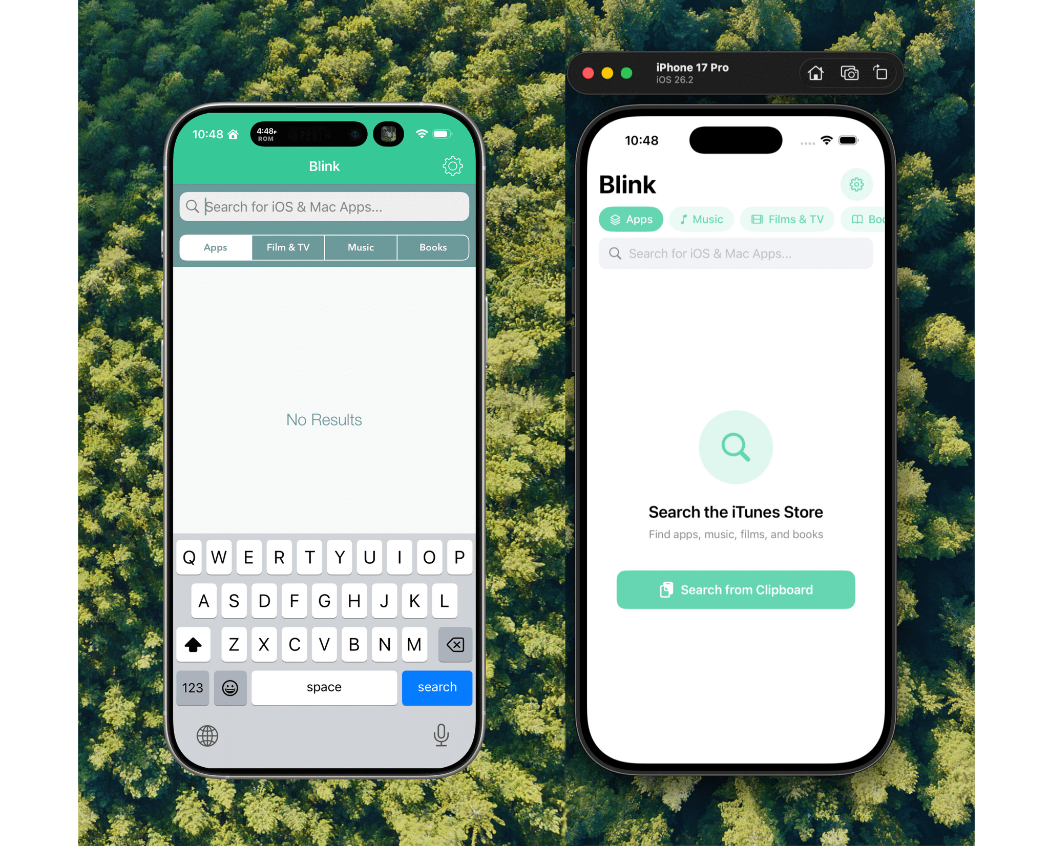
Before I wrote at MacStories, I made a few apps, including Blink, which generated affiliate links for Apple’s media services. The app had a good run from 2015-2017, but I pulled it from the App Store when Apple ended its affiliate program for apps because that was the part of the app that was used the most. Since then, the project has sat in a private GitHub repo untouched.
Last night, I was sitting on the couch working on a Safari web extension when I opened GitHub and saw that old Blink code, which sparked a thought. I wondered whether Claude Code could update Blink to use Swift and SwiftUI with minimal effort on my part. I don’t have any intention of re-releasing Blink, but I couldn’t shake the “what if” rattling in my head, so I cloned the repo and put Claude to work.
The MacStories Selects 2025 Lifetime Achievement Award
Unread

In the 16 years that I’ve been writing for MacStories, I’ve seen my fair share of new apps that have come and gone. Apps that promised to revolutionize a particular segment of the App Store were eventually acquired, discontinued, or simply abandoned. It’s been very unusual to witness an indie app survive in a highly competitive marketplace, let alone to find one that thrived after having been sold twice to different owners over the years. But such is the case of Unread, the RSS client now developed by John Brayton of Golden Hill Software and the recipient of this year’s MacStories Selects Lifetime Achievement Award.
Unread was originally created by indie developer Jared Sinclair in 2014, sold to Supertop (at the time, the makers of Castro), and then sold again to Golden Hill Software in 2017. When it first came out in 2014, Unread entered a crowded space: in the aftermath of Google Reader’s demise in 2013, third-party companies and developers rushed to offer comparable RSS syncing services and compatible apps to let users sync their RSS subscriptions and read articles across multiple devices.
In my original review from 2014, I noted how Unread set a new standard for elegant, gesture-driven interfaces optimized for phones that were getting progressively larger and harder to operate with one hand. With a fluid and minimal interface driven by “sloppy gestures” that didn’t require precision or specific buttons, Unread stood out because it followed Apple’s then-new “flat design” but imbued it with personality in the form of typographic choices, colors, share options (Sinclair created a custom share sheet before an official one even existed), and a novel interaction mechanism for an RSS reader.
After a three-year stint as a Supertop product, Unread was taken under the wing of John Brayton, who did something exceptionally rare: instead of following short-lived industry trends and fads, he doubled down on Unread’s essence while judiciously embracing modern technologies. Eleven years after its inception and eight years after its second sale to a different developer, Unread still stands out in the third-party indie app market because it’s managed to honor its lineage while adapting to the ever-changing nature of the Apple ecosystem.

Unread still is, at a fundamental level, an elegant and polished RSS client that syncs with multiple services and presents articles in a minimal, clutter-free UI that you can easily control with your thumb. Everything else around it, however, has evolved and expanded. Unread is now available on the iPad and Mac, where it supports features such as menu bar commands, windowing, and keyboard shortcuts. There is an Unread Cloud syncing service that is fully managed by its developer. Last year, Brayton shipped an incredibly powerful and custom Shortcuts integration that lets you trigger automations in the Shortcuts app from individual articles in Unread. This year, Brayton adapted to another new reality of the modern web: Unread can now securely store logins for paywalled websites – such as Club MacStories – so that all your articles that require a subscription to be read can be saved and accessed within the app. And in all of this, the modern Unread is both unmistakably the “same” app from 11 years ago, but also something far greater that has built upon Sinclair’s original idea thanks to the constant, relentless work of its current developer, John Brayton.
If you’ve been reading MacStories all these years, you know that this is no easy feat. Most app acquisitions don’t work out in the end, leaving users with the bittersweet nostalgia of something that used to be great and was eventually swallowed up by the greater scheme of economic factors, app rot, technical debt, and App Store changes.
Against all odds, Unread has successfully bucked that trend and evolved into a mature, powerful product that continues to stand alone in the sea of RSS clients as a beacon of hope for indie developers and our community as a whole. There is nothing else like it. For all these reasons, we couldn’t think of an app more worthy of the MacStories Selects Lifetime Achievement Award in 2025.
Learn more about Unread:
Awake: A Considered, Effective Alarm for Chronic Snoozers
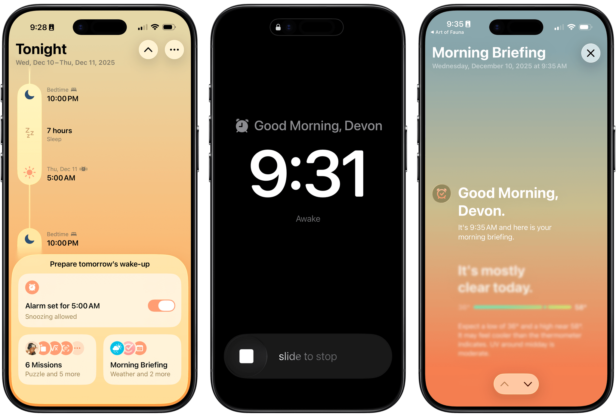
Waking up on time is a quintessential human problem. Over the years, we’ve come up with all kinds of solutions, from ringing analog clocks to flashing lights to motorized digital clocks that roll away from our bedsides as they chime, forcing us to get up and find them to turn them off. But what if there was a way to use a device you already have – your phone – to help you break the habit of snoozing and actually get out of bed when you’re supposed to?
That’s what unorderly, the team behind the day planner app and App Store Awards 2025 finalist Structured, have set out to do with their new alarm app Awake. Built on the newly introduced AlarmKit API, which gives third-party alarm apps the same level of system access as Apple’s Clock app, Awake takes a comprehensive approach to setting alarms that’s meant not only to wake you up but to help you feel more alert and prepared for the day when you do.
If you’ve ever used Structured before, you’re aware of how deeply the unorderly team considers every element of their work, from the color scheme to the fine details of editing events, to make tools that are both elegant and powerful. I’m happy to report that the same level of care is reflected in Awake, both in its design and in the balance of simplicity and customization it offers.
Alyx: A Fun, Flexible Way to Track Caffeine Intake

Activas: Modern Design with a Sprinkling of AI
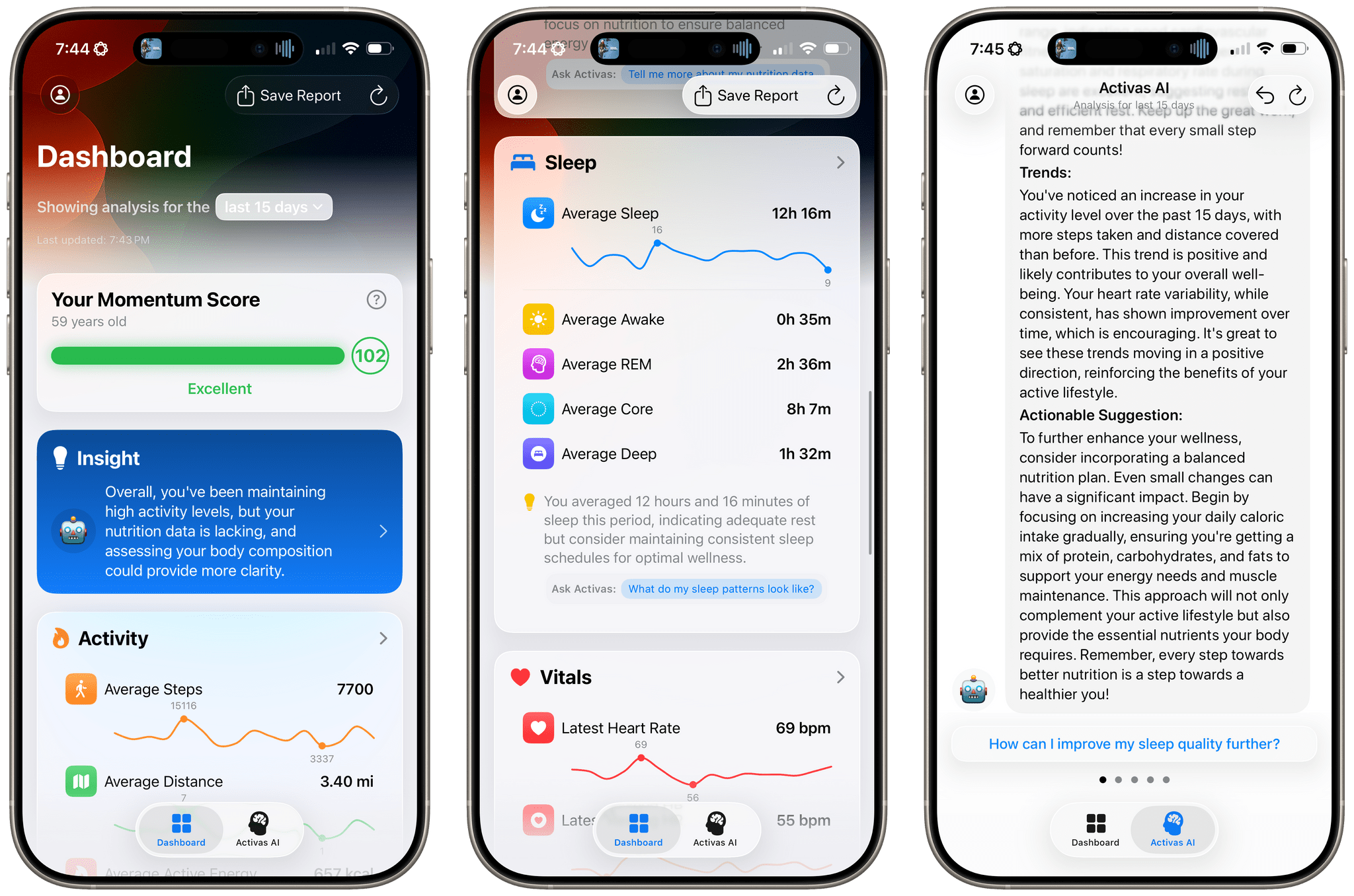
Activas is a new health and wellness tracker for the iPhone and iPad from developer Brian Hough, who built it from the ground up with Apple Intelligence and Liquid Glass in mind. The app serves as a dashboard that brings together information from the Health app in a colorful and easy-to-understand way, using progressive disclosure to avoid overwhelming users with data. It’s a fantastic example of modern design that marries form and function to elevate the user experience.
The app has just two tabs that adopt iOS 26’s Liquid Glass design without sacrificing legibility. The default view is the Dashboard, which can display your recent health and wellness metrics for the last 7, 15, or 30 days. At the top of the Dashboard is a Momentum Score that’s calculated based on a composite of step count, sleep, resting heart rate, and BMI targets, plus your calorie goal. Unlike many similar apps, Activas links to research supporting its targets, which I appreciate. The Momentum Score and a handful of additional stats can also be tracked using one of the app’s Home Screen widgets.
The Momentum Score is followed by an AI-generated insight about your metrics. Because I haven’t been tracking my calories or weight recently, the app suggested I should. That’s followed by overviews of Activity, Nutrition, Sleep, Vitals, and Body Measurement. Each of these sections appears as a SwiftUI-style card that includes graphs showing recent trends, an insight about your metrics, and a suggested question that you can ask the Activas AI with a tap. Sections can be turned on and off and reordered in the app’s settings, too.
The Dashboard’s design is superb. By collecting individual measurements in groups of related statistics and providing a takeaway about each section, the app allows users to get a quick, understandable overview of where they’re succeeding and what needs work.
Festivitas Brings Fresh Whimsy to Your Mac, iPhone, and iPad for the Holiday Season
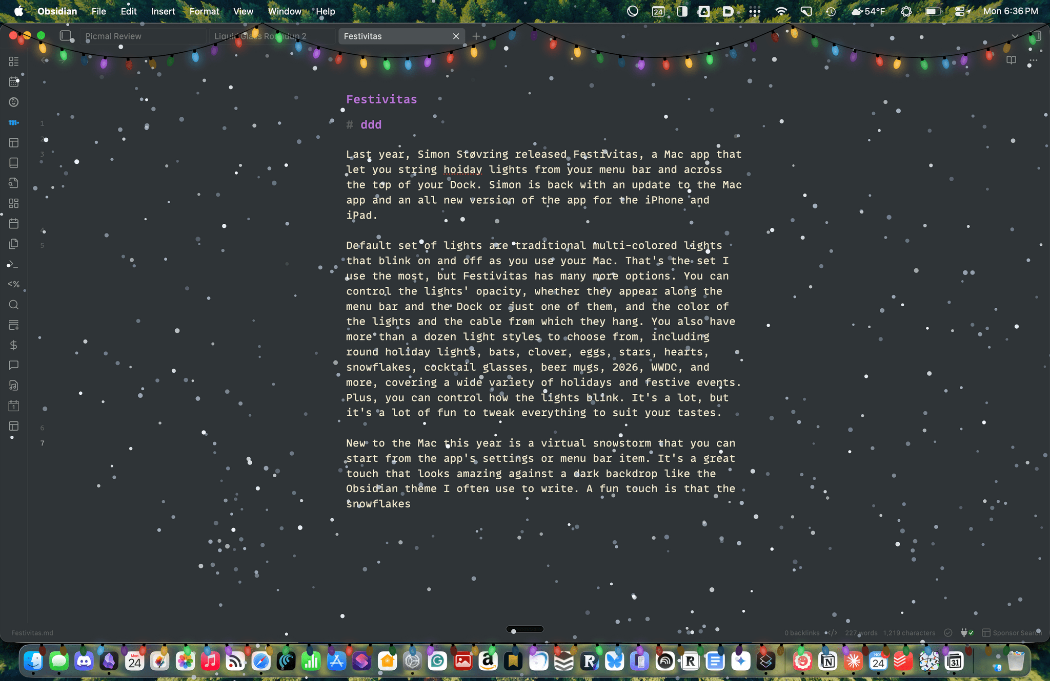
Last year, Simon Støvring released Festivitas, a Mac app that lets you string holiday lights from your menu bar and across the top of your Dock. This year, Simon is back with an update to the Mac app and a new version for the iPhone and iPad.
The default set of lights consists of traditional multi-colored bulbs that blink on and off as you use your Mac. That’s the set I use the most, but Festivitas offers many more options. You can control the lights’ opacity, whether they appear along both the menu bar and the Dock or just one of them, and the colors of the lights and the cable from which they hang. You also have more than a dozen light styles to choose from, including round holiday lights, bats, clovers, eggs, stars, hearts, snowflakes, cocktail glasses, beer mugs, “2026,” “WWDC,” and more, covering a wide variety of holidays and festive events. Plus, you can control how the lights blink. It’s a lot, but it’s also just plain fun to tweak everything to suit your tastes.
This year, the Mac app adds a virtual snowstorm that you can start from the app’s settings or menu bar item. It’s a great addition that looks amazing against a dark backdrop like the Obsidian theme I often use to write. A fun touch is that the snowflakes avoid your pointer, and you can adjust the sensitivity of this feature in settings. You can also use your pointer to push around the lights hanging from the menu bar, which is handy for those times when they obscure Safari’s menu bar or other content.
The snow is lovely. I highly recommend pairing it with the Animal Crossing Snowy Day soundtrack on Nintendo Music. It’s an incredibly peaceful and relaxing combination.
Festivitas supports Shortcuts, too. Simon has created some fun example automations that you’ll find in the app’s settings to do things like turning on the snowstorm when snow is forecast and activating your lights when you play music.

New this year is a Festivitas app for the iPhone and iPad. The app lets you build small, medium, and large widgets to place on your Home Screen. You can either frame a photo with twinkling lights or create a transparent-style widget so the lights frame an element of your Home Screen. I love that the lights framing the photos are animated, an effect I know isn’t easy to do with a widget. You can also add text and make other adjustments to each widget.
Festivitas isn’t going to help you get more done. In fact, it might even slow you down a little bit, and maybe that’s the point. Taking a moment to enjoy the app’s lights and be mesmerized by the falling snow is a good reminder to slow down a little and have some fun.
Festivitas for the Mac is available directly from the app’s website for any price you want to name between $3.99 and $9.99. The iPhone and iPad version is a free download on the App Store with a range of in-app purchases from $3.99 to $9.99 to create a similar name-your-price system.
Apple Announces 45 App Store Awards Finalists for 2025

Today, Apple announced the finalists for the 2025 App Store Awards. The App Store Awards are Apple’s annual celebration of exceptional apps and games across 12 categories spanning the company’s platforms. It’s an excellent collection that includes solo developers, small indie teams, big companies, and many MacStories favorites.
Here’s the complete list of finalists.