System Features
macOS Tahoe comes with a wide array of new and improved system features and apps. I want to kick things off with system-level features because that’s where the most exciting action is this year.
The Menu Bar and Control Center
In the previous section, I covered the changes to how the menu bar looks. It’s transparent by default, which I like, but there are a bunch of other changes that affect it and Control Center that I expect a lot of readers will enjoy.
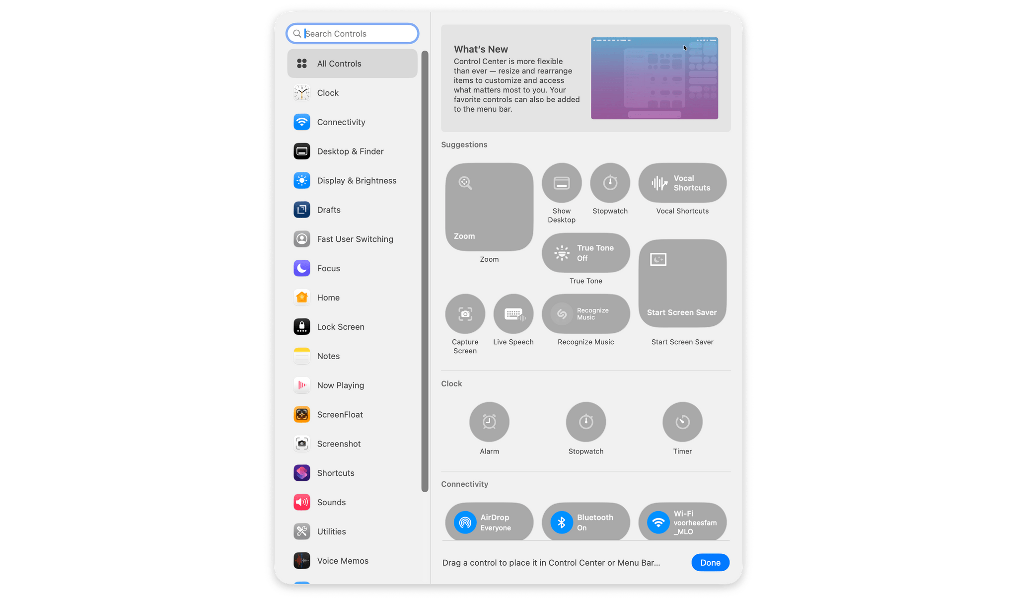
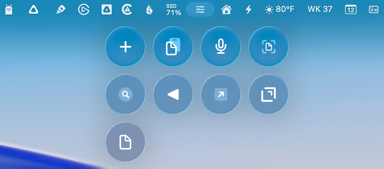
First of all, Control Center controls have been greatly expanded and can occupy multiple spots along the menu bar. There are controls to set timers, run shortcuts, tile your windows, create notes in the Notes app, record voice memos, and much more. To manage the changes, there’s a new Control Center gallery that can be accessed by clicking on the Control Center icon in the menu bar and then ‘Edit Controls’. That opens a UI that looks a lot like the widget gallery. There’s a sidebar on the left for searching for controls and browsing by app. The remainder of the window displays the available controls grouped by app.
When you hover over a control, a green ‘+’ button appears that will add it to Control Center when clicked. Alternatively, you can drag a control and place it wherever you’d like in your current Control Center panel or drag it to the menu bar, which will add it as a standalone menu bar item.
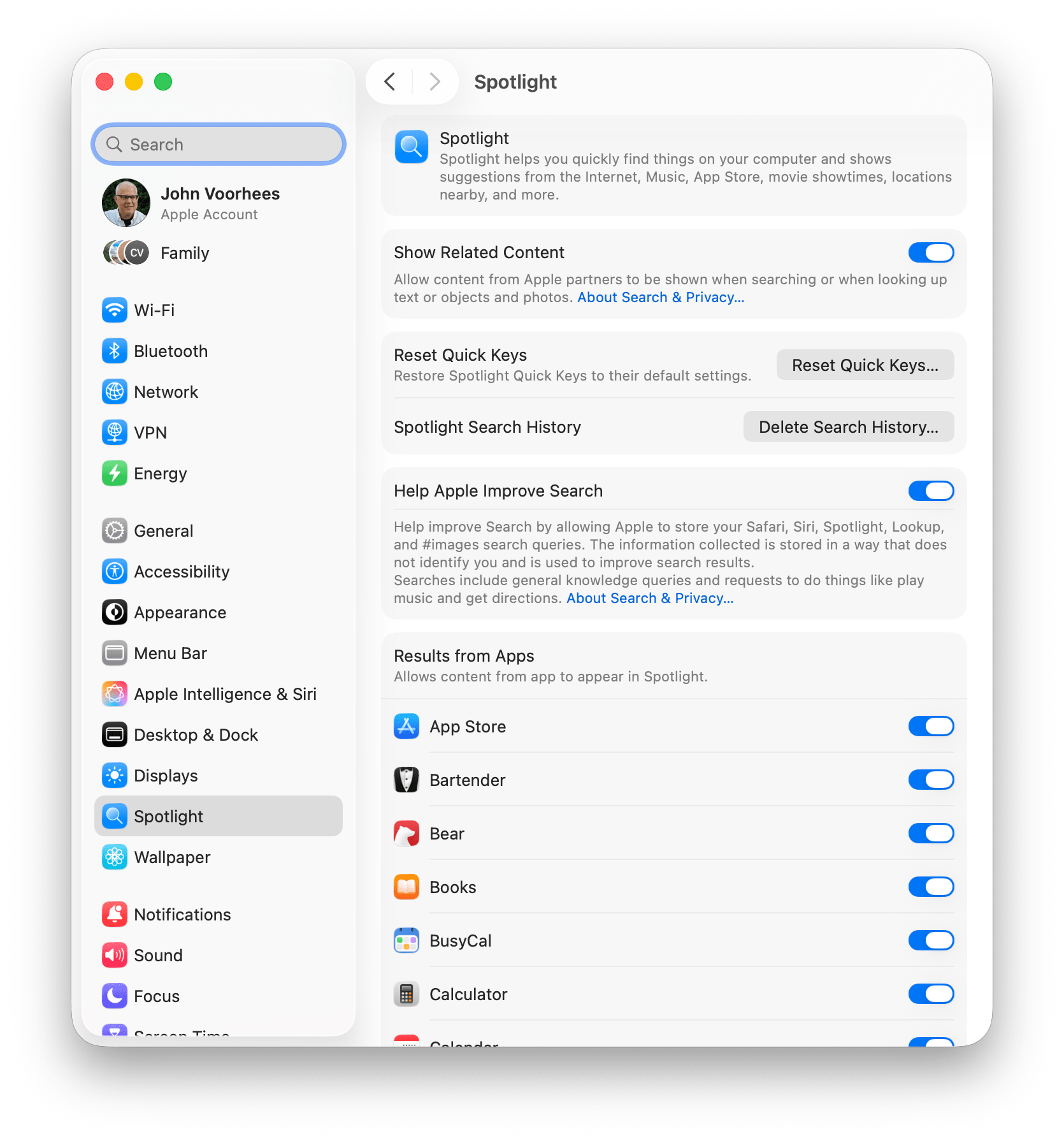
If you’d prefer to create multiple Control Center panels containing a variety of controls, you can do that, too. The Control Center gallery also displays a ‘+’ button in your menu bar, which will start a new panel where you can add controls. Each panel can be assigned one of 11 icons to distinguish it from your others. That’s not a lot of icons to choose from, but you can include repeats if you’d like. It’s worth noting that if you set up a new Control Center panel and don’t add any controls, it will simply disappear when you dismiss the Control Center gallery. Also, sliders for volume and display brightness, which used to appear in the middle of your screen now, appear below the Control Center button in your menu bar with a nice animation; I think it’s a better place for them, although it’s been a little hard to get used to.
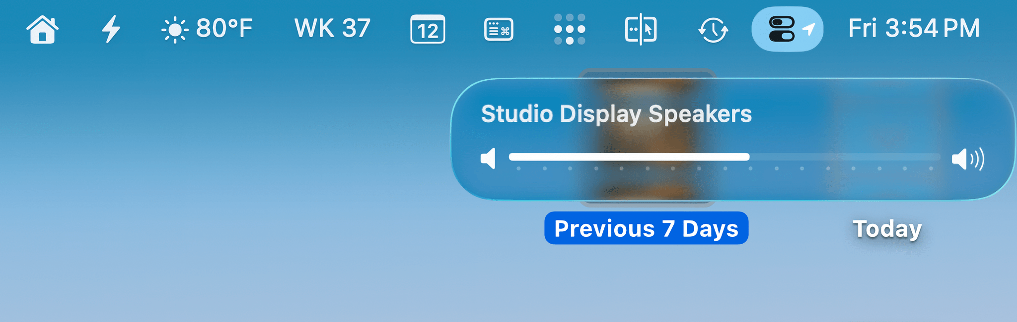
Volume and display brightness sliders appear beneath the Control Center menu bar icon when adjusted from your keyboard.
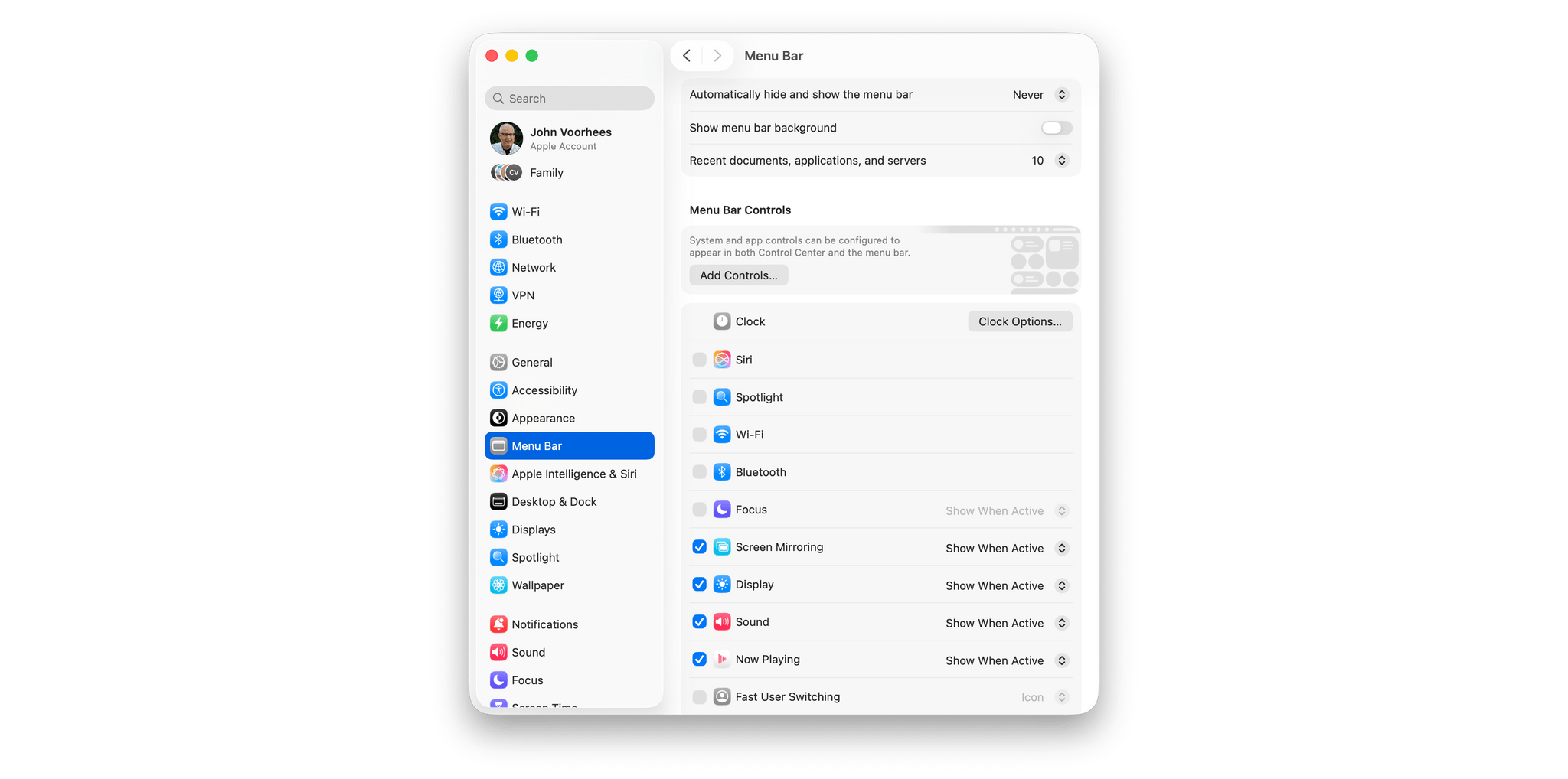
These features create a new menu bar dynamic. Multiple Control Center panels effectively allow you to stack a lot of menu bar items under one icon, saving space that’s at a premium on smaller displays. At the same time, however, Tahoe is adding more ways to fill your menu bar than ever before. To help ease the tension, there are new options in the Menu Bar section of System Settings. You can enter the Control Center gallery from there, but more importantly, you can use this section to turn off menu bar items even if they don’t give you that option in their own settings.
You’ve probably been there. You have some peripheral or app that insists it needs to live in your menu bar 24/7. The reality is that the list of must-have menu bar items is different for everyone. I, for one, welcome the ability to banish ScanSnap and Adobe Creative Cloud, along with several other apps, from my menu bar.
One feature announced at WWDC that you’ll have a hard time finding in this update is third-party Control Center controls. They’re so rare that I’ve only found two: the text editor Drafts (this week’s site sponsor) and the screenshot capture app ScreenFloat. I’ve tried a lot of Mac betas over the summer, and as we rolled into September, I figured that the third-party controls feature was being delayed or there was a bug preventing them from showing up because I had yet to see one. Nope. To be certain, I checked over 70 betas of all kinds – AppKit apps, SwiftUI apps, Catalyst apps, iPad apps running in compatibility mode, you name it – but nothing new turned up, except these two apps.
Update: Since publishing this review, I discovered with the help of the indie developer community that the lack of third-party controls in Control Center is a bug in macOS Tahoe, which you can read more about here. The fix, at least for some people, is to open the macOS widget gallery, which seems to refresh the Control Center gallery. Hopefully, this but will be resolved in an update soon.
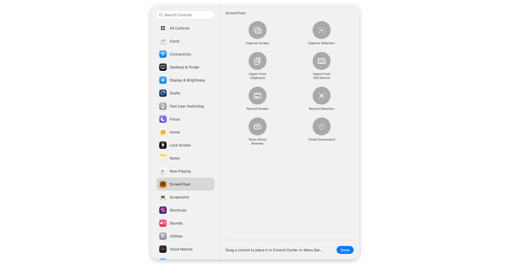
Drafts and ScreenFloat show it can be done, and I’m sure there are others, but they are very rare. Drafts offers controls to start a new draft, create a draft from the clipboard, dictate a draft, scan a document, search, open your last draft, open the app, open your default workspace, or open any of the individual notes inside your Drafts library. ScreenFloat has a lot too, with controls to capture the entire screen, an area of a screen, import a screenshot from the clipboard or an iOS device, open the app’s Shots Browser, and record a selected area of your screen. That’s a lot, and to be clear, the same functionality is available in Drafts’ and ScreenFloat’s separate menu bar apps, but now, users have the choice to add just the actions they use to Control Center, which I appreciate.
When I was having trouble finding third-party controls, I started asking around. From what I’ve been able to gather, few developers have worked on controls, and of those that have, at least some are struggling to get them to work properly. I hope that changes because I think the redesigned Control Center has a lot of potential. I love the flexibility of creating multiple Control Center panels and the option to drop one-off controls directly on the menu bar. It won’t replace a third-party menu bar organization utility for everyone, but it brings the core functionality of those sorts of apps to more users. The transition fits well with the direction Apple has taken with Shortcuts and App Intents, placing discrete bits of functionality at users’ fingertips, meeting them where they work and where they prefer to access their apps.
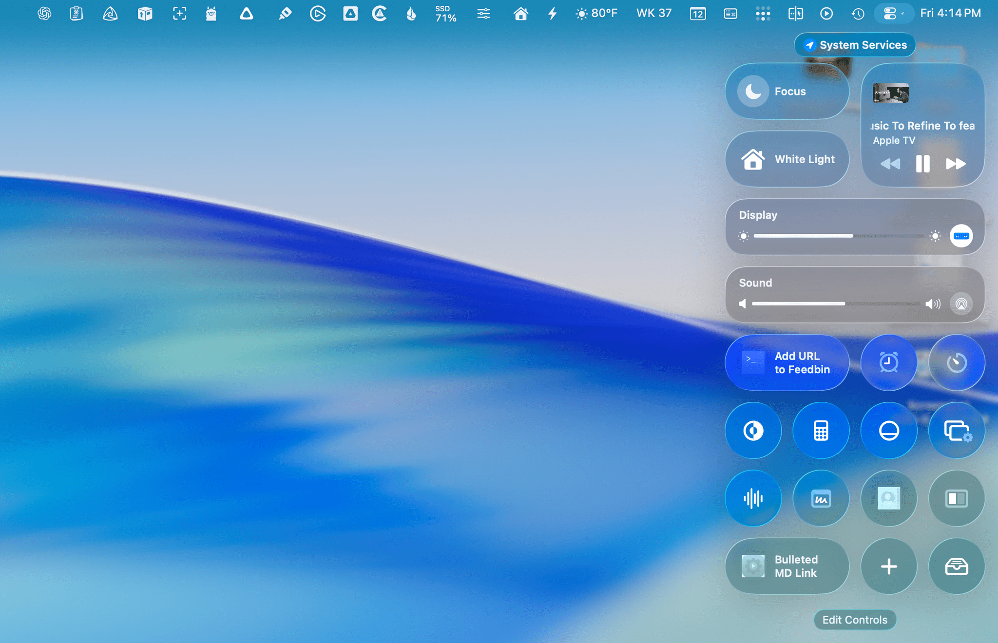
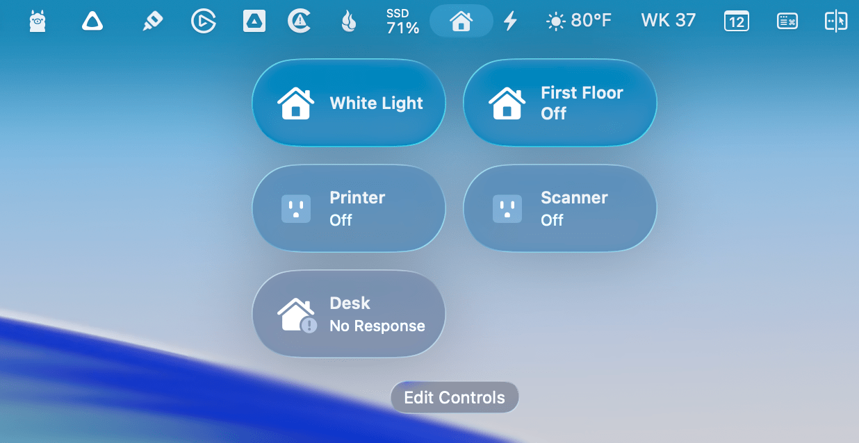
It’s a work in process, but this is my current main Control Center panel, a mix of system controls and controls from Drafts and ScreenFloat.
Personally, I’ve set up a Control Center panel with frequently used settings, such as Focus modes, display and sound controls, media controls, HomeKit scenes, and more. A separate Home control includes the lights and other smart home controls I use most from my desk. While I recognize that the changes to the menu bar and Control Center won’t be enough for everyone, they’ve meant that I no longer need to use a menu bar utility with my Mac. I’m happy with the default and don’t plan to go back.
One last note on Control Center panels is that on the Studio Display, they only reach about halfway down the screen. Seeing that, my first reaction was that I wished they were longer. I’m sure there are users who would love to fill all of their screens’ vertical space with controls from their favorite apps and stack one shortcut on top of another. Having lived with the new Control Center over the summer, though, I think limiting the height was the right decision. A longer panel would be hard to parse and wouldn’t fit on laptops anyway. By standardizing on a size that works across various Macs, Tahoe’s Control Center will make transitioning between different setups easier for users, which is the right choice.
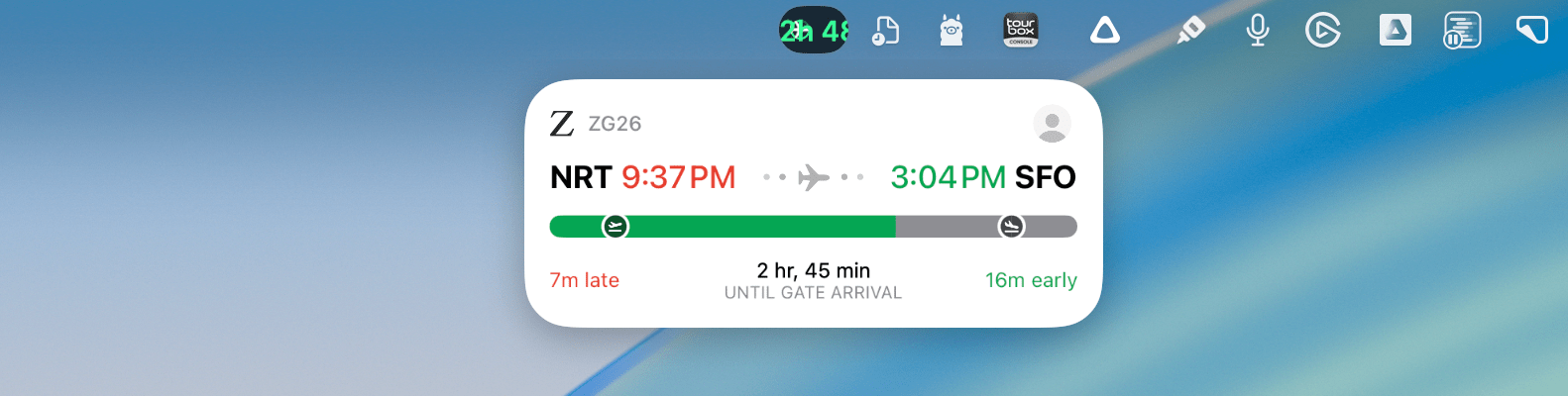
And finally, before leaving the realm of the menu bar, I want to mention Live Activities. I applaud Apple’s efforts to bring whatever is happening on your iPhone to the Mac with Continuity features like this one. It reduces distractions, and in many cases – like the new Phone app for Mac that I’ll get to – the integrations are remarkably useful. However, many times, I’ve found the menu bar text to be far too small for Live Activities to be useful. If you click on an activity, it expands below the menu bar and is much more functional, but the shrunken down menu bar-height UI needs to be reconsidered. It’s too small and easy to ignore. However, I do like that you can use a Live Activity to launch iPhone Mirroring and interact with the app from your Mac.
Overall, I’m a big fan of the direction the menu bar is heading. I like the transparency as well as the new customizability and flexibility of both the menu bar and Control Center. The expansion of system controls for Control Center makes it far more useful, too, but the lack of third-party support going into the Tahoe launch is disappointing. I hope that changes soon because I prefer using controls that I can place in a Control Center panel or pin as standalone menu bar items to the existing lineup of individual icons. Controls won’t make sense for every menu bar app, but they do for enough that widespread adoption would make it easier for users to manage their menu bars on smaller screens, which would be a big win. Let’s hope that emerges over the coming year and beyond.
Spotlight
The new Spotlight is fantastic. It’s not that I had anything in particular against Spotlight before; I just didn’t find it very useful compared to third-party alternatives. In recent years, most of its additions were data sources that made it easy to do things like pull up details about a place or an actor. Those features worked well enough, but they weren’t a good replacement for web search and, more recently, querying a large language model.
Tahoe’s Spotlight is different. The web search-adjacent features are still there for those who use them, but this year, Spotlight’s focus is on productivity, and the team behind the feature nailed it.
There are two axes that underpin Spotlight’s success: the first is the breadth of the feature’s capabilities, and the second is how you accomplish tasks.
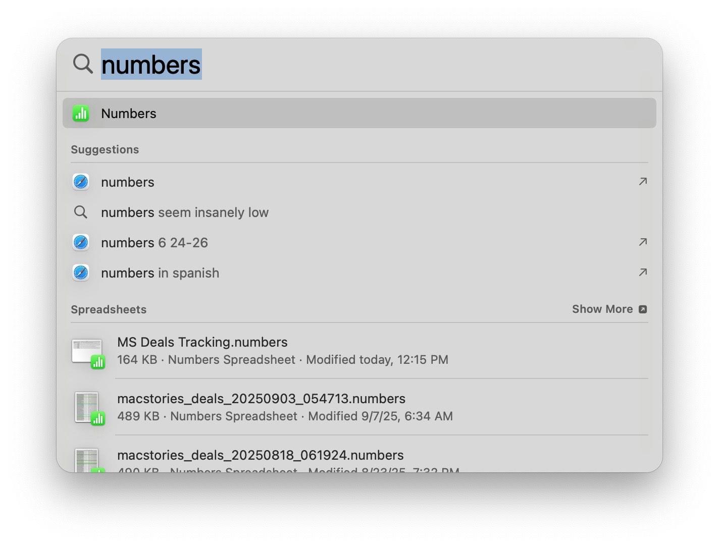
Let’s start with what can be done because there’s so much that it’s been broken into categories within Spotlight for the first time. As before, Spotlight can be used to launch apps; what’s changed is the depth of what you can do beyond launching an app. On Sequoia, if I typed “Numbers” into Spotlight, I’d get the option to open the app after typing its full name followed by suggestions for websites or web searches, which aren’t very useful in this context, followed by actual Numbers spreadsheets I’d opened recently.
I use Numbers often enough that Tahoe knows to put it at the top of the list as soon as I type an “N”.
In contrast, I use Numbers frequently enough that Tahoe has learned that when I type “N,” I probably want Numbers, so it’s the first choice. That sort of adaptive learning of which results to prioritize is found throughout Spotlight. The other options Spotlight displays aren’t broken into sections anymore. Instead, there’s a row of filters below the Spotlight search box that allow you to limit your search to certain contexts like menu items for the app you’re currently using, your clipboard, and other apps that may be relevant.
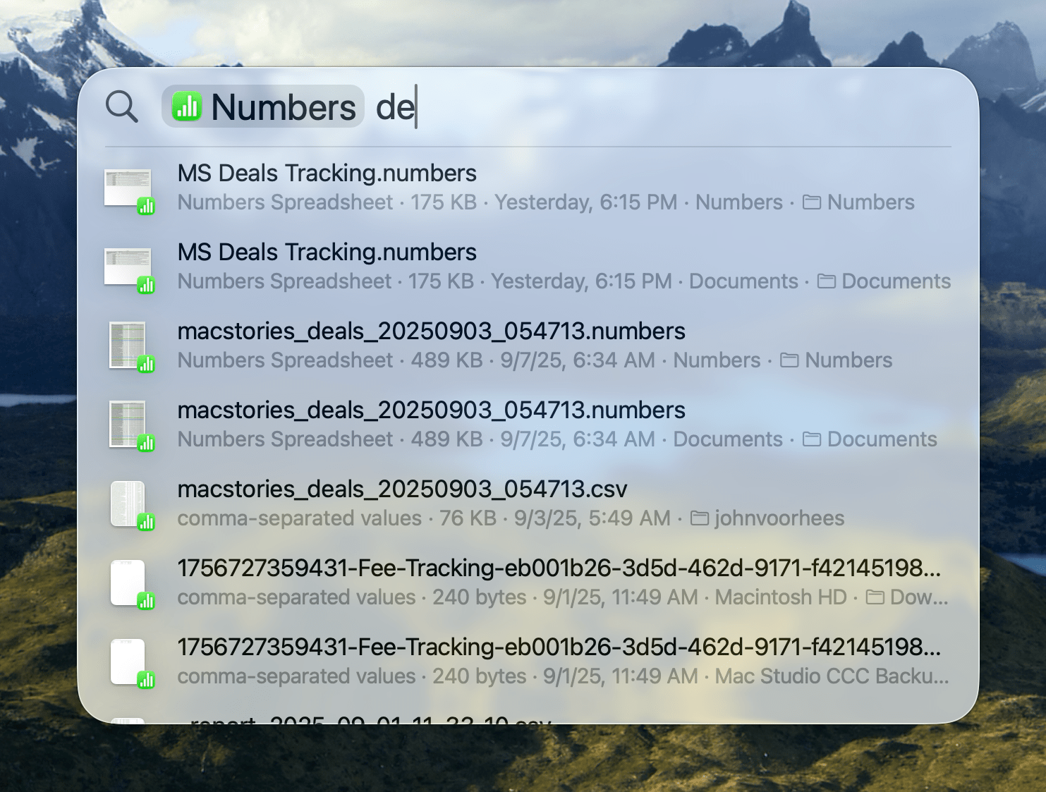
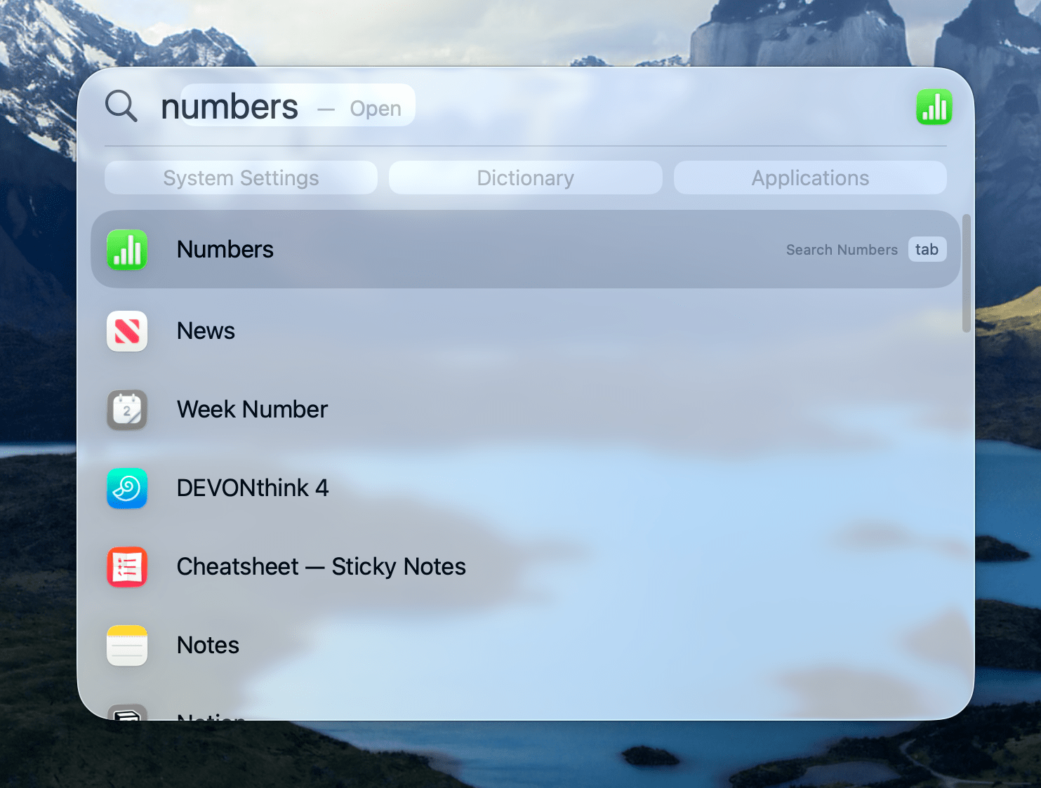
Selecting the Numbers filter or hitting Tab narrows your Spotlight search to just Numbers documents.
If the first choice is what you want, which it is for me when I simply type “N,” you can also hit the Tab key and limit the suggestions below the Spotlight search field to Numbers and CSV files. Begin typing again and, in my Numbers example, Spotlight will start searching this newly filtered list of relevant documents based on their metadata and content. It’s a powerful way to find files from outside the Finder that I absolutely love.
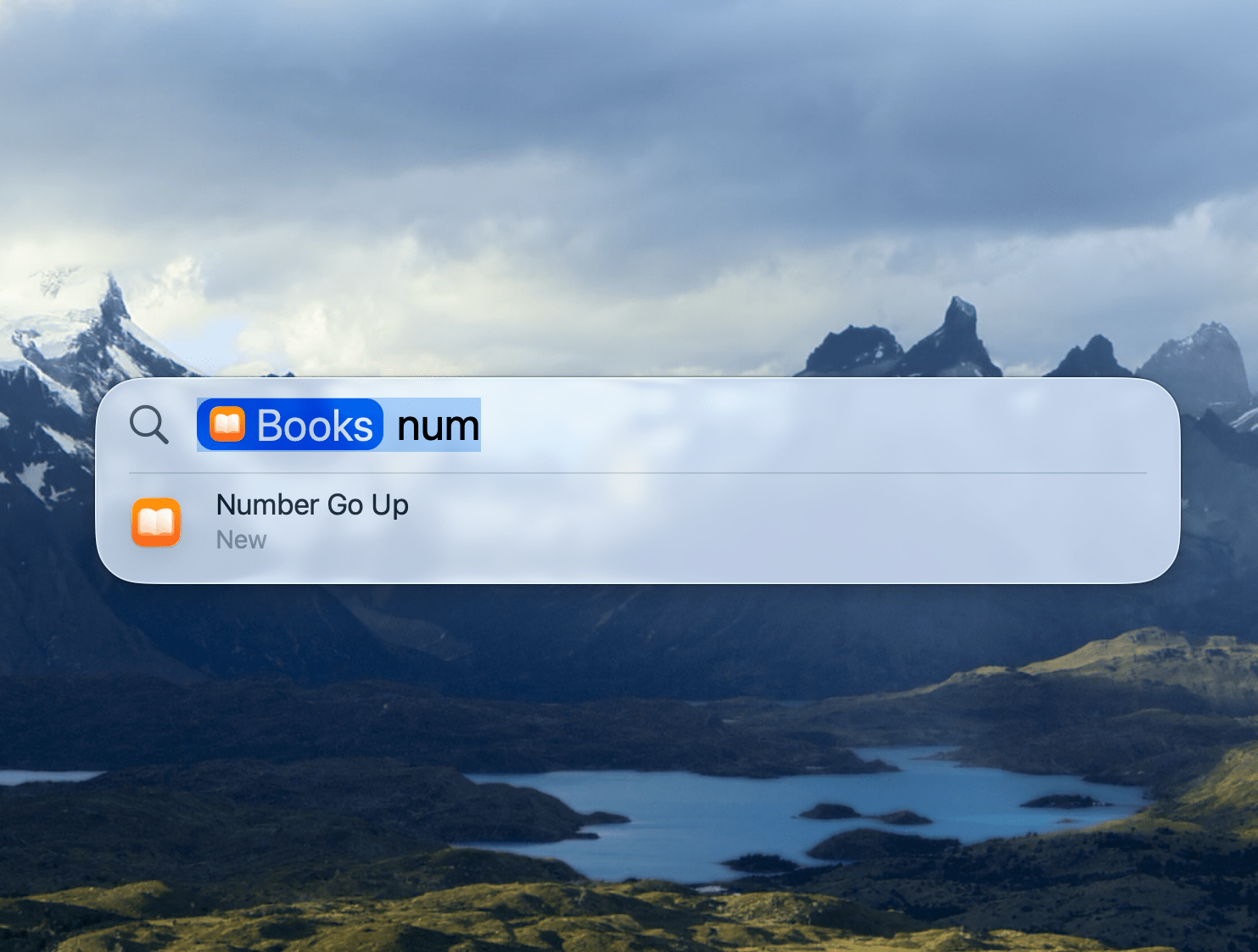
Just as cool, though, is that if I type the first few letters like “Num” because I want to find the audiobook Number Go Up by Zeke Faux and not the app Numbers, I can use the right arrow key to move into the row of filters under the Spotlight search field until I reach the Books app, which will find it in my Apple Books library. Then, after arrowing down to the first choice, I hit Return, Books opens, and the audio starts.
There is a bunch of newly-searchable content in Tahoe’s version of Spotlight too, including:
- the windows and tabs you have open in apps,
- files from third-party cloud services like Google Drive and Dropbox,
- podcasts,
- popular websites like YouTube, Amazon, and IMDb that are accessed by typing their names followed by a Tab, and
- text in screenshots.
Tabbing and arrowing through results is a good example of the second axis along which Spotlight has made major improvements, reducing friction and allowing anyone who prefers to use a keyboard more than a pointing device to move quickly. Another great example of Spotlight’s new keyboard-centric workflow is what Apple calls quick keys. These are essentially aliases that allow you to tie apps, actions, and other items indexed by Spotlight to key combinations. I’m calling them aliases because quick keys are a little different from traditional keyboard shortcuts in that they don’t require a modifier key.
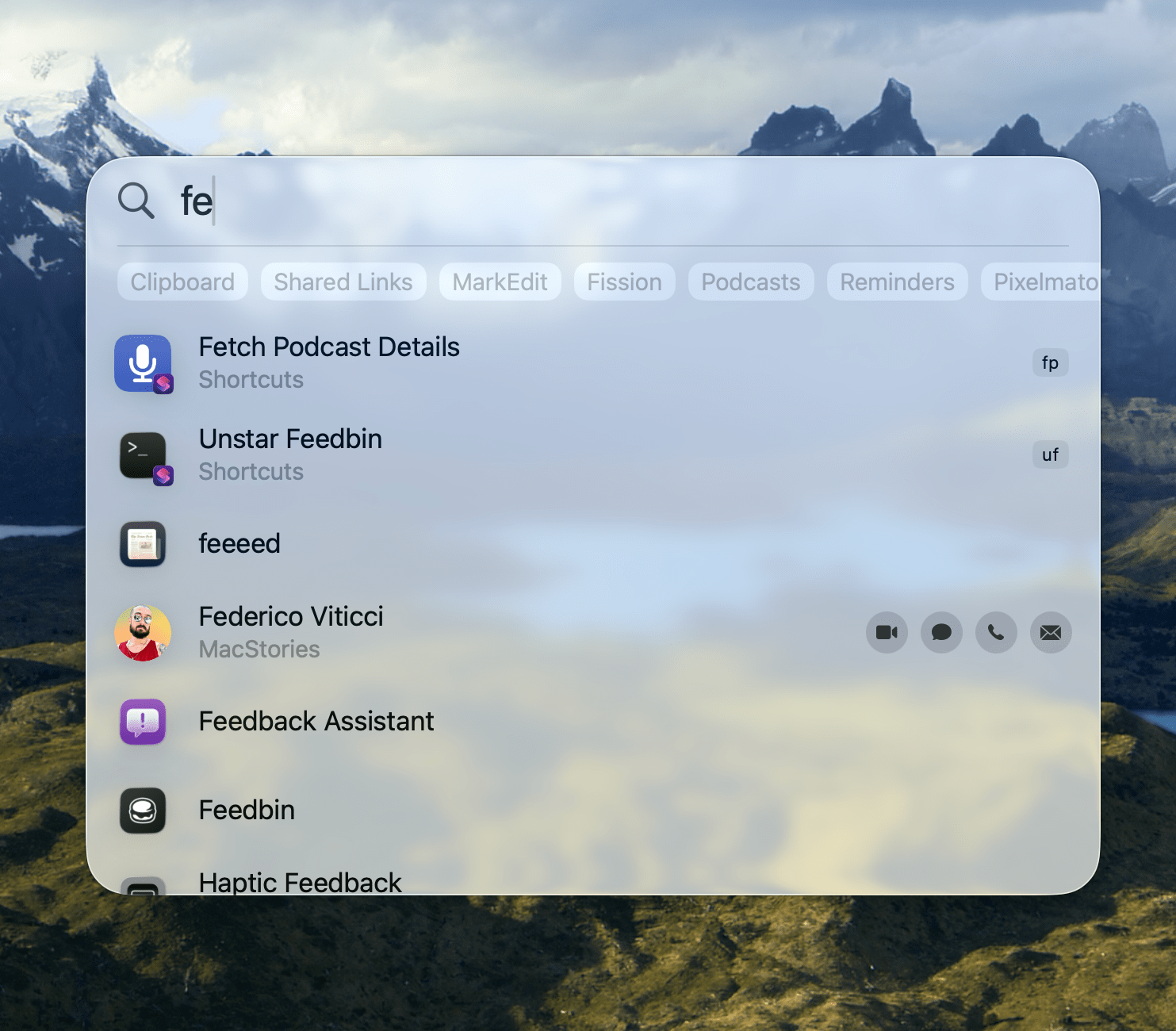
For example, I have a shortcut called ‘Fetch Podcast Details’ that pulls URLs and other metadata for me after we publish a podcast episode, saving it to PastePal for use later in the week. Shortcuts can now be launched from Spotlight the same way you would launch an app. For this particular shortcut, though, I assigned the quick key “fp” for “Fetch Podcast.” Now, whenever I want to run the shortcut, I type “fp” and hit Return to run the shortcut. That’s it.
Okay, let’s get back to what else is new in Spotlight. Many of our readers are probably aware of App Intents. It’s the Apple framework that powers everything from Shortcuts to widgets, Live Activities, and a lot more. It’s also what will eventually power the “Smarter Siri” outlined at WWDC 2024. With Tahoe, Spotlight has gained an entire Actions tab. These tabs can be found by activating Spotlight and then either using the arrow keys to reveal the new categories to the right of the search field, moving your pointer, or using the keyboard shortcuts ⌘ + 1 through ⌘ + 4. Again, Apple has gone all out on the keyboard navigation, which takes Spotlight from simply powerful to fast, too.
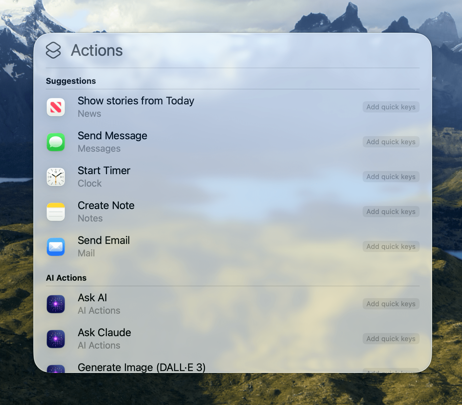
When you open the Actions section, you’ll see a list of suggested actions that will evolve over time based on your use. Suggested actions are followed by an alphabetical list of individual actions grouped by app. If you’ve ever used an App Shortcut on your iPhone or iPad, that’s essentially what these actions are: one-off actions available from macOS system apps and third-party apps. Like apps and shortcuts, they can be assigned quick keys to speed up the process of activating them.
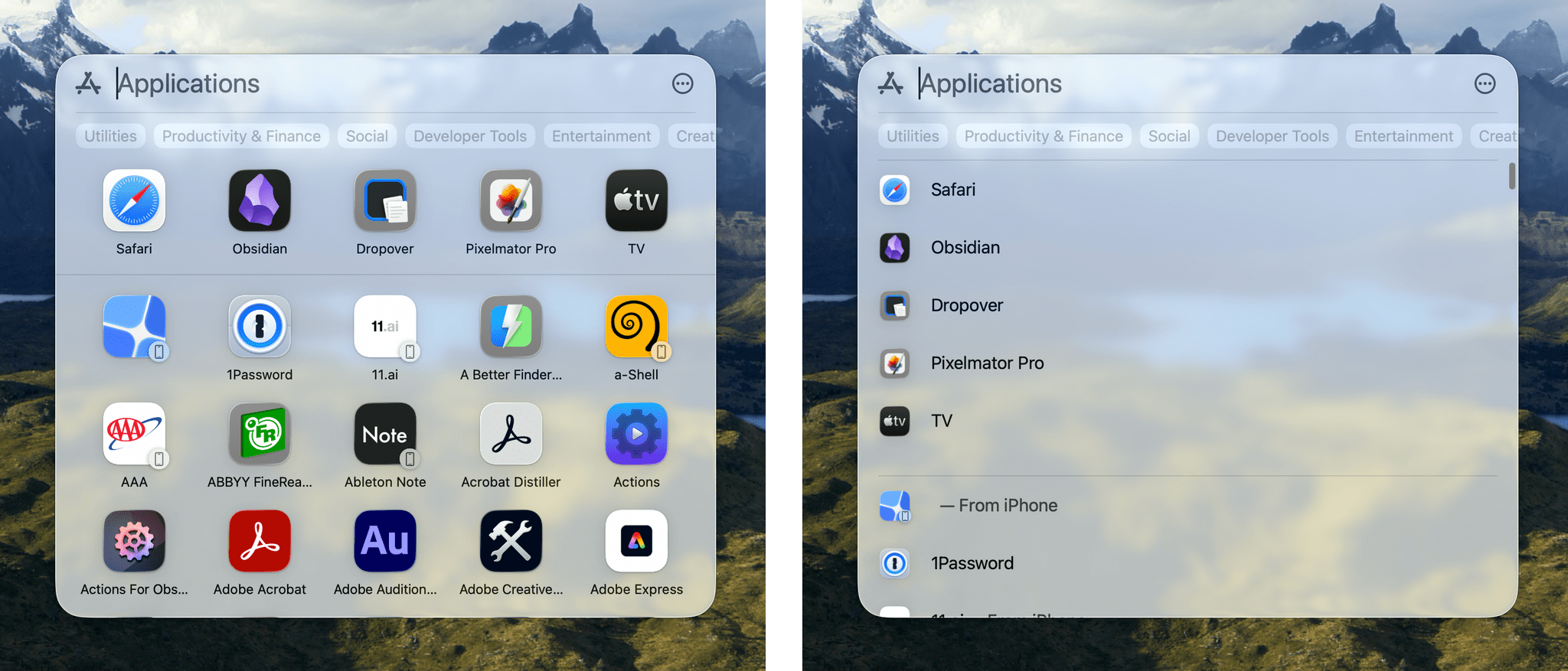
I’ve already covered how working with apps has changed from prior versions of Spotlight, but one other small change that the Applications and Files sections have in common is an option to toggle between a default grid and list view of results. In fact, when it comes to apps, Launchpad has been removed from Tahoe. Activate Spotlight’s apps section, and you’ll be presented with a grid of icons that’s a lot like what Launchpad was before, except that it scrolls vertically and can be filtered by app category. Another change is that, by default, the app section includes your iPhone apps, which can be opened on your Mac using iPhone Mirroring if your iPhone is nearby.
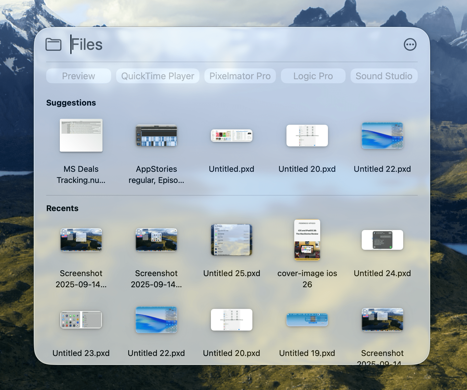
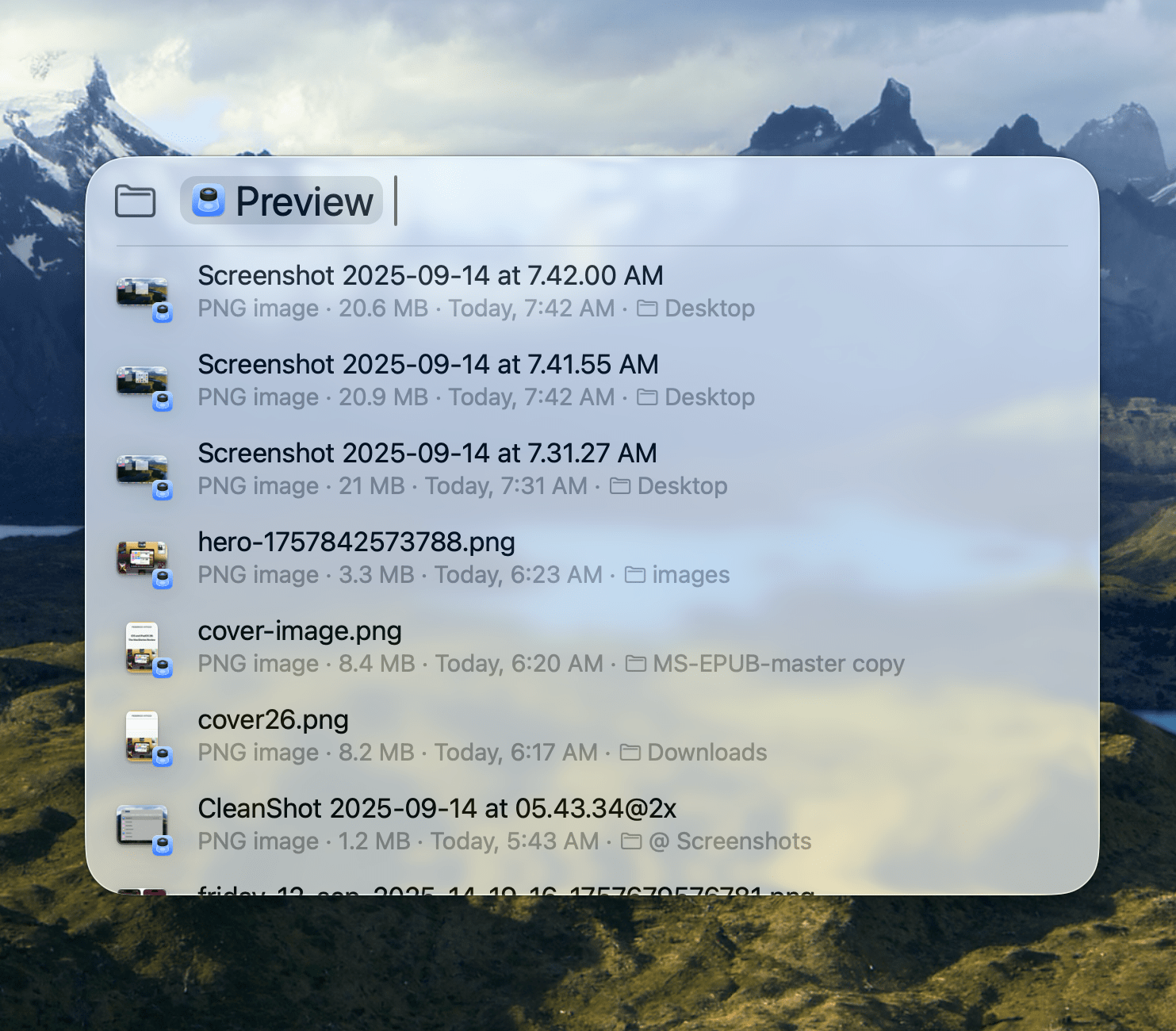
As for files, the experience of searching has improved here too. Looking at my suggestions, they’re all on point, offering a spreadsheet, a Logic project, and some images edited in Pixelmator Pro, all of which I worked on recently. Suggestions are followed by Recents, which include the other files I used today and yesterday.
Below the Spotlight search field, apps are suggested as filters for files. For example, selecting Preview will limit files to recent images, while picking Logic Pro will show me a reverse chronological list of my Logic project files. Of course, you can use the search field to narrow results, too.
Historically, I’ve searched for files using the Finder or an app like Forklift, but Spotlight has really grown on me as an alternative way to find files. Its Recents list works better than the Recents folder in the Finder, and the emphasis on recently used files in search results means I can find files from ongoing projects faster, without clicking around in Finder columns to sort files by their modified or added dates. I don’t expect I’ll abandon the Finder for accessing files by any means, but I do love the quick access that Spotlight now affords me.
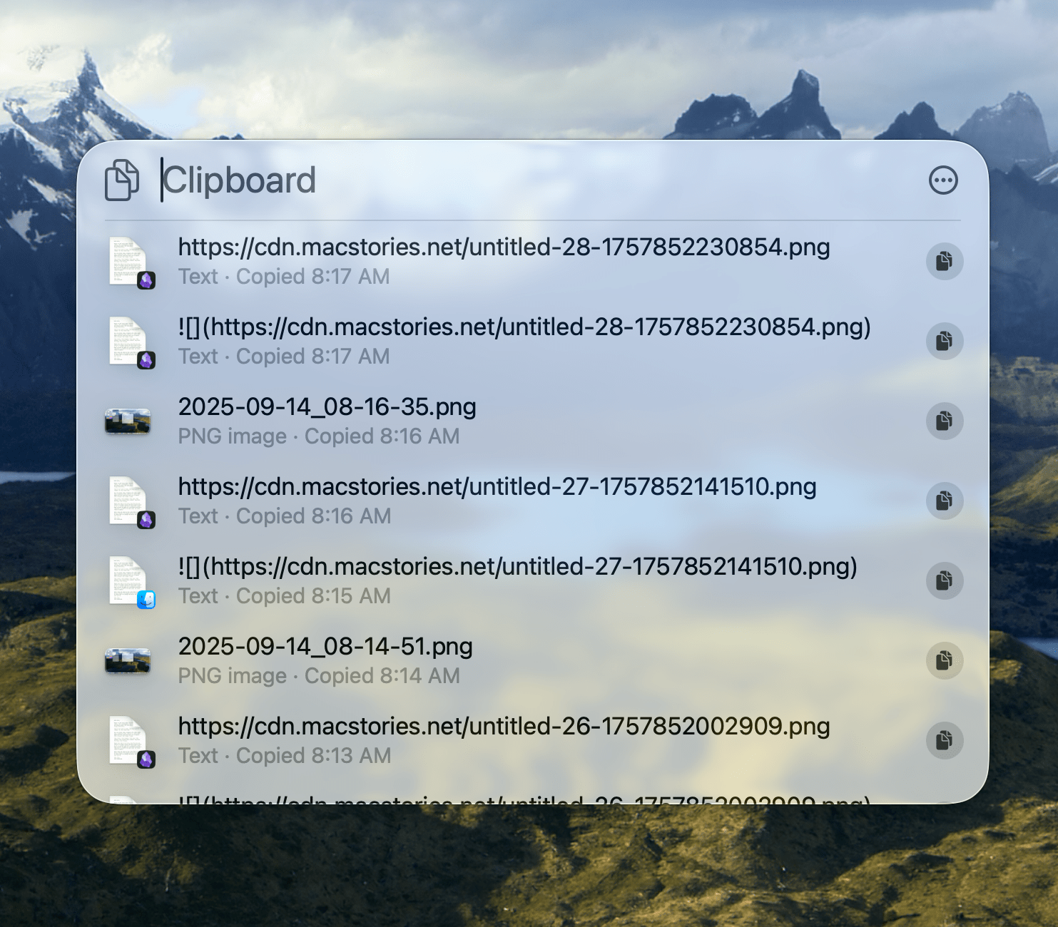
The final section of Spotlight is a clipboard history that aggregates items you’ve copied over the last eight hours. Other apps offer longer windows, but the reality is that, for me at least, I rarely search back further than that, which has been borne out in practice as I’ve used Spotlight this summer. However, Spotlight’s clipboard history doesn’t meet all of my needs. I supplement it with PastePal, which integrates with Shortcuts, allows me to save bits of text and files in categories, and lets me save sequences of clipboard items for quickly pasting into forms and spreadsheets.
You can also access prior Spotlight searches by arrowing up through them in reverse chronological order, and you can use slash commands to narrow searches. For example, when you open the Files tab and start a search with “/pdf”, your search will be limited to PDF documents. This trick works with screenshots, the clipboard, cloud file providers such as Dropbox and Google Drive, GIFs, JPEGs, PNGs, QuickTime videos, folders, and documents, too.
It’s also worth touching on Spotlight’s new settings. In Sequoia, you could exclude categories of items, such as apps, contacts, and various file types, from Spotlight’s index. Tahoe’s Spotlight takes a hybrid approach, giving you the ability to exclude the files generated by individual apps as well as broad system-level categories, including apps, documents, folders, iPhone apps, and menu items. Other new settings include the ability to exclude your clipboard history as well as Internet and services content from results, buttons to clear your search history and reset quick keys, and a toggle to turn off private query sharing with Apple.
It’s rare that a new macOS feature changes a fundamental workflow I’ve relied on for an extended period of time, but Spotlight has done that. I’ve used third-party app launchers from the time I got my first Mac. Until Tahoe, Spotlight just didn’t meet my needs. I’ve historically used launchers first and foremost to open apps, but there have always been other productivity features they offered that kept me from embracing Spotlight.
That’s changed with Tahoe. A big part of it is the inclusion of actions, but the biggest change has been the keyboard-driven approach Apple has taken and the adaptive results. It allows me to move quickly to find relevant information without hunting around in an app. I’ve also found that Spotlight is fast. I’ve tested Tahoe on my M1 Max Mac Studio, and over the course of the betas, Apple has continuously tuned Spotlight to a point where it’s fast and responsive. You will occasionally catch it in the midst of indexing, especially after an OS update, which can affect performance, but I haven’t found that indexing gets in my way as a practical matter.
The bottom line is that Spotlight’s update is fantastic and well worth your time to try.
Live Translation
Apple Intelligence powers an impressive new Live Translation feature found in Messages, Phone, and FaceTime. We’ll have more to say about Live Translation in a separate story, but I wanted to provide a brief overview of how it works and where you can find it.
In Messages, the first time a new language is detected, you’ll get a prompt asking whether you want to translate the message you received. If you indicate you want the message translated, macOS Tahoe will download the relevant language files, which takes a little while depending on your Internet connection. However, the next message you receive will be translated immediately, as will messages you send back.
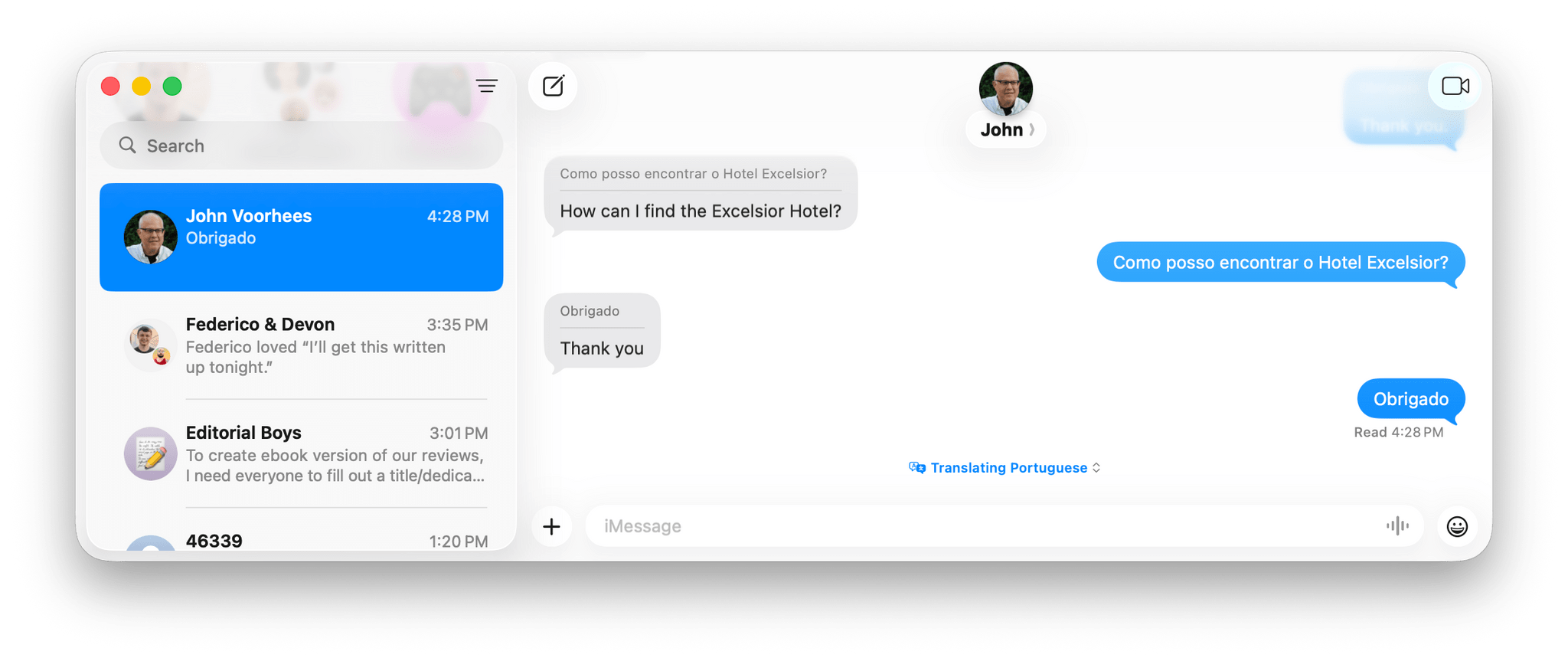
I tested Messages in Portuguese with the help of Google Translate and was impressed with the results. This isn’t a feature I expect to use often, but I appreciate that it’s available and works so well.
Likewise, FaceTime and Phone calls can be translated in real time. In the Phone app, you’ll hear the caller’s speech translated in real time into your language, and if you’re on speakerphone, you’ll see their words on screen in your language, too. The FaceTime experience is similar, with real-time captions appearing on screen in your language as someone speaks to you.
I’m all for anything that helps bring down communication barriers between people. I think my use cases for this feature will be limited, but having played around with it a bit, I’d be perfectly comfortable using it if the need arises in the future.
Apple Intelligence
Before moving on to discuss individual apps, I want to cover the highlights of Apple Intelligence. As it was with Sequoia, Apple Intelligence is sprinkled throughout macOS Tahoe. I’ve already mentioned Apple Intelligence in the context of Live Translation and will touch on it where it’s incorporated in other system apps, but there are a couple of other big-ticket Apple Intelligence features worth calling out here because they’re available in more than one place in Tahoe.
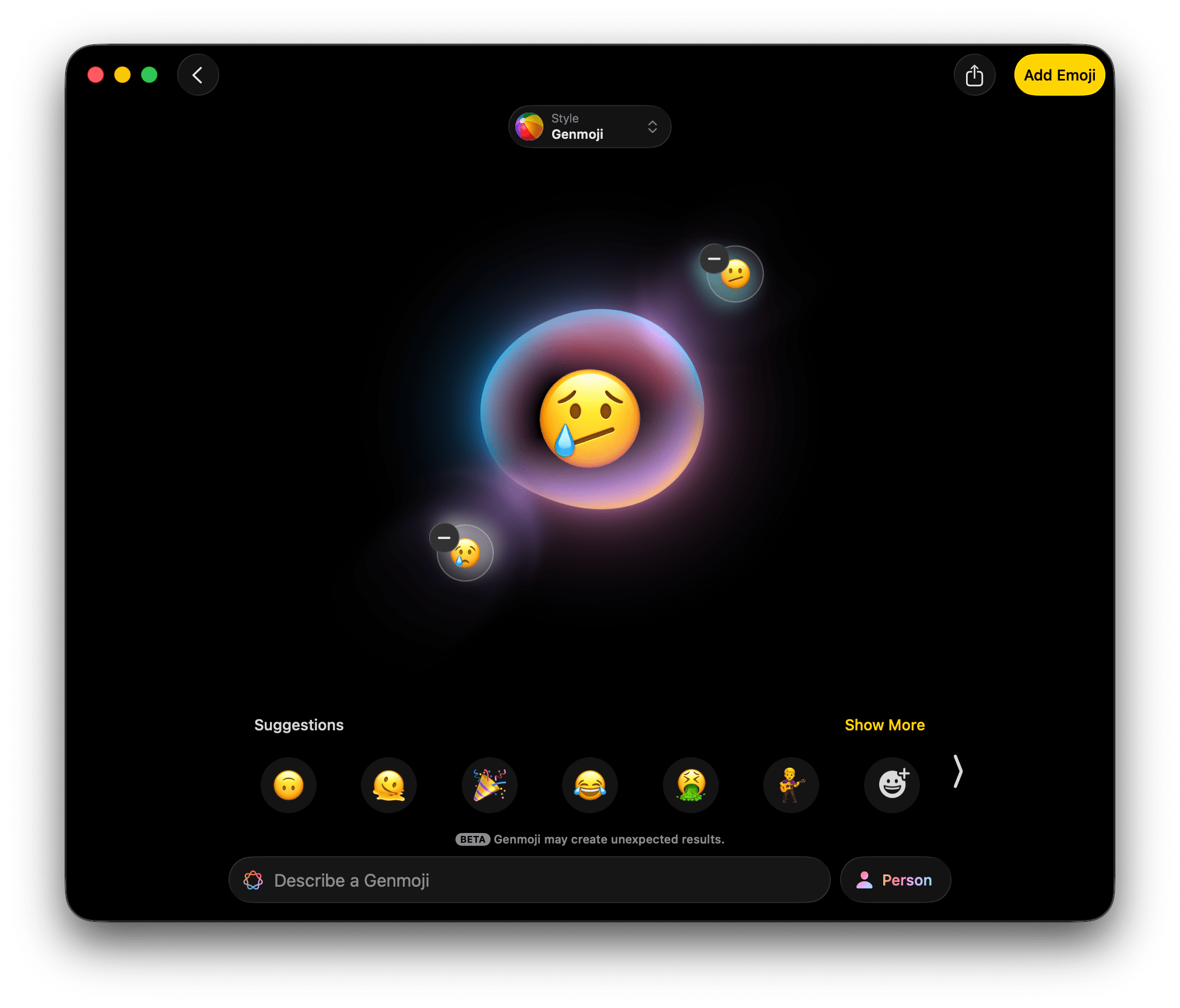
First off is Genmoji. Most readers probably know I’m not a fan of generative image creation. However, probably the least offensive use I’ve seen for it is the new ability to take multiple Apple-designed emoji and combine them to create something new that, more often than not, sort of looks as if it were designed by Apple, or at least someone imitating an Apple designer. That shouldn’t be surprising given that the source material is a set of emoji designed by Apple.
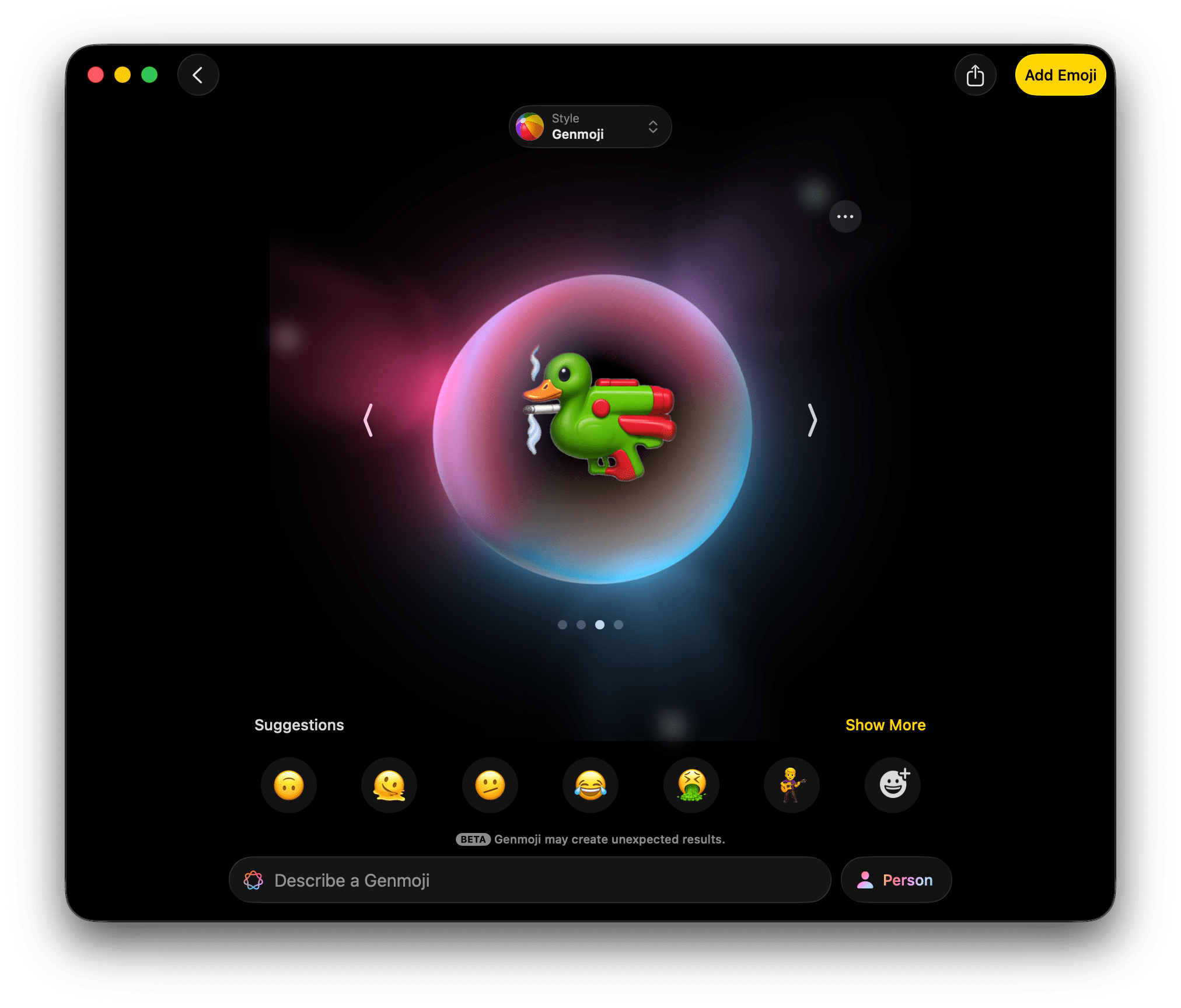
However, unusual combinations of disparate emoji can sometimes lead to unexpected and strange results. Also, some combinations fail occasionally, but it’s not at all clear to me whether that’s because of bugs, system limits, or the model’s guardrails.
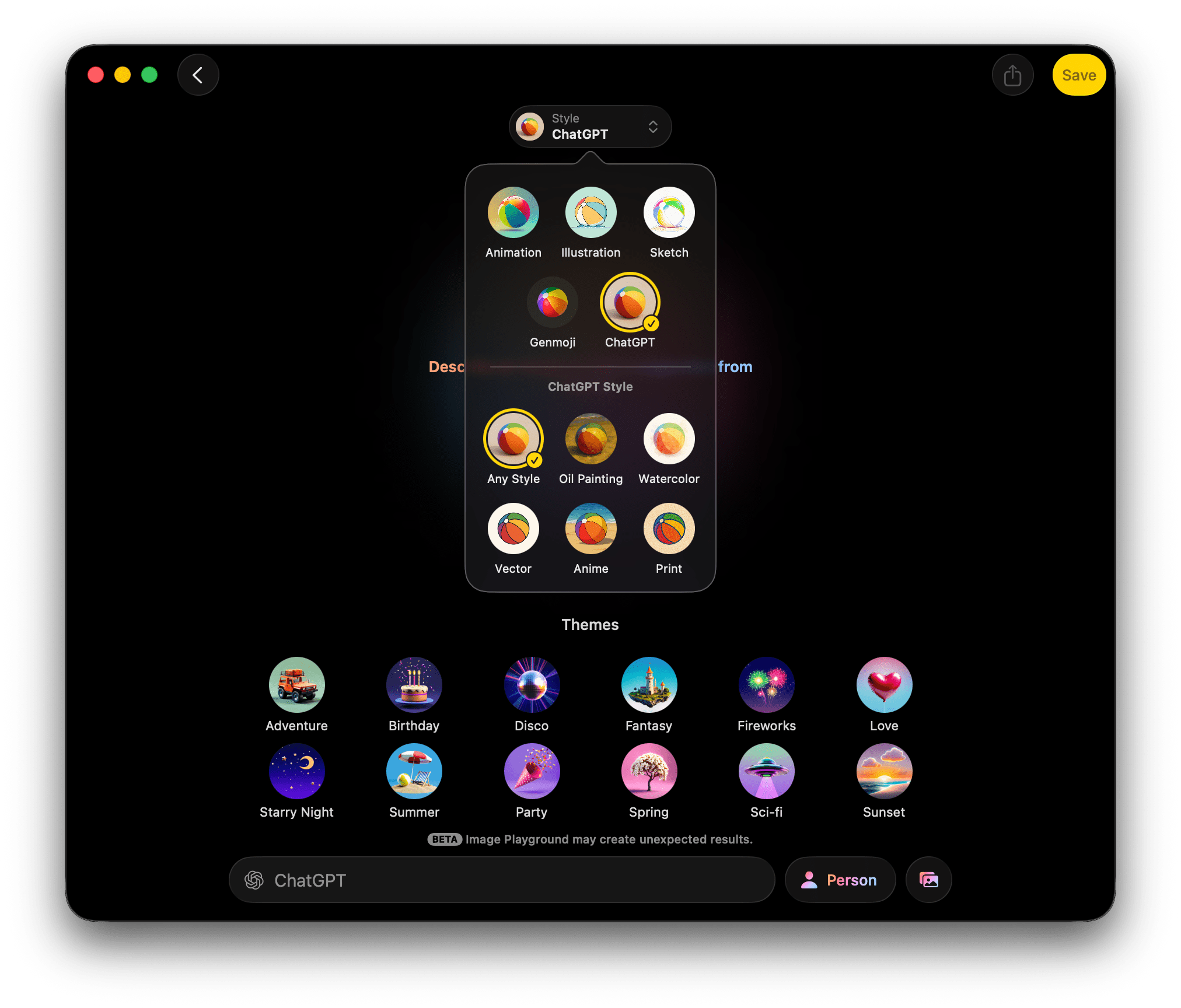
Image Playground has also added new style options thanks to OpenAI. If you click on the ChatGPT style option, you’ll find sub-options for:
- Any Style
- Oil Painting
- Watercolor
- Vector
- Anime
When you pick one of the ChatGPT options, you’ll be asked for permission to send the components of the image you’ve requested to ChatGPT. The generation process for these takes considerably longer than any of the locally generated images that use Apple’s models, which isn’t surprising. You also won’t get the continuously updating carousel of images to pick from that Apple’s models offer, undoubtedly due to the time it takes to generate each image.
As with any generative image tool, the results are often mixed, with the more stylized images evoking fewer creepy uncanny valley vibes. Here are a couple of examples of Federico as an astronaut that he said I could share:

The proportions of the Ticci-naut on the left, which was created with ‘Any Style,’ are all wrong, and the whole thing is creepy, whereas anime Ticci-naut bothers me less, probably because it’s less realistic.
I find the whole realm of image generation distasteful and never use it, but there are more options than before. Putting aside my distaste for a moment, I’d say that ChatGPT’s results are qualitatively better than the ones from Apple’s models, but still not as good as I’ve seen from other generative image tools. As for Apple’s image models, to my eye there’s no qualitative difference between the images that Image Playground produces in Sequoia and Tahoe, which is to say they’re still far behind the generative image tools available elsewhere.