Twitter is back on the Mac with an all-new Catalyst app. Twitter abandoned its Mac app early last year with a late Friday tweet:
https://twitter.com/TwitterSupport/status/964635740444360704
Given the lack of support for the app leading up to that point, Twitter’s actions weren’t surprising. However, that left Mac users with only Twitter’s web app or third-party apps until yesterday, when the company released a Mac Catalyst version of their iPad app.
Twitter’s iPad app isn’t known for a strong design:
Four years have passed since Federico tweeted that and Twitter’s iPad client hasn’t gotten much better, which left me skeptical about what a Mac Catalyst version of Twitter’s app would look like. However, I’ve been pleasantly surprised by how well the port works on the Mac despite some rough edges.
Before going any further, it’s worth noting that if you don’t like Twitter’s app on the iPhone or iPad, you won’t like it on the Mac either. After all, this is a port of Twitter’s iPad app. If you prefer third-party Twitter clients like Twitterrific or Tweetbot, I don’t expect Twitter’s Mac app to change your mind.
However, if the features available in Twitter’s official iOS and iPadOS clients that aren’t available in third-party clients intrigue you, but the lack of a native Mac app was holding you back, the new Mac Catalyst app is worth a look. That’s exactly the situation I’ve been in. I don’t like using Twitter in a web browser, but I’ve been finding myself using the official iOS and iPadOS apps more and more often for features I can’t get in third-party Twitter apps.
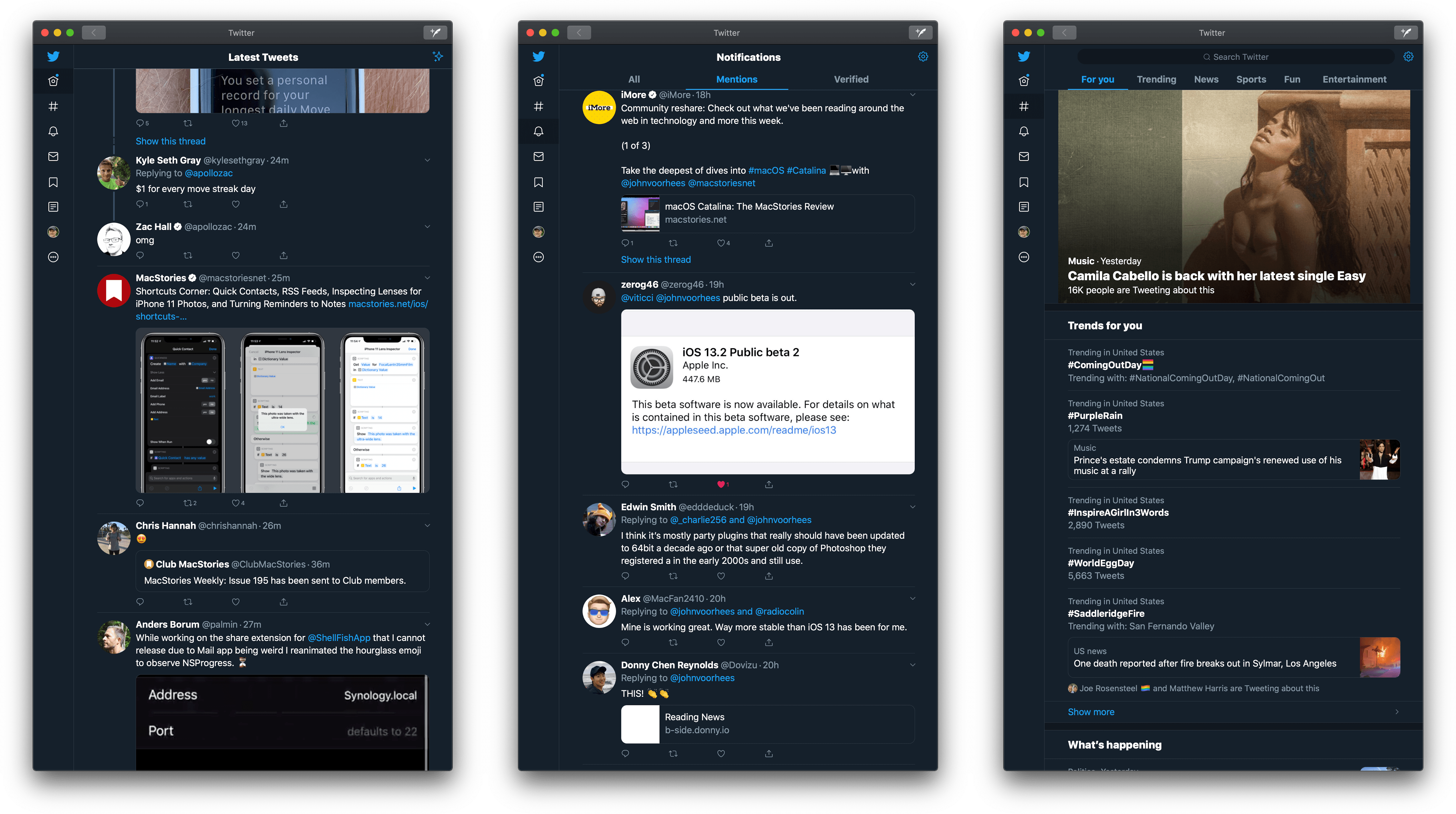
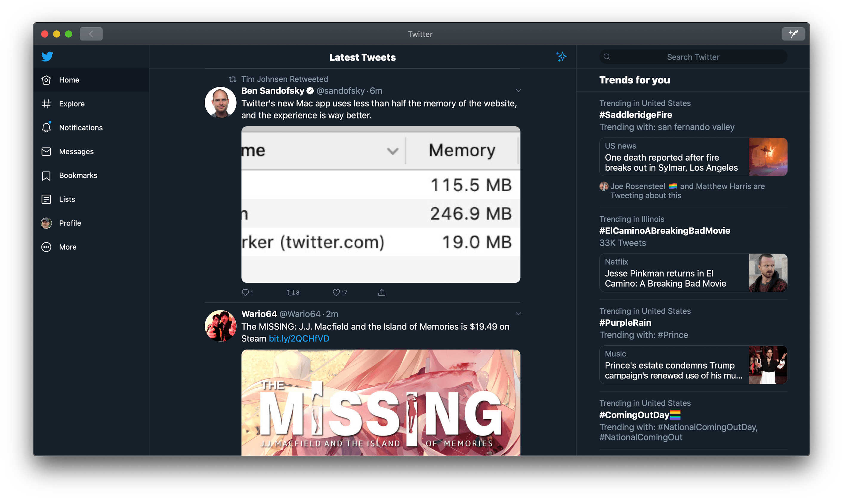
If you compare the new Mac Catalyst app to its iPad counterpart, you can see that this is more than a ‘check-the-box’ Catalyst app. Additional work has been done to lay out elements like the navigational controls and the tweet button in a way that’s unique to the Mac. Twitter has also added extensive keyboard shortcut support and built a standalone preference window, which many other Catalyst apps don’t include. As an added bonus, the app appears to use much less memory than twitter.com according to Halide developer Ben Sandofsky:
That’s not to say that there aren’t rough edges, though. The title bar and toolbar at the top of the window just look wrong stacked on top of each other. There’s plenty of room in the toolbar to fit all the controls, which I think would work better. Here’s an example of how I think it should be handled from LookUp:
There are other issues too. You may have seen this tweet showing what happens when you try to drag the slider in the preference window that controls the text size in the Twitter app:
Preference windows are one of the most lacking aspects of Mac Catalyst apps because not all the standard Mac controls are available to developers. That’s why you see things like iOS toggles instead of checkboxes. I suspect this ‘slider’ is a custom-built control gone wrong, but regardless of the cause, it should be fixed or abandoned for a better approach.
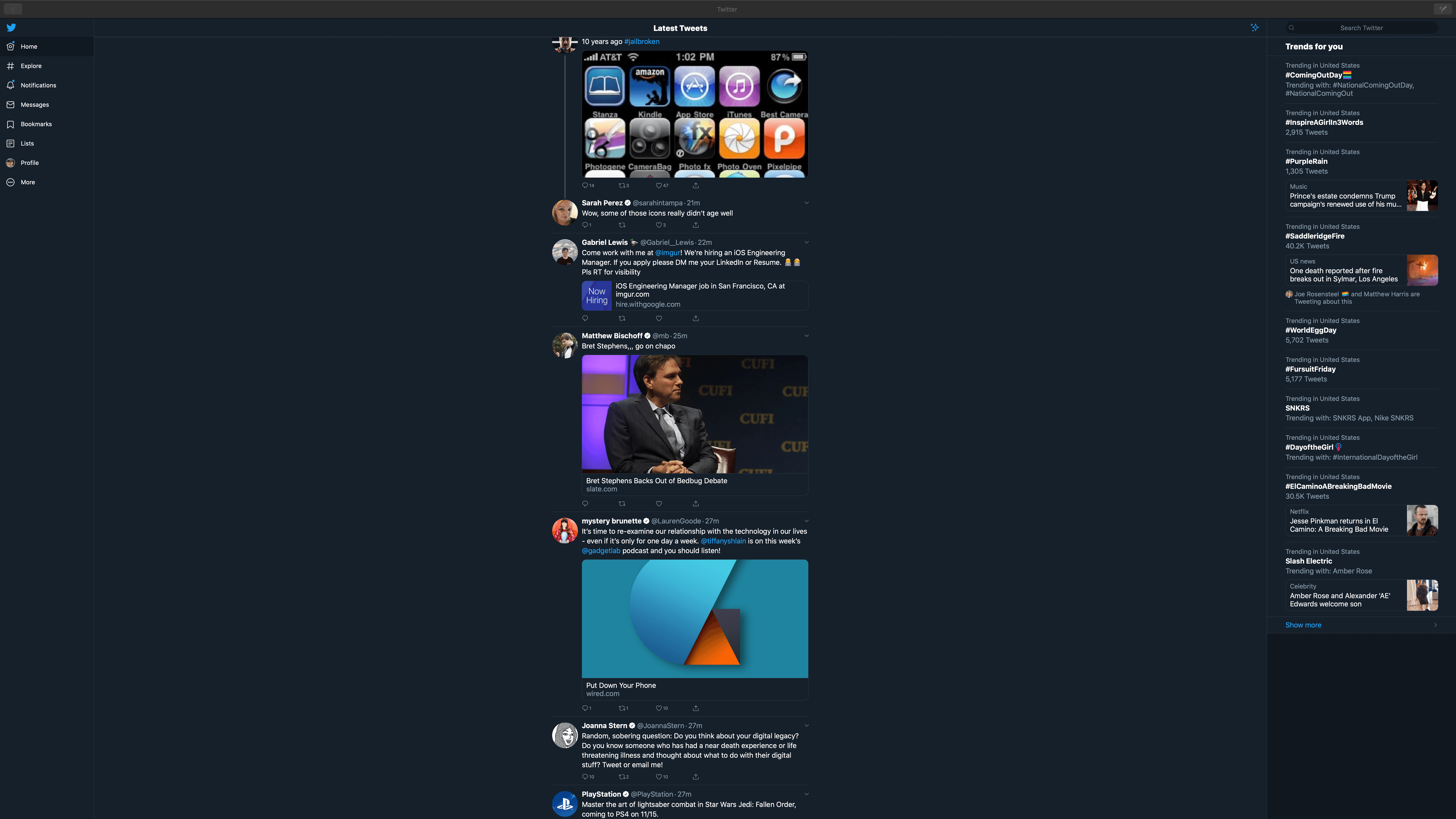
As you expand the width of the Twitter app’s window from a narrow window like the image at the top of this story, a search and trending column appears on the right side of the window, and then the icons on the left expand to include labels. It’s a nice touch that I appreciate because I don’t need the icon labels and don’t use search often. Moreover, I don’t care about the trending section. I can hide those by using a narrow column, but they’re readily available if you use them. What’s not as nice is that those extra elements pop into place in a jarring way that could use some animation.
If you increase the width of the window even further, things start to get weird. You very quickly enter the realm of the iPad app with its spacious margins, but then find yourself in a whole new strange Twitter-verse if you’ve got a large enough display. It’s not a great look, but at the same time, it’s also something completely within the user’s control, so I don’t mind it.
Two other things I’d like to see changed are the way right-clicking works in places. For instance, you can right-click on a tweet to report it or unfollow, mute, or block the user, which is handy. There are also hashtag-specific context menus available via a right-click. However, if you right-click on a link, it opens it in your default browser, which isn’t what Mac users expect. Also, if you right-click on a user name, the ability to right-click disappears from the app entirely, until you quit and restart it. Finally, the app should support trackpad swipe gestures and opening links in the background, which it doesn’t.
Like many Mac Catalyst apps I’ve seen, Twitter’s app has plenty of room for improvement. That said, I prefer it to the company’s web app. Some of the app’s odd behaviors and bugs are fixable now and should be addressed. Other limitations and awkward behaviors are because it’s still early days for Catalyst. Despite its limitations, though, I like Twitter’s Mac app enough that I plan to continue using it to see if it sticks long-term.
In many respects, Twitter is the perfect test case for Catalyst. From its past statements and actions, the company seems primarily focused on its web app. That led to the abandonment of Twitter’s original Mac app. Instead of continuing with a web-only strategy on the Mac or adopting a resource-hungry Electron app, Twitter has taken the native Catalyst route, which is encouraging. Perhaps it’s a big ‘if’ given Twitter’s history, but if the company remains committed to maintaining its Mac Catalyst app, I’m optimistic that the rough edges can be smoothed out, and Mac users will enjoy the same experience as iPad users.
Twitter is available as a free download on the Mac App Store.