This Week's Sponsor:

Textastic

The Powerful Code Editor for iPad and iPhone — Now Free to Try


iStat Menus 4

iStat Menus 4

I often mention iStat Menus by Bjango here on MacStories: it is, in fact, one of my must-have apps for Mac. I have been using version 3.0 for years: iStat Menus 3 provided a complete, yet user-friendly and accessible way to keep an eye on your Mac’s hardware (CPU, fans, GPU, RAM, and so on) and other data (network, time zones, battery status) with a series of dropdown menubar windows.

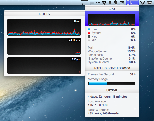
Bjango has now come out with iStat Menus 4, and the new version has some interesting and, for me, welcome changes. Aside from the usual bug fixes, Retina support and better Mountain Lion compatibility, iStat Menus 4 introduces a refreshed look that brings consistency with Bjango’s other iStat app, iStat 2. iStat Menus now features the same style for graphs and charts as iStat 2, and, even better, it comes with the same History menu to view a component’s performance over time. For instance, you can mouse over the CPU’s main graph and check out a second menu with History for the past hour, 24 hours, and 7 days. There are more time-related view options available, and there’s more to customize in the app’s Preferences (which have also been redesigned, and it took me a while to get used to them at first). I appreciate the consistency with iStat 2, and I like History because it lets me easily check my network’s conditions over time.

There are several new features in iStat Menus 4, but I’d like to mention the ones I personally use. The Network widget has a new per-process section to quickly see which process is consuming bandwidth (think a mini version of Little Snitch); the Time widget still supports different time zones (I use this on a daily basis), but it’s now cleaner and it has support for calendar events to get a quick summary of what you need to do on a specific day. It’s no Fantastical, but it’s a nice and unobtrusive addition.

I’m sure there are more powerful ways to check on the status of a Mac’s hardware components and processes. But I just need to see “what’s going on”, and in that regard iStat Menus 4 fits perfectly with my needs. iStat Menus is $16 on Bjango’s website.

Permalink

Fantastical for iPhone Review

I wouldn’t call myself a calendar power-user.

Ever since I started organizing the things I have to do with a system I can trust, I’ve faced a workflow conundrum: is this a task or a calendar event?

I know that there’s a difference between so-called “actionable items” and time-based events. Maybe I’m not hooked up right, but I’ve been looking for a way to immediately visualize, in a single interface, all the things that I have to do on a specific day. Independently from their actionable (“you need to do this”) or time-based (“you need to be here”) status, I want a software that, like a personal assistant, tells me exactly what I need to get done.

I have found such system in displaying my OmniFocus items inside my calendar. And now, the system has been enriched by the addition of Fantastical for iPhone.

I’ve been a fan of Fantastical for Mac since I first tried it in May 2011. Replacing iCal’s overly complicated interface with a simple menubar overview of your upcoming events, not only did Fantastical show that a simpler way to access your calendar was possible, it also profoundly changed the third-party OS X development scene with its use of natural language input. Futuristic as a concept, in practice Flexibits managed to bundle a powerful language parser within Fantastical that would recognize commands like “Coffee with Chris tomorrow from 6 to 7” and deconstruct them as specific values for a calendar event. It’s not a fancy gimmick: rather than clicking buttons and menus, I constantly find myself invoking Fantastical on a daily basis, typing away like I’d normally do in a blog post or note, saving events in just a few seconds.

Fantastical is one of my must-have apps for OS X. But how could Flexibits ensure its soul wouldn’t get lost in the transition to iOS? Read more


Expedia 2.0

Expedia 2.0

Sometimes innovation comes from unexpected places. Personally, I wouldn’t have thought Expedia would turn out to be one of the most well-designed, innovative, and fun apps I’ve tried on iOS lately. But it is. Released two weeks ago, Expedia 2.0 is a universal app developed by Mobiata, and it is an example of how a hotel-booking application should scale elegantly across different displays without providing a confusing and frustrating experience (a common thread of hotel-booking apps and software).

On the iPhone, the app starts with a gorgeous mosaic of deals for hotel rooms and flights. Photos are nice and compatible with the Retina display, and even the loading indicator has been designed with a hotel theme in mind: for flight search, the same indicator changes to another design, but I won’t spoil it here. Once you tap on a hotel, information is laid out elegantly with swipable galleries, green-colored icons for services offered by the hotel (WiFi, parking, etc), price tags, and an embedded Maps view. You can check out reviews, change the number of people requesting a room, and tweak the duration of your stay with a custom date picker that allows you to select multiple days with a single swipe. On the iPad, the same information is conveyed with a “stacked panel” UI that lets you switch at any time between map view and hotel information.

For flight search, the app is possibly even more pleasant to use. With blurred backgrounds and an Apple Store-like menu that progressively collapses as you confirm your choices, Mobiata managed to make the purchasing experience incredibly natural and good-looking in spite of the amount of data they need to present to the user.

The Expedia app is full of nice touches and details. Even if you’re not interested in hotel or flight booking, you should check it out for its design choices and interaction patterns. Free on the App Store.

Permalink


Home Automation With An iPad

Home Automation With An iPad

Here’s another interesting use case for my ongoing coverage of Pythonista. From the Pythonista Community Forums, user nlecaude shares a script and a demo video showing how he managed to control the lights in his house using Pythonista (thanks, Gabe).

The Pythonista app is pretty simple, it’s basically crossfading between different images to show the current state of the lights. I have one layer for each state (3 lights so 2^3) and I have invisible layers that I use as buttons to trigger the lamps and transition on and off. I’m quite fascinated by the possibilities of Pythonista.

If you watch the video below, it basically looks like magic. This guy is tapping on a photo of his room on an iPad to turn the actual lights on and off. In practice, he’s using a Python library to control a Philips Hue system that reacts to touch input from Pythonista.

For those unaware of Philips’ product, Hue is a personal wireless lightning system that can be remotely controlled and programmed to offer different lightning settings and color combinations for every occasion. Philips isn’t offering an SDK for developers yet, but the Python library manages to directly connect to the Hue wireless bridge and send input commands.

As nlecaude writes, this is just a script put together in 10 minutes with an unofficial library. The possibilities for home automation programmed from an iPad are seriously intriguing.

Permalink

PodGrasp, A Podcast App For OS X

PodGrasp, A Podcast App For OS X

Jonathan Poritsky has posted a review of PodGrasp, a new podcatcher for OS X:

All of that said though, PodGrasp is currently the best option available on the Mac App Store for desktop podcast management. It will only get better and it truly is an incredible start, especially considering there is almost no competition for this right now. Go get it so Gary Hughes, PodGrasp’s developer, can make it even better. His FAQ says an iPhone app is planned as well, so it’s not like he’s gonna take your Washingtons and run.

The lack of good podcast apps for OS X has consistently surprised me. Just a few weeks ago I tweeted about the subject, and proposed a possible API to figure out the (trickier than Twitter timelines) problem of syncing podcasts across platforms and devices.

But things are changing. Aside from PodGrasp, which I’ll make sure to try out, Instacast’s developer Martin Hering announced this morning that he’s working on a Mac version of Instacast. I have been trying the new Instacast for iOS, and it’s a solid update with new functionalities that I like; furthermore, it has a custom sync architecture that – unsurprisingly – works much better than the former iCloud sync. I’m looking forward to his Mac app.

In the meantime, to make sure I can listen to podcasts with my Mac’s speakers while using a podcast app I like, I have been using AirPlay with Reflection to get the job done.

Permalink

The (Un)Obviousness of iCloud

The (Un)Obviousness of iCloud

Chris Bowler writes (via Shawn Blanc) about his slow yet inexorable migration to iCloud:

And so it has gone with iCloud overall. I never really set out to use it to its fullness, but it has become integral to my computing experience. It should have been an obvious transition, but instead it was subtle. This past year came with migrations to two new laptops. The ease of setting up each blew me away both times. The combination of Dropbox (my data), Rdio (my music) and iCloud (preferences, OS X integrations, applications and everything else) is a powerful one and a testament to the time we live in.

I have previously written about how, for the end user, iCloud may as well look like “the operating system”.

When I think about it, I’m thankful for the kind of integration that iCloud provides. I use Calendar, Safari Tabs, and Find My iPhone on a regular basis and I enjoy their functionality. On the other hand, I’m less excited about iCloud Mail and its continuous downtimes, and I understand third-party developers who lament the poor state of iCloud sync and APIs for their apps.

Major shifts like iCloud take time. When you consider that Apple hasn’t traditionally been great at web services, what they have managed to make work reliably is quite a remarkable achievement. Yet, like Maps, average users don’t care about this: they just want their devices to work. And if Apple gave them iCloud, then Apple needs to make sure users can trust it.

As an aside, I’d point out that several friends of mine constantly ask me about iCloud – the things it does and what it is. Maybe my friends are lazy, but I’d go all the way out to guess perhaps Apple needs to tweak the initial guided setup to make iCloud even more understandable. I’ve always thought the short trackpad videos Apple embeds in OS X are nice and effective because they show features in context. Rather than using an animated cloud, short videos and actual screenshots would be a nice addition to iOS’ first setup guide.

Permalink

Rdio 2.0

Today, Rdio showed Spotify how to make a modern iOS client for a music streaming service.

I’ve been a Rdio user for over a year now. As I’ve previously written, tweeted, and discussed on various podcast appearances (including one on Generational that will be posted next week) I was a Spotify fan for years. At some point, however, I realized that the playlist-based nature of the service wasn’t working for me, and I switched to Rdio, a competing music streaming service that, like Spotify, lets you listen to a huge catalog of music for a monthly fee.

The distinction between a playlist-based user experience and being able to organize my music in a Collection with albums, songs, and artists made all the difference for me. I don’t like Spotify’s approach to forcing the listener to organize music in a playlist. A group of albums isn’t a playlist: it’s a collection. Read more


Scan 2.0: QR Codes and Beyond

Scan 2.0 app icon

Scan 2.0 app icon

I’ve certainly seen my fair share of complaints on Twitter, but QR Codes have their place. It’s unnecessary in advertising and definitely silly on T-Shirts, but I’ve found QR Codes save me heaps of time for things like importing contact information from business cards. Like it or not, these bit-by-bit squares of data are likely here to stay.

The QR Code itself necessarily isn’t the problem. It’s convenient shorthand for linking something physical to something digital. (I’d rather scan than open a web browser and type in a short URL.) The biggest point of friction, in my opinion, is the tool used to scan these codes. Likely, it’s an app on a smartphone. As I’ve said before, these scanners need to be effortless to use. Results have to be instant.

A row of iPhones displaying different Scan screenshots

A row of iPhones displaying different Scan screenshots

Last August, Scan earned my pick as the App Store’s best scanner. Over a year later, I’ll say it still holds that title. Starting with a remarkably easy to use iOS app, Scan is now a complete web service. Scan offers businesses a way to generate and manage codes and get analytics. QR Codes can be generated that instantly Like something on Facebook or Follow a business on Twitter (with your permission of course). And Scan makes available Scan Pages, which hosts a short bio and links to your various online profiles. For the rest of us, Scan’s app alone fulfills the simple role of getting scanning codes quickly. No longer just a simple scanner, Scan is a complete service that goes beyond the QR Code. There’s something for everyone.

Read more