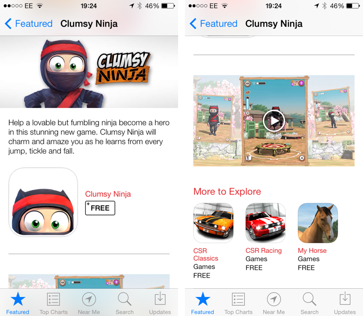
Apple is featuring Clumsy Ninja, an iOS game that was first announced at the iPhone 5 keynote in 2012, with a custom page on the App Store that, alongside a description, features a 1-minute trailer for the game. The custom “Featured” page is live on the UK App Store at the moment and it features Clumsy Ninja as Editor’s Choice for the week; it’s likely that the game will also be featured on the US App Store and other international stores later today.
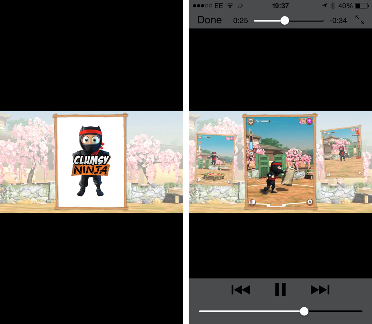
The big news is, of course, the fact that Apple is embedding a video in the App Store, which has historically only allowed developers to include up to five static screenshots for their apps. Clumsy Ninja’s video opens the built-in iOS media player in portrait mode, and it features music playing in the background with no voiceover or custom App Store branding. It is, effectively, a game trailer on the App Store; right now, it’s only available in the special Featured page for the app, as the app’s regular App Store page doesn’t show the trailer.
The possibility of including videos alongside screenshots on the App Store has long been one of the most requested features by third-party developers who, over the years, have struggled to explain App Store customers the purpose of their app or game with just text and images. With iOS 7’s focus on motion and animations, the lack of videos on the App Store was particularly surprising, and it led many to wonder as to whether Apple would soon add support for videos besides screenshots. When iOS 7 was first announced in June, even Apple produced a series of short videos for the OS’ official website, where they showcased the new features and design through animations and quick demonstrations of Messages and other apps.
It’s unclear at this point if Clumsy Ninja will remain an isolated case or become the norm for the App Store going forward. It’s also not clear whether any developer will be able to add a video for their app on the App Store, or if trailers will be limited to Editor’s Choice and managed by Apple’s curation team on a weekly basis. Developers have traditionally resorted to creating videos and screencasts of their apps for their websites or YouTube channels, and an integrated solution available in the App Store alongside screenshots, description, and buy buttons would be a fantastic addition to better illustrate an app’s feature set, flow, and user experience.