Apple Posts New Ad Shot Entirely on iPhones, Edited on Macs

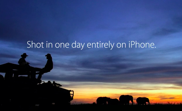
To further commemorate the 30th anniversary of the introduction of the original Macintosh on January 24, 1984, Apple has published a new ad shot entirely with iPhones on a single day in 15 different locations around the world. The creative production of the ad was overseen by Jake Scott, son of Ridley Scott, who directed the iconic 1984 commercial. On January 24, 2014, iPhone-equipped crews sent by Apple to 15 separate locations started uploading raw footage to a server in the United States, where Angus Wall and a team of 21 editors could edit using Macs.

Apple’s new commercial doesn’t only focus on Macs – while they’re prominently displayed, Apple highlights how the impact of the Mac has changed the computer industry, leading to the creation of the iPhone, iPod touch, and iPad. All Apple products are shown in the ad: there’s a father making breakfast for his son using an app to control his prosthetic hands; a conductor analyzing musicians’ performance with a Mac; kids using iPads at school, and more.

From sunrise in Melbourne to nightfall in Los Angeles, they documented people doing amazing things with Apple products. They shot over 70 hours of footage — all with the iPhone 5s. Then it was edited and scored with an original soundtrack. Thanks to the power of the Mac and the innovations it has inspired, an effort that normally takes months was accomplished in a matter of days.

In one day, Apple received footage for 45 stories from 15 locations spanning multiple timezones, which required 36 hours of productions in Los Angeles; Apple used 100 iPhones to shoot over 70 hours of footage. As Apple notes, “initially, the team of cinematographers thought they would need lots of professional equipment and software”, but in the end only iPhones with “additional equipment” were used.

Even more impressively, Apple notes that Jake Scott and his team transformed a sound stage in Los Angeles to oversee production remotely using Macs, iPads, and external displays. Scott could direct cinematographers remotely with FaceTime (as shown by Apple, a second iPhone followed each shooting session for real-time feedback) and have an instant overview of footage coming from around the world.

In order to direct 15 separate locations filming in a single day, Jake Scott transformed a sound stage in Los Angeles into a command center. He equipped it with an arsenal of Apple products including iMac, Mac Pro, and iPad, along with large projection displays positioned around the room. From there he was able to watch every scene as it was shot, and direct all the action remotely via FaceTime. Many involved in the production believe this innovative approach to a multilocation shoot will be adopted by other filmmakers.

Today’s commercial is the culmination of Apple’s efforts to communicate the importance of the Mac and the stories of people who use Apple devices. Today’s message, unlike the dedicated Mac webpage, isn’t about the Macintosh per se, but the ecosystem of Apple products that it helped creating.

You can watch the commercial below. Read more


Pedometer++ 2.0

David Smith’s step counter for the iPhone 5s started as a simple experiment but turned into a quite popular utility. Today David has released version 2.0 of the app, which comes with a nice visual update that lets you see a week’s worth of data with a clever use of color. I think that the new UI is much better than before, and I really like how the M7 is allowing developers to build new apps like Pedometer++.

My problem is that I feel guilty whenever I open Pedometer++. I mentioned this on the latest episode of The Prompt, and David is aware of it.

This app has generated more guilt than anything else I’ve ever created. I am constantly hearing from people who say that they open the app and are shocked at how little they actually move in a day. I know for myself it wasn’t until I actually measured it that I realized how sedentary my life was. It is sobering to see that you only took 2,000 steps in a day and realize just how unhealthy that likely is.

Pedometer++ 2.0 is free on the App Store.

Permalink

The Prompt: A Formal Dinner For Business

This week, Federico, Myke and Stephen discuss “paymium” apps and what happens when tech products become fashion accessories.

I had a lot of fun doing research for this week’s fashion topic, which is difficult to talk about because it’s not something that is usually discussed alongside tech gadgets and apps. I expect to revisit it later this year as rumors of an Apple wearable device will inevitably intensify.

Get the episode here.

Permalink

Rymdkapsel Now on Mac and PC

There aren’t too many games that get my attention, but rymdkapsel was one of them. It was the right kind of addicting eerie fortress defense meets Tetris meets what-are-these-monoliths that brought something unique and different to the touchscreen. The game’s back, now available on Mac, PC, Linux, through Steam or the rymdkapsel page.

The desktop edition of the game includes new game modes: Plus mode features four new mysterious monoliths to unlock, and Zen mode removes the invading space aliens from the game for a meditative experience.

A special Monolith edition of the game is exclusively available from the developer, and includes DRM free versions of the game for all desktop platforms, a Steam code, the original Android version of the game, a complete 45 minute soundtrack, ringtones, and a bonus game for the PC (Windows) version.

Rymdkapsel is available for $7.99 through the Humble Store and on Steam. The Monolith edition of the game is $11.99 and exclusively available on the Humble Store. You can also get the soundtrack separately on Bandcamp for €4.


Working with Evernote for iOS 7

Evernote 7.3

Evernote 7.3

When Evernote for iOS 7 was released in September, the app received a fair amount of criticism: the company had once again completely redesigned the app after users were still learning their way around the previous major redesign, there were bugs with sync and the note editor, plus several other minor issues that, together, didn’t provide a smooth upgade experience. Evernote listened and started working on iOS updates aimed at fixing problems reported by the userbase, which had resulted in low ratings on the App Store.

A few weeks ago, an article by Jason Kincaid highlighted some of the troubles he had with the Evernote apps, which prompted CEO Phil Libin to publicly address his complaints and, in the process, commit to making 2014 the year of prioritizing fixes and improvements to the existing Evernote experience instead of more complete redesigns and big feature additions. In January alone, Evernote has completed the transition to a new sync infrastructure that made sync four times faster for all users, and, today, released version 7.3 of the iOS app, which I believe shows a good thinking process by Evernote.

Read more


A Look at SwiftKey Note

Third party keyboards have been showing up on iOS, not as system replacements, but as individual apps that aim to provide an alternative to Apple’s standard keyboard. Keyboard replacements on Android, and apps on iOS like Fleksy, aim to either provide an alternate method of inputting characters (such as swiping over characters with your finger) or predict what you’re going to say next.

Apple’s keyboard for iOS is good, but not great. Auto-Correct doesn’t provide the right balance of letting me decide what I want to say[1] without disabling it completely, and popovers dismiss corrections rather than select them. Apple’s keyboard feels counterintuitive, and dare I say Apple’s smaller displays don’t lend themselves well to cramped keyboards[2] with buttons for dictation and international keyboards.

SwiftKey Note doesn’t replace Apple’s keyboard layout, but it does attempt to improve upon automatic corrections while offering easy-to-tap suggestions as you type. Does it hit the ball out of the park? Not completely, but it’s decent and for the most part has better suggestions than Apple.

Read more


Launch Center Pro for iPad Review

Launch Center Pro

Launch Center Pro

Contrast’s Launch Center Pro, the app that started the small revolution of iOS automation in June 2012, arrives today on the iPad with a new version (sold separately at $4.99) that takes everything you know about Launch Center Pro for iPhone and scales it up to the bigger screen. Launch Center Pro for iPad doesn’t do anything dramatically different from its iPhone counterpart: you can create custom actions, play around with Dropbox and clipboard integration, and do all the things that were possible in Launch Center Pro 2.1 – only now on your iPad too.

Finally.

Read more


Facebook Paper

Today, Facebook has announced Paper, a dedicated iPhone app to “explore and share stories” through Facebook. The app is coming out on February 3, and it takes a photo-centric approach at, essentially, displaying updates from your News Feed alongside “stories” (i.e. links and photos) recommended by a new curation team inside Facebook. The app uses full-screen, edge-to-edge layouts, relies on gestures for navigation, and it’s highly reminiscent of Flipboard for iPhone, both in terms of basic principles (status updates intermixed with news content) and the gesture to open and close “stories” (watch the promo video, and you’ll see).

I’ll save thoughts on the motivation and execution for the future, but, today, I’m skeptical. Facebook has a history of standalone apps that provided better, more elegant functionality than the main iPhone client (like Facebook Camera) which haven’t received enough attention. Aside from the name (this isn’t going to be awkward at all) and Flipboard-esque layout, I feel a disconnect. This app looks too beautiful for the kind of content that is shared on Facebook. Looking through my News Feed on a daily basis, what I see isn’t the hip mix of beautiful landscapes and inspiring moments that Facebook is advertising, but a chaotic mess of drunk selfies, memes, clubbing photos, and low-quality pictures of dinners or other family events. There is the occasional gorgeous photos, but does that justify a standalone, magazine-like approach to News Feed content?

What I’ve seen so far reminds me a lot of the beautiful News Feed that Facebook announced and never really shipped to users. A great idea in theory…which most people’s News Feeds don’t deserve. Of course, this time it may be different: Paper’s team includes Mike Matas (you can see some Push Pop Press influences in the video) and, according to The Verge, Loren Brichter contributed to the development. Facebook’s mobile numbers are growing, and perhaps the company needs to give its teams the ability to try new things that will eventually trickle down to the main experience (case in point: features of Facebook Camera later ported to the Facebook app).

I’m curious because a) I want to study the design/interaction approach taken by Matas and team and b) it appears you’ll be able to ignore status updates and browse only headlines by sources you follow or recommended by Facebook. Curation matters, and it’ll be interesting to see if and how Facebook will mix top publications with smaller independent authors. The focus on tackling “storytelling” by many companies lately is also a trend to keep an eye on, although I wonder if Paper can really become “Facebook 2.0” or “a reimagination of Facebook”.

Permalink