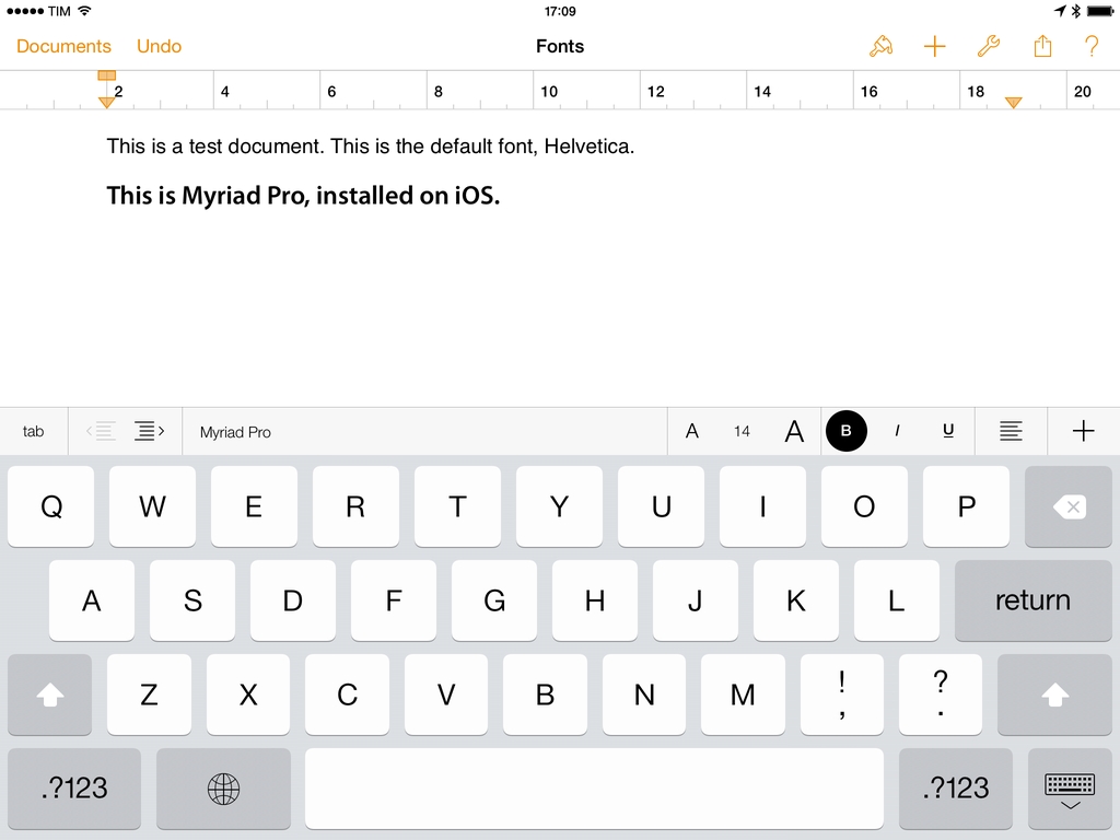
Indiegogo: Canary is Your Connected Home Security Camera

Home security systems have a reputation for being a hassle to install, difficult to use, and expensive to boot. Instead of entrusting a company to monitor you home for a monthly fee, what if you could monitor your home yourself?

Canary is personal monitoring device with a focus on home security. Not dissimilar from a modern baby monitor, Canary uses its widescreen HD camera and microphone to keep an eye on your home. Combined with night vision, motion detection, and smartphone alerts, Canary quickly becomes an inexpensive tool for apartment dwellers or renters. The monitoring device also includes some sensors for monitoring temperature, air quality, and humidity, which could be useful for determining whether a fire has broke out in your home.

What makes Canary unique is how it informs you of changes in your homes environment. Notifications will inform you of movement in your home, letting you then sound an alarm and call 911. It can also send notifications for sudden changes, like if hears audio when nobody is normally home or if the temperature suddenly drops. Kind of like the Nest, Canary is supposed to build a profile that knows when you’re home and when you’re not, and can use the iPhone’s geofencing features to automatically enable and disable Canary as you leave and enter your home.

I think the main thing that people like about security systems is that they feel like they’re a deterrent. Doors beep when people enter and leave the home and the house alarm will sound if a someone intrudes while you’re away, hopefully letting the neighbors know something isn’t right. There’s also all sorts of sensors that can detect when a window is broken for example. For people who want full home security, Canary won’t offer that kind of stuff. You can, however, connect multiple Canary monitors together if you want more coverage. The current suggestion is to put Canary in a place that covers the most entrances or where multiple places converge. For people who don’t have the option of installing a traditional alarm in their condos or apartments, I think Canary covers all the right bases in a compact device. You simply buy the device and there are no subscription fees to use the app and its monitoring service. For people who want more, Canary will offer that down the road.

Canary does away with keypads and codes, turning a smart camera and a plethora of sensors into an IFTTT like service that engages when you go to work or head out to take care of errands. It’s available to pre-order for $199 in white or $249 in black or silver. The campaign has already raised $146,284 in contributions, already ahead of the $100,000 goal. Learn more and contribute here.


Bugshot 1.1

In my review of Bugshot 1.0, I mentioned the app’s poor scrolling on iOS 6 devices and lack of Open In menu to send annotated images to other apps.

Version 1.1 is out today on the App Store, and it brings performance improvements, Open In support, and a Blur tool to pixelate sensitive information. I didn’t think about a Blur tool when I first covered the app, but it is indeed a great addition to Bugshot (with a cool implementation).

Bugshot is $0.99 on the App Store.

Permalink

Comparing T-Mobile’s, AT&T’s, and Verizon’s Early Upgrade Plans

Dante D’Orazio of The Verge compares the Jump, Next, and Edge plans across the United States’ three biggest carriers. The costs of these plans are broken down into tidy charts that explain what’s happening when you opt into these plans.

T-Mobile’s made a lot of news lately thanks to their outspoken CEO and marketing campaigns around becoming the “un-carrier.” T-Mobile’s greatest strength is that they have the most transparent plans in the industry and flexible options for those who bring their own phones to the carrier. Last week T-Mobile announced Jump, a plan that’s supposed to help people upgrade to a new phone earlier. AT&T and Verizon followed with Next and Edge, but their plans aren’t really that good of a deal. Dante has a couple breakdowns for those who want to upgrade every year and every six months. T-Mobile has the most affordable plans, but in the end none of them are that great.

Ultimately, most everyone is better served by sticking with their traditional cell phone plan and buying a phone at full cost when you can’t take that old smartphone any longer. It’s best, then, to think of these “upgrade plans” as extended payment plans that take advantage of customers who want the newest phones and want to pay little up-front by charging them massive fees as the months roll by. No deal.

I don’t think these plans are necessarily geniune attempts to help customers who want to upgrade early, but they do at least ease the pain of upgrading. Maybe people might find it easier to break up the cost of their next phone into chunks rather than paying for an expensive phone outright. Personally I’d rather just budget and buy the phone if I really wanted to do this, selling the old one afterwards, even though it’d be a bit of a hassle.

And these plans definitely make more sense for those who want the latest Android phones, since iPhones are (so far) on an iterative update cycle with major updates occurring every two years. For the iPhone it’s not the next phone that’s substantially better than the one you have now, it’s the one after that. If you have the iPhone 5 you’ll want next year’s. If you have the 4S you’ll want this year’s. Etc. etc. Things could change, but I think in the United States, the two year contract cycle is the way to go for most people. Today’s phones are powerful enough that the latest can stay relevant for a long time. You couldn’t say that in 2010, but you can say that now if you’re buying a flagship phone.

Permalink


On The Surface RT and Impatience

Nick Bilton of the New York Times writes:

Today’s consumers don’t want options. They are impatient. They want to tear their new shiny gadget from the box and immediately start using it. They don’t have time to think about SD cards or USB drives or pens or flip stands.

The surface RT didn’t allow that. Customers had to think about it.

The Surface RT had a lot of things that didn’t bode well for it. For one the name. The other was Windows RT, which I think is an even better example of what Nick Bilton is describing as far as options go.

I don’t think the Surface’s hardware ever really got in the way. An SD card slot or an available USB port don’t really interfere with what someone will do with a tablet. The kickstand and keyboard accessories are sort of the Surface’s cherry on top. The things that the Surface has on the hardware side are incentives. But I think Windows RT itself wasn’t what customers were looking for in a tablet.

On top of good hardware is an operating system that’s buggy and clumsy, getting in the way of the things people want to do. Windows RT is this cut down version of Windows that doesn’t let you install traditional desktop applications and wasn’t completely optimized for your fingers, and I think customers got fed up with this idea relatively quickly. I get what Microsoft is aiming for, the idea that you can have a tablet for both work and play that gives you a lot of choice in how you use it, but that point didn’t come across in their marketing and Microsoft’s implementation of it (like switching to the Desktop through a tile) ended up confusing people.

Microsoft said, “You can have the best of both worlds!” The result is a product that sends mixed messages about what it wants to do and what it’s really capable of. Surface RT feels like a product that had to hit some arbitrary deadline, was then rushed onto store shelves, and it shows.

The Surface RT doesn’t solve any pain points, which is the kicker. Things like the iPad take away a lot of the stuff that people don’t like about computers. People use their iPads because it instantly turns on, has great battery life, and doesn’t behave like a traditional computer. People generally don’t have to worry about maintaining their iPads. You don’t have to restart it to install updates every week, download the latest virus definitions, or run a cleaner to magically improve the computer’s performance. It’s a worry free device. The Surface RT was supposed to be Microsoft’s answer to these things — a product that sheds all of the legacy components Windows held onto for so long that would make the computer safer and easier to use — but ultimately Microsoft decided people wanted their desktops on their tablets so they could use Office, forgetting that that’s the thing people wanted to get away from. The irony is that the tablet that was supposed to offer more choice than the iPad ended being the compromised experience. That’s why it failed.

Permalink

QuickRadar for Apple Radar

Since iOS 7’s release, I have been submitting entries to Apple’s Radar, the company’s bug tracking system. The problem with Radar is that, for some reason, it comes with an outdated and slow interface that’s prone to errors and random logouts, making the process of filing radars tedious and unpleasant. A number of apps to “fix” Radar have surfaced over the years, but lately I’ve been trying an enjoying QuickRadar. I remembered it deserved a mention here thanks to Clark’s link two days ago.

QuickRadar is a menubar app for the Mac that signs you into Apple’s Radar and that can be activated with a keyboard shortcut. Instead of redirecting you to Radar’s web UI, it lets you write your bug report in a window on your Mac, and when you click “Submit” it’ll take care of uploading the report for you without launching the website. The app can also file duplicates, handle rdar:// URLs to launch them in OpenRadar or filing them as duplicates, and it comes with sharing options for WordPress and App.net if you want to share your radar’s number with the world. Like Tokens (another app made out of frustration with an Apple-made web UI), QuickRadar uses web scraping to communicate with Apple’s bug reporter.

QuickRadar is still in the alpha stages and has some rough edges. For instance, it doesn’t support file uploads for attachments, although the developer says they’re on the roadmap. Version 0.7 was released earlier this week with improved Preferences and support for Mountain Lion’s Notification Center.

You can download QuickRadar here.


iOS 7 and New Apps

Gedeon Maheux:

I’m sure many users are expecting developers of popular applications to simply update interface elements, compile some code and easily drop a brand spanking new version of their app onto the App Store for free. There’s little doubt that the majority of iOS 7 updates to existing apps will be free (which will please Apple), but I suspect there will be a surprising number of developers who will use the launch of the new operating system to completely re-boot their app, and why not? The visual and interactive paradigms iOS 7 mark a natural breaking off point and a perfect opportunity to re-coup costs. Some existing paid apps might even adopt an iOS 7 only strategy which means they’ll have no choice but to charge again.

This makes sense. One more reason why Apple will need to clearly and strongly highlight iOS 7 apps on the App Store.

Permalink

Human Authenticity

Great points by David Barnard:

There is nothing inherently authentic about anything created digitally. There’s nothing genuine about 0’s and 1’s and any particular sequence that describes pixels on a screen. Humans created the hardware and software that sequence those bits, and unless we’re talking about some sort of futuristic research project, everything created digitally is created for some ultimate form of human consumption.

Software doesn’t have to use realistic textures to be “physically authentic”.

Permalink

VLC for iOS Returns To The App Store

After a two-year absence, popular video player VLC is returning to the App Store with a new app for the iPhone and iPad. The new VLC for iOS will be available later today (it will start propagating at midnight in the various international App Stores) as a free download.

I’ve been able to test the new VLC for iOS for the past few weeks, and, in terms of visual appearances, the app isn’t too dissimilar from the old version that was available on the App Store in 2010. A main screen lists all your media with thumbnail previews, and you can tap on an item to start playback in a full-screen media player. However, in spite of a UI reminiscent of the old version, VLC has been completely rewritten to use modern audio and video output modules, multi-core decoding, and support for any file type supported by VLC on the desktop. In my tests, the app was able to quickly start playing any video file that I threw at it, such as .mp4 and .mkv files. Read more