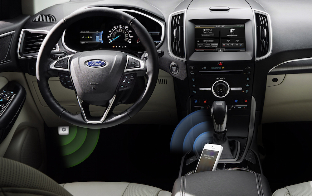
This Week's Sponsor:

Albums

Algorithm-Free Listening for Music Lovers


Jared Sinclair On Designing Unread

Jared Sinclair:

Comfortable also means physical comfort, which is an aspect of mobile app design that designers often forget. Anyone with a new baby knows how convenient it is to be able to use an app with one hand. Some areas of the screen are hard to reach, especially on an iPhone 5 or later. Grip your phone in one hand observe the sweep of your thumb. It’s easy to reach objects in the center, but the navigation bar is too far away to reach without adjusting your grip. Although it’s tempting to jump to the conclusion that closer is always better, positioning an item too close to your hand can cause discomfort because of the way your thumb has to flex to reach it.

One of my favorite aspects of Unread. Check out Jared’s post for more details on his design process, as well as concepts he didn’t end up using.

Permalink

Hoplite: A Mini Dungeon Turn-Based Strategy Game for iPhone and iPad

Each step feels more perilous than the last. As you dash over a pool of lava, you lunge to slay a demon archer, cornered and unprepared for the daring attack. Looking ahead it seems all but impossible to make the last jump, as demon footmen move to block the exit. Throwing your spear, you impale the dark beast, only to be greeted by a bomb that lands behind your feet. You bash away the bomb with your shield, taking out another demon as it explodes at a distance. Leaping across the last chasm, a lapse in judgement leaves you directly in the crosshairs of a second archer, who fires an arrow directly into your exposed side as you land.

And thus ends the quest for the Fleece.

This is Hoplite, where a pair of sandals, a trusty spear, sturdy shield, and three hearts are all that protect you from hordes of demons in the Underworld. Your quest is to recover the Fleece and make it out alive, but the journey is treacherous.

Read more


Safari Action Menu In Launch Center Pro

Launch Center Pro action menu

Launch Center Pro action menu

Last week, I was looking at the way I use Safari and save links to other apps and services, and I realized that I wanted a unified action menu to group some of my most used bookmarklets together. While this can be done by creating a bookmark folder in Safari, folders require too many taps on the iPhone and I’d like to have better visual differentiation between actions with unique icons for each one of them. That seemed like a good opportunity to test the capabilities of Launch Center Pro (now on the iPad as well) when it comes to lists and JavaScript, so I got to work.

A fair warning: Though my solution works, the code isn’t pretty. Until Apple improves the way apps can share information with each other, we’re stuck with hacks like URL schemes, JavaScript, and manual encoding. If you want to customize what I came up with, you’ll have to manually edit URL schemes and test everything on your own. If you’re not concerned about a bookmarklet’s prettiness, go ahead – I’m fairly satisfied with the results. Read more


Unread Review

Unread for iPhone

Unread for iPhone

Unread, developed by Jared Sinclair, is my new favorite RSS reader for iPhone. Unread is on my Home screen, on the same spot that Reeder held since late 2009 when I first reviewed it. Unread provides a fantastic mix of elegant typography, intuitive gesture-based, one-handed navigation, iOS 7 features, and modern sharing tools that, in my opinion, make it the best RSS reader for iPhone today.

The Sound Of Settling

I’ve been using Reeder for over four years, and the app hasn’t changed much. It received interface refinements through the years and support for more RSS services was added after Google Reader’s demise in 2013, but it’s no secret that, for months, Reeder stagnated, with no updates to reassure users that Silvio Rizzi still had big plans for the app. Not that the lack of updates was a problem per se: Reeder was a great app and it always kept working, but seven months without updates on the iPhone and the removal of the iPad and Mac versions from the App Store didn’t suggest that Reeder was on track for major changes.

In September 2013, just a week before iOS 7, Rizzi released Reeder 2, a new app for iPhone and iPad. Reeder 2 brought a completely new UI for the iPad and an evolution of the iPhone’s one, leveraging new animations and transitions for navigation inside feeds and articles. My review wasn’t completely positive: while I lauded the app’s speed, elegance, and familiarity, I also stressed that, in the age of Mr. Reader, Reeder for iPad was too little, too late for my workflow. I concluded by saying that Reeder was a “beautiful and familiar app that could have taken bigger risks”. In spite of the fresh(ish) coat of paint, I couldn’t shake the feeling that Reeder 2 wasn’t exactly new or advancing the basics of the app in meaningful ways.

Especially if you’ve been waiting for an update to Reeder for iPad, maybe a redesigned Reeder that doesn’t go crazy with new features but that instead brings a cleaner reading and syncing experience is exactly what you wanted from Rizzi. Reeder 2 is a fine piece of software – it certainly looks and works better than the majority of RSS clients on the App Store – but my hope was that Rizzi would include new functionalities in the sharing and browsing departments. I guess that, with Reeder 2, I was expecting the same impact that Reeder 1 had in 2009, whereas what I found was a beautiful, solid, but familiar (and trite, in some areas) take on the same app.

I was hopeful that the new foundation would give Rizzi time to regroup and evaluate how Reeder could add new iOS 7 features without losing its nature in the process, but, four months and a 2.1 update later, things haven’t changed much. That’s not necessarily a bad thing – good software takes time, especially when you’re an indie developer – but, as a user, I was curious to see whether other RSS readers could satisfy my news-reading needs better.

Hence, Unread. Read more


How In-App Purchase Is or Is Not Really Destroying The Games Industry

I read two articles over the weekend about the impact of In-App Purchases on the games industry. Thomas Baekdal argues that consumable IAPs, mastered by companies like Electronic Arts, are destroying the industry. He uses the latest Dungeon Keeper game for iOS as an example.

We have reached a point in which mobile games couldn’t even be said to be a game anymore. Playing a game means that you have fun. It doesn’t mean that you sit around and wait for the game to annoy you for so long that you decide to pay credits to speed it up. And for an old geezer like me who remember the glory days of gaming back in the 1990s, it’s just unbearable to watch.

With the help of NerdCubed (great guy), let me illustrate just how bad in-app purchases in games have become. Let’s compare a game from the 1990s with the same game on the iPad today.

On the other hand, Drew Crawford makes the case for In-App Purchases as the best revenue model for the modern App Store games market, noting that they can be considered the evolution of the arcade:

See, in the in-app purchase model actually predates phones. It predates video game consoles. It goes all the way back to the arcade, where millions of consumers were happy to pay a whole quarter ($0.89 in 2013 dollars) to pay for just a few minutes. The entire video games industry comes from this model. Kids these days.

But in fact, the model predates computers. I can trace it at least as far back as the Periscope mechanical arcade game from Sega in 1966 that offers to sell you ten lives for 25 cents ($1.80 in 2013 dollars).

I understand Crawford’s position, and I think that In-App Purchase isn’t strictly a bad model for monetization. My problem is with the user-hostile consumable approach to IAP as illustrated by Baekdal and perfected by EA. It may make sense financially, it may even turn out to make millions of dollars for EA, but, as a gamer, I just think it’s sad.

Permalink

Behind The Scenes of Apple’s “1984” Commercial

Speaking of 1984, Forbes’ Allen St. John published a look behind the scenes of Apple’s iconic Super Bowl commercial. If you can bear with the paginated format and initial ad, there are some interesting details.

On the 30th anniversary of the ad that changed the world, I talked to Steve Hayden, the Chiat/Day advertising VP who wrote that spot. He talked about how Apple founder Steve Jobs commissioned the ad, Blade Runner auteur Ridley Scott brought it to life, and how that 60 second spot which ran just once in January of 1984, changed his life.

Permalink


Apple Posts New Ad Shot Entirely on iPhones, Edited on Macs

To further commemorate the 30th anniversary of the introduction of the original Macintosh on January 24, 1984, Apple has published a new ad shot entirely with iPhones on a single day in 15 different locations around the world. The creative production of the ad was overseen by Jake Scott, son of Ridley Scott, who directed the iconic 1984 commercial. On January 24, 2014, iPhone-equipped crews sent by Apple to 15 separate locations started uploading raw footage to a server in the United States, where Angus Wall and a team of 21 editors could edit using Macs.

Apple’s new commercial doesn’t only focus on Macs – while they’re prominently displayed, Apple highlights how the impact of the Mac has changed the computer industry, leading to the creation of the iPhone, iPod touch, and iPad. All Apple products are shown in the ad: there’s a father making breakfast for his son using an app to control his prosthetic hands; a conductor analyzing musicians’ performance with a Mac; kids using iPads at school, and more.

From sunrise in Melbourne to nightfall in Los Angeles, they documented people doing amazing things with Apple products. They shot over 70 hours of footage — all with the iPhone 5s. Then it was edited and scored with an original soundtrack. Thanks to the power of the Mac and the innovations it has inspired, an effort that normally takes months was accomplished in a matter of days.

In one day, Apple received footage for 45 stories from 15 locations spanning multiple timezones, which required 36 hours of productions in Los Angeles; Apple used 100 iPhones to shoot over 70 hours of footage. As Apple notes, “initially, the team of cinematographers thought they would need lots of professional equipment and software”, but in the end only iPhones with “additional equipment” were used.

Even more impressively, Apple notes that Jake Scott and his team transformed a sound stage in Los Angeles to oversee production remotely using Macs, iPads, and external displays. Scott could direct cinematographers remotely with FaceTime (as shown by Apple, a second iPhone followed each shooting session for real-time feedback) and have an instant overview of footage coming from around the world.

In order to direct 15 separate locations filming in a single day, Jake Scott transformed a sound stage in Los Angeles into a command center. He equipped it with an arsenal of Apple products including iMac, Mac Pro, and iPad, along with large projection displays positioned around the room. From there he was able to watch every scene as it was shot, and direct all the action remotely via FaceTime. Many involved in the production believe this innovative approach to a multilocation shoot will be adopted by other filmmakers.

Today’s commercial is the culmination of Apple’s efforts to communicate the importance of the Mac and the stories of people who use Apple devices. Today’s message, unlike the dedicated Mac webpage, isn’t about the Macintosh per se, but the ecosystem of Apple products that it helped creating.

You can watch the commercial below. Read more


Pedometer++ 2.0

David Smith’s step counter for the iPhone 5s started as a simple experiment but turned into a quite popular utility. Today David has released version 2.0 of the app, which comes with a nice visual update that lets you see a week’s worth of data with a clever use of color. I think that the new UI is much better than before, and I really like how the M7 is allowing developers to build new apps like Pedometer++.

My problem is that I feel guilty whenever I open Pedometer++. I mentioned this on the latest episode of The Prompt, and David is aware of it.

This app has generated more guilt than anything else I’ve ever created. I am constantly hearing from people who say that they open the app and are shocked at how little they actually move in a day. I know for myself it wasn’t until I actually measured it that I realized how sedentary my life was. It is sobering to see that you only took 2,000 steps in a day and realize just how unhealthy that likely is.

Pedometer++ 2.0 is free on the App Store.

Permalink