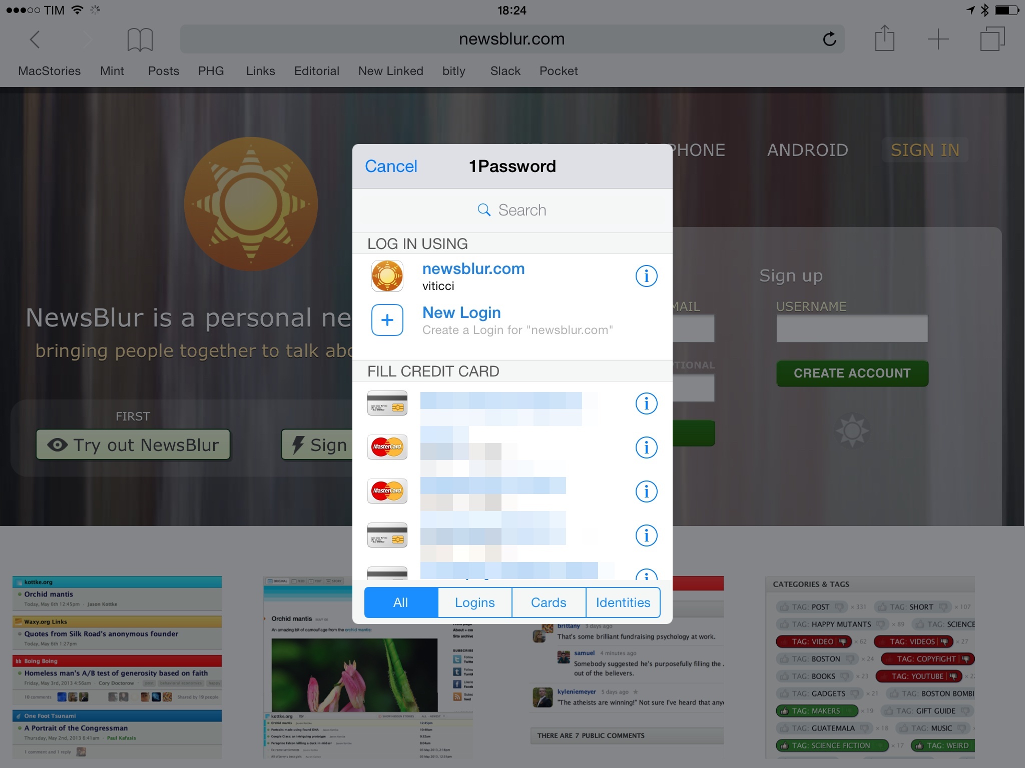
With version 5.3 of 1Password for iOS, the team at AgileBits has shipped considerable improvements to the app’s action extension, launched alongside iOS 8 back in September. In the updated app, the extension is now almost on par with the browser extension found in 1Password for desktop computers, which means I’ll no longer wish for the “real” 1Password extension whenever I’m logging into websites or setting up new logins on my iPhone and iPad.
1Password 5.3 Improves iOS 8 Extension
Thank You, Gary Allen
Gary Allen announced on Friday that he would stop writing new articles for ifo Apple Store, the website he has been running for 14 years. Over the years, Allen and ifo Apple Store has became an invaluable resource for news, data and analysis relating to Apple’s rapidly expanding retail efforts.
After following Apple retail for 14 years, I’ve reached a happy ending, and am gracefully backing away from the crazy world of following the company and its stores. No more stories or analysis, or flying out to far-flung locations to join overnight crowds,waiting for the excitement of new store opening (NSO). I began this Web site as simply a way of celebrating the fun of grand openings and the close friendship of the people I met when I arrived in a new country or city. My first overnight camp-out was with my son Devin on the sidewalk in front of the epic Palo Alto store in October 2001, I continued to other store openings with him in China, Australia, UK and other countries. I’ve visited over 140 stores around the world.
ifo Apple Store has been in my RSS feed for many of those years and I am genuinely sad to hear that Allen is winding down operations. Many of the articles I’ve written about Apple’s retail operations have been informed in some way by the work done by Allen. That includes this article from late-2012 on Apple’s Retail Expansion, which is one of the articles I am most proud of, and it probably wouldn’t exist without ifo Apple Store.
Thank you, Gary Allen. We wish you all the best.
Tim Cook: Pro-Discrimination ‘Religious Freedom’ Laws Are Dangerous→
Tim Cook in The Washington Post today:
There’s something very dangerous happening in states across the country.
A wave of legislation, introduced in more than two dozen states, would allow people to discriminate against their neighbors. Some, such as the bill enacted in Indiana last week that drew a national outcry and one passed in Arkansas, say individuals can cite their personal religious beliefs to refuse service to a customer or resist a state nondiscrimination law.
Cook’s op-ed in The Washington Post comes after Indiana’s ‘Religious Freedom Restoration Act’, which allows businesses to deny service to same-sex couples, was signed into law last week.
I encourage you all to read the full op-ed, Cook does a remarkable job at highlighting just why these laws are dangerous. His final paragraph is particularly powerful:
This isn’t a political issue. It isn’t a religious issue. This is about how we treat each other as human beings. Opposing discrimination takes courage. With the lives and dignity of so many people at stake, it’s time for all of us to be courageous.
Virtual: Attract the Clickers→
This week Federico shares stories of his new PS4 and The Last of Us.
Fun episode of Virtual this week, especially if your definition of fun involves listening to someone who hasn’t owned a PlayStation in years gush about modern games and controllers. You can listen here.
Sponsored by:
- Harry’s: An exceptional shave at a fraction of the price. Use code VIRTUAL for $5 off your first purchase
Connected: I Misplaced That Civil War→
This week, Stephen, Myke and Federico talk about some Italian history, TeleText’s current state in Sweden and then answer listener questions.
Q&A episodes are always fun, and you can listen to this week’s Connected here.
Speaking of Connected, we launched our new t-shirts earlier today. I love the new design – longtime listeners will instantly get the inside joke – and we’re doing a limited run. Get yours here and make sure to beta test it for a few weeks before any judgement.
First Apple Watch Apps Available on the App Store→
Ahead of the Apple Watch release next month, Apple has begun approving the first wave of Watch apps from a selected group of developers. Here’s Juli Clover, reporting for MacRumors:
As of today, several popular iOS apps have been updated with built-in Apple Watch apps, including Evernote, Dark Sky, Things, and Target.
Additional apps with Apple Watch support will be rolling out over the course of the day, giving us a first look at how many of the apps on the device will function. We’ll be updating this post with a list of Apple Watch apps that are available as they come out in the App Store.
See iDownloadBlog for a running list of the updated apps.
I received two Watch app updates on my iPhone – Evernote and Lifesum. In both cases, the apps are indicative of the kind of functionality that will be enabled in the initial group of Apple Watch apps. Evernote will let you dictate new notes, view existing ones, set reminders and receive notifications, and even search for notes in your account. Lifesum will bring “simple” food tracking to your wrist, plus suggestions, exercise reminders, and daily tips to live healthy. I’m curious to see how iPhone apps will bring a subset of their functionality to the Watch, and especially how quickly I’ll find a balance between useful notifications and annoying interruptions.
I also think timing is interesting. For the first time in several years, a new Apple product will be reviewed by people who have access to third-party apps from the App Store. When the iPhone launched, there was no App Store; when the iPad launched, reviewers didn’t have access to public downloads from the iPad App Store.
That won’t be the case with Apple Watch, and this is a clever choice from Apple. Because the Watch is many things, it needs apps to offer a more complete picture of its potential. By approving the first Watch apps this week, reviewers (and customers at the try-on sessions in the retail stores) will get access to a selection of third-party apps that can show how the Watch will integrate in everyday life through the apps they already use.
Smart move, and good timing.
Instapaper 6.2 Adds Speed Reading, Textshots→
Nice Instapaper update released today: the app’s extension has been sped up (again), Instant Sync has been added (it uses silent notifications on iOS to fetch new articles in the background), and you can now get through your read-later list with speed reading. I’ve never been a fan of speed reading, but I like how Betaworks integrated it as a feature inside Instapaper. The extension is much faster in the new version, and it seems to be on par with the speed of Pocket’s share extension.
Along the lines of integration, Instapaper 6.2 also lets you generate textshots for Twitter directly from the app. There are some excellent touches in how Instapaper handled textshots: they’re generated via software (so you won’t end up with images cluttering the Camera Roll) and they preserve the current font and theme selection.

Furthermore, Instapaper also attempts to guess the best aspect ratio to avoid truncation on Twitter. All this, I think, makes it one of the finest implementations of textshots to date. Bonus points for making it easy to tweet a text selection with the Share button of the copy & paste menu.
Betaworks keeps doing good work on Instapaper. Version 6.2 is available now on the App Store.
Twitter Launches Periscope→
Periscope, Twitter’s latest acquisition, has launched today on the App Store. For those who haven’t been following the news, Periscope is a company that Twitter bought before the rise in popularity of Meerkat, a live streaming app. Periscope also lets you live stream video from your iPhone, but, according to early reviews, it’s cleaner, faster, and obviously more integrated with Twitter’s social graph – which was unceremoniously cut off from Meerkat.
Mat Honan has a good story on Periscope:
Fire up the app, launch the camera, and the app tweets out a message (if you want it to) that you have gone live. Simultaneously, a notification fires off — with that little look-at-me whistle — to everyone following you on Periscope. As they join in, they can comment on what you’re doing. And because it has super-low lag time — or latency, to use the term of art — people watching can comment on your actions more or less as they happen. It means that people watching the video can change the course of what’s happening. They can chime in with questions or comments, and all the while tap-tap-tap on the screen to send a stream of hearts to the broadcaster. Don’t want comments? Fine, you can turn them off. If you choose, you can let the video live on Persicope’s servers afterwards, where it will stay for 24 hours before disappearing forever. Or you can choose to let your video be purely ephemeral, living only in the moment and then gone forever. It is delightfully fun.
Joanna Stern’s article, however, really hit close to home for me:
Maybe I should be thankful. Periscope’s biggest promise lies in those times when life is far from boring. Whether it be a breaking news situation or a friend’s traumatic experience, there are times when peeking in and watching a live story unfold makes the most sense. While it’s bound to be abused, this new way of communicating could bring us closer than any photo or recorded video could.
I experienced that this week. My friend Drew Olanoff, who has been suffering from Hodgkin’s Lymphoma, just had a stem-cell transplant. He’s been using Periscope to stream (or “‘scope”) from his hospital room, updating his friends and followers on his progress. Every day, he shows the board that lists his blood stats and flips the camera around—by tapping on the screen—so we can see how he looks.
Like Joanna, I don’t know if my life is exciting enough to warrant a daily dose of live streams. But then again, before Twitter and Facebook and Instagram, most of us didn’t think we’d be inclined to share so much about our daily lives either. Reading how Drew is using Periscope reminds me of when I was stuck there doing a stem cell transplant, and how I wished I could update all my friends and readers at once in a simple, natural way. Sure, I could send selfies to different iMessage threads and I could tweet text and pictures, but the idea of a real-time live stream is much more powerful. And Periscope is pretty cool: I came across some questionable streams in the Home tab, but the app is fast, polished, and, indeed, a window into the world of others.
Live streaming isn’t new. But this new take on the category – fast, integrated, mobile – comes at an interesting time. Periscope is free on the App Store.
Facebook Messenger’s “Optimized” Approach and App Discovery
Over at Fast Company, Sarah Kessler has a good summary of Facebook’s Messenger announcements from today’s F8 developer conference:
Facebook wants to turn its Messenger app into more than just a messaging app. At its F8 conference in San Francisco Wednesday, the company announced details on its much-rumored plans to integrate Messenger with purchases made on other sites, and to allow third-party developers to build apps that work within it.
Messenger users will soon be able to select from a list of services inside of the app. At launch, most of these apps help users create new content, like singing telegram app Ditty, GIF app Giphy, and voice app FlipLip Voice Changer. There’s also a fun special effects app available from J.J. Abrams and an ESPN app that provides users with sports GIFs. Facebook says 40 apps will be available today or in the days to come.
I was curious about Facebook’s plans for Messenger Platform, and the addition of an API immediately caught my interest. I tweeted:
Messenger Platform could be interesting for app discovery. How is Facebook picking which apps to show though? pic.twitter.com/BsNy6qdz3R— Federico Viticci (@viticci) March 25, 2015
Also interesting that Facebook is basically doing their own “extensions” for Messenger. Imagine this for iMessage?— Federico Viticci (@viticci) March 25, 2015
After reading more about how Messenger Platform works with third-party apps, though, I realized that my tweets from earlier today don’t exactly apply to what Facebook is doing.